7
The Evolution of Typographic Technology
The invention of typography has been called the beginning of the Industrial Revolution. It is the earliest mechanization of a handicraft: the handlettering of books. Typographic design has been closely bound to the evolution of technology, for the capabilities and limitations of typesetting systems have imposed constraints upon the design process. At the same time, typesetting has offered creative challenges as designers have sought to explore the limitations of the available systems and to define their aesthetic and communicative potential.
From hand composition to digital typography, it is important for designers to comprehend the nature and capabilities of typographic technologies, as this understanding provides a basis for a thoughtful blending of design and production.
HAND COMPOSITION
1450s to 1880s
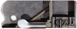
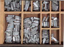
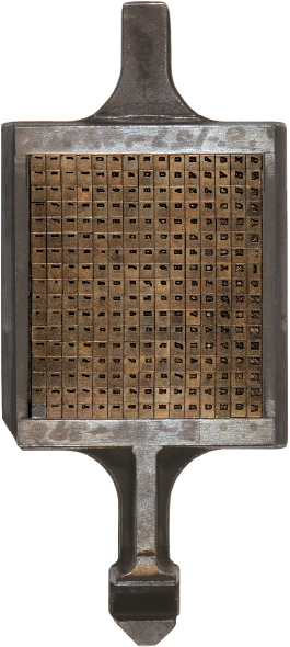
The traditional method of setting foundry type by hand is similar to the method used by Gutenberg when he invented movable type in 1450. For centuries, hand composition was accomplished by assembling individual pieces of type into lines. A typographer would hold a composing stick (Fig. 7-1) in one hand while the other hand placed type selected from a type case (Fig. 7-2) into the stick. Type was set letter by letter, line by line, until the desired setting was achieved. When it was necessary to justify a line, additional spaces were created in the line by inserting metal spacing material between words. Letterspacing was achieved by inserting very thin pieces of copper or brass between letters until words appeared to be evenly spaced. When additional space between lines was desired, strips of lead were inserted between the lines until the type column was the proper depth. By adding lead, the exact proportion and size of the column could be formed, assuring readability through consistent spacing.
Once type was set, it was “locked up” in a heavy rectangular steel frame called a chase (Fig. 7-3). This was done on a table called a stone. The type was surrounded by wood or metal spacing material, called furniture, and the contents of the chase were made secure by tightening wedgelike steel devices called quoins. After the type was secured in the chase, it was ready to be transferred to a press for printing, and after printing, the individual pieces of type were distributed back into the type case by hand.
Hand composition was tedious and time consuming. When typesetting became automated as a result of the invention of Linotype and Monotype machines, hand composition was used only for setting small amounts of type or for display type. Currently, hand composition is obsolete as a practical means of setting type, though it has been revived as an art form. Private presses produce limited-edition books and a variety of experimental materials by hand. Many of our typographic conventions and traditions have their origins in the rich heritage of handset metal type.
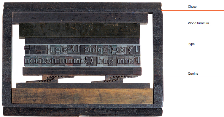
7-3 A chase containing type locked up and ready for printing.
MACHINE COMPOSITION
1880s to 1960s
Linotype
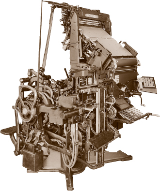
One of the most profound developments in typesetting technology was the invention of the Linotype machine (Fig. 7-4) by Ottmar Mergenthaler in 1886. This machine represented the first great step toward typographic automation. Its name was coined because it produced a single line of type to a predetermined length specified by the keyboard operator.
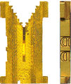
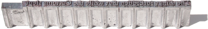
The operation of the Linotype was based on the principle of a circulating matrix. Each time a key was pressed, a single brass matrix (Fig. 7-5) was released from an overhead magazine, divided into ninety vertical channels, each containing matrices for one character. The magazine was the character storage case for the machine. Once an entire line had been typed, the matrices moved into an automatic casting mechanism where the line of type was cast from molten lead. As each line was being cast, the operator typed the next line. After the casting process was complete, cast lines of type called slugs (Fig. 7-6) were ejected from the mold, and the matrices were automatically returned to their appropriate slot in the magazine for reuse.
The advantages of machine composition as compared to hand composition were obvious. It was faster and more accurate; the problem of type distribution (returning characters to the type case) was eliminated, for the cast lines of type were simply melted, and the lead was reused. Justification of type was automatic, eliminating the tedious process of inserting spaces between letters and words. A standard Linotype could cast lines up to thirty picas in length.
An important development for linecasting type was the Teletypesetter. This perforated tape-driven machine—an attachment to Linotype and Intertype—was introduced in 1928. Tape, which was punched by a machine similar to a standard typewriter, could be generated from a distant office and transmitted to the linecaster by wire, which made the machine invaluable to news services.
Monotype
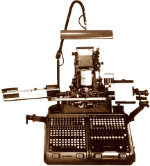
Another significant achievement leading to fully automated typesetting was the Monotype machine, invented by Tolbert Lanston in 1887. This machine cast one character at a time rather than an entire line. It was composed of two parts: a keyboard and a typecaster (Fig. 7-7). When an operator typed at a keyboard, a perforated paper tape was generated. This coded tape was used to drive the second part of the system—the typecaster. Compressed air, blown through the punched holes of this revolving spool of coded paper, determined which characters would be cast by the typecaster. Actual casting of type occurred when hot metal was forced into matrices from the matrix case (Fig. 7-8). Once the cast characters had cooled, they were placed into a metal tray called a galley, where the lines were assembled. Monotype lines could reach a maximum length of about sixty picas.
Monotype became an efficient way to set type for several reasons. Corrections could be made by changing individual letters instead of complete lines. Therefore, complex typesetting, such as scientific data and tabular information, was easier. The Monotype matrix case held many more characters than a Linotype magazine, and the casting machine was relatively fast, casting 150 characters per minute. Since the system consisted of two separate machines, an operator could generate type away from the clatter of the casting machine. In fact, several operators could keyboard information for later setting.
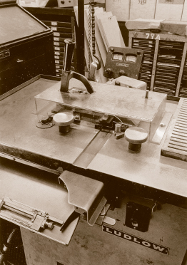
Ludlow
Ludlow, a semiautomatic linecaster, is another machine that found a place in the development of automated typesetting (Fig. 7-9). Unlike the Linotype and Monotype, the Ludlow did not have a keyboard but combined both hand and machine production. An operator took matrices from a matrix case similar to a handset type case and placed them into a special composing stick, one by one. The stick would automatically justify or center lines by inserting blank matrices where necessary. Once a line of matrices was assembled, it was placed into a casting device where it was automatically cast into slugs. If a correction was necessary, matrices were inserted into the stick, cast, locked up, and printed. Although partially automated, this process was time consuming. Distributing the matrices back into the type case by hand added to the production time.
Type produced by the Ludlow machine ranged from 6 to 144 points. Its major use was to produce display type for headlines and other purposes requiring larger typefaces. As was true in the case of handset composition, the Ludlow was neither practical nor efficient for setting large volumes of type.
PHOTOTYPESETTING
1950s to 1970s
7-10 A display phototypesetter.
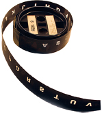
7-11 Film font for a display phototypesetter.
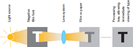
Phototypesetting is a cold-type process, for type is set not from molten cast metal, but by exposing film negatives of characters onto photographic paper. Although photographic typesetting was explored as early as the 1880s, its potential was not fully recognized until after World War II. As printing advanced from letterpress to offset lithography, typography underwent a similar evolution. Hand composition of metal display type, and cast metal machine-set text type, yielded to photographic typesetting. Two kinds of phototypesetting systems were developed: display phototypesetters, for larger headlines and titles; and keyboard phototypesetters, used to set text type through keyboard input. Phototypesetting gradually replaced metal type during the 1960s, as the technology improved rapidly.
Display phototypesetting
In display phototypesetting machines (Fig. 7-10), light is projected through film negatives and a lens to expose letters, numbers, and other symbols onto a strip of photographic paper. While a font of type in hand composition consists of a drawer full of raised metal letters, a font for display photo composition consists of clear images on a long strip of film (Fig. 7-11) wound on two reels. This film font slides between an amber safe light and a lens. Characters are projected onto a strip of photo paper resting in a shallow tray filled with a developing solution. An operator uses hand cranks to roll the strip from one drum to another, putting the next letter in position to be exposed. By pressing a button, the operator causes a bright white light to flash thorough the lens, exposing the character to the photo paper (Fig. 7-12). The character immediately begins to develop, so the operator sees it while using a lever to advance the photo paper. The projected image for the next character is positioned by winding the film strip on the reels with hand cranks. Character by character, a line of display type is exposed on the photo paper, then developed and fixed. Because the operator can view recently set characters as they develop, letterspacing is precisely controlled (Fig. 7-13). This spacing flexibility was a major innovation. Many design advantages of display phototypesetting made it the dominant method for setting headlines by the late 1960s. No longer constrained by the fixed sizes of metal type, the designer could now specify display type set from the film font (whose capitals were about an inch tall) in a wide range of sizes. Type could be enlarged up to two times the master font size, for two-inch capitals, or reduced to a one-fourth size, with capitals as small as a quarter inch high. Enlarged and reduced type retained perfect sharpness, unlike metal type, which became very ragged when enlarged. Metal fonts had a limited number of characters, while photo type had an unlimited number of characters, because the same negative could be exposed over and over again.
The constraints of metal blocks yielded to the elasticity of photographic processes, and innovative designers rapidly explored new possibilities. The lens system permitted photographic distortion. Characters could be expanded, condensed, italicized, and even backslanted (Fig. 7-14). The tremendous expense of introducing new metal typefaces, requiring punches, cast letters, and matrices, was replaced by the cost of one economical film font. As a result, many new display typefaces—as well as revivals of earlier styles that were no longer available—were introduced at a rapid pace.
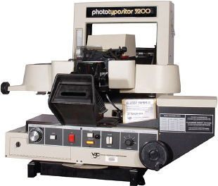
Keyboard phototypesetters
Keyboard phototypesetters were introduced in 1950. Two major types of phototypesetting systems (Fig. 7-15) were developed: photo-optical and photo-scanning systems. They have the same basic components (Fig. 7-16); the primary difference is how the photo paper or film is exposed.
Photo-optical systems store characters as a master font on film disks, drums, grids, or strips. The letters, numbers, and other symbols in the text are input on a keyboard. A typical film disk or drum spins at several thousand revolutions a minute, and a computer controls the exposure of light through the negative characters and a lens, onto light-sensitive paper or film. At the same time, the computer advances the paper or film in a transport device, moving it forward by the set width of the previously exposed character and into position for the next character to be exposed. Different lenses are used for different magnifications, so the typesetter can set different sizes of type. The computer makes very precise adjustments in spacing for the specific type size, and increases interletter and interword spacing when setting justified text columns. These systems are capable of setting hundreds of characters per minute.
7-12 Components of a typical display phototypesetter.
7-13 Unlike hand composition, where every letter is cast on a block of metal and cannot easily be kerned, display photo-type interletter spacing is visually controlled by the operator and can be set wide, normal, tight, or even touching.
7-14 Photographic distortion permitted by the lens system allows characters to be normal, expanded, condensed, backslanted, and italic (top to bottom).
7-15 A keyboard phototypesetter.
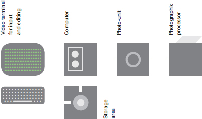
7-16 Components of a typical keyboard phototypesetter.
Early phototypesetting systems used a special keyboard to code punched paper tape that was fed into the phototypesetter to control the typesetting process. Paper-tape systems were replaced by magnetic tape systems and then by magnetic disks and diskettes.
A newer generation of photo-scanning typesetters replaced the photo-optical systems with an electronic system. Fonts are stored as electronic data. These digitized characters are projected as typeset text on a cathode ray tube (CRT) screen. A lens focuses the type on the CRT screen onto light-sensitive film or paper. A full page of type, including many different sizes and typefaces, can be divided into a grid of several blocks, each the size of the CRT screen, and stored in the computer's memory. Photo-scanning typesetters are much faster than photo-optical systems. They reproduce sections of the page rapidly, one block at a time, setting up to ten thousand characters per second.
Phototypesetters are flexible and fast, compared to hot-metal typesetting machines, which could set only about five characters per second. Hot-metal machines had many mechanical parts, while phototypesetters were operated electronically. Photo type needs little storage space because it is stored on flat photographic paper or film, while metal slugs are very heavy and require enormous amounts of storage space. Phototypesetting permits electronic editing, with corrections and changes made at the keyboard.
Phototypesetting freed designers from the physical restrictions of metal type. Increased flexibility in spacing typographic elements included greater control over kerning, interletter and interline spacing, overlapping, and special effects such as runarounds (type running around elements such as images). Designers who understood the potential of this technology used it to great advantage.
DIGITAL TYPESETTING
1970s to present
A computer in combination with the high-resolution cathode ray tube (CRT) and laser revolutionized the communications industry. Using only electronic rather than mechanical components, computers set and process type at speeds never thought possible. In addition, the text type from digital typesetters rivals the quality of photo type.
Digital typesetting systems encode typographic characters digitally on a grid, defining the shape of each letter as a certain number of distinct points. Every detail of a letter is defined, including horizontal strokes, vertical strokes, and curves. The coded characters are stored electronically as digital instructions designating the x and y coordinates of the character on the grid. In the earliest digital typesetters, these instructions were sent to a CRT, where the character is generated onto the computer screen.
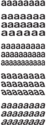
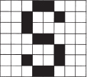
The degree of resolution in digital letterforms is an important consideration. Basically, the more dots or lines used to describe a letterform, the higher the resolution. Because letters are constructed on a grid, the curved lines consist of a series of stair-stepped contours (Fig. 7-17). When more dots are used to represent a curve, the curve appears smoother to the eye. The quality of letterforms is determined not only by their design but also by their digital resolution (Fig. 7-18).
Resolution is improved through a process called hinting (see Chapter 8), which mathematically encodes letterforms in a manner true to their original design. Each size of a well-designed typeface possesses characters with unique proportional characteristics, and hinting preserves these characteristics, a concern particularly relevant for typefaces of smaller size. Details of curves, strokes, and serifs maintain optical integrity.
7-17 Curved lines consist of a series of stair-stepped contours in digital letterforms.

7-18 Examples of digital letterforms, demonstrating decreasing resolution, from left to right, as the number of dots is reduced.
7-19 Components of a digital-scanning typesetter.
7-20 Components of a digital-laser typesetter.
7-21 A morphology of multiple master fonts, originating with six master fonts interpolated along the axes of weight, width, and optical size. Weight and optical size occur along the vertical axis; width occurs along the horizontal axis. Though the variations seem subtle, each represents an individual font.
7-22 Walker, a typeface designed by Matthew Carter, enables designers to “snap on” five variations of serifs at will.
Scanning and laser systems
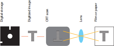
There are two classes of digital typesetters: digital-scanning systems, first introduced in 1972, and digital-laser systems. In digital-scanning systems (Fig. 7-19), photographic characters were digitally scanned and recorded electronically on a magnetic disk or tape. The characters were translated into a grid of extremely high resolution and then transmitted as a set of instructions to a CRT. Next, the characters were generated onto the CRT by a series of scan lines. The letterform images were then projected from the CRT onto paper, film, or an electrostatic drum. Because the output type is digital, it could be modified automatically to reflect a number of typographic variations. For example, it could be made heavier, lighter, slanted, condensed, or expanded at the command of the operator.
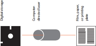
Rather than employing a CRT to generate characters, digital-laser systems (Fig. 7-20) used a laser beam that scanned photographic paper as it read digital information stored in the typesetter. As the paper was scanned, a series of dots forming the characters were exposed to the paper. The information controlling the laser included the font, as well as spacing, paragraph configuration, hyphenation, and kerning.
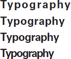
The nature of typographic communication has changed drastically as the responsibility for typesetting has shifted from a compositor to the designer. The ability of a designer to dynamically edit and alter individual letterforms and entire fonts with the aid of software has in many ways redefined the way type is used. For example, multiple master typefaces, developed by Adobe in 1991, readily enabled designers to interpolate and therefore change fonts along several design axes (Fig. 7-21). These axes include weight, width, optical size, stroke shape, and serif configuration.
Other developments depart entirely from traditional typesetting methods. The typeface Walker, for example, designed in 1995 by Matthew Carter for the Walker Art Center, provides “snap-ons,” that is, variant serifs treated as separate characters that can be added to or removed from letters as desired (Fig. 7-22).
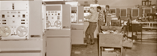
Digital typesetting moved onto the designer's desktop with the development of more powerful personal computers, software applications, and laser printers (Fig. 7-23). Page-design programs were made possible by the development of interpretive programming languages that provide a software interface between page-design programs and output devices. Interpretive programming languages like PostScript by Adobe Systems were specifically designed to handle text and graphics and their position on the page. The introduction in 1985 of products like the page layout software PageMaker and the Apple LaserWriter printer gave designers more flexibility in how they worked, keeping more of the production process in the studio and decreasing dependence on service bureaus and commercial printers. Color monitors, faster processors, and more robust file storage methods continued to speed up the design process.
Such major leaps forward in typographic technology have brought unprecedented control and freedom to typographic design. These tools make it possible for designers to make unlimited changes to their designs, create mock-ups from laser or inkjet printers, and send electronic proofs to clients and collaborators. One file can take many forms and may be sent to a commercial printer, self-published, converted to a template, made into an interactive Portable Document Format (PDF), or used as a prototype for an app, game, or web page. Control over the means of production of typography has also given designers the tools to experiment with typographic form, composing it in unconventional or expressive ways by manipulating settings of leading, tracking, rotation, and more.
7-23 Components of a desktop publishing workstation.
7-24 Web typography is no longer limited to a simple outline layout and can use a wide array of typefaces and column arrangements. (Designer: Mark Sanders)
SCREEN-BASED TYPOGRAPHY
7-25 A deconstruction of all the elements used to build typography that signifies interaction. (Design: Tim Collins)
With electronic communication, typography has evolved from static, printed output to dynamically created and distributed information viewed and interacted with entirely on screen. As in printed typography, screen-based typography is used to communicate and convey information in many different mediums.
Web
With more than twenty years of typographic development and technical improvements, the web is the most robustly explored and documented application of screen-based type. Early browsers confined type to a single, vertical column of running text, so typesetting was limited to expressing the importance of text through only size, weight, and posture. As the use of the web increased, more sophisticated layout and typeface choices were developed. Complex column arrangements, broad typeface choices, layering, and rotation became possible as browsers and coding became vastly more powerful. Today's screen-based typographic designers now have almost as broad a palette as their counterparts in print (Fig. 7-24).
Web typography is meant to be not only read but also engaged. This can take the form of links, which allow site users to load new pages or access additional information, or other interface components that allow further interaction with content (Fig. 7-25). This act of engagement has grown in importance as websites have moved from presenting relatively static information on screen to encouraging user participation while dynamically assembling the content.
Mobile apps
With the launch of the App Store in 2008, Apple set in motion the next great advance in on-screen typography. Apps (short for applications) are self-contained programs that perform specific tasks. While they have existed in a variety of formats since the introduction of the personal computer, their relative ease of creation, the ready-made App Store distribution network, and a fixed format established this latest iteration as a screen-based medium. Originally designed for mobile phones, mobile apps are now utilized by tablets and even by desktop computers.
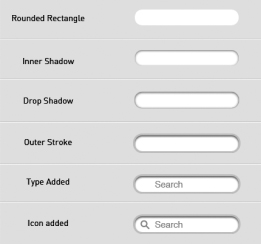
Mobile apps are generally developed utilizing a software development kit (SDK) that governs the platform they run on. This SDK contains not only programming instructions but also interface, design, and even typography specifications. App designers can depart from these guidelines, but on their own these standards establish a typographic cohesion and ready-made hierarchy of information. Typography for mobile apps is influenced by a fixed screen size that responds to touch and gestures performed by fingers (Fig. 7-26).
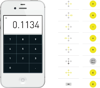
7-26 The Rechner Calculator app uses gestures in place of buttons for controlling calculations. (Designer: Berger & Föhr)
In response to the differences in programming, layout, and complexity of information that exist among mobile phones, tablets, and desktop computers, a hybrid strategy known as responsive design is now in practice. On-screen design and typography “respond” to the screen size they are being viewed on, fitting content into the frame for each device (Fig. 7-27). The advantage of this technique is that a single code base is used for all display sizes, simplifying the coding and unifying the design from device to device.
Virtually all aspects of typographic layout and design can be varied in response to a specific screen size. Visual and interface elements can also be removed or reordered to best utilize the communication potential of the specific device.
Responsive design is especially challenging since the designer must plan to display information in a variety of layouts that best suit the screen size. For example, content may be designed in a one-column layout for a mobile phone screen, while a multicolumn layout may be be more appropriate for a desktop computer with a wider screen. Designers also anticipate the different ways users interact with information, such as touching a mobile device or using a mouse or trackpad on a desktop.
Typographic media continues to develop rapidly, and designers must keep abreast of innovations that influence the design process and the typographic image. Having now assumed almost all of the typographers' role, designers must develop specialized knowledge of the typesetting system they are utilizing in order to fully understand its capabilities and achieve the desired quality of typographic communication.
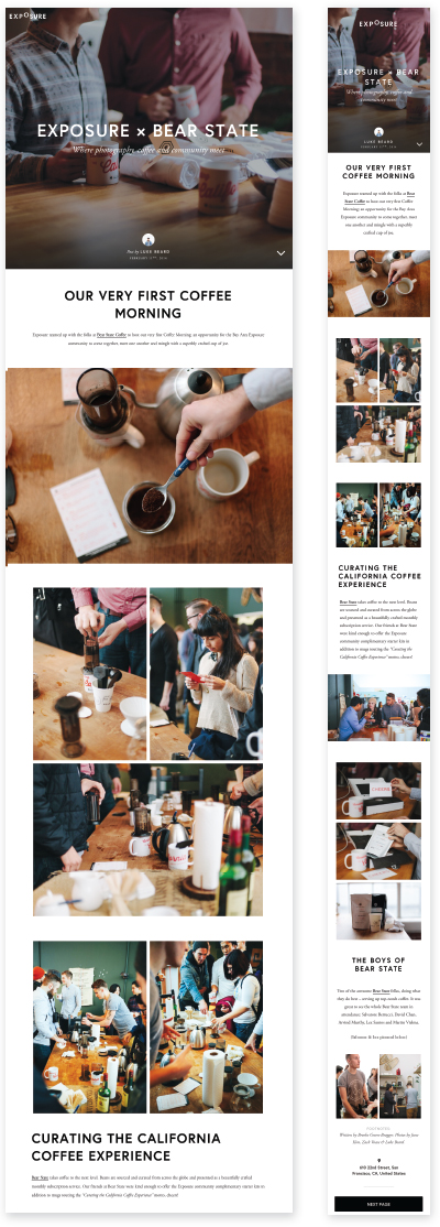
7-27 The layout and typography of the website Exposure.so change in response to different screen sizes.