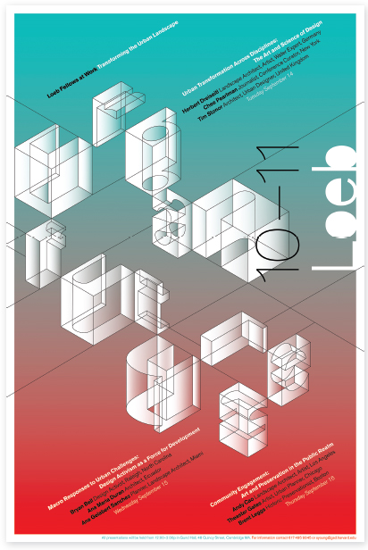
6
The Typographic Message
This chapter introduces typography as a language of potent visible signs, a language capable of educating, persuading, informing, and entertaining. When typographic signs are created with an informed eye and mind, they can achieve clarity, expression, lucidity, aesthetic beauty, and more. Typographic messages pervade our culture to the degree that they are often taken for granted or not noticed at all, but those that are etched into the mind and memory are characterized by a relationship between content and form.
A MULTIDIMENSIONAL LANGUAGE
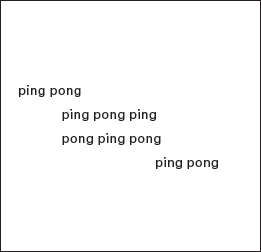
6-1 “ping pong” (Poet: Eugen Gomringer)
The typographic message is verbal, visual, and vocal. While typography is read and interpreted verbally, it may also be viewed and interpreted visually, heard and interpreted audibly. It is a dynamic communication medium. In this sense, early twentieth-century typography became a revolutionary form of communication, bringing new expressive power to the written word. Consider the concrete poem “ping pong” (Fig. 6-1). The geometric structure of this poem is composed of a repetition of the words ping and pong. As these words are repeated, they signify the sound of a bouncing ping-pong ball, and the circular letters p, o, and g reflect the shape of the ball. The full impact of this poem is achieved when it is read aloud. By hearing the sounds while viewing the typographic forms, the typographic message is strengthened.
Significant departures from the use of conventional typographic forms occurred in Europe at the beginning of the twentieth century. During this activist period, experimentation in all the visual and performing arts was affected by potent social and philosophical changes, industrial and technological developments, and new attitudes about aesthetics and modern civilization. Typographic design was pulled into this artistic revolution as poets and visual artists realized that both meaning and form could be intensified in typographic communications.
The Futurist manifesto, written by the Italian poet Filippo Marinetti in 1909, profoundly influenced thinking in Europe and Russia. Futurism praised technology, violence, danger, movement, and speed. Futurist typography, known as “free typography,” demonstrated these ideas in a highly expressive manner (Fig. 6-2; see also Fig. 1-125). The chill of a scream was expressed in bold type, and quick impressions were intensified through italics. Letters and words raced across the page in dynamic motion.
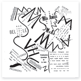
6-2 Les mots en liberté futuristes. (Designer: Filippo Marinetti)
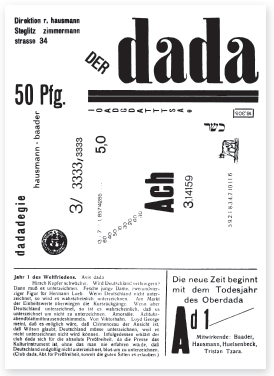
6-3 Cover of the first issue of Der Dada. (Editor: Raoul Hausmann)
![]()
6-4 Title lettering for De Stijl. (Designer: Theo van Doesburg)
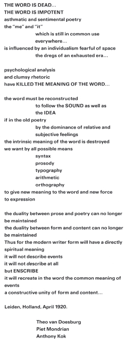
Among the movements affected by Futurism were Dadaism in France, Switzerland, and Germany; de Stijl in Holland; and Constructivism in Russia. Each of these historical movements has had a penetrating effect upon typography. Artists and designers associated with these movements saw typography as a powerful means of conveying information relating to the realities of industrialized society (Figs. 6-3 to 6-5; see also Figs. 1-129 to 1-135). They disdained what typography had become: a decorative art form far removed from the realities of the time. The architect Otto Wagner further emphasized that “all modern forms must be in harmony with the new requirements of our time. Nothing that is not practical can be beautiful.” Written in 1920, the second de Stijl manifesto clearly demonstrated the concern for a new, expressive typography (Fig. 6-6). With dramatic changes taking place in the form and content of typography, the typographic message became a multifaceted and expressive form of communication. Typography needs to be read, seen, heard, felt, and experienced.
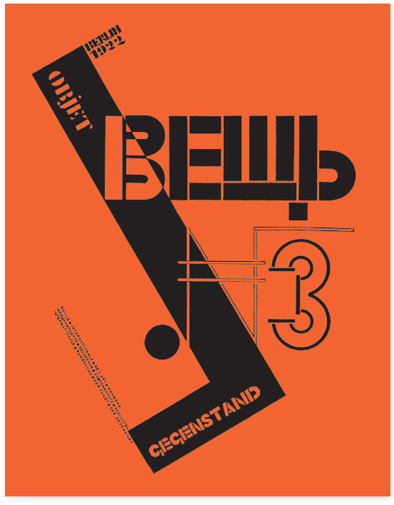
6-5 Constructivist cover design for Veshch, Gegenstand, Objet. (Designer: El Lissitzky)
6-6 De Stijl manifesto of 1917.
VERBAL/VISUAL EQUATIONS
As a dynamic representation of verbal language, typography must communicate. This functional role is fulfilled when the receiver of a typographic message clearly and accurately understands what is in the mind of the transmitter. This objective, however, is not always accomplished. With a proliferation of typographic messages littering the environment, most are missed or ignored. The messages that are noted, possessing effective qualities relating to form and content, are appropriate to the needs of both message transmitter and message receiver.
The impact of an effective typographic message cannot be easily measured. Some may assume that since printed and broadcast messages are ephemeral, they have little impact upon their audience. This assumption is false. Because typographic ephemera are rhetorical, they often have a long-range effect upon a message receiver, influencing the context of social, political, and economic events. The symbol of the solidarity expressed by Polish workers (Fig. 6-7), the social statements made with graffiti in urban environments, and the typography on billboards aimed at passing motorists all operate as purposeful messages directed toward a predetermined audience within a specific context.
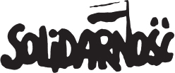
6-7 Solidarity logotype. (Designer: Jerzy Janiszewski)
Effective typographic messages result from the combination of logic and intuitive judgment. Only the neophyte approaches this process in a strictly intuitive manner; a purely logical or mechanical procedure undermines human expression. Keeping these two extremes in balance requires the use of a functional verbal/visual vocabulary capable of addressing a broad spectrum of typographic communication.
Language, in any of its many forms, is a self-contained system of interactive signs that communicate ideas. Just as elocution and diction enhance and clarify the meaning of our spoken words, typographic signs can be manipulated by a designer to achieve more lucid and expressive typographic communication.
Signs operate in two dimensions: syntactic and semantic. When the mind is concerned with the form of a sign, it is involved with typographic syntax. When it associates a particular meaning with a sign, it is operating in the semantic dimension.
All objects in the environment can potentially function as signs, representing any number of concepts: a smog-filled city signifying pollution, a beached whale representing extinction, and confetti implying celebration—each functions as a sign relating a specific concept.
Signs may exist at various levels of abstraction. A simple example will illustrate this point. Let us consider something as elemental as a red dot. It is a sign only if it carries a particular meaning. It can represent any number of things: balloon, ball, or Japanese flag. The red dot becomes a cherry, for example, as the mind is cued by forms more familiar to its experience (Fig. 6-8).
The particular syntactic qualities associated with typographic signs determine a specific meaning. A series of repeated letters, for example, may signify motion or speed, while a small letter in a large void may signify isolation. These qualities, derived from the operating principles of visual hierarchy and ABA form, function as cues, permitting the mind to form concepts. Simple syntactic manipulations, such as the repetition of letters or the weight change of certain letters, enable words to visually mimic verbal meaning (Fig. 6-9). In another example, the letter E has been visually altered, relating it to the meaning of specific descriptive words (Fig. 6-10).
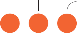
6-8 Signs exist at various levels of abstraction. A form is a sign, however, only when it carries a message. As the mind is cued by forms familiar to experience, information is conveyed.
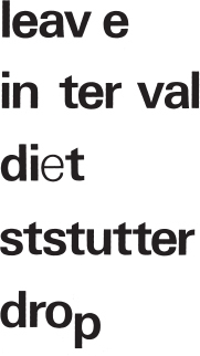
6-9 Syntactic manipulations are controlled by such factors as repetition, size change, position change, or weight change. These enable words to visually mimic verbal meaning.
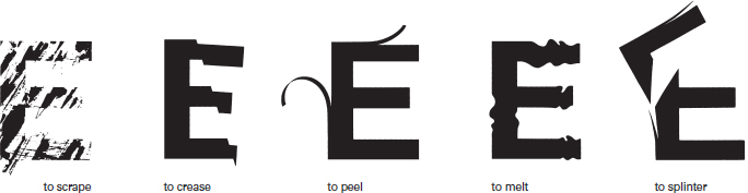
6-10 These elaborations of the letter E express a variety of concepts. (Designers: Carol Anthony, Linda Dronenburg, and Rebecca Sponga)
6-11 Typographic signs combine to form a more complex sign, suggesting a decorated Christmas tree. (Designer: Donna Funk)
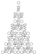
In language, signs are joined together to create messages. Words as verbal signs, grouped together in a linear fashion, attain their value vis-à-vis other words through opposition and contrast. Words can also evoke meaning through mental association. These associative relations are semantically derived. Since typography is both visual and verbal, it operates in a linear fashion, with words following each other in a specific sequence, or in a nonlinear manner, with elements existing in many syntactic combinations. For example, in the visual poem “O Christmas Tree,” the choice of the typeface, Futura Light, is very important. The capital letter O is a perfect circle, signifying ornaments; the linear strokes of other letterforms suggest the texture of evergreen needles (Fig. 6-11). This typographic message is derived from the mental associations formed by contrasting typographic signs.
Two terms important to the understanding of signs are denotation and connotation. When considering the meaning of typographic signs, denotation refers to objective meaning, the factual world of collective awareness and experience. For example, a denotative interpretation of a yellow O would be: “This is a yellow letter O” or “This is a yellow circle.” Connotative interpretations of the yellow O might be: “This is the sun, a slice of lemon, or a golden ring.” Connotative observations are often conditioned, for they relate to overtones and are drawn from prior personal experience.
Typographic signs are both verbal and visual. The associations formed between the verbal and visual attributes are verbal/visual equivalencies, which are found in a variety of configurations. These reveal the associative nature of signs composing the typographic message and help us further understand its multifaceted attributes. Figures 6-12 to 6-24 illustrate the nature of some of these verbal/visual equations.
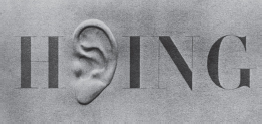
6-12 Visual substitution: The visual sign of an ear is substituted for the letters E, A, and R. (Designer: Lou Dorfsman)
6-13 Visual transformation: Letterforms are drawn to represent the visual sign of a building and spell the words urban and futures. (Designer: Thirst/John Pobojewski)

6-14 Simultaneity: The numeral 8 functions as the letter g in this logotype used for a group exhibition of paintings by the early twentieth-century American art group the Eight.

6-15 Visual transformation: A mother, father, and child are suggested through the visual transformation of the letters l and i. (Designer: Herb Lubalin)
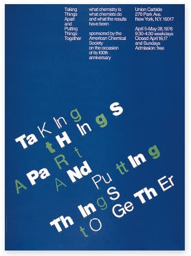
6-16 Visual exaggeration: The irregular syntactic treatment of typographic signs exaggerates the process of taking things apart and putting things together. (Designer: Steff Geissbuhler)
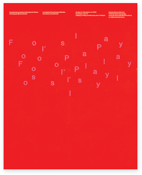
6-17 Visual exaggeration: The repetition and playful treatment of typographic forms effectively reinforces the content of the drama Fool's Play. (Designer: David Colley)

6-18 Form combination: Visual and verbal signs are combined into a single typographic statement, creating trademarks that suggest the nature of various industries: an electrical contractor, a maker of plastic fibers for carpets and draperies, and a lithographic printer. (Designer: Don Weller)
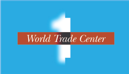
6-19 Form combination: Verbal signs are combined with visual signs (skyscraper and clouds) to evoke concepts of memory, opposition, and incompleteness as metaphors for the building 1 World Trade Center. (Designer: Mark Sanders)
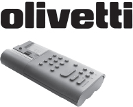
6-20 Parallel form: The Olivetti logotype and electronic calculator have similar visual characteristics that parallel each other. (Logotype design: Walter Ballmer)
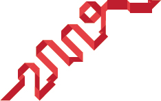
6-21 Verbal/visual correspondence: The syntactic qualities of the number 2009, used on a holiday card, represent the material qualities of ribbon and the idea of celebration. (Designer: Q Collective)
![]()
6-22 Verbal/visual correspondence: The visual characteristics of this typographic sign correspond to the form of a zipper. This is achieved by a repetition of letters and a horizontal shift within the word. (Designer: Richard Rumble)
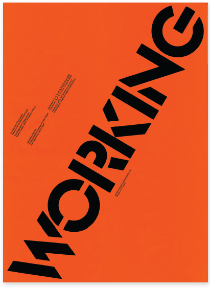
6-23 Verbal/visual correspondence: The visual qualities of the typeface chosen for the poster for the play Working make direct reference to the stenciled typography typically seen at a warehouse or construction site. (Designer: David Colley)
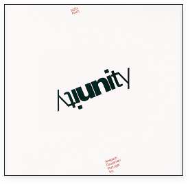
6-24 Verbal/visual correspondence: The visual repetition of this word—unified by the shared letters u and n—express the concept of unity. (Designer: Steff Geissbuhler)
FUNCTION AND EXPRESSION
Functionalism is a term used to describe the utilitarian and pragmatic qualities of designed objects. During the early twentieth century, functionalism was generally equated with designed objects of clarity, purpose, and unornamented simplicity. However, it has since evolved as a subjective notion that varies widely according to the needs of the audience and the objectives of the designer.
For example, if comfort in the design of a chair is defined as plushness and cushiness, an upholstered automatic recliner complete with footrest might satisfy the criteria of a functional chair.
In contrast to the automatic recliner is the red/blue chair, a central artifact of the de Stijl movement, designed in 1918 by Gerrit Rietveld (Fig. 6-25). Members of de Stijl sought a restrained expression and a new philosophy for living. With its hard, flat surfaces, the red/blue chair appears very uncomfortable; however, Rietveld's desire was for the chair to promote alert mental activity through rigid support. The seat and backrest planes are attached at only one edge, enabling the pliable wood to adjust to the user's weight. In this regard, the chair functions according to Rietveld's intentions. In an interior environment, Rietveld's red/blue chair has the presence and visual harmony of a piece of sculpture. The needs for a functional object (seating) and for aesthetic experience are fulfilled in this one object.
In typography, function is the purposeful communication of information to a specific audience. Although the range of possible typographic design solutions is infinite, the appropriateness of a solution always depends upon the purpose for which it was intended. Varying degrees of formal reduction or elaboration can be effective when solving specific typographic problems.
Formal reduction can be used to create optimum clarity and legibility, presenting complex information, such as news or scientific data, in a clear and straightforward manner. Orderly presentation guides the eye from one element to another, preserving reader and attention (Figs. 6-26 and 6-27).
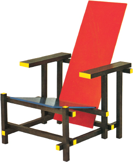
6-25 Red/blue chair, 1918. (Designer: Gerrit Rietveld)
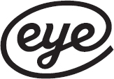
6-26 The elemental shape and sequence of letters in the word eye visually suggest two eyes and a nose. Based on the typeface Radio, this typographic configuration serves as the masthead for Eye: The International Review of Graphic Design. (Concept: Nick Bell; designer: Magnus Rakeng)
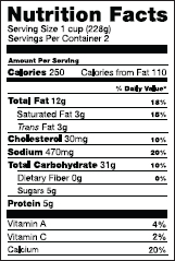
6-27 Required to appear on all food packaging in the United States, the standardized Nutrition Facts label clearly provides consumers with important information about the nutritional value of foods. Typography responsibly assumes an objective, informational role. (Designer: Burkey Belser)
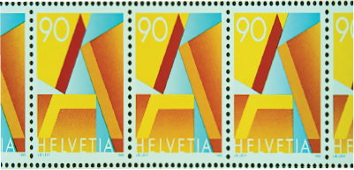
6-28 The “A” stamp is the official priority stamp of the Swiss postal service. A simple configuration of three interlocking shapes suggests an uppercase A. The trilogy of shapes represents the codependent parts of the mailing process: message, sender, and receiver. (Designer: Jean-Benoît Lévy)
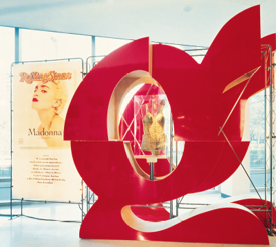
6-29 The vitality of Rolling Stone magazine is revealed in this monumental, three-dimensional letterform, a deconstructed element used in the traveling exhibition The 30th Anniversary Covers Tour. (Designer: J. Abbott Miller, James Hicks, Paul Carlos, and Scott Davendorf)
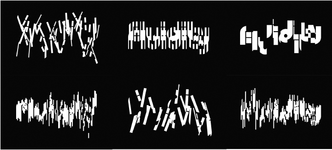
6-30 This sequence of frames represents the dynamic identity for Fluidity, a water design firm. To communicate the qualities of water, the letterforms transform in shape and mimic refraction. The identity appears in different forms on different applications. (Designer: Thirst/John Pobojewski)
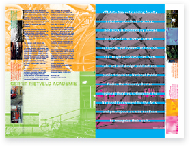
Another approach, expressionism, accomplishes its purpose through formal elaboration and ornamentation, creating visual impact. When appropriate, attention can be given to experimental, expressive, and ornamental possibilities. Ornament serves a variety of practical needs. Because it is semiotic, iconographic, and historical, it identifies the object with which it is associated. Expressive and ornamental typographic forms place objects in time, reveal their purpose, and clarify their structures (Figs. 6-28 to 6-30). The formal elaboration of objects in architecture, industrial design, and the fine arts can significantly influence typographic possibilities. Figures 6-31 to 6-33 possess strong ornamental qualities (as do Figs. 1-71 and 1-119). Innovative typography can emerge when a designer fully understands communication needs and is able to assimilate a diversity of visual ideas.
On this subject, Ladislav Sutnar—graphic designer, author, and pioneer of information design—commented that “an eccentric visual scandal or visual shock of the outrageous and of the unexpected can catch the attention of the astonished eye... it may also delight the eye to see a fresh design concept or a message so orderly presented as to make comprehension fast and easy.” A designer can avoid conventional solutions to typographic problems when innovation is appropriate. A single approach to typographical design, induced by stylistic convention and predetermined formulas, is a routine activity lacking the vitality of meaningful typographic invention. Sound principles and a trained vision should supersede dependency upon preconceived formulas. For typography to be truly functional, satisfying the needs of an audience, a designer must understand both the verbal and visual attributes of a typographic message.
6-31 A field of typographic forms, photographs, and the colors orange and yellow charge this poster with expression. (Designer: Sandra Maxa)
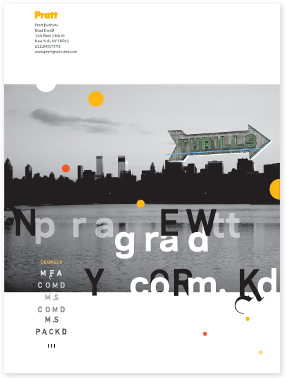
6-32 This view book acquires its robust and expressive quality through vivid color, varying typographic textures, and structural complexity. (Designer: Rob Carter)
6-33 Expressive text type is achieved on a spread of the book Elvis+Marilyn by its configuration into the letter R. (Designer: Mirko Ilić)