12
Typographic Design Process
The creative process is a struggle with the unknown. Whether composing music, making a painting, or designing a chair, one is faced with the challenge of how to begin and how to end. Every project offers unique challenges, and no fail-safe formula exists for solving problems.
The design process can range from the use of highly structured methods to the serendipity of chance operations. Often, designers work in a realm somewhere between these two extremes, somewhere between intuition and logic. The solution to a problem emerges on rare occasion as a brilliant scrawl on a dinner napkin, but most often the problem-solving process is a journey that requires courage, patience, and confidence in finding one's way through uncertain terrain.
The design process is a sequence of events that begins as soon as the designer takes on a problem. It continues until either a deadline is reached or problem criteria have been met. Rarely is the process predictable, a progression in a straight line from point A to point B. The design process is more like reading a road map. There are many ways of reaching the final destination. If side roads are taken, it will probably take longer to get to the destination. But side roads are almost always more interesting than well-traveled highways.
A TRADITIONAL MODEL
This chapter explores the design process and its role in typographic problem solving. Many models exist that schematically represent the design process. But in fact, there is no single process or method for working through problems. Most designers approach their work in a highly individual manner, some using a combination of traditional and digital tools and methods. Digital technology has played an enormous role in the evolution and individualization of design processes.
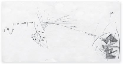
A well-known model of the design process consists of five steps, which are explained below. Traditionally, these steps have been thought to occur in a linear manner, beginning with defining the problem and progressing toward realizing the solution. But rarely, if ever, is the process so smooth and predictable. Design formulas certainly can be devised and followed letter by letter, ending in solutions lacking imagination and mental rigor. But perhaps it is more helpful to think of the process as five fields of activity that overlap one another in a multidimensional environment of intellectual discourse. The process is not linear; rather, it is one of interaction and ambiguity where paths appear to meander aimlessly toward durable and innovative solutions (Fig. 12-1).
Defining. Immersion into the design process begins by defining the problem and its parameters. What are the client's needs, and what is the sphere of the client's activity? What are the goals and objectives of a potential solution? Who is the audience? What are the budget and production limitations? To answer these and other pertinent questions is to set the problem's parameters. These parameters may change at any time during the process and should not be too tightly defined.
Gathering. This phase provides the essential information needed by the designer regarding all aspects of the problem. This includes gathering information about the client, problem content, and production requirements. While gathering information, designers should make use of all available resources. Experts, libraries, museums, antique shops, and movie theaters are all excellent information-gathering venues. The Internet is also an invaluable resource.
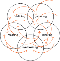
12-1 This typographic diagram reveals the design process as a flexible, dynamic, and unpredictable mental journey. Diverse lines of thought and activity lead eventually to closure.
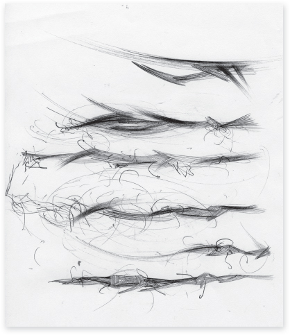
12-2 Selected spreads from sketchbooks reveal process drawings, thoughts, and visual notations. (Designers: Yoon-Young Chai, Brent McCormick, Matthew Stay)
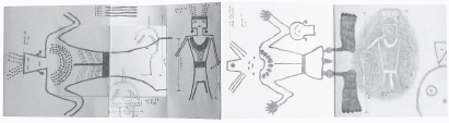
12-3 A process book unfolding in time documents the petroglyphs and pictographs of the Anasazi and Fremont cultures of the American southwest desert region. (Designer: Rob Carter)
As new developments arise later in the process, designers may find it necessary to gather additional information. A designer's curiosity is the key to informed practice and the ability to openly and clearly communicate with colleagues and clients.
Ideating. The worst enemy of the design process is thinking inside the proverbial box. The mind should be open to lateral, sideways, and unconventional thinking. Often, experienced designers rely upon formula or knowledge-based intuition to solve problems. But these approaches often limit the vast potential for new possibilities.
Synthesizing. Whereas the ideation phase is concerned with expanding possibilities, the synthesis phase concentrates on narrowing options and coming to closure. Often, the most effective solutions are readily apparent; they meet initial problem criteria and are formally and aesthetically superior to weaker solutions. Short of using sophisticated marketing techniques, the best way to evaluate the effectiveness of a solution is to weigh it point by point against the criteria established at the outset of the problem. However, if necessary and appropriate, the original criteria can change at this stage and the solution can be adjusted.
Realizing. Implementation cannot go forward without client approval. Usually, designers and clients communicate on a regular basis throughout the process, which prevents confusion and misunderstanding at the end. More often than not, clients are not visually oriented people, thus making it the designer's responsibility to educate them and communicate with them clearly and without the use of jargon or highly technical language. Such communication breeds mutual trust and respect. Upon final approval, the design moves into final production. Successful implementation requires the designer to manage production processes such as printing and manufacturing with an eye on intermediate and final deadlines.
Processing typographic form and ideas
The typographic design process involves a search for typographic form and its meaning. Any change in form (syntactics) results in a shift in meaning (semantics). The goal of typographic problem solving is to formulate ideas based on form and its meaning. The following methods and techniques aid the designer in this search.
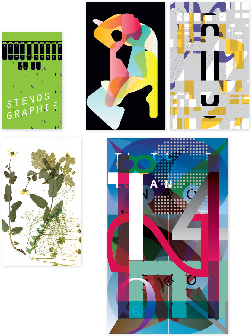
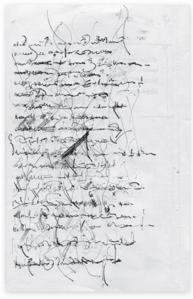
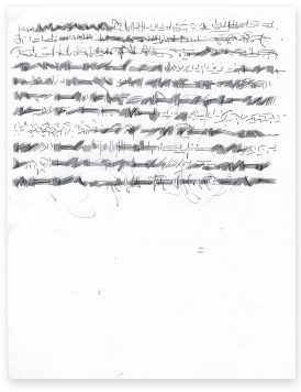
Sketchbooks and process books. Highly curious individuals, designers crave visual stimuli and make a habit of recording daily visual experiences. Through camera lens and sketchbook, they record thoughts and images by drawing, writing, photographing, and collecting.
Effective sketchbooks do not resemble typical scrapbooks. They reflect ordinary as well as extraordinary experiences during the course of everyday working and living. Sketchbooks function as a collection, a repository of things found and observed, of the visible and invisible, the concrete and abstract. They are both public and private.
Sketchbooks contain a variety of content, from nonsensical doodles to visual schemas of scientific phenomena. Growing and expanding regularly, they reflect the individual designer's mental flights, observances, and voice (Fig. 12-2).
While a sketchbook is a continuing exercise in recording visual and verbal ideas, a process book records specific processes as they unfold (Fig. 12-3). Keeping a process book aids the designer in staying consciously aware of the activities and thinking leading to problem solutions.
12-4 Any subject can serve as the nucleus for a mind map. Mind mapping is an invaluable exercise wherein the designer's thought processes are revealed as an ever-expanding universe of possibility and potential. (Designer: Matt Klimas)
Brainstorming. Brainstorming is perhaps the most familiar ideation strategy for design teams. Though it has its detractors, it remains an effective approach if conducted according to basic ground rules. These include deferring judgment of all ideas during a session, generating as many ideas as possible, and being open to both good and bad ideas. The basic theory is that the group is a deep reservoir of experience, and that one idea leads to new and unique possibilities.
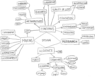
Mind mapping. Related to free association, mind mapping is a nonlinear brainstorming process with a word or concept at its nucleus. By making lighting-quick associations of the concept, a web of related themes reflecting mental patterns emerges (Fig. 12-4). The satellite concepts generated from mind mapping help designers identify areas of possible content, both visual and verbal.
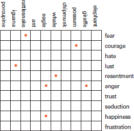
Word lists and interaction matrix structures. Making lists of analogous words and descriptive phrases related to specific umbrella topics, or spontaneously generating random words derived from brainstorming or mind mapping, can stimulate thinking and open the mind to broader visual possibilities. When lists of words are integrated into the structure of a matrix, new and improbable relationships can be forged between unlikely and contrasting word pairs. Often the most intriguing concepts emerge from the interaction of polar or nearly polar opposites. A sign is understood more clearly and achieves greater impact when juxtaposed with an opposite sign (Fig. 12-5). Interaction matrix structures can also accommodate the interaction of words with images, or images with other images. Collecting an abundance of material related to given content and applying it to an interaction matrix can aid the designer in identifying and defining a problem, or in developing fresh ideas outside of conventional thinking. When engaging in these processes, it is helpful to unleash the play instinct, release the child within, and hush any tendency toward self-criticism. In the sample matrix structure, the red dots are placed at points of potential interaction (Fig. 12-6).
Visual notations and comprehensives. Ideas that remain in the mind and are not articulated visually do little to move the process ahead. Design students often convey their ideas to teachers and classmates verbally. This is where ideas begin, but until they are expressed visually in the form of sketches or notations, their effectiveness cannot be evaluated. Thumbnail notations can be created with a variety of tools and materials, from pencil and paper to computer.
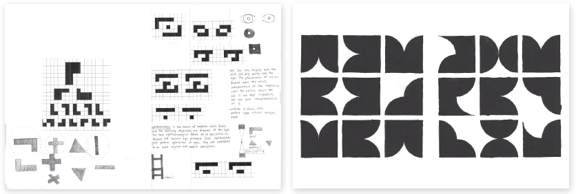
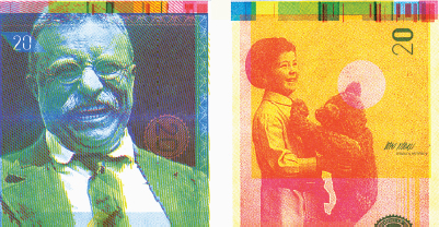
The design process can be thought of as beginning at the broad base of a pyramid. Options are expansive at first, but as one moves through the pyramid toward its apex, the vision of a viable outcome—the solution to a problem—becomes more specific. The process may begin as a mind-mapping session, progress into a series of general notations, and then advance to comprehensive sketches. A project conducted at Rutgers University by Professor Ned Drew is used to illustrate this progression. Visual notations and sketches leading to the design of banknotes are shown (Figs. 12-7 to 12-13; see also Figs. 11-60 and 11-61).
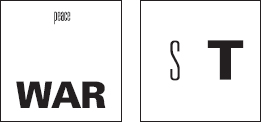
12-5 Polar opposition occurs in both the syntactic and semantic realms. In this example, the letters S and T stand syntactically in opposition in terms of shape and weight. The lightness and solitude of peace stand in opposition to the heaviness and aggressiveness of war.
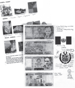
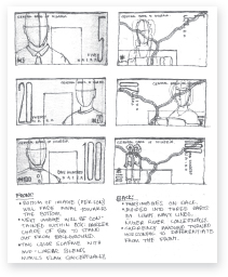
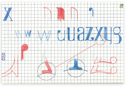
12-7 Gathering images and organizing them thematically aids in generating ideas. (Designer: Jessica Salas)
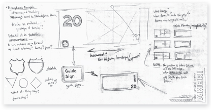
12-8 Preliminary visual notations exploring a wide range of concepts and typographic concerns. (Designer: Alan Bayot)
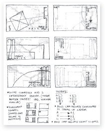
12-9 and 12-10 Sketches with accompanying notes explore thematic possibilities. (Designer: Chinedue Chukwu)
12-11 Small but highly articulated thumbnail notations search for a typographic system that will unify the series of banknotes. (Designer: Roland Ilog)
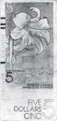
12-12 and 12-13 A distinct progression in visual refinement can be seen in this comparison of a preliminary and a final composition. (Designer: Roland Ilog)
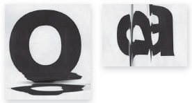
Metaphorical thinking. In language, a metaphor is a subset of analogy, a figure of speech suggesting that something appears, sounds, or behaves like something else. Letterforms can suggest objects and ideas beyond their function as symbols for spoken language. They possess visual qualities and can be manipulated to suggest other objects, sounds, and images. Typographic metaphors are derived through any number of syntactic manipulations, including those of spacing, position, rhythmic sequencing, and color. Metaphorical thinking is a conceptual process focused on finding relationships between dissimilar ideas and objects; some are highly abstract, others more concrete. Metaphors are successful when the mind makes a conceptual leap and perceives shifts in context. New contexts are established when visual signs are combined to make new signs or when the mind makes an association based on past experience. Fragmented and exploding letterforms suggest fireworks; forms organized into a syncopated rhythm imply a jazz orchestra. Every typeface is also a potential metaphor capable of suggesting meaning beyond the mere content of the words and text. Some typefaces march, others dance (Figs. 12-14 and 12-15).
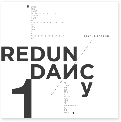
12-14 Reorganizing letters in the word redundancy translates into a typographic metaphor of the word. (Designer: Todd Timney)
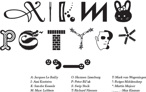
12-15 The typeface Dutch Doubles, with designs by thirty-seven Dutch type designers. Designers of the selected letters and symbols shown:
12-16 A pasteboard in an application measuring approximately 36 × 16 inches serves as a large digital sketch pad for the development and processing of form and ideas. (Designer: Guilherme Villar)
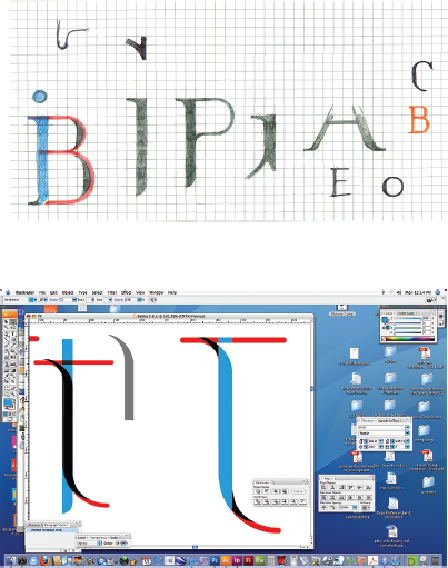
Typographic processes and the computer. With the computer as a major design tool, designers often employ hybrid problem-solving methods. Some begin with hand-drawn sketches and proceed to the computer to refine and produce the final designs. Others scan rough sketches and import them as templates into chosen applications. In a reciprocal process, Swiss designer Jean-Benoît Lévy often begins with hand sketches, redraws them on a computer, prints them out, applies changes and color by hand, and returns to the computer once again. Designer Guilherme Villar creates digital pasteboards, often containing hundreds of elements that are combined and manipulated in search of problem solutions (Fig. 12-16). It is not unusual for designers to begin the problem-solving process by going directly to the computer and developing ideas by means of digital sketches and permutations. All approaches are valid as long as the process delivers an effective and creative solution. Each designer is faced with embracing a unique relationship with the computer and all other methods, tools, and new techniques that emerge.
When using a computer as a design tool, file management becomes an essential part of the design process and a design problem in and of itself. Diligently saving each permutation as its own file for possible future reference or using a revision control system such as Git are strategies for cataloging every step of the process. Another major challenge facing designers is how to adequately archive digital files for future reference and, as appropriate, for posterity.
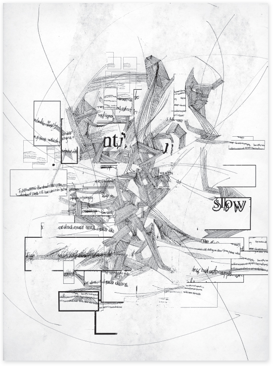
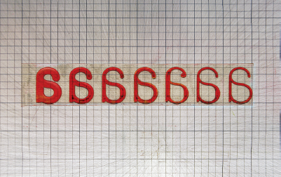
Morphologies. A morphology is a menu of visual possibilities. It consists of a list of syntactic and/or semantic variables that can be systematically or randomly explored in a search for typographic solutions (Fig. 12-17). Morphologies can be tailored in size and scope to accommodate a wide range of problems and applications. Just as the twenty-six letters of the alphabet are combined to form an infinite number of words, so too can morphological factors be employed to achieve a vast number of typographic effects. When used freely and creatively, morphologies liberate rather than constrain the creative mind. Several precedents exist for the development and use of morphologies in typographic design practice, including the pioneering work of Karl Gerstner, who developed logical morphologies based on the formal language of type. Gerstner believes that working with “morphological boxes” enables randomness, serendipity, and a kind of invention. He wrote, “Working by the morphological method is value-free and unprejudiced—and at least makes it easier to find pioneer solutions where they are possible.”
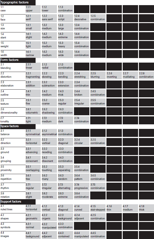
12-17 This morphology features a collection of typographic factors that can be freely appropriated in the course of solving typographic problems. The challenge and joy of using a morphology is to combine the components of the various categories in a search for visual alternatives.
The boxes filled with black represent other possibilities that may be added as needed.
TYPOGRAPHIC DESIGN PROCESS: CASE STUDY
Exploring typographic permutations
This project commenced in the postgraduate program in graphic design at the Basel School of Design in Switzerland. The encouragement and criticism of Wolfgang Weingart are gratefully acknowledged.
The range of potential solutions to a typographic problem is seemingly infinite. Variations, permutations, and transformations can be developed, exploring changes in both fundamental aspects and subtle details. Processing typographic form in search of solutions involves a process of insertion, substitution, and omission. After freely exploring ideas and selecting those for further development, the designer explores many permutations by inserting elements into the typographic space. The space may be organized by a predetermined grid structure, or the visual dynamics of the elements may define their own structures. This initial process enables the designer to consider the placement of parts, and most important, the relationship of the parts to the whole. Limiting initial elements to the same size and weight provides a solid base for the expansion of syntactic possibilities.
The substitution process replaces initial elements with alternative elements in an effort to test and improve the hierarchy and legibility of the text, as well as to heighten visual resonance. This is achieved by assigning different sizes, weights, spacings, positions, and other syntactic variations.
The omission phase eliminates superfluous or meaningless elements, reduces elements to their essential form, and simplifies the typographic field as a whole. The process then repeats itself until all possibilities are exhausted and a viable solution to the problem is revealed.
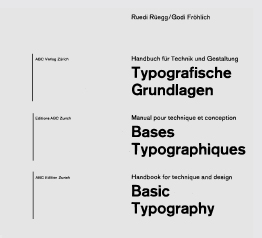
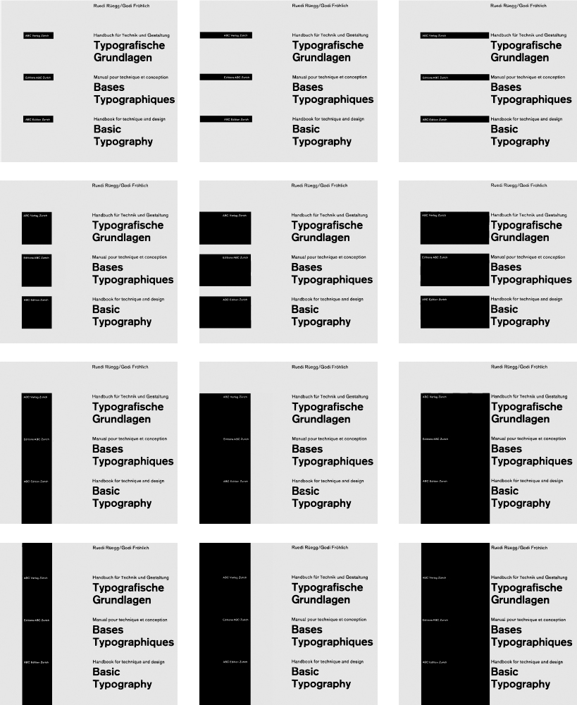
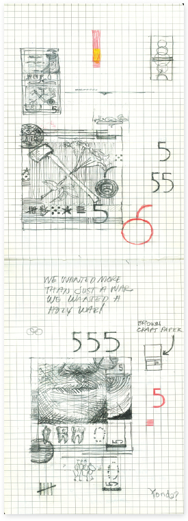
To create a title page, designer Thomas Detrie developed a sequence of possible solutions. Detrie's approach to the design process is based on his beliefs that “solutions come from within the problem” and “ideas come from working with the material and are not supplied or preconceived.”
Detrie's personal problem-solving method is a three-stage design process: preliminary exploration, message investigation, and visualization of solutions. In his preliminary exploration, Detrie considered the nature and content of the problem and made sketches to explore possible directions. Typographic information (title, subtitle, authors, and publisher) was assigned priority.
Detrie raised the question, “For the book Basic Typography, what is basic to typography that can be signified in a visual solution?” His answer established parameters appropriate to the given problem: a right-angled system, black on white, printed and unprinted areas, and a clear message. These considerations became the criteria for the investigation.
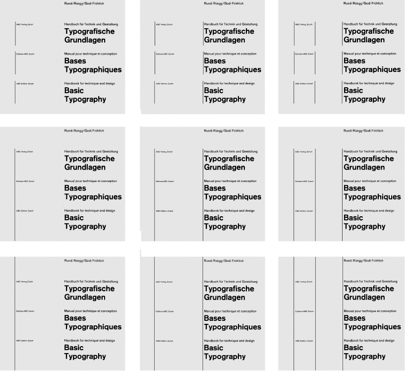
To investigate the range of typographic possibilities for the clear presentation of the manuscript, actual type was set and used in the initial visualizations for accuracy. A sans serif face was chosen, and the message was printed in three sizes and two weights for use as raw material in these typographic studies. While maintaining the message priorities determined in the first stage, a variety of visual solutions were executed.
Decisions were made through subtle comparisons of type sizes and weights to select those that provided the best visual balance and message conveyance. Detrie did not place the type upon a predetermined grid; rather, he allowed the organizational structure to evolve from the process of working with the type proofs. Selecting the basic typographic arrangement was an intermediate step in the design process (Fig. 12-18).
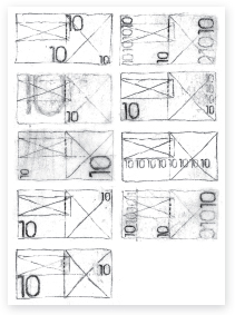
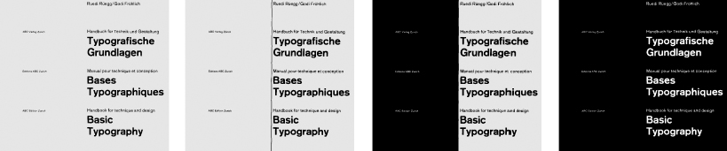
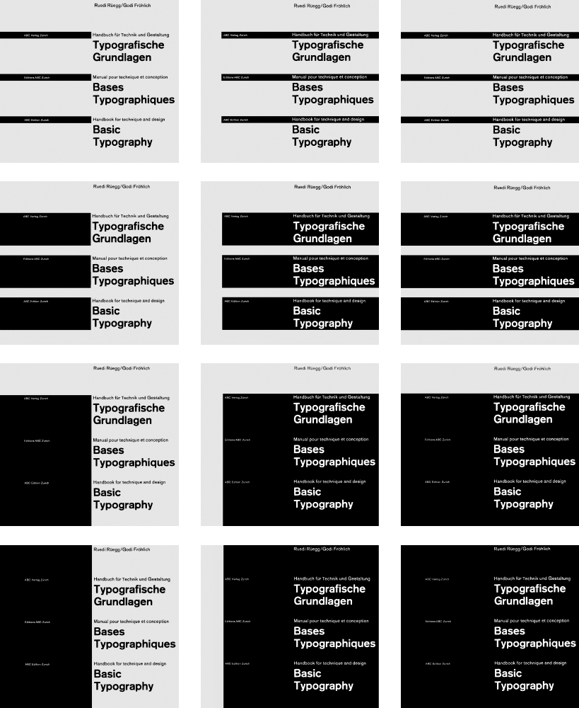
Next, Detrie developed a series of variations of this arrangement by investigating the application of horizontal and vertical lines, positive and negative shapes with positive type, and positive and negative shapes with positive and reversed type. Figure 12-19 demonstrates nine permutations with the application of vertical lines to the basic typographic schema. Permutations range from type alone to the addition of linear and rectilinear elements to a solid black page with reversed type (Fig. 12-20). A graded arrangement of twenty-four of the many solutions is shown in Figure 12-21. Observe the horizontal and vertical sequencing.
Unlimited solutions are possible in typographic design, and selection becomes an integral part of the design process. Not every possible solution is appropriate; the designer must continually evaluate each one against the problem criteria.
TYPOGRAPHIC DESIGN PROCESS: CASE STUDY
Exploring typographic transformation
Ernest Bernhardi engaged in a series of free typographic experiments with the intent of broadening his understanding of typographic syntax and exploring new forms of typographic expression. For this project, he thought of typography not as an end or a result but rather as part of a continuous, transformative process shared by other forms of expression: automatic writing/drawing, collage, and photography.
To carve out a focused span of time for intense investigation, Bernhardi isolated himself in his work space for a period of several months. He states, “I purposely shut myself off from the outside in an effort to enter fractions of bliss, and to lead my thoughts effortlessly into a state of peace and humility. The process, the activity of graphic design, became my sanctuary.”
Seldom sitting, Bernhardi worked on his feet. He explains, “standing forces me out of the comfortable chair—the chair where slouching and chin-resting-on-the-hand occurs. These seemingly irrelevant and harmless behaviors mark the beginning of disengagement in the design process.” Over time, his dance-like movements formed patterns of behavior resembling a performance.
Bernhardi's minimal studio, located in a small attic space, was primarily analog in scope. It was equipped with paper, a copy machine, traditional tools and supplies, and two studio lights. He also used digital tools: a computer, digital camera, printer, and scanner. He utilized these conventional tools and materials as a brazen nonconformist.
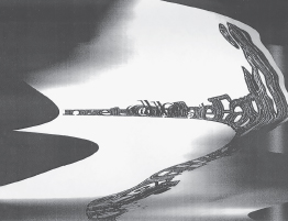
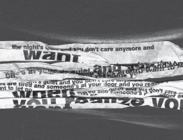
He began, without predetermined expectations or intentions, a process of automatic writing and sketching. Responding to visual and verbal stimuli, he sought to master the art of response rather than the art of planning, for response suggests process, and planning suggests product. This exercise encouraged mental and physical agility, and response through action and improvisation (Figs. 12-22 to 12-25). These highly focused yet unconscious notations then served as typographic material for new explorations in typographic form and structure (Fig. 12-26).
12-22 A kinetic notation reveals the process of thought transformed into visible language.
12-23 to 12-25 Having roots in Surrealist automatism, “visual sentences” emerge through automatic writing.
12-26 Automatic writing and sketching combined with spontaneous typographic fragments unveils an intricate and expressive typographic environment.
Bernhardi responded to various content using a wide variety of materials and processes. Hand-drawn and computer-generated elements were liberally combined in search of uncommon visual effects.
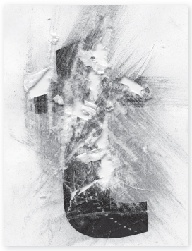
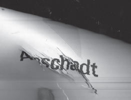
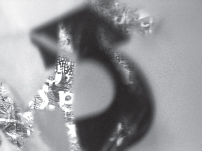
Operations were quickly executed and included cutting, slicing, tearing, crumpling, scratching, scribbling, and taping (Figs. 12-27 to 12-29). He repeated particular actions until evocative and enigmatic forms emerged, and he remained open to abruptly breaking away in search of new typographic effects (Fig. 12-30). Working with physical material drove the process.
Compositions developed by adding and subtracting elements. Discarded parts, such as excess paper trimmed from previous exercises, were often used in subsequent studies. Adding type provoked subtraction and an urge to further tear at the surface. Conversely, tearing suggested the adding of new layers. Eventually, an abstract, formal language emerged.
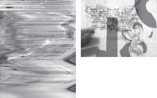
Previous experiments were combined and manipulated into new forms using a combination of tools and techniques. For example, using the copy machine unconventionally (Figs. 12-31 to 12-34), manipulating paper to suggest topographic space (Fig. 12-35), and photographing through “windows” to expose hidden layers (Fig. 12-36) lent unusual visual effects.
12-27 to 12-29 Armed with an attitude described by the late designer Paul Rand as the “play instinct,” Bernhardi, rather unconsciously and spontaneously, transformed typographic elements in search of possible new forms and meaning.
12-30 In an extension of automatic writing, Bernhardi scratched sentences onto a typographic grid.
12-31 to 12-34 Typographic elements are further processed into compelling images through the serendipitous effects of a copy machine.
12-35 Hand-molded strands of typographic text suggest three-dimensional topographical maps.
12-36 A digital camera is used to capture a typographic layer discovered through a “window.”
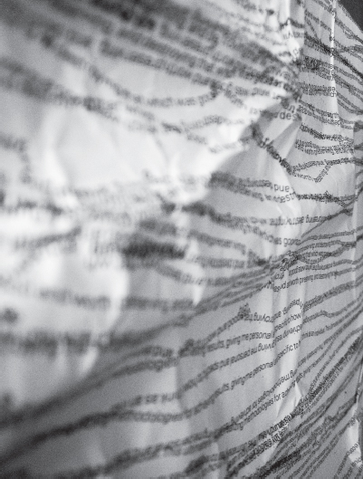
Visual transformations occurred instinctively and seamlessly. Various kinds of tape, including clear packaging tape, contributed to amorphous layers characterized by light, reflection, and fragmentation (Figs. 12-37 to 12-39). These mystifying surfaces force the viewer's eye into and out of focus, providing mystery and intrigue.
Bernhardi's typographic approach is one of adaptability and expansion. The attitude is similar to that of the composer John Cage, who viewed the random sounds of the surrounding environment—car horns, voices, falling objects, and footsteps—as a sonic system of signs comprising an abstract language. From within a seeming clutter, Bernhardi identified unexpected spatial relationships, the emergence of unusual forms and textures, and the potential for new meaning and applications.
The investigation culminated as a series of large-scale, tiled posters constructed from Bernhardi's amassed collection of typographic experiments (Figs. 12-40 to 12-43). These conclusive permutations visually and verbally recorded and expressed his growth and transformation as a typographic designer.
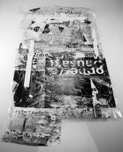
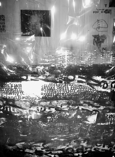
12-37 and 12-38 Layer upon layer of typographic forms and textures were embedded in clear tape. Details of this evolving tapestry provided new vignettes that were photographed and integrated as material in further explorations.
12-39 Bernhardi explored reflected light, shadow, and impromptu photography to provide typographic form with sensory qualities.
12-40 to 12-43 These posters represent a final stage in Bernhardi's investigations, but they also beg further transformation in a perpetual design process.
TYPOGRAPHIC DESIGN PROCESS: CASE STUDY
Ludd: a typographic expedition
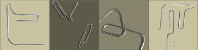
12-44 Bent paper clips informed the original iteration of the Ludd typeface.
Ned Drew's self-initiated project began as a simple response to his dissatisfaction with the current design of U.S. currency. It grew, however, into an elaborate and multifaceted investigation incorporating various typographic and image studies as well as letterpress printing. Ultimately this process led to the creation of the typeface Ludd—an allusion to Ned Ludd, the symbolic leader of the Luddites, an early-nineteenth-century movement that protested the social and economic changes spurred by the new technology of the Industrial Revolution. Far from decrying technology in design, however, Drew's eponym invokes an attempt to balance the tension between the digital and letterpress technology that influenced the typeface's creation.
Inspiration
Everyday life often provides subtle but pivotal motivation for creation. A simple object or observation may facilitate a long journey of discovery and creation. For this project, a paper clip, with its curves, efficient proportions, and minimal form, was a catalyst in the creation of a system of modular numerals for currency that works together with different weights and proportions. Bending a paper clip created unique shapes and letterforms (Fig. 12-44). Using these shapes/letterforms and a grid, a progressive sequence was developed (Fig. 12-45). The proportions were then refined by maneuvering the basic units found in the simple structure.
Objects and images Drew had collected and his memory of the design of other significant items formally expanded the previous structural investigations. These disparate, eclectic objects and observations manifested themselves in the overall look and feel of this system (Fig. 12-46). The roundness and soft forms of the early 1960s Volkswagen Bug, the graceful organic curves of human anatomy, and the beautifully refined proportions and elegant simplicity of the Japanese national flag were all inspirations. Additionally, Univers, with its extended family and system of organization, the construction and geometric strokes and fragments of Futura, and the curvilinear elegance found in the ball terminals of Bodoni's namesake typeface all informed the design.
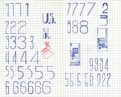
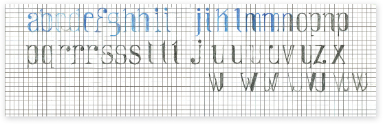
12-45 A grid brought unity to early letterforms.
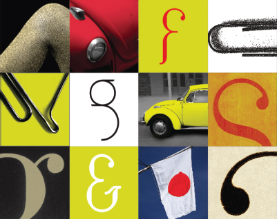
12-46 Samples of objects that further inspired the Ludd typeface.
To transform these disparate inspirations and studies into a typeface, Drew had to remove them from their original context. Establishing a modular grid imposed a structural system that organized these eclectic references and established Ludd's visual vocabulary. Because of the grid, Ludd has a substantial geometric look and feel that is expressed through unique interpretations of typographic forms.
Remaining open to new discoveries and eclectic combinations was essential to the process. Several letterforms are unconventional, displaying a quirky incompleteness and progressive typographic appearance (Fig. 12-47). The Ludd typeface, as an element of the currency project, bears the identity of the process and influences contributing to its creation. But by also leveraging the history and conventions of typographic design, this project offers the unique challenge of working both with and against established models, patterns, and conformities (Fig. 12-48).
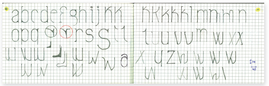
12-47 Exploration of letterform quirks.
12-48 The Ludd typeface is informed by a deep understanding of typeface design conventions through working both with and against them.
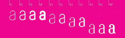
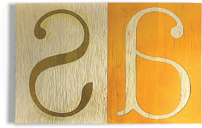
12-49 The letter a shown in all weights and orientations of the type family.
12-50 and 12-51 Drawing allowed both more nimble experimentation and more deliberate development.
Expanding the system
Drew's initial Ludd typeface experiments with the design of numerals grew into planning and creating an entire type family. Starting with the mono weighted Ludd 1.1 and working to the heavier Ludd 1.7 (with their corresponding obliques), Drew followed a natural progression from an extremely light style to a heavy style. As he proceeded to explore, he forged an unusual path, adding weight asymmetrically to the existing frames and creating unusual and seemingly incomplete versions (Ludd 2.3 through 2.6). These versions gave way to developing a semi–san serif version (Ludd 3.3 through 3.6) with contrasting weights (thicks and thins) similar to a serif face but with tapered ascenders and descenders, stems, finials, and strokes, and the inclusion of ball terminals. Finally, he designed a serif version with three different weights (Ludd 4.3 through 4.8) (Fig. 12-49).
Learning through making
Throughout Drew's investigation, one of his major concerns was to reconnect with making, drawing, and visualizing ideas. The sketching phase was critical because this manual design process allowed him thoughtful review and evaluation during each step of the evolution. A slower pace created a sphere in which missteps, chance combinations, and unsatisfactory strategies could inform new directions of exploration. Drawing was a way to fuse the physical making with the thinking, to build trust in the creative process, and to push beyond the sense of isolation and uncertainty that he sometimes felt as the project unfolded (Figs. 12-50 and 12-51).
As a broad approach, this ensured both quality and control of each step of the process while also reconnecting with manual craft. As mechanical and technical refinements were being made to the typeface (Fig. 12-52), Drew further engaged hands-on creation by making test character samples of the Ludd typeface from polymer (Fig. 12-53) and laser-cut plates (Fig. 12-54), then using letterpress printing to apply the type design and critique it (Fig. 12-55).
In the manner of a letterpress operator's “make-ready” process where alignments, inks, and other mechanical aspects of the printing process are tweaked, Drew used letterpress printing as a test and application of the visual characteristics of Ludd as it evolved toward its final versions. Thinking on press, adjusting the alignments, calibrating the pressure, and adjusting the mixing and color of the inks all fostered pensive exploration (Fig. 12-56).
12-52 Refinements were made to the Ludd typeface both in drawing and on computer.
12-54 Laser-cut letterform plates.
12-55 Letterpress printing of the plates.
12-56 Letterpress “make-ready” prints that further informed the design of the Ludd typeface.
By leaving behind the immediate feedback of working with a computer, Drew learned through making, via both hand drawing and letterpress printing, slowing down the design process. Experimentation at the press mimicked the physical and intellectual engagement of drawing. At the press, a multisensory experience was engaged through the smell of the inks, the tactile qualities of the impressions on paper, and the rumbling physical presence of the press itself. Formal discoveries made at the press informed the computerized version of the typeface. Nearing final versions, Drew carved some of his plates by hand in poplar (Fig. 12-57), while his letterpress explorations grew to combinations built from six to eight different colors (Fig. 12-58).
12-57 Hand-carved letterform plates.
12-58 Letterpress exploration.
Application (returning full circle)
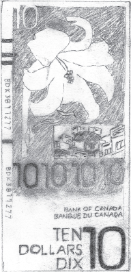
Once Ludd reached maturity, Drew applied it in the context that inspired it—a currency project. Quirky and playful like Ludd itself, the bills combine layered imagery that reflects shared cultural associations and historical references. They have balanced yet dynamic compositions, bold yet refined palettes, and a sense of decorum tempered by a bit of irreverence (Fig. 12-59).
In retrospect, Drew thinks the heart of his investigation was an overarching concern for a more holistic design process—a process outside the computer screen or laser printer, in which the needs of the project dictate its direction, and in which interdependently designed elements shape one another. The currency project led to a type family, which encouraged letterpress printing, which came back full circle to the implementation of the currency.
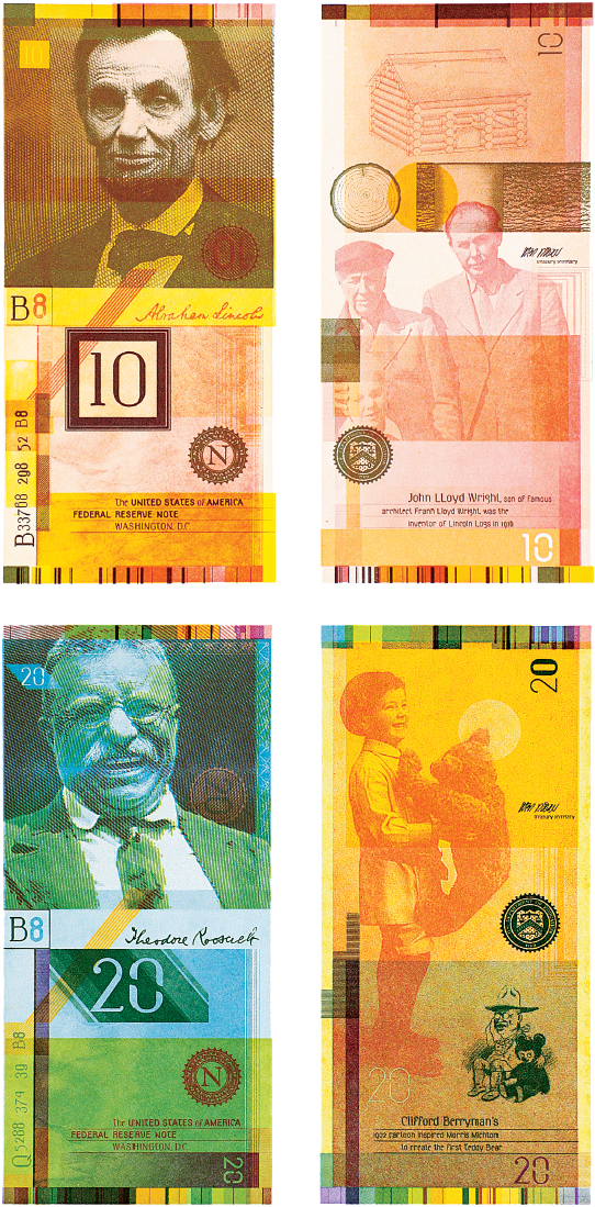
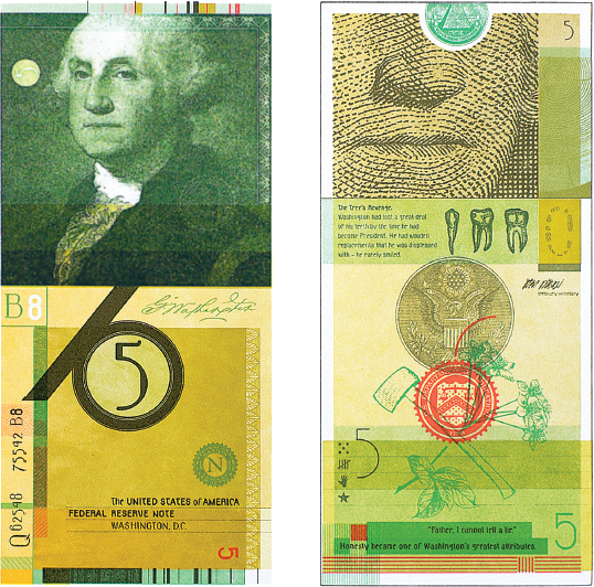
12-59 Samples of the final currency design utilizing the Ludd typeface.
TYPOGRAPHIC DESIGN PROCESS: CASE STUDY
Composites
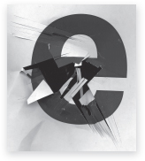
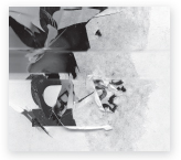
Designer David W. Steadman devised an experiment that yielded visual compositions via a process that deliberately creates unpredictable results. Similar to a collage, these compositions are multiple layers of image and typographic elements merged to form a composite whose purpose is to explore the convergence and alignment of graphic elements manipulated to adhere to the same geometric guidelines. His composites allowed him to observe a combination of visual references that symbiotically created a hybrid, or multifaceted, message.
Steadman randomly chose topics that are rich in visual resources. Common themes in his work include diagrammatic patterns, language transmissions, iconography, and geographic references.
Contraints
Creation of the composites mirrored a traditional design process, but with the addition of rules and constraints that forced Steadman to work with unpredictable outcomes. Realized entirely on computer, the final digital composites are informed by a wide range of subjects. Through the design process, he explored the intersection of geometry, subject matter, and time.
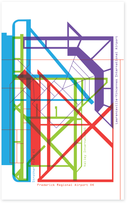
Geometry. A geometric grid of fixed size based on the golden rectangle, which has side-length proportions (approximately 1:1.618) derived from the Fibonacci sequence, provide the basis for Steadman's composites (Fig. 12-60).
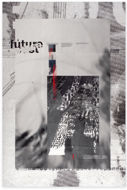
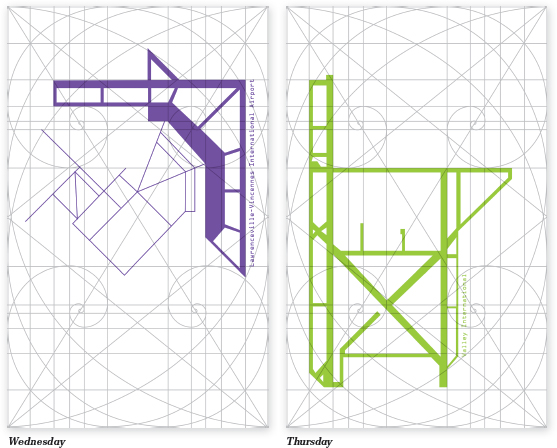
Subject matter. Steadman chose a specific subject matter for each composite. Examples of concepts he explored are social media, astronomy, sonar, airports, Navaho Yei, and Beauchene disarticulation, an “exploded” visualization used by anatomist Claude Beauchene to illustrate the structure of the human skull.
Time. Each composite was created during a five-day span.
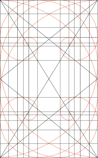
12-60 Grid used for each composite.
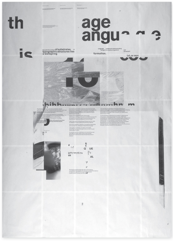
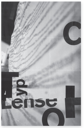
To create each composite, Steadman went through the exact same process. Using an illustration software program, he created five blank canvases that shared the same dimensions and grid. Each canvas was assigned a day of the week, Monday through Friday. He then selected a subject matter that would be the focus of study for the duration of the five-canvas project. Visual and textual research related to the subject became the building blocks of each composition (Fig. 12-61).
Starting on a Monday, Steadman selected a visual or textual reference to the subject and applied it to the canvas. Using the grid guidelines, he manipulated the form or set the type to adhere to the guidelines. On Tuesday, he opened a blank canvas and applied a new visual or textual reference. By Friday, he had four separate canvases containing graphic elements (Figs. 12-62 and 12-63).
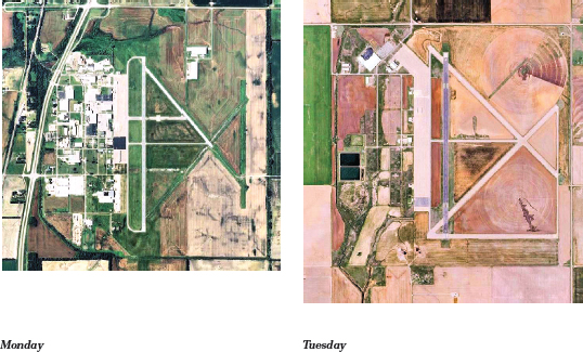
12-61 Visual and textual items related to the subject “airports” gathered by Steadman as research.
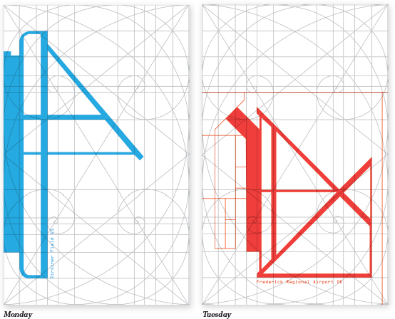
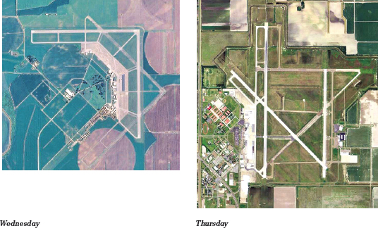
12-62 Monday through Thursday compositions for the subject “airports.”
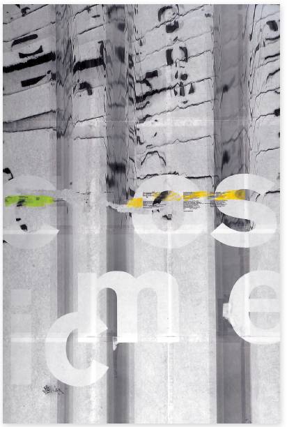
The four separate canvases of graphic elements were layered to make a final canvas. In a single canvas, he tweaked the composition by making minor adjustments to the graphic elements, applying transparency effects to certain layers, and changing the stacking order of all layers. The resulting canvas contains all the elements from previous days (Figs. 12-64 to 12-67).
The final composites vary in visual composition and topic while sharing the same geometric properties. As a result, the composites together have continuity in form, while separately each has unique properties specific to the topic.
Composites can be used as a narrative form or as a way to communicate multiple aspects of a single subject. References to the topic can range from literal to figurative, forming a unique hybrid message.
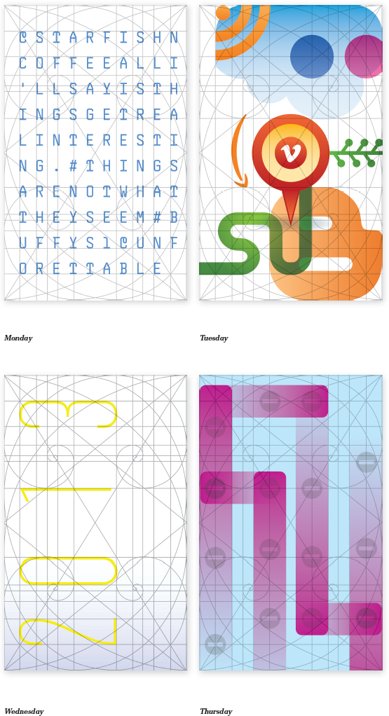
12-63 Monday through Thursday compositions for the subject “social media.”
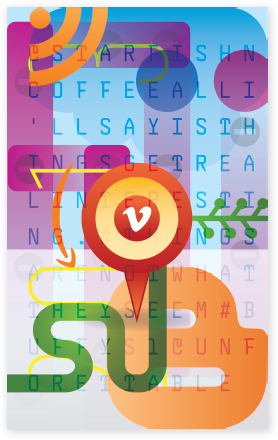
12-64 Final composite for the subject “social media.”
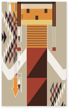
12-65 Final composite for the subject “Navaho Yei.”