
Chapter 3. Form Design Basics: Working with InfoPath Layout, Controls, and Views
Chapter at a Glance
Most Microsoft InfoPath forms you create will have several basic design concepts in common. The form design process typically begins with the following two tasks:
Building the visual aspects of the form by using tables, themes, and page designs.
Adding the necessary controls to provide the functionality and data fields that your form requires.
Depending on the complexity of the form, you might need to do much more than this, but typically the creation of most InfoPath forms starts with layout and controls. In this chapter, you will learn how to build a form from scratch with visual layouts, themes, controls, and views.
In Chapter 1, you learned that InfoPath uses XML for storing data and managing the schema of the form for you. Most of the tools you will use to build the form have a direct correlation to the underlying XML. However, InfoPath removes the need for you to interact with all of the XML “plumbing” behind the scenes. For example, when you add a simple text control, InfoPath automatically generates an XML leaf node (the XML equivalent of an InfoPath field) in the underlying XML schema. Once again, it is not necessary to be an XML guru to use InfoPath, but it is important to understand that when you create an InfoPath form, InfoPath is generating a “well-formed” XML document for you.
Note
Practice Files Before you can complete the exercises in this chapter, you need to copy the book’s practice files to your computer. The practice files you’ll use to complete the exercises in this chapter are in the Chapter 3 practice file folder. A complete list of practice files is provided in Downloading the Practice Files and eBook on page xxvi.
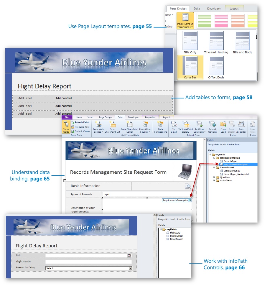
Form Layout
Depending on which template you choose when you first generate a new form in InfoPath Designer, you will find yourself with a relatively clean slate on which to work. Essentially, the Blank Form template has nothing on it other than a simple design surface. The SharePoint Form Library template shown in the following illustration has slightly more structure, including predefined tables and locations for controls.
Notice in the preceding illustration that the InfoPath Designer displays gridlines along the borders of the tables. These gridlines are to assist you in designing and formatting a new template. They are not displayed when the form is actually being filled out by a user. They are purely a “design-time” feature. InfoPath has several design-time visuals to assist you when you are in design mode.
It is important that we clarify a couple terms that will be used in this chapter—when you are in Designer building a form, you are in design time, working with the design surface. When you preview the form or actually fill out a form instance, you are in run time. Run time is the experience your users will have when they fill out your forms.
Tip
When you are in Designer, you can press the F5 key to quickly preview a form in run time mode. This functionality is also available on the Home tab on the ribbon by clicking the Preview button.
The design time visual layout tools that you will use most often can be found on the ribbon. The following tabs on the ribbon are relevant to form layout:
The Home tab This is where you can find the basic text editing tools that you would find in a word processor. The functionality available on the Home tab is for controlling fonts size, color, and so forth. These tools are fairly standard and work just like the other Microsoft Office products.
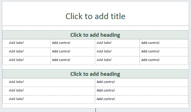
The Insert tab This is where you can find the pre-built table styles. These tables can give your forms a consistent and professional layout.
The Page Design tab The Page Design tab contains InfoPath’s predefined page layouts and color themes to quickly give your form a professional look and feel. The color themes are the same ones that are in Microsoft SharePoint 2010, so it’s easy to make your forms blend in nicely on a SharePoint site. Also, on the Page Design tab you can work with Views and add headers and footers if necessary.
The Layout tab Also known as the Table Tools tab, the tools on this tab are used for modifying properties of the tables in your forms. Tables are the primary structural tool for organizing controls, labels, and images in your forms. This is also the location where you can use the Table Drawing tool if you don’t want to use any of the provided table styles.
There are two schools of thought regarding how to build a new form:
Use one of the built-in page layouts, adding some tables and a color theme, and then adding data controls.
Start by adding all the data fields you need (in the Fields pane), and then worry about design and layout later.
The second, more idealistic approach can be a good choice if you already know what data fields, data types, and controls you need to support the functionality in your form. Both approaches have their benefits, but the reality is that most of the time you might not have all the information you need to accurately create all your data structures. You will need to modify the form as it comes to life, probably altering it a number of times before it’s actually finished.
Therefore, the first approach—starting with a built-in layout and then adding controls—is the one we’ll use for the exercises in this chapter because it more closely matches what InfoPath designers often do in the real world. The good news is that InfoPath’s design tools and data controls are flexible enough that you can easily add or change your design later as requirements dictate.
Adding a Layout and Table
Note
SET UP Ensure that you have downloaded to your desktop the Blue Yonder header.bmp image file from the Practice Files to your desktop. You will use this image on your form.
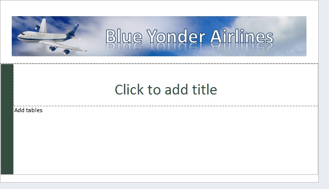
In the following exercise, you will create a new blank form and add all the necessary design components such as tables, an image, and a theme. This will be a Flight Delay form that employees of the fictitious Blue Yonder Airlines company use to file reports on reasons why a plane was late in arriving at its destination.
On your desktop, click the Start button, and then open InfoPath Designer. Double-click Blank Form.
Place your cursor in the top table row where it says Click to add title. The placeholder text should go away.
On the ribbon, click the Insert tab, and then select Picture. Browse to the location on your desktop where you saved the Blue Yonder header image file.
Double-click the image to insert into the table.
Click the image to ensure that it’s selected, and then on the Home tab, click the Center Text button to center the image in the table. Your form should now look like the screenshot that follows.
On the ribbon, click the Page Design tab. Ensure that your cursor is active in the bottom table row, and then select the Color Bar option from the Page Layout Templates drop-down list.
Your form should now have a color bar and an additional row.
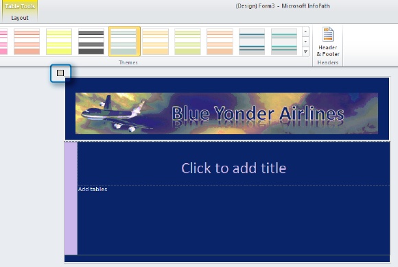
To give the form a professional color scheme, apply a theme. Select the entire design surface area by clicking the selection button at the upper-left corner of the design surface.
With the entire design surface selected, on the ribbon, in the Themes area, click the drop-down arrow. Select the Industrial Vantage theme to apply this theme.
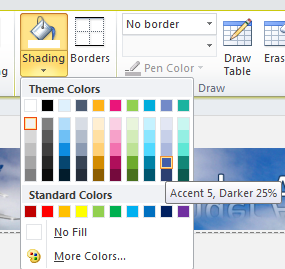
With the theme applied, let’s add shading to the top row of the table (the one with the image inside it).
Position your cursor in the top row of the table by clicking anywhere within it. On the ribbon, click the Layout tab, and then click the drop-down arrow at the bottom of the Shading button to show all the colors from the theme that you can apply as shading.
Select the blue color Accent 5, Darker 25%.
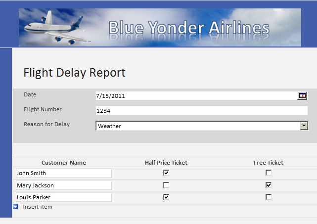
Your form should now appear as below. You’re off to a great start on the visual aspect of the Flight Delay Form!
Position your cursor in the row with the Click to add title text, and then change the title to Flight Delay Report.
Place your cursor in the bottom row of the form by clicking in the area labeled Add tables. On the Insert tab, click the More button to open the drop-down list for the tables so that you can see all the different options. From the Two Column section of tables, choose the Two Column Offset with Emphasis 4 No Heading table.
Click the Layout tab, click the Cell Padding button, and then set the top to 16 px so that there isn’t so much excessive empty space above the image.
The cell padding properties are useful for controlling and managing the spaces inside your table cells.
The form should appear similar to that shown in the following illustration. Your form is now ready to have controls added, which you will do in the next exercise, after you learn about InfoPath controls.


InfoPath Controls
Apart from creating the visual layout, the most common task that you will perform when designing a new form is adding controls. The controls in InfoPath cover a wide range of functionality that you will need in your form. In this section, we will discuss the most commonly used InfoPath controls and provide a brief overview of what each one does.
Tip
For the purposes of this book, assume that your forms need to be browser-compatible so that they can work with SharePoint Forms Services. Therefore, we will focus on the controls that are enabled when you create browser-compatible forms. Additional controls are available if your forms will be used only with InfoPath Filler. You can view those additional controls by changing the compatibility of your form from browser to InfoPath Filler. This is performed by going into Form Options in the Info section of the Backstage view. (You can access the Backstage view by clicking the File tab on the ribbon.)
The controls are separated into three different categories when you view them in the Controls pane: Input, Objects, and Containers.
The functionality of most input controls is fairly self-evident; they capture different types of data from users. (See the table below for a description of the input controls.)
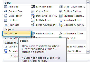
Object controls are for adding objects that your users will interact with in the form, such as attaching a file or clicking a button.
Container controls are for grouping controls or adding repeating controls in the forms—for example, a repeating table such as the one you used in Chapter 1 for the Products form.

Object Controls (described in the following table) are different from Input controls in a couple of important ways. First, Object controls don’t necessarily add a field to the underlying XML; some of them are purely for design surface purposes. For example, the Button control creates no fields in the schema but is still one of the most useful InfoPath controls. The other difference with Object controls is that they can be added to the form at design time, and some of them, such as the Hyperlink and Picture controls, can also be added by the user at run time.

Object Control Name | Description | Data Type |
Button | Use this control for tasks, such as submitting the form, querying a data source, and much more. The button can have rules associated with it as well, making it a very flexible tool. | n/a |
Picture Button | Similar to the Button control in functionality but also allows for the use of an image rather than the standard button look and feel. Another key capability is that the Picture Button control can display a different image when the pointer hovers over it, thus creating a very dynamic experience. | n/a |
Calculated Value | Useful for when you want to display read-only text, display the value of another control on the form, or display values based on formulas. This control does not actually store data; it references other data and displays a value. | Variable |
File Attachment | Used for attaching a file to the form. If you are creating a SharePoint List form, the file attachment will be stored as part of the SharePoint list rather than in the form itself. | Picture or File Attachment |
Picture | Used for attaching images (or a link to the image). | Picture or File Attachment |
Hyperlink | Allows users to insert a hyperlink in a form. | Text (String) |
As defined in the following table, Container Controls are designed to group other controls together for the purposes of organizing (for example, the Section control) or providing repeating and optional data structures (for example, the Repeating Table control). The structure of container controls is different than the other controls in that container controls do not directly contain data themselves. When you add a container control, it appears in the Fields pane as a folder with fields (also called leaf nodes) underneath it. Although the containers do not directly contain data, they are extremely useful for organizing data because they represent a group node in the underlying XML schema. This is a key difference between container controls and tables. While tables are excellent for visual layout, they do not connect to the data source and therefore can’t have properties and rules applied to them in the same way container controls can. Therefore, the best practice is to use tables and controls inside a Section control (or other type of container) when you need to manage controls together as a group.
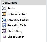
Container Control Name | Description |
Section | Container for other controls. A Section control can include any of the other controls (including other Section controls). When you add a Section control, an XML group is added in the schema. This means that you can apply validation and formatting rules to the Section, and thus to all the controls contained within it (more on rules in Chapter 5). |
Same as a Section control except that users are given the choice at run time as to whether or not they want to add that particular section to the form. | |
Repeating Section | Same as Section control except that users are given the ability to add additional instances of the Section, either above or below it. |
Repeating Table | Used for adding tables that display information in a tabular structure and allow the user to add or delete rows. As with Section containers, repeating tables can contain other controls. |
A unique control that contains two or more Choice Sections. The form users can replace one Choice Section with another at run time. When filling out a form with a Choice Group, users can replace the default Choice Section with a different Choice Section. | |
Like a regular Section control, this is a control that contains other controls. But Choice Sections are used inside Choice Groups. Choice Sections are useful when you need to add more choices to an existing Choice Group. They can be used only inside a Choice Group or repeating Choice Group (Filler-only control). If you try to add a Choice Section outside of a Choice Group, InfoPath automatically adds the Choice Group for you. |
Control Properties Ribbon
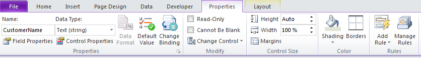
When working with controls, many properties can be set. However, the specific properties that you can set vary, based on the type of control. Fortunately, the ribbon has a Properties tab that becomes active when you select a control in a form. This is a convenient central location in which you can work with nearly all the options available to you for a particular control.
Following are the main control-related tasks that you can carry out on the control Properties tab:
You can change the name of a control. As a best practice, you should always rename your controls to something that is meaningful to you.
For certain controls, you can change the data type and data format on the fly.
You can set default values so that the form will have pre-populated values in fields where it makes sense.
You can use the Change Binding button to change the binding of the control to a different field in the schema.
You can set the field to be read-only if you don’t want users modifying data in that particular field, or conversely, you can set the field to require data input by selecting the Cannot Be Blank check box.
If you’ve added the control as the wrong type, you can change it (for example, changing Text Box to Rich Text Box).
All of the aesthetic properties of the control can be modified here, including height, shading, and borders.
And last but definitely not least, you can add and manage logic rules on your control (more on this in Chapter 5).
Understanding the Basics of Data Binding
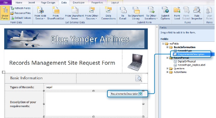
When you add a control to the form design surface, InfoPath automatically creates a field in the underlying InfoPath document that corresponds to the correct data type for your field. (For example, a Text Box is a string data type.) This process of tying the control to the field in the underlying XML is called data binding. You can easily tell which field a control is bound to simply by selecting the control on the design surface; InfoPath then automatically selects and highlights the bound field in the Fields pane. You can also create your own fields in the Fields pane if you need to, but to keep things simple, it’s generally best to let InfoPath generate the fields for you when possible. There are obvious exceptions, such as when you need a hidden field that will be used to store some data or variable but won’t actually be displayed on the form. The following screenshot shows the correlation between a control on the design surface and its corresponding entry in the Fields pane.
Tip
It is always a best practice to rename your fields to something useful that you can understand. By default, InfoPath uses field1, field2, and so on.
When you add a control on to the design surface, InfoPath automatically adds the corresponding field or group to the Main data source. As you saw in Chapter 1, it is possible to have multiple data sources for your form if you need to integrate data that is coming from other sources, such as databases, XML files, or web services.
Tip
Because fields are automatically generated in the data source when you add a control, a common point of confusion for beginning InfoPath users arises from the false assumption that the fields are also automatically deleted if the control is removed from the design surface. To remove the field from the data source, in the Fields pane, right-click the field, and then choose Delete.
Most controls will automatically create a field in the data source that they are bound to, but not all. For example, the Button control is purely a visual design tool, and by default, it’s not bound to anything. Basically, your controls will be bound to two types of structures: fields and groups. Fields are equivalent to XML leaf nodes, which means that they are used for holding and working with data (for example, text fields). Groups are equivalent to XML container nodes; they are for holding and organizing other fields. Section controls are probably the most common group objects. The following screenshot shows a section on the design surface that has multiple controls associated with it. Notice how it correlates to a folder (group) in the Fields pane.

Adding Controls to the Flight Delay Form
Note
SET UP Open InfoPath Designer and the Flight Delay form you created in the first exercise of this chapter. Alternatively, you can download the practice file named Flight Delay Post exercise 1.xsn. Remember, you can right-click the .xsn template file, and then choose Design.
In the following exercise, you will continue building the Flight Delay Form. Your job now is to add the controls that will provide the needed functionality. The data you need to capture includes the items listed in the following table.
Data Needed | Control You Will Use |
Data | Date Picker |
Flight number | Text Box |
Reason for flight delay | Drop-Down List Box |
Follow-up ticket awards | Repeating Table with 3 columns (Customer Name, Half-Price Ticket, Free Ticket) |
Pilots report | Choice Group (File Attachment or Hyperlink) |
Submit button | Button |
In the top row of the table on the form, position your cursor in the label field, and then type Date.
Tab into or click in the first row of the right column. On the ribbon, click the Date Picker control. Remove the label that InfoPath automatically inserted.
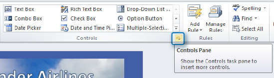
There are two ways by which you can add controls to a form. One is to position your cursor on the design surface so that it’s active in the location where you want the control added. Then, click the desired control on the ribbon or the Controls pane to add it at that location on the form. The second method is to drag a control from the Controls pane. To open the Controls pane, click the expansion arrow at the bottom of the Controls area on the ribbon, as shown here:
In the following screenshot, you can see the fully expanded Controls pane.
Tip
By default, InfoPath automatically creates a field in the Fields pane when you add the data control. (You can turn this off by clearing the check box at the very bottom of the Controls pane.) If you accidentally delete your control from the design surface, you can add it back to the form by dragging it from the Fields pane. Remember, deleting the visual occurrence of the control from the design surface does not remove it from the schema in the Fields pane. Likewise, if you accidentally add a control that you don’t want, you can right-click and delete the field from the Fields pane. If you do this, the control will still appear on the design surface but it will have a blue warning icon that indicates it is unbound, as shown in the following screenshot. Unbound controls are those that have lost their connection to fields in the underlying schema. You want to remove unbound controls because they will not function.
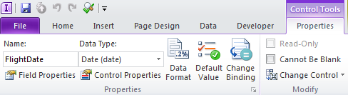
On the ribbon, click the Control Tools/Properties tab set, and then rename the Date Picker field that you just added to FlightDate.
This will alter the name of the field in the Fields pane so that later you can remember the purpose of this field. This is much better than Field1. (Remember, you need to select the control that you want to modify in order to activate the Control Tools tab on the ribbon.)
The next thing you need to do for the Date field is to add a default value. Default values are extremely helpful when you want a control to be pre-populated with a value for the user. The user can still optionally select or enter a different value, but in a case such as a date, it often makes sense to just populate the control with a default value so that the user doesn’t need to enter anything.
Verify that your date control is the active selection, and then on the Control Tools tab, click the Default Value button
Click the formula button on the default values field.
Click the Insert Function button, find the Date category, and then select today.
This sets the default value of the Date Picker control to be equal to the current day. This makes sense because users will most likely be entering flight delay information on the same day it happens.
Click OK three times to return to the design surface. Preview your form by pressing F5 to confirm the date field populates with the current date.
On the second row, add a label that says Flight Number, and then add a Text Box control. Remove the auto-generated label, and then rename the field to FlightNumber by using the Control Tools tab.
On the third row of the table, enter Reason for Delay in the label column, and then add a Drop-Down List Box control in the right column. Rename the field to DelayReason.
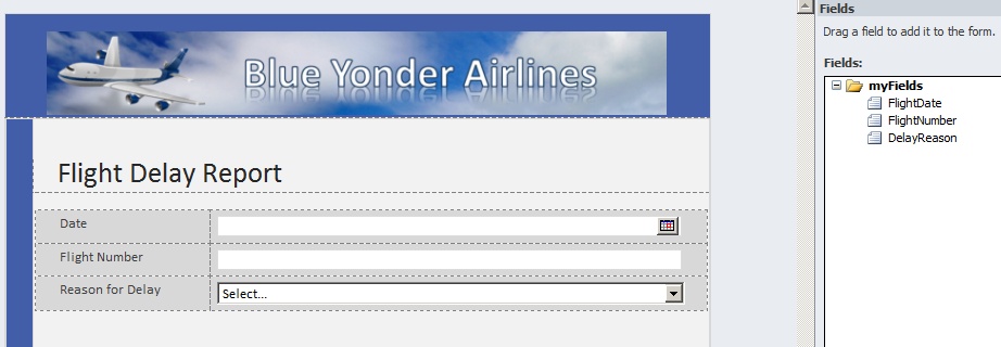
Your form should now look like the following screenshot.
Ensure that the Drop-Down List Box control is the active selection, and then on the ribbon click the Properties tab. Click the Edit Choices button. Click the Add button,enter National Aviation System into the Value field, and then click OK.
Add three more choices: Weather, Late-Arriving Aircraft, and Security. Click OK.
You can preview the form (F5) at this point to ensure that your drop-down list is working.
The next control you need is a Repeating Table, in which the form users can enter a list of customers that need to be awarded a free or half-priced flight as a result of the flight delay.
Position your cursor below the table on the design surface, press Enter a couple times to give yourself some space between tables, and then insert a Repeating Table control. Set it for 3 columns.
The top row of the new repeating table is for labels. In the left column, enter Customer Name; in the middle column, enter Half Price Ticket; and in the right column, enter Free Ticket.
Using either the Fields pane or the Properties tab, rename the three fields to CustomerName, HalfPriceTicket, and FreeTicket, respectively.
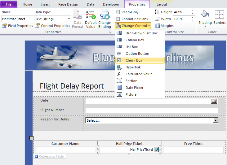
With the HalfPriceTicket Text Box control active on the design surface, use the ribbon to change the control from Text Box to a Check Box. Do the same thing to the FreeTicket control.
Select the Check Box controls. On the Home tab, in the Format Text area click the Center button to center the controls in the column. Preview the form, and verify that it looks like the following screenshot. Enter a name or two; use the Insert item arrow to add more rows to your repeating table.
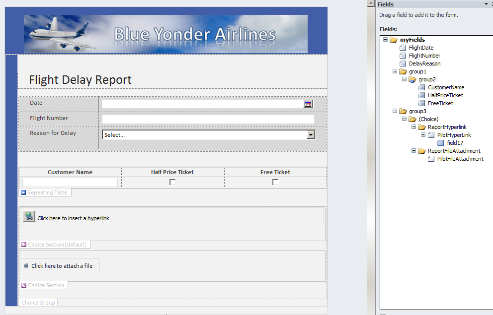
Add a Choice Group control in the Container controls by positioning your cursor beneath the repeating table and then pressing the Enter key twice (to allow a little space). On the ribbon or in the Controls pane, add a Choice Group control.
Rename the two fields that were added (they are actually Choice Sections) to ReportHyperlink and ReportFileAttachment.
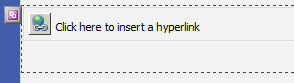
Inside the ReportHyperLink section, add a Hyperlink control, and then rename it toPilotHyperlink.
Inside the ReportFileAttachment sections, add a File Attachment control and rename it to PilotFileAttachment.
The reason why you are adding this Choice Group control is because the pilots are required to submit a report in the event of a flight delay. They can either post it on a SharePoint site or email the file. So use a Choice Group control to allow the form user to either directly add a file attachment or provide a hyperlink to the report on a SharePoint site. The form should now appear as shown in the following illustration (in Design mode).
If you preview the form now, you will see a button pop up when you hover over the Hyperlink control in the Choice Group control. You can click this button to switch between a Hyperlink control and a File Attachment control.


Adding a Submit Button with a Rule to the Flight Delay Form
Note
SET UP Open InfoPath Designer and the Flight Delay form you created in the last exercise of this chapter. Alternatively, you can download the practice file named Flight Delay Post exercise 2.xsn. Remember, you can right-click the .xsn template file, and then choose Design.
In the following exercise, you will add a Button control to the form along with a rule that submits the form to an email data connection.
Insert your cursor just below or to the right of the Choice Group control on the design surface, and then press Enter a couple times to make room to insert a button. Your cursor must be outside the Choice Group control so that you have open space (outside and below the Choice Group container).
On the ribbon, click the Home tab, and then in the Format Text section, use the center function to position the button in the center of the form.
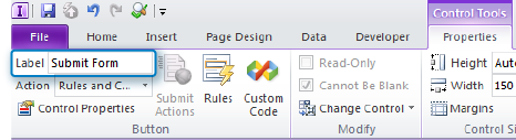
On the Control Tools tab, in the Label box, change the button’s name from Button to Submit Form.
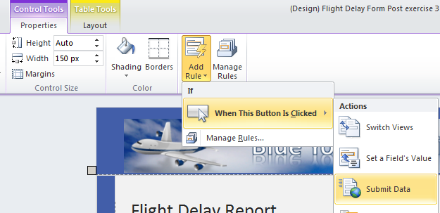
While still on the Control Tools tab, click the Add Rule button, and then click Submit Data to add a rule that sends the data when a user clicks the button
When the Rule details window opens, click Add.
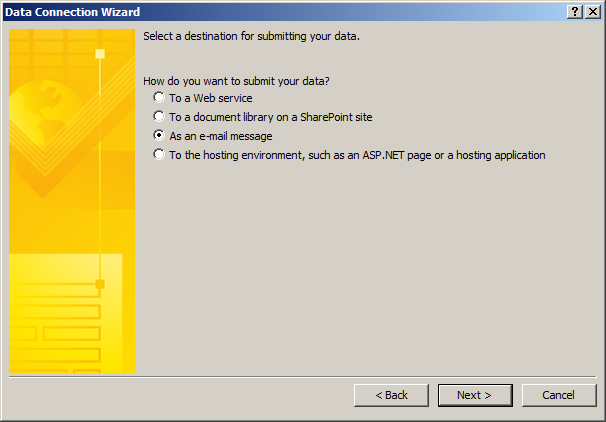
When using a rule to submit a form, it is necessary to provide a data connection to instruct InfoPath about how to handle the submission. When the Data Connection Wizard opens, it defaults to submit data. Click Next.
Select As an e-mail message.
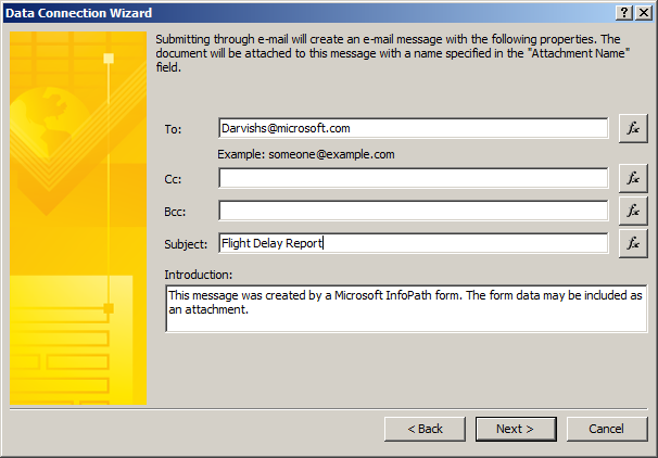
On the next wizard page, enter your own email address in the To: text box, enter Flight Delay Report in the Subject text box, and then click Next.
Leave the default setting to send as an attachment. Click Next again, and then click Finish. Click OK in the Rule Details window so that you’re back in the form.
The Rules pane automatically opens for you on the right side of the Designer.
Now you have an email data connection with a submit rule attached to your button so that when users fill out the form and click submit, the form will be emailed to you as an attachment. (You’ll find more information about rules in Chapter 5.)
Views
Your forms often will have too many controls to fit cleanly on a single page. One of the worst mistakes novice forms designers can make is putting everything on one page and forcing the user to scroll through an unnecessarily long and complex form—or even worse, creating multiple forms for users to fill out when having one consolidated form is far more efficient and manageable. InfoPath views can help alleviate these problems and solve a few other challenges, as well.
A view in InfoPath is simply another way to display data from the same data source, but in a different way. It is perhaps easiest to think of a view simply as another page in the same form. If you create a second view, additional or different fields might be displayed, or even a completely different visual layout, but underneath the covers, all the views in a form use the same data source(s) and schema. The beauty of this approach is that you can manage all the properties of your form—such as security, fields, data connections, and workflows—in one place and still have the power and flexibility of presenting the right view of data to the right people, at the right time.
Following are six common situations for which using InfoPath views make a lot of sense:
Taking a lengthy or unwieldy form and breaking it into more manageable pieces.
Building a wizard-like or survey-like interface. Because you can use buttons with rules to switch views, views provide an easy way to build a form with multiple pages through which a user progresses. Chapter 5 has a robust example of a wizard-like form.
Presenting different views to different users based on role. Using InfoPath Roles, you can define which views a user can see depending on which security groups she is in. For example, your form might need to have an extra page of data that only members of the “Managers in Finance” group can see.
Adding a read-only “confirmation” view that displays when the user has finished entering data.
Providing a summary or roll-up view. Some forms need a dashboard that consolidates data from multiple other views into one place. Also, some forms might need a very different visual layout than the input views of the form.
Providing a print view. Similar to the summary view, a print view can be useful when you want to give users a page to print out data from your form, consolidated in one special view just for printing.
Adding a Second View to the Flight Delay Form
Note
SET UP Open InfoPath Designer and the Flight Delay form that you created in the last exercise of this chapter. Alternatively, you can download the practice file named Flight Delay Post exercise 3.xsn. Remember, you can right-click the .xsn template file, and then choose Design.
In the following exercise, you will add a confirmation view to the Flight Delay form. And you will add another rule to the submit button that moves the user from the Default view (View 1) to the confirmation view.
On the ribbon, click the Page Design tab.
The Page Design tab is the primary location used for creating and managing views.
Click New View, and then name it Confirmation.
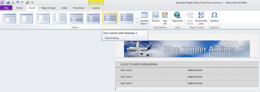
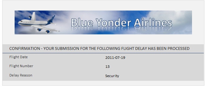
On the Page Design tab, use the View drop-down list to switch back to View 1, and then copy the Blue Yonder Graphic. Switch back to the Confirmation view, and then paste it at the top of the table. From the Insert tab, add the Two-Column with Emphasis 3 table.
In the text area provided for a subheading, type Confirmation – your submission for the following flight delay has been processed.
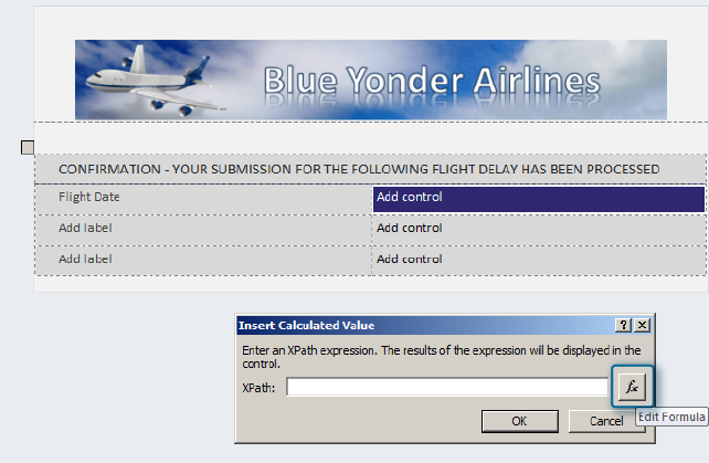
In the first label of the table, type Flight Date. In the control cell on the same row, insert a Calculated Value control from the Objects category. Click the function button to edit the formula.
Click Insert Field or Group, and then select the FlightDate field. Click OK three times to return to the design surface.
This adds the value from the FlightDate field in View 1 as a read-only control on the Confirmation view.
Perform the same steps on the next row for the Flight Number. Once again, use the Calculated Value control.
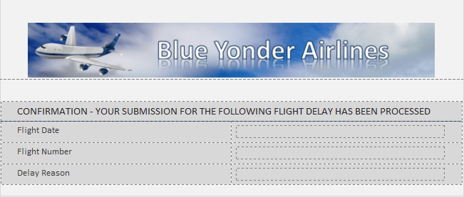
In the third row of the table, add one more Calculated Value control with a label of Delay Reason. Your form should now look like the following screenshot.
On the ribbon, click the Page Design tab, and then in the Views area, click the Properties button.
Notice all the properties that can be set for the view, including the option to set it as read-only. You don’t need to set any properties for the Confirmation view right now, so just click Cancel.
On the Page Design tab, use the View drop-down list to switch back to View 1.
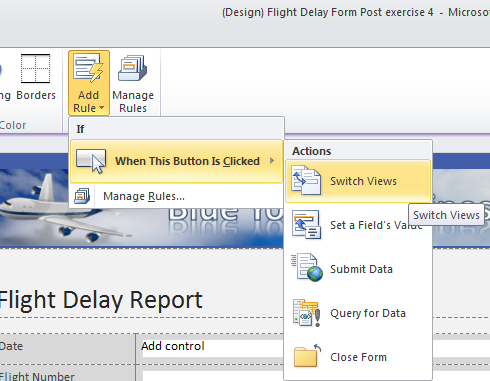
Make the Submit button the active selection, and then on the ribbon, click the Control Tools tab. Click the Add Rule button, and then select Switch Views. Set it to switch to the Confirmation view; this rule will automatically redirect a user to the confirmation view when he clicks Submit.
Preview your form, and fill out the information as if you were a user. After you’ve added a flight number, a reason, and so on, click the submit button.
The rules you added on the submit button should perform two actions: first, InfoPath will attempt to email you a copy of the form using your default email program; second, it will automatically switch you to the Confirmation view. Your Confirmation view should now look like the following screenshot.

Congratulations! You now have a functional Flight Delay form that not only collects data but also has a button to submit the form via email and a rule that switches your users to a second view of the form. One last real-world feature that you’d probably want to consider adding is a button on the Confirmation view that makes it easy for the user to close the form. Again, you can do this easily via a Close Form rule on the button. As a best practice, you never want to leave a user guessing what to do with the form when they are done inputting data. A nice, big Close Form button is always a good idea.
Key Points
InfoPath provides page layout tools and templates that make it easy to build professional-looking forms with tables.
InfoPath has a robust set of controls with which you can provide different types of input depending on the needs of your form.
InfoPath controls are bound to the underlying XML schema.
Containers are data-bound group controls that you can use to organize other controls.
Default values create an easier, more intuitive experience for the form user.
You can use InfoPath views to organize your form into multiple pages, which makes the form easier to fill out, or for providing a special print, summary, or confirmation view of the form data.