
Chapter 30. Brushes, Styles, Templates, and Animations in WPF
Building rich user experiences has become an important business. Functionalities are no longer the only requirement, even in business applications, because an attractive user interface (UI) also plays a fundamental role. Windows Presentation Foundation (WPF) offers the ideal platform for enriching the user interface with interactive content, such as animations, media files, dynamic documents, and graphical effects. WPF is also the ideal platform for building graphics manipulation applications, in which geometry or 3D graphics can run. Before you learn such important features, it is important to know about some graphics fundamentals so that you can enrich visual elements. It is worth mentioning that one of the biggest benefits of WPF is that you can take complete control over UI elements’ customization. You can fill them with impressive gradients; you can completely rewrite their layout while keeping their behavior safe; and you can animate them along the UI, ensuring that they will still work as you expect. The goal of this chapter is to illustrate customization so that you can make your UI more and more attractive.
Introducing Brushes
At one time or another, you have probably wanted to fill your UI controls with interesting background textures or gradients or set a particular color, maybe as the background or the foreground. In WPF, you fill visual elements with brushes. WPF defines several kinds of brushes, all deriving from System.Windows.Media.Brush. The following list summarizes available brushes:
• SolidColorBrush—Enables you to fill a graphical object with a single color. Colors are exposed as static properties from the System.Windows.Media.Colors class.
• LinearGradientBrush—Enables you to fill a graphical object with a linear gradient composed of multiple colors.
• RadialGradientBrush—Similar to the previous one, but the gradient is circular.
• ImageBrush—Enables you to fill a graphical object with a picture.
• DrawingBrush—Enables you to fill a graphical object with geometrical shapes or pen drawings.
• SelectionBrush—Enables you to define the highlighting color when selecting text in specific controls.
• CaretBrush—Enables you to define the mouse pointer color in particular controls. Actually, CaretBrush is a property exposed by controls such as TextBox and RichTextBox, which accept Brush objects.
• VisualBrush—Enables you to fill a graphical object with the content of another element in the user interface.
• BitmapCacheBrush—Enables you to cache a visual element instead of rendering it again and is useful when you need to recall the same visual elements multiple times.
You can apply brushes to properties in visual elements exposing a Background, Foreground, or Fill property, such as user controls and geometrical shapes. In the next sections, you learn to fill your UI elements with the previously listed brushes. Before providing examples, let’s create a new WPF project with Visual Basic 2012. Divide the default Grid into eight rows and adjust Window’s size as follows:
<Window x:Class="MainWindow"
xmlns="http://schemas.microsoft.com/winfx/2006/xaml/presentation"
xmlns:x="http://schemas.microsoft.com/winfx/2006/xaml"
Title="MainWindow" Height="550" Width="550">
<Grid>
<Grid.RowDefinitions>
<RowDefinition />
<RowDefinition />
<RowDefinition />
<RowDefinition />
<RowDefinition />
<RowDefinition />
<RowDefinition />
<RowDefinition />
</Grid.RowDefinitions>
</Grid>
</Window>
To make lines of code shorter, add an Imports System.Windows.Media directive in the Visual Basic code behind the file.
Applying a SolidColorBrush
The System.Windows.Media.SolidColorBrush object enables you to fill an object with a single color. The color is applied to the Fill property of geometric shapes and to the Background or Foreground properties in UI controls. The following code demonstrates how to apply a SolidColorBrush:
<Rectangle Grid.Row="0" Width="200" Margin="5">
<Rectangle.Fill>
<SolidColorBrush Color="Red"/>
</Rectangle.Fill>
</Rectangle>
The Color property receives a value of type System.Windows.Media.Color. Colors are exposed by the System.Windows.Media.Colors class as shared properties. The result of this color brush is shown in Figure 30.1.
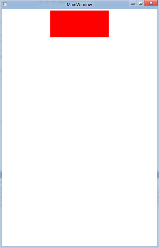
Figure 30.1. Applying a SolidColorBrush.
Applying a color at runtime in Visual Basic code is also a simple task. The following snippet shows how you can set it within the code-behind file:
Dim rect As New Rectangle
Dim scb As New SolidColorBrush(Colors.Red)
rect.Fill = scb
Applying a LinearGradientBrush
A LinearGradientBrush enables you to apply a gradient color to fill a visual element. Valid targets are the Fill property for geometric shapes—Background and Foreground properties for user controls. The following code draws a Rectangle and demonstrates that the gradient is applied both as background color (Fill property) and as foreground (Stroke):
<Rectangle Grid.Row="1" Width="200" Margin="5" Name="GradientRectangle"
StrokeThickness="3">
<Rectangle.Fill>
<LinearGradientBrush StartPoint="0,0" EndPoint="0,1">
<GradientStop Offset="0" Color="Orange"/>
<GradientStop Offset="0.5" Color="Red"/>
<GradientStop Offset="0.9" Color="Yellow"/>
</LinearGradientBrush>
</Rectangle.Fill>
<Rectangle.Stroke>
<LinearGradientBrush StartPoint="0,0" EndPoint="0,1">
<GradientStop Offset="0" Color="Blue"/>
<GradientStop Offset="0.5" Color="Green"/>
<GradientStop Offset="0.9" Color="Violet"/>
</LinearGradientBrush>
</Rectangle.Stroke>
</Rectangle>
First, it is worth mentioning that the StrokeThickness property of Rectangle specifies the shape’s border size. Each color in the gradient is represented by a GradientStop element. Its Offset property requires a value from 0 to 1 and specifies the color position in the gradient, whereas the color property accepts the color name or the color hexadecimal representation. Also notice how the StartPoint and EndPoint properties in the LinearGradientBrush enable you to influence the gradient direction. Figure 30.2 shows the result of the preceding code.
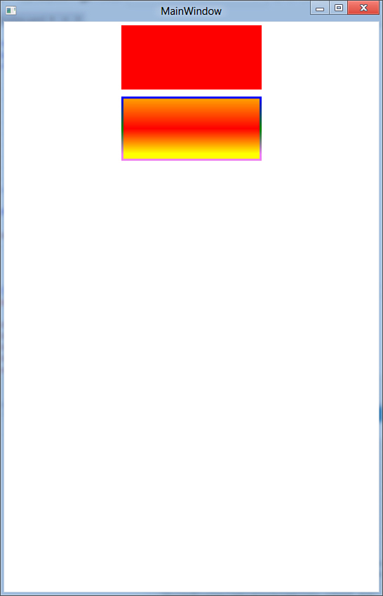
Figure 30.2. Applying a LinearGradientBrush.
You can define a LinearGradientBrush in Visual Basic code for runtime appliance. This is accomplished by the following code:
Dim lgb As New LinearGradientBrush
lgb.GradientStops.Add(New GradientStop With {.Offset = 0,
.Color = Colors.Red})
lgb.GradientStops.Add(New GradientStop With {.Offset = 0,
.Color = Colors.Yellow})
lgb.GradientStops.Add(New GradientStop With {.Offset = 0,
.Color = Colors.Orange})
'rect is a Rectangle instance
rect.Fill = lgb
Notice how you add instances of the GradientStop class to the GradientStops collection. Each GradientStop requires both Offset (of type Double) and Color (of type System.Windows.Media.Color) properties to be set. Colors are exposed by the System.Windows.Media.Colors class as shared properties.
Applying a RadialGradientBrush
The RadialGradientBrush brush works exactly like the LinearGradientBrush, except that it creates a circular gradient. The following code shows how you can apply such a brush to an Ellipse:
<Ellipse Width="100" Margin="5" Grid.Row="2" Stroke="Black"
StrokeThickness="2" >
<Ellipse.Fill>
<RadialGradientBrush>
<GradientStop Offset="0" Color="Blue"/>
<GradientStop Offset="0.5" Color="Green"/>
<GradientStop Offset="0.9" Color="Violet"/>
</RadialGradientBrush>
</Ellipse.Fill>
</Ellipse>
You are not limited to the Ellipse shape, but for demo purposes it is the one that best fits the example. Figure 30.3 shows the result of the brush applied.
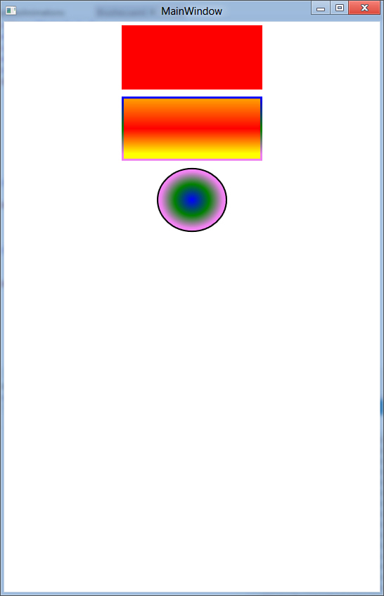
Figure 30.3. The result of the RadialGradientBrush.
The Visual Basic code for applying the brush at runtime is similar to the one for the linear gradient. The following code snippet provides an example:
Dim ragb As New RadialGradientBrush
ragb.GradientStops.Add(New GradientStop With {.Offset = 0,
.Color = Colors.Red})
ragb.GradientStops.Add(New GradientStop With {.Offset = 0,
.Color = Colors.Yellow})
ragb.GradientStops.Add(New GradientStop With {.Offset = 0,
.Color = Colors.Orange})
rect.Fill = ragb
Applying an ImageBrush
You can fill a visual element with an image file by using the ImageBrush brush. This object is useful even if you want to fill text with image textures. The following code snippet shows how to apply an ImageBrush as a button background and as the text foreground color:
<StackPanel Grid.Row="3" Orientation="Horizontal">
<Button Width="100" Margin="5" Content="Hello!"
Foreground="Yellow">
<Button.Background>
<ImageBrush Opacity="0.5"
ImageSource=
"/StylesBrushesTemplatesAnimations;component/Images/Avatar.jpg" />
</Button.Background>
</Button>
<TextBlock Margin="5"
FontFamily="Segoe UI" FontSize="40" Text="Hello!"
FontWeight="Bold" >
<TextBlock.Foreground>
<ImageBrush ImageSource=
"/StylesBrushesTemplatesAnimations;component/Images/Avatar.jpg"/>
</TextBlock.Foreground>
</TextBlock>
</StackPanel>
Note
In the previous code, the Avatar.jpg file is just a sample picture of me. I suppose you might prefer to replace my face with one of your favorite pictures!
The image is specified by assigning the ImageSource property with the image’s Uniform Resource Identifier (URI). The previous code produces the result shown in Figure 30.4 (see the last row).
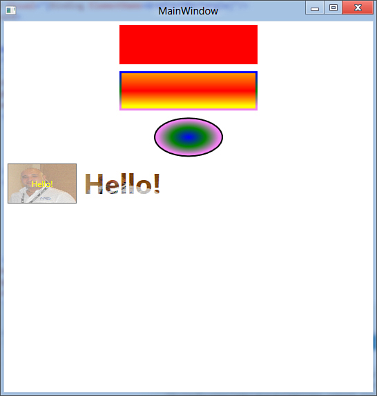
Figure 30.4. Applying an ImageBrush as the background and foreground color.
If you want to add your images to the application resources so that you can easily refer to them when applying the ImageBrush, follow these steps:
1. Write the ImageBrush element in the XAML code editor.
2. Add image files to the project (Project, Add Existing Item).
3. In the XAML code editor, select the previously added ImageBrush object and then press F4 to open the Properties window.
4. Select the ImageSource property and expand the drop-down box, as shown in Figure 30.5. Pick up the desired picture that will be assigned to the selected brush. When added, its address will be assigned to the ImageProperty in the XAML code under the form of a packed Uri.
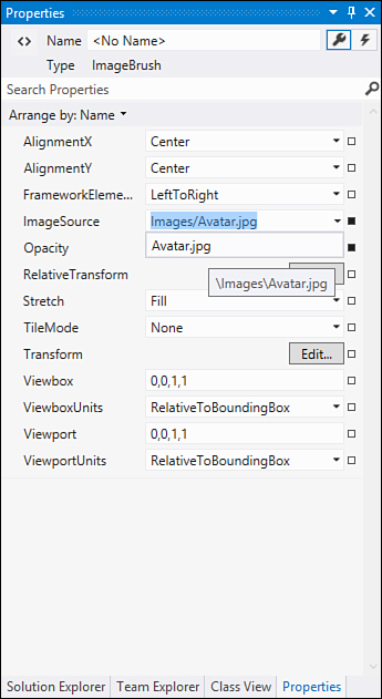
Figure 30.5. Selecting an image with the designer tools.
Applying an ImageBrush in Visual Basic code is also a simple task, demonstrated by the following code snippet:
Dim myButton As New Button
Dim imgb As New ImageBrush
imgb.ImageSource = New BitmapImage _
(New _
Uri("/StylesBrushesTemplatesAnimations;component/Images/Avatar.jpg",
UriKind.Relative))
myButton.Background = imgb
Notice how, in Visual Basic code, you specify the image by creating first an instance of the BitmapImage class whose constructor receives an argument of type Uri pointing to the actual image file.
Applying SelectionBrush and CaretBrush
WPF 4.5 offers two special objects, SelectionBrush and CaretBrush, which are properties of type System.Windows.Media.Brush and that accept brushes to be assigned to them. The first one enables you to apply a brush to the highlighting color when selecting text, whereas the second one applies a brush to the mouse caret within the control. Controls that can receive application of these brushes are TextBox and PasswordBox. SelectionBrush can also be applied to FlowDocumentPageViewer, FlowDocumentReader, and FlowDocumentScrollViewer. You apply both brushes as child nodes of the desired control. The following code demonstrates how to apply a linear gradient color for both the highlighting selection color and the caret color:
<TextBox Grid.Row="4" Margin="5"
FontSize="20" FontWeight="Bold"
Name="TextBox1">
<TextBox.SelectionBrush>
<LinearGradientBrush>
<GradientStop Offset="0" Color="Chartreuse"/>
<GradientStop Offset="0.5" Color="Violet"/>
<GradientStop Offset="1" Color="Blue"/>
</LinearGradientBrush>
</TextBox.SelectionBrush>
<TextBox.CaretBrush>
<LinearGradientBrush>
<GradientStop Offset="0" Color="Red"/>
<GradientStop Offset="0.5" Color="Yellow"/>
<GradientStop Offset="1" Color="Orange"/>
</LinearGradientBrush>
</TextBox.CaretBrush>
</TextBox>
Figure 30.6 shows the result of this code, although the caret gradient is not visible at this point, but you will see there are no problems on your screen.
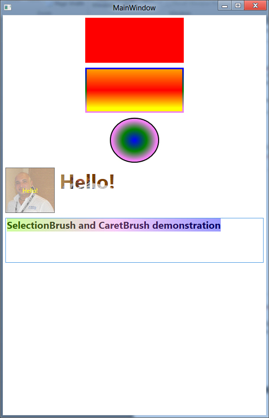
Figure 30.6. Applying SelectionBrush and CaretBrush.
You can apply different kinds of brushes, such as ImageBrush or VisualBrush, as described in the next section.
Applying a VisualBrush
The VisualBrush enables you to fill an object with the content of another visual element in the user interface. For example, you could set a button’s background with the content of a MediaElement that is playing a video. Applying a VisualBrush is simple, in that you just need to assign its Visual property with the name of the visual element you want to bind. The following code example shows how you can assign another visual element currently in the user interface as the background of a button:
<Button Width="100" Margin="5" Grid.Row="5">
<Button.Background>
<VisualBrush Visual="{Binding ElementName=GradientRectangle}"/>
</Button.Background>
</Button>
The requirement is that the source visual element has a Name property set. You assign the visual element with the Binding markup extension, whose ElementName property points to the actual visual element. You learn more about the Binding extension in Chapter 32, “Introducing Data-Binding.” The previous example produces the result shown in Figure 30.7.
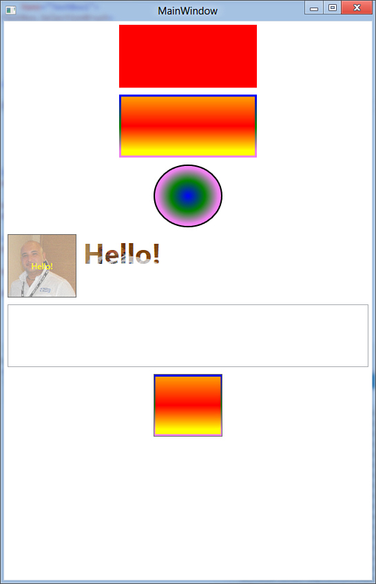
Figure 30.7. Applying a VisualBrush.
The button’s background typically is not a color but is a rectangle with all its properties. So, if you make modifications to the binding source, the changes will be reflected into the VisualBrush. This is the real power of this brush. For example, try to use a TextBox as the source element; when you write in the TextBox, your text will be reflected into the VisualBrush.
Applying a DrawingBrush
The DrawingBrush brush enables you to paint an area with a so called drawing. A drawing, according to the MSDN documentation, can be a shape, an image, a video, text, or another item and is an instance of the System.Windows.Media.Drawing class. The following code sample fills a rectangle with a DrawingBrush defining a drawing where two ellipses intersect each other:
<Rectangle Width="100"
Grid.Row="6">
<Rectangle.Fill>
<DrawingBrush>
<DrawingBrush.Drawing>
<GeometryDrawing>
<GeometryDrawing.Brush>
<LinearGradientBrush>
<GradientStop Offset="0" Color="Blue"/>
<GradientStop Offset="0.7" Color="LightBlue"/>
</LinearGradientBrush>
</GeometryDrawing.Brush>
<GeometryDrawing.Geometry>
<GeometryGroup>
<EllipseGeometry RadiusX="0.1" RadiusY="0.5"
Center="0.5,0.5" />
<EllipseGeometry RadiusX="0.5" RadiusY="0.1"
Center="0.5,0.5" />
</GeometryGroup>
</GeometryDrawing.Geometry>
</GeometryDrawing>
</DrawingBrush.Drawing>
</DrawingBrush>
</Rectangle.Fill>
</Rectangle>
Other than the brush, it is interesting here how ellipses are declared via EllipseGeometry objects that are the geometric representation of ellipses and are enclosed within a GeometryGroup that can group different kinds of geometric representations, such as LineGeometry or RectangleGeometry. (These classes derive from System.Windows.Media.Geometry, for your further studies.) Figure 30.8 shows the result of the previous snippet.
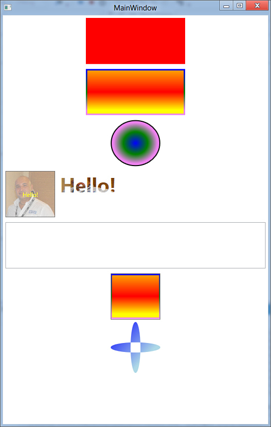
Figure 30.8. Applying a DrawingBrush.
Applying a BitmapCacheBrush
WPF 4.5 has the concept of cached composition, which was introduced back in WPF 4 and that lets you store a visual element to a cache so that redrawing an element is faster and provides better performance instead of rendering the graphic element each time it needs to be used. Among the others, with cached composition you can cache images to apply as a brush. This is accomplished by first declaring a BitmapCache object that establishes the rules for caching the desired object and then by applying a BitmapCacheBrush to the visual element. The following code demonstrates how to apply a BitmapCacheBrush as the background of two TextBlock controls, by using cached composition (comments in the code will help you understand better):
<StackPanel Grid.Row="7">
<StackPanel.Resources>
<!— an image pointing to the previously added
resource —>
<Image x:Key="cachedImage"
Source="/StylesBrushesTemplatesAnimations;component/Images/Avatar.jpg">
<!— supposing we'll use the same image multiple
times, we can cache it instead of
rendering each time —>
<Image.CacheMode>
<!— RenderAtScale = 1 means that it is cached
at its actual size (no zoom) —>
<BitmapCache RenderAtScale="1"
EnableClearType="False"
SnapsToDevicePixels="False"/>
</Image.CacheMode>
</Image>
<!— Applying the cached image as a brush —>
<BitmapCacheBrush x:Key="cachedBrush"
Target="{StaticResource cachedImage}"/>
</StackPanel.Resources>
<TextBlock Text="Text one..." FontSize="24"
Height="60" Foreground="Blue"
FontWeight="Bold"
Background="{StaticResource cachedBrush}"/>
<TextBlock Text="Text two..." FontSize="24"
Height="60" Foreground="Green"
FontWeight="Bold"
Background="{StaticResource cachedBrush}"/>
</StackPanel>
The BitmapCache.RenderAtScale property establishes when the visual element has to be cached. If assigned with 1, as in the preceding example, the visual element is cached at its natural size. For example, you could assign such a property with 2 in case you want to cache the visual element only when it is zoomed at the double of its size. The BitmapCache.EnableClearType property lets you decide whether you want to apply Clear Type precision to the visual elements, but it is useful only with text. The BitmapCache.SnapsToDevicePixels property should be assigned with True when you need precise pixel-alignment and takes the same value of the EnableClearType property. Finally, notice how the BitmapCacheBrush object points to the image via the Target property and how it is applied to TextBlock controls via the Background property pointing to the new resource. The preceding code produces the result shown in Figure 30.9. Now that you know about WPF brushes, you are ready to get an overview of another great feature: styles.
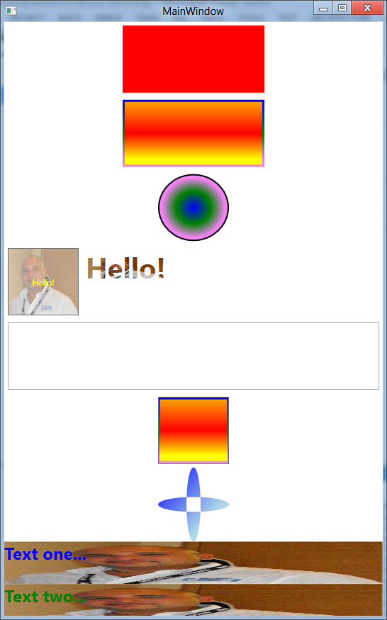
Figure 30.9. Applying BitmapCachedBrush objects.
Introducing Styles
One of the biggest benefits of WPF user controls is that their layout is completely customizable. As explained further in the “Introducing Control Templates” section, you can completely redefine their layout and behavior using templates. In some situations, you have multiple controls of the same type and want them to have the same properties. For example, you might want to implement three buttons, with each button having the same width, height, and font as the other ones. To avoid the need of applying the same properties for each control, which can be annoying if you have dozens of controls, you can define a style. A style is an instance of the System.Windows.Style class and enables you to define a set of common properties for the specified type of control. Styles are defined within the Resources section of a Window, of panels, or at the application level (Application.xaml file). Each style must have an identifier assigned via the x:Key attribute and is applied to controls assigning their Style property. The code in Listing 30.1 defines a style for buttons and applies the style to three buttons in the interface.
Listing 30.1. Defining and Assigning a Style for Buttons
<Window x:Class="Styles"
xmlns="http://schemas.microsoft.com/winfx/2006/xaml/presentation"
xmlns:x="http://schemas.microsoft.com/winfx/2006/xaml"
Title="Styles" Height="300" Width="300">
<StackPanel>
<StackPanel.Resources>
<Style x:Key="ButtonStyle" TargetType="Button">
<Setter Property="Width" Value="100"/>
<Setter Property="Height" Value="40"/>
<Setter Property="Foreground" Value="Blue"/>
<Setter Property="FontFamily" Value="Verdana"/>
<Setter Property="Margin" Value="5"/>
<Setter Property="Background">
<Setter.Value>
<LinearGradientBrush>
<GradientStop Offset="0.2" Color="Orange"/>
<GradientStop Offset="0.8" Color="Red"/>
</LinearGradientBrush>
</Setter.Value>
</Setter>
</Style>
</StackPanel.Resources>
<Button Style="{StaticResource ButtonStyle}" Content="Hello!"/>
<Button Style="{StaticResource ButtonStyle}" Content="Another styled"/>
<Button Style="{StaticResource ButtonStyle}" Content="Button three"/>
</StackPanel>
</Window>
Understanding the scope of styles is important. In the code example, the style is defined at the panel level, meaning that buttons outside the panel cannot get the style applied. Notice how the TargetType property enables you to specify the target control type. If it’s not specified, WPF assumes FrameworkElement as the target. Properties are specified via Setter elements. Each setter requires the target Property specification and its value. You can also define a complex value by splitting its definition to create a Setter.Value node, which can store multiple lines of XAML code. This was shown in Listing 30.1, where the technique is used to define a LinearGradientBrush gradient. Finally, notice how the new style is assigned to buttons setting the Style property, pointing to the style identifier via an XAML markup extension named StaticResource.
Staticresource and Dynamicresource
In different situations you can often find controls pointing to resources via StaticResource or DynamicResource markup extensions. The difference is that a StaticResource is something defined in the XAML that will not change during the application lifetime. It will be assigned only once, even before its actual point of use. A DynamicResource instead is assigned when its value is required and if its content changes during the application lifetime, its changes are reflected to the caller.
Running the code can produce the interesting result shown in Figure 30.10.
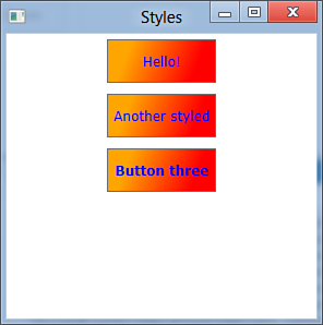
Figure 30.10. Styling multiple controls of the same type with Styles.
On the Visual Basic side, you create and apply a style as in the following code snippet:
Dim buttonStyle As New Style
'Need to specify the System.Type
buttonStyle.TargetType = GetType(Button)
'The Setter.Property member is assigned with a dependency property exposed
'by the System.Type
buttonStyle.Setters.Add(New Setter With {.Property = Button.WidthProperty,
.Value = "100"})
Button1.Style = buttonStyle
This can be particularly useful if you need to generate a style at runtime, although you define styles at design time. Therefore, declaring and applying them via XAML is the most preferable way (so that designers can eventually take advantage of XAML for their work).
Styles Inheritance
You can define a style that inherits from another one to extend it with new settings. This is accomplished by specifying the BasedOn property as follows:
<Style x:Key="InheritedStyle" TargetType="Button"
BasedOn="{StaticResource ButtonStyle}">
<Setter Property="FontWeight" Value="ExtraBold"/>
</Style>
If you now assign this new style to a button, it can take all the style properties of the base style plus the FontWeight value.
Understanding Triggers
Until now, you saw how styles can be applied to controls without condition. This is useful, but it is more useful for deciding when to apply a style. The easiest example is to consider a button; you apply a background color that you might want to change when the mouse pointer passes over the button, and this behavior should be replicated for each button in the UI via styles. To conditionally apply styles, you use triggers. A trigger essentially represents a condition that enables you to apply a particular style when the condition is evaluated as True. Triggers are defined within a Style.Triggers collection, and each of them requires you to specify the property affected by the condition and a Boolean value (True or False) that determines when the trigger has to be executed. The code in Listing 30.2 retakes the first style example, adding a trigger condition in the final part of the code.
Listing 30.2. Applying a Single Trigger Condition
<Style x:Key="ButtonStyle" TargetType="Button">
<Setter Property="Width" Value="100"/>
<Setter Property="Height" Value="40"/>
<Setter Property="Foreground" Value="Blue"/>
<Setter Property="FontFamily" Value="Verdana"/>
<Setter Property="Margin" Value="5"/>
<Setter Property="Background">
<Setter.Value>
<LinearGradientBrush>
<GradientStop Offset="0.2" Color="Orange"/>
<GradientStop Offset="0.8" Color="Red"/>
</LinearGradientBrush>
</Setter.Value>
</Setter>
<Style.Triggers>
<Trigger Property="IsMouseOver" Value="True">
<Setter Property="Background">
<Setter.Value>
<LinearGradientBrush>
<GradientStop Offset="0.2" Color="Red"/>
<GradientStop Offset="0.8" Color="Yellow"/>
</LinearGradientBrush>
</Setter.Value>
</Setter>
</Trigger>
</Style.Triggers>
</Style>
Applying the trigger described in code can cause buttons to have a different background color when the mouse pointer passes over them. In this way we applied a style according to just one condition, but sometimes multiple conditions have to be evaluated. For example, continuing the Button control discussion, we could decide to apply a style when the mouse pointer passes over the control and also if the button is enabled. This can be accomplished using a MultiTrigger object. A MultiTrigger can contain multiple condition specifications and as many setters for as many properties as we want to apply in the style. The following code snippet demonstrates how to declare a MultiTrigger for the preceding implemented style:
<Style.Triggers>
<MultiTrigger>
<MultiTrigger.Conditions>
<Condition Property="IsMouseOver" Value="True"/>
<Condition Property="IsEnabled" Value="True"/>
</MultiTrigger.Conditions>
<Setter Property="Background">
<Setter.Value>
<LinearGradientBrush>
<GradientStop Offset="0.2" Color="Red"/>
<GradientStop Offset="0.8" Color="Yellow"/>
</LinearGradientBrush>
</Setter.Value>
</Setter>
</MultiTrigger>
</Style.Triggers>
In this case the new background is applied only when both conditions are evaluated as True.
Introducing Control Templates
WPF controls have a particular structure, in which the layout system is separated from the behavior. When searching resources about WPF controls, you often find a definition stating that they are lookless. This means that WPF controls have no default aspect, whereas they expose a common set of properties that can be assigned for defining the layout and the behavior. This common set is referred to as the control template. The WPF system provides a default control template for each available control in the Base Class Library (BCL). You can then override the existing template or create a custom one. Control templates are so versatile because you can completely redesign the control look while keeping its original behavior, but you can also improve the behavior. For example, you can use an Ellipse as a control template for a Button. The new Button will look like an Ellipse, but your user can still click it and you can still handle button events.
Use Expression Blend
Even if the XAML designer has been enhanced even more in Visual Studio 2012, creating custom control templates can be a hard task to accomplish with the IDE only. This is a developer tool and therefore cannot offer advanced design features as Expression Blend does. If you plan to make intensive use of custom control templates, use Blend. Use Visual Studio if your custom templates are basic implementations. In the next examples, you see something easy to implement with Visual Studio, although the logic of control templates is fully implemented.
Control templates are implemented as styles, but actually they are not simple styles. The difference between styles and templates is that styles affect existing properties within an existing template, whereas a control template can completely override or replace the properties and layout of a control. Talking in code terms, a control template is defined within a Style definition, setting the Template property and assigning the Value of this property. The code in Listing 30.3 shows how to utilize an Ellipse as the control template for buttons, where the background gradient color changes when the button is pressed or when the mouse pointer flies over it.
Listing 30.3. Building a Control Template
<Window.Resources>
<Style x:Key="ButtonStyle1" TargetType="{x:Type Button}">
<Setter Property="Template">
<Setter.Value>
<ControlTemplate TargetType="{x:Type Button}">
<Grid>
<Ellipse x:Name="ellipse" Stroke="Black">
<Ellipse.Fill>
<LinearGradientBrush EndPoint="0.5,1"
StartPoint="0.5,0">
<GradientStop Color="Black" Offset="0"/>
<GradientStop Color="White" Offset="1"/>
</LinearGradientBrush>
</Ellipse.Fill>
</Ellipse>
<ContentPresenter HorizontalAlignment=
"{TemplateBinding HorizontalContentAlignment}"
VerticalAlignment=
"{TemplateBinding VerticalContentAlignment}"
SnapsToDevicePixels=
"{TemplateBinding SnapsToDevicePixels}"
RecognizesAccessKey="True"/>
</Grid>
<ControlTemplate.Triggers>
<Trigger Property="IsFocused" Value="True"/>
<Trigger Property="IsDefaulted" Value="True"/>
<Trigger Property="IsMouseOver" Value="True">
<Setter Property="Fill" TargetName="ellipse">
<Setter.Value>
<LinearGradientBrush EndPoint="0.5,1"
StartPoint="0.5,0">
<GradientStop Color="White" Offset="0"/>
<GradientStop Color="Black" Offset="1"/>
</LinearGradientBrush>
</Setter.Value>
</Setter>
</Trigger>
<Trigger Property="IsPressed" Value="True">
<Setter Property="Fill" TargetName="ellipse">
<Setter.Value>
<LinearGradientBrush EndPoint="0.5,1"
StartPoint="0.5,0">
<GradientStop Color="#FF4F4F4F"
Offset="0"/>
<GradientStop Color="#FF515050"
Offset="1"/>
<GradientStop Color="White"
Offset="0.483"/>
</LinearGradientBrush>
</Setter.Value>
</Setter>
</Trigger>
<Trigger Property="IsEnabled" Value="False"/>
</ControlTemplate.Triggers>
</ControlTemplate>
</Setter.Value>
</Setter>
</Style>
</Window.Resources>
Tip: Restyling Windows
Control templates are not limited to user controls, but they can be successfully implemented for completely restyling Window objects layout so that you can create custom windows while still taking advantage of their behavior. The template’s TargetType is therefore Window.
If you look at the code, you can notice how the button default aspect is replaced by an Ellipse within the ControlTemplate value of the Template property. Probably some concepts you learned about styles help you understand what is happening. Triggers enable you to change the background color according to specific mouse actions. Don’t forget to add the ContentPresenter element in your custom templates because it enables you to show text or other UI elements within your control. Control templates are assigned to controls using the DynamicResource markup extension. The following XAML line assigns the previous custom control template to a button:
<Button Click="Button_Click" Name="Button1"
Style="{DynamicResource ButtonStyle1}"
Width="100" Height="80" Content="Button"/>
Changes will be automatically reflected at design time. You can also assign an event handler for the Click event to ensure that everything is working fine:
Private Sub Button_Click(ByVal sender As System.Object,
ByVal e As System.Windows.RoutedEventArgs)
MessageBox.Show("You clicked!")
End Sub
Figure 30.11 shows how the button looks within the running application when the mouse pointer passes over it.
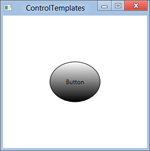
Figure 30.11. The custom control template designs a button as an ellipse.
Recommendation
Control templates enable you to create amazing control layouts, but this is not necessarily a good choice. Remember that users prefer to easily associate a simple control shape to a particular action more than having colored and funny controls that they cannot easily recognize.
Introducing Transformations
Transformations are special objects that modify the appearance of visual elements of type FrameworkElement, applying interesting effects such as rotation or translation, keeping unchanged the visual element’s functional behavior. For example, with transformations you can rotate a ListBox 180°, but it will still work as usual; only the layout changes. Transformations are important to understand if you intend to apply animations to visual elements. I cover animations in the next section. Keep in mind that when you apply animations, you animate transformation objects that affect visual elements. You apply transformations by adding a RenderTransform node for your visual element at the XAML level. I explain this by dividing a Grid into four cells, where each cell must contain a ListBox. To accomplish this, write the following XAML code that divides the grid and provides a common set of properties for ListBox instances via a style:
<Grid Name="Grid1">
<Grid.RowDefinitions>
<RowDefinition/>
<RowDefinition/>
</Grid.RowDefinitions>
<Grid.ColumnDefinitions>
<ColumnDefinition/>
<ColumnDefinition/>
</Grid.ColumnDefinitions>
<Grid.Resources>
<Style x:Key="ListStyle" TargetType="ListBox">
<Setter Property="Margin" Value="5"/>
<Setter Property="Width" Value="160"/>
<Setter Property="Height" Value="160"/>
<Setter Property="ItemsSource" Value="{Binding}"/>
</Style>
</Grid.Resources>
</Grid>
At this point, each cell contains a ListBox, as explained in the next sections. Before going into that, switch to the code behind file and handle the Window.Loaded event as follows:
Private Sub Transforms_Loaded(ByVal sender As Object,
ByVal e As System.Windows.RoutedEventArgs) _
Handles Me.Loaded
'Gets a list of names for running processes
'and populates the Grid.DataContext so that children
'elements will pick up data from it
Me.Grid1.DataContext = From proc In Process.GetProcesses
Select proc.ProcessName
End Sub
The DataContext property is the data-source for a given container, and all children controls pick up data from it. In this case, assigning the Grid1.DataContext property populates all children ListBoxes.
Checking the Samples Result
For the sake of simplicity, and because the design actions are reflected to the designer, only one figure will be provided about the transformations result. Figure 30.12 shows the complete results. The interesting thing is that ListBox controls continue working independently of their skew or position on the screen.
Figure 30.12. The result of applying transformations.
Rotating Visual Elements with RotateTransform
RotateTransform is a transformation that enables you to rotate a visual element for the specified number of degrees and at the specified position. The following code adds a ListBox in the upper-left cell, and it is rotated 180°:
<ListBox Name="RotateListBox" Grid.Row="0" Grid.Column="0"
Style="{StaticResource ListStyle}">
<ListBox.RenderTransform>
<RotateTransform Angle="180" CenterX="80" CenterY="80"/>
</ListBox.RenderTransform>
</ListBox>
Notice how the Angle property specifies the degrees, whereas CenterX and CenterY represent the position of rotation. In the preceding example, the rotation comes in at the center of the ListBox (both values are the half of Width and Height). Transformations are automatically reflected to the designer, so you should see the result of what you are doing. Figure 30.12 shows the result of this transformation (see the upper-left cell). Notice also how the control is working normally even if it is in an unusual position.
Dynamically Resizing Visual Elements with ScaleTransform
ScaleTransform enables you to dynamically resize a control. The following code demonstrates how a ListBox can be scaled to different dimensions:
<ListBox Name="ScaleListBox" Grid.Row="0" Grid.Column="1"
Style="{StaticResource ListStyle}">
<ListBox.RenderTransform>
<ScaleTransform CenterX="0" CenterY="0" ScaleX="0.6" ScaleY="0.6"/>
</ListBox.RenderTransform>
</ListBox>
Notice how scaling is expressed in percentage with the ScaleX and ScaleY properties. A value of 0.6 means that the control is scaled to 60% of its original dimensions. A value of 1 means 100% (that is, the original size), whereas a value bigger than 1 enlarges the visual element. Take a look at the upper-right cell in Figure 30.12 to get an idea about the result. With animations, ScaleTransform enables you to animate visual elements by making them larger or smaller.
Changing Visual Elements’ Angles with SkewTransform
SkewTransform enables you to skew a visual element for the specified angles on both the X-axis and Y-axis, simulating 3D depth for 2D objects. The following code demonstrates how to apply to a ListBox a horizontal skew of 15° and a vertical skew of 30°, where the center point is established by CenterX and CenterY properties:
<ListBox Name="SkewListBox" Grid.Row="1" Grid.Column="0"
Style="{StaticResource ListStyle}">
<ListBox.RenderTransform>
<SkewTransform AngleX="15" AngleY="30" CenterX="50" CenterY="50" />
</ListBox.RenderTransform>
</ListBox>
Skewing is probably the most impressive transform if you then try to use visual elements and controls, discovering that they work exactly as if they were not transformed. Figure 30.12 shows the result of skewing (see the bottom-left cell).
Dynamically Moving Visual Elements with TranslateTransform
TranslateTransform enables you to move a visual element from a position to another one in the layout system. This is useful if you want to build animations capable of moving visual elements. The following example shows how you can translate a ListBox of 50 points on the X-axis and of 100 points on the Y-axis:
<ListBox Name="TranslateListBox" Grid.Row="1" Grid.Column="1"
Style="{StaticResource ListStyle}">
<ListBox.RenderTransform>
<TranslateTransform X="50" Y="100" />
</ListBox.RenderTransform>
</ListBox>
The result of this translation is shown in Figure 30.12 (see the bottom-right cell).
Applying Multiple Transforms
You can apply multiple transformations by contextually implementing a TransformGroup as a nested node of RenderTransform. The following code demonstrates how you can both rotate and skew a visual element:
<ListBox Name="SkewListBox" Grid.Row="1" Grid.Column="0"
Style="{StaticResource ListStyle}">
<ListBox.RenderTransform>
<TransformGroup>
<SkewTransform AngleX="15" AngleY="30" CenterX="50"
CenterY="50" />
<RotateTransform Angle="180" CenterX="80" CenterY="80"/>
</TransformGroup>
</ListBox.RenderTransform>
</ListBox>
A Couple of Important Notes
Another transformation named MatrixTransform is available and enables you to build custom transformations. This is quite a complex object and is beyond of the scope of this book. Visit the official MSDN page at http://msdn.microsoft.com/en-us/library/system.windows.media.matrixtransform(VS.110).aspx.
Next, RenderTransform is not the only place for putting transformations. Another node named LayoutTransform requires a transformation to be applied before the WPF layout system comes in. This can be useful only when you need the parent of the affected element to adjust the transformed size, but in all other cases use RenderTransform because it offers better performance, especially with animations.
Introducing Animations
WPF offers lots of interesting features about graphics and multimedia to provide a great user experience with rich client applications. Animations are one of these features. They enable visual elements (or just some portions of them) to move along the UI or to dynamically change their aspects during the specified interval. Subsequent sections explain how you can apply animations to WPF visual elements. There are different kinds of animations in WPF; we cover the most common of them—DoubleAnimation and ColorAnimation.
Note
A special type of animation based on timelines is available, but it is not easy to implement with Visual Studio. However, it is the easiest animation that you can realize with Expression Blend. With that said, from a developer perspective, this chapter covers animations based on storyboards.
Animations are cool in that they can be eventually controlled by pausing, removing, stopping, and manually playing and are represented by System.Windows.Media.Animation.Storyboard objects. Each Storyboard can define one or more DoubleAnimation or ColorAnimation that applies to transformations (see the previous section for details). To decide the time when animations need to come in, you define them within the control’s triggers specifying an EventTrigger that requires you to specify the event representing the moment for the animation to run. For example, if you want an animation to start when a window is loaded, the EventTrigger points to Window.Loaded. Before providing any code example, add a new window to your current WPF project or create a new project from scratch. When the new window is ready, divide the default Grid into four cells by typing the following XAML:
<Grid Name="Grid1">
<Grid.RowDefinitions>
<RowDefinition/>
<RowDefinition/>
</Grid.RowDefinitions>
<Grid.ColumnDefinitions>
<ColumnDefinition/>
<ColumnDefinition/>
</Grid.ColumnDefinitions>
</Grid>
Applying DoubleAnimation
A DoubleAnimation object enables you to animate the specified transform property; it also enables you to revert the motion, specify the duration, and specify whether the animation needs to be repeated unlimitedly. The first example animates an image, applying the animation to a SkewTransform and to a ScaleTransform contextually. The code in Listing 30.4 shows how to accomplish this.
Listing 30.4. Applying a DoubleAnimation to an Image
<Image Grid.Row="0" Grid.Column="0" Name="Image1"
Source="/StylesBrushesTemplatesAnimations;component/Images/Avatar.jpg">
<Image.RenderTransform>
<TransformGroup>
<SkewTransform x:Name="SkewImage"/>
<ScaleTransform x:Name="ScaleImage"/>
</TransformGroup>
</Image.RenderTransform>
<Image.Triggers>
<EventTrigger RoutedEvent="Image.Loaded">
<EventTrigger.Actions>
<BeginStoryboard>
<Storyboard>
<DoubleAnimation Storyboard.TargetName="SkewImage"
Storyboard.TargetProperty="AngleY"
From="0" To="15" Duration="0:0:3"
AutoReverse="True"
RepeatBehavior="Forever" />
<DoubleAnimation Storyboard.TargetName="ScaleImage"
Storyboard.TargetProperty="ScaleX"
From="1" To="0.3" Duration="0:0:3"
AutoReverse="True"
RepeatBehavior="Forever" />
<DoubleAnimation Storyboard.TargetName="ScaleImage"
Storyboard.TargetProperty="ScaleY"
From="1" To="0.3" Duration="0:0:3"
AutoReverse="True"
RepeatBehavior="Forever" />
</Storyboard>
</BeginStoryboard>
</EventTrigger.Actions>
</EventTrigger>
</Image.Triggers>
</Image>
The code first applies to transformations. They are empty, with no properties set, therefore with no changes to the Image. But they have a name so that they can be referred to from the storyboard. The EventTrigger within triggers specifies the Image.Loaded routed event, which establishes that the animation will run when the image is loaded. The BeginStoryboard object is a container for children Storyboard objects. In the code example there is just one Storyboard that contains multiple DoubleAnimation objects. Notice how each DoubleAnimation refers to a transformation via the Storyboard.TargetName attached property and to the particular transformation’s property via the Storyboard.TargetProperty attached property. From and To specify the starting and finish points of the animation, respectively. In the case of the SkewTransform, they specify the angle degrees, whereas in the case of the ScaleTransform they specify the scaling percentage. Duration is a property for specifying how many hours:minutes:seconds the animation will last; AutoReverse specifies whether the animation has to be repeated back, and RepeatBehavior specifies how long the animation will last (Forever is self-explanatory). At this point, run the application to have your image skewed and scaled via the animation. Refer to Figure 30.13 to see an approximate result. (Figures cannot show animations running!) Next, the code example about DoubleAnimation is applied to a TextBlock object for animating text. In this case you see the conjunction of a RotateTransform and SkewTransform. The code in Listing 30.5 provides the previously mentioned example.
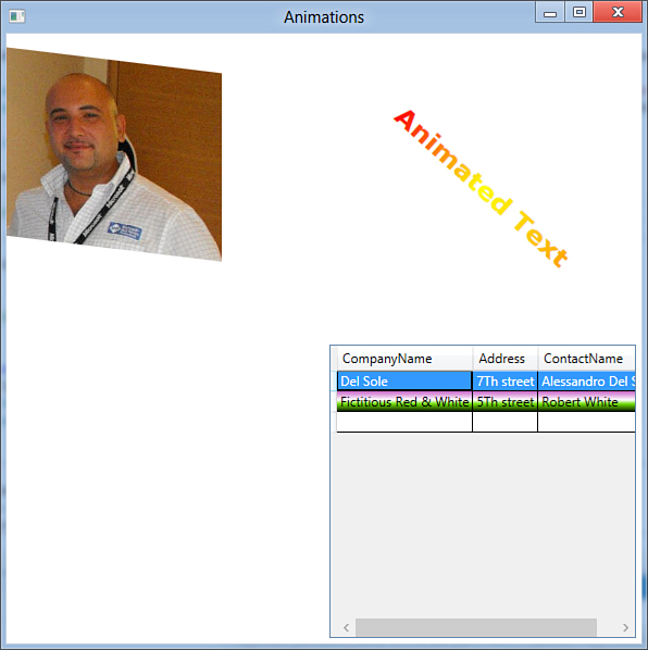
Figure 30.13. The result of applied animations.
Listing 30.5. Applying DoubleAnimation to a TextBlock
<TextBlock Grid.Row="0" Grid.Column="1" Text="Animated Text" FontSize="24"
FontFamily="Verdana" FontWeight="Bold"
HorizontalAlignment="Center"
VerticalAlignment="Center" RenderTransformOrigin="0.5 0.5">
<TextBlock.Foreground>
<LinearGradientBrush>
<GradientStop Offset="0" Color="Red" />
<GradientStop Offset="0.5" Color="Yellow" />
<GradientStop Offset="1" Color="Orange"/>
</LinearGradientBrush>
</TextBlock.Foreground>
<TextBlock.RenderTransform>
<TransformGroup>
<RotateTransform x:Name="RotateText" />
<SkewTransform x:Name="SkewText"/>
</TransformGroup>
</TextBlock.RenderTransform>
<TextBlock.Triggers>
<EventTrigger RoutedEvent="TextBlock.Loaded">
<BeginStoryboard>
<Storyboard Name="TextAnimation">
<DoubleAnimation Storyboard.TargetName="RotateText"
Storyboard.TargetProperty="Angle"
From="0" To="360" Duration="0:0:5"
RepeatBehavior="Forever" />
<DoubleAnimation Storyboard.TargetName="SkewText"
AutoReverse="True"
Storyboard.TargetProperty="AngleX"
From="0" To="45" Duration="0:0:5"
RepeatBehavior="Forever" />
</Storyboard>
</BeginStoryboard>
</EventTrigger>
</TextBlock.Triggers>
</TextBlock>
The logic is the same, with the EventTrigger and transformations. The first DoubleAnimation is applied to a RotateTransform that affects rotation degrees. Run the code to get an idea of the result and refer to Figure 30.13 for a graphical representation.
Applying ColorAnimation
A ColorAnimation enables you to animate colors within a brush, such as LinearGradientBrush and RadialGradientBrush. A color is replaced with another one passing through a gradient. The next example is a little bit particular because it will be applied to a DataGrid control to demonstrate that business controls can receive animations. The DataGrid exposes an AlternatingRowBackground property that enables you to specify a different color for alternating rows. The goal of the example is animating colors in the background of such rows. For this, code in Listing 30.6 shows how to apply the described color animation.
Listing 30.6. Applying a ColorAnimation
<DataGrid Name="CustomerDataGrid" AutoGenerateColumns="True"
Grid.Row="1" Grid.Column="1" Margin="5">
<DataGrid.AlternatingRowBackground>
<LinearGradientBrush EndPoint="0.5,1" StartPoint="0.5,0">
<GradientStop Color="Black" Offset="0" />
<GradientStop Color="Black" Offset="1" />
<GradientStop Color="White" Offset="0.4" />
<GradientStop Color="White" Offset="0.6" />
</LinearGradientBrush>
</DataGrid.AlternatingRowBackground>
<DataGrid.Triggers>
<EventTrigger RoutedEvent="DataGrid.Loaded">
<EventTrigger.Actions>
<BeginStoryboard>
<Storyboard>
<ColorAnimation From="Black" To="Violet"
Duration="0:0:2"
Storyboard.TargetProperty=
"AlternatingRowBackground.GradientStops[0].Color"
AutoReverse="True"
RepeatBehavior="Forever"/>
<ColorAnimation From="Black" To="Chartreuse"
Duration="0:0:2"
AutoReverse="True"
RepeatBehavior="Forever"
Storyboard.TargetProperty=
"AlternatingRowBackground.GradientStops[3].Color"/>
</Storyboard>
</BeginStoryboard>
</EventTrigger.Actions>
</EventTrigger>
</DataGrid.Triggers>
</DataGrid>
As you can see, this type of animation works like DoubleAnimation except that From and To require you to specify the source and target colors. When referring to a GradientStop, you enclose its index within square parentheses. (Remember that the index is zero-based.) To complete the example, you need to populate the DataGrid with some data. Switch to the code behind file and write the code in Listing 30.7, which defines a Customer class, creates some instances of the class, and creates a List(Of Customer) collection that is the data source.
Listing 30.7. Populating the DataGrid
Public Class Animations
Private Sub Animations_Loaded(ByVal sender As Object,
ByVal e As System.Windows.RoutedEventArgs) _
Handles Me.Loaded
Dim cust1 As New Customer With {.Address = "7Th street",
.CompanyName = "Del Sole", .ContactName = "Alessandro Del Sole"}
Dim cust2 As New Customer With {.Address = "5Th street",
.CompanyName = "Fictitious Red & White",
.ContactName = "Robert White"}
Dim custList As New List(Of Customer) From {cust1, cust2}
Me.CustomerDataGrid.ItemsSource = custList
End Sub
End Class
Public Class Customer
Public Property CompanyName As String
Public Property Address As String
Public Property ContactName As String
End Class
Run the application. You get the result represented in Figure 30.13.
Working with Animation Events
Storyboard objects expose events that can help you get control over the animations. The first step is assigning a name to the desired storyboard, as in the following example:
<Storyboard Name="ImageStoryBoard">
After you assign a name to the Storyboard, you can handle events summarized in Table 30.1.
You handle the Completed event to make an action when an animation completes, as in the following code snippet:
Private Sub ImageStoryBoard_Completed(ByVal sender As Object,
ByVal e As System.EventArgs) _
Handles ImageStoryBoard.Completed
'Write code for the animation completion
End Sub
Notice how animations do not throw routed events, whereas they raise standard events. Storyboard objects also expose some methods that enable controlling the animation in code, such as Begin, Stop, Pause, Seek, and Resume, which are all self-explanatory. Moreover, you can set in Visual Basic code some animation properties that I explained through XAML code, as in the following code snippet:
With ImageStoryBoard
.AutoReverse = True
.RepeatBehavior = System.Windows.Media.Animation.
RepeatBehavior.Forever
.Duration = New TimeSpan(0, 0, 5)
End With
Animations can also be applied to 3D graphics that are beyond the scope of this book but that you can explore through the MSDN documentation.
Creating Animations with Visual Basic
Maybe you understood that XAML is the best way for creating, customizing, and managing visual elements. Writing VB code is something that you should practice only when there is an effective need to apply effects at runtime. This can also be the case of animations. The code in Listing 30.8 shows how to create at runtime a new button and how to apply an animation that increases and decreases the button’s height. The code is not difficult to understand when you have a clear idea of the sequence of elements required within an animation.
Listing 30.8. Creating an Animation in VB Code
Public Class Animations
Private myAnimation As Animation.DoubleAnimation
Private WithEvents aButton As Button
Private heightAnimationStoryboard As Animation.Storyboard
Private Sub CreateRuntimeAnimation()
'An instance of a new Button
aButton = New Button With {.Width = 150, .Height = 50,
.Content = "Runtime button",
.Name = "RuntimeButton"}
'Associates the button's name to the Window names collection
'(required at runtime)
Me.RegisterName(aButton.Name, aButton)
'Adds the Button to the Grid at the given row/column
Grid.SetColumn(aButton, 0)
Grid.SetRow(aButton, 1)
Grid1.Children.Add(aButton)
'Creates a new DoubleAnimation, with properties
myAnimation = New Animation.DoubleAnimation
With myAnimation
.AutoReverse = True
'From and To are Nullable(Of Double)
.From = 50
.To = 15
.RepeatBehavior = Animation.RepeatBehavior.Forever
.Duration = New TimeSpan(0, 0, 3)
End With
'Sets the target control via its name
Animation.Storyboard.SetTargetName(myAnimation, aButton.Name)
'Sets the target property
Animation.Storyboard.SetTargetProperty(myAnimation,
New PropertyPath(Button.
HeightProperty))
'Create a new storyboard instance and adds the animation
'to the storyboard's collection of animations
heightAnimationStoryboard = New Animation.Storyboard
heightAnimationStoryboard.Children.Add(myAnimation)
End Sub
'Starts the animation when the button is loaded
Private Sub aButton_Loaded(ByVal sender As Object, ByVal e As RoutedEventArgs) _
Handles aButton.Loaded
heightAnimationStoryboard.Begin(aButton)
End Sub
End Class
The one thing you have to pay attention to is registering the button name because, otherwise, it will not be accessible at runtime by the animation. Another thing that is worth mentioning regards how you set the storyboard target property. This is accomplished via the StoryBoard.SetTargetProperty shared method that requires the animation instance and a PropertyPath instance that receives a dependency property as an argument. Figure 30.14 represents a particular moment of the animation running.
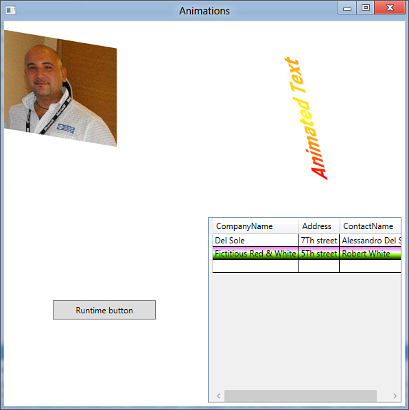
Figure 30.14. The application runs the Visual Basic-generated animation.
Summary
Windows Presentation Foundation offers great benefits for customizing user interface elements. In this chapter you got a high-level overview of the modes allowed for customizing elements and for making them more interesting to the final user. First, you got information about brushes and saw how many brushes are offered by WPF and how you can apply them for coloring or filling visual elements. Next, you learned about styles, understanding how you can use them for setting a common set of properties for the specified control type. Subsequently, you got an overview of control templates, learning how you can completely redefine the graphical aspect of a user control while keeping its behavior safe. You also got information on transformations, learning how they can dynamically change controls’ appearance. Finally, you took a tour of animations, seeing how you can enrich your user interface with cool animations that take advantage of transformations. In the next chapter, we discuss other important features of WPF—the ability to create dynamic documents and manage media contents.