
Chapter 32. Introducing Data-Binding
Many developers erroneously used to think of Windows Presentation Foundation (WPF) as just a multimedia platform, especially when the first versions came out. WPF is instead a complete framework for rich client applications development, including datacentric applications. This technology offers a powerful data-binding engine, and version 4.5 provides the ideal environment for building great business applications. This chapter provides a high-level introduction to the data-binding in WPF 4.5 with Visual Basic 2012, discussing the most important .NET objects that you can explore in further studies by applying WPF-specific patterns such as Model-View-View Model (MVVM).
System Requirements
Introducing the Data-Binding in WPF
Windows Presentation Foundation offers a powerful data-binding engine, held by the System.Windows.Data namespace, which makes binding data to the user interface (UI) and receiving input from the user even simpler. At a higher level, you perform data-binding between a user control and a data source making use of the Binding markup extension, which a lot of controls enable. It is worth mentioning that in WPF, a data source can be a collection of .NET objects but also a property from another user control. The following examples show you both scenarios. Particularly, you receive an explanation of the DataGrid control for tabular data representations and the ObservableCollection(Of T) in action for binding to a collection. Before going on, create a new WPF project with Visual Basic and name it IntroducingDataBinding. When the code editor is ready, write the following XAML code that divides the root Grid into two columns and adds some controls that will be necessary for the next examples:
<Grid Name="Grid1">
<Grid.ColumnDefinitions>
<ColumnDefinition Width="200" />
<ColumnDefinition />
</Grid.ColumnDefinitions>
<StackPanel Grid.Column="0">
<TextBox Name="ValueTextBox"
Margin="5"/>
<Slider Name="ValueSlider" Margin="5"
Minimum="0" Maximum="10"/>
</StackPanel>
<StackPanel Grid.Column="1">
<DataGrid Name="DataGrid1"
Height="150"/>
<TextBox Margin="5" Foreground="Red"
Name="LogBox"
Height="100"/>
</StackPanel>
</Grid>
Utilized user controls now have no other properties than the ones necessary for defining their layout, which are set in code in the next sections.
Binding UI Elements with the Binding Markup Extension
You perform data-binding between a user control and a data source via the Binding XAML markup extension. Such an extension requires specifying two properties: ElementName, which is the source item name, and Path, which is the property containing the actual data to bind and whose name must be exposed by the object assigned to ElementName. The following example, in which you have to substitute to the first TextBox in the earlier example, shows how to bind the context of a TextBox to the value of a Slider control so that when the user moves the selector, the slider value is reflected into the TextBox:
<TextBox Text="{Binding ElementName=ValueSlider,
Path=Value}"
Name="ValueTextBox"
Margin="5"/>
Binding has to be applied to the property that will present bound data—in this case Text. If you now run the application and move the selector on the slider, you see how its value is reflected as the TextBox.Text content, as demonstrated in Figure 32.1.
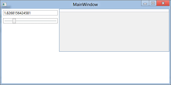
Figure 32.1. Binding a control’s property to another control’s content.
This is the most basic data-binding example and can be considered as the one-way mode because the binding is performed only from the data-source (the Slider.Value property) to the UI control (the TextBox). In fact, the data-binding does not return a value from the TextBox to the Slider. To accomplish this, which means updating the Slider value according to the TextBox content, we need the two-way data-binding that enables binding from and to the data source. You apply for two-way data-binding by adding the Mode=TwoWay assignment within the Binding markup extension. The following code demonstrates this:
<TextBox Text="{Binding ElementName=ValueSlider,
Path=Value, Mode=TwoWay}"
Name="ValueTextBox"
Margin="5"/>
<Slider Name="ValueSlider" Margin="5"
Minimum="0" Maximum="10"
Value="{Binding ElementName=ValueTextBox,
Path=Text, Mode=TwoWay}"/>
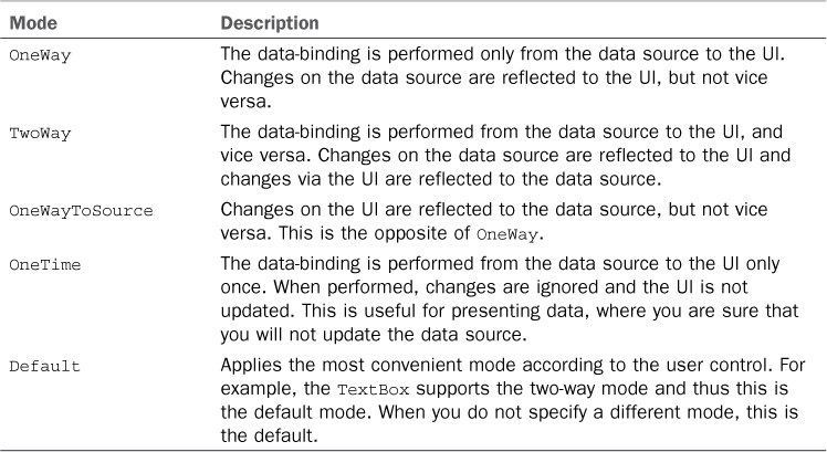
Notice how both controls need to set binding on the two-way mode so that they can reflect each other’s value. If you run the application, you can see how the slider’s selector value is updated according to the text box content. One-way and two-way are not the only allowed modes. Table 32.1 summarizes available data-binding modes in WPF, exposed by the System.Windows.Data.BindingMode enumeration.
Table 32.1. Available Data-Binding Modes
Creating Bindings with Visual Basic
In case you need to create data-binding expressions at runtime, you need to write some Visual Basic code. You need an instance of the System.Windows.Data.Binding class setting some of its property and then pass such instance to the target control. The following snippet reproduces the data-binding expression described in the previous section, this time utilizing Visual Basic code:
Dim bind As New Binding
'Instead of ElementName, use Source assigning the control
bind.Source = ValueSlider
bind.Path = New PropertyPath("Value")
bind.Mode = BindingMode.TwoWay
'You set the binding considering a dependency property
Me.ValueTextBox.SetBinding(TextBox.TextProperty, bind)
Until now you saw the most basic data-binding technique that can be useful when you need to make controls depend on other controls’ properties. In the next section you will see data-binding techniques against data sources based on .NET collections.
Understanding the DataGrid and the ObservableCollection
In most cases you perform data-binding operations against .NET collections, even when fetching data from databases. WPF offers a different binding mechanism, such as user controls like the new DataGrid, the ListView, or the ListBox; you can bind specific data to single controls like TextBox (for example, when building master-details representations). In this book, which targets Visual Basic 2012 and .NET 4.5, you get an example of how to take advantage of the new DataGrid control, which offers a convenient and fast way for tabular data. The goal of the next example is binding a collection of objects to a DataGrid enabling you to insert/update/delete operations onto the collection. First, add a new implementation of the Person class to the project as follows:
Public Class Person
Public Property FirstName As String
Public Property LastName As String
Public Property Age As Integer
End Class
Now add a new People class, which inherits from ObservableCollection(Of Person) as follows:
Imports System.Collections.ObjectModel
Public Class People
Inherits ObservableCollection(Of Person)
End Class
This new collection is the data source for binding to the DataGrid. Now go to the VB code behind the file for the main window. You need to declare a variable of type People and handle the Window_Loaded event to instantiate some Person objects to populate the collection. The following code accomplishes this:
Private WithEvents source As People
Private Sub MainWindow_Loaded(ByVal sender As Object,
ByVal e As System.Windows.
RoutedEventArgs) Handles Me.Loaded
Dim personA As New Person With {.FirstName = "Alessandro",
.LastName = "Del Sole",
.Age = 35}
'fantasy name
Dim personB As New Person With {.FirstName = "Robert",
.LastName = "White",
.Age = 38}
source = New People From {personA, personB}
Me.Grid1.DataContext = source
'If you plan to data-bind only the DataGrid:
'Me.DataGrid1.ItemsSource = source
End Sub
You easily created an instance of the People collection with collection initializers. The most important thing here is the assignment of the Grid.DataContext property. As a general rule, DataContext is a property that points to a data source, and all children controls within the panel that exposes the DataContext property will populate by picking up data from this property. This also means that DataContext has scope; for example, the Window.DataContext property can share data to all controls in the user interface, whereas the DataContext from a particular panel can share data only with controls nested in that particular panel. In the previous code example, only controls nested in the Grid (including thus the DataGrid) can populate picking data from the DataContext. This is not mandatory. If you have a single control that you want to bind, you do not need to assign the DataContext, but you can assign the specific control data property. For instance, the DataGrid control exposes an ItemsSource property (like ListView and ListBox) that populates the control. Data-binding to user interface controls in WPF is possible thanks to the implementation of the INotifyPropertyChanged interface. Controls can reflect changes from data sources that implement that interface. The ObservableCollection(Of T) generic collection also implements behind the scenes and therefore can notify the user interface of changes so that it can be refreshed automatically. This is the reason we use such a collection in the example. This specialized collection is also interesting because it enables you to get information on what changed on data. It exposes a CollectionChanged event that offers an argument of type NotifyCollectionEventArgs that offers some useful information. For example, it enables intercepting when an item is added or removed or retrieving a collection of added items. Continuing with the example, suppose you want to create a sort of log to write a message each time an item is added or removed from the source collection. This is useful for demonstrating that the collection is effectively updated with changes performed through the user interface. The second TextBox in the user interface of the sample application is the place where log messages will be put. According to this, consider the following code snippet that provides an event handler for the CollectionChanged event:
'Requires an Imports System.Collections.Specialized directive Private Sub
source_CollectionChanged(ByVal sender As Object,
ByVal e As _
NotifyCollectionChangedEventArgs) _
Handles source.CollectionChanged
Me.LogBox.Text += e.Action.ToString & Environment.NewLine
End Sub
The code sends to the text box the current value of the System.Collection.Specialized.NotifyCollectionChangedAction enumeration, which can be one of the following: Add, Remove, Move, Replace, or Reset. If you perform multiple CRUD operations on an ObservableCollection instance, you might also be interested in the NewItems and OldItems properties. They represent a collection of items added to the data source and a collection of items affected by a remove, replace, or move operation, respectively. Before running the application, it is necessary to perform a couple of operations on the DataGrid at the XAML level; therefore, switch back to the XAML code editor. Extend the DataGrid declaration as follows:
<DataGrid Name="DataGrid1"
AutoGenerateColumns="True"
AlternatingRowBackground="LightGreen"
ItemsSource="{Binding}"
Height="150"/>
First, the DataGrid automatically generates columns for you according to each property exposed by a single item (Person) in the bound collection (People). Second, the ItemsSource, which populates the control, is set to Binding with no arguments—meaning that the data-binding will be performed at runtime. Notice how the AlternatingRowBackground property enables specifying a color (which you can eventually replace with a brush) for the background in alternating rows. Now run the application. You get the result shown in Figure 32.2.
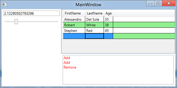
Figure 32.2. The data-bound DataGrid enables you to present and manipulate data.
Datagrid Binding Tips
Different from controls such as the ListView and the ListBox, the DataGrid enables you to bind any collection implementing IList or IBindingList. This is because such control requires a place for editing, other than presenting. So remember this requirement when you try to bind the result of LINQ queries to a DataGrid, which requires conversion into a generic collection. For LINQ, if you try to bind LINQ to XML, query results also remember to create a class for holding objects, just like the Person class and People collection instead of directly binding the query result.
If you play with the DataGrid, you can easily understand how it enables adding, removing, and editing items. The log text box stores messages each time you perform an operation, confirming that the underlying collection is actually affected by changes performed through the user interface. You can then plan to implement some code for saving your data. The DataGrid exposes other interesting properties:
• SelectedItem, which returns the instance of the selected object in the control
• CurrentCell, which returns the content of the selected cell
• CanUserAddRows and CanUserRemoveRows, which provide (or not) the user the ability of adding and deleting rows, respectively
• CanUserReorderColumns, CanUserResizeColumns, CanUserSortColumns, which provide (or not) the ability of changing the order of resizing and sorting columns
• CanUserResizeRows, which provides (or not) the ability of resizing rows
• RowStyle, which enables you to override the style for rows
So far, you’ve seen simple data-binding tasks, although the last code example provides a good way for understanding the mechanism. WPF data-binding is even more complex and the .NET Framework offers specific objects that are important in more articulate scenarios. The next section describes such objects taking advantage of new Visual Studio features.
Discussing the Drag’n’Drop Data-Binding
Visual Studio 2012 retakes from its predecessor the feature of the drag’n’drop data-binding, something that was already available in Windows Forms for many years. The drag’n’drop data-binding enables developers to quickly build data forms in WPF by dragging items from the Data Sources window, and Visual Studio will generate all the code for you, including master-details scenarios. This section explains how you can take advantage of the WPF drag’n’drop data-binding to easily build data forms, explaining the meaning and behavior of the autogenerated code.
Tip
The drag’n’drop data-binding has some limitations, and in many cases you need to put your hands over the autogenerated code or write your own data-binding code from scratch. This new technique offers several advantages: The result is completely customizable, as in the style of WPF applications; second, if you are new to data-binding in WPF, it enables you to understand how things work against a more complex data-source (such as an EDM or a DataSet). Finally, it also provides the ability of separating the data-source from the user interface, although this is something that you will probably need to edit according to your application logic.
To complete the next code examples, follow these steps:
1. Create a new WPF project for Visual Basic.
2. Add a new Entity Data Model based on the Northwind sample database, ensuring that you include the Customers and Orders tables. If you need a recap, take a look at Chapter 26, “Introducing ADO.NET Entity Framework.”
After this brief introduction, it is time to understand how easy building data forms is with WPF 4.5.
Creating Tabular Data Forms
The goal of the next example is to show how simple it is to create tabular data representations, also taking a look at necessary objects for performing data-binding in code. To accomplish this, first divide the default Grid into two columns as follows:
<Grid>
<Grid.ColumnDefinitions>
<ColumnDefinition Width="200"/>
<ColumnDefinition/>
</Grid.ColumnDefinitions>
</Grid>
Next, add a ListBox control either by dragging it from the Toolbox or by writing the following code (for better layout purposes, ensure that you place it in the left column):
<ListBox Name="CustomersListBox"
Grid.Column="0"/>
This ListBox stores a list of customers’ names that will be added shortly. Now open the Data Sources window by clicking Shift+Alt+D. The result looks similar to Figure 32.3, depending on how many entities you added to the Entity Data Model.
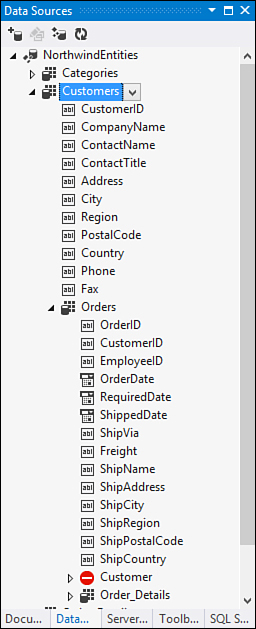
Figure 32.3. The Data Source window lists entities from the EDM.
The default icon near each entity name indicates that data will be represented as tabular, but you can replace this representation with a list view or with a details view by selecting the appropriate value from the combo box on the right side of each entity name. (At the moment, leave the default selection unchanged.) Now, expand the Customers entity (as shown in Figure 32.3) and select the CompanyName item; then drag it onto the ListBox and release the mouse. When you release the mouse, you will not notice anything new on the designer surface, but look at what happened in the XAML code editor:
<Window.Resources>
<CollectionViewSource x:Key="CustomersViewSource"
d:DesignSource=
"{d:DesignInstance my:Customer,
CreateList=True}" />
</Window.Resources>
<Grid DataContext="{StaticResource CustomersViewSource}">
<Grid.ColumnDefinitions>
<ColumnDefinition Width="200"/>
<ColumnDefinition/>
</Grid.ColumnDefinitions>
<ListBox Name="CustomersListBox"
Grid.Column="0" DisplayMemberPath="CompanyName"
ItemsSource="{Binding}" />
</Grid>
Visual Studio generates some code, both XAML and Visual Basic, each time you perform some drag’n’drop action. For now, it generated a CollectionViewSource object within the window’s resources. You can compare the WPF CollectionViewSource to the Windows Forms’ BindingSource control, which acts like a bridge between the underlying data collection and the user interface. The code states that such CollectionViewSource is populated via a list (CreateList=True) of Customer instances. This statement is accomplished via the d:DesignInstance custom markup extension, exposed by the d XML namespace that points to Microsoft Expression Blend schema for WPF. This is useful because it provides resources for design-time data-binding. Notice also how Visual Studio added a DataContext property for the default Grid, whose source is the previously described CollectionViewSource. In this way, all child controls will populate by picking data from the CollectionViewSource. You can get an example of this by taking a look at the ListBox overridden definition: It is populated with data-binding (ItemsSource property) and shows just the value of the CompanyName property (DisplayMemberPath) for each item in the bound collection. Now drag onto the form the Orders item from the Data Sources window, ensuring that you drag the one nested within Customers. When dragged and dropped, the result should look like Figure 32.4.
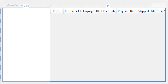
Figure 32.4. The result of the drag’n’drop operations in the Visual Studio designer.
First, notice how the new DataGrid control enables you to build tabular data representations. By dragging the data source, Visual Studio generated all the necessary items for you. If you now take a look at the XAML code editor, you will first notice a second CollectionViewSource referring to the Orders data:
<CollectionViewSource x:Key="CustomersOrdersViewSource"
Source="{Binding Path=Orders,
Source={StaticResource CustomersViewSource}}" />
Notice how the source for the data-binding is the Orders collection from the previously generated CustomersViewSource object of type CollectionViewSource. Next, Visual Studio also generated markup code for the DataGrid. For this, it did not take advantage of columns autogeneration; it instead created specific columns for each property in the bound collection. This enables the IDE to also generate custom cell templates that can show data with the appropriate control. The following is the XAML code for the DataGrid:
<DataGrid AutoGenerateColumns="False"
EnableRowVirtualization="True"
Grid.Column="1"
ItemsSource="{Binding
Source={StaticResource CustomersOrdersViewSource}}"
Name="OrdersDataGrid"
RowDetailsVisibilityMode="VisibleWhenSelected">
<DataGrid.Columns>
<DataGridTextColumn x:Name="OrderIDColumn"
Binding="{Binding Path=OrderID}"
Header="Order ID"
Width="SizeToHeader" />
<DataGridTextColumn x:Name="CustomerIDColumn"
Binding="{Binding Path=CustomerID}"
Header="Customer ID"
Width="SizeToHeader" />
<DataGridTextColumn x:Name="EmployeeIDColumn"
Binding="{Binding Path=EmployeeID}"
Header="Employee ID"
Width="SizeToHeader" />
<DataGridTemplateColumn x:Name="OrderDateColumn"
Header="Order Date"
Width="SizeToHeader">
<DataGridTemplateColumn.CellTemplate>
<DataTemplate>
<DatePicker
SelectedDate="{Binding Path=OrderDate}" />
</DataTemplate>
</DataGridTemplateColumn.CellTemplate>
</DataGridTemplateColumn>
<DataGridTemplateColumn x:Name="RequiredDateColumn"
Header="Required Date"
Width="SizeToHeader">
<DataGridTemplateColumn.CellTemplate>
<DataTemplate>
<DatePicker
SelectedDate="{Binding Path=RequiredDate}" />
</DataTemplate>
</DataGridTemplateColumn.CellTemplate>
</DataGridTemplateColumn>
<DataGridTemplateColumn x:Name="ShippedDateColumn"
Header="Shipped Date"
Width="SizeToHeader">
<DataGridTemplateColumn.CellTemplate>
<DataTemplate>
<DatePicker
SelectedDate="{Binding Path=ShippedDate}" />
</DataTemplate>
</DataGridTemplateColumn.CellTemplate>
</DataGridTemplateColumn>
<DataGridTextColumn x:Name="ShipViaColumn"
Binding="{Binding Path=ShipVia}"
Header="Ship Via"
Width="SizeToHeader" />
<DataGridTextColumn x:Name="FreightColumn"
Binding="{Binding Path=Freight}"
Header="Freight"
Width="SizeToHeader" />
<DataGridTextColumn x:Name="ShipNameColumn"
Binding="{Binding Path=ShipName}"
Header="Ship Name"
Width="SizeToHeader" />
<DataGridTextColumn x:Name="ShipAddressColumn"
Binding="{Binding Path=ShipAddress}"
Header="Ship Address"
Width="SizeToHeader" />
<DataGridTextColumn x:Name="ShipCityColumn"
Binding="{Binding Path=ShipCity}"
Header="Ship City"
Width="SizeToHeader" />
<DataGridTextColumn x:Name="ShipRegionColumn"
Binding="{Binding Path=ShipRegion}"
Header="Ship Region"
Width="SizeToHeader" />
<DataGridTextColumn x:Name="ShipPostalCodeColumn"
Binding="{Binding Path=ShipPostalCode}"
Header="Ship Postal Code"
Width="SizeToHeader" />
<DataGridTextColumn x:Name="ShipCountryColumn"
Binding="{Binding Path=ShipCountry}"
Header="Ship Country"
Width="SizeToHeader" />
</DataGrid.Columns>
</DataGrid>
The DataGrid data source is set via the ItemsSource property pointing to the CustomersOrdersViewSource object, which includes information from both Customers and related Orders. The rest of the code is quite simple to understand. Each column has a cell template, which is of type DataGridTextColumn for text fields. Other built-in types are DataGridHyperLinkColumn for displaying hyperlinks, DataGridCheckBoxColumn for displaying Boolean values with a check box control, and DataGridComboBoxColumn for selecting items from within a combo box. It is worth mentioning that for data types, the DataGrid has no default counterpart. Visual Studio generates a custom cell template with DataGridTemplateColumn objects. In this case the custom template has been generated for embedding DatePicker controls for setting and displaying dates within cells.
Designing Columns
The IDE provides a convenient way for designing columns with the designer instrumentation. Select the DataGrid and in the Properties window, click Columns. Figure 32.5 shows how you can edit existing columns or add new ones, also setting data-binding at design time.
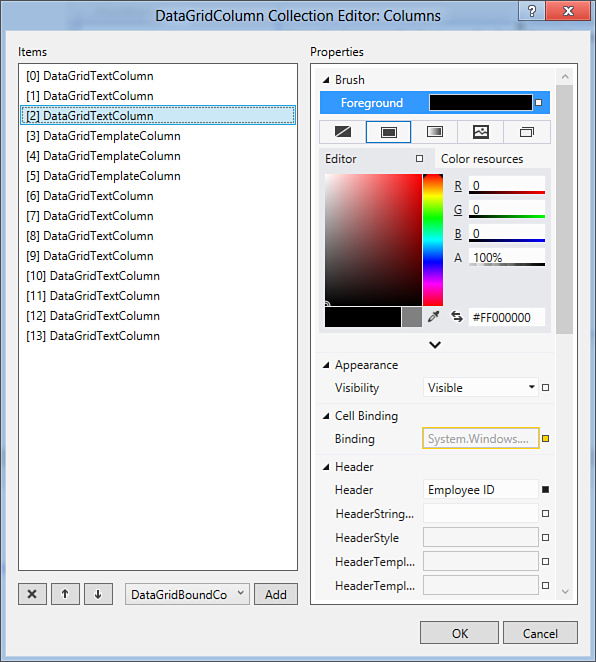
Figure 32.5. Designing columns with Visual Studio.
This is not enough, of course, in that some Visual Basic code is also required for fetching data and assigning the data to the user interface for presenting. If you now open the Visual Basic code behind the file for the current Window, you get the result shown in Listing 32.1.
Listing 32.1. The VB Auto-Generated Code for the Drag’n’Drop Data-Binding
'Add an Imports directive followed by the project namespace
Imports IntroducingDataBinding
Class MainWindow
Private Function GetCustomersQuery(ByVal NorthwindEntities As NorthwindEntities)_
As System.Data.Objects.ObjectQuery(Of Customer)
Dim CustomersQuery As System.Data.Objects.ObjectQuery(Of Customer) = _
NorthwindEntities.Customers
'Update the query to include Orders data in Customers.
'You can modify this code as needed.
CustomersQuery = CustomersQuery.Include("Orders")
'Returns an ObjectQuery.
Return CustomersQuery
End Function
Private Sub Window_Loaded(ByVal sender As System.Object,
ByVal e As System.Windows.RoutedEventArgs) _
Handles MyBase.Loaded
Dim NorthwindEntities As NorthwindEntities = New NorthwindEntities()
'Load data into Customers. You can modify this code as needed.
Dim CustomersViewSource As System.Windows.Data.CollectionViewSource = _
CType(Me.FindResource("CustomersViewSource"),
System.Windows.Data.CollectionViewSource)
Dim CustomersQuery As System.Data.Objects.ObjectQuery(Of Customer) = _
Me.GetCustomersQuery(NorthwindEntities)
CustomersViewSource.Source = CustomersQuery.Execute(System.Data.Objects.
MergeOption.AppendOnly)
End Sub
End Class
The GetCustomersQuery method returns the full list of customers and related orders, returning a new Entity Framework object, ObjectQuery(Of T). Such an object type represents a typed query and is also capable of receiving data back. Such a query is a default one; therefore, you can customize it according to your needs. When the window is loaded, other than the ObjectContext instance, notice how the code retrieves the instance of the CustomersViewSource (of type CollectionViewSource) via the FindResource method, which enables searching for a resource declared in XAML. This instance will finally receive the executed query so that its result will be reflected to the user interface. The process is the following: The query fetches data; data is assigned to a CollectionViewSource instance; because this instance is bound to a UI control (such as the DataGrid), fetched data is reflected to the UI, and vice versa. This is also because the DataGrid control provides support for the two-way data-binding, and is also allowed by the ObjectQuery(Of T) class. At this point, you can run the application to see the result shown in Figure 32.6.
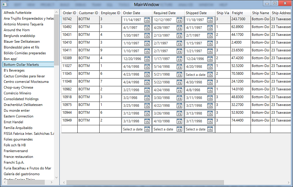
Figure 32.6. The tabular data application running.
With a few mouse clicks, you can build an application that can present tabular data. You can click inside the DataGrid for editing existing data or for adding new rows. If you want to save data to the underlying database, you should implement a control, such as a Button, whose Click event handler invokes the ObjectContext.SaveChanges method, and you are done. But you see this example in the next section, which is interesting but that requires a little bit of manual work.
Creating Master-Details Forms
Similarly to what already happened in Windows Forms, creating master-details forms in WPF 4.5 is also straightforward. This also enables you to understand other important concepts for the data-binding. Add a new window to the current project and name it MasterDetails. Divide the default Grid into four cells, so that you can also add special buttons, as follows:
<Grid>
<Grid.ColumnDefinitions>
<ColumnDefinition Width="200"/>
<ColumnDefinition/>
</Grid.ColumnDefinitions>
<Grid.RowDefinitions>
<RowDefinition/>
<RowDefinition Height="50"/>
</Grid.RowDefinitions>
</Grid>
Repeat the step of adding a ListBox and binding the customer’s CompanyName property, just as in the first part of the previous subsection. Ensure that the ListBox is placed in the upper-left column. Visual Studio 2012 generates exactly the same XAML code of the previous example for you. Now go to the Data Sources window, select the Orders item nested within Customers; then from the combo box, select Details. Next, drag Orders onto the upper-right cell of the window. Figure 32.7 shows the result of this operation.
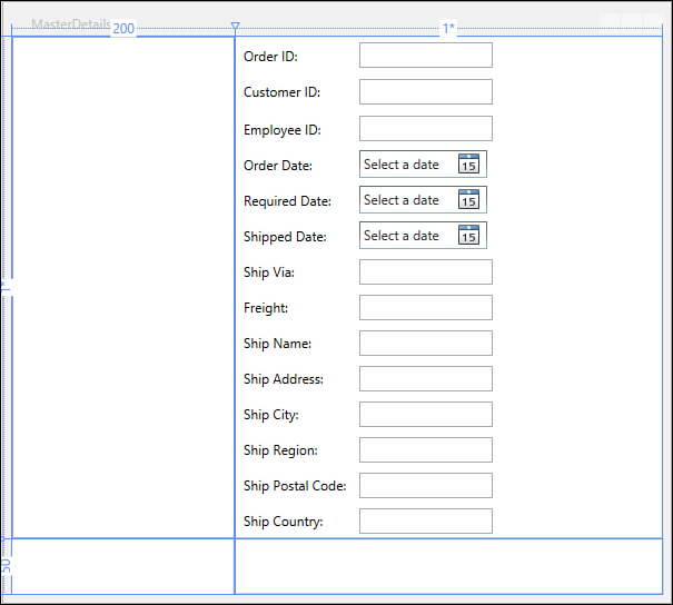
Figure 32.7. The result of the master-details drag’n’drop.
Notice how Visual Studio generated a series of controls, which are couples of Label/TextBlock. Also notice how the IDE can recognize the bound data type and add the appropriate controls. For example, for dates, it adds to the form some DatePicker controls. Instead of a DataGrid, the autogenerated XAML code contains a new Grid with a series of children controls. Listing 32.2 shows an excerpt of the content of the new Grid.
Listing 32.2. Excerpt of the Autogenerated XAML Code for Details
<Grid DataContext="{StaticResource CustomersOrdersViewSource}"
Grid.Column="1"
Grid.Row="0" Name="Grid1" >
<Grid.ColumnDefinitions>
<ColumnDefinition Width="Auto" />
<ColumnDefinition Width="Auto" />
</Grid.ColumnDefinitions>
<Grid.RowDefinitions>
<RowDefinition Height="Auto" />
<RowDefinition Height="Auto" />
<RowDefinition Height="Auto" />
<RowDefinition Height="Auto" />
<RowDefinition Height="Auto" />
<RowDefinition Height="Auto" />
<RowDefinition Height="Auto" />
<RowDefinition Height="Auto" />
<RowDefinition Height="Auto" />
<RowDefinition Height="Auto" />
<RowDefinition Height="Auto" />
<RowDefinition Height="Auto" />
<RowDefinition Height="Auto" />
<RowDefinition Height="Auto" />
</Grid.RowDefinitions>
<Label Content="Order ID:" Grid.Column="0" Grid.Row="0"
HorizontalAlignment="Left" Margin="3"
VerticalAlignment="Center" />
<TextBox Grid.Column="1" Grid.Row="0" Height="23"
HorizontalAlignment="Left" Margin="3" Name="OrderIDTextBox"
Text="{Binding Path=OrderID}"
VerticalAlignment="Center" Width="120" />
<Label Content="Customer ID:" Grid.Column="0" Grid.Row="1"
HorizontalAlignment="Left" Margin="3"
VerticalAlignment="Center" />
<TextBox Grid.Column="1" Grid.Row="1" Height="23"
HorizontalAlignment="Left" Margin="3" Name="CustomerIDTextBox"
Text="{Binding Path=CustomerID}"
VerticalAlignment="Center" Width="120" />
<Label Content="Employee ID:" Grid.Column="0" Grid.Row="2"
HorizontalAlignment="Left" Margin="3"
VerticalAlignment="Center" />
<TextBox Grid.Column="1" Grid.Row="2" Height="23"
HorizontalAlignment="Left"
Margin="3" Name="EmployeeIDTextBox"
Text="{Binding Path=EmployeeID}"
VerticalAlignment="Center" Width="120" />
<Label Content="Order Date:" Grid.Column="0" Grid.Row="3"
HorizontalAlignment="Left" Margin="3"
VerticalAlignment="Center" />
<DatePicker Grid.Column="1" Grid.Row="3" Height="25"
HorizontalAlignment="Left" Margin="3"
Name="OrderDateDatePicker"
SelectedDate="{Binding Path=OrderDate}"
VerticalAlignment="Center" Width="115" />
<!--Following other controls... -->
</Grid>
The code implements pairs of labels/text. For dates, you can notice the presence of DatePicker controls whose SelectedDate property is bound to the date property from the data source. If you take a look at the Visual Basic autogenerated code, you see no differences with the one shown in the first example. Now there is some other work to do. Building a master-details form requires providing controls for navigating, adding, deleting, and saving items. Now, you need to add the following XAML code, which implements some buttons whose meanings should be self-explanatory:
<StackPanel Grid.Row="1" Grid.Column="1" Orientation="Horizontal">
<StackPanel.Resources>
<Style TargetType="Button" x:Key="ButtonStyle">
<Setter Property="Width" Value="80"/>
<Setter Property="Height" Value="40"/>
<Setter Property="Margin" Value="5"/>
</Style>
</StackPanel.Resources>
<Button Style="{StaticResource ButtonStyle}" Content="Save"
Name="SaveButton" Click="SaveButton_Click"/>
<Button Style="{StaticResource ButtonStyle}" Content="Add"
Name="AddButton" Click="AddButton_Click"/>
<Button Style="{StaticResource ButtonStyle}" Content="Delete"
Name="DeleteButton" Click="DeleteButton_Click"/>
<Button Style="{StaticResource ButtonStyle}" Content="Next"
Name="NextButton" Click="NextButton_Click"/>
<Button Style="{StaticResource ButtonStyle}" Content="Back"
Name="BackButton" Click="BackButton_Click"/>
</StackPanel>
Now switch to the Visual Basic code. The first task is moving the ObjectContext declaration at class level, to make it reachable from within other methods. Replace the NorthwindEntities variable declaration with the northwindContext name to avoid conflicts, move it to class level, and edit the first line of the Window_Loaded event as follows:
Private northwindContext As NorthwindEntities
Private Sub Window_Loaded(ByVal sender As System.Object,
ByVal e As System.Windows.RoutedEventArgs) _
Handles MyBase.Loaded
Me.northwindContext = New NorthwindEntities
The first button that can be handled is the SaveButton. The Click event handler is the following:
Private Sub SaveButton_Click(ByVal sender As System.Object,
ByVal e As System.Windows.
RoutedEventArgs)
'Handle your logic here, such as exceptions
'and optimistic concurrency
Try
Me.northwindContext.SaveChanges()
Catch ex As Exception
End Try
End Sub
The second task is moving to class level the CollectionViewSource objects declarations so that we can invoke them within event handlers. They actually are enclosed in the Window_Loaded event handler and thus have no external visibility. Moreover, we also need to manually declare and get the instance of the CustomersOrdersCollectionViewSource object because the application needs to provide the ability of adding and removing items only to the Orders collection. (Performing this on CustomersViewSource would affect Customers, too.) The code in Listing 32.3 summarizes the edits that you need to do manually at this point.
Listing 32.3. Moving CollectionViewSource Declarations at Class Level
Private CustomersViewSource As CollectionViewSource
Private CustomersOrdersViewSource As CollectionViewSource
Private Sub Window_Loaded(ByVal sender As System.Object,
ByVal e As System.Windows.RoutedEventArgs) _
Handles MyBase.Loaded
Me.northwindContext = New NorthwindEntities
'Load data into Customers. You can modify this code as needed.
Me.CustomersViewSource = CType(Me.FindResource("CustomersViewSource"),
CollectionViewSource)
Me.CustomersOrdersViewSource =
CType(Me.FindResource("CustomersOrdersViewSource"),
CollectionViewSource)
Dim CustomersQuery As System.Data.Objects.
ObjectQuery(Of IntroducingDataBinding.Customer) = _
Me.GetCustomersQuery(northwindContext)
CustomersViewSource.Source = CustomersQuery.
Execute(System.Data.Objects.
MergeOption.AppendOnly)
End Sub
The next buttons require explaining other concepts, which the next sections cover.
Understanding Views and Binding Lists
CollectionViewSource objects expose an interesting property named View. It provides the ability of filtering, sorting, and navigating through a bound collection of items. To understand how a view works, the best example in our scenario is handling the Next and Back buttons. The following code snippet shows how easy it is to navigate back and forward through items:
Private Sub NextButton_Click(ByVal sender As System.Object,
ByVal e As System.Windows.RoutedEventArgs)
If Me.CustomersOrdersViewSource.View.CurrentPosition < _
CType(Me.CustomersOrdersViewSource.View, CollectionView).
Count - 1 Then
Me.CustomersOrdersViewSource.View.MoveCurrentToNext()
End If
End Sub
Private Sub BackButton_Click(ByVal sender As System.Object,
ByVal e As System.Windows.RoutedEventArgs)
If Me.CustomersOrdersViewSource.View.CurrentPosition > 0 Then
Me.CustomersOrdersViewSource.View.MoveCurrentToPrevious()
End If
End Sub
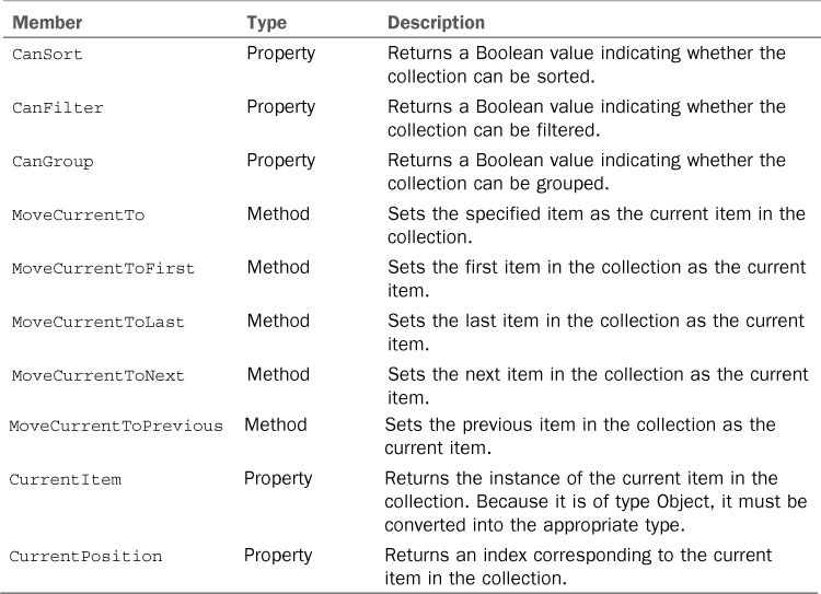
The code calculates the position and enables moving back or forward only if there are any other items that can be navigated. Notice how the CustomersOrdersViewSource.View property exposes the Count property, representing the current position being examined in the collection. Methods such as MoveCurrentToNext and MoveCurrentToPrevious enable moving back and forward to another item. Other interesting members from views are self-explanatory and are summarized in Table 32.2.
Table 32.2. Views’ Most Common Members
To retrieve the items count, a CType operator converts from CollectionViewSource.View into a CollectionView object. This last one represents a single view, and the conversion is required because Option Strict is On and the View property is of type ICollectionView. Views from CollectionViewSource objects are straightforward because they also support data-binding but have several limitations. As you can see from Table 32.2, no member is exposed for adding, editing, or removing items in the underlying data collection. To provide the ability of CRUD operations, the best approach is utilizing a System.Window.Data.Binding ListCollectionView, which also offers a reference to data collections but provides more capabilities. At class level, declare the following variables:
Private WithEvents CustomerView As BindingListCollectionView
Private CustomersOrdersView As BindingListCollectionView
Now, in the Window_Loaded event handler, add the following lines as the last lines of code in the method:
Me.CustomerView = CType(Me.CustomersViewSource.View,
BindingListCollectionView)
Me.CustomersOrdersView = CType(Me.CustomersOrdersViewSource.View,
BindingListCollectionView)
This converts views references to two BindingListCollectionView objects. Now with these you can perform insert/update/delete operations to the underlying collection, which is picked up from the CollectionViewSource associations and is data-bound to the BindingListCollectionView, too. To understand how this works, write the following handler for the Click event about the Add button so that we can provide the capability of adding a new order:
Private Sub AddButton_Click(ByVal sender As System.Object,
ByVal e As System.Windows.RoutedEventArgs)
'A new order
Dim newOrder As Order
'Adds a new order to the view and assigns the instance
'to the newly declared order
newOrder = CType(Me.CustomersOrdersView.AddNew(), Order)
'If I need to assign properties to newOrder before
'it is sent to the collection, then this is the place
'Sends the new order to the view
Me.CustomersOrdersView.CommitNew()
End Sub
The AddNew method adds an instance of the specified object type to the view, and the addition is automatically reflected to the bound user interface controls. The CType conversion is required because the method returns Object; therefore, converting to the appropriate type returns the effective instance of the order. This is not actually required, but it is useful if you want to set some default properties before the object is sent to the underlying collection. Notice that this code submits the new item to the underlying collection, but the new object will not persist to the underlying database until you invoke the ObjectContext.SaveChanges method. Removing items works similarly, in that you retrieve the current object instance and invoke one of the enabled methods. The following event handler for the Delete button demonstrates this:
Private Sub DeleteButton_Click(ByVal sender As System.Object,
ByVal e As System.Windows.
RoutedEventArgs)
If Me.CustomersOrdersView.CurrentPosition > -1 Then
Dim result = MessageBox.Show("Are you sure?",
"", MessageBoxButton.YesNo)
If result = MessageBoxResult.Yes Then
Me.CustomersOrdersView.
RemoveAt(Me.CustomersOrdersView.CurrentPosition)
Else
Exit Sub
End If
End If
End Sub
In this case I’m using RemoveAt to remove the item at the current position, but you can also invoke Remove, which requires the instance of the current object. RemoveAt requires fewer lines of code. Before running the application, there is one thing that you need to take care of—and that is the fact that the BindingListCollectionView content needs to be refreshed each time you move to another item in the master part of the master-details relationships. Considering our code example, you need to remember the BindingListCollectionView referred to orders each time you select a different customer. To accomplish this, you handle the CurrentChanged event in the master part of the relationship, as demonstrated by the following code:
Private Sub CustomerView_CurrentChanged(ByVal sender As Object,
ByVal e As System.EventArgs) _
Handles CustomerView.CurrentChanged
Me.CustomersOrdersView = CType(Me.CustomersOrdersViewSource.View,
BindingListCollectionView)
End Sub
The preceding event handler is invoked when you click a different customer in the user interface and refreshes the CustomersOrdersView (of type BindingListCollectionView) object pointing to the actual orders collection referred by the underlying CollectionViewSource. That keeps the data-binding alive. Now you can run the application and get the result summarized in Figure 32.8.
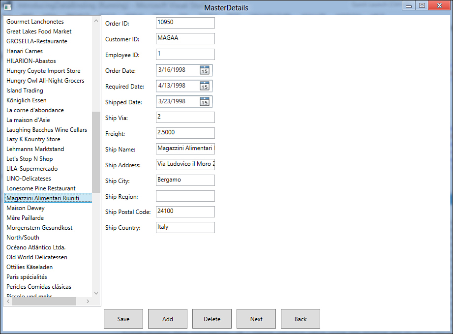
Figure 32.8. The master-details application running.
Binding to Datasets
The drag’n’drop data-binding works the same with DataSets, and you can still take advantage of CollectionViewSource and BindingListCollectionView objects. The code remains the same as the previously shown examples, whereas the difference is where you need to persist data to the database or fetch data, where you can use DataSet methods and LINQ to DataSets, respectively.
You can now play with additional controls such as Add, Delete, Next, and Back. When you are done, try to save changes to ensure that new or edited data is correctly persisted to the database. This sample application can be enhanced in several other ways. For example, you can implement entities validation or showing details for a single order using LINQ. These topics are beyond the scope of an introductory chapter about data-binding, but you can further explore them with the help of the MSDN documentation. Particularly, I suggest you read this blog post by Beth Massi from Microsoft, where she discusses WPF validation on entities: http://blogs.msdn.com/bethmassi/archive/2009/07/07/implementing-validation-in-wpf-on-entity-framework-entities.aspx. Although the blog post targets the .NET Framework 3.5 SP 1, this technique is convenient on .NET 4.0 and 4.5, too.
Implementing String Formatters and Value Converters
The need to represent strings in a more appropriate format when binding data to the user interface is not uncommon. For example, you might want to present money values or percentages. In WPF, you can accomplish this in two modes: string formatters and the IValueConverter interface. This section describes both, showing how they can be used for better presentation purposes.
Implementing String Formatters
You can apply string formats directly in the XAML Binding markup extension that performs data-binding. This enables you to express a particular value type in a more convenient string format. For a better understanding, consider Figure 32.8. Notice how the Freight field is shown as a decimal number. However, you probably want to display it with your currency symbol. Locate the XAML code that implements the Freight textbox and apply the StringFormat property as shown in the following code snippet:
<TextBox Grid.Column="1" Grid.Row="7" Height="23"
HorizontalAlignment="Left" Margin="3"
Name="FreightTextBox"
Text="{Binding Path=Freight, StringFormat=c}"
VerticalAlignment="Center" Width="120" />
The BindingBase.StringFormat property is applied within the Binding markup extension and requires the specification of the formatter. Figure 32.9 shows how the Freight field is now represented with a currency symbol.

Figure 32.9. Representing strings with StringFormat.
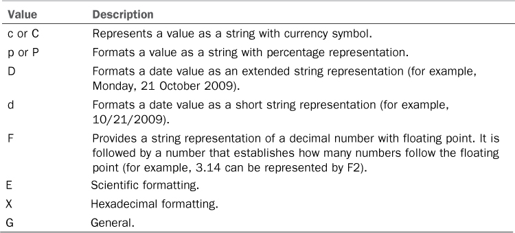
Table 32.3 summarizes the most common StringFormat values.
Table 32.3. Most Common Formatters’ Values
The good news is that string formatters also provide converting the user input. For the Freight example, if you type a value into the field, it is represented as a currency in the user interface, but it is correctly saved to the data source according to the required type. StringFormat also enables string formatting as it happens in Visual Basic code. Consider the following code:
<TextBox Name="FreightTextBox"
Text="{Binding Path=Freight, StringFormat=Amount: {0:c}}"/>
In the preceding code, the Amount word takes the place of 0 at runtime. So the result will be Amount: $1.21. There is another useful technique known as multibinding. The following code demonstrates how you can apply multiple formatters with MultiBinding:
<!--Applies date and currency formatting-->
<TextBlock>
<TextBlock.Text>
<MultiBinding StringFormat="Order date: {0:D}, Cost: {1:C}">
<Binding Path="OrderDate"/>
<Binding Path="OrderPrice"/>
</MultiBinding>
</TextBlock.Text>
</TextBlock>
Several user controls, such as Button and Label, also offer a ContentStringFormat property that enables you to apply formatting to the control’s content the same way as StringFormat works. The following is an example:
<Label ContentStringFormat="C" Content="200"/>
Similarly, controls such as ListView, ListBox, and DataGrid offer the HeaderStringFormat and ItemStringFormat properties that enable you to format the header content for columns and items in the list, respectively. String formatters are straightforward, but in some situations you need more extensive control over value representation, especially when you need to actually convert from one data type to another. This is where IValueConverter comes in.
Implementing the IValueConverter Interface
Sometimes default conversions provided by string formatters are not enough, especially if you have to implement your custom logic when converting from the user input into another type. With IValueConverter, you can implement your custom logic getting control over the conversion process from and to the data source. To follow the next steps, create a new class and name it CustomConverter. When the new class is ready, implement the IValueConverter interface. The resulting code will be the following:
Public Class CustomConverter
Implements IValueConverter
Public Function Convert(ByVal value As Object,
ByVal targetType As System.Type,
ByVal parameter As Object,
ByVal culture As
System.Globalization.CultureInfo) _
As Object Implements _
System.Windows.Data.IValueConverter.Convert
End Function
Public Function ConvertBack(ByVal value As Object,
ByVal targetType As System.Type,
ByVal parameter As Object,
ByVal culture As System.Globalization.
CultureInfo) As Object _
Implements _
System.Windows.Data.IValueConverter.
ConvertBack
End Function
End Class
The interface implementation requires two methods, Convert and ConvertBack. The first one manages data when applying from the data source to the user interface, and the second one manages the conversion when getting back from the user interface to the data source. The most important argument in the Convert method is parameter, which represents how data must be converted. Such data is stored by the value argument. Implementing Convert is quite easy, in that you need to format value as a string according to parameter’s establishment. This can be accomplished taking advantage of the current culture. The following is the standard Convert implementation:
Public Function Convert(ByVal value As Object,
ByVal targetType As System.Type,
ByVal parameter As Object,
ByVal culture As _
System.Globalization.CultureInfo) _
As Object Implements System.Windows.Data.
IValueConverter.Convert
If parameter IsNot Nothing Then
Return String.Format(culture, parameter.ToString, value)
End If
Return value
End Function
This ensures that on the XAML side a valid converter property (reflected by parameter), which is described later, has been provided and that it is not null. In this case the method returns the string representation of the value according to the system culture. If no converter is specified, the method returns the value. ConvertBack is a little bit more complex because it has to convert strings (that is, the user input) into a more appropriate type. The goal of this example is providing conversion from String to Decimal, for money fields. The following code snippet implements the method (see comments for explanations):
Public Function ConvertBack(ByVal value As Object,
ByVal targetType As System.Type,
ByVal parameter As Object,
ByVal culture As System.Globalization.
CultureInfo) As Object _
Implements System.Windows.Data.
IValueConverter.ConvertBack
'If the type to send back to the source is Decimal or Decimal?
If targetType Is GetType(Decimal) OrElse targetType _
Is GetType(Nullable(Of Decimal)) Then
Dim resultMoney As Decimal = Nothing
'Checks if the input is not null
If Decimal.TryParse(CStr(value), resultMoney) = True Then
'in such case, it is returned
Return CDec(value)
'if it is empty, returns Nothing
ElseIf value.ToString = String.Empty Then
Return Nothing
Else
'If it is not empty but invalid,
'returns a default value
Return 0D
End If
End If
Return value
End Function
It is worth mentioning that you need to provide conversion for nullable types, as in the preceding code, if you work against an Entity Data Model (EDM). If your user interface presents data but does not receive input from the user, you can implement ConvertBack by putting a Throw New NotImplementedException as the method body. The MSDN official documentation suggests an interesting best practice when implementing custom converters. This requires applying the ValueConversion attributes to the class; this attribute enables you to specify data types involved in the conversion, as in the following line that has to be applied to the CustomConverter class:
<ValueConversion(GetType(String), GetType(Decimal))>
The first attribute’s argument is the type you need to convert from, and the second one is the type you need to convert to. Custom converters must be applied at XAML level. This requires first adding an XML namespace pointing to the current assembly that defines the class. For the previous example, add the following namespace declaration within the Window element definition, taking care to replace the IntroducingDataBinding name with the name of your assembly (IntelliSense will help you choose):
xmlns:local="clr-namespace:IntroducingDataBinding"
When you have a reference to the assembly, which can be useful for utilizing other classes at the XAML level, you need to declare a new resource that points to the custom converter. Within the Window.Resources element, add the following line:
<local:CustomConverter x:Key="customConverter"/>
Now that the converter has an identifier and can be used at the XAML level, you pass it to the bound property you want to convert. For example, suppose you want to format and convert the Freight property from the Order class. The following code demonstrates how to apply the converter:
<TextBox Grid.Column="1" Grid.Row="7" Height="23"
HorizontalAlignment="Left" Margin="3"
Name="FreightTextBox"
Text="{Binding Path=Freight,
Converter={StaticResource customConverter},
ConverterParameter='{0:c}'}"
VerticalAlignment="Center" Width="120" />
You pass the converter identifier to the Converter property of the Binding markup extension. The ConverterParameter receives the conversion value, which are the same in Table 32.3. If you run the application, you get the result shown in Figure 32.9—the difference is that with custom converters you can control how the conversion and formatting processes behave.
Summary
The data-binding is a key concept in every kind of application, and this is true for WPF, too. In the first part of this chapter, you learned how to apply data-binding to simple controls with the Binding markup extension in XAML code, to bind some properties to the value of other controls or to a .NET data source. For this, you got an overview of the DataGrid control and of the ObservableCollection(Of T) generic class (which you already studied), this time applied to WPF. You found out how the DataGrid supports the two-way data-binding also due to the underlying support for the technique offered by the ObservableCollection. In the second part of the chapter, we covered the drag’n’drop data-binding and how easily you can create data forms. After this discussion, the StringFormat and IValueConverter objects were presented for formatting and converting objects to and from String. There is much more to say about data access in WPF, but it is beyond the scope here. The next chapter is the last one on WPF and is related to another important topic: localization.