
Multi-Resolution Support and Basic User Interface Components
Windows Phone 7.x only had support for WVGA resolution. Windows Phone 8 expands that to include WXGA and HD720p. It’s important to understand how to tailor your application to these different resolutions.
Therefore, the following recipes are included in this chapter:
- Managing Resolution Dependent Assets
- Dynamic Layout
- Adding buttons and menus to the Application Bar
- Page Navigation
- The LongListSelector control
- Enhancing the UI with the Silverlight Toolkit
Table 2-1 lists the different resolutions and how they relate to each other.
Table 2-1. Windows Phone 8 Supported Resolutions, Aspect Ratios, and Scaling Factors
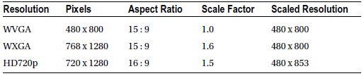
The different number of pixels on the x- and y-axis of each resolution is to be expected, but you’ll notice that HD720p is unique in that it has a different aspect ratio. The HD720p resolution has its origin in high-definition television and is exactly twice the width and one and one half the height of 4:3 VGA. VGA’s aspect ratio and line count is virtually the same as DV-NTSC video. Figure 2-1 shows these resolutions relative to each other.
In general you don't really need to be concerned with these ratios, as everything is worked out for you by the rendering subsystem. There are a few cases, however, where these factors come into play: providing dynamic user interface layout, managing resolution-dependent assets, and working with Direct3D using the Direct3DInterop and DrawingSurface classes.

Figure 2-1. From left to right: WVGA, WXGA, and HD720p
FrameworkElement-derived classes report their ActualWidth and ActualHeight values in Device Independent Pixels. You’ll notice in Table 2-1 that the scale factor for WVGA is 1.0, which means there is a one-to-one ratio between device independent and native pixels. The D3DInterop properties NativeResolution and RenderResolution need to be set in native pixels and the scale factor helps you work this out.
Direct3D programming is beyond the scope of this book1 but we are still left with the problem of resolution-dependent assets and dynamic layout. A recipe is included for each of these scenarios.
With proper scaling taken care of, we move on to the basic user interface components that are integral to Windows Phone application development. The chapter wraps up with an example using the LongListSelector control, which is new to Windows Phone 8, as well as a look at using the Silverlight Toolkit to enhance your mobile application’s user interface.
2-1. Managing Resolution Dependent Assets
Problem
Sometimes you have no choice but to use a bitmapped image. The problem with bitmaps is that there is always some amount of visual compromise when the image is scaled to a different size and changes to the aspect ratio almost never results in a satisfactory result.
Solution
The visual assets you include in your application should, as much as possible, be vector-based. Vector-based graphics have the distinct advantage of being infinitely scalable. You can stretch them as much as you like and they will always look good and not display the pixilation that is common with bitmapped images.
For your application’s splash screen you can do one of two things:
- Add a single 720 x 1280 image named SplashScreenImage.jpg to the root folder of your project and set its Build Action to Content or . . .
- Add three images named SplashScreenImage.screen-WVGA.jpg, SplashScreenImage.screen-WXGA.jpg and SplashScreenImage.screen-720p.jpg each with its corresponding resolution to the root folder of your application. Again, set the Build Action of each file to Content
 Note Sample splash screen images can be found in the Chapter02BasicMultiResolution root folder and sample resolution dependent images can be found in the Chapter02BasicMultiResolutionAssets folder.
For all other assets you must include a separate image file for each of the supported resolutions and then, based on the resolution of the device, load the appropriate file.
How It Works
For the splash screen, it just works. The phone will automatically scale your image to the proper size if you chose to have a single image or it will automatically select the right image if you provided three correctly named images. Automatic selection of the right image only works for the splash screen. All other resolution-dependent assets require you to write code that selects the right asset.
The Application.Host.Content.ScaleFactor property will give us a value that we can use to determine which asset to load. The ScaleFactor property returns an integer value representing the amount by which the content area scales its contents. By referring to Table 2-1, you can determine the resolution of the device. Let’s create a helper class that we can use in our code.
Create a new Windows Phone App by following the directions in Chapter 1 and name your project MultiResolution. First we’ll create an enumeration for the supported resolutions. Add a new class to the project and name it Resolution. Delete the default Class1 declaration and add in the following code:
public enum Resolution
{
    WVGA,
    WXGA,
    HD720p
}
Add a second class to the project and name it DeviceHelper. Again, delete the default Class1 declaration and add the following code:
public static class DeviceHelper
{
    private static int scaleFactor = Application.Current.Host.Content.ScaleFactor;
    private static Resolution resolution;

    static DeviceHelper()
    {
        switch(scaleFactor)
        {
            case 100:
                resolution = Resolution.WVGA;
                break;
            case 160:
                resolution = Resolution.WXGA;
                break;
            case 150:
                resolution = Resolution.HD720p;
                break;
            default:
                throw new InvalidOperationException(
                 string.Format("The scale factor {0} is not supported", scaleFactor));
                break;
        }
    }
}
The scaleFactor field will be initialized to the ScaleFactor of the current host’s Content the first time our DeviceHelper class is used. Next, the static constructor will run and allow us to examine the scaleFactor field’s value and set the resolution field’s value to the correct enumeration value. The only thing left is to provide a public static property to return the enumeration. Add the Resolution property to your class.
public static Resolution Resolution
{
    get
    {
       return resolution;
    }
}
Since we’ve only just met I won’t expect you to just take my word for it that this will work. Let’s modify the MainPage.xaml so we can see our helper in action. Open the MainPage.xaml file in the Visual Studio designer and look in the XAML. You should see a section marked with the following comment and an empty Grid:
<!--ContentPanel - place additional content here-->
<Grid x:Name="ContentPanel" Grid.Row="1">

</Grid>
Remove the Margin attribute and add the following XAML inside the Grid:
<StackPanel>
     <TextBlock
         Style="{StaticResource PhoneTextNormalStyle}"
         Text="Device Resolution: "/>
     <TextBlock
         Style="{StaticResource PhoneTextNormalStyle}"
         x:Name="resolution"/>
         <Image x:Name="resolutionImage"/>
     </StackPanel>
Open the MainPage.xaml.cs code-behind file and add the following line of code just after the call to InitializeComponent(). Add the MainPageLoaded method after the constructor.
public MainPage()
{
    InitializeComponent();
    this.Loaded += MainPageLoaded;
    // Sample code to localize the ApplicationBar
    //BuildLocalizedApplicationBar();
}

void MainPageLoaded(object sender, RoutedEventArgs e)
{
    resolution.Text = DeviceHelper.Resolution.ToString();
    string uriString = string.Format("Assets/{0}-Asset.jpg", DeviceHelper.Resolution);
    resolutionImage.Source = new BitmapImage(new Uri(uriString, UriKind.Relative));
}
Select an emulator from the drop-down list and then run the application. You should see the splash screen for the resolution of the emulator you chose to run. When the main page of the application displays you should see not only the proper text but also the corresponding image. Figure 2-2 shows the screen when running in the WVGA emulator.

Figure 2-2. WVGA emulator sample screen shot
Problem
There was only one supported resolution for phones running Windows Phone OS 7.1: WVGA. You always knew the exact dimensions of the screen on which your application would be displayed. Windows Phone 8 introduces two additional resolutions, and one of them (HD720p) has a 16:9 aspect ratio whereas the others are 15:9. Your application needs to be able to adapt its layout accordingly.
Solution
The WPF and Silverlight developers in the audience will have no doubt already guessed the answer: Don’t hard-code the width, height or position of the controls in your application. Use controls such as the Grid and StackPanel and let the layout subsystem do the work for you.
How It Works
Some controls will grow to fill the space allotted to them by their parents while others will expand to accommodate their children. Two of the most commonly used layout controls are the StackPanel and the Grid. A key difference between the two is the way that controls inside them behave.
For example, a Button or TextBlock in a StackPanel with the Orientation set to the default of Vertical will expand to fill the width of the StackPanel but not the height since the height is really the sum of the height of all the child controls inside it. Changing the Orientation to Horizontal causes the children to expand to fill the height of the stack panel but not the width since the width is really the combined width of the children.
A Button or TextBlock in a cell of a Grid control will expand to fill all of the available space. You can achieve a fairly fine degree of control over the layout of your application by using a Grid with properly set row and column definitions and still have it be flexible. There are three common methods of setting the Height of a row and the Width of a column. You can have them automatically adjust to the size of their content, divide themselves evenly across the available space, or divide proportionately according to a ratio you define (called “star” sizing). We’ll use row definitions in our example but the rules apply equally to column definitions.
Note You can also set a hard-coded Width or Height value but then you lose the flexible layout that we are trying to achieve. For the best results, avoid hard-coded layout property values.
The default behavior of rows and columns in a Grid is to divide themselves evenly across the available space. You don’t need to set a value at all if this is the desired result. For example:
<Grid.RowDefinitions>
         <RowDefinition/>
         <RowDefinition/>
         <RowDefinition/>
<Grid.RowDefinitions>
This is the same as:
<Grid.RowDefinitions>
         <RowDefinition Height="*"/>
         <RowDefinition Height="*"/>
         <RowDefinition Height="*"/>
<Grid.RowDefinitions>
More often than not, you probably want the space divided up in a more specific manner. You would want a heading row to only take up enough room to display its contents. The “Auto” setting will allow you to achieve this. The following will give you a first row sized to its content and the other two rows dividing the remaining height between them.
<Grid.RowDefinitions>
         <RowDefinition Height="Auto"/>
         <RowDefinition Height="*"/>
         <RowDefinition Height="*"/>
<Grid.RowDefinitions>
Now that you have the heading row taking up only the space that it needs, you may want to divide up the space for the remaining two rows by a proportion other than 50-50. When you set the Height or Width to “*” this is actually the same as setting it to “1*.” If you total up the numbers for each row you can then take an individual row’s value and calculate the ratio. In our simple example, 1 + 1 = 2 so each row gets 1 / 2 = 0.5 or 50%. Let’s look at another example with some different numbers.
<Grid.RowDefinitions>
         <RowDefinition Height="3*"/>
         <RowDefinition Height="6*"/>
         <RowDefinition Height="9*"/>
<Grid.RowDefinitions>
How much space does each row get in this example? Again, we simply add up all of the ratios and use that total as the denominator when dividing for each row.
Total = 9 + 6 + 3 = 18
Row 1 = 3/18 = 1/6
Row 2 = 6/18 = 1/3
Row 3 = 9/18 = 1/2
The numbers themselves are not important. It’s the ratio between them that is key. We could achieve the exact same result with this:
<Grid.RowDefinitions>
         <RowDefinition Height="2*"/>
         <RowDefinition Height="4*"/>
         <RowDefinition Height="6*"/>
<Grid.RowDefinitions>

Total = 6 + 4 + 2 = 12
Row 1 = 2/12 = 1/6
Row 2 = 4/12 = 1/3
Row 3 = 6/12 = 1/2
Some people go wrong when using star sizing because they don’t understand how the calculations are being carried out. Usually these are the same people that are hard-coding the parent control’s size as well so it looks good right up to the point when it doesn’t. If the sum of your star ratios is the same as, or a multiple of, the fixed size then it’s going to look alright. Things are going to go weird if not and it will be hard to figure out what’s going on.
Let’s apply what we’ve learned to our sample application. We’ll move the image to the bottom of the screen and add a column so that we can put the screen resolution label and the reported value side by side. We’ll configure the rows so that the middle row fills any space not used by the heading and the image.
Start by changing the StackPanel to a Grid. Next add in the column and row definition elements. We’ll want two columns and three rows. Set the height of the first and last row to “Auto.” Don’t set a height for the middle row. You also don’t need to set a width for the columns because the default split of 50-50 is fine for our purposes. Set the Grid.Row and Grid.Column attached properties to position the label TextBlock in row zero, column zero, the resolution TextBlock in row zero, column one, and the Image in row two, column zero. You’ll also need to set the Grid.ColumnSpan attached property on the Image control because we want it to take up the full width of the screen. Your XAML should now look like this:
<Grid x:Name="ContentPanel" Grid.Row="1">
    <Grid.ColumnDefinitions>
        <ColumnDefinition/>
        <ColumnDefinition/>
    </Grid.ColumnDefinitions>
    <Grid.RowDefinitions>
        <RowDefinition Height="Auto"/>
        <RowDefinition/>
        <RowDefinition Height="Auto"/>
    </Grid.RowDefinitions>
    <TextBlock
        Grid.Row="0"
        Grid.Column="0"
        Style="{StaticResource PhoneTextNormalStyle}"
        Text="Device Resolution: "/>
    <TextBlock
        Grid.Row="0"
        Grid.Column="1"
        Style="{StaticResource PhoneTextNormalStyle}"
        x:Name="resolution"/>
    <Image
        Grid.Row="2"
        Grid.Column="0"
        Grid.ColumnSpan="2"
        x:Name="resolutionImage"/>
</Grid>
Note The Row and Column attached properties of the Grid default to zero so you don't technically need to set them in XAML if zero is what you need.
Run your application and make sure you see the desired results. Try it in the different emulators to see how the layout is the same at all resolutions and aspect ratios. Finally, let’s fill up the middle row with something useful. Add the following XAML between the second TextBlock and the Image:
<Grid Grid.ColumnSpan="2" Grid.Row="1">
    <Grid.RowDefinitions>
        <RowDefinition Height="*" />
        <RowDefinition Height="*" />
        <RowDefinition Height="*" />
        <RowDefinition Height="*" />
    </Grid.RowDefinitions>
    <Grid.ColumnDefinitions>
        <ColumnDefinition Width="*" />
        <ColumnDefinition Width="*" />
        <ColumnDefinition Width="*" />
    </Grid.ColumnDefinitions>
    <Button Grid.Row="0" Margin="0" Grid.Column="0" Content="1" />
    <Button Grid.Row="0" Grid.Column="1" Content="2" />
    <Button Grid.Row="0" Grid.Column="2" Content="3" />
    <Button Grid.Row="1" Grid.Column="0" Content="4" />
    <Button Grid.Row="1" Grid.Column="1" Content="5" />
    <Button Grid.Row="1" Grid.Column="2" Content="6" />
    <Button Grid.Row="2" Grid.Column="0" Content="7" />
    <Button Grid.Row="2" Grid.Column="1" Content="8" />
    <Button Grid.Row="2" Grid.Column="2" Content="9" />
    <Button Grid.Row="3" Grid.Column="0" Content="#" />
    <Button Grid.Row="3" Grid.Column="1" Content="0" />
    <Button Grid.Row="3" Grid.Column="2" Content="*" />
</Grid>
Run the application again in the different emulators and observe how the layout remains consistent in the different resolutions. It should resemble the screenshot in Figure 2-3.

Figure 2-3. Final sample application screen shot
2-3. Working with the Application Bar
Problem
The ApplicationBar, ApplicationBarIconButton, and ApplicationBarMenuItem classes do not derive from DependencyObject and therefore do not support data binding. The lack of data binding means we can’t just wire up our buttons and menu items to a view model and be done.
Solution
We can achieve a happy medium that still gives us a loosely coupled user interface by using a combination of code-behind, custom dependency properties, and delegation.
“The MVVM police will not take your family away if you use code behind.”
— Glen Block
How It Works
Most developers that are familiar with Silverlight and Windows Presentation Foundation developement will no doubt be acquainted with the Model-View-ViewModel pattern. This development pattern provides for a very clean separation of concerns between the user interface and the business logic of the application. One of the greatest features of this pattern is the ability to connect the Command property of a Button to an implementation of the ICommand interface exposed via the ViewModel. This allows you to encapsulate any code that would normally be handled in code-behind to be contained in the ViewModel.
There is a problem when it comes to the ApplicationBar and its menu items and buttons. They are not derived from FrameworkElement and don’t implement a Command ability. This recipe is an exploration of some techniques for working around this limitation. There’s a lot of ground to cover here, so let’s get started.
The ApplicationBar, ApplicationBarIconButton, and ApplicationBarMenuItem classes are actually system components with which our application is interoperating. ApplicationBarIconButton and ApplicationBarMenuItem also don’t support the ICommand. Normally you would just use an attached behavior on the Click event to execute a command but since the button and menu item doesn’t inherit from FrameworkElement behaviors aren’t going to work either.
The ApplicationBar is exposed as a property of the PhoneApplicationPage and the creation and population of it is easily accomplished in either XAML or code. The ApplicationBar exposes several properties that we may want to configure at runtime. Table 2-2 lists the properties of the ApplicationBar.
Table 2-2. Properties of the ApplicationBar
| Property | Description |
|---|---|
| Mode | The Mode property controls the initial appearance of the ApplicationBar as well as the mode to which it returns after the user expands it using the ellipsis. Use the mini setting to maximize available screen space for your page. In landscape orientation, the ApplicationBar's setting will be ignored and it will remain in default mode to improve usability. Switching from portrait to landscape will also cause the ApplicationBar to display in default mode. |
| Opacity | This value can range from 0.0 (complete transparency) to 1.0 (fully opaque). You can set this property to any valid System.Double value. For best results it is highly recommended to limit the choice to three values: 0.0, 0.5, and 1.0. • 0.0 - The host page is not resized, the ApplicationBar is completely transparent and is laid over the page contents • 0.5 - The host page is not resized and the ApplicationBar is partially transparent and is laid over the page contents • 1.0 - The host page is resized to accommodate the ApplicationBar, which is completely opaque. This value must be greater than or equal to one for the transition to be triggered |
| BackgroundColor | This is the color of the background of the ApplicationBar and can be any valid System.Windows.Media.Color value. This will also be the background color of the buttons if you are using transparent images. |
| ForegroundColor | This is the color of the foreground of the ApplicationBar and can be any valid System.Windows.Media.Color value. This color will be used for the menu item text as well as the button labels. It will also be the color of the buttons if you are using transparent images. It is strongly recommended that you use the default theme colors for your ApplicationBar and its menu items and buttons. Custom colors can have an effect on the display quality of the icon buttons and lead to strange visual artifacts in menu animations. |
| IsMenuEnabled | A System.Boolean that controls the visibility of the menu items when the user expands the ApplicationBar. |
| IsVisible | A System.Boolean that controls the visibility of the entire ApplicationBar. |
Create a new Windows Phone 8 application and call it ApplicationBarButtonMenu. Open the MainPage.xaml.cs file and add the code from Listing 2-1.
Listing 2-1. Defining an ApplicationBar in Code
// add this line right after the call to InitializeComponet()
// in the MainPage constructor
BuildApplicationBar();

private void BuildApplicationBar()
{
    ApplicationBar = new ApplicationBar();

    ApplicationBarIconButton appBarButton =
            new ApplicationBarIconButton(new Uri("/Assets/like.png", UriKind.Relative));

    appBarButton.Text = "like";
    ApplicationBar.Buttons.Add(appBarButton);

    appBarButton = new ApplicationBarIconButton(new Uri("/Assets/save.png", UriKind.Relative));
    appBarButton.Text = "save";
    ApplicationBar.Buttons.Add(appBarButton);

    // Create a new menu item with the localized string from AppResources.
    ApplicationBarMenuItem appBarMenuItem = new ApplicationBarMenuItem("advanced options");
    ApplicationBar.MenuItems.Add(appBarMenuItem);

}

void AdvancedOptionsClick(object sender, EventArgs e)
{
    MessageBox.Show("Advanced Options Clicked");
}
Comment out the call to BuildApplicationBar() in the MainPage constructor. Open MainPage.xaml in the editor and then add the XAML in Listing 2-2 to the area just above the layout grid.
Listing 2-2. Defining an ApplicationBar in XAML
<phone:PhoneApplicationPage.ApplicationBar>
        <shell:ApplicationBar IsVisible="True" IsMenuEnabled="True">
            <shell:ApplicationBar.MenuItems>
                <shell:ApplicationBarMenuItem Click="AdvancedOptionsClick" Text="advanced options"/>
            </shell:ApplicationBar.MenuItems>
            <shell:ApplicationBarIconButton IconUri="/Assets/like.png " Text="like"/>
            <shell:ApplicationBarIconButton IconUri="/Assets/save.png" Text="save"/>
        </shell:ApplicationBar>
</phone:PhoneApplicationPage.ApplicationBar>

<!--LayoutRoot is the root grid where all page content is placed-->
    <Grid x:Name="LayoutRoot" Background="Transparent">
    ...
Note Images for the ApplicationBarIconButton can be found in the SDK in C:Program Files (x86)Microsoft SDKsWindows Phonev8.0IconsDark. You only need to include the Dark versions and Windows Phone will switch them to work with the Light Theme as well.
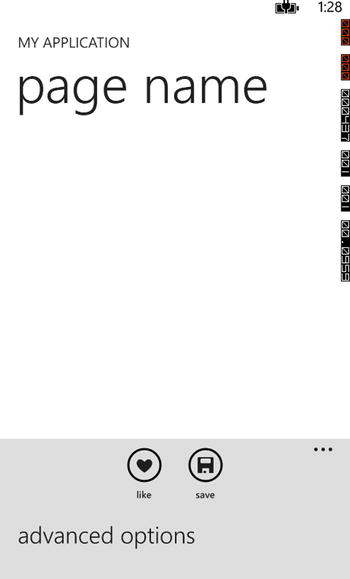
Figure 2-4. The results are the same whether defining the ApplicationBar in XAML or code
View Model and Data-Binding Support
Ideally that logic that manages these property values would be encapsulated in a view model. Fortunately, the PhoneApplicationPage ultimately inherits from DependencyObject, which means we can create our own dependency properties. We can then bind these properties to properties of our view model, and in the PropertyChanged event we can update the corresponding property of our ApplicationBar.
We’ll work through adding functionality to enable us to control the IsMenuEnabled property from the view model. You can then copy the pattern to extend it to the other properties. You could also extend this technique to control properties of the buttons and menu items. I will leave it as an exercise for the reader.2
The first thing we need to do is create a view model for our page. Add a new folder to your project and name it ViewModels.
Add a new class to the ViewModels folder and name the class MainPageViewModel. Your view model class will need to implement support for property change notification. This is probably best defined in a base class that can be reused for all ViewModels. Add an IsApplicationBarVisible property to the view model. See Listing 2-3.
Listing 2-3. The MainPageViewModel Class
internal class MainPageViewModel : ViewModel
{

    // we'll use this to flip the visibility
    // one per second for demo purposes
    private DispatcherTimer timer;

    public MainPageViewModel()
    {
        timer = new DispatcherTimer();
        timer.Interval = new TimeSpan(0, 0, 1); // one second
        timer.Tick += (s, e) =>
        {
            IsApplicationBarVisible = !IsApplicationBarVisible;
        };

        timer.Start();
    }

    // default to visible...
    private bool isApplicationBarVisible = true;
    public bool IsApplicationBarVisible
    {
        get
        {
            return isApplicationBarVisible;
        }
        set
        {
            isApplicationBarVisible = value;
            RaisePropertyChanged();
        }
    }

}
Open up the MainPage.xaml.cs file and add the code is Listing 2-4 to setup a Model property that will delegate to the DataContext of the page. This allows us to access the view model in a strongly typed manner without having to cast it every time we need it.
Listing 2-4. Adding a Model Property to Our Page
// add this line in the constructor after the call
// to InitializeComponent()
Model = new MainPageViewModel;

private MainPageViewModel Model
{
    get
    {
        return (MainPageViewModel)DataContext;
    }
    set
    {
        DataContext = value;
    }
}
Now that we have a view model with a property of interest to our page, we need to implement a way to have the view respond to changes in that property without the view model “knowing” anything about the view. This is where dependency properties come in.
Add a DependencyProperty of type System.Boolean to the MainPage. Open the MainPage.xaml.cs file and add the code from Listing 2-5 to the code-behind.
Listing 2-5. Declaring a DependencyProperty
public static readonly DependencyProperty IsApplicationBarMenuEnabledProperty =
        DependencyProperty.Register("IsApplicationBarMenuEnabled",
                typeof(bool),
                typeof(MainPage),
                new PropertyMetadata(true, OnIsApplicationBarEnabledChanged));

private static void OnIsApplicationBarEnabledChanged(DependencyObject d,
        DependencyPropertyChangedEventArgs e)
{
    ((MainPage)(d)).OnIsApplicationBarEnabledChanged((bool)e.OldValue, (bool)e.NewValue);
}

private void OnIsApplicationBarEnabledChanged(bool oldValue, bool newValue)
{
    ApplicationBar.IsMenuEnabled = newValue;
}

public bool IsApplicationBarMenuEnabled
{
    // IMPORTANT: To maintain parity between setting a property in XAML
    // and procedural code, do not touch the getter and setter inside this dependency property!
    get
    {
        return (bool)GetValue(IsApplicationBarMenuEnabledProperty);
    }
    set
    {
        SetValue(IsApplicationBarMenuEnabledProperty, value);
    }
}
Make note of the static OnIsApplicationBarEnabledChanged method. Whenever a dependency property’s value changes, the property changed callback method that was declared with the PropertyMetaData is invoked, and the instance of the object whose property has changed is passed in as the first parameter. We simply cast the object to the correct type and then invoke the instance OnIsApplicationBarEnabledChanged method, passing it the old and new values extracted from the DependencyPropertyChangedEventArgs parameter. It is in this instance method that we can now simply set the IsMenuEnabled property of the ApplicationBar.
The only thing left for us to do now is to bind our new dependency property to the corresponding property of the view model. The code in Listing 2-6 demonstrates the creation of a data binding in code. Add it to the constructor of the MainPage.xaml.cs file.
Listing 2-6. Creating a Data Binding in Code
// Add this code right after the previous code
Binding menuEnabledBinding = new Binding("IsMenuEnabled");
SetBinding(IsApplicationBarMenuEnabledProperty, menuEnabledBinding);
Run the application and you should see that the visibility of the ApplicationBar changes at 1-second intervals.
Normally when working with buttons you would bind the Command property of the button to the ICommand exposed on your view model. Since ApplicationBarIconButton and ApplicationBarMenuItem do not expose a Command property that option isn’t available to us. The next option would be to use a Blend Attached Behavior to hook the Click event of the control but again we are blocked because ApplicationBarIconButton and ApplicationBarMenuItem don’t inherit from FrameworkElement. We’re going to have to use some code-behind but only just enough to get the job done.
The first thing we’ll need is an implementation of the ICommand interface to work with. Listing 2-7 shows a sample implementation of the interface.
Listing 2-7. A Sample Implementation of the ICommand Interface
public class RelayCommand : ICommand
{
    readonly Action<object> execute;
    readonly Predicate<object> canExecute;

    public RelayCommand(Action<object> execute) : this(execute, null)
    {
    }
    public RelayCommand(Action<object> execute, Predicate<object> canExecute)
    {
        if (execute == null)
            throw new ArgumentNullException("execute");
        this.execute = execute;
        this.canExecute = canExecute;
    }
    [DebuggerStepThrough]
    public bool CanExecute(object parameter)
    {
        return canExecute == null ? true : canExecute(parameter);
    }
    public void Execute(object parameter)
    {
        execute(parameter);
    }

    public event EventHandler CanExecuteChanged = delegate
    {
    };

    public void RaiseCanExecuteChanged()
    {
        CanExecuteChanged(this, EventArgs.Empty);

    }
}
We’ll create a command that executes when someone taps on the advanced options menu item. Add the code in Listing 2-8 to setup a command and the supporting methods in the MainPageViewModel.
Listing 2-8. Code for the Advanced Options Menu Item Command
// add the following line to the end of the MainPageViewModel
// constructor to initialize the command
AdvancedOptionsCommand =
        new RelayCommand(AdvancedOptionsCommandExecute,
                AdvancedOptionsCommandCanExecute);

private RelayCommand advancedOptionsCommand;
public RelayCommand AdvancedOptionsCommand
{
    get
    {
        return advancedOptionsCommand;
    }
    set
    {
        advancedOptionsCommand = value;
        RaisePropertyChanged();
    }
}

private bool AdvancedOptionsCommandCanExecute(object parameter)
{
    return true;

}

private void AdvancedOptionsCommandExecute(object parameter)
{
    // of course, in real life, you would never use
    // a MessageBox in your view model but it's ok
    // for our purposes here...
    MessageBox.Show("Advanced Options selected.");

}
The last thing to do is modify the Click event handler we added to the code-behind of the MainPage in Listing 2-1 so that it calls the CanExecute and Execute methods on the AdvancedOptionsCommand property of the Model. Listing 2-9 shows the new Click handler code. Oh, and you’ll also want to comment out the timer code in the MainPageViewModel constructor or you won’t be able to see the menu item long enough to be able to click on it.
Listing 2-9. Executing the Command from Code-Behind
void AdvancedOptionsClick(object sender, EventArgs e)
{
    if(Model.AdvancedOptionsCommand.CanExecute(null)
    {
        Model.AdvancedOptionsCommand.Execute(null);
    }
}
By using this approach we still have code that is easy to test, and our view and view model are still loosely coupled.
Problem
You need to provide the ability in your application to navigate to a separate page. For example, you may have a main opening page that acts as a menu and allows the user to navigate to additional pages of functionality.
Solution
Use the Navigate method of the NavigationService to launch the page from a Tap or Click event handler.
How It Works
Basic Navigation
Open Visual Studio and create a new Windows Phone App and name it BasicNavigation. Open MainPage.xaml in the editor and locate the ContentPanel grid and add a StackPanel to it. Add a Button to the StackPanel and set its Content property to “Settings.” Add a second button and set its Content property to “About.” Double-click the “Settings” button in the designer to add an event handler to the button’s Click event. Do the same for the “About” button. Your ContentPanel for MainPage.xaml should look like Listing 2-10.
Listing 2-10. XAML for the ContentPanel in MainPage.xaml
<Grid x:Name="ContentPanel" Grid.Row="1" Margin="12,0,12,0">
    <StackPanel>
         <Button Content="Settings" Click="Button_Click_1"/>
         <Button Content="About" Click="Button_Click_2"/>
    </StackPanel>
</Grid>
Right-click on the BasicNavigation project and add a new Windows Phone Portrait Page and name it “About.” Add a second page and name this one “Settings.” Find the TextBlock elements in the TitlePanel section and give each page an appropriate name so you can distinguish between them when testing.
Listing 2-11. Example TitlePanel XAML for the Settings and About Pages
<StackPanel Grid.Row="0" Margin="12,17,0,28">
     <TextBlock Text="Widnows Phone 8 Recipes" Style="{StaticResource PhoneTextNormalStyle}"/>
     <TextBlock Text="about" Margin="9,-7,0,0" Style="{StaticResource PhoneTextTitle1Style}"/>
</StackPanel>

<StackPanel Grid.Row="0" Margin="12,17,0,28">
     <TextBlock Text="Widnows Phone 8 Recipes" Style="{StaticResource PhoneTextNormalStyle}"/>
     <TextBlock Text="settings" Margin="9,-7,0,0" Style="{StaticResource PhoneTextTitle1Style}"/>
</StackPanel>
The PhoneApplicationPage class exposes a read-only NavigationService property that is populated by the system with the NavigationService used to navigate to the current page. You pass a Uri to the Navigate method and the NavigationService takes care of instantiating and displaying an instance of the target page. Navigation is only supported to relative URIs that are fragments, or begin with ’/’, or which contain “;component/.” Listing 2-12 shows the code for the Settings button Click event handler. Use this example to add code for the About button that will navigate you to the About.xaml page.
Listing 2-12. Using the NavigationService to navigate to the Settings page
NavigationService.Navigate(new Uri("/Settings.xaml", UriKind.Relative));
Navigation Events
There are three main events in the lifecycle of a page navigation. You can access these events by overriding their corresponding virtual methods listed in Table 2-3. These events together allow you to do things such as load or save data, cancel the navigation, or preconfigure the UI.
Table 2-3. Navigation Lifecyle Events
| Method | Description |
|---|---|
| OnNavigatingTo | This method is called when the page becomes the active page in the frame. Typically you would load your data in this method. |
| OnNavigatingFrom | This method is called just before the page will no longer be the active page in the frame. You can use this method to cancel the navigation. |
| OnNavigatedFrom | This method is called just after the page is no longer the active page in the frame. You can use this method to save your data. |
| OnFragmentNavigation | This method is called when navigating to a fragment in the current content or to a fragment in the content of a new navigation. |
Let’s add some code to our project that will exercise each of these methods. Open the AboutPage.xaml file in the editor and add a StackPanel containing a TextBlock and a CheckBox to the ContentPanel. Set the properties of the controls as shown in Listing 2-13.
Listing 2-13. CheckBox in the ContentPanel of AboutPage.xaml
<Grid x:Name="ContentPanel" Grid.Row="1" Margin="12,0,12,0">
    <StackPanel>
         <TextBlock
             HorizontalAlignment="Left"
             TextWrapping="Wrap"
             VerticalAlignment="Top"
             x:Name="instructionTextBlock"/>
         <CheckBox
             Content="I agree"
             HorizontalAlignment="Left"
             Margin="10,10,0,0"
             VerticalAlignment="Top"
             x:Name="confirmationCheckBox"/>
    </StackPanel>
</Grid>
Now we’ll override the OnNavigatedTo and OnNavigatingFrom methods. We’ll set the Text of the instructionsTextBlock in when we navigate to the page. When we are navigating away from the page, we’ll check to be sure that the user has checked the confirmationCheckBox and cancel the navigation if they haven’t. Before cancelling navigation, however, we need to ascertain whether or not the system will ignore the Cancel property of the NavigatingCancelEventArgs Add the code in Listing 2-14 to the code-behind in About.xaml.cs.
Listing 2-14. Code for OnNavigatedTo and OnNavigatingFrom
protected override void OnNavigatedTo(NavigationEventArgs e)
{
    instructionTextBlock.Text = "Please check below to indicate you have seen this screen.";
}

protected override void OnNavigatingFrom(NavigatingCancelEventArgs e)
{
    if (!confirmationCheckBox.IsChecked ?? false)
    {
        if(e.IsCancelable)
        {
            MessageBox.Show("You must check the confirmation check box to proceed");
            e.Cancel = true;
        }
    }
}
The IsCancelable property will return false whenever the navigation destination is an external location. This includes other applications, launchers, and choosers. It will also return false if this is a backward navigation that is going to exit the application. You can always cancel backwards navigation no matter what by overriding the OnBackKeyPress method of the PhoneApplicationPage. This method is called when the hardware back button is pressed.
Passing Information
There are two main methods of passing information between pages during navigation. You can add one or more query parameters to the Uri that you pass to the NavigationService.Navigate method. You could pass an item identifier to a details page, for instance. The other option is to add a fragment to the Uri. The fragment is simply any text value added after the resource name and prefixed with a hash tag. Fragments are commonly used to indicate how the destination page should be displayed. Let’s modify our basic navigation application to demonstrate these techniques.
Fragments
To demonstrate a common use of a fragment we modify the About page to contain a Pivot control and use the fragment to control which PivotItem is displayed when we navigate to the page.
Open About.xaml in the editor and replace the entire contents of the LayoutRoot Grid with the XAML in Listing 2-15. Add an override of the OnFragmentNavigation method using the code from Listing 2-16. You’ll also want to modify the code in MainPage.xaml.cs and add “#contact” to the end of the Uri as shown in Listing 2-17.
Listing 2-15. XAML for the Modified About Page
<!--Pivot Control-->
<phone:Pivot x:Name=”aboutPivot” Title="WINDOWS PHONE 8 RECIPES">
    <!--Pivot item one-->
    <phone:PivotItem Header="privacy">
        <Grid/>
    </phone:PivotItem>

    <!--Pivot item two-->
    <phone:PivotItem Header="contact">
        <Grid/>
    </phone:PivotItem>
</phone:Pivot>
Listing 2-16. OnFragmentNavigation Override for About.xaml.cs
protected override void OnFragmentNavigation(FragmentNavigationEventArgs e)
{
    string frag = e.Fragment;

    switch (frag)
    {
        case "privacy":

            break;
        case "contact":
            aboutPivot.SelectedIndex = 1;
            break;

    }
}
Listing 2-17. Using the NavigationService to navigate to the About page
NavigationService.Navigate(new Uri("/About.xaml#contact", UriKind.Relative));
You’ll notice that the fragment has been conveniently parsed for us and is contained in the Fragment property of the FragmentNavigationEventArgs instance that is passed into the method. We just need to examine the fragment value and take the appropriate action. In this example, I’ve used it to automatically set the selected item of the Pivot control to the contact PivotItem.
It is quite common to have a page with a list of items on it and be able to tap an item and navigate to an item details page. We need some method to tell the destination page which item we want to display. QueryString parameters are just the thing we need to accomplish this. Open up Visual Studio and create a new Windows Phone Databound App and name it MasterDetailNavigation. This template project is a good example of a master-detail navigation and also comes with sample data so this will save us a bunch of typing and let us get right into the details. This will also introduce you to the concept of an “Anchor” view model, which is a common pattern in Windows Phone 8 applications.
Take a look at the code in App.xaml.cs and notice that the App class exposes a static property of type MainViewModel that serves as the “Anchor.” The fact that the lifetime of this anchor view model is tied to the application’s lifetime and not to that of any particular page greatly simplifies our code. Data persistence, for example, can be handled centrally. A Windows Phone 8 application behaves more like a web application than a traditional, stateful desktop application. The lifetime of each PhoneApplicationPage is uncertain at best, and even the order in which pages are created can change depending on how they are navigated and whether the application is coming back from being tombstoned or not.
Open the MainPage.xaml.cs file and locate the MainLongListSelector_SelectionChanged method or look at Listing 2-18.
Listing 2-18. The MainLongListSelector_SelectionChanged Event Handler Method
private void MainLongListSelector_SelectionChanged(object sender, SelectionChangedEventArgs e)
{
    // If selected item is null (no selection) do nothing
    if (MainLongListSelector.SelectedItem == null)
        return;

    // Navigate to the new page
    NavigationService.Navigate(new Uri("/DetailsPage.xaml?selectedItem=" +
                      (MainLongListSelector.SelectedItem as ItemViewModel).ID, UriKind.Relative));

    // Reset selected item to null (no selection)
    MainLongListSelector.SelectedItem = null;
}
The MainLongListSeletor.SelectedItem is tested to see if there if the user has selected anything. The selected item is cast to an ItemViewModel and the ID property is concatenated into the Uri as a query string parameter added to the path to the details page. One advantage of QueryString parameters over the use of a fragment is that you can have as many parameters as you need, whereas you are limited to a single fragment.
Listing 2-19 shows the override of the OnNavigatedTo method in the DetailsPage.xaml.cs file. The ID of the selected item is retrieved from the NavigationContext.QueryString, converted to an integer, and then used to index into the Items property of the anchor view model.
Listing 2-19. Override of the OnNavigatedTo Method in DetailsPage.xaml.cs
protected override void OnNavigatedTo(NavigationEventArgs e)
{
    if (DataContext == null)
    {
        string selectedIndex = "";
        if (NavigationContext.QueryString.TryGetValue("selectedItem", out selectedIndex))
        {

            int index = int.Parse(selectedIndex);
            DataContext = App.ViewModel.Items[index];
        }
    }
}
Problem
You have a very long list of items and need an efficient way to display them to the user. Long lists can often consume a lot of resources because they need to create the user interface elements for every item. It should also be easy for the user to jump to parts of the list without having to scroll.
Solution
The LongListSelector control has become the recommended control of choice for the display of any list and you should choose it over the ListBox. First available in the Silverlight Toolkit for Windows Phone and now available as a native part of Windows Phone 8, the LongListSelector supports full data and UI virtualization. The LongListSelector can also display grouped data and has built-in provisions for group headers and footers as well as a list header and footer.
How It Works
The LongListSelector is simple to use and you configure it the same as you would a ListBox when displaying a flat list. You simply set the ItemsSource property to any collection of items that implements IList, set the ItemTemplate with a DataTemplate and the rest just works. Listing 2-20 is the LongListSelector definition from the Windows Phone Data Bound App project template:
Listing 2-20. XAML for LongListSelector Basic Configuration
<phone:LongListSelector
    x:Name="MainLongListSelector"
    ItemsSource="{Binding Items}"
    <phone:LongListSelector.ItemTemplate>
        <DataTemplate>
          <StackPanel Margin="0,0,0,17">
               <TextBlock
                 Text="{Binding LineOne}"
                 Style="{StaticResource PhoneTextExtraLargeStyle}"/>
               <TextBlock
                 Text="{Binding LineTwo}"
                 Margin="12,-6,12,0"
                 Style="{StaticResource PhoneTextSubtleStyle}"/>
          </StackPanel>
        </DataTemplate>
    </phone:LongListSelector.ItemTemplate>
</phone:LongListSelector>
In fact, the LongListSelector is so similar in basic configuration to a ListBox that you can actually replace the phone:LongListSelector with ListBox and it will just work. Visually, you won’t even notice the difference. However, you won’t find the ListBox in the Visual Studio ToolBox. This was done to emphasize that the LongListSelector is now the default choice and to encourage its use when displaying lists of data. You can still use the ListBox if you want, but you must type it in directly in you XAML.
As mentioned earlier, you can set the ItemsSource to any collection of data that implements IList. The most common choice is the ObserveableCollection<T> . Since it derives from Collection<T> it has support for IList and adds support for INotifyCollectionChanged which allows any ItemsControl bound to it to automatically detect additions and deletions and update the UI accordingly.
Create a new Windows Phone Data Bound App and then open the MainViewModel.cs file in the editor. Notice how there is a hard-coded list of items being added to the Items property. While this gets the job done, it doesn’t scale particularly well. What if you wanted to try out your list with a thousand items? Listing 2-21 shows a neat trick using LINQ to quickly generate as many items as you want in just a couple of statements. The declarative nature of LINQ makes it a very powerful tool when it comes to data manipulation. We’ll revisit LINQ when we get to grouping data in a later section.
Listing 2-21. Sample test data using LINQ
var testItems = from number in Enumerable.Range(1, 1000)
                select new ItemViewModel
                {
                    ID = number.ToString(),
                    LineOne = "First Line " + number,
                    LineTwo = "Second Line " + number,
                    LineThree = "Third Line " + number
                };
Items = new ObservableCollection<ItemViewModel>(testItems);
For scenarios where you just want to get some data into the list and don’t need view models, data binding and collection change notification you can set the ItemsSource to the results of a LINQ statement by simply calling the ToList() extension method as shown in Listing 2-22.
Listing 2-22. Setting the ItemsSource to the Results of a LINQ Statement
var testItems = from number in Enumerable.Range(1, 1000)
                select new ItemViewModel
                {
                    ID = number.ToString(),
                    LineOne = "First Line " + number,
                    LineTwo = "Second Line " + number,
                    LineThree = "Third Line " + number
                };
MyLongListSelector.ItemsSource = testItems.ToList();
In the next section we’ll take a look at creating the various templates that define the look of the LongListSelector control.
Templating
The LongListSelector exposes several properties of type DataTemplate that define the look of the various parts of the control. Table 2-4 lists these properties.
Table 2-4. Template and Style Properties of the LongListSelector
| Property | Description |
|---|---|
| ListHeaderTemplate | The DataTemplate that defines the item to be displayed in the header of the LongListSelector. It appears once at the top of the control. |
| ListFooterTemplate | The DataTemplate that defines the item to be displayed in the footer of the LongListSelector. It appears once at the bottom of the control. |
| GroupHeaderTemplate | The DataTemplate that defines the item that will appear at the top of a group just before the first item in the group. The group header will appear once at the top of each group of items displayed. |
| GroupFooterTemplate | The DataTemplate that defines the item that will appear at the bottom of a group after the last item in the group. The group footer will appear once at the bottom of each group of items displayed. |
| ItemTemplate | The DataTemplate that defines the item that will be displayed for each item in the underlying list of data. |
| JumpListStyle | The Style used to display the jump list when the user taps on a GroupHeader. You define the DataTemplate for the jump list within the JumpListStyle. |
Screen space is always at a premium on mobile devices so you need to be aware of how best to use that space when designing your pages. It will probably be a rare occasion when you need to use the ListHeader and ListFooter. Most likely your list will be hosted in a PhoneApplicationPage or PivotItem and the TitlePanel content of the page or the Title and Header information of the PivotItem should be enough of a description for your list. Figure 2-5 shows a screen shot from the TheLongListSelector sample project. Any additional information would just be redundant.
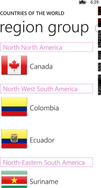
Figure 2-5. Sample LongListSelector hosted in PivotItem
From the sample screenshot in Figure 2-5 you can also see that the GroupFooter would more than likely be redundant and add nothing to the display of information. The end of one group is quite effectively demarcated by the header of the next group.
As always when creating your UI you should follow the Modern UI desing guidelines. Listing 2-23 shows the definition of an ItemTemplate taken from the Chapter two sample code.
Listing 2-23. ItemTemplate Sample for LongListSelector
<DataTemplate x:Name="AlphaItemTemplate">
    <Grid Margin="0,0,0,17">
        <Grid.ColumnDefinitions>
            <ColumnDefinition Width="128"/>
            <ColumnDefinition />
        </Grid.ColumnDefinitions>
        <Grid.RowDefinitions>
            <RowDefinition/>
            <RowDefinition/>
        </Grid.RowDefinitions>
        <Image
            Grid.Row="0"
            Grid.RowSpan="2"
            Source="{Binding FlagUri}"/>
        <TextBlock
            VerticalAlignment="Center"
            Grid.Column="1"
            Margin="6,0,0,0"
            Text="{Binding EnglishName}"
            Style="{StaticResource PhoneTextLargeStyle}"/>
        <TextBlock
            VerticalAlignment="Top"
            Grid.Column="1"
            Grid.Row="1"
            Margin="6,0,0,0"
            Text="{Binding LocalName}"
            Style="{StaticResource PhoneTextNormalStyle}"/>
    </Grid>
</DataTemplate>
Note You should use make use of the default styles provided with the SDK as much as possible. Styles are provided for TextBlocks as well as some predefined styles for the LongListSelector control. This will help to ensure that your application provides a consistent visual experience for the user. You can find these styles in C:Program Files (x86)Microsoft SDKsWindows Phonev8.0Design.
The JumpListStyle is a little different and deserves some further investigation. The JumpListStyle property is of type Style and targets the LongListSelector control type. The alphabetic jump list is almost certainly the most common. Listing 2-24 shows the style for the alphabetic grouping sample in the sample code project.
Listing 2-24. Alphabetic Jump List Style
<Style x:Key="LongListSelectorJumpListGridStyle" TargetType="phone:LongListSelector">
    <Setter Property="GridCellSize"  Value="111,111"/>
    <Setter Property="LayoutMode" Value="Grid" />
    <Setter Property="Margin" Value="18,12,0,0"/>
    <Setter Property="ItemTemplate">
        <Setter.Value>
            <DataTemplate>
                <Border
                    Margin="6"
                    Background="{Binding Converter={StaticResource BackgroundConverter}}">
                    <TextBlock
                        Margin="6,0,0,0"
                        Text="{Binding Key}"
                        Style="{StaticResource JumpListAlphabetStyle}"/>
                </Border>
            </DataTemplate>
        </Setter.Value>
    </Setter>
</Style>
There are a couple of properties of note being set in the style. The first is the LayoutMode property. This property gets it value from the LongListSelectorLayoutMode enumeration and the valid values are Grid and List. The jump list items will be arranged in a WrapPanel when the LayoutMode is set to Grid and you must define a size for the cells in the GridCellSize. The values for the GridCellSize probably strike you as a bit odd. How did we arrive at the value of 111? Running the application shows that there are four letters per row in the alphabetic jump list so we’ll base our calculations on that assumption.
Refer back to the values in Table 2-1. You’ll recall that when setting the height or width of an element you do so using device independent pixels. The logical width of the screen then is always 480 device independent pixels. You’ll notice in the style that we are setting an 18-pixel margin on the left side of the jump list only. Assuming that we want to be left with a corresponding 18 pixel margin that would leave us with 480 - 36 = 444 pixels for our cells. The math from here is left as an exercise for the reader.3
Look back at Listing 2-24 and notice the reference to a static resource named “BackgroundConverter” in the binding for the Background of the Border in the ItemTemplate of the style. This resource is declared at the top of the resource section and is an instance of the JumpListItemBackgroundConverter. There is also a JumpListItemForegroundConverter. These are two value converters provided by the framework that will automatically determine the right colors based on the user’s preferences and return a SolidColorBrush.
Listing 2-25. Declaration of the Jump List Converters
<phone:JumpListItemBackgroundConverter x:Key="BackgroundConverter"/>
<phone:JumpListItemForegroundConverter x:Key="ForegroundConverter"/>
Shaping the Data
One of the most useful features of the LongListSelector is its ability to provide quick navigation through the list using grouping and the built-in “jump list.” Grouping controls that I’ve worked with usually have built-in support for grouping and displaying data with no shaping of the data required. They do this by making use of the HierarchicalDataTemplate. This is not the case with the LongListSelector and you need to shape the data yourself.
Each grouping of data needs two things: a property that serves as the group key and an enumerable list of items. While you could create your own type from scratch by implementing IList, IList<T>, IEnumerable<T>, and ICollection<T> along with INotifyCollectionChanged so that the addition and removal of items in the list can be observed by the LongListSelector control, that’s a lot of work. Fortunately for us, the framework already provides us with 99% of what we need in the form of the ObservableCollection<T> and we can simply subclass that. Adding a property to serve as the group key and some appropriate constructors finishes the implementation. Listing 2-26 shows the just such a class.
Listing 2-26. The ObservableLongListGroup Collection
public class ObservableLongListGroup<T> : ObservableCollection<T>
{
    public ObservableLongListGroup(IEnumerable<T> collection, string key)
        : base(collection)
    {
        this.Key = key;
    }

    public ObservableLongListGroup(List<T> list, string key)
        : base(list)
    {
        this.Key = key;
    }

    public string Key { get;  set; }

}
We’ll also use the ObservableCollection<T> to expose our groups on the view model using our ObservableLongListGroup as the generic type. You could create the groups and populate their items one at a time by iteratating over your main list of items, but there is a far more efficient and elegant way of grouping your data using LINQ. Listing 2-27 shows the properties and methods in the main view model of the sample application that creates two groupings. The first one is grouped by the first letter and the second is grouped by the country’s region.
Listing 2-27. Grouping the list of coutries using LINQ
public ObservableCollection<ObservableLongListGroup<Country>> CountriesByFirstLetter
{
    get;
    set;
}

public ObservableCollection<ObservableLongListGroup<Country>> CountriesByWorldRegion
{
    get;
    set;
}

private void PopulateGroupsByWorldRegion()
{
    var byWorldRegion = from country in Countries
                        group country by country.WorldRegion into groupedCountries
                        orderby groupedCountries.Key ascending
                        select new ObservableLongListGroup<Country>
                            (
                                        groupedCountries, groupedCountries.Key
                            );

            CountriesByWorldRegion = new ObservableCollection<ObservableLongListGroup<Country>>
                         (
                                    byWorldRegion
                         );
}

private void PopulateGroupsByFirstLetter()
{
    var byFirstLetter = from country in Countries
                        group country by country.EnglishName.Substring(0, 1).ToLower()
                        into groupedCountries
                        orderby groupedCountries.Key ascending
                        select new ObservableLongListGroup<Country>
                             (
                                  groupedCountries, groupedCountries.Key
                             );

    CountriesByFirstLetter = new ObservableCollection<ObservableLongListGroup<Country>>
                            (
                                  byFirstLetter
                            );
}
Now that we have our data we just need to bind the items to our LongListSelector as its ItemsSource and attach the required templates. In your GroupHeaderTemplate and JumpListStyle you can bind the Key property of the ObservableLongListGroup to a TextBlock to display the group. Listing 2-28 shows the templates from the sample application.
Listing 2-28. GroupHeaderTemplate and JumpListStyle from the Sample Application
<DataTemplate x:Name="AlphaGroupHeaderTemplate">
    <Border
        BorderThickness="1"
        Background="{Binding Converter={StaticResource BackgroundConverter}}"
        HorizontalAlignment="Left"
        Width="50">
        <TextBlock
            Foreground="{Binding Converter={StaticResource ForegroundConverter}}"
            Text="{Binding Key}"
            Style="{StaticResource LongListSelectorGroupHeaderStyle}"/>
        </Border>
</DataTemplate>

<Style x:Key="LongListSelectorJumpListGridStyle" TargetType="phone:LongListSelector">
    <Setter Property="GridCellSize"  Value="111,111"/>
    <Setter Property="LayoutMode" Value="Grid" />
    <Setter Property="Margin" Value="18,12,0,0"/>
    <Setter Property="ItemTemplate">
        <Setter.Value>
            <DataTemplate>
               <Border
                   Margin="6"
                   BorderThickness="1"
                   BorderBrush="{Binding Converter={StaticResource BackgroundConverter}}">
                   <TextBlock
                       Margin="6,0,0,0"
                       Text="{Binding Key}"
                       Style="{StaticResource JumpListAlphabetStyle}"/>
                   </Border>
            </DataTemplate>
        </Setter.Value>
    </Setter>
</Style>
2-6. Using the Windows Phone Toolkit
Problem
You’ve created a Windows Phone Application but the SDK doesn’t contain certain user interface components that would make it special. Things like an AutoCompleteBox, RatingControl, and some animation effects would be very useful.
How It Works
The Windows Phone Toolkit provides a collection of controls, extension methods, and page animations. Using the toolkit will allow you to create more visually interesting and consistent Windows Phone user interfaces and make common progamming tasks easier.
Formerly called the Silverlight Toolkit for Windows Phone, the toolkit has been given its own separate home on the CodePlex site at http://phone.codeplex.com. With an uncharacteristic flourish of creativity, Microsoft has also rebranded the toolkit and given it a dynamic new name: “Windows Phone Toolkit” or “WPToolkit,” for short.4
Installation
The WPToolkit was previously provided as an MSI-based installer. The Visual Studio extension NuGet has become increasingly popular and just recently the NuGet Gallery surpassed 50 million downloads. The NuGet package manager is also included with Visual Studio 2012 right out of the box. Given this popularity many third-party toolkits and libraries are choosing NuGet as their installation and distribution channel. The WPToolkit is now hosted in the NuGet Gallery.
Note To get started with NuGet when working with Windows Phone 8 projects you need to be sure that you have upgraded your version of NuGet to at least version 2.1. Installation and upgrade information along with instructions for use can be found on the NuGet documentation website at http://docs.nuget.org.
Once you have the most recent version, use the package manager to add the WPToolkit libraries to a new Windows Phone App.
Referencing the Controls
Once you have added the WPToolkit to your project you’ll notice a new reference to the Microsoft.Phone.Controls.Toolkit assembly. You need to define an XML namespace in your XAML so that you can use the controls in the toolkit. The samples available on http://phone.codeplex.com are quite comprehensive so we won’t go into any depth here. Listing 2-29 shows the namespace reference and a sample of the Rating control.
Listing 2-29. XML Namespace for the WPToolkit in XAML
<!-- add to the list of namespace declarations at the top of the XAML-->
xmlns:toolkit="clr-namespace:Microsoft.Phone.Controls;assembly=Microsoft.Phone.Controls.Toolkit"

        <!--ContentPanel - place additional content here-->
        <Grid x:Name="ContentPanel" Grid.Row="1" Margin="12,0,12,0">
            <Grid.RowDefinitions>
                <RowDefinition/>
                <RowDefinition/>
            </Grid.RowDefinitions>
            <toolkit:Rating
                Width="250"
                Height="50"
                x:Name="RatingControl"
                RatingItemCount="5"
                Value="3.5"
                ShowSelectionHelper="True"/>
            <TextBlock
                HorizontalAlignment="Center"
                Grid.Row="1"
                Style="{StaticResource PhoneTextTitle1Style}"
                Text="{Binding ElementName=RatingControl, Path=Value}"/>

        </Grid>
1 Look Mom, my first cliché in print!
2 That’s cliché number two for those of you that are keeping score at home.
3 That’s three. One cliché every 10 pages so far. That’s not bad.
4 Sarcastic? Me? Never.