
Tiles are the entry point to a Windows Phone application. Windows Phone 8 provides 3 tile templates that you can use to add flair to their application. Each tile template must define the appearance of a tile for each of the 3 available sizes (small, medium, large), which will be visible when a Windows Phone 8 app is pinned to a user’s start screen. You will need to take care to ensure that your live tile represents your application appropriately, while still following the Windows Phone design guidelines, and in a way that captures the user’s attention. This chapter will guide you through the basics of adding live tiles to your application for each template. We close off the chapter by stepping through how to enable lock screen customization from within the app, as well as how to handle integration between the lock screen settings page and the application.
- 4-1. Configure the Default Application Tile
- 4-2. Create a flip tile
- 4-3. Create an iconic tile
- 4-4. Create a cycle tile
- 4-5. Create Secondary Tiles
- 4-6. Create lock screen background image
- 4-7. Handle interactivity between lock screen settings and the app
4-1. Configure the Default Application Tile
Problem
You want to configure which tile shows up on the home screen when the user pins your application.
Solution
Configure the Tile Template, Tile Title, and Tile Images properties in the application’s manifest file.
How It Works
The default, or primary, tile for your application is defined in the WMAppManifest.xml file located under the Properties folder of your application.
Start Visual Studio, create a new Windows Phone App and name it DefaultTile. Locate the WMAppManifest.xml file in the Properties folder and then double-click on it to open up the editor. Figure 4-1 shows the three properties in which we are interested.
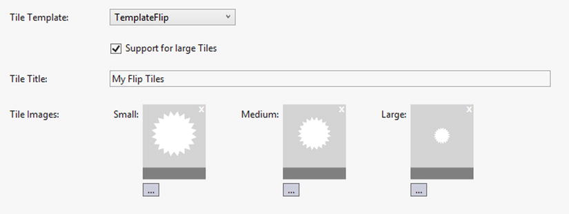
Figure 4-1. The Tile Template, Tile Title, and Tile Images properties in the application manifest edit
The Tile Template allows you to choose from three different tile templates: Flip, Iconic, and Cycle. Each of these is examined in greater depth in other recipes but for now Table 4-1 gives you a brief description of each type.
Table 4-1. Tile Template Descriptions
| Tile Template | Description |
|---|---|
| TemplateFlip | The flip template gives you two surfaces on which to provide information to the user. Only the front and back of the medium and large tiles sizes display information. The tile flips at random intervals, so it’s important to choose the right type of information to display. |
| TemplateCycle | The cycle template can be configured with one to nine images and cycles through them. The transitions and animations are fixed. |
| TemplateIconic | The iconic template displays a single image with a place to display a count. It also has predefined areas for the display of information to the user in the large format. |
The check box below the Tile Template section allows you to enable or disable support for large Tiles. Large Tile support only applies to the TemplateFlip format and when you check the box an additional selection box is enabled for the Tile Images. The TemplateIconic does not require a large format image, as it reuses the small image when the Tile is set to the large format and content is present. When no content is provided in the large format, the medium image is used.
The Tile Title shows up aligned to the bottom left of the medium and large format Tiles. The small format does not display any text other than the count number. The text is limited to 19 characters for the medium format and to 39 for the large format Tile. The tiles won’t wrap any text you supply and will simply truncate it. The Segoe WP font used on the tiles is not a fixed width font so these character lengths are only approximations, and therefore, dare I say it, your mileage may vary.
The final configuraton item then is the Tile Images. You can click on the browse ellipsis below each of the small, medium, and, if required, large icon placeholders to browse for a suitable image. The exact design details of each template tile size will be covered in each of their respective recipes. For now, you can use the default images supplied with the Windows Phone App project template. The placeholders will display your image once selected. Figure 4-2 shows an example of how each of the small, medium, and large tiles display.
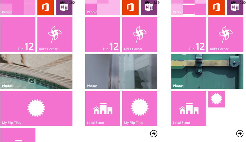
Figure 4-2. Small, medium, and large Tile examples
 Note The Tiles subfolder of the Assets project folder contains default sample images. A small, medium, and large flip tile image is included as well as a small and medium iconic tile image.
Once you have everything configured, run your application in the emulator. Click the Start button on the emulator and then swipe left to get to the application list. Tap (click) and hold the DefaultTile application entry and then select “pin to start” on the popup menu. The system will navigate automatically to the home screen. You see your tile appear there with your title displayed. Tap and hold the Tile to enter the home screen editing mode, and resize your Tile to see the different formats. Set your tile to the large format and then click outside the Tiles to switch the screen back to normal mode.
We used the TemplateFlip Tile template for our applications default Tile but the observant among you might have noticed the the tile is just sitting there mocking you1 and not flipping at all. There’s a far simpler explanation for this behavior than malevolent anthropomorphism. We simply haven’t given it anything to show us.
The manifest editor is a convenient but incomplete tool. It didn’t provide us with any means to add content to our default tile. Fortunately the tile configuration is stored in the manifest in XML. All we have to do is edit it. Make sure you have closed the manifest editor and then right-click on the WPManifest.xml file and choose Open With. . . In the resulting dialog, choose the XML (Text) Editor and click OK.

Listing 4-1 shows the Tokens section of the application manifest. You’ll see the paths to the image files you selected along with the Title text you entered. You’ll also see some empty elements in there. This is where we can enter some text for the content of our Tile and set a default count if we want to. Fill in some text for the BackTitle, BackContent, and LargeBackContent and then save and close the file. Run the application in the emulator.
Listing 4-1. Sample Tokens section from the application manifest
<Tokens>
  <PrimaryToken TokenID="FlipTilesToken" TaskName="_default">
<TemplateFlip>
        <SmallImageURI IsRelative="true" IsResource="false">AssetsTilesFlipCycleTileSmall.png</SmallImageURI>
        <Count>0</Count>
        <BackgroundImageURI IsRelative="true" IsResource="false">AssetsTilesFlipCycleTileMedium.png</BackgroundImageURI>
        <Title>My Flip Tiles</Title>
        <BackContent/>
<BackBackgroundImageURI IsRelative="true" IsResource="false">
</BackBackgroundImageURI>
        <BackTitle>
        </BackTitle>
        <LargeBackgroundImageURI IsRelative="true" IsResource="false">AssetsTilesFlipCycleTileLarge.png</LargeBackgroundImageURI>
        <LargeBackContent/>
        <LargeBackBackgroundImageURI IsRelative="true" IsResource="false">
        </LargeBackBackgroundImageURI>
        <DeviceLockImageURI IsRelative="true" IsResource="false">
        </DeviceLockImageURI>
        <HasLarge>True</HasLarge>
    </TemplateFlip>
  </PrimaryToken>
</Tokens>
Note You may not see your changes take effect if your application is still pinned to the start screen from a previous deployment. You may have to unpin and repin it for the changes to take effect.
Now that the tile actually has some content to display on the back of the tile, it will start to flip at random intervals. Figure 4-4 shows the front and back of the medium and large Tile formats.
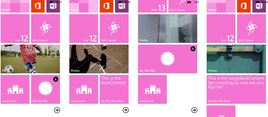
Figure 4-4. Front and back examples of the medium and large Tile displays
Solution
Use the FlipTile as the default tile for your application.
Recipe 4-1 explored how to configure a particular Tile template as the default for your application but didn’t really go into any details regarding the tiles themselves. In this recipe we’ll take a detailed look at the Flip Tile and its various properties.
How It Works
The Flip Tile template is best suited for times when you have additional information that the user would be interested in seeing without having to launch your application. A perfect example of this is a weather application. You can show current information on the front of the tile and then more detailed information on the flip-side. Perhaps provide a 5-day forecast.
The key to determining what information to provide on each side is relevance. The interval between flips is random and you don’t want the user waiting for informaton. The information on both sides should be as immediately relevant to the user as possible. The 5-day forecast in the example above could still provide the current day as 1 of the 5 days. In this way you aren’t keeping the user waiting on your Tile and they will have a more enjoyable experience.
An example of a poor use of the Flip Tile would be a bus schedule that shows the next arrival time on the front but neglects to include that informaton in some form on the reverse side of the Tile. To add variety to your Tile’s information you could present the same information in a different format. You could show a map of the current location of the next bus. The user can then infer the time of the next arrival from the position of the bus on the map. In this way the user has the scheduled arrival time on one side and a visual representation that allows her to estimate the actual arrival time.
Each of the different Tile templates has an associated class that defines the data consumed by the Tile. For the Flip Tile this is the FlipTileData class. You don’t use this class directly when defining your default tile but rather enter values in the PrimaryToken element in the WPAppManifest.xaml file. The names of the properties on the FlipTileData class don’t correspond directly to the element names contained in the PrimaryToken. Table 4-2 shows how each property maps to its corresponding element. You’ll see this class in use in the recipes in Recipe 4-5 on creating Secondary Tiles in this chapter as well as in Chapter 5 on Tile notifications.
Table 4-2. Mapping of FlipTileData Class Properties to the PrimaryToken Element of WPAppManifest.xaml
| Property Name | PrimaryToken Element | Description |
|---|---|---|
| BackBackgroundImage | BackBackgroundImageURI | The background image of the back of the Tile. When set to an empty URI, the background image of the back of the Tile will not change during an update. |
| BackContent | BackContent | The text to display on the back of the Tile, above the title. When set to an empty string, the content on the back of the Tile will not change during an update. |
| BackgroundImage | BackgroundImageURI | The background image of the front of the Tile. When set to an empty URI, the background image of the front of the Tile will not change during an update. |
| BackTitle | BackTitle | The title to display at the bottom of the back of the Tile. When set to an empty string, the title on the back of the Tile will not change during an update. |
| Count | Count | This property is of type Nullable<int> with a valid range that is between 1 and 99. The value will be displayed in the Count field of the Tile. A value of 0 means the Count will not be displayed. When not set, the Count display will not change during an update. |
| SmallBackgroundImage | SmallImageURI | The front-side background image for the small Tile size. |
| Title | Title | The text that displays on the front side of the medium and wide tile sizes. |
| WideBackBackgroundImage | LargeBackBackgroundImageURI | The back-side background image for the wide Tile size. |
| WideBackContent | LargeBackContent | The text that displays above the title, on the back side of the wide Tile size. |
| WideBackgroundImage | LargeBackgroundImageURI | The front-side background image for the wide Tile size. |
| Not Applicable | DeviceLockImageURI | The image to be used on the Lock Screen if your application has been configured to provide Lock Screen information. Recipe 4-6 will cover this element of the PrimaryToken. |
| Not Applicable | HasLarge | True if your application supports the large Tile format; False if not. |
Character Content
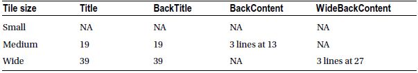
Character-based content is limited to predefined areas of the template and therefore limited in length. The Flip Tile template won’t wrap text or add an ellipsis to the end of a line and will simply truncate the data if it is too long for display. Table 4-3 shows the number of characters that can be accommodated by each text area in the template. The Segoe WP font that is used to display text on the start screen is not a fixed width font, and therefore the character counts are approximations only.
Table 4-3. Flip Tile Template Approximate Character Counts
Visual Layout
The layout of the Flip Tile is predefined and you have no control over how the content is presented. This is a good thing because it enables you to focus on the content data and not have to worry about providing a consistent visual experience for the user. Figure 4-5 shows a typical Flip Tile with complete content.
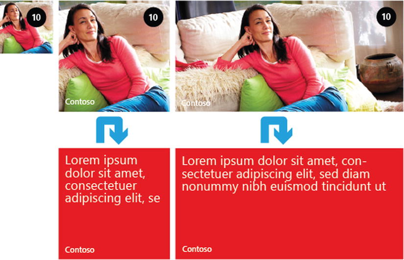
Figure 4-5. A typical Flip Tile
The content provided by the values you enter for the properties in Table 4-2 gets mapped into the Tile in a predefined way. Figure 4-6 shows how each of these values maps into the Flip Tile template for each of the small, medium, and large Tile formats.
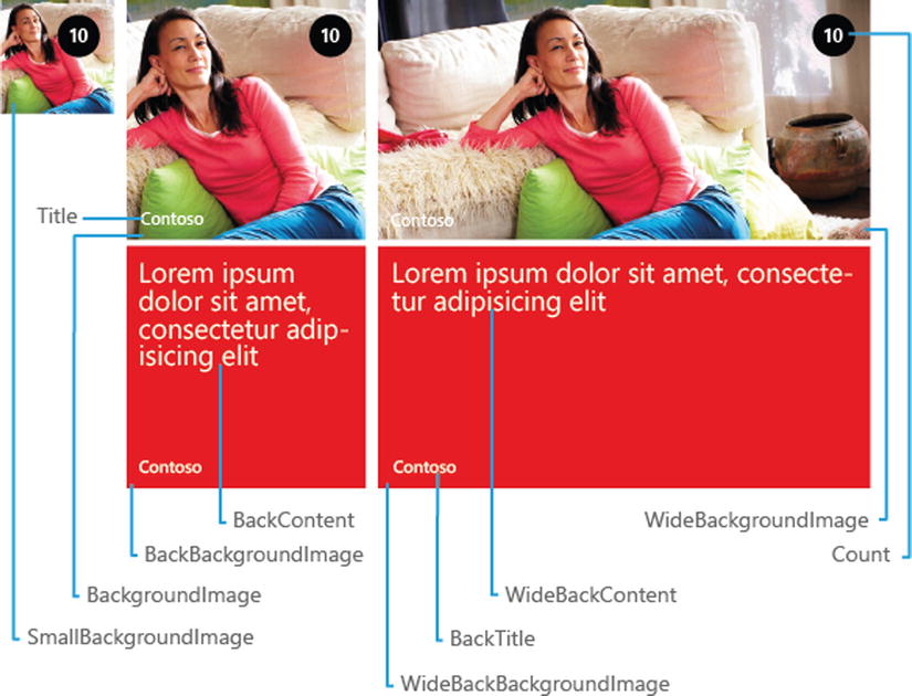
Figure 4-6. FlipTileData property mapping to the Flip Tile template
Figure 4-7 illustrates the layout of the various parts of the Tile for each of the sizes. Table 4-4 lists the size of the images used for each size.
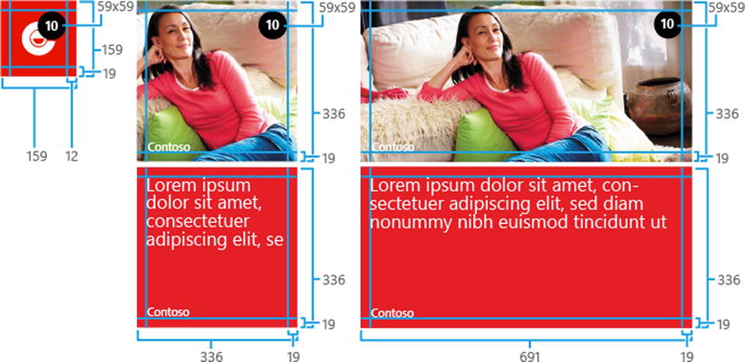
Figure 4-7. Flip Tile template layout dimensions
Table 4-4. Image Dimensions
| Tile Size | Image Dimensions |
|---|---|
| Small | 159 × 159 pixels |
| Medium | 336 × 336 pixels |
| Wide | 691 × 336 pixels |
Problem
Your application has information that is count-centric and you want to best method of showing that count to the user.
Solution
Use the Iconic Tile as the default tile for your application.
How It Works
The Iconic Tile template is best suited for times when you have an application for which a current count of items is the most relevant information that the user would be interested in seeing without having to launch your application. A perfect example of this would be an e-mail application. You can show the current number of new e-mails that have arrived since the last time the user launched your application.
The Iconic Tile doesn’t support any type of image display beyond a white icon with a transparent background. This makes it unsuitable for applications that rely on images to convey information. The large Tile format does support a few lines of text, but because the user can change the size of the Tile at any time you shouldn’t rely on this to communicate the primary information.
An example of a poor use of the Iconic Tile would be a weather application that shows the temperature because the Count property can only display positive integers from 1 to 99. A value of 0 turns the count icon off completely. This might work in the warmer regions of the world but just about anywhere you go the current temperature is likely to exceed the valid range in one direction or another, and in any case you would just be limiting the market for your application.
Each of the different Tile templates has an associated class that defines the data consumed by the Tile. For the Iconic Tile this is the IconicTileData class. You don’t use this class directly when defining your default tile but, rather, enter values in the PrimaryToken element in the WPAppManifest.xaml file. The names of the properties on the IconicTileData class don’t correspond directly to the element names contained in the PrimaryToken. Table 4-5 shows how each property maps to its corresponding element. You’ll see this class in use in Recipe 4-5 on creating Secondary Tiles in this chapter as well as in Chapter 5 on Tile notifications.
Figure 4-8 shows a typical Iconic Tile with complete content.
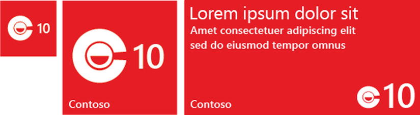
Figure 4-8. A typical Iconic Tile
Table 4-5. Mapping of IconicTileData Class Properties to the PrimaryToken Element of WPAppManifest.xaml
| Property Name | PrimaryToken Element | Description |
|---|---|---|
| BackgroundColor | BackgroundColor | The background color of the Tile. Setting this property overrides the default theme color that is set on the phone. See note below for additional usage information. |
| Count | Count | This property is of type Nullable<int> with a valid range that is between 1 and 99. The value will be displayed in the Count field of the Tile. A value of 0 means the Count will not be displayed. When not set, the Count display will not change during an update. |
| IconImage | IconImageURI | The icon image for the medium and large Tile sizes. |
| SmallIconImage | SmallImageURI | The icon image for the small Tile size. |
| Title | Title | The text that displays on the front side of the medium and wide tile sizes. |
| WideContent1 | LargeContent1 | The text that displays on the first row of the wide Tile size. This text is displayed in a larger font than WideContent2 and WideContent3. |
| WideContent2 | LargeContent2 | The text that displays on the second row of the wide Tile size. |
| WideContent3 | LargeContent3 | The text that displays on the third row of the wide Tile size. |
| Not Applicable | Message | Do not set a value for the element as it makes a complete mess of things. See note below. |
Note When setting the BackgroundColor element in the WPAppManifest file, be sure that the HEX value you enter DOES NOT include anything for the Alpha channel. Any value at all will result in your custom color being ignored and the default system color will be shown. For example, to set the BackgroundColor to RED you should enter #FF0000 and NOT #FFFF0000.
Character Content
Character-based content is limited to predefined areas of the template and therefore limited in length. The Iconic Tile template won’t wrap text or add an ellipsis to the end of a line and will simply truncate the data if it is too long for display. Table 4-6 shows the number of characters that can be accommodated by each text area in the template. The Segoe WP font that is used to display text on the start screen is not a fixed width font, and therefore the character counts are approximations only.
Table 4-6. Iconic Tile Template Approximate Character Counts
| Tile size | Title | WideContent1 | WideContent2 | WideContent3 |
|---|---|---|---|---|
| Small | NA | NA | NA | NA |
| Medium | 19 | NA | NA | NA |
| Wide | 39 | 33 | 33 | 33 |
Visual Layout
The layout of the Iconic Tile is predefined and you have no control over how the content is presented. This is a good thing because it enables you to focus on the content data and not have to worry about providing a consistent visual experience for the user.
The content provided by the values you enter for the properties in Table 4-5 gets mapped into the Tile in a predefined way. Figure 4-9 shows how each of these values maps into the Iconic Tile template for each of the small, medium, and large Tile formats. Figure 4-10 shows the dimensions of the various layout areas of the Tile.

Figure 4-9. IconicTileData property mapping to the Iconic Tile template

Figure 4-10. Iconic Tile template layout dimensions
Icon Design
There are a few things you need to keep in mind when creating your icon to ensure proper scalability across resolutions. You’ll need to supply two images: one for SmallIconImage and one for IconImage (SmallIconImageURI and IconImageURI, respectively, in WPAppManifest).
- SmallIconImage
- Used when the Tile is set to small or when the Tile is set to large and you’ve provided content in the WideContent properties. See Figure 4-9.
- The maximum size of this image is 110 pixels by 110 pixels but. . .
- The recommended “best fit” dimensions are 70 pixels wide by 110 pixels high.
- IconImage
- Used when the Tile is set to medium or when the Tile is wide and has no content strings on it and may or may not have a count. See Figure 4-9.
- The maximum size of this image is 202 pixels by 202 pixels, but. . .
- The recommended “best fit” dimensions are 130 pixels by 202 pixels
For the best results when creating your assets, always pad vertically with a transparent buffer to the full size of the asset you’re creating. Let’s assume you have an icon where the white pixels in the medium or large image are only 130 pixels high. In this case you would pad the top and bottom of the icon out to 202 pixels high using a transparent buffer area. Remember to always keep the image centered vertically.
Contrary to what is done for the vertical plane, the horizontal plane is always cropped tight to the image. Crop the image to its actual width and don’t pad the horizontal plane with a transparent buffer. Adding a transparent horizontal buffer will push the count too far away from the image and it won’t look consistent with the icons of other application tiles.
You will achieve the best results if you begin with the layout of your large icon image and, if possible, scale it down for the small icon. For example, if we assume a “best fit” large icon that’s 130 pixels wide by 202 pixels tall, set the small aspect ratio to 110 pixels tall and approximately 70 pixels wide. This is virtually the same aspect ratio, so everything should look fine when scaling down.
4-4. Create a Cycle Tile
Problem
You want to display several visual representations of your application’s content.
Solution
Use the Cycle Tile as the default Tile for your application.
How It Works
The decision to use the Cycle Tile is fairly straightforward but you should be aware of certain limitations. For example, the Cycle Tile has various animations built into it for the display of the images provided. You have no control over the transitioning, zooming, or cropping of the images as they are displayed. This makes the Cycle Tile unsuitable for the conveying of textual information to the user.
An excellent example of an appropriate use of the Cycle Tile is a music application. Pictures or album art can be displayed in rotation for the currently playing artist. The Photos application that ships with Windows Phone 8 is also a perfect example of Cycle Tile use.
The Count property is still available to you, but depending on the application you may or may not find it useful, as it is limited to the range of 1 to 99. Photos in an album could quickly exceed 99 but the number of songs in a current playlist might be acceptable. Having said that, the playlist I am listening to while I write this is currently sitting at 90 songs. If I add a few more into rotation,2 then the Count becomes irrelevant.
Mapping Content
Each of the different Tile templates has an associated class that defines the data consumed by the Tile. For the Cycle Tile this is the CycleTileData class. You don’t use this class directly when defining your default tile but rather enter values in the PrimaryToken element in the WPAppManifest.xaml file. The names of the properties on the CycleTileData class don’t correspond directly to the element names contained in the PrimaryToken. Table 4-7 shows how each property maps to its corresponding element. You’ll see this class in use in the recipes in Recipe 4-5 on creating Secondary Tiles in this chapter as well as in Chapter 5 on Tile notifications.
Table 4-7. CycleTileData class to PrimaryToken Element Mapping
| Property Name | PrimaryToken Element | Description |
|---|---|---|
| Count | Count | This property is of type Nullable<int> with a valid range that is between 1 and 99. The value will be displayed in the Count field of the Tile. A value of 0 means the Count will not be displayed. When not set, the Count display will not change during an update. |
| SmallIconImage | SmallImageURI | The icon image for the small Tile size. |
| Title | Title | The text that displays on the front side of the medium and wide tile sizes. See Table 4-8 for character limits. |
| CycleImages | Photo01ImageURI through Photo09ImageURI | A collection of up to 9 background images for the medium and wide Tile sizes. There should always be at least one URI configured for this property. |
Character Content
The only character-based content that can be configured is the Title and has the same limitations as the Title of the other Tile templates. Table 4-8 shows the number of characters that can be accommodated by each text area in the template. The Segoe WP font that is used to display text on the start screen is not a fixed-width font, and therefore the character counts are approximations only.
Table 4-8. Approximate Character Counts for the Cycle Tile Template
| Tile Size | Title |
|---|---|
| Small | NA |
| Medium | 19 |
| Wide | 39 |
Visual Layout
The visual layout of the Cycle Tile template is fairly simple. The Count is displayed in the top-right corner of all three sizes of tile and the Title is displayed in the bottom-left corner of the medium and large sizes. No Title is displayed for the small size. Figure 4-11 shows how each property of the CycleTileData class maps into the Tile. Figure 4-12 shows the dimensions of the layout areas.

Figure 4-11. CycleTileData property mapping to the Cycle Tile template

Figure 4-12. Cycle Tile template layout dimensions
The images you provide to the Cycle Tile are, you guessed it, cycled through one at a time at random intervals. The image may be cropped or zoomed depending on its size and it is also animated to slide slowly across the tile. Think of someone carrying a large picture past a smaller window. You have no control over any of the manipulations applied to your image and are at the mercy of Windows Phone 8.3 It’s because of these random animations and transitions that text content in the images isn’t very practical. Figure 4-13 shows an example, albeit a static one, of this transition.

Figure 4-13. Images in transition in the Cycle Tile template
Problem
You want to be able display information from a particular area of your application in a tile on the start screen.
Solution
Use the Tile API to create a secondary Tile on the start screen.
How it Works
In Recipe 4-1 we learned how to configure the default Tile for your application. This is the tile that is used when the user does a tap and hold on your application in the list and chooses pin to start. You can also write code within your app that will allow the user to pin specific content to the start screen.
The choice to expose certain areas of your application on a secondary tile should be made carefully. You can create any of the three Tile template types —Flip, Iconic, and Cycle—and the same guidelines apply whether they are used as the default or secondary. There are a few additional considerations to keep in mind when deciding on a secondary Tile:
- Secondary Tiles can be updated using the same API as the default Tile so the content should be dynamic to attract the user’s attention and encourage the use of your application
- The choice to create a secondary Tile is completely up to the user but you must add the capability to suitable areas of your application. Nothing can be pinned by default.
- Use the SDK provided app bar buttons for pin and unpin functionality when you are pinning the current page’s content.
- Pinning of an individual item in a list is best accomplished by using a contextual menu.
In addition to these guidelines, there are a couple of Don'ts that you should keep in mind. These are:
- You should not use a secondary Tile as a link to a discrete file or other static content that might disappear.
- Don’t use a secondary Tile as a virtual Button to trigger functionality within your application—like a Next Track function in a music player or something similar. Tiles are designed to be a single-click target that launches your application. Subverting that purpose is only going to antagonize the user and make them unistall your application.
Add an App Bar
The first thing you’ll need is an application bar for the page that contains the content you want to pin. See Recipe 2-3 in Chapter 2 for the gory details of working with the app bar. We’ll keep it simple in this recipe. Listing 4-2 shows the XAML to add to create an app bar with a pin/unpin button.
Listing 4-2. XAML for the App Bar With a Pin/Unpin Button
<phone:PhoneApplicationPage.ApplicationBar>
    <shell:ApplicationBar IsVisible="True" IsMenuEnabled="True">
         <shell:ApplicationBarIconButton
            x:Name="btnPinToStart"
            IconUri="/Assets/pin.png"
            IsEnabled="True"
            Text="pin to start"
            Click="PinToStartScreenClick"/>
    </shell:ApplicationBar>
</phone:PhoneApplicationPage.ApplicationBar>
Creating the Tile
Unlike the default Tile that you configure in the WPAppManifest.xml file, secondary Tiles can only be created through code at the explicit request of the user. You can refer to the other recipes in this chapter for information on the design of each type of Tile. Here we’ll just create a Flip Tile. First, we’ll need some content that the user of our application can pin to the start screen. You can follow along in the sample application included with the book’s source or you can create a new project using the Windows Phone Databound App project template and work with the Details.xaml page in that.
Note A sample application SecondaryTiles project can be found in the Chapter04 folder of the sample code.
The next thing we need to do is handle the Click event of the pin button. There are three things we need to do here:
- If there is already a Tile for the current content, then it was previously pinned and we need to remove it.
- If a Tile doesn’t exist for the current content, then we need to create one.
- Update the app bar button to reflect the proper state for the current content.
You’ll see these tasks reflected in the code from the sample application shown in Listing 4-3. Also included are some helper functions for working with the Tiles. The Source property of the NavigationService will tell us how we got to this page. See Recipe 2-4 in Chapter 2 for more information on the NavigationService. This is the same URI that would have been used to create the secondary tile in the first place. Key to all of these functions is the ShellTile class.
The ShellTile class exposes a static property called ActiveTiles that contains all of the Tiles for your application. ActiveTiles always contains at least one item representing the Application Tile which cannot be deleted. The Application Tile is always the first item in the list. The ActiveTiles list also contains any secondary Tiles that have been created. The CharacterTileExists and DeleteCharacterTile helper methods use the ActiveTiles property to find a specific tile reference.
The ShellTileClass also exposes a static method called CreateTile. The CreateTile method has two implementations. When working with Windows Phone 8, you should always use the overload that requires three parameters. When passed anything other than a StandardTileData object, the other implementation will throw an InvalidOperationException. There’s nothing to stop you from using StandardTileData bit it’s not part of the official design guidelines and is only there for backwards compatibility with Windows Phone 7.x. It will behave pretty much the same as FlipTileData but has no support for the large size and you can’t configure a different image for the small size.
The SetPinBar method is pretty straight forward. It again uses the Source property of the NavigationService to test if a character tile exists and changes the icon and text of the app bar button based on the results.
Listing 4-3. The Click Event Handler for the App Bar Pin Button
private void PinToStartScreenClick(object sender, EventArgs e)
{
    string uri = NavigationService.Source.ToString();

    if (CharacterTileExists(uri))
    {
        // If the tile already exists, then we delete it
        DeleteCharacterTile(uri);
    }
    else
    {
        // Otherwise create it
        SetCharacterTile(uri);
    }

    SetPinBar();

}
private bool CharacterTileExists(string navigationSource)
{
    ShellTile tile = ShellTile.ActiveTiles
         .FirstOrDefault(o => o.NavigationUri.ToString().Contains(navigationSource));
    return tile == null ? false : true;
}

private void DeleteCharacterTile(string navigationSource)
{
    ShellTile tile = ShellTile.ActiveTiles
         .FirstOrDefault(o => o.NavigationUri.ToString().Contains(navigationSource));
    if (tile != null)
    {
        tile.Delete();
    }

}

private void SetCharacterTile(string navigationSource)
{

    FlipTileData tileData = new FlipTileData()
    {
        Title = selectedCharacter.CharacterName,
        SmallBackgroundImage =
             new Uri(selectedCharacter.ImageUri, UriKind.RelativeOrAbsolute),
        BackgroundImage =
             new Uri(selectedCharacter.ImageUri, UriKind.RelativeOrAbsolute),
        BackTitle = selectedCharacter.CharacterName
    };

    ShellTile.Create(new Uri(navigationSource, UriKind.Relative), tileData, true);

}

private void SetPinBar()
{
    var uri = NavigationService.Source.ToString();
    if (CharacterTileExists(uri))
    {
        PinButton.IconUri = new Uri("/Assets/unpin.png", UriKind.Relative);
        PinButton.Text = "Unpin";
    }
    else
    {
        PinButton.IconUri = new Uri("/Assets/pin.png", UriKind.Relative);
        PinButton.Text = "Pin";
    }
}
The whole point of a secondary tile is to provide the users of your application with a deep link into your content. If you run the application now with only what we’ve done so far, you’ll find yourself on the right page but the app bar button won’t reflect the fact that this content is already pinned. Everything still works fine, but the user is going to be confused. Fortunately, this is easily solved by adding a call to SetPinBar in the OnNavigatedTo method override.
You should already have code in this method to handle setting the DataContext of your page to the right item. Simply add the call to SetPinBar as the last line of code in this method so it can fix up the app bar button. See Listing 4-4 for an example.
Listing 4-4. DataContext management code with SetPinBar function call
protected override void OnNavigatedTo(NavigationEventArgs e)
{
    if (DataContext == null)
    {
        string selectedCharacterName = "";
        if (NavigationContext.QueryString
            .TryGetValue("selectedItem", out selectedCharacterName))
        {
            if (!string.IsNullOrEmpty(selectedCharacterName))
            {
                selectedCharacter = (from character in App.ViewModel.Items
                                     where character.CharacterName == selectedCharacterName
                                     select character).FirstOrDefault();
                DataContext = selectedCharacter;
            }
        }
    }

    SetPinBar();
}
4-6. Create a Lock Screen Background
Problem
You want to be able to allow the user to use a lock screen image provided by your application.
Solution
Create a lock screen image and register your application as a lock screen background image provider.
How it Works
There are two ways to provide a background image for the lock screen from your applicaton. You can provide a default image that the system can pull from your application or you can set a specific image via code. In this recipe we’ll look first at the design guidelines for a lock screen image and then look at how to provide one as a default as well as through a user action from within your application.
There aren’t too many restrictions on the background image, but there are a couple of important things to keep in mind. You should keep any text content in your image to a minimum. The image also shouldn’t be too “busy”. The lock screen is more than just eye candy. It is also interactive in that it provides the user with relevant information at a glance without them having to unlock the phone.
The current time and the next upcoming appointment are two of the default pieces of information that are displayed on the lock screen. Too much text, or a vivid and complex image, is going to interfere with, and distract from, this information as well as annoy the user. Annoyed users ususally uninstall your application. That’s no good for anybody. Figure 4-14 shows a nice example of an appropriate lock screen background image.

Figure 4-14. A simple and pleasing lock screen image
It’s certainly appropriate to include your application’s logo and your company name or other brief information on the background, but keep in mind that this information is static. It’s possible to replace the lock screen from a background agent to update the information, but this requires swapping out the entire background. The lock screen has a clearly defined area in which you should contain your content. It’s always in the top-left region of the screen but differs in dimensions for each screen resolution. Figure 4-15 shows the location and dimensions of the application content section for each of the three device resolutions, and Figure 4-16 shows three excellent examples of the use of this area.
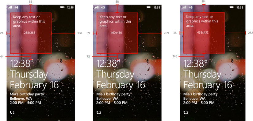
Figure 4-15. Recommended application specific content area for the lock screen background

Figure 4-16. Examples of custom lock screen background image content
You’ll want to keep the text as well as the logo, if you include one, relatively small so that they won’t compete with the date, time, and notifications. You might even consider making your logo slightly transparent. The text you include should be directly related to the image you are displaying and not, for example, an advertisement for your application. People have been killed for less.4 The focus of the lock screen image should be the visual and not the text.
Provide a Default Lock Screen Image
Now that you’ve designed the most awesome lock screen image anyone will ever need, you must now unleash it upon the world.5 Providing a default lock screen image couldn’t be simpler.
All you need to do is register your application by adding the Lockscreen_Background extension in the WPAppManifest.xml file and provide a default lock screen image in the root of your application named, of all things, DefaultLockScreen.jpg. In the manifest file, immediately after the </Tokens> section, which always exists, you may need to add an <Elements> section to the manifest. Listing 4-5 shows the required XML element. The ConsumerID is just one of those “magic strings” and will never change.
Listing 4-5. Extension Element XML to register as a LockScreen Background provider
</Tokens>
<!-- Immediately after Tokens -->
<Extensions>
  <Extension
    ExtensionName="LockScreen_Background"
    ConsumerID="{111DFF24-AA15-4A96-8006-2BFF8122084F}"
    TaskID="_default"/>
</Extensions>
Now that you have registered your application to provide a lock screen background you will find that you application now shows up in the Settings on your phone. Deploy your application to your device or emulator and then open the Settings on the device. Tap on lock screen and you should see the screen in Figure 4-17. Tap on the box below the Background caption and you will be presented with a screen listing all of the applications that can provide a background. Your application should appear in this list. See Figure 4-18.
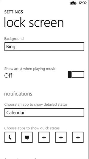
Figure 4-17. The lock screen settings page

Figure 4-18. List of applications that can provide a lock screen background image
Select your application from the list and then lock your device to see your image displayed. If you are using the emulator you can lock the device in one of two ways. You can press F12 when the emulator has focus to turn off the screen and lock the device and then again to wake it up. The other way is to use the Simulation Dashboard in Visual Studio by choosing it from Tools menu. Figure 4-19 shows the Dashboard. Simply toggle the radio button below Lock Screen between Locked and Unlocked to lock the emulator.

Figure 4-19. The Simulation Dashboard in Visual Studio
Let the User Choose a Lock Screen Background
Setting the lock screen image in code is almost as easy as setting up the default. You provide an app bar button for the page that represents the image you want to use and then use the LockScreenManager and LockScreen classes to set the selected image as the background.
Create a method in your code-behind that will be called when the user makes a selection. You can use a contextual menu, an app bar button, or your own button. The method in Listing 4-6 is for the Click event of an app bar button.
Note By default the Click event handler will be created as a synchronous method. Because we are going to be using await on an asynchronous method call, we need to mark this handler with the async keyword. For more information and async/await, refer to the C# documentation on MSDN.
http://msdn.microsoft.com/en-us/library/vstudio/hh156513(v=vs.110).aspx
Listing 4-6. App Bar Button Click Code
private async void SetAsLockScreenBackGround(object sender, EventArgs e)
{
    if (!LockScreenManager.IsProvidedByCurrentApplication)
    {
        await LockScreenManager.RequestAccessAsync();
    }

    if (LockScreenManager.IsProvidedByCurrentApplication)
    {
        Uri tempUri = new Uri
            (
            string.Format("ms-appx://{0}", selectedCharacter.ImageUri),
            UriKind.RelativeOrAbsolute
            );

        LockScreen.SetImageUri(tempUri);
    }
}
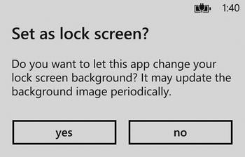
Figure 4-20. Getting permission from the user to change the lock screen
First we check with the LockScreenManager to see if we are currently set as the lock screen background provider, and if not, we request access. Calling The RequestAccessAsync method of the LockScreenManager will pop up a dialog (Figure 4-20) asking the user if they will allow us to set the background. When we return from this call, we again check the IsProvidedByCurrentApplication property and if the user agreed, we go ahead and set the background image. Setting the background image is a simple matter of calling the SetImageUri static method of the LockScreen and passing it a valid Uri pointing to the image you want on the lock screen.
4-7. Lock Screen Notification Support
Problem
You want you application to be able to display Live Tile information on the lock screen.
Solution
Configure the required Extensions as well as a lock screen icon in the WPAppManifest.xml file. Optionally, link to the lock screen settings page from within your application.
How it Works
In Windows Phone OS 7.1, only first-party applications could participate in lock screen notifications, but in Windows Phone 8 any third-party can offer notification support. Notification content is pulled directly from your applications default Tile so if you haven’t done so, you should check out Recipe 4-1 and get that done now. The Information will only be displayed if the default Tile contains it. If your default Tile isn’t showing a Count, for instance, a count will not be displayed on the lock screen. You will also need to configure a lock screen icon in the manifest. Figure 4-21 shows an example of the Lock Screen Notification Area.
Lock Screen Icon
The lock screen icon must be a PNG file that is 38 x 38 pixels in size. The image must contain only white pixels and have some level of transparency. Once you have the image, edit the WPAppManifest.xml file by right-clicking it and choosing Open With. Within the <PrimaryToken> element you will find the <DeviceLockImageURI> element. Set the IsRelative attribute to “true” and the IsResource attribute to “false”. Add the full path to your icon inside the element as shown in the following example:
<DeviceLockImageURI
  IsRelative="true"
  IsResource="false">AssetsLockIcon.png</DeviceLockImageURI>
Note At the time of this writing there is a bug in the parser related to this particular element. You must ensure that there is NO whitespace around the path to your icon. If your icon isn't showing up on the lock screen, this might be the cause.

Figure 4-21. The Lock Screen Notifications Area
After configuring the <DeviceLockImageURI> you can add in the extensions while you are editing the manifest. Add the LockScreen_Notification_IconCount and LockScreen_NotificationTextField extensions to the <Extensions> element. You may have to add this element to the manifest, and if so, it should be added immediately after the <Tokens> element. Listing 4-7 shows a properly configured manifest.
Listing 4-7. The <Extensions> Element in WPAppManifest.xml
</Tokens>
<!-- Immediately after Tokens -->
<Extensions>
  <Extension
    ExtensionName="LockScreen_Notification_IconCount"
    ConsumerID="{111DFF24-AA15-4A96-8006-2BFF8122084F}"
    TaskID="_default"/>
  <Extension
    ExtensionName="LockScreen_Notification_TextField"
    ConsumerID="{111DFF24-AA15-4A96-8006-2BFF8122084F}"
    TaskID="_default"/>
  <Extension
    ExtensionName="LockScreen_Background"
    ConsumerID="{111DFF24-AA15-4A96-8006-2BFF8122084F}"
    TaskID="_default"/>
</Extensions>
Linking to the Lock Screen Settings
The last thing you might want to consider is to add a way for the user to get to the lock screen settings page from within your application. For this example, we’ll use an app bar menu item on the main page of the application. Listing 4-8 shows the code and XAML needed. In the Click event handler you simple call the LaunchUriAsync method of the System.Windows.Launcher class passing in the ms-settings-lock: path.
Listing 4-8. App Bar Menu Item and Click Handler for Lock Screen Settings Page Navigation
<phone:PhoneApplicationPage.ApplicationBar>
    <shell:ApplicationBar Mode="Minimized">
        <shell:ApplicationBar.MenuItems>
            <shell:ApplicationBarMenuItem
                x:Name="AboutMenuItem"
                IsEnabled="True"
                Text="lock screen settings"
                Click="SettingsMenuItemClick"/>
        </shell:ApplicationBar.MenuItems>
    </shell:ApplicationBar>
</phone:PhoneApplicationPage.ApplicationBar>

private async void SettingsMenuItemClick(object sender, EventArgs e)
{
    // Launch URI for the lock screen settings screen.
    Uri lockSettingsUri = new Uri("ms-settings-lock:");
    await Launcher.LaunchUriAsync(lockSettingsUri);

}
Note By default the Click event handler will be created as a synchronous method. Because we are going to be using await an asynchronous method call, we need to mark this handler with the async keyword. For more information and async/await, refer to the C# documentation on MSDN.
http://msdn.microsoft.com/en-us/library/vstudio/hh156513(v=vs.110).aspx
1 Ok, maybe it’s just me, but look at it sitting there all smug and not flipping. “Oh, I can flip” it mocks, “but I choose not to.”
2 I have one playlist I call “Rotation” and just add and remove songs from it. There are enough songs that I don’t get bored if it repeats. I also have somewhat ecclectic musical taste so I can mix it up a bit in a single list. I can even “shuffle” up the play order if I’m feeling dangerous. You can’t stop me. Don’t even try.
3 Besides, you’ve got better things to do—for example, setting up the ultimate “Rotation” playlist of your favorite music.
4 While in all likelihood people haven’t actually been actually killed for less, they have been subjected to merciless and sardonic ridicule.
5 There is no charge for awesomeness. . . or attractiveness. - Kung Fu Panda