CHAPTER 10
CREATING GUI ELEMENTS
As you’ve seen by now, there is more to a 3D game than just the imaginary world into which the player plunks his avatar. There is the real need to provide the player with some method to make selections and otherwise control the game activities. Generally, we provide a Graphical User Interface (GUI) to the player to interact with the program. The menu we employed at the start-up of the program, where the player clicks buttons to launch the game, change the setup, or quit; the dialog box that shows the client’s loading progress; the dialog box that asks if the player really wants to quit—these screens are all examples of GUIs.
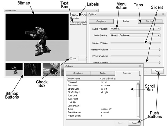
If you take a look at Figure 10.1, you can see a sample of the variety of elements found within these interface screens. This example shows the various controls of the three tab panes of the Options dialog box in the Torque demo.
Some of the elements are things we can interact with:
 push buttons
radio buttons
edit boxes
checkboxes
menus
sliders
Figure 10.1
Common graphical user interface elements.
Some of the elements are things we can just look at:
frames
labels
backgrounds
text boxes
Also, during the course of discussions about graphical user interfaces, you may find the terms GUI, window, interface, and screen used interchangeably. I’ll stick to the words interface and screen as much as possible, although contextually it might make more sense to use GUI or window from time to time. GUI is best used to describe the entire game interface with the player as a whole. Window is a term that most people tend to associate with the operating system of their computer.
The names of GUI items that are available by default with Torque don’t differentiate between whether they are interactive or noninteractive GUI elements.
If you are familiar with X-Windows or Motif, you probably will have encountered the term widgets. If so, your definition of widgets may be a fair bit broader than the one I am about to use here. In our situation, widgets are simply visual portions of a displayed GUI control. They convey information or provide an aesthetic appearance and offer access to defined subcontrol elements.
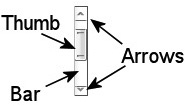
For example, Figure 10.2 portrays a scroll bar. Within the scroll bar are the thumb, arrow, and bar widgets. These aren’t controls in their own right but rather are necessary, specialized components of the control to which they belong.
Figure 10.2
Scroll bar widgets.
It is possible for a control to use another control as a widget. In fact, every control in a screen can be considered a widget within the control that defines the screen. This will become clearer later on. I will only use the term widget to refer to a specialized component of a control that is not itself a control.
Worth noting is the fact that you can create your own GUI elements using TorqueScript if the ones that are available by default don’t suit your needs.
CONTROLS
The name says it all—controls are graphical items provided to the program user to control what the program will do. In Torque, interactive controls are used by clicking them or click-dragging the mouse across them. Some controls, like edit boxes, also require you to type in some text from the keyboard. Some of the controls have built-in labels that identify their purpose, and some will require you to create an accompanying noninteractive control to provide a label. Noninteractive controls, as the name implies, are used only to display information and not to capture user input.
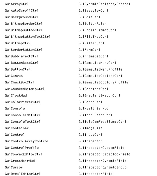
Torque provides almost 150 default controls right out of the box, listed in Table 10.1.
You encountered a few of these controls in earlier chapters, and we will discuss several more of them in this chapter. You can use them as is, you can modify them by adjusting the control’s profile, or you can use them as the basis for defining new controls.
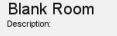
Figure 10.3 shows a dialog used to select mission levels to play. There is a list of available levels on the client in the form of buttons arrayed along the bottom. There is a bitmap image to preview the selected level, and a checkbox to indicate whether you want to host this level for other players. Finally, there is a button to click if you want to go ahead and play this level, and a close box at the upper right of the dialog to click if you want to return to the previous screen. Note, too, that there is a background—the same background used for FPS Example’s start-up menu.
What we’ll do next is examine each of the screen’s GUI elements in detail.
GuiChunkedBitmapCtrl
The GuiChunkedBitmapCtrl class is usually used for the large backgrounds of interfaces, like menu screens. Figure 10.4 shows such a background. The name derives from the concept of breaking up an image into a collection of smaller ones (“chunks” o’ bitmaps) in order to improve display performance.
Figure 10.3
Choose Level interface screen.
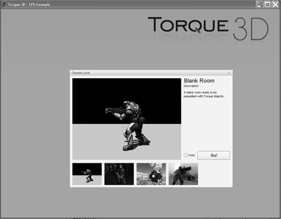
Figure 10.4
GuiChunkedBitmapCtrl background sample.

Here is an example of a GuiChunkedBitmapCtrl definition:
new GuiChunkedBitmapCtrl(MenuScreen) {
   profile = "GuiContentProfile";
   horizSizing = "width";
   vertSizing = "height";
   position = "0 0";
   extent = "640 480";
   minExtent = "8 8";
   visible = "1";
   bitmap = "./interfaces/emaga_background";
   // insert other controls here
};
The first thing to note about this definition is the line // insert other controls here. Typically, a GuiChunkedBitmapCtrl control would contain other controls, functioning as a container. All other controls in a given screen using this control would be children, or subelements, of this control. This line is a comment, so in and of itself, it has no effect on the control’s definition. I include it here to indicate where you would start nesting other controls.
Note the extent property, which specifies a width of 640 and a height of 480. These are “virtual pixels” in a way. Any subelements you insert in this control will have a maximum area of 640 × 480 to work with for positioning and sizing. These virtual pixels are scaled in size according to the actual canvas size, which you can change by setting the value of the global variable $pref::Video::windowedRes and then calling CreateCanvas or, if you already have a canvas, by calling Canvas.Repaint or ResetCanvas;—we saw CreateCanvas in Chapter 7.
The minExtent property specifies the smallest size that you will allow this control to be shrunk down to when using the Torque built-in GUI Editor. We will use that editor later in this chapter.
GuiControl
The GuiControl class, as shown in Figure 10.5, is a generic control container. It’s often used as a tablike container, or as what other systems often call a frame. With it, you can gather together a collection of other controls and then manipulate them as a group.

Here is an example of a GuiControl definition:
new GuiControl(InfoTab) {
   profile = "GuiDefaultProfile";
   horizSizing = "width";
   vertSizing = "height";
   position = "0 0";
   extent = "640 480";
   minExtent = "8 8";
   visible = "1";
};
Probably the property you will be most interested in is the visible property. You will likely want to programmatically make the control visible or invisible based on the contents (the other controls) you place within the control. You can do that by adding either of the following statements to your scripts in a place suitable to your game design:
InfoTab.visible = true;
InfoTab.visible = false;
Note that true is the same as 1 or “1” and false is the same as 0 or “0”.
GuiTextCtrl
The GuiTextCtrl, as shown in Figure 10.6, is a straightforward, commonly used control. In Figure 10.6 you see two differently sized GuiTextCtrl controls being used as labels, which are commonly used to display textual information. You can get a GuiTextCtrl to display any text you want. You can put it on an interface with no text and then fill in the text as the game progresses using script code.
Figure 10.6
GuiTextCtrl sample.
Here is an example of a GuiTextCtrl definition:
new GuiTextCtrl(PlayerNameLabel) {
   profile = "GuiTextProfile";
   horizSizing = "right";
   vertSizing = "bottom";
   position = "183 5";
   extent = "63 18";
   minExtent = "8 8";
   visible = "1";
   text = "Player Name:";
   maxLength = "255";
};
You would specify the text font and other characteristics with your choice of profile. You can change the contents quite easily in this example by adding the following to your script in an appropriate location, dictated by your design:
PlayerNameLabel.text = "Some Other Text";
Tip
The maxLength property allows you to limit the number of characters that will be stored with the control. Specifying fewer characters saves memory.
GuiButtonCtrl
The GuiButtonCtrl, as shown in Figure 10.7, is another clickable control class. Unlike GuiCheckBoxCtrl or GuiRadioCtrl, this class does not retain any state. Its use is normally as a command interface control, where the user clicks it with the expectation that some action will be immediately invoked.
Figure 10.7
GuiButtonCtrl sample.
Here is an example of a GuiButtonCtrl definition:
new GuiButtonCtrl() {
   profile = "GuiButtonProfile";
   horizSizing = "right";
   vertSizing = "top";
   position = "16 253";
   extent = "127 23";
   minExtent = "8 8";
   visible = "1";
   command = "Canvas.getContent().Close();";
   text = "Close";
   groupNum = "-1";
   buttonType = "PushButton";
};
The most significant property is the command property. It contains a script statement to be executed when the button is clicked. This example will close the interface screen being shown in the canvas.
Another feature is the buttonType property. This can be one of the following:
PushButton
ToggleButton
RadioButton
The property groupNum is used when the buttonType is specified to be RadioButton. Radio buttons in an interface screen that have the same groupNum value are used in an exclusive manner. Only the most recently clicked radio button will be set to the checked value (true); all others in the group will be unchecked. Otherwise, the radio button type works the same as the GuiCheckBoxCtrl class, described in the next section.
This control is also used as a base for deriving the three button classes shown previously. You would probably be better off to use the specialized classes GuiCheck BoxCtrl and GuiRadioCtrl for types ToggleButton and RadioButton, rather than this control, because they have additional properties.
So the upshot is, if you use this control, it will probably be as a PushButton.
GuiCheckBoxCtrl
The GuiCheckBoxCtrl, as shown in Figure 10.8, is a specialized derivation of the GuiButtonCtrl that saves its current state value. It’s analogous to a light switch or, more properly, a locking push button. If the box is empty when you click the control, the box will then display a checkbox. If it is checked, it will clear the checkmark out of the box when you click the control.
Figure 10.8
GuiCheckBoxCtrl sample.
Here is an example of a GuiCheckBoxCtrl definition:
new GuiCheckBoxCtrl(IsMultiplayer) {
   profile = "GuiCheckBoxProfile";
   horizSizing = "right";
   vertSizing = "bottom";
   position = "155 272";
   extent = "147 23";
   minExtent = "8 8";
   visible = "1";
   variable = "Pref::HostMultiPlayer";
   text = "Host Mission";
   maxLength = "255";
};
If you specify the variable property, then the value of the specified variable will be set to whatever the current state of the control is after you’ve clicked it. When the control is first displayed, it will set its state according to the value in the specified variable. You need to make sure that the variable you use contains appropriate data.
You can also specify the text label that will be displayed next to the checkbox using the text property.
Note that the GuiRadioCtrl control functions much like this control, except that it automatically enforces the principle that only one button in the same group will be checked.
GuiScrollCtrl
The GuiScrollCtrl class, as shown in Figure 10.9, is used for those famous scrolling lists that everyone likes. Okay, so not everyone may like them, but everyone has used them.
Figure 10.9
GuiScrollCtrl sample.
Here is an example of a GuiScrollCtrl definition:
new GuiScrollCtrl() {
   profile = "GuiScrollProfile";
   horizSizing = "right";
   vertSizing = "bottom";
   position = "14 55";
   extent = "580 190";
   minExtent = "8 8";
   visible = "1";
   willFirstRespond = "1";
   hScrollBar = "dynamic";
   vScrollBar = "alwaysOn";
   constantThumbHeight = "0";
   childMargin = "0 0";
   defaultLineHeight = "15";
   // insert listing control here
};
Normally, we would populate a scroll control with a list, usually defined by the contents of a GuiTextListCtrl control. The GuiTextListCtrl control containing the list would be added as a subelement of the GuiScrollCtrl control.
The willFirstRespond property is used to indicate whether we want this control to respond to arrow keys when they are pressed (to control scrolling) or to let other controls have access to arrow key inputs first.
Both the hScrollBar and vScrollBar properties—referring to the horizontal and vertical bars, respectively—can be set to one of these modes:
alwaysOn. The scroll bar is always visible.
alwaysOff. The scroll bar is never visible.
dynamic. The scroll bar is visible only when the list exceeds the display space.
The property constantThumbHeight indicates whether the thumb, the small rectangular widget in the scroll bar that moves as you scroll, will have a size that is proportional to the number of entries in the list (the longer the list, the smaller the thumb) or will have a constant size. Setting this property to 1 ensures a constant size; 0 will ensure proportional sizing.
The property childMargin is used to constrain the viewable space inside the parent control that would be occupied by whatever control contained the list to be scrolled. In effect, it creates a margin inside the scroll control that restricts placement of the scroll list. The first value is the horizontal margin (for both left and right), and the second is the vertical margin (both top and bottom together).
Finally, defaultLineHeight defines in virtual pixels how high each line of the control’s contents would be. This value is used to determine how much to scroll when a vertical arrow is clicked, for example.
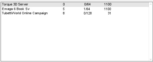
GuiTextListCtrl
The GuiTextListCtrl, as shown in Figure 10.10, is used to display 2D arrays of text values.
Here is an example of a GuiTextListCtrl definition:
new GuiTextListCtrl(MasterServerList) {
   profile = "GuiTextArrayProfile";
   horizSizing = "right";
   vertSizing = "bottom";
   position = "2 2";
   extent = "558 48";
   minExtent = "8 8";
   visible = "1";
   enumerate = "0";
   resizeCell = "1";
   columns = "0 30 200 240 280 400";
   fitParentWidth = "1";
   clipColumnText = "0";
   noDuplicates = "false";
};
The enumerate property indicates which line of text is presented as highlighted.
You can allow the cells to be resized with the GUI Editor by setting the resizeCell property to true.
Each record, or line, in the array has space-delimited fields. You can format the display of these fields by using the columns property to indicate at which column number each field will be displayed.
Figure 10.10
GuiTextListCtrl sample.
The fitParentWidth property indicates whether the control will be enlarged in size to fill the available display space of any control that might contain this control.
We can decide whether overlong text in each column is to be clipped or will be left to overrun adjoining columns by setting the clipColumnText property.
We can automatically prevent the display of duplicate record entries by setting the noDuplicates property to true.
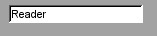
GuiTextEditCtrl
The GuiTextEditCtrl, as shown in Figure 10.11, provides a tool for users to manually enter text strings.
Here is an example of a GuiTextEditCtrl definition:
new GuiTextEditCtrl() {
    profile = "GuiTextEditProfile";
    horizSizing = "right";
    vertSizing = "bottom";
    position = "250 5";
    extent = "134 18";
    minExtent = "8 8";
    visible = "1";
    variable = "Pref::Player::Name";
    maxLength = "255";
    historySize = "5";
    password = "0";
    sinkAllKeyEvents = "0";
    helpTag = "0";
};
Figure 10.11
GuiTextEditCtrl sample.
With this control, the variable property is the key one. When the user types a string of text into the control’s edit box, that string is entered into the variable indicated. When the control is first displayed, the contents of the indicated variable are stuffed into the edit box for display.
Text edit controls have a nifty history feature that can be quite handy. All the previous entries—up to a maximum specified by historySize—are saved and can be recalled using the Up Arrow key to go back in history or the Down Arrow key to go forward.
If you are using this control to accept a password, then set the password property to true. The control will substitute asterisks (“*”) in place of whatever is typed by the user so that bystanders can’t see what is being typed.
The sinkAllKeyEvents property, when set to true, causes the control to throw away any keystrokes that it receives but doesn’t understand how to handle. When sinkAllKeyEvents is set to false, these keystrokes will be passed to the parent.
THE TORQUE GUI EDITOR
Torque has an editor built in for creating and tweaking interfaces. You can invoke the GUI Editor by pressing the F10 key (this is defined in the common code base scripts, but you can change it if you want). You are perfectly free to ship your game with this editor code, or you can remove it in any shipping version to ensure that people will not fiddle with the interfaces. Or you can modify it to suit your heart’s desire!
Note
If you want to edit GUIs from any of your projects (like Emaga4, 5, or 6 or, in later chapters, Koob), you’ll need to do a little preparation.
You need to do this preparation using the Emaga6 project, which you built in Chapter 6. We’ll be working with it for the rest of this chapter.
Make a copy of the Emaga6 project and rename the Torsion file to Emaga10.torsion and the Torsion project properties to ch10 just as we did in Chapter 6 when converting from Emaga5 to Emaga6. Don’t forget to also rename the Torsion options and exports files as well.
From your 3D3EResources folder for Chapter 10, locate the Tools folder, and copy it to your project’s folder. Next, open your newly named Emaga10.torsion project. In the project window, locate and open the root main.cs file (the one in the same folder as the T3Ddemo.exe executable and the Emaga10.torsion file), and locate the line near the end of the file that says this:
Exec("control/main.cs");
And add this to the next line immediately after it:
Exec("tools/main.cs");
Now the explanation for the next bit might be a bit confusing, but give a whirl, and if you don’t understand it, don’t worry—it’s a special case anyway. You can merrily proceed to follow the instructions without understanding, and as long as you follow the instructions carefully and get it right, I won’t tell anyone if you don’t.
The core code and the tools code should be unaware of what names you use for your game objects that you create in script. But, unfortunately, they aren’t fully unaware. The core code and the tools code both expect a GameTSCtrl object named PlayGui to be the interface screen (we use PlayerInterface) for the player when in game, and they also expect that the ActionMap for keybindings to be called MoveMap (we use PlayerKeymap).
This is unfortunate because it limits our ability to follow our own naming schemes in our game, somewhat. We call this a case of the PlayGui and MoveMap object names being hardcoded in the core and tools code.
Now, the changes required to fix the core code are easy enough. We can just wade into the core code searching for PlayGui and replace it with PlayerInterface, and that would work, as far as the core code goes.
But we don’t have the source code for the tools code—only the binary code in .dso format. It doesn’t ship with the Torque 3D Tools demo. What to do? We could go ahead and use the GarageGames names, but I’m not willing to give in to such tyranny.
Instead, what I’ve done is built a version of the Tools folder that has replaced all instances of PlayGui with $PlayGui. So instead of PlayGui being an object name, the dollar sign prepended to the word makes it a global variable. And because it’s a variable, we can assign whatever value to it that we want, and we want to assign the handle, or object ID, of the PlayerInterface to that variable, and that’s just what we are going to do.
Before I continue, I need to point out that the only place where this capability with the tools code exists is here in this book, specifically on the companion DVD in the RESOURCES/CH10/tools folder. And I do NOT supply the source code. GarageGames doesn’t include the source code for the Tools folder in the demo, so I won’t either.
Anyway, using your Emaga10 Torsion project, open the file control/client/interfaces/playerinterface.gui and near the top locate the line that reads:
new GameTSCtrl(PlayerInterface) {
and insert $PlayGui = at the front of the line so that it looks like this:
$PlayGui = new GameTSCtrl(PlayerInterface) {
That takes care of the player interface object.
The same approach applies to the key mapping object. Open the file control/client/misc/presetkey.cs and near the top locate the line that reads:
new ActionMap(PlayerKeymap);
and insert $MoveMap = at the front of the line so that it now looks like this:
$MoveMap = new ActionMap(PlayerKeymap);
Next, save all of your revised files if you haven’t already, and then run your program. If you do this, you will have the latest Torque 3D editor code and interfaces available to work with, as discussed in the section called “The Cook’s Tour of the GUI Editor.” If you don’t, then you may not be able to access an editor, but fret thee not—you could just go ahead and run the FPS Example that you got when you installed the Torque 3D demo. However, you would have to copy all of your work from the FPS Example folders to your project, so there is that to consider.
It’s best to get the editors working in your project.
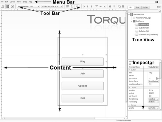
The Cook’s Tour of the GUI Editor
When you launch the editor by pressing the F10 key, after the nag screen (assuming you are using the T3Ddemo version and not the full SDK version) the editor will appear and load the Main Menu GUI, making it ready for editing. If you want to edit another GUI, simply open it from the GUI pop-up menu, described later.
Visually, there are five components to the GUI Editor: the Content pane, the Tree view pane, the Inspector pane, the Toolbar, and the Menu bar. There is also a sixth component, in a certain sense: keyboard commands.
Additionally, the Tree view has three tabs: GUI, Library, and Profiles. When either the GUI tab or Profiles tab is active, the Inspector pane beneath is enabled and showing the properties of whichever control object is currently selected in the Tree view.
Figure 10.12 shows the GUI Editor open and working with the main menu screen from the FPS Example game (you, however, should be working with your own menu screen in Emaga10).
The Content Pane
The Content pane is where you can place, move, and resize controls. In Figure 10.12 the Content pane is the large rectangular area at the lower left in the GUI Editor view.
Selection Normally, you select a control by clicking the mouse on it. Some controls can be difficult to select because of their positions. Another way to select controls is by using the Tree view, which is covered in a later section.
Figure 10.12
The Torque GUI Editor.
If you hold down the Shift key while clicking the mouse (shift-clicking) on several controls, you can select more than one control at once. Each time you shift-click you add that control to the selection. The sizing handles turn white and can no longer be used to size the control. You can still move the controls. Only controls that share the same parent can be selected at the same time.
Movement Move a control by clicking and dragging its content area after selecting it. When you move controls, be aware of which controls they may be contained by—when you drag the control to one side or another, you may be dragging it outside the display area of its parent control, and you don’t want that.
Resizing You resize a control after selection by clicking on and dragging one of the eight black sizing knobs, or handles. As with movement, you need to stay aware of how the control you are resizing is related to other controls. The sizing might be restricted by a parent control’s display area. Figure 10.13 shows the sizing knobs, attached to the Start Game button.
Figure 10.13
The Start Game button with sizing knobs.
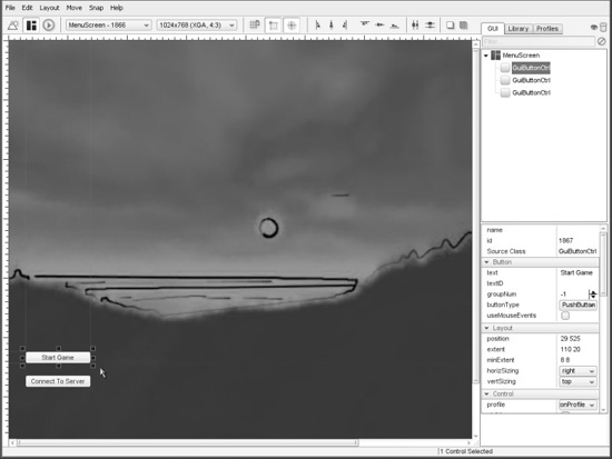
Adding As you’ve seen, controls can contain other controls, and when they do, they are called containers. The container that is the parent control of a currently selected control is outlined with a metallic-blue band. This control can be thought of as the destination container. Any new control created from the Toolbar or pasted from the Clipboard will be added to this control.
In order for a control to be a destination container that contains other controls, it must have its isContainer property (located in the Editing properties) set to true.
The destination container control can be specified manually on container-capable controls by right-clicking on the control’s entry in the Tree view, and choosing “Add New Controls Here”.
The Tree View
The Tree view shows the current content control hierarchy. It is in the upper-right corner of the GUI Editor view.
Parent controls—remember that these are also called containers, controls that contain other controls—have a little box to the left of their entry in the tree. If the box is a plus sign, clicking it will expand that control into the list, bringing the child controls into view. If you click it when it looks like a minus sign, it will contract the control’s list back to a single entry comprising solely the parent control.
Clicking any control in the tree will cause it to be selected in the Content pane and cause the control’s properties to be displayed in the Inspector pane. You can see this effect by looking back at Figure 10.12.
The Inspector Pane
The Inspector pane is where any currently selected control’s attributes are displayed. It is located in the lower-right corner of the GUI Editor, below the Tree view. All the properties of a control are displayed in the Inspector and can be changed here.
When first displayed, all the properties are expanded visually within their categories, such as Layout, Control, and Tooltip. There are a number of categories in addition to those three that are present in all controls, such as Editing, Localization, Object, Persistence, and Dynamic Fields; other controls have different categories that are specific to their characteristics. To access the properties within a category that is closed, simply click the little plus signs in the Inspector view beside those category names, and the category expands, giving you edit boxes and buttons with which you can manipulate the properties.
The Toolbar
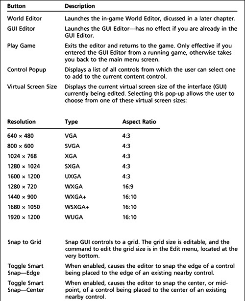
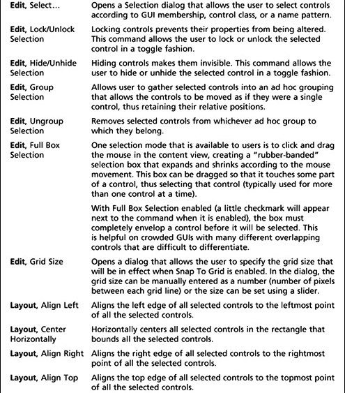
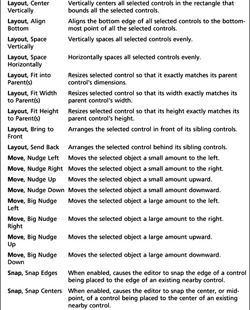
The Toolbar contains functions for creating new controls, opening existing GUIs, and setting a virtual screen size (for testing). The Toolbar has pop-up menus, organized into six sections, for creating new controls and changing the currently edited GUI. The functions of the buttons are described in Table 10.2. Realize that the table is laid out with the controls in left-to-right order.
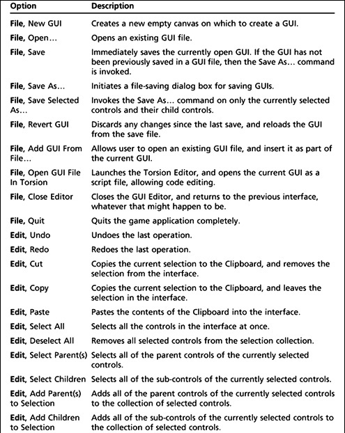
The Menu Bar
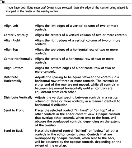
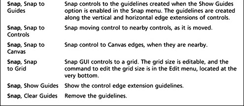
The Menu bar contains some standard menus, like File and Edit, which have approximately the expected functionality. There are three additional specialized menus: Layout, Move, and Snap (see Table 10.3).
Note
As is de rigueur in modern windowed applications, when the current context of your editing activities does not allow a particular operation to be performed, then the menu command for that operation will be grayed out, and unavailable. For example, when you have nothing in the copy/paste buffer, then you can’t actually paste anything, and the Edit, Paste command will be grayed out. No copy, no pasta. Me Gusta.
Table 10.2 Toolbar Button Functions
Keyboard Commands
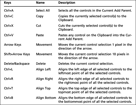
In addition to using mouse selection and GUI button clicks, the user has a number of keyboard commands available. Table 10.4 shows some of these commands, but is not an exhaustive list. You can see more of these key binds by browsing the menus themselves.
CREATING AN INTERFACE
In this section you will see how easy it is to create and employ an interface using the Torque 3D GUI Editor.
You should note that the Torque 3D GUI Editor assumes your screen resolution is set to a minimum resolution of 1024 × 768. You may find it more useful to use a higher resolution, to allow the different views more room to display their data. In the following procedure, you may have to click the Continue Using Demo button to get rid of the nag screen several times.
1. Run your Emaga10 game.
2. When the main menu screen appears, press the F10 key.
The various editor controls and panels will appear on the top and right side of the screen.
Table 10.4 GUI Editor Keyboard Commands
3. Choose File, New GUI, and enter a name for the new interface in the GUI Name field—do not use spaces in the name. Use “MyFirstInterface” for the GUI name.
4. Leave the class as GuiControl, and then click the Create button. You will now have a nice, shiny new interface to work with.
5. In the Control Tree panel, select the control named “MyFirstInterface”. Its properties should appear in the Control Inspector panel.
6. Locate the profile property, and click the button on the right-hand side to get the pop-up menu.
7. Scroll through the menu until you locate the GuiContentProfile, and select that.
The profile is automatically applied. This should cause your content view to turn all white. Now you have a Content Control to which you can add other controls.
8. On the right side, click the Library tab near the top. A list of control categories appears.
9. Click the Buttons, and a list of button controls appears. Choose GuiButtonCtrl, and a GuiButtonCtrl will appear in your content view, nestled into the upper-left corner. If the new button is not already selected (it should be) then select the button using one of the two techniques you’ve learned (via the Content Editor or the Tree view).
10. Back up at the tabs, choose the GUI tab, to get the Tree view and Inspector pane back.
11. Look in the Inspector pane, and locate the text property for this new control. It’s at the top of Button group, which is the topmost property group. You might have to scroll up to find it, using the mouse wheel, or the scroll bar on the right. Put some text of your own in it. “Test Button” would work just fine. Press the Enter key to apply the text to the new button control.
12. Enter quit(); in the command property. This is found in the Control property group, situated about in the middle of the list of groups. Press the Enter key after typing in the command, to ensure that the property change is committed.
13. Choose File > Save. The Save feature will automatically use the top-level control in your interface for the filename, so leave that as is.
14. At the top of the Save dialog box is a button that you can use to select the folder in which to save the file. Choose the control/client/interfaces folder.
15. Ensure one final time that the filename to be saved is MyFirstInterface.gui, and then click Save.
There, you’ve created an interface using the Torque GUI Editor!
Now let’s break it! No wait… I mean, let’s test it!
1. Close the GUI Editor using the F10 key.
Your one-button GUI will be there, awaiting you.
2. Click the button. Deal with the nag screen in the usual way.
Okay, hopefully clicking that button caused the nag screen to come up, you clicked on Continue, and >poof<. The game went away.
Let’s test it one more way, a little more relevant to actual usage:
1. Launch the EMAGA10 demo from Torsion.
2. When you get to the main menu, press the Tilde (“~”) key to summon the console.
3. Type in the following, pressing the Enter key when you’re done:
exec("art/gui/MyFirstInterface.gui");
4. Now type in the following, again pressing the Enter key when you’re done:
canvas.setContent("MyFirstInterface");
5. Press the Tilde key again to close the console.
Your interface should be up on the screen. Just go ahead—click that button! Now you see that the whole program quits, because that’s what you programmed it to do.
Now, to properly use such an interface in your game, you need to put those two code statements from the previous procedure into script somewhere. Typically, GUIs are loaded with the exec call in control/client/initialize.cs inside the InitalizeClient function.
Of course, this is a simple interface. They can get as complex as you need. You can see that there is a lot of power available in Torque to address your interface needs. And if Torque doesn’t have it, you can create it yourself!
MOVING RIGHT ALONG
So now you should have a reasonable understanding of how controls are made and added to an interface. You’ve seen the innards of some of the more common controls that are available in Torque.
You’ve also learned how to use one of the valuable built-in tools that Torque supplies, the GUI Editor. It’s worth your while to practice making a few interfaces—even goofy ones that have no purpose, if you like—just to reinforce the steps involved and to become comfortable using the GUI Editor.
Staying with the visual aspects of a game, we will examine structural material textures in the next chapter.