
CHAPTER 11
STRUCTURAL MATERIAL TEXTURES
In earlier chapters we encountered textures used to enhance the 3D game environment in the resources included with the Emaga sample game. We only caressed the topic with the most feathery of touches. As the book progresses we’ll explore the topic in depth from many different angles. In this chapter we’ll look at one aspect of 3D game textures—those used to define 3D structures, like buildings, walls, sidewalks, and other virtual world artifacts.
You can judiciously and creatively use textures in several important ways. We’ll use a prebuilt scene with a few basic and more complex structures to illustrate some of these principles, including the following:
![]() Project information. One of the most basic uses of textures in a 3D game is to define the object containing the textures. A simple box shape can become an electrical transformer, a house, a crate of weapons, or an air conditioner, merely by applying different textures to the shape.
Project information. One of the most basic uses of textures in a 3D game is to define the object containing the textures. A simple box shape can become an electrical transformer, a house, a crate of weapons, or an air conditioner, merely by applying different textures to the shape.
![]() Convey mood. We can set a mood in a scene using different styles of textures. The amount of subtlety is up to the designers; a somewhat unremarkable and neutral air vent high on a wall can become an ominous clue to an unseen threat by adding a graphic of slime or other unmentionable stuff oozing from its louvers.
Convey mood. We can set a mood in a scene using different styles of textures. The amount of subtlety is up to the designers; a somewhat unremarkable and neutral air vent high on a wall can become an ominous clue to an unseen threat by adding a graphic of slime or other unmentionable stuff oozing from its louvers.
![]() Establish space and place. A cramped machine room full of noise and whirling parts might have shapes built with textures jammed with pipes, wires, knobs, and other mechanical items. The machinery shapes would probably be busy-looking affairs, even in static form. On the other hand textures for the walls in a high-ceilinged, multistory hall might have only vertically oriented lines and long, thin curves, with high-contrast shading.
Establish space and place. A cramped machine room full of noise and whirling parts might have shapes built with textures jammed with pipes, wires, knobs, and other mechanical items. The machinery shapes would probably be busy-looking affairs, even in static form. On the other hand textures for the walls in a high-ceilinged, multistory hall might have only vertically oriented lines and long, thin curves, with high-contrast shading.
During this chapter you will be directed to use Gimp from time to time, so it’s a good idea to have it open and ready for use.
SOURCES
There are many ways to create textures for use in structures. Techniques can range from the obvious (photographing buildings and walls and other real-world items or drawing them with pen and pencil) to the more imaginative (making rubbings with paper and charcoal) to the more high-tech (using texture-creation software).
In this section we’ll look at two of the most accessible texture-creation methods, photography and original artwork.
Photography
To use photography as a source, you’ll need a camera, of course. Digital cameras with decent resolutions available can be quite inexpensive. Most digital cameras come with hardware that allows you to quickly upload the images to your computer.
Digital Versus Film
If you buy a digital camera, you should get one that will provide pictures of at least 800 pixels by 600 pixels with 32-bit color.
Your other options are to use a normal film camera and then either scan the resulting photos or send the film to a shop that will digitize the photos for you when they’re developed. These shops are quite common, and the extra step of digitization of your developed film is often a no-cost “loss leader” that the shops use to attract business.
Scanners are also low-cost items. The minimum specification for a scanner that you need for use in game development would be a 600-dpi 32-bit color scanner. Flatbed scanners are best for this kind of work.
Note
If you intend to use photography as a source for textures, be aware that there are some things to watch out for. Don’t use pictures of items with trademarked images or copyrighted text or graphics on them. You will probably end up in violation of trademark or copyright law if your game ends up shipping with those images in it.
If your game absolutely must include a photo of a billboard ad for a popular soft drink, for example, make sure you contact the soft drink company to obtain written permission before you ship your game. In addition to staying legal, you also might just be able to obtain sponsorship or some other support from the company for your game. Now I’ll admit that this is probably not likely, but it is certainly possible.
When you have identified a candidate texture for use in your game, make sure to take several different pictures of the item from different angles, at different distances, and in different lighting, if possible. Take lots and lots of pictures, and then review them when you get back to your home or office to find what suits your needs. Keep all the originals. Sometimes, on later examination, you will discover details that you didn’t notice when first taking the pictures. These details may require choosing a different shot from a different angle to ensure that they don’t show. It wouldn’t work to have the condensation trail of an airliner in an image used for the sky in a game that takes place in a medieval era.
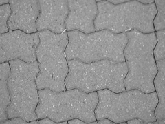
Figure 11.1 shows a picture of some interlocking bricks used for a walkway. Figure 11.2 shows the same walkway with the picture taken under slightly different circumstances (for example, the area photographed for Figure 11.2 was a few feet away from the area shown in Figure 11.1). One detail I picked up on quickly when examining the photos on my computer that I didn’t notice at the scene is that some of the bricks in Figure 11.2 are double bricks, lain side by side. This despite the fact that I have trodden this particular walkway literally thousands of times in the past 10 years or so!
Figure 11.1
Real-world candidate for sidewalk texture.
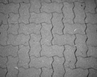
Figure 11.2
Alternate candidate for sidewalk texture.
So the lesson is this: when at the scene, don’t be a censor and don’t be judgmental. Just take oodles of photographs of the items in question. Then sort it all out back at the shop.
Postprocessing
After getting back to the shop, you will probably have to do a certain amount of postprocessing of the chosen photos. Even if you were creating a photorealistic game, you would still need to ensure that the lighting and palettes of the textures were close enough matches to each other. This would be especially true when your texture photos were taken in different areas at different times.
It’s probably best to do all of your pixel-related processing first, before you crop or extract your textures. This ensures that the changes you make are done in the proper context—the areas that you aren’t interested in will change along with the areas you are interested in—thus guiding your efforts more appropriately.
All of the photo-processing capabilities of any tools you have are at your disposal. Three specific operations are generally used more than the others: color matching, lighting, and cropping.
Color Matching The first thing you will probably need to do is match the colors of your texture to existing in-game textures and lighting conditions. Usually you will match your colors by adjusting the balance of colors. This can be done in Gimp by choosing Tools, Color Tools, Color Balance. The dialog box that appears does a good job of guiding you in your adjustments. Note that when you reduce the red component of a color palette, you increase the cyan influence, and when you reduce the blue component, you increase the yellow. In general, cooler color temperatures are stronger in the blue/cyan influence, while warmer temperatures cavort about with more red/yellow makeup.
Unfortunately, it is extremely difficult to illustrate the differences between different temperature settings in grayscale images like the ones used in this book, so Figure 11.3 may not adequately demonstrate the subtle variations. If you installed the companion DVD, you can find the full-color version of the image in the file 3D3ERESOURCESCH1111-03.jpg. Of course, you can go ahead and try the various settings in Gimp and see the differences for yourself.
In Figure 11.3, from left to right, the three settings chosen are Incandescent, Fluorescent, and Bright Sun. Compare these variations with the original shown in Figure 11.2 and found at 3D3ERESOURCESCh1111-02.jpg.
The light of bright sunlight on a clear day contains all colors of the visible spectrum pretty well in their natural proportions, with the sole modification being some filtering by the atmosphere. This atmospheric filtering (predominantly by water molecules) scatters a certain proportion of light at the blue-violet end of the spectrum, reducing the amount of light at those wavelengths that makes it to the surface. Nonetheless, you can see that there is still a strong blue component in the bright sunlight area.
Figure 11.3
Reference image for three color temperatures.
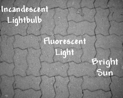
The fluorescent light area shows a somewhat more balanced spectrum, with less blue than with the bright light. The incandescent lightbulb area shows the opposite end of the spectrum from sunlight and has a much warmer feel due to the presence of more red and less blue.
So in Figure 11.3 the color temperature moves from warm on the left to cool on the right.
The original image, as shown in Figure 11.2, has a coloring somewhere between fluorescent and sunlight, leaning heavily toward the fluorescent. This is not really a surprise—I took those photos outside on a sunny clear summer day, but in the shade. The illumination is therefore provided by the light reflected from the surroundings, which in this case had the effect of moving the spectrum toward the middle.
Lighting Lighting is closely tied to color matching. Changes in the apparent lighting of an image will tend to drag the color temperature in one direction or the other. So keep this in mind when you apply lighting changes to images.
In the context of processing 2D images for use as textures, what we are trying to achieve is imparting a sense of the light direction and light “play” upon the surface of the texture being portrayed.
For example, one feature about surface textures that we may need to enhance is the sense of depth. As shown in Figure 11.4, the texture may contain numerous small stones that protrude from a flat surface.
One simple method we can use to increase the sense of depth is to increase the contrast. The problem with adjusting the contrast is that it tends to drastically alter the color temperature—the more contrast, the warmer the overall color temperature.
Figure 11.4
Pebbled surface with lighting adjustment.
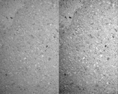
The obvious way to handle this would be to boost the contrast and then tweak the color balance. Sometimes this does not work so well, especially if a wide spectrum of colors is represented in the image. In those cases there are other ways to deal with the issue, such as tweaking the saturation.
What you see in Figure 11.4 is the original texture on the left and the adjusted texture on the right. In this case what I did was use Gimp to enhance the contrast by 40 percent (choose Tools, Color Tools, Brightness–Contrast) and then reduce the saturation by 41 percent (choose Tools, Color Tools, Hue–Saturation).
Note
You can’t reduce the saturation on grayscale images. Gimp won’t even let you try.
Cropping When using photographs as image sources, we rarely want to keep the entire image. Artifacts such as lighting changes at the periphery, fisheye distortion at the edges caused by extreme perspective, extraneous items in the image, and other issues typically make the outer edges of photographs unsuitable for use as textures.
The solution is to crop the image, leaving behind the portion that is useful to us. Figure 11.5 shows a piece of wood that has a texture of interest. It stretches across the entire frame from left to right but only covers somewhat less than half of the vertical area. It’s also not parallel with the sides of the image. In this case we will want to crop the wood out and “de-rotate” it as well.
Figure 11.5
A photograph that needs to be cropped.
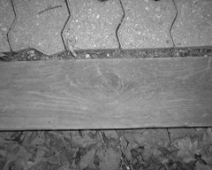
You can access the original of the photo I used here at 3D3ERESOURCESCH11COLORPHOTOSwoodencurb.jpg
You might be tempted to crop the wood out and then apply rotation to straighten it out, but experience shows that these operations should be done the other way around. Just as with the color and lighting operations, you should apply the geometric changes first, and then crop the texture. This allows the image processing software to make its geometry in the full context of the image parts that surround the area of interest, which can have a subtle effect on the end result.
Another reason for resolving the geometric appearance of the texture before cropping is that cropping tools tend to use rectangular shapes for selection. It is helpful to the overall process and productivity to crop images where the areas of interest are appropriately oriented horizontally and vertically.
To use the Crop tool in Gimp, click the Crop tool icon on the Tool palette of the main window (see Figure 11.6). Click and drag the tool on the image to select the rectangular area of interest. The resulting selection rectangle will have small square handles on the sides, which you can click and drag to resize the crop area. In the Crop tool options you can manually specify crop dimensions and other parameters. When you are satisfied with your selected area, click within the cropped area of the image to cause the actual cropping operation to take place.
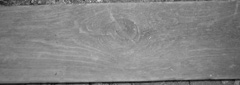
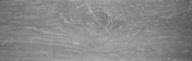
Figure 11.7 shows the result of merely cropping the image to include all portions of the wood without first altering the orientation of the wood. It still needs to be rotated. Of course, you may actually want the woodgrain to be slanted, but then you may need to remove the nonwood slivers of area above and below the woodgrain by erasing them to a fixed solid color or making those areas completely transparent.
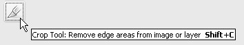
Figure 11.7
Cropped portion of unaltered photo.
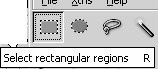
In our case we really want the woodgrain to be parallel to the bottom and top edges of the image, so we should rotate the woodgrain portion before cropping. Use the Rectangular Selection tool (see Figure 11.8) to select the area to be rotated.
Figure 11.8
Rectangular Selection tool icon.
Then choose Tools, Transform Tools, Rotate to get the Rotate dialog box (see Figure 11.9).
In the Rotate Tools options area in the Toolbox, ensure that Interpolation has been set to Cubic (Best) and that Transform is set to Selection. Then, in the Rotate dialog box, type 2.00 in the text box labeled Angle. Click Rotate. This will rotate the selected area 1 full degree to the right (see Figure 11.10).
You should have your rotated area with the selection marquee still surrounding it. In the Layers dialog box you’ll see that a new layer has been created. Right-click the Floating Selection (Transformation) layer and select Anchor Layer. Once again use the Crop tool to get rid of all the parts that aren’t wood. You will then end up with an image as shown in Figure 11.11, suitable for use as a texture.
Now compare Figure 11.11 with Figure 11.7, and you will see the difference.
Figure 11.9
The Rotate dialog box.
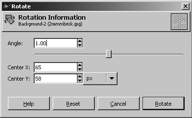
Figure 11.10
The rotated woodgrain.
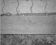
Figure 11.11
The cropped woodgrain image.
Original Artwork
The other approach to creating textures is to use original artwork. Some people believe this is not a real option for them, because they think they can’t draw or paint to save their lives. I tend to feel that everyone can learn the techniques required. My intent here, however, is not to teach you how to draw, so if you want to learn more, I encourage you to look into taking some lessons.
If you are satisfied with your artistic skills, then you have another rich avenue for texture generation available. The techniques used to convert a photograph to a texture can also be used to convert your handmade images to textures.
Another approach for creating original artwork is to create your images directly in a tool like Gimp. You can draw freehand using the mouse or a pen tablet.
With tools like Gimp you have a wide variety of means for creating textures, including many that can be created via the various options in the Filters menu. Figure 11.12 shows examples of textures created using the built-in features of Gimp. I encourage you to explore this tool in depth. It can really be a time-saver. And you can use it to create some knockout textures.
SCALING ISSUES
When creating your textures, you will need to pay attention to the issue of scale. The sizes of the things within an image that are used to make a texture have a particular relationship to other real-world objects. We are subconsciously aware of many of these relationships from our exposure to the world in general and will notice when the textures are out of proportion to the items they adorn. If it’s bad enough the effect can sometimes be similar to the sound of fingernails being dragged across a chalkboard!
Figure 11.13 shows two stylized houses. The bricks in house A are far too large, while the bricks in house B are more appropriately sized yet may still be a bit too large. Yes, there are some uses for stone blocks having proportions such as those in house A, but they are rarely used in bungalow-sized or two-story homes, as depicted in the figure.

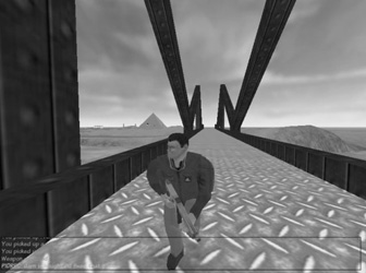
The scale issue can pop up anywhere, as you can see in Figure 11.14. The texture image in the corrugated metal bridge surface is probably about 10 times larger than is appropriate. Sometimes you might need to redo the texture to match; other times you can adjust how the texture is applied to the polygons using the modeling tools. My rule of thumb is that if the texture image size is 64 pixels by 64 pixels or smaller and needs to be made larger, you should make a new texture at the larger size. The same goes the other way. If the image size is larger than 64 pixels by 64 pixels and needs to be made smaller, then make a new texture at the smaller size.
TILING
Many structures have large surfaces with repeating patterns. The best way to approach making textures for these surfaces is to create one smaller texture that is replicated many times across the surface rather than simply making one large texture.
The replication will usually take place in two dimensions. It is important to make sure that the edges of the texture align properly when they meet. Figure 11.15 shows this to good effect. You can see the obvious horizontal as well as the more subtle artifacts in house A where the tiled brick textures don’t quite line up. In house B, where care was taken to ensure that the texture edges matched up correctly, those artifacts aren’t visible.
However, in house B in Figure 11.15 there is another obvious artifact of tiling, this time caused by asymmetric lighting effects in the texture shading. You can see each repeated texture tile—its position is marked by the presence of the darker shaded bricks in a repeated pattern. This effect can be quite subtle and difficult to detect in an image viewed in isolation.
Figure 11.16 shows the texture used in house B of Figure 11.15. Looking at it in isolation, you would be hard pressed to notice the subtly darker shaded bricks.
The simplest way to fix up a texture for use as a tiled texture is to copy the left edge, about 5 or 10 pixels wide, mirror the copy horizontally, and then paste the copy on the right side of the image. Do the same for the bottom edge. Of course, you can go from top to bottom or right to left as well. The important step is the mirroring.
Figure 11.15
Tiled brick texture.
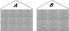
Figure 11.16
The brick texture with asymmetric shading.

After placing the mirrored edges, spend a little time blending their inner edges with the interior portions of the image.
Figure 11.17 shows a stone block texture that is a candidate for use in a tiling situation.
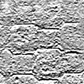
Figure 11.18 shows the texture tiled in a set of four. Again, you can see the artifacts caused by the mismatched edges.
Figure 11.18
Poorly tiled stone texture.
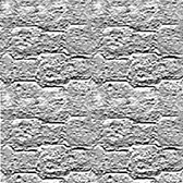
Figure 11.19 shows the left edge being copied, mirrored, and placed on the right.
Figure 11.19
Replicating the left edge.
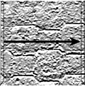
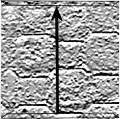
Figure 11.20 shows the same thing happening with the bottom edge.
Figure 11.20
Replicating the bottom edge.
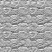
Finally, Figure 11.21 shows the tiled result.
Gimp has a helpful filter tool for use with tiling. Using a random texture of your own selection, choose Filters, Map, Make Seamless. This tool does a great job of speeding up the process of making tileable textures. Unfortunately, it doesn’t give you any options to vary the effect.
Figure 11.21
Properly tiled stone texture.
TEXTURE TYPES
There are far too many texture types and classes of material appearances for me to enumerate them with any sort of thoroughness. Given that, there is a much smaller set of texture types that are found over and over in nature and man-made structures.
Most of the following textures are types that are used for buildings, bridges, and other man-made items in a game world. Most of the texture types and patterns can be generated using Gimp, by choosing Filters, Render, Pattern and using one of the many submenus that reside there.
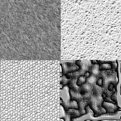
Irregular
Irregular textures tend to have a general disorder and random appearance, like that shown in Figure 11.22. Dirt and grass are examples of irregular textures. Quite often irregular textures are combined with other, different irregular textures in order to give a weathered or damaged appearance to an area or a surface.
Rough
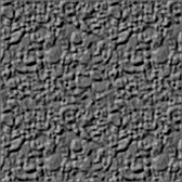
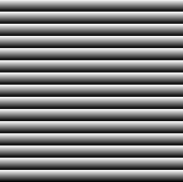
Rough textures, as shown in Figure 11.23, sometimes have somewhat the same sense about them as irregular textures. They are often used as tiles on a surface like a sidewalk or rough concrete walls.
Figure 11.22
An irregular texture.
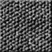
Pebbled
Pebbled textures are another example of textures often used for paved surfaces and stone walls. Tarmacadam pavement is an example of a finely pebbled surface when viewed from a distance of about 5 or 6 feet. Figure 11.24 shows a more obvious pebbled texture that could be used for a wall or decorative planter.
Figure 11.24
A pebbled texture.
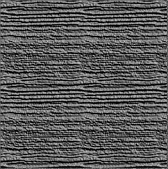
Woodgrain
Figure 11.25 shows a woodgrain texture that has many highly variant bundles of lines ranging from fine to coarse that run roughly parallel to each other, sometimes interrupted by swirls and knots. Some kinds of stone have similar appearances.
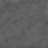
Smooth
We all know when something is smooth—there are no discernable bumps or irregularities to the touch. Depicting smoothness in textures can be a little difficult. We usually create a rather bland surface look and then introduce a few soft and mild irregularities in order to emphasize the smoothness. Figure 11.26 shows a smooth texture.
Figure 11.25
A woodgrain texture.
Patterned
Patterned textures are pretty straightforward. The intent is not necessarily to convey the contour, bumpiness, or feel of a surface but rather to represent regular shapes or patterns that appear on an item. Figure 11.27 depicts a pattern that could be used to represent the louvers of an air duct in a wall.
Figure 11.27
A patterned texture.
Fabric
Fabric textures emulate the appearance of things like canvas or carpet. Fabrics may be woven or not, but they all tend to exhibit fine repetitive shapes. Figure 11.28 shows a woven fabric texture that could be canvas. Gimp has a great tool available in its Filters menu for simulating cloth. You can find it by choosing Filters, Artistic, Clothify and fiddling with the settings.
Metallic
Metallic textures tend to have a dominant color, with a strong dark shadow that follows the outer contours of the metallic object and a bright accent color that runs along raised surfaces. Figure 11.29 shows a texture that could be used for a metal tube.
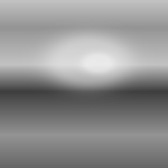
Reflective
A reflective texture simulates the effect of a light source in the scene reflecting strongly off the surface of the textured object. Figure 11.30 is such a texture that might be depicting a bright overhead light reflecting off a window.
Plastic
Plastic textures are similar to metallic textures in their manner of shading and highlighting. Plastic tends to have more of an oily appearance to it at times, so the shading and highlights are often more sinuous. As shown in Figure 11.31, the highlights tend to be less clearly defined than with metallic textures, while the light source often appears as a distinct highlight.
Figure 11.29
A metallic texture.

Figure 11.30
A reflective texture.

MOVING RIGHT ALONG
In this chapter we examined how to collect images to use in applying textures to objects that represent real-world structures. We saw some of the processing techniques that we may need to use to prepare our images for use as textures, like color matching and cropping.
Figure 11.31
A plastic texture.
Some of the areas that can be more problematic when considering textures for structures are scaling the images and preparing them to be tiled if the texture will be used in a repeating fashion. A texture that can be tiled is one whose opposite edges can be mated together without producing a noticeable seam.
Finally, we explored some of the more common texture patterns and characteristics that are used in games.
In the next chapter we will look at terrains and skyboxes, two mechanisms that are often used to provide that touch of realism in our game worlds. Some of the ideas we’ve covered in this chapter will certainly be useful in the next chapter as well.