
39. Signage Versus Documents
Drive Your PowerPoint Home

American Apparel, Staples, Knoll Furniture, and Lufthansa Airlines all share a common denominator with the New York subway system: Each of these diverse organizations uses the same popular typeface in its signage: Helvetica. A book called Helvetica and the New York City Subway System describes why their decision makers chose the font style:
For years, the signs in the New York City subway system were a bewildering hodge-podge of lettering styles, sizes, shapes, materials, colors, and messages.... Efforts to untangle this visual mess began in the mid-1960s, when the city transit authority hired the design firm Unimark International to create a clear and consistent sign system. We can see the results today in the white-on-black signs throughout the subway system, displaying station names, directions, and instructions in crisp Helvetica.1
Figure 39.1 shows the clean look of several New York City subway train letter and number identifiers in Helvetica font embedded in simple circles.
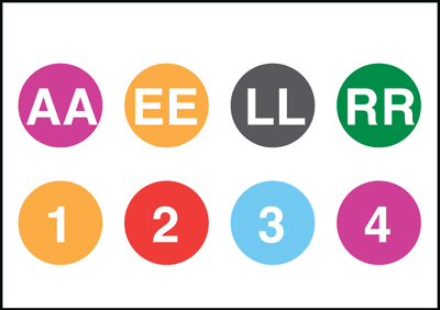
Figure 39.1. New York City subway train IDs
Helvetica, which is a sans serif font, is best suited for signage because its characteristic clean, straight strokes command attention. Sans serif is the font of choice in two universally familiar signs where attention is vital: EXIT and STOP.
Serif font, with its small decorative flourishes at the ends of the line strokes, is better suited for printed text because the little hooks help a reader’s eyes to distinguish individual letters in long word strings. In printing, serif font is conventionally used for the body text. (Except for the body text on websites where, because of the low resolution of even the best computer screens, the hooks are difficult to read.) Just look at the body text of any article in the New York Times or the Wall Street Journal.
The point here for presenters is to draw an indelible boundary between documents that are meant to be read and graphics that are meant to illustrate. If you are creating a document, by all means use serif font.
But if you are creating presentation graphics, treat the text in your slides as signage or headlines. Design them in sans serif and compose them as headlines. Look again at any newspaper or magazine, and you’ll see that the headlines are composed mainly of key words such as nouns, verbs, and modifiers, with very few articles, conjunctions, and prepositions; the latter are only necessary for complete sentences in the body text.
Unlike readers of text, your presentation audiences must process not only what you are showing but simultaneously what you are saying. If they have to process a large amount of sensory data, their eyes, ears, and, ultimately, their brains can go into overload—and they stop listening to you.
Instead, compose the text in your slides as headlines and do so in sans serif font—then provide the body text in your verbal narrative.
You are the presentation; your slides are the signage.