C h a p t e r 1 6
Module 8—Using Tools
to Improve Analysis
Module 8 covers very simple tools that may be helpful when making decisions.
Training Objectives
After completing this module, the participants should be able to
- describe at least five simple tools that may help improve analysis of information
- apply the appropriate tools to a variety of situations requiring analysis of information.
 Module 8 Time
- Approximately 2 hours
Note: This schedule includes time for a quick review at the start and a learning check at the end and includes time for a 10-minute break.
Materials
- Attendance list
- Pencils, pens, and paper for each participant
- Whiteboard or flipchart, and markers
- Name tags or name tents for each participant
- Worksheet 16–1: Decision Matrix Worksheet
- Worksheet 16–2: Decomposition Trees, Decision Trees, and Scatter Diagrams (optional)
- Worksheet 16–3: Value-Matrix Template
- Worksheet 16–4: Reviewing Your Decisions So Far
- Computer, screen, and projector for displaying PowerPoint slides; alternatively overhead projector and overhead transparencies
- PowerPoint slide program (slides 16–1 through 16–16)
- Software and files
- This chapter for reference or detailed trainer’s notes
- Optional: music, coffee, or other refreshments
- Also, having calculators available will be useful (have either one per subgroup or one per participant).
Module Preparation
Arrive ahead of time to greet the participants and make sure materials are available and laid out for the way you want to run the class. Turn on and test the computer equipment.
SUGGESTIONS FOR THIS MODULE
This module can be intimidating to many participants and some instructors.
You should observe the skill levels and levels of comfort of your participants and adjust your presentation accordingly. This module should not be lecture only. You can ease the pressure on individual participants by mixing groups with skilled and unskilled people and by doing the calculations on the whiteboard or flipchart.
The worksheets are designed to cover the material whether presented together at the end of the session or presented one at a time as the concepts are introduced. There are two reasons for this: First, the final worksheet does not require everyone to work on each tool that’s covered. Second, many participants may find the tools slow to design and develop, in which case the timing would be difficult to control in a training setting.
Sample Agenda
| 0:00 | Welcome the class. |
| Have slide 16–1 up on the screen as participants arrive. | |
| 0:05 | PowerPoint presentation, with discussion. |
| Move through slides 16–2 to 16–9, discussing and demonstrating each concept. You will probably need to use flipcharts or a whiteboard for some of this. | |
| 0:55 | Break. |
| 1:05 | PowerPoint presentation with discussion. |
| Move through slides 16–10 to 16–13, discussing and demonstrating each concept. | |
| 1:25 | Practice worksheets. |
| For Worksheets 16–1 and 16–4, ask participants to use one of the decisions they identified on the pretest at the start of the course. | |
| You may also present Worksheets 16–2 and 16–3, as time allows. | |
| See the directions with slide 16–14. | |
| 1:55 | Wrap-up. |
| Use slide 16–15 to review module 8. | |
| Ask for questions and make any further assignments. | |
| 2:00 | Use slide 16–16 to dismiss the class. Edit the slide, so it contains appropriate information. |
Trainer’s Notes
![]() 8:00 a.m. Welcome (5 minutes).
8:00 a.m. Welcome (5 minutes).
Show slide 16–1 as participants arrive.
Take care of housekeeping items.
8:05 a.m. Decision Matrix (15 minutes).
![]() Show slide 16–2 and preview the objectives. Tell the participants that now you will cover decision matrices. A decision matrix is a deductive tool for general decision making among options of various types. The overall purpose of using a decision matrix is to provide a structure to comparing options that may not be directly comparable, due to their complexity. A matrix discipline forces you to consider each option, one criterion at a time, therefore structuring your thoughts rationally instead of leaving them confused with the problem. Without a matrix, each option has both some good and some bad points, and therefore no clear choice emerges.
Show slide 16–2 and preview the objectives. Tell the participants that now you will cover decision matrices. A decision matrix is a deductive tool for general decision making among options of various types. The overall purpose of using a decision matrix is to provide a structure to comparing options that may not be directly comparable, due to their complexity. A matrix discipline forces you to consider each option, one criterion at a time, therefore structuring your thoughts rationally instead of leaving them confused with the problem. Without a matrix, each option has both some good and some bad points, and therefore no clear choice emerges.
Typical decisions that might be aided by a decision matrix include where to go on vacation, which new car to buy, where to open up a branch office, which applicant to hire for a job opening, or any other decision among complex alternatives.
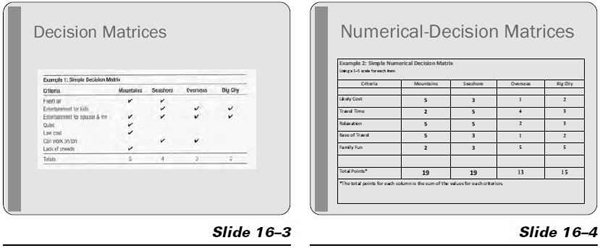
The decision matrix can be developed in several forms. We will introduce them from the simplest to more complex. The first type of decision matrix is extremely simple, employing only a “yes or no” judgment. They get more complex as you add scaling, then weighting and scaling, to the process.
Show slide 16–3. You are trying to decide where to take a family vacation. You have narrowed it to four possible options: the mountains, the seashore, an overseas site, or a big city. Using the simplest matrix, you might begin by listing what your family is looking for in the vacation (fresh air, entertainment, and so on). Your matrix might look like the one on slide 16–3. Based on this, your choice would be to go to the mountains because it received the greatest number of check marks. Note, also, that because all four options received check marks under “entertainment for spouse and me,” that particular criterion had no effect on the outcome and could have been eliminated.
Your next step could be adding some numbers to sharpen the decision making, using a scale of one to five to measure the relative importance of factors such as cost and travel time.
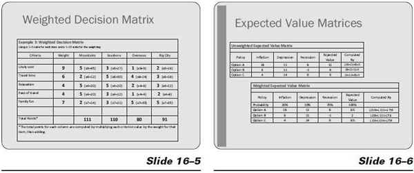
Show slide 16–4. Your decision matrix can be more complex by adding a scale. Let’s return to our vacation example: Your list of desired qualities are cost, travel time required, relaxation expected, ease of travel to the site, and family fun—each ranked on a scale of one to five.
Let’s assume your thought process goes like this:
Mountains: Low cost gives mountains a five out of five, but the long drive gives mountains only a two out of five. It’ll be relaxing when you get there, so that’s another five out of five. Driving to the mountains doesn’t require a passport or other complications, so it gets another five. On the other hand, your kids hate the idea, which brings the mark for “family fun” down to a one.
Note: Present the rankings of the other three choices in a similar fashion.
Seashore: More expensive than the mountains, but closer. It, too, will be relaxing. Drive goes through big cities. Kids approve; spouse is ambivalent.
Overseas: Expensive, but flying is quick. Tough to relax in unfamiliar surroundings. Need passport, different money, interpreter, and guide. Sounds like fun to the family.
Big city: Expensive, short drive, hectic, but not too complex. Lots of museums and excitement.
After all that, you still don’t have a clear winner because the mountains and seashore columns have equal scores. But you might at least eliminate two of the options (overseas and big city), then go back and add some other criteria—or just flip a coin.
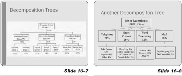
Or you could move on to a better way of ranking, by assigning relative weights to the importance of each of the five criteria in your matrix.
Show slide 16–5 and introduce example three, the Weighted Decision Matrix. In all probability, your criteria are not of equal importance to you. The matrix shown adds a criterion weighting scale of 1 to 10. This gives cost the major impact on the decision, with ease of travel and relaxation as the two least important criteria.
Other than the weighting column, the rest of the numbers are the same as the previous slide. To get the weighted score, you multiply the number in each cell by the number in the weight column. This is shown by the numbers in the parentheses. Then you add each column. So for the mountains, your rating was a five out of five for cost (meaning it’s the cheapest, because a low cost would be rated the best). Multiply that five by the nine (out of 10) that you’re weighting the cost, and you get 45. Do the same for each cell in the matrix and add the scores at the bottom.
Your preference would be for the choice that received the greatest number of points, so this would eliminate an overseas or big city vacation. In this case, a trip to the mountains is best and the seashore a close second.
Now we move to a tool designed to help determine the “expected value” of a transaction. Expected values are index numbers useful as a basis for comparison of alternatives. The expected-value computation uses a combination of the decision matrix and probabilities.
The basic difference between this new tool and the decision matrices on the previous slides is that in the earlier matrices we used relative scales (such as one to five) to evaluate each criterion, whereas entries in the next step, the expected-value matrix, are real numbers representing actual or projected outcomes from each alternative under the various conditions.
8:20 a.m. Expected-Value Matrices (10 minutes).
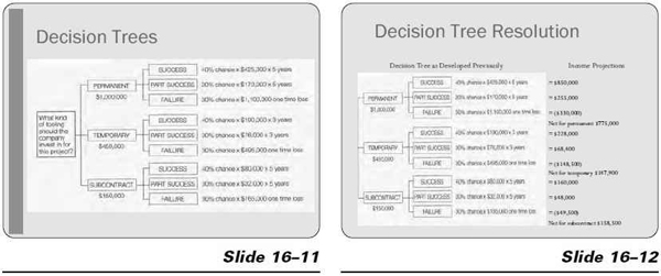
Show slide 16–6. Refer to the top graph (Unweighted Expected-Value Matrix). This example shows an expected-value matrix for someone who has money to invest and has a choice of three different investment policies suggested by her financial advisor. These three investment policies will perform differently, depending on whether we have a period of inflation, recession, or depression in the economy.
To create an expected-value matrix, the decision maker must know: (1) the alternatives available (rows A, B, and C—think of them as alternative investment portfolios, with different rates of return), (2) the likely conditions under which these alternatives will be operating (the columns: inflation, depression, and recession), and (3) the predicted result for each alternative under each condition (to be entered in the expected value column). For quick comparison of the three alternatives, we record the average expected values of each alternative investment portfolios in the expected-value column.
In the example on the screen, for each $100 invested, Option A will earn $16 a year if there is inflation, $11 a year if there is a depression, and $6 a year if there is a recession. Option B earns $8, $11, and loses $1 under each condition. The expected value is essentially an estimate of what would happen if you made these investments over and over and over. In the long run, if all three conditions occurred approximately an equal number of times, Option A would earn an average of $11 a year for each $100 invested; Option B would earn $6; and Option C would earn $9.
But then we realize that inflation, depression, and recession are not equally probable. To take that into account, we predict the probabilities of each of those conditions and weight the expected values accordingly.
Refer to the bottom graph (Weighted Expected-Value Matrix): With recession as the most likely condition (70 percent), rows A and C become equally preferred alternatives.
Computing the expected value of alternative courses of action provides a rational basis for comparison of each to the other. Although the actual outcome is unlikely to be exactly as computed, a relative likelihood of profit or value can be established among the alternatives under various conditions. The result of the computation is an index number for each alternative.
Recap: Step-by-Step Instructions for Creating an Expected-Value Matrix
Step 1: List vertically the various options being considered.
Step 2: List horizontally across the top the various conditions that might occur to affect the outcome.
Step 3: Determine what the result is likely to be for each of the options under each of the conditions specified. Enter this index number in the appropriate spot in the matrix.
Step 4a: If the conditions are equally likely, compute the expected value by just taking the average of the rates for each of the options.
Step 4b: If the conditions are not equally likely, this changes the analysis. Predict the likelihood of each condition, and then compute the expected value by weighting the table in a manner similar to that described for the decision matrix.
Depending on your time and interest, here are some optional questions that will help to bring home the idea of a weighted expected value matrix. They will add about five minutes to the presentation. Questions that might occur to the investor at this point include:
- How much would additional information about the portfolios be worth in deciding where to invest?
- How much would you pay another expert for an opinion?
- What action might ensure that one investment outperformed the others?
An investor who knew it was going to be inflation would certainly choose Policy A over Policy C. What do you think? He or she might choose A anyway (50/50 chance). Is it worth $5 per $100 to know what it’ll be?
8:30 a.m. Decomposition Trees (20 minutes).
Show slide 16–7. Provide the participants an overview of decomposition trees. Decomposition trees are a visual aid for understanding the parts that make up a whole. The trees look like traditional organization charts. Their purpose is to help in the “decomposition” or breaking up a larger item into its components. They could be used for a variety of decision-making or problem-solving needs, such as to analyze a budget, review staffing in an organization, or help with a job analysis by a human resources specialist to determine which tasks an individual performs in a job. The results might also be used in the development of a Pareto analysis.
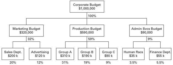
Refer to slide 16–7 as you go over the following example. As part of the data collection to plan for the company’s budget for next year, you have decided to use a decomposition tree to display the current budget. You break down the current budget allocations according to your organization’s structure. Note that each of the three levels add to $1,000,000 or 100 percent of the organization’s budget on the slide. A decomposition tree provides a basis for a manager or analyst to ask questions and make useful comparisons across the organization. For example, is it appropriate for the sales department to have nearly six times the budget of the human resources department?
Show slide 16–8. This is another example of how to use a decomposition tree to organize information for decision-making purposes. The job of a receptionist in a small company has been analyzed and the tree shows how this person’s time is spent during the workweek.
This information could be used to help decide such things as what skills are necessary to be hired for this position, which departments should share in the cost of this person, and so forth.
8:50 a.m. Thoughts About Decision Making (5 minutes).
Show slide 16–9, and read the Jonah Lehrer and Malcolm Gladwell quotes and discuss their implications with the class.
8:55 a.m. Break (10 minutes).
9:05 a.m. Scatter Diagrams (10 minutes).
Show slide 16–10. Point out that the schedule allows only a brief overview of scatter diagrams.
Scatter diagrams visually indicate relationships or absence of them between two sets of data. Scatter diagrams compare and show the relationship of one factor to another such as height and weight, work done and people working, day of week and customer traffic, price and sales, accidents and age, and other pairs of factors.
For example, does the speed of a conveyor belt on a production line influence the number of defects produced? Does the amount of fertilizer affect the yield of an acre of corn? Is the income level of a city a true indicator of the potential sales of a product in that city?
Recap: Step-By-Step Instructions to Create a Scatter Diagram
Step 1: Determine which two sets of data need to be compared. Make sure they’re appropriately stratified to provide an accurate analysis. For example, if you’re comparing productivity of employees to the amount of formal training they’ve received, it would be best to group new employees and experienced employees separately. Otherwise, you’ll not be able to analyze whether the productivity is related to training or to experience on the job.
Step 2: Lay out the vertical and horizontal axes and determine which data to scale along which axis. Certain conventions should be observed. For example, time should be shown horizontally, with earliest times at the left. Although the technique can work with unconventional scaling, it interferes with effectively communicating the information to others. Common sense usually works, but if you want more information, you need to find a reference on graphics presentation.
Step 3: Place a dot or other indication at the intersection of the coordinates that represent each set of data.
Step 4: Examine the resulting pattern of dots for evidence that suggests or denies the existence of relationships in the data. Statistical measures of the degree of actual relationship can be determined using correlation-regression analysis and other techniques.
Resulting Diagrams: Examples
Referring to slide 16–10, explain the different patterns in the scatter diagrams.
A—Positive Relationship. This scatter diagram gives a pretty good indication that when one of the data items goes up, the other probably will too. If you could draw a straight line that went through all points, it would be a perfect relationship (100 percent correlation). That would mean that each move on the vertical axis would have an exactly predictable move along the horizontal axis. For example, if you were buying apples at five cents each, and plotted the number of apples along the vertical axis and the total price paid along the horizontal, it would be a perfectly straight line between the points.
B—Linear, Positive Loose Relationships. This diagram has the basic elements of A, but it’s “looser.” That means you can’t be as sure of the relationship with small changes in one data set. In statistical terms, the correlation is “lower.” If you were plotting the height and weight of people, you’d probably get a chart like this. Most people who are 6′4′′ would weigh more than most who are 4′10′′. However, you couldn’t be sure that someone whose 5′11′′ weighs more than someone who is 5′9′′. The looser the relationship, the less you can rely on the data’s predictability.
C—Negative Relation. As one piece of data goes up, the other will go down. For example, if you plotted price on the vertical axis and the number sold on the horizontal axis, most products would give a diagram such as this. The higher the price, the fewer sold; the lower the price, the more will sell, other things being equal.
D and E—Non-linear Relationships. Patterns in these diagrams indicate that there probably is some relationship—you can draw a single line that will go fairly near all the points. The line, however, isn’t straight. There are statistical formulae to determine the mathematical equation of the line that has the best fit to the dots. This will give you the predicted mathematical relation between the two data sets. Frequently the visual or approximate information you get from the diagram is all that is necessary for decision making.
F—No Relationship. If the scatter diagram looks like this, there is probably no relationship between the data plotted on the vertical (y) axis and the data plotted on the horizontal (x) axis. They are independent of each other. If one goes up, the other may go up, down, or not change. You can make no judgments from data such as this, except that they’re probably not related.
9:15 a.m Decision Trees (5 minutes).
Show slide 16–11: Decision Trees. Provide an overview of decision trees. Decision trees help to visualize and follow to conclusion the logic of decisions and their consequences based on events that may result from a decision. As such, a decision tree can provide a basis for either subjective or objective comparison of options. They represent the same data as a multi-level expected-value matrix.
Even if you don’t get to the stage of assigning probabilities and calculating specific results, just listing the options and potential results can be helpful in structuring your thinking about the decision.
A graphic “tree” shows the options, providing a map of possible outcomes. When combined with probabilities and expected values, a decision tree presents a quantitative projection of results.
Use slide 16–11 and provide step-by-step instructions for creating a decision tree:
Step 1: Starting at the left of the page, list your decision to be made as the “trunk” of the tree, and the options as the first “limbs.”
Step 2: From each of the limbs, divide out into projected results (branches) from a future chance event under different conditions (same set of conditions for each limb). Repeat this step one or two more times, if it is appropriate to consider more than one future chance event.
Step 3: Assign probabilities to the chance events and a dollar value (or other quantifiable value) to the expected implementation cost and resulting profit under those events.
Step 4: Multiply the probabilities and values, and add them up for each initial option. The best option is the one with the most favorable total expected value.
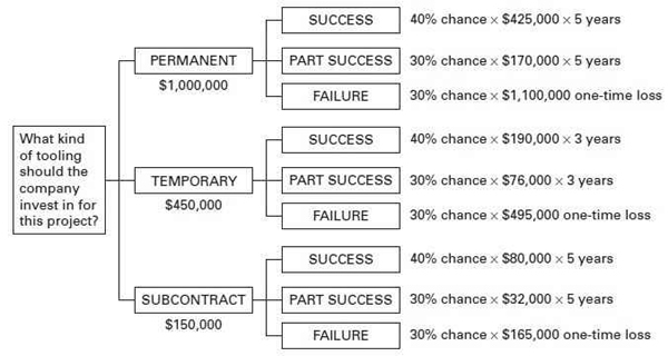
Show slide 16–11 and flesh out the example.
A company must make a decision about purchasing new equipment. The three options under consideration are a permanent tooling investment, a temporary tooling investment, or subcontracting the project. The conditions that may occur in the future, with any of the three options are defined as “success,” “partial success,” or “failure.”
Assign a probability to each of the conditions and a cost and projected profit to each of the options. Let’s say that installing permanent tooling will cost $1,000,000, the temporary tooling will cost $400,000, and that subcontracting requires a guarantee of $150,000 to the subcontractor.
Further, suppose that if the new product is a success, the return, if we use permanent tooling, is expected to be $425,000 a year for five years. The return on temporary tooling will be $190,000 per year for three years, and the return from subcontracting will be $80,000 a year for five years.
If the product is a partial success, we’ll make 40 percent of the total success figures above. If the product is a failure, we lose our investment plus 10 percent opportunity cost. Now, give the product a 40 percent chance of success and a 30 percent chance of being at least a partial success—which means also that the product has a 30 percent chance of being a failure.
Finally, compute the expected return on each of the three options, given the assumptions we’ve presented above. To do this, multiply the figures shown beside each branch in the tree above, add them for the three possibilities for each initial choice option, then subtract the required initial investment. This gives you the expected value for each of the options. This is shown following as “Net” figures. The highest numbers generally represent the best choices. The tree on the next slide indicates the best choice to be permanent tooling, given our criteria.
Show slide 16–12. This slide shows the income projections for each of the three options. For the permanent tooling, the weighted average income, using the assumptions discussed before, suggests that a $1 million investment is likely to pay back an additional $775,000 over five years. The temporary tooling and subcontracting options have respective paybacks of $147,000 on a $450,000 investment and $158,000 on a $150,000 investment over five years.
If the company can’t get the financing for the $1,000,000 investment, the next best choice is to subcontract, rather than go with temporary tooling. The company can anticipate making a profit in any of the three choices. There is, of course, a 30 percent chance of failure in any of the options.
If we’re looking for return-on-investment rather than total profit, the best bet is subcontracting. This is most likely to give us the highest return on the amount invested, but it doesn’t give us the highest total profit.
All of this depends on the accuracy of our estimates of cost and probability of success. Good data on those items is important. The actual possible outcomes under the conditions described above would range from a profit of $1,125,000 to a loss of $1,100,000.
Are any of these numbers exactly right? Probably not. This tool just forces the decision maker to structure the costs and possible outcomes into a logical pattern.
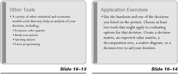
9:20 a.m. Other Tools (5 minutes).
Show slide 16–13. Mention a few other tools that can be used to help decision making. Say that economic order quantity and break-even analysis are common tools, which many of your participants might already know, depending on their background. Queuing analysis and linear programming are among the other tools sometimes used to prepare for important corporate decisions.
Note: Economic order quantity (EOQ) and break-even analysis are tools that many of your participants may already know, depending on their school and job experience. However, if you would prefer to teach those tools instead of the expected-value matrices or the other tools presented in module 8, feel free to create the slides and materials to substitute. You can find information on these subjects in any basic management or supervision textbook. The Rue and Byars text in the “For Further Reading” section at the end of this book would be a good source.
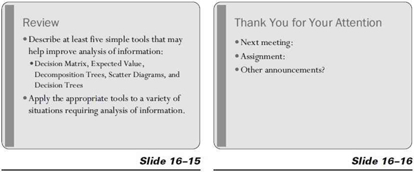
 9:25 a.m. Apply the Tools to Help You Make a Decision (30 minutes).
Show slide 16–14. Distribute Worksheets 16–1 and 16–4. Also, if you choose, distribute optional Worksheets 16–2 and 16–3.
 Announce to the participants that they are to “Use the worksheets to help you make one of the decisions you listed on the pretest during module 1.”
The worksheets ask you to apply at least two tools we’ve worked on in class. Choose the tools that best apply to evaluate options for your decision. For example, you may create a decision matrix, an expected value matrix, a decomposition tree, scatter diagram, or a decision tree to aid your decision.
- Worksheet 16–1 is a template for a decision matrix.
- Worksheet 16–2 (optional) provides instruction for using decomposition tree, decision trees, and scatter diagrams. This worksheet is optional, but it has been developed to give the participants a more detailed summary of these tools so they can take it with them. Decide how useful this will be to the participants based on their level of understanding during the training and how likely they are to use the tools described on the worksheet.
- Worksheet 16–3 (optional) is a template for an expected-value matrix.
- Worksheet 16–4 asks participants to use the tools covered in this module to help with decision(s) they identified in the pre test taken in module 1. If participants are unable to complete this assignment during the remaining time, suggest that they complete it on their own and bring it back to the following session.
9:55 a.m. Module 8 Summary (5 minutes).
Show slide 16–15 and review the objectives of the modules.
 LEARNING CHECK QUESTIONS
You can use the learning check questions and answers in oral or printed form.
Discussion Questions
- Which of the decision-making tools in this module require groups, and which tools can be done by individuals?
Answer: All of the tools can be done by individuals, although the data necessary might be better collected by a group. - When should you use a weighted decision matrix?
Answer: When the criteria are not equally important to the decision. - How is an expected value matrix different from a weighted decision matrix?
Answer: The expected value matrix uses real numbers in it, not just index numbers. - Can you create a decision tree with more than three initial branches?
Answer: Yes; you can have as many as necessary. - Is it ever possible to earn exactly the expected value projected from a decision tree?
Answer: Probably not. Expected values are a constructed number that is tied to probability over multiple occurrences. - What would you expect a scatter diagram to look like if you were to chart age (birth to death) against personal income?
Answer: It would probably look like a bell-shaped curve with the center skewed to the right so the highest point would be toward the end of the working years.
10:00 a.m. Thank You for Your Attention.
Show slide 16–16. Edit the slide to include information relevant to your participants.
Worksheet 16–1
Restate the decision issue that you’ve been working on here:
Use the following form to create a decision matrix of possible options and criteria related to the decision you are working with.
| Options → | ||||||
| Criteria ↓ Weight ↓ | ||||||
| Total Points | ||||||
Other considerations:
© 2010 Decision-Making Training, American Society for Training & Development
Worksheet 16–2
Other decision analysis tools covered in this unit include decomposition trees, decision trees, and scatter diagrams. Also mentioned, although not covered, are break-even analysis, economic order quantity, queuing analysis, and others. These are too problem-unique to create a template to be filled in and probably would take too long to do during a training session. This sheet explains the process to create three tools so you can try them out on your own, if you wish.
Decomposition Trees Overview
Decomposition trees are a visual aid to understanding the parts that make up a whole. The trees essentially look like traditional organization charts. Their purpose is to help in the “decomposition” or breaking up of a larger item into its components. They could be used for a variety of decision-making or problem-solving needs such as to analyze a budget, review staffing in an organization, or help with a job analysis by a human resources specialist to determine what tasks an individual performs in a job. The results might also be used in the development of a Pareto analysis.
Results or Data Output:
The output is a visual “tree” with relative values indicated for each part.
Step-by-Step Instructions:
Step 1:On the top line of a sheet of paper, list the unit to be analyzed (the entire budget, organization, job, and so forth).
Step 2: Break the whole out into its major parts, and indicate the appropriate value for each part beside it on the next lower line. The value might be in percentages or in real numbers. If percentages, they should add to 100 percent. If real numbers, they should add to the same totals on each line.
Step 3: Continue repeating this process until you have reached the level necessary for whatever analysis you are conducting. Note that each level adds to $1,000,000 or 100 percent.
Decision Trees Overview
Decision trees help to visualize and follow to conclusion the logic of decisions and their consequences based on chance events subsequent to the decision. As such, they provide a basis for either subjective or objective comparison of options. They essentially represent the same data as a multilevel expected-value matrix.
Even if you don’t get to the stage of making computations and assigning probabilities, just listing the options and potential results can be helpful in structuring your thinking about the decision.
Knowledge or Input Required: Options available for the decision and the likelihood and value of subsequent events.
Results or Data Output Provided:A graphic “tree” shows the options, providing a map to all projected possible outcomes. When combined with probabilities or expected values, a quantitative projection of results is possible.
Step-by-Step Instructions:
Step 1: Starting at the left of the page, list your decision to be made as the “trunk” of the tree, and the options as the first “limbs.”
Step 2: From each of the limbs, divide out into projected results (branches) from a future chance event under different conditions (same set of conditions for each limb). Repeat this step one or two more times, if appropriate to consider more than one future chance event.
Step 3: Assign probabilities to the chance events and a dollar value (or other quantifiable value) to the expected implementation cost and resulting profit under those events.
Step 4: Multiply out the probabilities and values, and add them up for each initial option. The best option is the one with the most favorable total expected value.
Scatter Diagram Overview
Scatter diagrams visually indicate relationships or absence of them between two sets of data. Scatter diagrams compare and show the relationship of one factor to another, such as height and weight, price and sales, work done and people working, accidents and age, day of week and customers, and so forth.
Knowledge or Input Required: To use scatter diagrams, the analyst needs information on the sets of data that are to be compared and, in the case of control charts, which standards are required. A basic understanding of the use of graphing is also necessary.
Results or Data Output: Scatter diagrams can suggest whether or not a relationship exists between sets of data. For example, does the speed of a conveyor influence the number of defects produced? Does the amount of fertilizer affect the yield of an acre of corn? Is the income level of a city a true indicator of the potential sales of a product?
Step-by-Step Instructions:
Step 1: Determine which sets of data need to be compared. Make sure they’re appropriately stratified to provide an accurate analysis. For example, if you’re comparing productivity of employees compared to the amount of formal training they’ve received, it would be best to group new employees and experienced employees separately. Otherwise, you’ll not be able to analyze whether the productivity is related to training or to experience on the job.
Step 2: On graph paper (or by some other appropriate means), lay out vertical and horizontal axes and determine which data to scale along which axis. Certain conventions should be observed. For example, time should be shown horizontally, with earliest times at the left. Although the technique can work with unconventional scaling, it interferes with effectively communicating the information to others. Common sense usually works, but if you want more information, you need to find a reference on graphics presentation.
Step 3: Place a dot or other indication (“x”) at the intersection of the coordinates that represent each set of data.
Step 4: Examine the resulting pattern of dots for evidence, which suggests or denies the existence of relationships in the data. Statistical measures of the degree of actual relationship can be determined using correlation-regression analysis and other techniques. (See any book on simple business statistics for further information.)
© 2010 Decision-Making Training, American Society for Training & Development
Worksheet 16–3
Restate the decision issue that you’ve been working on here:
Use the following form to create an expected value matrix of possible options and criteria related to the decision you are working with.
| Conditions → | |||||
| Options ↓ Weight → | |||||
| Expected Value |
Other Considerations
© 2010 Decision-Making Training, American Society for Training & Development
Worksheet 16–4
You have now completed both the creative and analytical portions of making your decision. The remaining two modules will deal with the intangible considerations and developing a final proposal. Before going on to that, collect your worksheets so far and make some notes.
- Does the decision matrix you just developed (Worksheet 16–1) look at all like what you expected when you started? (That is, do you have the options and criteria that you anticipated?) If not, what surprises you?
- Can you use any of the other analytical techniques described in this module to help with the decision? Which ones, and how? Why would others not work?
- Which of the creative techniques from modules 2 through 5 helped you? Are there any others that you now think might have been useful?
- Do the seven steps explained in the first module seem to make more sense now?
Discuss your progress toward a final decision and proposal with one of your fellow learners.
© 2010 Decision-Making Training, American Society for Training & Development