In This Chapter
Effectively using fonts
Playing with text
Combining text and images to create art
Creating text from images
Cavemen drew pictograms — word pictures that represent ideas — on walls. Ancient civilizations chiseled hieroglyphics on tablets using small tools. Early printing presses clacked and clattered, slapping ink on heavy vellum paper to combine text with pictures. The history of communicating with text and art obviously goes back a long time.
As the use of text for communication grew, so did font families, which are typefaces classified according to style, line thickness, and strokes. The old Roman type lettering changed when people invented new styles, and then new categories of typefaces (computer-generated) appeared when people wanted more new versions of old styles as well as brand new looks.
Today, you can use all kinds of applications, even Microsoft Word, to communicate thoughts via words. You can easily place text into your document by entering text within an image in Photoshop or creating an image file that can be copied and pasted into Word. And text in Word and text in Photoshop are interchangeable: Just copy from Word to Photoshop by using the Copy and Paste commands in both programs. And create with not just words alone but also words combined with an image (or sometimes hundreds of images), each layered on top of another and processed to create anything from the signage on buildings to the final credit of your favorite movie.
The marriage of text and the visual image is a natural one — over the years, this marriage has become more and more appealing as technology progresses. You can work with text from Word or (any place else for that matter) as well as create text right in Photoshop using cool tools to make your text become part of your artwork, which is just what this chapter is all about. So, incorporate text into your visual arts and create matrimony that's sure to woo your viewer into opening his pocketbook to purchase your work.
When you create your own effective art pieces that combine text and photos, remember to keep the following design fundamentals in mind. Look at ads, billboards, and signage to see what's effective as well as eye-catching. After these examples, you can read about fonts and how you can manipulate them to help you make your design choices.
Color: Text among matching background colors is a draw. In Figure BC2-1, eye-catching (because of their color) bills are effective when shown in numbers.
Balance: Take care to balance not only how the text is placed but also the text style that you use for a visually appealing work of art. In Figure BC2-1, note that only sans serif fonts (fonts without the little flourishes at the ends of each stroke) are used. (For the rebel in you, read about mixing fonts in the upcoming section, "Mixing fonts.") You can break the rules anytime; it just depends what's in your picture and what looks good to you and a couple of aesthetically astute pals. Aside from that, many businesses mix fonts all the time, so your choices are many.
Tip
If you're going to do the font mix, start with mixing Century Old Style with ITC Franklin Gothic Heavy or Franklin Gothic with Futura Light or Century Old Style.
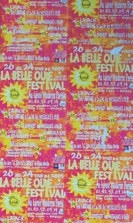
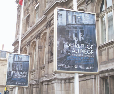
Display: Although not truly part of the art design process, keep in mind how your work will be displayed. Of course a single instance of your art — such as an individual poster — should be appealing, but you can also design with the actual utilization in mind. Take, for example, Figure BC2-2. Knowing that a poster will be displayed in repetition enables you to include more information than an individual might be expected to comprehend when seeing a single poster while walking or driving past.
Note
Words in art can play, dance and even send subliminal messages — a powerful tool made even more powerful with the fairly new process of image processing and text manipulation.
When you choose text to use in tandem with your art, you want to make sure that it's complementary and appropriate. That includes choosing the font itself as well as its size and any special treatment, such as italic, condensed, light, or bold. To help you make your decisions, you need a little background on the factors that help define a font and its look.
Font families are divided into two main categories: serif and sans serif:
serif: A serif font is one that includes "handles" as part of the text, like the font used for this sentence. Serif fonts are generally used for small type that's closely spaced, such as the body text of a book or magazine. The serifs at the ends of the character strokes make the letters more recognizable in close quarters, making it easier to read such type. When using a serif font in a design project or as part of your artwork, it will generally convey such concepts as solid, establishment, elegant, and perhaps conservative (depending on the subject or concept).
sans serif: Sans serif (literally without serif) fonts don't include the little flourishes at the end of the strokes. Sans serif fonts are typically used more for headlines and large type. Helvetica (shown in this sentence) is an example of a sans serif font. Sans serif fonts come in a wide variety of styles, some of which are quite business-like and others that are fun, flirty, flamboyant, and even rather fantastic.
You know the old standby fonts, Times New Roman (what this text looks like) and Helvetica. You probably use them most every day if you have a computer. These are the traditional, steadfast, and dependable fonts that move from the Internet to your cell phone and PDA. However, don't forget about some of the other fonts — the fonts that both Word and Photoshop offer as well as those that open a world of possibilities as you add graphic design to your art repertoire.
There are dozens of places to get fonts on the Internet, both for free and for a price. As a matter of fact, I obtained the font I used in the pool party invite (in the "Using fonts effectively" section, later in this chapter) for free at free-font-downloads.com. Here are some other places to get fonts:
www.housind.com: The hippest fonts — that look as if they came from The Jetsons television show — will cost you. They're smooth and beautiful, tooled like a BMW; use them to write words like Astroman and anything-a-rama. You can try 'em out right at the site. The kits cost around $150.www.fonts.com: If you're looking for fonts that will appeal to kids to use in your art work, this site is the place for you. It even offers an insect font. A font that looks hand-drawn is a good choice because you can't really get that effect in Word or Photoshop — and if you try to do it yourself with a mouse (which is like drawing with a bar of soap), you get mouse shake. At this site, you can pick up Skippy Sharp (among hundreds of others), a hand-drawn font, for just $22.1001fonts.com: This site (unlike many other font sites that make you hunt for the advertised freebies) puts its free fonts right on the first page. A really nice one is a Disney-esque font called Waltograph, which would be a great addition for any type of fireworks photos that you have, not to mention lady-like dragon flies named Tinkerbell. Users can submit fonts (which are pretty good) for people to use as freeware (which you can download for free).
To see how to create your own custom text, see the later section "Making Art out of Text."
When planning your text, know what options are available in Photoshop or whatever text processor you're using. This way, you can adjust your fonts so that they fit within your image and among the other characters in your text.
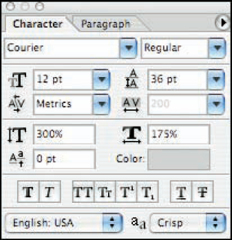
By default, you set your font size by points (pt) although you can also use pixels in Photoshop. Points are the traditional measurement of font size, equal to 1/72 of an inch (generally speaking). When working with fonts in Photoshop, you'll see that the Options bar and the Character palette provide some preset font sizes. Don't think that you're restricted to just those sizes! With Photoshop's Type tool active, you can size your font however you like — simply type the font size in the Font Size field. You can also click directly on the double-T symbol to the left of the Font Size field, hold down the mouse button, and drag left or right to resize selected text. As you can see in Figure BC2-3, you can also use the Character palette to scale the font, changing its horizontal or vertical proportions independently.
The color that you choose for your font also helps convey the message you want for your art piece. Obviously, black is traditional and businesslike, red implies urgency, blue is trustworthy and calm, and so on. Keep in mind the background of your finished piece when choosing font color — just because you like a particular color doesn't mean that your font will be readable or clear.
In Word, you can choose font color from the Formatting toolbar. Just open the drop-down Font Color palette and click the color you want. In Photoshop, you can choose font color by clicking the Type tool and then clicking the Set the Text Color option (a color-filled rectangle at the Options bar or within the Character palette), after which a Color Picker dialog box comes up for you to make your choices. You can also pick font color after you write your text by selecting the font layer and then selecting a color in the Character palette.
Good (standard) design rules dictate that you use only one or two fonts to a page in an ad or image. You don't want to make your viewer overwhelmed looking at just the text and fonts, and you certainly want your image, message, and text styles to flow together as one unit. More conservative design rules state that you shouldn't mix sans serif with serif fonts on the same page (or over, under, or on top of the same image), but in the anything-goes atmosphere of graphic design these days, mixing the two seems to be more common.
Tip
You can also, in effect, mix fonts by varying the style of the same font: that is, using bold, italic, and/or fat, skinny, tall, or small characters.
Keeping in mind font styles and how they relate to your picture and each other will help you to produce a fine art piece. Mixing and matching fonts is a creative process and one that can be an experiment — a trial-and-error process of trying the different typefaces (or fonts) to create something that appeals to you and others with the same sense of style.
With hundreds of fonts to choose from and to use with an image, picking the right one can be daunting — but it can also be great fun. Just keep in mind the message you want to convey and emphasize.
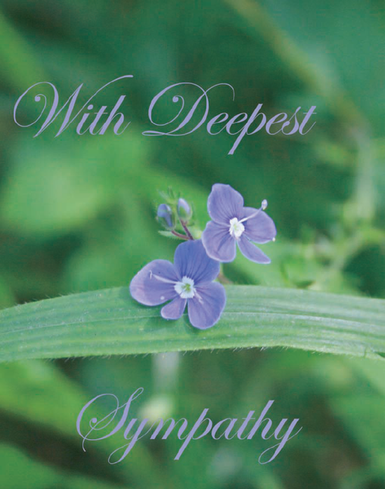
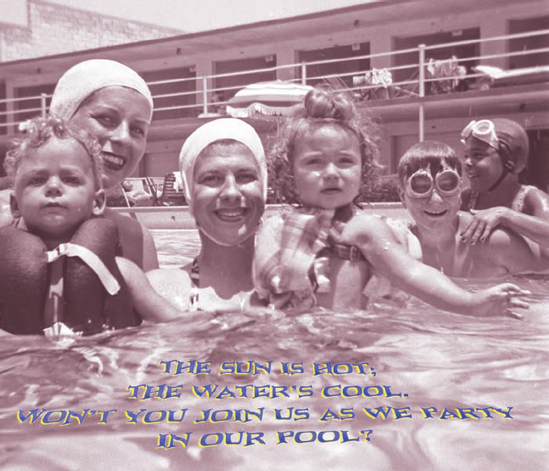
In a sympathy card, for example, an elegant script font does justice to a sad event (Figure BC2-4). In contrast, a more light-hearted font can dress up a pool party invitation (see Figure BC2-5).
You can create and then tweak text in Word and Photoshop. Both offer choices for font, font size and color, and various formatting treatments, such as bold, italic, and so on. Word additionally offers WordArt options, which you can use to create 3-D text.
Note
You can always run a spell check in Word to catch most typos and misspellings. Just click the Spelling and Grammar icon on the Standard toolbar. In Photoshop, select the type layer in the Layers palette and use the menu command Edit
To create text in Word, simply open a new document, choose your font and size, enter the text, apply the formatting you want, and save. It's just that easy. You choose your font, size, color, and any formatting from the Format toolbar:
Font: Choose this from the Font drop-down menu.
Font size: Choose this from the Font Size drop-down menu.
Font color: Choose this from the Font Color drop-down palette.
Formatting: Click the appropriate icon (B for bold, I for italic) on the Formatting toolbar.
You can also create a background (other than white) for your text in word by choosing Format
Note
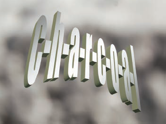
Word includes a cool feature for manipulating text: WordArt. Using WordArt is a simple but effective way to put text on top of a photo background. For example, I can take a shot of black gravel and purposely blur it to make it look like charcoal, and then create WordArt to use in the foreground that describes what I put in the background — charcoal! To add a little extra artistic flare, I put a dash between each letter. See Figure BC2-6.
Clicking the Type tool puts Photoshop into text mode. In this mode, you can directly type onto an image, without passing go or collecting $200. You click the Type tool in your image to add "point type" (like newspaper headlines) or drag the tool to add paragraph type (like the columns of text in a newspaper). One of the most important aspects of type in Photoshop is that it's re-editable. Sure, that may sound like an "Of course!" feature, but it hasn't always been that way. (Remember that Photoshop is an image editing program, not a word processor.) Unless and until you flatten your image or elect to rasterize the type layer (perhaps to use Photoshop's advanced warping capability), you can go back and make changes to the text on the type layer. Even after special effects have been applied! However, keep in mind that once you merge layers or flatten your image, you can't select and edit the text. For more about layers, see Chapter 14.
After selecting the Text tool, you can customize the following options:
Font: Choose this from the Set the Font Family drop-down menu in the Options bar or from the Character palette.
Font size: Choose this from the Set the Font Size drop-down menu in the Options bar or from the Character palette.
Note
Font size presets only go up to 72 points in Photoshop's Options bar. To use larger text, simply type a number in the Font Size field.
Font color: Click the color swatch in the Options bar to open the Color Picker and then use the Set the Text Color option in the Options bar or from the Character palette.
Font Style: Choose this from the Set the Font Style drop-down menu in the Options bar or from the Character palette.
Anti-Aliasing: Choose this from the Set the Font Style drop-down menu in the Options bar. This option removes jagged edges. Photoshop offers a couple of choices when it takes away the jag — sharp, crisp, strong and smooth.
Note
Photoshop places text in a new layer each time you click an area of the screen with the Type tool. (Click too close to text on an existing type layer, and you'll be editing that text rather than creating a new type layer.)
You can change the background color (from white) of your text in a new document (File
Tip
You can add a new background with one action by adding a new fill layer (choose Layer
To type text vertically, use the Type Vertically Text tool. (What tool were you expecting?) To access this tool, click the Type tool in the Toolbox and hold it until you see the fly-out menu; then click the Vertical Type tool. Press Return (Mac)/Enter (Windows) to advance to the next line of text.
For some examples of putting text and photos together in Photoshop, see the later sections, "Creating an Ad with Text and a Photo" and "Making Art out of Text."
No matter whether you create your text in Word or Photoshop, after you choose an appropriate font and decide its color and style and height, you have a few layout options to tinker with — like leading, kerning, and tracking — to make the text appear as you want on your composite project.
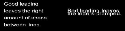
Leading: Leading (pronounced led-ding, as in the metal lead) is the amount of space between lines (see Figure BC2-7). Not enough leading is the culprit when you see a line of text on top of another. For optimal legibility, set leading values a bit larger then font size.
Tip
Word: Choose Format

Photoshop: Click the Type tool and then access the Character palette by clicking Toggle the Character and Paragraph Palettes. After the Character palette comes up, type in a value larger than your font size to get proper spacing between lines. 120% is usually a good choice.
Kerning: Kerning is setting the distance between each character.
Word: Choose Format
Photoshop: You can adjust this value by adjusting the values in the upper right of the Character palette (refer to figure BC2-3). When you kern, you select the space between two letters only. Kerning affects the letter to the right of where you click in the text with the Type tool. After you set your cursor between two letters, kerning with positive values pushes the entire letter set to the right of your text to make extra room for the extra space you want between two letters. When you set negative values, all letters to the right get pushed to the left so that there is less space between the letter pair you are kerning.
Tracking: Tracking is the option to the right of the kerning settings. First select the text to be amended, and the space between all your letters that you select changes according to the values you choose.
Time to tie the knot, so to speak. Take your font and text-tweaking prowess and combine them with a great photo for projects that are fun and effective. Think greeting cards, think invitations, think ads ... your creativity is the limit.
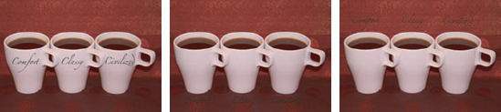
Of course, text overlaid on a photo doesn't serve any purpose if you can't read it. You have to consider both placement as well as what color type you choose. Contrast between foreground text and a background image creates depth in your final product and makes the text easy to read. You have to follow just two rules when placing text over a background (see Figure BC2-8 to see what I mean):
Overlay light-colored text on a dark background. White text on a background of darker shades of gray and black has a nighttime effect.
Overlay dark-colored text on a light background. Black text on a white background is very traditional (and readable). However, you can vary from light shades of gray as a background to dark shades of gray for your text.
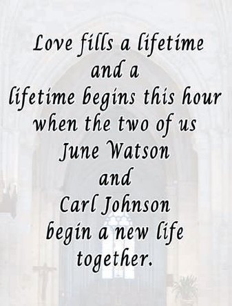
In the wedding invitation shown in Figure BC2-9, for example, I adhered to these basic rules: By brightening the church picture while muting the contrast within it significantly, I make sure that I'm putting dark text over a lighter background. To match the font appropriately to the occasion, I chose the Lucida Calligraphy font, which has an old-fashioned, formal, and romantic feel — perfect for a wedding.
Everybody loves a pooch. Making a good ad or party invite with an animal as the superstar involves a photogenic pooch and the finesse of Photoshop layers — not to mention how well you compose and shoot the photo, and, of course, how you compose the text with respect to the picture. With a bit of luck (getting the pooch to cooperate), you can have your pet saying something great in a well-composed photo where the dog is looking nothing less than fabulous. Just follow these steps:
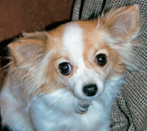
In Photoshop, open an image.
Figure BC2-10 shows the image I'm using for this example.
The image comes up as a locked Background layer.
To unlock the photo layer so that you can move it around in your artwork, double-click the layer name Background in the Layers palette and rename the layer.
Choose Image
Add a new layer below your original image layer by Command+clicking (Mac) or Ctrl+clicking (PC) on the New Layer button at the bottom of the Layers palette.
Choose Edit
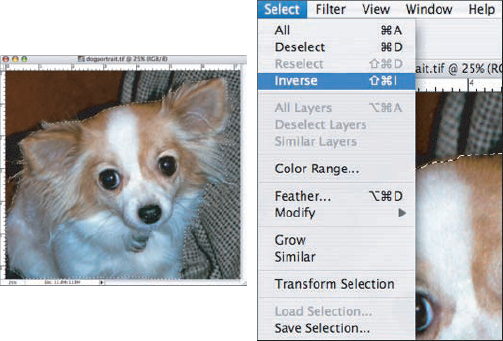
Select the Magnetic Lasso tool from the Toolbox and select the Anti-Aliasing check box in the Options bar.
Make sure that the upper layer (your original image layer) is active by clicking it in the Layers palette.
Use the Magnetic Lasso selection tool to outline the subject (the dog, in this example), as shown in Figure BC2-11, and then choose Select
Choose Edit
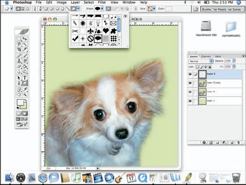
Select the Custom Shape tool from the Toolbox and choose a speech bubble shape from the Shape Picker in the Options bar.
Figure BC2-12 shows you where to find the shape tools from the Tools palette.
Drag the Custom Shape tool in your image, creating a shape layer. If necessary, use Edit
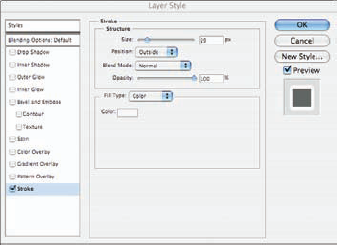
Add a Stroke layer style to help the shape stand out from the background.
You can open the Layer Style dialog box through the button at the bottom of the Layers palette or through the Layer
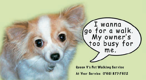
Select the Type tool and click in your image to add the text.
The final ad is shown in Figure BC2-13.
Tip
You can resize an ad to make business cards.
Telling a story with text and images within one or more photos
You can use a photo set to tell a story (which I discuss in Bonus Chapter 1). When you add text to your story, the text has power to teach or tell about
Photography techniques: You can include the settings that you used for those special shots in a space at the bottom of the paragraph. And with iPhoto and other image storage programs, you have all the data you need to record this when you select the picture and then click the Get Info option. You can also include your experience in getting the shot(s).
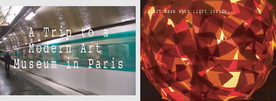
Your experience: How many times have you looked through your camera's pictures and found that the story is already there, from taking the train/subway/car to a sports event to what you saw at the event to stuff and people you saw afterward. The two images shown here are from a sequence with text taken directly from the same roll of images shot on an outing to an art museum in Paris. The text documents what I saw in a similar way that you might write about a picture in a photo album.
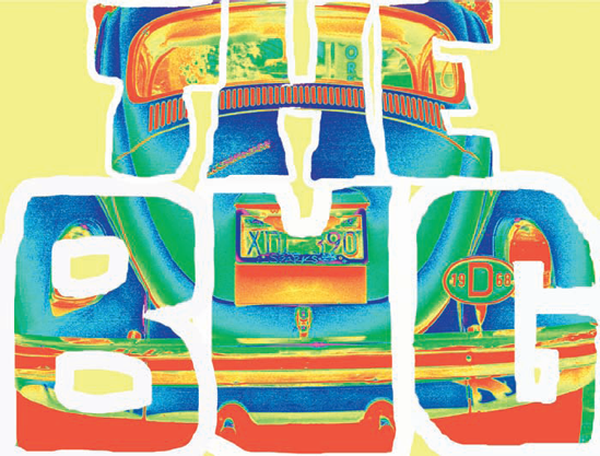
If you're game to stretch beyond premade fonts — that is, draw the text yourself with your mouse for a less-mechanical look — you can create your own text style. It just takes a little planning. Remember that a character is just an element to which you can apply many tweaks in Photoshop.
Note
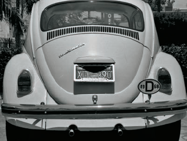
In this example, the text The Bug contains six characters and a space in between, offering a myriad of opportunities for art. Of course, your projects will, too. For this example, I use a photo of a VW bug. For a hybrid auto, you could use the words Gas Saver. For a Jaguar, you could use The Cat. (A graphics tablet [see Chapter 3] is ideal for this kind of task.)
Start with a picture.
For this example, I use a shot of a favorite car, as shown in Figure BC2-14.
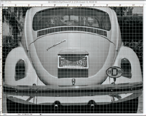
Choose View
This puts a grid over your image so that you can plan out your text in relation to the photo (see Figure BC2-15). Also check to make sure that the option View
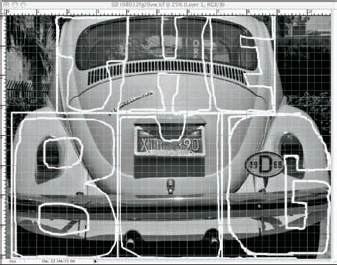
Add a new layer on which to draw.
Click the New layer button at the bottom of the Layers palette to add a new empty layer. This permits you to experiment without ruining your original image.
Using the Brush tool, draw your text over the grid on the layer copy (see Figure BC2-16).
In the Options bar, you want to select a brush tip size and hardness (generally about 90% for this sort of work) as well as a color. So that the letters can be filled with color later, make sure that each is a closed path — don't leave any gaps in your outlines.
Make a selection of the interior of each letter.
Select the Magic Wand tool from the Toolbox and choose the Contiguous option from the Options bar. Hold down the Shift key on your keyboard and click inside each of the letters. The goal is to make a selection of everything that would be color if these were letters created with the Type tool. (Don't, for example, click in the areas that would create the holes in the letter B.) If you see that suddenly the entire layer is selected, you've found a gap in one of your outlines. Deselect (

Add a new layer.
With your selection still active, click the New Layer button at the bottom of the Layers palette.
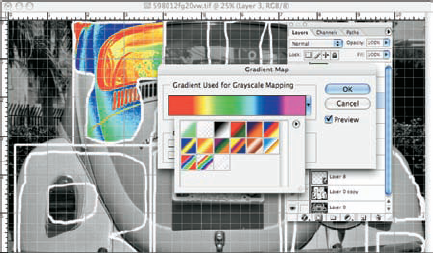
Fill the selection with color, a pattern, or a gradient and adjust the layer's blending mode and opacity.
Choose Edit
(Optional) Choose Image
This randomly colorizes your image, making it Warhol-like.
Stroke each letter.
Make sure that the layer with the body of your text is active in the Layers palette and apply a rather large Stripe layer effect. For this example, I use white as the color and 29 pixels for the stroke width (see Figure BC2-18).
Delete your work layer.
In the Layers palette, drag the layer on which you originally created your letter outlines to the trash.
Make a selection of the empty background.
Make sure that your text layer is active in the Layers palette by clicking it. Select the Magic Wand tool. In the Options bar, deselect the Contiguous option. Click once in the empty area of the layer.
Add a new layer.
Fill the selection with color.
Select a complementary color and fill the area, hiding the bottom layer except where the letters appear. The final version is shown in Figure BC2-19.