Seeing how layers work
Making a layered picture with a theme
Layering images is one of the most powerful features of Photoshop. Remember working with an x-y axis in algebra? You can think of your image in terms of that plane. In more advanced math, you also have a z axis, which is a kind of space that moves up and down. You can think of other images that you lay over your original as being in that plane. A layer is just a picture file that Photoshop uses to make an image. Photoshop can merge many pictures together in a kind-of-third dimension called a layer.
For the purposes of this book, I leave heavy rendering of dozens of images to graphic designers. From a photographer's perspective (more specifically, this art photographer), if a photographic image is overdone with Photoshop, you move it into a different category of art — more toward graphics. For now, digital photography graphic designs have not sold widely as prints without the aid of mass production. In other words, designs do sell but mostly if they're part of a poster produced as part of an event, a gallery opening, movie premiere, or stage production. But, in the art world, you never know when this will catch on.

This chapter discusses how you can make interesting photo montages using Photoshop layers.
When working with layers in Photoshop, first show the appropriate palette. The Layers palette can be shown and hidden, like all of Photoshop's palettes, through the Window menu (Window
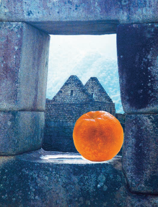
You can layer any image one on top of the other by selecting a smaller image and dragging it onto a larger image. In the first example of layering a bit later in this chapter, I take a simple image — a cutout of an orange — and juxtapose it with an image of a natural window of stone.
Tip
It's important to know the relative pixel dimensions of images you're combining. Use the Photoshop Image
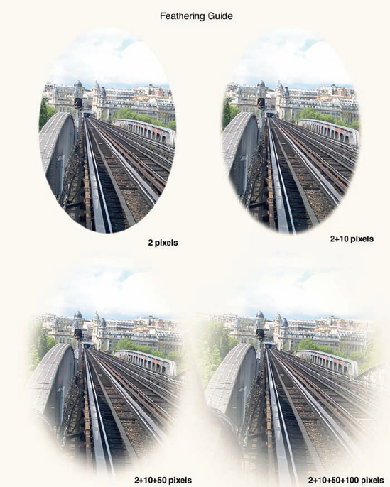
Before I get into the fun of layering images, you need to understand the concept of feathering. This finishing technique is essential to help your superimposed images blend smoothly, preventing an upper layer from looking as if it's been pasted on top of your background (like a poster board project kids make in grade school).
To make the superimposed image blend in — and avoid a pasted-on hard outlined edge — feather a selection (choose Select
Figure 14-2 shows you what happens when you select and feather and then click and drag a selection from one document to another (in this example, a plain white document).
The two basic ways to soften the edges of a selection with feathering are
Make a selection and then feather. Use any of Photoshop's selection tools or commands to make a selection. Then use the menu command Select

Set the feathering before making the selection. Both the Marquee and Lasso selection tools offer a Feather field in the Options bar. Enter a value in the field before using the tool to make a selection.
Note
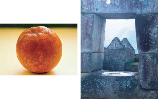
Here's how you can move one image over another in Photoshop to get an awe-inspiring result for your viewers. I start with a simple two-image example:
In Photoshop, open the two photos that you want to arrange together, one on top of the other.
Here are the photos I use: an orange and part of an edifice of an Inca ruin that I call a natural window, as shown in Figure 14-3.
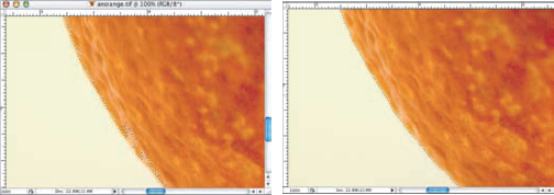
Make a selection of the area of one image that you want to copy to the other.
For a subject that's similar in color to its background but has a distinct edge (like the orange used in this example), the Lasso tool is a good choice. When there's a significant difference in color between the subject and the background, the Magic Wand tool or the Magnetic Lasso tool (both found in the Toolbox) might make selecting easier.
Note
You can set your feathering before using a selection tool, or you can feather afterward by using the Select
Refine your selection.
As you can see to the left in Figure 14-4, you might need to fine-tune the edges of your selection. Hold down the Shift key and drag a selection tool to add to a selection; hold down the Option key (Mac) or the Alt key (Windows) and drag a selection tool to subtract pixels from a selection.
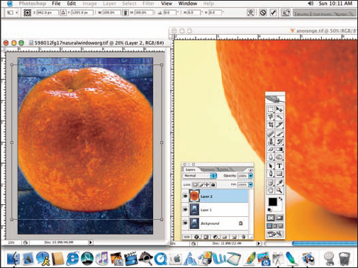
Move your selected subject to the other image.
You have a couple of choices when you're duplicating the selected pixels into the second image:
Copy and paste: You can use the menu command Edit
Click and drag: You can also simply select the Move tool in the Toolbox, click the selected pixels, and then drag the selection to the window of the other image.
Position and transform as necessary.
Use the Move tool to position the pasted pixels where you need them in the second image. You can also use Photoshop's Edit
When using a Transform command, you'll see a bounding box surrounding the pixels on the layer. Drag the side or corner anchor points (the hollow boxes around the square, shown in Figure 14-5) to manipulate the pixels.
Evaluate the composite for lighting and shadows.
After you move and transform the pasted pixels, take a good look at the composited image and ask yourself these questions:
Do the angles of lighting for the background and the subject match?
Are there any places where a shadow should be falling on the new subject that no shadow is evident?
Is the overall tonality of the composited image harmonious, or do you need to adjust the lightness/darkness of the new subject?
Is there agreement in overall color between the new subject and the background?
As you can see in Figure 14-6, sometimes additional work with Photoshop's Image
Saving as an investment
Sometimes you invest a considerable amount of time in making a selection or need to interrupt your selection creation for any number of reasons. Rather than risk losing your work to date, choose Select
Tip
There's generally no need to flatten the layers in your image (unless you're desperate to save hard drive space or require a specific file format that doesn't support layers). Save your images as a Photoshop PSD file without using the Image
Creating collages around a theme is popular in many art venues, from huge billboards in upscale shopping areas to advertising to small personal scrapbooks. A good theme leads to a good collage. When you keep to a specific theme — one that you've narrowed down to a simple focus — a viewer can easily understand your overarching message. For example, when creating a Roman collage theme, consider using appropriate elements such as round, arched, or fluted columns; marble/bronze trims and mosaic tile; decorative sculptures; and frescos from your photographs. The only limits to creating a theme are your imagination and source photos.
Here, I show you how to use Photoshop to put together a group of pictures — a collage — with multiple layers.
In a nutshell, you take a background, middle ground, and foreground and separate each with a solid color fill layer, which is then faded to become semitransparent. Each time you move a picture, Photoshop automatically creates a new layer for you.
Tip
Using Photoshop's Browse command (File
Open (double-click it from your browser window) a picture that you want to be the background of your document.
Choose Image
I set mine to 8 × 10.
Check all three options at the bottom of the Image Size box.
I changed the width to 10, the height to 8, and the resolution to 300 pixels per inch (ppi), which is a resolution that's great for most inkjet printers because it balances image quality and file size.
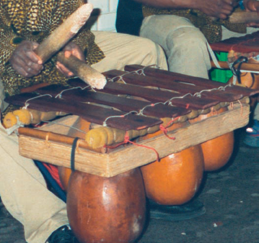
Experiment a little. Try different images until you get a background that you feel summarizes your theme. I chose an image of wooden marimbas, cropped so that they form a nice set of horizontal and vertical lines (kind of like railroad tracks) that also have perspective. The image is shown in Figure 14-7.
Tip
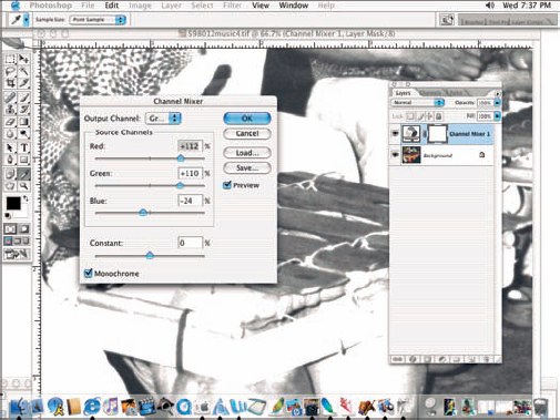
(Optional) Use the Channel Mixer layer (Layer
I wanted a fairly bleached-out background (that is, lots of pure white tones) so that the middle ground and foreground images aren't overshadowed by the background picture. Figure 14-8 shows the channel mixer values I used. I selected the Monochrome check box and tweak the slider bars to give lots of white tones. (For more about using the Channel Mixer layer, see Chapter 9.)
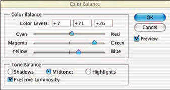
(Optional) Use a color balance layer (Layer
You can choose any tone that you feel matches your images. Figure 14-9 shows the slider bars in the Color Balance dialog box. You can choose values for not only the midtones but also for highlights and shadows.
I chose a brown (sepia) tone to match the colors of natural wood instruments. To maintain a harsh contrast, I left the Preserve Luminosity check box unchecked. I needed this contrast because this layer will be covered with three fill layers later. I also chose to get my sepia tones by balancing only the midtones. I didn't use the Tone Balance options for the shadows or highlights. For more about creating an art photo by choosing from a variety of sepia tones, see Chapter 12.
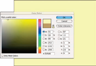
To choose a color overlay for the background, choose Layer
Click the color swatch to open the Color Picker. I chose a pale yellow (see Figure 14-10) from the Color Picker dialog box. To get the pale yellow, click in the vertical color spectrum bar of color choices to get in the vicinity of yellows, as shown in the Pick a Solid Color square work area.
Use the Opacity slider in the Layers palette to control how much you blend this color into the background picture.
To soften your background, click Layer 1 in the Layers palette (Windows
Note
Reducing the opacity lets you blend two layers together so that you get, in essence, both pictures together. If you use a white fill layer, reducing the opacity gives a silky smooth look to the image you lay it over.
Open another image and select an object to move to your collage.
I selected my object to add (a street musician) with the Magnetic Lasso tool.
Soften the edges of your selection with Select
For most subjects with defined edges, feathering one or two pixels is great. However, if you want very soft edges to more gradually blend your subject into the background, use a larger value.
Copy and arrange your selection.
Use the Copy and Paste commands (as described earlier in this chapter) or drag the selection with the Move tool onto the window of your collage background. If necessary, use the Edit
(Optional) Using the Add a Layer Style button (the second one over on the bottom of the Layers palette drop-down menu), I put a color overlay to soften the image of the man just a little.
I clicked the Add a Layer Style button at the bottom of the Layers palette and selected Color Overlay to bring up the Layer Style dialog box. I then chose a color via the Color Picker and used the slider bar there to adjust the opacity.
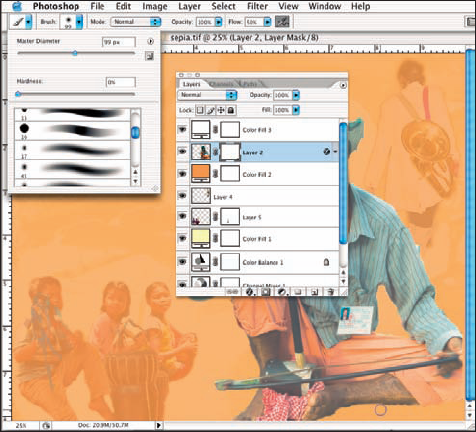
Repeat Steps 4–8 for the additional images to move and make overlays for. You can tweak them along the way so that they fit as secondary and complementary — not primary — images in the collage.
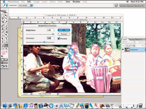
For example, in Figure 14-12, I made a selection to apply a Brightness/Contrast adjustment to lighten the image (of children playing instruments). When copied into my collage, this image was less prominent and therefore didn't conflict with what became the primary image of the collage. I added just one more image after this one (the guy walking away with the horn).
(Optional) Repeat Step 4 one more time, using white as a fill layer.
This unified my entire image with a softness — a subtle retreat from what a photograph taken with a normal lens would ordinarily give.
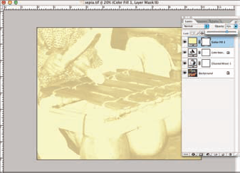
Use a layer mask (Layer
Click a layer in the Layers palette and then add the layer mask. Paint with the Brush tool, using black as the foreground color, to hide areas along the edges. Repeat for each additional layer that needs touching up, clicking the layer in the Layers palette and then adding a layer mask for that layer.
For example, I noticed some black edges on the man playing the instrument. To soften them, I chose Layer 2 (where the man appears) and then chose Layer
Flatten the image (if desired), and you're done!
Remember that flattening the image blends all the layers into one layer, which reduces the file size but makes it nearly impossible to go back and make changes to your collage. Figure 14-14 shows my final result.