In This Chapter
Starting from square one: Digital photography
Creating art photography in five steps
Mastering basic composition elements
Art is the product of human creativity: a medium to create pleasure as well as express the conditions of life and feelings. Art also records history: who we are; what's around us; and how we interpret life, feelings, and interpersonal interactions. This concrete expression has come in many forms: prints, drawings, paintings, and sculpture. With today's digital technology, however, the art form of photography reaches new creative levels, taking on new forms as people flock to this new digital medium.
In this book, I cover the art form of photography. Whether you're a film-based photo purist or firmly entrenched in the digital-only camp, you're covered. This chapter serves as an introduction to the world of photography and how it relates to digital photography. I begin with a brief discussion of digital art photography before moving on to the five essential steps to creating a digitized masterpiece. Finally, I end the chapter with a crash course in composition.

Digital images — whether from a digital camera, scanned from film or print, stills from a camcorder, or something from the Web — can be defined as any artwork stored electronically. After you have a digital image tucked into the hard drive of a computer, the chip of a cellphone, or the memory inside a digital camera, you can
Manipulate it with a mouse click. You can change your image's color or size, take away blur (a new tool in Photoshop CS2), make it look like a painting with filters, and emulate many photography techniques without having to go to the trouble of shooting with lots of extra lenses and filters.
Keep it indefinitely without deterioration. Digital images don't crease, bend, or crumble like traditional hard copies. They don't pick up stains from fingerprints or (yikes) coffee, either.
What few people think of and what makes this book special is how the digital image is conceived. In this book, digital images encompass those born again (or for the first time) into the digital world, including
Scanned original art: You can scan an illustration or a painting as easily as you can scan a photograph. Then, if the art is yours to manipulate, you can open it in Photoshop and create a digital work of art.
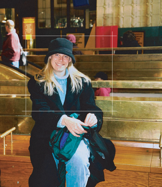
Scanned photo negatives and positives: Figure 1-1 is a scanned positive (a slide). I scanned it into my computer by using a Hewlett-Packard (HP) Scanjet 5470C. I had the original slide tucked away in some old family photos. It dates from the 1960s, but now it's digital.
Scanned print photos: Scan prints just like you would scan negatives and positives. This is a great way to make repairs to old photographs (see Chapter 12) or to combine images to create a digital masterpiece (see Chapter 13).
Electronically tweaked creations: After you scan something or download images from your digital camera, you can tweak that digital file in an image editor, electronically enhancing its beauty for sale as a gallery-quality digital print. (For more about printing and preparing your work for gallery exhibition, see Part IV.) Figure 1-2 is an image of a sunset that was tweaked in Photoshop to enhance its color and contrast. Would anyone ever know it was tweaked in Photoshop? That's a question that you should be thinking about when reading this book.


Tip
Most of the time, you want to keep your image as natural as possible. Your goal is to clean up dust specks and scratches from print photos or to enhance color and contrast without overdoing it — that is, without producing annoying noise, those specs of color that make your images look unnatural. A little tweaking can go a long way.
Long discussions have ensued among many photographers, amateur and professional alike, as to what format is better: digital or film. There's really no answer, but some people are adamant about one or the other. Take a look at Table 1-1 and judge for yourself which is better. Whatever the case and whatever medium you use, don't be shy about trying out both from time to time. Each has its advantages, and it's a fun ride to see what you get when the light shines on your film or on your digital sensor. (A digital sensor is a small device inside a digital camera that captures picture info and sends it to the storage inside the camera.)
Table 1-1. Digital versus Film
Digital | Film | |
|---|---|---|
Cost | No film costs, but high-end equipment is expensive. | Film and developing costs. For cheaper costs, develop as negatives only and scan at home. |
Ease of use | More controls in LCD panel in addition to filmlike creative and manual modes controlled by knob at top of camera on most models. Frequent change of batteries or battery removal and recharging required for camera to work. | Fewer controls and no LCD make camera less confusing. |
Image quality | Clear and vivid. Some folks notice a "plastic" quality that digital images can have. Edges are crisp (too crisp, according to some). | More natural-looking images when light hits film, which creates observable chemical change that's recorded on the film and that can be kept as a hard copy for decades. |
Output tools | Gallery-quality prints can be made at home with new multiple ink cartridge printers. | Gallery-quality prints have to be sent out for processing unless you have complicated developing materials at home along with a darkroom. |
A gallery-ready art print is one that is defined continually throughout this book — through many examples and for many types of photographs, from old reproductions to the newest, swiftest digital art around. From taking a traditional portrait to making text-based art from a photograph, you'll travel through a land of light, space, time, and patience (remember, anything digital can get quirky) to create some of the most original and high-quality work around. Photographers who take the time to capture and print superior quality images by adhering to these five steps, each a creative process in itself, produce gallery-ready art prints that turn viewers into buyers who will enjoy the work for a lifetime.
When making choices about what to photograph, think about what interests you. If it's sports, you've got it made with an abundance of uniformed players, cheerleaders, and wild fans in the bleachers. If it's rare and exotic orchids in Guatemala that you long for, your trek is likely a bit more arduous but doable. And if you really don't know what you want to photograph — or whom to create photographs for — go directly to Chapter 4 where I discuss defining yourself as a photographer as well as your audience and subject matter.
Photography, like any art form, is based on some basic rules of composition, such as the Rule of Thirds and using a vanishing point. After you master those composition techniques, you can put your own artistic interpretation of a scene into your art photo. After all, it's your art and your photo, and you can do with it what you want. Read through the remainder of this chapter for more specifics on all things composition, including use of geometry, color, and cropping. The more you can create and manipulate in-camera, the less you have to do in your image editor and when printing. Also, see Chapters 8 and 11, where I cover shooting for great color and achieving special in-camera effects, respectively.
Snapping a photograph is only the beginning. Digital art photography requires following certain paths before you can print and frame your output (final image), including
Getting the image into your computer: You do this either by transferring the files from your digital camera to your computer or by digitizing a film photo, in which case you want to scan either the photograph itself or (even better) its negative. (Remember, after transferring a film print, positive, or negative into the computer, it becomes digital.) Chapter 3 covers scanners; see Chapter 16 for more about transferring images.
Digitally tweaking the image: With your image open in Photoshop (or your image editor of choice), there's practically no end to the tweaking that you can do. You can crop an image, apply filters to it, resample it, use layers to merge it with other images ... the list goes on. See the chapters in Part III for more about image editing.
Saving your image in the appropriate file type: Whether you're shooting with a high-end digital single lens reflex camera (dSLR) or a mid-level point-and-shoot model, the files in which your camera stores your pictures are ultimately saved in a high-resolution format called TIFF, which is a file format that I describe in Chapter 2. Your digital image might travel across a number of devices and platforms before it's ultimately printed.
After you complete Step 3 — that is, you've tweaked, you've resized, the color is perfect, and the photo is ready for the world — just press Print, and you're good to go. Okay, the printing process is more involved than that. In Chapter 3, I discuss what types of printers are available. And in Chapter 17, I discuss the whole printing process in detail.
When you have your printed image in hand, you're almost to the finish. Following are your three choices for framing your digital photograph:
Take your photos to your local framer and have mats and frames made. This is mostly for those who want a select look for their home or office that matches exactly to their décor. It's not a cost effective route for those who want to sell their prints framed.
Cut your own mats and make your own frames. This is a great way to get your work framed if you're a carpenter. Many people take this route but buy the frames premade from a wholesaler while cutting the mats themselves.
Buy your mats precut and your frames from a wholesaler or your local discount frame store. Hey, for people starting out (and even for people who do the art show circuit), this isn't a bad idea.
For creative framing options, see Chapter 18.
The difference between someone who takes pictures and an art photographer is that the latter realizes that the cornerstone of fundamental design is composition. Folks easily take this element for granted, getting swept away by coolness or locale of the subject. Composition is more than what your subject is and how it's posed: It comprises all that plus the background, foreground, color, lighting, and framing. Always remember to compose first and expose second.
All great photographs start with sound composition techniques, which are basic rules of how to put together a pleasing image. When you compare two shots (say, using the same subject and lighting), one of a sloppily composed image with one that's thoughtful and crafted, you can immediately tell the difference. And when you follow these rules, remember that you follow in the footsteps of masters of art and architecture: The ancient Greeks and Romans practiced these same tenets 20 centuries before the advent of photography. It's obvious in their architecture.
Tip
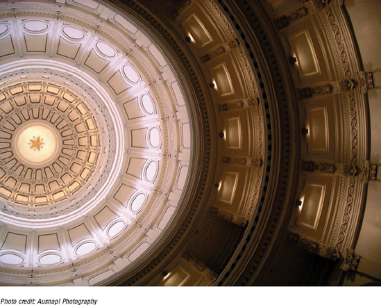
Most photographs need a focus — anything inherently interesting to your viewer, from a looming tree and its shadow to a church's dome. Figure 1-3 shows a pair of pictures: The left image has too many unnecessary objects in the frame that render the image unfocused; the right image is composed artfully.

And, by the way, call 'em guidelines instead of rules if you want. Know, too, that after you master these guidelines, you can bend them to your artistic desire.
Keeping your shots clean and uncluttered is paramount to presenting a great art photograph. That's not to say that you can't shoot something detailed and ornamented, but make sure your audience sees what you want to show, not a photo cluttered with unnecessary background distractions. Read more about this in the upcoming section, "Foreground, background, and depth of field."
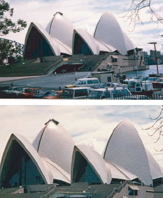
For example, consider the architecture of the Sydney Opera House. People gather around this Australian landmark, snapping pictures left and right. To present this wonderful architecture artfully to your viewer (or to present any subject artfully to your viewer), crop it boldly and closely — either while you shoot (ideally) or later in Photoshop if necessary. By doing so, you can retain your viewer's focus on this monument only and nothing else, as shown in the two images in Figure 1-4.
Akin to using simplicity is the art of balance. Achieving good balance means paying careful attention to how you arrange shapes, colors, or areas of light/dark to complement one another so that the photograph has interest but isn't lopsided. (Try to avoid centering the subject; read more about this in the section on the Rule of Thirds.)
When using symmetrical balance, the two halves of an object look the same — they are mirror images of each other, if you will. In the Greek islands (and elsewhere), gates and foyers are often built symmetrically, as shown in Figure 1-5.

You can use asymmetry to give a less formal yet balanced feel to your shots. This image of a bird with its beak sticking out of the cage (Figure 1-6) is unsymmetrical yet balanced. You can use simple geometry to help create balance. For more on that, see the later section, "Identifying lines in photos."

I show examples of the Rule of Thirds through-out this book. This composition principle is based on the theory that the human eye gravitates naturally to a point about two-thirds of the way up an image. Thus, images with the subject or a dominant dividing line that falls in the upper or lower third of an image is pleasing. Hint: By visually dividing the image into thirds (vertically or horizontally), you can asymmetrically balance, as I discuss in the preceding section.
Imaginary lines divide the image into thirds both horizontally and vertically. You place important elements of your composition where these lines intersect. In Figure 1-7, you can visualize those imaginary lines that denote where the one-third and two-third marks fall horizontally and vertically in your photograph.
When you're shooting a wide area of land or water, the third-line will usually be two-thirds up from the bottom, as shown in Figure 1-8.

Conversely, if you want to showcase the sky — like for a remarkable sunrise or sunset — your main line is effective one-third up from the bottom, as shown in Figure 1-9.
Capturing light — how you want to show and exploit it — truly defines photography. After all, photography literally means light writing. You can use light to paint, illuminate, mask, shadow, and color your subject almost limitlessly. Use light to your advantage to capture everything from blasting saturated color to ethereal backlit fog and mist to stark silhouettes. For more on reading light when shooting outdoors and indoors, see Chapters 5 and 6, respectively. For great techniques on capturing light when shooting black-and-white, see Chapter 9. And for shooting in virtually no light, see Chapter 10 for the lowdown on night photography.
Note
Photographing landscapes and people with strong late afternoon or early morning sun in front of you creates a silhouette, as shown in Figure 1-10.


You can also use light and shadow at night to add depth to photographs, sometimes making them look similar to paintings. Older buildings that show wear offer your camera's sensor a brush stroke effect in its interpretation of the light's reflection on the worn stone.
Tip
Many of the best architecture and landscape photographs are shot at dusk. The long shadows, soft light, and reflections can create dramatic results. For instance, Figure 1-11 shows a quiet street scene made dramatic by the long shadows caught at dusk. (In Chapter 9, I further discuss shooting architecture photos in the context of black-and-white photography.)

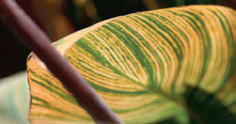
Don't be afraid to exploit contrast when calculating the proper light for exposure. After you get the hang of your camera's auto settings, master how to set your exposures manually. (More on that in Part II.) For example, in Figure 1-12, you can see how the light paints the outlines of the multicolored leaf.
You probably learned as a kid that two points make a line and that four lines fit together to make a rectangle. Later in life, you also likely learned about intersecting lines, parallel lines, and all the types of triangles. Then 3-D spaces of area and volume were next.
I know, I know: "It's math — ugh, geometry, at that! — and you can't make me like it any more than spinach." However, with a minimum of effort, you can quickly discover how to use lines, triangles, and all things geometric to help compose photographs that are compelling and full of life.
Also, don't overlook capturing texture and form repetition as strong compositional tools.
Vertical, horizontal, diagonal, curved, zigzag — straight lines come in many forms. And lines don't have to be straight, either: Don't forget ovals, curves, and circles.
In the earlier section on the Rule of Thirds, you can see how a simple horizontal line can effectively divide a shot. Now flip that line on the bias (a 45° angle) to show how using a strong diagonal line can add more interest and a dynamic sense, as shown in Figure 1-13. In this image, the paths of the two women, along with the painted street lines, form diagonal lines.
Note
When you're out and about — running errands or just going for a walk — really look at the lines in your world. Try to notice straight lines (fences and sidewalks), parallel lines (railroad tracks), soft and slinky curves (like a cat stretching), or undulating waves (like the overpass shown in Figure 1-14).

After you become better at identifying lines in a potential shot, start looking for geometric forms to mimic. Your viewer likely won't even realize your trick but will be attracted to the composition of an image when you cleverly hide a triangle, like the example shown in Figure 1-15. (Oh, so I did manage to sneak in some spinach, after all.)
Shapes don't have to be linear, either. You can use a rounded shape to draw attention to your subject, as shown in Figure 1-16. (Image that: Circles and repetition!)
Now take the triangle technique one step further, using one to create a vanishing point. When you arrange lines to converge in a distant point — usually at a corner of an image — you create a vanishing point. Perhaps the lines don't truly disappear off the edge, but they look as though they could, as shown in Figure 1-17.

More importantly, the lines and geometric shape immediately pull your eye to the place of interest you craft via composition. When lines are repeated — even when they repeat but end in a jumble, like a pile of sticks — you create even more visual interest. In Figure 1-18, notice how the repetition of a line draws your eye up the image.
Repeating a geometric shape can also be quite effective. You can often find this technique in architecture, as shown in Figure 1-19.

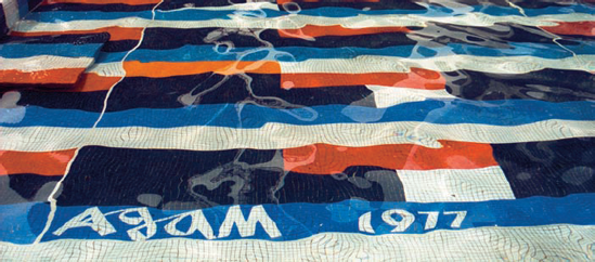
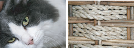
A basic micro-element of art — a mark — can be considered like a mini-line. When that mark is repeated, that creates texture (on a small scale, like the fur of a cat) or repetition (like a woven pattern in cloth), as shown in Figure 1-20.
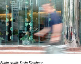
Be cognizant of how you place your subjects. Avoid sun shining right in their eyes (see Chapter 5), having odd things in the background seemingly sprout from their heads (see the upcoming section, "Foreground, background, and depth of field"), and having them in motion to disappear from an image, as shown in Figure 1-21.
The risk of Impressionism
Claude Monet's Impression, Sunrise (in the Musée Marmottan Monet, Paris) plays with light and shadow on canvas. About a century and a half ago, Monet took a risk by painting in a different way, re-creating the natural environment that surrounded him. Soon others began painting with dabs of color that come together when you step back from the work and view it as a whole. The Impressionist movement got its name when art critic Louis Leroy commented that Monet's work wasn't finished. Up until that time, works of art were more realistic. A painting of a garden, for example, was expected to approximate reality and not be just an "impression."
Just like Monet took a risk, so can you. The following figure illustrates a risk that a photographer can take when filming and manipulating images to give photographs an Impressionistic feel. Take a picture on a rainy day and you get a picture looking as if it was painted with short brush strokes a century and a half ago.

Take the extra minute and consider these points about your subjects when composing:
Frame them in the shot's context.
Identify line shapes that you can exploit.
Calculate how much (or how little) of the object you want in your picture.
Choose what angle to shoot from.
Create dimension and, by context, show more than just the face/main portion.
Looking at color is a matter of observing the world around you. As your kids grow up, their hair changes shades. (Um, yours does, too.) And those bananas you bought at the store the other day morph from yellow-green into deeper shades of yellow (and if you don't eat them, brown). Also, color changes — sometimes extraordinarily — under different light; the shades of the desert re-create themselves from dawn to noon to dusk, from yellow to pink or even green, depending on the weather, light, and season.
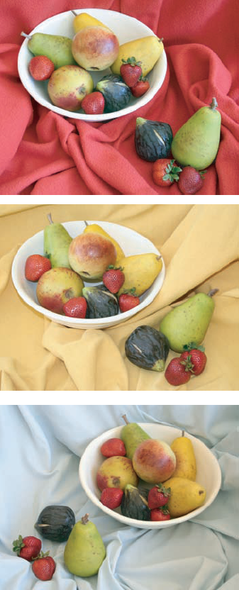
And perceptions can play with color. To one person at one moment, red can appear bright and cheery or warlike and aggressive. Color perception also changes on your object/subject when other colors are nearby. A green object can shift to more yellow or blue depending on the colors of the object next to it or the color of the foreground and/or background, as shown in the three fruit images in Figure 1-22.
The colors you see around you can depend on sunlight, atmospheric conditions (clouds, rain, haze), and season. (Light is always softer in spring and fall.) You can also affect how your camera sees color with some of its settings. For more on color photography, see Chapter 8.
To understand how to effectively capture color, you need to understand a wee bit about the beast. It's all pretty simple, and you likely know more than you think you do. Three primary colors — red, yellow, and blue — inside a triangle are at the center of a color wheel (shown in Figure 1-23). Next come the triangles of secondary colors — orange, green, and violet — that are made from mixing the primary colors. It's this group of triangles that points the way around the rest of the color wheel, to the tertiary colors.

Use this wheel to find complementary colors that are on opposite sides of the wheel — for example, red and green. You can also use one section or side of the wheel to find colors in the same tonal family — for example, pink, salmon, and orange. (Note: These types of color usually go well together but at the expense of contrast.)
Note
To create contrast, choose complementary colors, like the orange and blue in Figure 1-24.

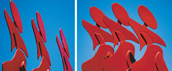
In Figure 1-25 are photos of an outdoor sculpture from two different vantage points, which shows how positive and negative space changes. Negative space is the space in between and around the object. An object in a picture is the positive space of the picture. Sculptors constantly evaluate the negative space as they mold their art, noticing not only the object itself (the positive space) but also the space between it (the negative space). As a photographer, you can exploit both spaces, too.
Positive and negative space tell you the following about your picture:
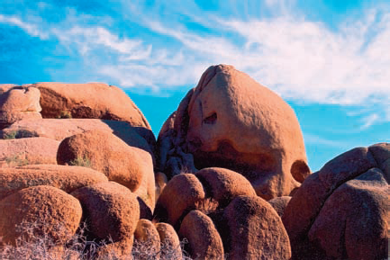
What shape and form the object is: Forms without jagged edges — smooth and even-rounded — are more pleasing to the eye in an art photo. Smooth round rocks (the positive space) among brilliant sky (the negative space) offer a viewer comfort in nature in Figure 1-26.
How much of the object occupies the picture: If the positive space is small, it should stand out in some other way, such as being a bright color. If it's large, like an extreme close-up of a person, it's more interesting if it shows some sort of emotion: excitement, concern, or disappointment. This emotion can be seen in the eyes or somewhere unexpected, like in puffy cheeks or a toothy smile.
How the subject and object interact: Whether your subject is in motion or static makes a big difference in how the distinction between the spaces is outlined. The way in which the two spaces meet affects how the picture will react to image manipulation. Rapidly changing tones within a small area sometimes gather pixels of disparate colors with tweaks in Photoshop, but more about that in Chapter 15. Also, the more dimension the object has, the more complicated the interaction between the two spaces.
How busy the space is: A busy shot is bad for art photos because when too much is going on, the viewer has no focus. That being said, millions of successful art pieces are very busy. It just depends on trends and what's out in the culture and/or community as a whole. Figure 1-27 is a photo that is, well, just too busy with too much going on. Your viewer's eyes will just juggle looking at the picture.
Right off the bat, you can't talk about backgrounds and foregrounds in photography without addressing depth of field. Basically, the depth of field is how much of your picture is in focus. Some photos have detail throughout the foreground and background with no blur, and others show a subject clearly with blur in the background.
You can use Photoshop to make a blurred background clear and vice versa, but it's done in kind of a roundabout way to get a good result. Turn to Chapter 14 for more about making backgrounds with Photoshop layers.
So why would you want any blur at all in a photograph? Blur creates an illusion of dimension, movement, and, sometimes, even the suggestion of a sixth sense. To make a variety of art with your state-of-the-art digital equipment, keep these points in mind:
The clarity of the negative and positive space: If you have a picture with a blurred background and want it clear, you'll probably have to replace it with a clear background from another picture in Photoshop.
The number and dimension of your subjects: If your picture is a simple 2-D negative/positive-space photo, tweaking it in an image processing program is fairly easy. You can use almost any option to make a good art photo. For more about cleaning up pictures in Photoshop, see Chapter 12.
Tip
The sharper the distinction between foreground and background, the easier you can process, transfer, and manipulate the foreground and background in an image processing program.
Tip
Small is relative. Tiny objects cast in massive backgrounds can be missed, so those tiny objects need to have a certain eye-catching something. When you're casting something small in a big background, make that small object colorful and memorable.
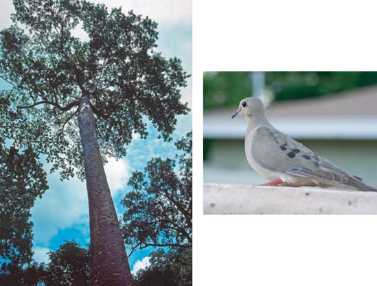
Having little or no background can make a photograph dramatic. In a portrait, such a shot is an extreme close-up, which is a type of photograph that reveals expression in all the features. In Figure 1-28, the focus is solely on the subject. But note how the subject is shifted to the right, leaving some background — a space that assumes some importance in the picture.

Often, pictures with large foregrounds and just a little background can give the viewer a sense of being right in front of the subject.
And don't forget to scrutinize your background when composing and shooting. Who hasn't taken a photo of someone with an errant phone pole or tree growing out of someone's head (as in the top image in Figure 1-29)? Sure, you can probably clean up your image later in Photoshop, but if you're careful to begin with, that's just less manipulation to do later (as in the image on the bottom in Figure 1-29).

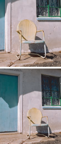
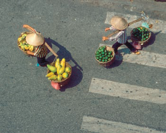
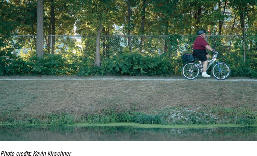
Showing a different angle or perspective of a subject can lend an artsy feel to a photograph. To experiment with this, walk around your subject, keeping your eye to the viewfinder to see how the light in the foreground or background changes with your different camera positions. Don't forget to move up and down, too. Sometimes shooting from above or below (as in the left image of Figure 1-30) gives you a feeling that's quite different from your normal eye level (as in the image on the right in Figure 1-30).
Perhaps the most valuable technique at your disposal when shooting is to crop judiciously. Think of this from a pragmatic view: What's the point in all that wasted space that you later have to crop in an image editing application? The more base image you have to work from, the less noise you get when you enlarge your image. See how Figure 1-31 could have benefited from more in-camera careful cropping?
Tip
Too, paying attention to in-camera framing lends to the craft of the shot, adding a professional touch. Use framing to visually lead the viewer into the scene or add a softened edge for effect.