
TEXT WRAPS ARE A FANTASTIC WAY to add emphasis to a picture and create a lively page design. An uninteresting picture can become an intriguing shape; a boxy layout can become unique and exciting. However, like most tricks, text wraps should be used sparingly. It’s shockingly easy to make a bad text wrap. Once you start looking out for them you realize they are everywhere. What frequently seems to get overlooked is that when you place a graphic inside a block (or blocks) of type, you narrow the column measure. All your careful planning of type size to column width ratio goes out the window. So while it doesn’t require rocket science to make a good text wrap, it does take some consideration—and often some tweaking.
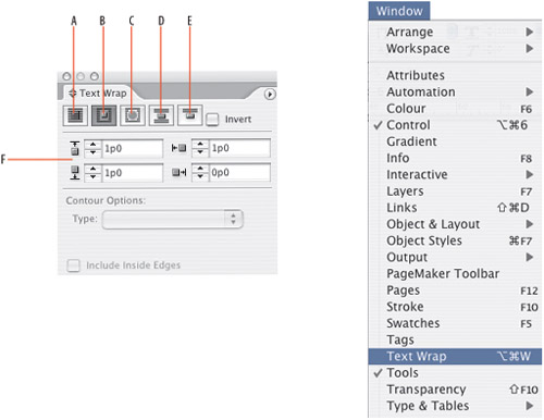
A. None
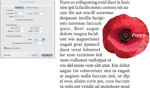
B. Wrap Around Bounding Box creates a rectangular wrap around the bounding box of the wrap object.
C. Wrap Around Object Shape creates a text wrap around the contours of the wrap object.
D. Jump Object keeps text from appearing to the right or left of the wrap object.
E. Jump to Next Column forces all text below the wrap object to the next column or text frame.
F. Offset determines distance between wrap object and text. Positive values move the wrap away from the edges of the frame. Negative values position the wrap boundary inside the edges of the frame or object.
Figure 17.1. Different Types of Text Wraps:
Here are a few simple precautions:
Avoid text wraps in a single column where the text wraps around all four corners (or the entire shape) of the bounding box or graphic. Such text wraps disrupt the horizontal flow of the text, and readers may be confused about whether to jump the graphic or continue reading down the left side of the column.
Text wraps work best with justified type. Ragged type undermines the purpose of the text wrap—the interesting shape of the text margin when text wraps around a bounding box or the contours of an image. If you must use ragged type, then reduce the amount of text wrap offset on the left of the wrap object so that the gaps from the left alignment are optically similar to the space on the other side.
Avoid having the left edge of lines in a paragraph start at different horizontal locations (apart from a first line indent). When you do this, the reader’s eye has to search for the start of the line and may lose the rhythm of the text, ending up on the wrong line.
Here’s a recurring theme: It’s all about optical spacing. And with text wraps, it’s essential to optically balance the space around the graphic. This is about more than just selecting equal values for all the text offsets. The vertical space around the wrapped object depends on where it sits relative to the baselines of the type around it.
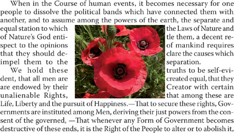
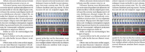
Figure 17.2. With a wrapping object in a single text column, it’s unclear to the reader whether to “jump” the picture or continue reading down the column.

Figure 17.3. The vertical positioning of the text-wrap object affects the size of the offset above and below the graphic. In example A the image is carelessly placed causing unequal spacing. In example B, the top of the image is aligned with the x-height of the line of type and the bottom of the image aligned with the baseline of the corresponding line.
When working with text wraps on rectangular images, align the top of the picture frame to the ascender line, cap height, or x-height of the text. Whichever you choose, be consistent. Align the bottom of the picture frame with the baseline of the text.
Carefully check all lines affected by the wrap and, where necessary, fix composition problems with a combination of tracking, hyphenation, and rewriting.
When using more than one text wrap in your document, keep the offset amount consistent.
Don’t attempt the impossible. If the shape of your wrap object is too irregular, the result will be too many different line lengths, too much hyphenation, and great gaping holes in the text.

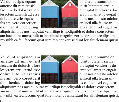
Figure 17.4. Example A uses left aligned text. Note the bigger space between text and picture on the left of the wrapping object even though the text-wrap offset is set to 6 points on all four sides. In example B the following changes are made: 1. The text is justified to equalize the space to the left and right of the picture. 2. The graphic has been nudged vertically to align with the cap height of line four. 3. The graphic has been slightly resized and recropped so that the bottom of the picture frame aligns with the baseline of line 12. 4. The bottom offset has been pulled up to allow line 13 to tuck under the image. 5. The line breaks of the text in the left column have been adjusted using discretionary hyphens.
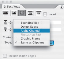
When working with an irregularly shaped object, select the object and choose Wrap Around Object Shape from the Text Wrap palette. The best way to prepare your image is as a Photoshop file (psd) with an Alpha channel or Layer Mask. In-Design supports Photoshop transparency, so you no longer need to worry about drawing pen paths around your image for a hard-edge vector-clipping path. From Contour Options, choose Alpha Channel. The text will use the image’s transparency to define a wrap boundary. You can adjust the Top Offset field (you’ll only have the one) to determine how close the text comes to the 100 percent opaque pixels in the image.
Don’t have/don’t know Photoshop? You can still create a clipping path for your graphic within InDesign, which will knock out the background areas of the image. This works best if the image has a flat background, preferably one that contrasts with the foreground.
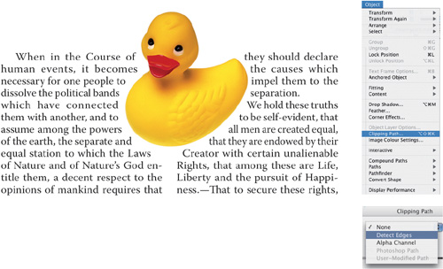
Figure 17.7. Creating a Clipping Path within InDesign. The opaque white of the image background is “knocked out” using Detect Edges. The text wrap is set to Wrap Around Object Shape, causing the text to wrap around the clipping path. Use the Direct Selection tool and click the image to see the new path and the text-wrap offset, both of which can be adjusted.
Using the Direct Selection and the Pen tool, you can manipulate your path to exactly the shape you want the text to wrap around. Select the image with the Direct Selection tool to show the text wrap path. Now drag any of the anchor points to adjust the text-wrap shape. To add or delete anchor points, switch to the pen tool. Click on the path where there is no anchor point to add one, or click on an existing anchor point to delete it. You can also use the Pen tool to convert smooth points to corner points and visa versa.
Tip: Reset your text wrap.
If you’ve adjusted your text wrap and don’t like the result, you can start again by choosing Wrap Around Bounding Box, then choosing Wrap Around Object Shape once more.
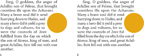
Figure 17.8. Wrapping around a circular shape. In example A, the text wrap at the poles of the circle is larger than that at its center. In example B, the Direct Selection tool is used to pull the text wrap offset at both poles toward the center of the circle letting the text hug the circle shape.
It’s best to evaluate text wraps by eye rather than rely on the numbers in the Text Wrap palette. For example, a text wrap around a curved shape may appear to have a bigger offset at the top and bottom of the shape than at its center, even though the wrap offset is set to a uniform distance from the graphic.
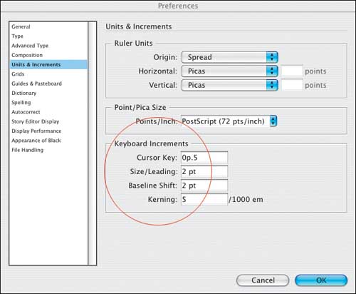
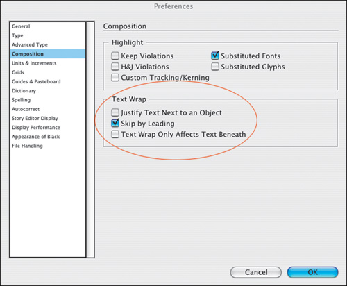
The following preferences determine how your text wrap behaves:
Justify Text Next to an Object will justify text next to wrap objects that are placed in a single column. Note, this preference will not justify ragged type when the wrap object straddles more than one column. In my humble opinion it’s not worth much, because you shouldn’t be using ragged type with text wraps, and you certainly shouldn’t be wrapping text around all sides of an object in a single column.
Skip By Leading. When working with multiple columns of text, if you have a text wrap that affects some but not all of those columns, this preference ensures that the text below the wrap object is knocked down to the next available leading increment, making sure that your baselines align across columns. For some reason this does not work if the wrap object is at the top of the column. Rather than turn this preference on, you’re better off using a baseline grid to get the same effect (see Chapter 16 “Everything in Its Right Place: Using Grids.”).
Tip
When adding a text wrap to a picture, make sure you add the text wrap to the picture frame (selected with the Selection tool) and not the picture itself (selected with the Direct Selection tool). If you do the latter, the text will wrap according to the picture’s uncropped dimensions rather than its cropped dimensions.
Text Wrap Affects Only Text Beneath makes InDesign behave like Quark, where text wraps—or Runarounds as they are called in Quark land—affect only the text beneath them in the stacking order. This is a bad idea, because putting your pictures on the topmost layers can result in printing problems due to transparent objects that overlap type. (See Chapter 15: “Setting Up your Document”) Rather than use this approach, if you don’t want a text frame to get pushed around by a text wrap, choose Object > Text Frame Options and turn on Ignore Text Wrap (see below). This way you can put your text on the topmost layer and avoid any potential printing problems.
Suppressing Text Wrap When Layer is Hidden. This option is not in Preferences, but rather is a Layer Option—double click any layer name to bring up its Layer Options. When you hide a layer that contains a text wrap object, the text on other layers continues to wrap around the object. This is so your text won’t recompose if you turn off the layer. You can also use it to get interesting text-wrap shapes without seeing the text-wrap object. Turning on Suppress Text Wrap When Layer Is Hidden will cause the text to reflow when the layer containing the wrapping object is hidden. This may be useful if you want to edit or print only the text and not the images.
Note
If you are converting a Quark document to an InDesign document be sure to carefully check any text wraps. Because InDesign and Quark handle text wraps/runarounds differently, you may see differences between your original and the converted document.
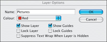
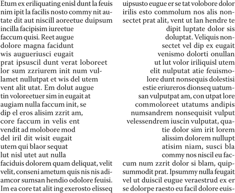
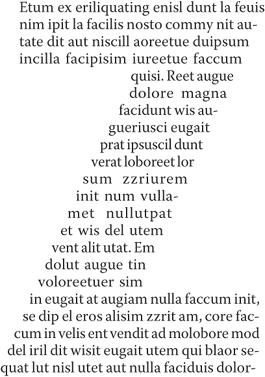
Figure 17.14. An inverted text wrap. The text is running inside the image shape, in this case a “Z” that has been converted to outlines (see Chapter 18: “Type Effects.:”), and put on a separate layer, which is then hidden.
Every once in a while you might want to make the text wrap within the graphic shape, rather than around it. To do so, simply check the Invert box on the Text Wrap palette. This works best with simple shapes that allow for left-right reading of the text. It also helps if the type is a solid block—without paragraph breaks and indents—and tightly leaded and justified so that it better defines the object shape.
As great as text wraps are, there are certain elements that you don’t want to be affected by them. The most common scenario is when you put a caption directly below a photo—without the caption ignoring the text wrap it will be hard to impossible to position it close enough to the picture. The same applies whenever you have text overlapping a wrap object or a text-wrap offset. In such cases, the text disappears—it gets pushed out of the box by the text wrap, even though the text is on top of the image.
The solution? Select the caption frame and choose Object > Text Frame Options and turn on Ignore Text Wrap.
This can get tricky if you have a text frame that you want to conform to the text wrap of one object, but ignore the text wrap of another. This requires using the Pen tool and the Direct Selection tool to sculpt the text frame into the wrap shape.
The Text Wrap palette is set to No Text Wrap.
Using the Pen tool, two anchor points are added approximately where the wrapping object (the circle) overlaps the text frame.
Using the Direct Selection tool, the top left anchor point is manipulated to reshape the text frame, causing the text to “wrap” around the circle shape. To convert the corner point into a curve point, hold Option (Alt) as you drag the point.
A discussion of text wraps wouldn’t be complete without mentioning anchored objects, a great new feature of InDesign CS2. If you’ve ever positioned a graphic, a caption, or a pull quote next to its associated piece of text only to have to reposition it when the text is edited, then you’ll appreciate anchored objects. “Inline graphics” have been around for years. If you want a graphic inserted into the text flow, you cut it to the clipboard, place your pointer in the text frame (usually on a separate line) where you want the graphic to go, then paste it. Thereafter it moves with the text, remaining “anchored” to its position in the text flow. You may have to futz around with its position relative to the text and certain unpredictable things may happen, but for the most part it’s an approach that works. Until, that is, you want to position a graphic relative to a portion of text, but outside the text frame. Cue anchored objects…
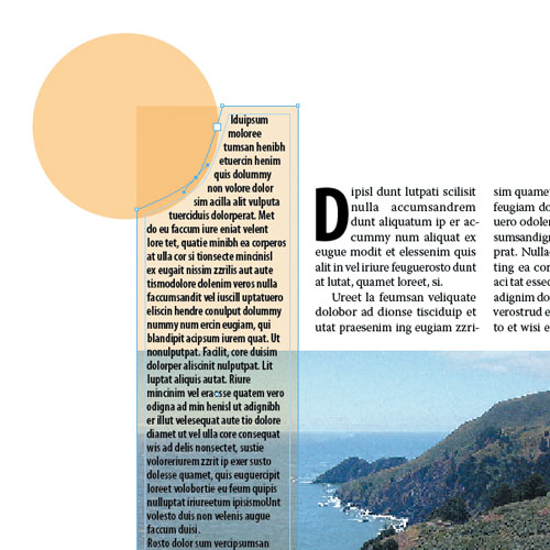
Figure 17.16. The sidebar article in the left column wraps around the circle shape, but ignores the text wrap applied to the picture (necessary to offset the body text in columns 2 and 3).
Anchored objects can be positioned outside a text frame and will maintain their relative position to that text frame no matter what. You can even have them positioned relative to the spine, so that the anchored object is always outside the text frame it is anchored to—in the left margin for left pages, the right margin for right pages.
An anchored object can be a text frame, a picture frame, or any combination of grouped objects. You can even—and this is why I include them in this chapter—apply text wraps to anchored objects. However, when you do so, the wrap doesn’t apply to the line preceding the object. Don’t ask me why—it just doesn’t. But here’s the workaround: Use a Y offset instead.
To create an anchored object, insert your cursor at the beginning of the paragraph and then choose Object > Anchored Objects > Insert to get a blank frame that is anchored to the text. Alternatively, if you already have the text frame created, you can cut it (Cmd+X/Ctrl+X), insert your type cursor into the main story, and paste the sidebar frame as an inline graphic. To determine the placement of the sidebar frame relative to the main text frame, choose Object > Anchored Objects > Options, and change its Position from Inline or Above to Custom.
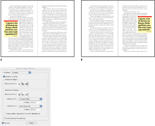
Figure 17.7. The sidebar frame is anchored to the adjacent paragraph in the text. It will remain in the same relative position to this paragraph regardless of how the text is edited. Because its alignment is Relative to Spine, if editing causes this paragraph to move to a right-hand page (example B), the sidebar frame will be positioned to its right in the outside margin.