Before things go too far here, let's make sure everyone's clear on the terminology. To fill a selection or a layer is to put color inside it; to stroke a selection or a layer is to put color around it. You can fill a layer or a selection or shape; you place a stroke around that filled area. Of course, you may prefer the term outline to stroke, but an outline is typically a border, a line placed around something to encase it, like a fence or a wall, to delineate it from the stuff surrounding it. Outlines are solid, uniform, and one thinks of them as being straight lines with sharp corners. A stroke, on the other hand, is more like color and/or a texture (depending on the nature of the stroke) that envelopes content, conforming to its shape rather than confining it. Further, stroke is also the PostScript term, and given the history of graphics and desktop publishing and their ties to the PostScript world, stroke also became (and remains) the term Photoshop uses, so for clarity's sake, we'll use it.
This chapter will teach you to fill selections using keyboard shortcuts, how to create interesting framing effects, how to make the most of Photoshop's gradient options, and how to add an arrowhead to a curving line — all in addition to the really basic things every Photoshop user needs to know. Has that filled you with excitement? Then let's get started.
Photoshop's fill and stroke functions are so straightforward that you may have long since forgotten about what to call them or how they actually work — they're just there, they work just fine, and you don't need to think about them too much. So how do you fill the layer, shape, or selection? Let us count the ways:
Paint Bucket tool: Also known as the Fill tool, the Paint Bucket shares a flyout with the Gradient tool in the Toolbox. You can apply the foreground color or a repeating pattern to areas of related color in an image by clicking in the image window with the tool. For example, if you want to turn all pink pixels in an image into orange pixels, set the foreground color to orange and then click one of the pink pixels. As you learn later in this chapter, the tool has options for controlling how and where that fill is applied to the pink pixels, and it's worth noting that you can't use this tool on images that you converted to bitmap mode.
Fill command: Choose Edit

Tip
To choose the Fill command without even moving the mouse, press Shift+Backspace (Shift+Delete on the Mac).
Backspace (Win) and Delete (Mac) key techniques: Keyboard shortcut fans will love this, and it gives you a chance to work with keys that are typically used only to edit a string of text. After selecting part of a single-layer image — or part of the background layer in a multilayered image — you can fill the selection with the background color by pressing Backspace (Win) or Delete (Mac). You also can fill any layer with the background color without a selection by pressing Ctrl+Backspace (Win) or

Gradient tool: Drag across a layer or selection with a Gradient tool to fill it with a multicolor gradient in one of five gradient styles. You choose a gradient style by clicking an icon in the Options bar. Press G (or Shift+G, depending on your preferences setting for tool toggles) to toggle the Gradient and Paint Bucket tools, which occupy the same flyout menu in the Toolbox. In addition to the gradient styles, you also have scads of gradient presets that you can apply, in the style you choose. But more about that later.
Layer fills: You can use Layer Style features to fill a layer with a solid color, gradient, pattern, or special effect fills.
The next sections explain the first four fill options.
Note
To find out more about layer styles, turn to Chapter 15.
Unlike the very basic and limited paint bucket tools in other painting programs — heavy-handed devices that apply paint exclusively within outlined areas or areas of solid color — the Photoshop Paint Bucket is a more elegant tool, offering several useful and powerful adjustment options. When you activate the Paint Bucket tool, its Options bar appears, giving you access to those adjustment options.
Tip
If you don't see the Options bar, press Enter or Return, double-click the paint bucket icon in the Toolbox, or choose Window
In the Paint Bucket's Options bar, you can play with these controls:
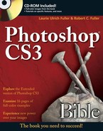
Source: In this pop-up menu, you set the source for your fill. You can choose between Foreground (the default) and Pattern. If you choose the former, you fill with the current Foreground Color. If you choose the latter, you can use one of Photoshop's preset patterns (pick one from the adjacent option, which displays a pattern icon that displays a palette of pattern presets, as shown in Figure 6.1, when you click it) or one you create using Edit
Tip
You load, replace, edit, and create pattern presets just as you do tool and brush presets (see Chapters 2 and 5, respectively), working either in the Preset Manager dialog box or the Pattern palette menu.
Mode: This menu offers a selection of blend modes (the same ones you read about in Chapter 5) that determine how and when color is applied, as demonstrated using a photo from our friend Terri Shadle, in Figure 6.2. The Clear mode creates a hole in the image, leaving transparency in its wake. The Soft Light mode (see the middle panel) effects are obvious, and Overlay does an interesting job of increasing contrast and boosting saturation. (Note that Clear is dimmed when working on a flat image or a Background layer.)
Opacity: Type a new value or press a number key to change the translucency of a color applied with the Paint Bucket. (Press 0 for full opacity, 9 for 90 percent opacity, and so on.)
Tolerance: Raise or lower the Tolerance value to increase or decrease the number of pixels affected by the Paint Bucket tool. The Tolerance value represents a range in brightness values, as measured from the pixel that you click with the Paint Bucket.
Immediately after you click a pixel, Photoshop reads the brightness value of that pixel from each color channel. Next the program calculates a color range based on the Tolerance value — which can vary from 0 to 255. The program adds the Tolerance to the brightness value of the pixel you clicked to determine the top of the range and subtracts the Tolerance from the pixel's brightness value to determine the bottom of the range. For example, if the pixel's brightness value is 100 and the Tolerance value is 32, the top of the range is 132 and the bottom is 68.
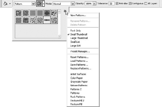
Figure 6.3 shows the result of clicking the same pixel three separate times, each time using a different Tolerance value — once set to a lower-than-default 20, once at 32 (the default), and once at 100. Because of the variety of colors in the background, it took a high Tolerance setting to fill the background. Of course, the tool's specificity is a good thing when you want to only fill areas based on very specific pixels — as you can see, when the Tolerance did its job and filled the background, nearly all of the flower and much of the butterfly was filled, too.
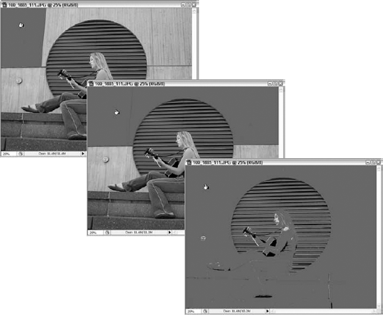
Anti-aliased: Select this option to soften the effect of the Paint Bucket tool. As demonstrated in the middle example of Figure 6.4, Photoshop creates a border of translucent color between the filled pixels and their unaffected neighbors. If you don't want to soften the transition, deselect the Anti-aliased option. Photoshop then fills only those pixels that fall inside the Tolerance range, as demonstrated in the bottom example of the figure.
Contiguous: When you select this option, Photoshop fills only contiguous pixels — that is, pixels that both fall inside the Tolerance range and touch another affected pixel. If you instead want to fill all pixels within the Tolerance range — regardless of where those pixels lie — deselect the check box. For what it's worth, the option was left selected when creating Figures 6.2 and 6.3.
All Layers: Select this option to make the Paint Bucket see beyond the current layer. When the option is selected, the tool takes all visible layers into account when calculating the area to fill. Mind you, it fills only the active layer, but the way it fills an area is dictated by all layers.
Note
For a complete description of all the blend modes and their uses and effects, see Chapter 13.
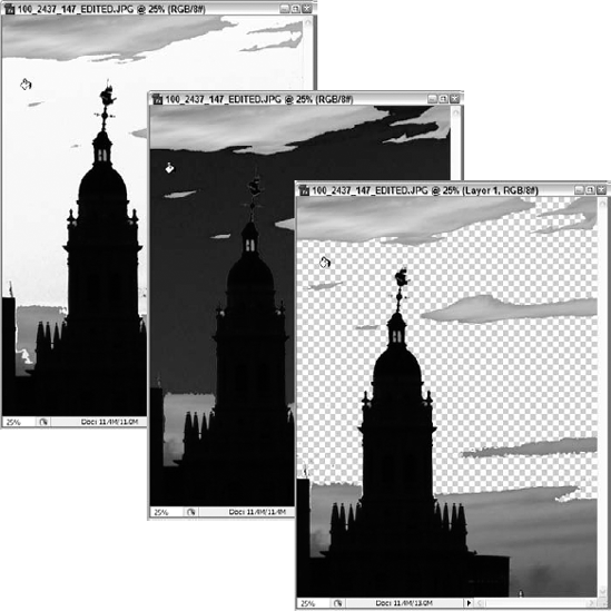
In Figure 6.5, you can see the All Layers option in use. Layers were created for the chairs, so that fills could be added for each of them without harming our original Shift+click-created image from Chapter 5. To use the background layer as the source, the All Layers option is selected, and the Paint Bucket used as normal. As a result, Photoshop respected any outlines within the background when coloring the various layers, and we can deal with the fill on each layer separately.
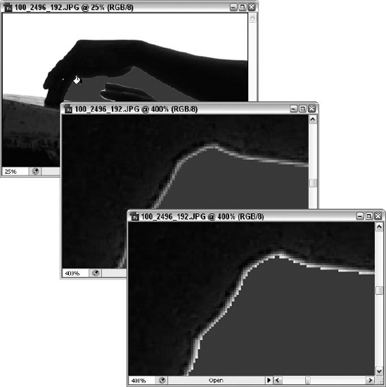
Figure 6.4. The results of turning on (middle) and off (bottom) the Anti-aliased check box before using the paint bucket tool.
Tip
To limit the area affected by the Paint Bucket, select a portion of the image before using the tool. As when using a paint or edit tool, the region outside the selection outline is protected from the Paint Bucket.
When working on a layer, you can protect pixels by locking the layer's transparency in the Layers palette.
Note
You can find out more about the locking options and every other exciting aspect of Layers in Chapters 11, 12, and 13.
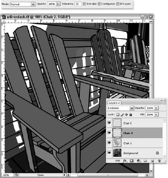
Figure 6.5. Despite each chair layer having no content to start with, the Use All Layers option is on, so the background image supplies the context for the Paint Bucket tool.
Tip
You can use the Paint Bucket to color the empty window area around your image. First, make your image window larger than your image so you can see some gray canvas area around the image. Now Shift+click with the Paint Bucket to fill the canvas area with the foreground color. This technique can come in handy if you're creating a presentation or you simply don't care for the default shade of gray.
The one problem with the Paint Bucket tool is its lack of precision. Although the tool is undeniably convenient, the effects of the Tolerance value are so difficult to predict that you typically have to click with the tool, choose Edit
A better option is to use one of Photoshop's selection tools to select the area to be filled and then choose Edit
Why make a selection first? Well, instead of putting your faith in the Paint Bucket tool's Anti-aliased option (or the aforementioned Tolerance setting, which isn't always predictable in its results), you can draw a selection outline that feature's hard edges in one area, anti-aliased edges elsewhere, and downright blurry edges in between.
Of course, you don't have to make a selection first. For example, if you want to fill an entire layer, you don't need to create a selection outline before choosing Fill. The program assumes that you want to fill the whole layer if it doesn't see a selection outline.
Note
Dynamic fills and layer styles provide additional ways to fill a layer; see Chapter 15 for details on how these fills differ from those you create with the Fill command.
Selection outline or no, choosing the Fill command displays the dialog box shown in Figure 6.6. In this dialog box, you can apply a variety of fills, from the current Foreground color, to a color you choose (the Color Picker can be opened from within the dialog box), a pattern, black, white, or 50% gray. You also can apply a translucent color or pattern by typing a value in the Opacity option box. And you can choose a brush mode from the Mode pop-up menu, which offers the ubiquitous list modes we discussed in Chapter 5 and see again later in the book.
If you display the Use pop-up menu, you see a collection of fills that you can apply. Foreground Color and Pattern behave the same as they do for the Paint Bucket tool. When you select Pattern, the Custom Pattern option becomes available, as shown in Figure 6.6. Click the icon to display the Pattern drop-down palette (refer to Figure 6.6), which also works as described in the preceding section. Click an icon to select a pattern; click the right-pointing arrow to display the palette menu and load a different pattern preset.
Note
To find out how to load, save, edit, and create custom pattern presets, see Chapter 5. You use the same techniques for brush presets and pattern presets.
You also can fill a selection with the background color and such monochrome options as Black, White, and 50% Gray. Black and White are useful if the foreground and background colors have been changed from their defaults; 50% Gray fills the selection with the absolute medium color without having to mess around with the Color palette. History allows you to revert the selected area to a previous appearance, as you see in Chapter 7.
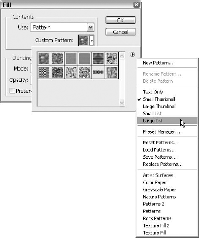
Figure 6.6. The Fill dialog box combines the opacity and brush mode options available for the Paint Bucket with an expanded collection of fill content options.
The Preserve Transparency option gives you the same result as locking the active layer's transparency in the Layers palette, which you can read about in Chapter 13. If you select Preserve Transparency, you can't fill transparent pixels in the active layer. Deselect Preserve Transparency, and you can fill the selection outline uniformly. (The option is dimmed when you're working on the background layer or if you already locked the layer's transparency in the Layers palette.)
Of all the fill techniques, the Backspace key (Delete key on the Mac) is by far the most convenient and, in most respects, every bit as capable as the others. The key's only failing is that it can neither fill a selection with a repeating pattern nor revert a selection to a previous state. But with the exception of those two items, you can rely on the Backspace or Delete key for many of your fill needs.
Try these techniques for using Backspace (Win) or Delete (Mac):
Background color, method 1: To fill a selection on the background layer with solid background color, press Backspace (Win) or Delete (Mac). The selection outline remains intact.
Background color, method 2: Press Ctrl+Backspace (
A word of caution here: A problem worth noting with pressing Backspace (Delete on the Mac) is that it's unreliable. If the selection is floating, as explained in Chapter 8, the Backspace (Delete on the Mac) key deletes it. The key also erases pixels on a layer. What to do? If you like the simplicity of using these keys for a quick fill, use method 2 above or the following options for controlling exactly how the fill is applied. These methods aren't single-key simple, but they are faster than Edit
Foreground color: To fill a selection or a layer with solid foreground color, press Alt+Backspace (Win) or Option+Delete (Mac). This works when filling floating and nonfloating selections alike.
Black or white: To fill an area with black, press D to get the default foreground and background colors and then press Alt+Backspace (Option+Delete on the Mac). To fill an area with white, press D for the defaults and then Ctrl+Backspace (
Preserve transparency: You can fill only the opaque pixels in a layer — regardless of whether you locked the layer's transparency in the Layers palette — by pressing Shift. Press Shift+Alt+Backspace (Shift+Option+Delete on the Mac) to fill a selection with the foreground color while preserving transparency. Press Ctrl+Shift+Backspace (
Note
Learn more about this technique for preserving transparency in Chapter 13.
Without demanding that you whip out a thesaurus to find a list of other words that you could substitute for "gradient," suffice to say it is a progression of colors that fade gradually into one another, as demonstrated in Figure 6.7. You specify a few key colors (or even just one, paired with transparency as the other "color") in the gradient, and Photoshop automatically generates the hundred or so colors in between to create a smooth transition.
Note
If you're accustomed to using gradients in a drawing program — such as Illustrator or FreeHand — you'll find that in many ways Photoshop is better. Because Photoshop is a pixel editor, it lets you blur and mix colors in a gradient if they start banding — that is, if you can see a hard edge between one color and the next when you print the image. And Photoshop's gradients never choke the printer or slow it down, no matter how many colors you add. In Illustrator, each band of color in an object-oriented gradient is expressed as a separate shape — so that one gradient can contain hundreds, or even thousands, of objects. Gradients in Photoshop are simply colored pixels, no more or less complicated than the pixels in any of the images we've looked at thus far in this book.
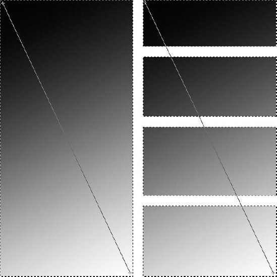
Figure 6.7. A gradient dragged across a single selection and multiple selections. The distance dragged from starting point (upper left) to ending point (lower right) determines the span of the gradient from Foreground to Background color.
The Gradient and Paint Bucket tools share a Toolbox slot and a keyboard shortcut — press G to toggle between the two tools (or Shift+G, depending on whether you selected the Use Shift Key for Tool Switch option in the Preferences dialog box, as discussed in Chapter 2). But unlike the Paint Bucket, which fills areas of similar color according to the Tolerance setting, the Gradient tool affects all colors within a selection — or if you don't make a selection, it applies to an entire layer.
To use the tool and apply the default gradient, click the Gradient button in the Toolbox and drag inside the selection, as shown in Figure 6.7. The default gradient, which takes the foreground color and creates a gradient with the background color, is applied based on the point at which you begin dragging (the upper-left corner in the figure, in this case). This starting point defines the location of the first color in the gradient, and the point at which you release (the lower-right corner, as shown in the figure) defines the location of the last color. If multiple portions of the image are selected, the gradient fills all selections continuously. Photoshop doesn't stop and apply the gradient to the individual selections — it follows your mouse path across selections, skipping the intervening areas that are not within the selection.
As with other tools in Photoshop, the Gradient tool has its own Options bar, which you can see in Figure 6.8 (or on your own computer, if you're playing along). If you don't see the Options bar, press Enter or Return when the Gradient tool is active or double-click the tool icon in the Toolbox.
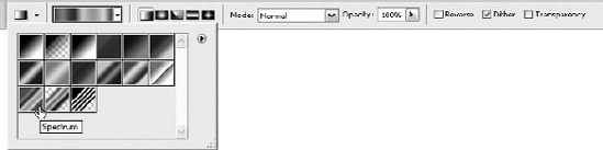
Figure 6.8. The Options bar gives you quick access to all Gradient tool options — including a list of gradient presets.
The following list explains how the controls in the Options bar work. In all cases, you must adjust the options before using the Gradient tool. They do not affect gradients you've already applied in the image:
Gradient preview: The selected gradient appears in the gradient preview, the first option shown on the Options bar in Figure 6.10. Click the preview to open the Gradient Editor dialog box, discussed in the section "Creating custom gradients."
Gradient drop-down palette: Click the triangle adjacent to the preview to display the Gradient palette, which contains icons representing gradients in the current gradient presets. Click the icon for the gradient you want.
Note
In the default gradient preset, the first two gradients are dependent on the current foreground and background colors. The others contain specific colors bearing no relationship to the colors in the Toolbox.
You load gradient presets using the same techniques described in detail in the brush preset discussion in Chapter 5, but here's the short story:
Click the triangle near the top of the drop-down palette to display the palette menu. The Photoshop collection of presets and any presets that you defined on your own appear at the bottom of the palette menu. Click a preset group by name to access those presets instead of or in addition to the default set of presets. The preset groups' names — like Metals and Pastels — are fairly revealing.
To append a preset from disk — such as when a coworker gives you a preset file — choose Load Gradients from the palette menu or click Load in the Preset Manager dialog box. If you want to replace the current preset instead, choose Replace Gradients from the palette menu or click Replace in the dialog box. To return to the default gradients, choose Reset Gradients from the palette menu, either from the Options bar palette or the one in the Preset Manager dialog box.
Tip
You can edit a gradient and perform the aforementioned preset manipulations from the Gradient Editor dialog box, too. The section "Creating custom gradients" covers this dialog box in detail.
Gradient style: Click an icon to select the gradient style. The section "Gradient styles" explains the five styles.
Mode and Opacity: These options work as they do for the paint and edit tools (as explained in Chapter 5), the Fill command, and every other tool or command that offers them as options. Select a different brush mode to change how colors are applied; lower the Opacity value to make a gradient translucent. Remember that you can change the Opacity value by pressing number keys as well as by using the Opacity control in the Options bar. Press 0 for 100 percent opacity, 9 for 90 percent opacity, and so on.
Reverse: When active, this option begins the gradient with the background color and ends it with the foreground color. Use this option when you want to start a radial or other style of gradient with white, but you want to keep the foreground and background colors set to their defaults.
Dither: Remember how we said that Photoshop doesn't give you banding when you print a gradient? Well, that's not totally true. In the old days, Photoshop drew its gradients one band at a time, and each band was filled with an incrementally different shade of color. The potential result, known as banding, made it so that you could clearly distinguish the transition between two or more bands of color. The Dither option helps to eliminate this problem by mixing up the pixels between bands (much as Photoshop dithers pixels when converting a grayscale image to black and white), smoothing the transitions between them. It's generally safe to deselect the Dither option if you're working on an image in 16-bit mode, as it's essentially unnecessary and banding won't occur anyway. If you're not working in 16-bit mode, you should leave this option turned on unless you want to use banding to create a special effect.
Tip
If you're not sure you're working in 16-bit mode, select the Image
Transparency: You can specify different levels of opacity throughout a gradient. For example, the Soft Stripes effect (available from the Gradient palette when the Special Effects preset is loaded) lays down a series of alternately black and transparent stripes. But you needn't use this transparency information. If you prefer to apply a series of black and white stripes instead, you can make all portions of the gradient equally opaque by deselecting the Transparency option.
For example, in Figure 6.9, the Soft Stripes effect is applied as a radial gradient in two separate swipes (first to a selection in the middle image, and again on the bottom image). Both times, the Opacity setting is changed to 50 percent, so the eye is never completely obscured. (The Opacity setting works independently of the gradient's built-in transparency, providing you with additional flexibility.) In the top gradient (middle example), the Transparency option is selected, so the white stripes are completely transparent. In the bottom gradient, Transparency is turned off, so the white stripes become 50 percent opaque (as prescribed by the Opacity setting).
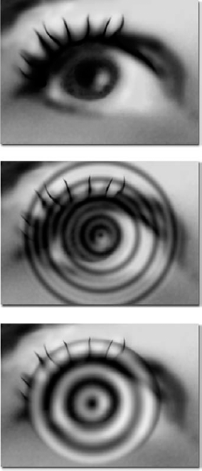
Figure 6.9. With the Opacity value set to 50 percent, the Soft Stripes gradient is applied to the middle and bottom eyes. Transparency is selected in the middle eye, so that you can see through what would otherwise be the white stripes. Transparency is deselected in the bottom eye, and the gradient is applied to a smaller elliptical marquee.
You select the gradient style by clicking the gradient style icons in the Options bar; refer to Figure 6.8 to identify these icons. The five styles are illustrated in Figure 6.10:
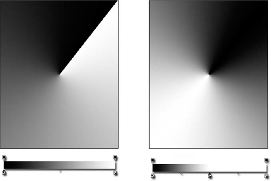
Linear: A linear gradient progresses in bands of color in a straight line between the beginning and end of your drag. The top two examples in Figure 6.10 show linear gradients created from black to white and from white to black. The point labeled "B" marks the beginning of the drag; "E" marks the end.
Radial: A radial gradient progresses outward from a central point in concentric circles, as in the second row of examples in Figure 6.10. The point at which you begin dragging defines the center of the gradient, and the point at which you release defines the outermost circle. This means the first color in the gradient appears in the center of the fill. So to create the gradient on the right side of Figure 6.10, you must set the foreground color to white and the background color to black (or select the Reverse option in the Options bar).
Angle: The angle gradient style creates a fountain of colors flowing in a counterclockwise direction with respect to your drag, as demonstrated by the third row of examples of Figure 6.10. This type of gradient is known more commonly as a conical gradient because it looks like the bird's-eye view of the top of a cone.
Of course, a real cone doesn't have the sharp edge between black and white that you see in Photoshop's angle gradient. To eliminate this edge, create a custom gradient from black to white to black again, as explained in the "Adjusting colors in a solid gradient" section later in this chapter.
Reflected: The fourth gradient style creates a linear gradient that reflects back on itself. Photoshop positions the foreground color at the beginning of your drag and the background color at the end, as when using the linear gradient style. But it also repeats the gradient in the opposite direction of your drag, as demonstrated in Figure 6.10. It's great for creating natural shadows or highlights that fade in two directions.
Diamond: The last gradient style creates a series of concentric diamonds (if you drag at a 90-degree angle) or squares (if you drag at a 45-degree angle, as in Figure 6.10). Otherwise, it works exactly like the radial gradient style.
Many users open this dialog box by accident. Attempting to display the Gradient presets (which display only if you click the triangle on the first Gradient option), they click the Gradient preview, and instead of a tidy array of potential gradients, they get this dialog box, as shown in Figure 6.11.
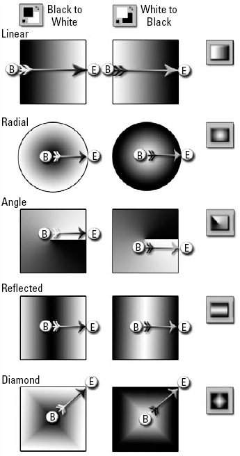
Figure 6.10. Examples of each of the five gradient styles created using the default foreground and background colors (left column) and with the foreground and background colors reversed (right column). B marks the beginning of the drag; E marks the end.
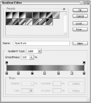
Figure 6.11. Click the gradient preview in the Options bar to display the Gradient Editor dialog box, which enables you to design custom gradients.
Here are some important points about the Gradient Editor:
The scrolling list at the top of the dialog box mirrors the Gradient drop-down palette in the Options bar and the Gradients panel of the Preset Manager dialog box. If you click the triangle at the top of the scrolling list, you display a virtual duplicate of the palette menu.
Tip
If you want to see gradient names instead of icons in the list, choose Text Only from the dialog box menu. Or choose Small List or Large List to see both the icon and the gradient name.
To create a new gradient, find an existing gradient that's close to what you have in mind. Then type a name for the gradient in the Name option box and click New. The new gradient appears in the scrolling list, and you can edit the gradient as you see fit.
Warning
Even though the gradient appears in the dialog box (as well as in the Gradient palette and the Preset Manager dialog box), it's vulnerable until you save it as part of a preset. If you make further edits to the gradient or replace the current gradient preset, the original gradient is lost. Deleting your main Photoshop preferences file also wipes out an unsaved gradient. See the section "Saving and managing gradients" for more details.
You can create noise gradients as well as solid-color gradients. If you select Noise from the Gradient Type pop-up menu, Photoshop introduces random color information into the gradient, the result of which is a sort of special-effect gradient that would be difficult to create manually.
The options at the bottom of the dialog box change depending on whether you select Solid or Noise from the Gradient Type pop-up. For solid gradients, Photoshop provides a Smoothness slider, which you can use to adjust how abrupt you want to make the color transitions in the gradient.
Tip
For greater control when creating or editing a gradient, make the dialog box wider by dragging the size box in the lower-right corner.
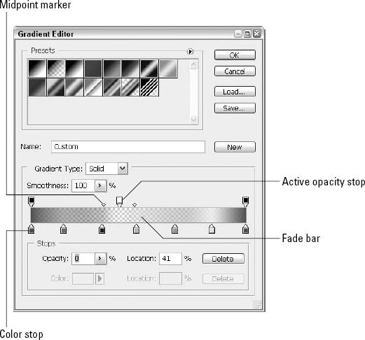
If you select Solid from the Gradient Type pop-up menu, you use the options shown in Figure 6.12 to adjust the gradient. Note that this is a doctored screen shot — all the options are visible in the figure; normally, only some of the options associated with the active stops are available.
The fade bar (labeled in Figure 6.12) shows the active gradient. The starting color is represented by a color stop (see the triangle on top of a square) on the left; the ending color stop appears on the far right. The upside-down stop markers on the top of the fade bar are opacity stops. These stops determine where colors are opaque and where they fade into translucency or even transparency.
To select either type of stop, click it. The triangle portion of the stop appears black to indicate that it is active. After you select a stop, diamond-shaped midpoint markers appear between the stop and its immediate neighbors. On the color-stop side of the fade bar, the midpoint marker represents the spot where the two colors mix in exactly equal amounts. On the transparency side, a marker indicates the point where the opacity value is midway between the values that you set for the stops on either side of the marker.
You can change the location of any stop or marker by dragging it. Or you can click a stop or marker to select it and then type a value in the Location option box below the fade bar:
When numerically positioning a stop, a value of 0 percent indicates the left end of the fade bar; 100 percent indicates the right end. Even if you add more stops to the gradient, the values represent absolute positions along the fade bar.
When repositioning a midpoint marker, the initial setting of 50 percent is at equal points between two stops, 0 percent is all the way over to the left stop, and 100 percent is all the way over to the right. Midpoint values are, therefore, measured relative to stop positions. In fact, when you move a stop, Photoshop moves the midpoint marker along with it to maintain the same relative positioning. If you type a value below 5 percent or more than 95 percent, Photoshop politely ignores you.
Tip
Pressing Enter or Return after you type a value into the Location option box is tempting, but don't do it. Photoshop dumps you out of the Gradient Editor dialog box, which you may not be ready to leave just yet.
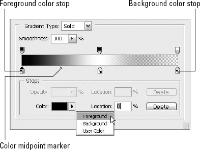
When editing a solid gradient, you can add colors, delete colors, change the position of the colors in the gradient, and control how two colors blend together. After clicking a color stop to select it, you can change its color in several ways:
To change the color to the current foreground color, open the Color pop-up menu, as shown in Figure 6.13, and select Foreground. You also can select Background to use the background color instead.
When you select Foreground or Background, the color stop becomes filled with a grayscale pattern instead of a solid color. If you squint real hard and put your nose to the screen, you can see that the pattern is actually a representation of the Foreground and Background color controls in the Toolbox. The little black square appears in the upper-left corner when the foreground color is active, as shown in the first stop on the fade bar in Figure 6.13.
If you change the foreground or background color after closing the Gradient Editor dialog box, the gradient changes to reflect the new color. When you next open the Gradient Editor, you can revert the stop to the original foreground or background color by selecting User Color from the pop-up menu.
To set the color stop to some other color, click the Color swatch or double-click the color stop to display the Color Picker and define the new color. Select your color and press Enter or Return.
Tip
You may have noticed that when you open the Gradient Editor dialog box, Photoshop automatically selects the Eyedropper tool for you and displays that tool's controls in the Options bar. Why did it do that? Because you can click with the Eyedropper in an open image window to lift a color from the image and assign that color to the selected color stop. You also can sample a color from anywhere onscreen by first clicking with the Eyedropper in an image window and then dragging outside it.
To change the point at which two colors meet, drag the midpoint marker between the two stops. Or click the midpoint marker, and type a new value into the Location box. A value of 0 puts the midpoint marker flush against the left color stop; a value of 100 moves the stop all the way over to the right stop.
You add or delete stops as follows:
To add a color stop, click anywhere along the bottom of the fade bar. A new stop appears where you click. Photoshop also adds a midpoint marker between the new color stop and those to its left and right. You can add as many color stops as your heart desires. To define the color of the stop, double-click the new color stop (double-click an existing stop if you want to change its color) and watch as the Color Picker dialog box opens. Make a selection, click OK, and voila! Your new color stop is created and its color is set.
Tip
If your goal is a gradient that features tons of random colors, you may be able to create the effect you want more easily by using the Noise gradient option. See the section "Creating noise gradients" for more information.
To duplicate a color stop, Alt+drag (Option+drag on the Mac) it to a new location along the fade bar. One great use for this is to create a reflecting gradient.
For example, select Foreground to Background from the scrolling list of gradients and click New to duplicate the gradient. After naming your new gradient — something like Foreground to Background to Foreground, for example — click the background color stop and change the Location value to 50. Then Alt+drag (Option+drag on the Mac) the foreground color stop all the way to the right. This new gradient is perfect for making true conical gradients with the angle gradient style, as demonstrated in Figure 6.14.
To remove a color stop, drag the stop away from the fade bar. Or click the stop, and click Delete (the button in the dialog box or the key on your keyboard — Backspace, if you're on the Mac). The stop icon vanishes, and the fade bar automatically adjusts as defined by the remaining color stops.
If you like, you can include a transparency mask with each gradient. The mask determines the opacity of different colors along the gradient. You create and edit this mask independently of the colors in the gradient.
To create a transparency mask, you adjust the opacity stops across the top of the fade bar. When you click an opacity stop, the transparency options become available below the fade bar and the color options dim.
To add an opacity stop, click above the fade bar. By default, each new stop is 100 percent opaque. You can modify the transparency by selecting a stop and changing the Opacity value. The fade bar updates to reflect your changes. To reposition a stop, drag it or type a value in the Location option box.
Midpoint markers represent the spot where the opacity value is half the difference between the opacity values of a pair of opacity stops. In other words, if you set one opacity stop to 30 percent and another to 90 percent, the midpoint marker shows you where the gradient reaches 60 percent opacity. You can relocate the midpoint marker, and thus change the spot where the gradient reaches that midrange opacity value, by dragging the marker or typing a new value in the Location option box.
Adobe describes a noise gradient as a gradient that "contains randomly distributed colors within the range of colors that you specify." This means that Photoshop adds random colors to the parameters that you set in the Gradient Editor dialog box. Figure 6.15 demonstrates examples of three noise gradients, which should help clarify what's going on. Of course, if you wanted the looks achieved here, you could create these same gradients using the regular Solid gradient controls, but it would take you forever to add all the color and midpoint stops required to produce the same effect. If you're willing to let Photoshop randomly apply the colors, you'll save lots of time and get generally as good an effect as if you'd set up each of the stops yourself.
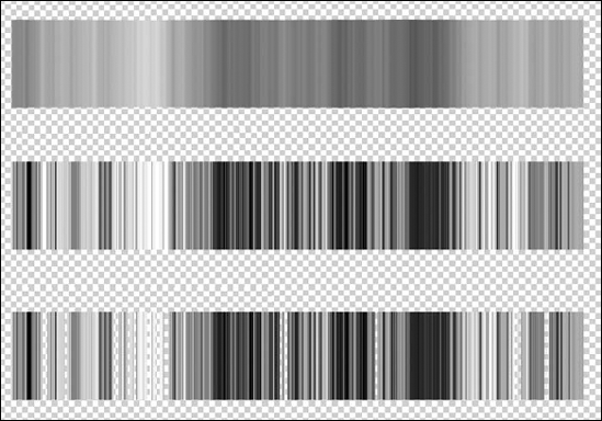
Figure 6.15. Three Noise gradients — with 50% Roughness (top), 100% Roughness (middle), and finally, 100% Roughness plus Transparency (bottom)
To create a noise gradient, select Noise from the Gradient Type menu in the Gradient Editor dialog box, as shown in Figure 6.16. You can adjust the gradient as follows:
Raise the Roughness value to create more distinct bands of color, as in the middle example in Figure 6.15. Lowering the Roughness value results in softer color transitions, as you can see from the top example, which are set at one-half the Roughness value of the middle example.
Use the color sliders at the bottom of the dialog box to define the range of allowable colors in the gradient. You can work in one of three color modes: RGB, HSB, or Lab. Select the mode you want from the pop-up menu above the sliders.
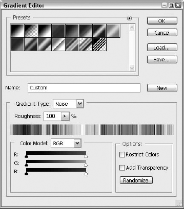
Figure 6.16. Use the Noise gradient option to create gradients like the ones you see in Figure 6.17.
The Restrict Colors option, when selected, adjusts the gradient so that you don't wind up with any oversaturated colors. Deselect the option for more vibrant hues.
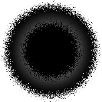
If you select Add Transparency, Photoshop adds random transparency information to the gradient, as if you had added many opacity stops to a regular gradient. In the bottom example of Figure 6.15, we started with the gradient from the middle example, selected the Add Transparency option, and left the Roughness value at 100.
Click Randomize, and Photoshop shuffles all the gradient colors and transparency values to create another gradient. If you don't like what you see, just keep clicking Randomize until you're satisfied. Note that each click of Randomize produces a radically different gradient, so if you find a gradient that's close to what you're looking for, you may want to save it as a preset and continue tweaking it by hand.
Tip
For some really cool effects, try applying special effects filters to a noise gradient. Figure 6.17 shows the results of applying the Gaussian Blur, Twirl, and Ripple filters on the original noise gradient shown in the left-most example. Find out how to apply these and other distorting filters in Chapter 11.
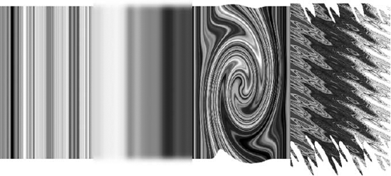
Figure 6.17. Four areas are selected along a rectangle, filled with a Noise Gradient. From left to right: Roughness set to 100%, Gaussian Blur filter set to 5 pixels, Twirl set at an angle of 300 degrees, and Ripple at 999% and set to Large. Experiment with other filters at various settings and see what cool results you get.
When you define a new gradient, its icon appears in the palette, the Preset Manager dialog box, and the Gradient Editor dialog box. But if you replace the current gradient set or edit the gradient, the originally applied gradient is deleted. You also lose the gradient if you delete your Photoshop CS3 preferences file because that's where the temporary gradient information is stored.
Tip
If you want to delete your preferences file, press Ctrl+Alt+Shift (
If you want to preserve a gradient, you must save it as part of a preset — which is nothing more than a collection of gradients. Photoshop ships with several gradient presets stored in the Gradients folder, which resides inside the Presets folder in the main Photoshop program folder. You can create as many custom presets as you like. Gradient presets have the .grd file extension.
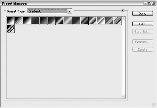
You can save all the gradients in the active preset — including any custom gradients that you define — by clicking Save in the Gradient Editor dialog box or by choosing Save Gradients from the Gradient palette pop-up menu. But if you want to save only some of the current gradients as a preset, choose Preset Manager from the Gradient palette pop-up menu and then display the Gradients panel, shown in Figure 6.18, by pressing Ctrl+3 (
To delete a gradient, Alt+click (Option+click on the Mac) its icon in the palette, the Preset Manager, or the Gradient Editor dialog box. To delete multiple gradients, Ctrl+click (use Cmd+click on the Mac) the gradients in the Preset Manager and then click Delete. Save the preset immediately if you want the deleted gradients gone for good; otherwise, they remain an official part of the preset and reappear the next time you load the preset.
All standard brush modes, including the two new ones for CS3 (Lighter Color and Darker Color), are available when you apply gradients, and they make a tremendous impression on the performance of the gradient tool. This section examines one way to apply a brush mode in conjunction with the tool. Naturally, given the millions of combinations of gradients and modes, this section can't possibly do more than touch the surface of what's possible (otherwise, this would be a 5,000-page book), but it may inspire you to experiment and discover additional effects on your own.
To apply a mode when using a gradient, first select your gradient — using either the drop list of presets or setting up your own gradient through the Gradient Editor dialog box (access to this is described earlier in this section of the chapter). With your gradient chosen, use the Mode drop list to pick the mode you want used when the gradient is applied.
Next, click and drag your mouse to apply the gradient. As stated earlier, this can be done on a layer with no selection made (so the entire layer is affected) or to a selection within a layer. The gradient is applied, with the chosen mode's effect, as shown in Figure 6.19. You then can go back and apply different gradients or reapply the same one with different modes, creating interesting compound effects, or you can undo and start over with a different gradient, a different mode, or both.
Photoshop is nearly as adept at drawing lines and outlines as it is at filling selections — and like the fill tools and commands, Photoshop's tools for drawing lines and outlines are as varied. By "drawing lines" in this section, we don't mean the same lines we talk about in Chapter 5; the word "lines" here refers to what you'd call outlines and borders. The following sections discuss how to apply a border around a selection outline — which is practical, if not terribly exciting — and how to create arrowheads — which can yield more interesting results than you may think.
To further clarify what we mean by lines, bear in mind that we're talking about raster lines — that is, lines made of pixels that you create with the Line tool set to the Fill Pixels mode. To find out how to use the tool to produce vector lines and work paths, see Chapters 15 and 8, respectively. Some Line tool techniques discussed here apply to the Line tool also when it's set to vector mode or work path mode.
Strokes make great frames and outlines. Generally, you can apply a stroke to an image in Photoshop in four ways:
Stroke command: Select the portion of the image that you want to stroke, and choose Edit
In the Stroke dialog box, type the thickness of the stroke in the Width option box. The default unit of measurement here is pixels, but you can use inches and centimeters as well. Just type the value and then the unit abbreviation (px for pixels, in for inches, or cm for centimeters).
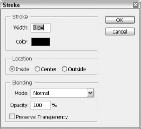
Figure 6.20. Use the options in the Stroke dialog box to specify the thickness of a stroke and its location with respect to the selection outline.
You also can set the stroke color from within the dialog box. Click the color swatch to select a color from the Color Picker — don't forget that you have full access to the Eyedropper tool (it is automatically activated simply by choosing Edit
Tip
Select a Location radio button to specify the position of the stroke with respect to the selection outline. When in doubt, select Inside from the Location radio buttons. This setting ensures that the stroke is entirely inside the selection outline in case you decide to move the selection. If you select Center or Outside, Photoshop applies part or all of the stroke to the deselected area around the selection outline — unless, of course, your selection extends to the edge of the canvas, in which case you wind up with no stroke at all for Outside and half a stroke inside the selection outline for Center.
The Stroke dialog box also includes Mode, Opacity, and Preserve Transparency options that work like those in the Fill dialog box.
Border command: Select a portion of the image, and choose Select
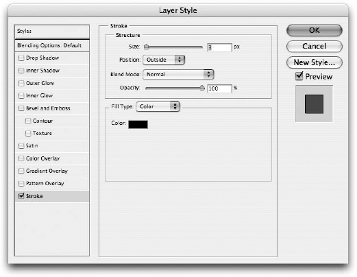
Layer Style effects: If you want to stroke an entire layer, try the options provided by the Layer Style feature. Choose Layer
Note
The Layer Style dialog box is covered in detail in Chapter 14, so if you have any questions about or problems with the stroke options, look there for help.
Canvas Size trick: Okay, so this one is a bit unorthodox and probably was not intended for this purpose, but it works, so here you go. To create an outline around the entire image, choose Image
For example, to create a 1-pixel border all the way around, type 2 pixels for the Width value (1 for the left side and 1 for the right) and 2 pixels for the Height value (1 for the top and 1 for the bottom). (You also could deselect the Relative option and add 2 pixels to the existing Width and Height values if you're inordinately fond of doing math.) Leave the Anchor option set to the center tile so that the added canvas is applied on all sides of the image. Choose Other from the Canvas Extension Color pop-up menu to open the Color Picker dialog box. Select a color, and click OK to return to the Canvas Size dialog box. When you press Enter or Return, Photoshop enlarges the canvas size according to your specifications and fills the new pixels around the perimeter of the image with the color you chose. Simple, logical, and it works. Who could ask for more?
The one function missing from all the operations in the preceding list is applying arrowheads. This is not because we forgot to discuss it — rather, it's because, in Photoshop, you can apply arrowheads only to straight lines drawn with the Line tool.
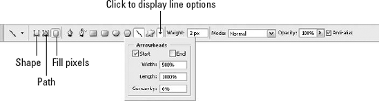
The Line tool is grouped with the drawing tools — the tools you use for drawing shapes like rectangles, ellipses, polygons, and custom shapes. You can cycle among the tools by pressing U (or Shift+U, depending on your preferences setting for switching tools). The Line tool can create three kinds of shapes. You can paint raster lines — that is, lines made up of pixels — or you can draw vector-based lines on a new shape layer, as explained in Chapter 15. Finally, you can create a work path using the Line tool, which is discussed in Chapter 8.
You specify which type of line you want to create by clicking one of the three icons near the left end of the Options bar, which you can see labeled in Figure 6.22. If you don't see the Options bar, press Enter or Return, or double-click the Line tool icon in the Toolbox.
Tip
When choosing the type of line you're going to create, remember that the Shape Layers option creates a...surprise!...shape layer (containing a vector shape, which you can later rasterize by right-clicking the layer and choosing Rasterize Shape from the pop-up menu), Paths creates a path from the line you draw, and Fill Pixels creates a raster line. If you choose Fill Pixels, the line you draw becomes part of the active layer (unless you're on a Shape or Type layer), so be careful to create a new layer for the raster line if your goals for further editing require the line to be on its own editable layer.
Regardless of which type of line you're creating, you set the width of the line by typing a value into the Weight box in the Options bar. Then you add arrowheads using the drop-down options palette shown in the figure. To display the options, click the triangle at the end of the strip of shape icons. Use the Arrowheads options as follows:
Start: Select this option to add an arrowhead to the beginning of a line drawn with the Line tool.
End: Select this option to add an arrowhead to the end of a line. This sounds like something you probably didn't need explained to you, but it's surprising how many people don't realize that the way the line is drawn, from where you begin to drag to where you stop dragging, determines the start and finish of the line and therefore which end is the pointy end of the arrow.
Width: Type the width of the arrowhead in this option box. The width is measured as a percentage of the line weight, so if the Weight is set to 6 pixels and the Width value is 500 percent, the width of the arrowhead is 30 pixels. This opportunity to do some multiplication can be very exciting for you math fans out there.
Length: Type the length of the arrowhead, measured from the base of the arrowhead to its tip, as a percentage of the line weight.
Concavity: You can specify the shape of the arrowhead by typing a value between negative and positive 50 percent in the Concavity option box. Figure 6.23 shows examples of a few Concavity settings applied to an arrowhead 50 pixels wide and 100 pixels long, the top arrow at −50 percent and the bottom at 50 percent.
In this chapter, you learned to apply color with the Paint Bucket tool and Fill command, including the use of Fill tools and commands for filling a selection with custom patterns.
For interesting fills, you also learned about using the Gradient features, including the ability to design your own multicolor gradients and apply them with blend modes for interesting results. You also learned how to create outlines and borders and how to work with Stroke commands, including the ability to attach an arrowhead to any stroke.