
VISUAL STORYTELLING6
This chapter centers on the use of visual communication.
Following a promotion, Lee was tasked with designing her company’s annual report, which is shared each year with prospective clients and investors. These reports were always narrative-based, using only a few scattered images to illustrate business metrics. Lee sensed that their previous reports read as shortsighted snapshots since they failed to capture what investors loved most about the company, namely, how their business decisions reflected their values.
Hoping to leverage some untapped potential and emphasize their company’s broader vision, Lee set out to design a different kind of report – one that would rely on integrated visuals to convey information.
INTRODUCTION
We acquire more information through our eyes than from all of our other senses combined.1 So it may not be surprising that the last 10% of effort allocated to a project can often serve as the initial basis of a viewer’s evaluation. That is to say, the visual packaging surrounding an idea can influence impressions about the design itself. Once these impressions are set, they can be difficult to alter. While designers are adept at producing sketches, illustrations, and renderings, presenting intangible ideas can prove more difficult. Moreover, conveying ideas without getting in the way of design itself can be difficult. The question becomes how the visual package can align with and support the idea, providing the audience with a clear and compelling message.
This chapter will explore this connection through decisions on images, type, and layout.
IS A PICTURE WORTH A THOUSAND WORDS?
Once your storyboard and talking points are developed, it’s time to generate the props to support your story. Since our brains are wired for visual information, these props can be extremely important. In fact, the human brain contains approximately 20 billion neurons dedicated to analyzing visual information.2 This gives our brains a remarkable capacity to process images. Studies suggest that due to their vividness, distinctiveness, and our ability to see the entire visual at once, visual messages hold several advantages over their word-only counterparts, especially in terms of garnering attention, influencing emotions, and aiding in recall and comprehension. To capitalize on these advantages, however, thoughtful planning is required, with consideration given to Vitruivan aspects of: attractiveness, soundness, and utility.3

Figure 6.0
The ancient Roman architect Vitruvius theorized that designs should exhibit three principles: venustas, firmitas, & utilitas.4 Design scholars continue to use this framework to evaluate a design’s success5
ATTRACTION & PERSUASION
Designers can learn a great deal from advertisers. Each day, they vie for our attention (and dollars) using distinct and sometimes eye-popping visual appeals. Since these images can be both vivid and quite different from one another, their novelty can be used to entice an audience to consider their proposals.6 Recent research in consumer thinking suggests that graphic ads can more easily capture consumers’ attention,7 and to enable greater levels of issue-relevant thinking.8 These insights suggest that we are more inclined to think about a product longer (and maybe purchase it) if we can see it rather than just read about it. The danger, however, lies in providing an audience with too much of a good thing – effectively overwhelming or desensitizing them to the message at hand. While we are awed by dazzling product imagery, we also encounter a range of other types of images each day, from empowered professionals and aspiring athletes to starving children and mistreated pets. In effect – we are almost constantly manipulated via visual messages. These images are used to stimulate an “immediate visceral understanding,”9 such that our gut reactions evoke a range of emotions like sadness, guilt, confidence, or joy. These emotions can leave a strong impression and vivid imprint, influencing our beliefs,10 often without our even recognizing that our beliefs have changed. This manipulation is frequent but not inherently bad since it is often done for very valid and altruistic purposes. For instance, public service announcements compel us to give or strive for self-improvement, while news outlets rely on visuals to express the significance of world events. Understanding the persuasive potential of imagery can help designers leverage these same messaging tactics.
LEVERAGING THE FIRST IMPRESSION
Right or wrong – our first impressions are often both potent and long-lasting. In his book, The Design of Everyday Things, Donald Normal described the visceral effect of our perceptions, causing us to either feel attracted to or repulsed by what we see.11 This effect can be especially potent in visual communications since it is thought that our immediate exposure to visual information trumps the slower processes of our rationale thinking.12 As a case in point, while our money may be better spent on future expenses, we might still go out and buy those expensive shoes that we just saw in the store window. We are drawn in by what we see.
Similarly, designers might be able to secure sustained buy-in for an idea based on first impressions. These initial thoughts may even withstand potential scheduling challenges and budgetary constraints – problems that may very well occur later in the design process. While many of these reactions are based on subjective perceptions, some knowledge of human cognition and the design elements and principles can lead to more effective strategies.
FOR FURTHER READING
The Design of Everyday Things by Donald Norman
RECALL & COMPREHENSION
Along with persuasive sway, evidence suggests that visuals trigger memories and aid information recall. In fact, one study found that when shown a series of many images, viewers had the capacity to remember which images they had seen before with 90% accuracy – even four days later.13 This effect has become known as picture superiority effect,14 and it can be elevated further by pairing images with corresponding text.15 Researchers have suggested that such word/image pairings activate both verbal and non-verbal neural pathways,16 engaging more of our brain, consequently increasing the chances that we will retain the information in our long-term memory.
There are also several ways that visuals aid comprehension. First, they are thought to present information in a concise and focused manner, thus helping viewers to attend to particular aspects of a message.17 Images can also provide an organizational structure, allowing viewers to navigate information with greater ease.18 Finally, word/image pairings are thought to help viewers understand complex ideas through scaffolding – where words build on images, and images on words, thus reinforcing understanding.
In addition to focusing on aesthetics and viewer emotions, picture superiority can be leveraged through the use of:19
| Relevant visuals to represent concrete objects. | Visual analogies which relate new ideas to familiar content. |
| Two or more images shown in association to reinforce the message. | An uncluttered composition that reinforces a clear hierarchy of information. |
| Images paired with words. |
AUTHOR’S NOTES 6 E’s of information engagement
While design scholars have long lamented a lack of research utilization by designers, few have explored or proposed strategies to improve communication between researchers and those in design practice. I have come to believe that this disconnect is stunting progress in many design fields since research studies that remain unknown or unacknowledged by designers stand little chance of influencing their design decisions for the better. As I transitioned from practice to academia, I felt compelled to address this impasse by studying how design practitioners approach and process research findings.
My research included Likert-type tests, heat maps, open-ended responses, and interview questions, from which themes emerged regarding which tactics designers considered to be both effective and engaging.20 I have come to call these the 6 E’s of Information Engagement.
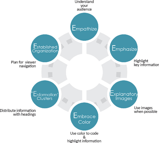
E-MPATHY
Whether your audience is composed of eight-year-olds or executives, time and attention are likely short in supply.
Consider what your audience already knows, and plan to highlight what is important to them. Once you learn what they care about, you can use imagery that aligns with these interests. For instance, those moved by pathos appeals would likely be swayed by images conveying emotion.
E-MPHASIZE
Call out key information both visually and verbally. Aim for this information to be relatable and tangible.
Use statistics sparingly, but poignantly. When stats are used, give them in smaller, more approachable terms and use descriptive labels, so viewers can “picture” those involved in the statistics. For example, eight of ten girls will sound more convincing – and palpable than 80% of female children.
E-XPLANATORY IMAGES
When appropriate, show vivid imagery, but be sure that it is clear, supportive of your message, and in no way distracting or overwhelming.
Never insert images “just to fill space.” Chances are images selected under this pretense will have little to do with your intended message.
E-MBRACE COLOR
Color can be used to trigger an emotional response or aid comprehension.
Consider how and when to use color to elicit favorable opinions, thread information together, or draw distinctions.
“E-NFORMATION” CHUNKING
Too much of anything can be overwhelming. Educational psychologists use the term “chunking” to describe the parsing of information into more manageable chunks, like how we might say phone numbers in short strings of 3 or 4 numbers.
If your information is dense, consider parsing it out, similar to how the 6 E’s were provided on this page spread.
E-STABLISHED ORGANIZATION
Some aspects of compositional constancy will allow viewers to interpret information and distinguish differences with greater ease.21
Strive for an established organization when possible. In print work, this means creating only a handful of page layouts and limiting the number of colors and fonts used. However, exact duplicates can feel static, so determine what should change and why.
Exercise 6.0 ENGAGEMENT TACTICS
Using a pair of facing pages in your favorite design publication, consider the following:
Empathize
How does the content align with the magazine’s audience?
For instance, how might this information pique their interest or speak to their needs?
Emphasize
How does the composition emphasize important information?
Have the document’s designers used headings, captions, large graphic text, or diagrams?
Explanatory Images
What images are used and how do they support the message?
Embrace Color
What colors are used, and how do they support the message?
What emotions do the colors evoke (excitement, calming, etc.)?
Have the document’s designers used color-coding tactics?
“Enformation” Clusters
Is the information parsed out into “chunks” such as paragraphs or insets?
How is this done?
Established Organization
Flip through a few other pages in the same issue.
Are there any similarities, such as a comparable use of margins or placement of objects?
VISUAL THINKING STRATEGIES
Since imagery is so vital to design storytelling, selecting and creating the right story “props” can make the difference between which ideas are embraced and which are rejected. While there is no single right or wrong way to go about creating imagery, four tasks can help conceptualize images that are attractive, sound, and useful.22 We’ll refer to these tasks as Scanning, Understanding, Imagining, and Developing.

Figure 6.2
Visual thinking tasks
SCANNING & UNDERSTANDING
We are constantly in scanning and understanding modes. In fact, our eyes help us make sense of the world around us by scanning it constantly. While we rarely notice it, they are in near constant motion, allowing us to track a range of details and six million different colors.23 We rely on these processes for our learning, understanding, and survival. Consider the scenario below:
Would you stay and play or run away?
Imagine you are walking down the street and see a dog running toward you. While you’re a dog lover, you still need to determine whether this dog is friend or foe, so your brain directs your attention toward features and patterns that are most meaningful.24 In this case, you look at the dog’s posture and facial expression. This dog has its ears back and teeth showing.
Your decision happens in less than a second from seeing the dog – eye to brain, brain to feet – any longer might be dangerous.
When conceptualizing visual story props, think of the big picture first and foremost. Author and consultant, Daniel Roam suggested that to begin, we actually should back away, reflect, and see everything – all at once.25 Stepping back can admittedly be difficult to do, especially when facing a lot of information, tight deadlines, and packed schedules. However, spending even a few minutes “scanning” to see the richness of the issue at hand can make a big difference in how you move forward. For instance, ask yourself, what were your original goals? And, how did your design decisions satisfy those intentions? If you’re working with information, laying it all out is the first step to determining what to include and how to represent these ideas.
Figure 6.3
Note cards are a fast way to see and sreorganize ideas
If Scanning helps us see the big picture, Understanding helps us to make sense of it. This is when we decide what information warrants our time. We determine this by filtering these inputs, or cues for relevancy. We then categorize and cluster them so that we can identify patterns, commonalities, and differences, essentially, asking ourselves, what is important?
SENSORY VS. ARBITRARY CUES
Many of our interpretations (and those of our audience) are informed by our prior knowledge, environments, and cultural backgrounds. Arbitrary cues depend on these types of learned understanding. For example, a child who cannot read would not know to avoid the chemicals under the sink based upon a written label alone. Arbitrary symbols only work if the person knows enough about them to accurately interpret their meaning. Arbitrary symbols can also be interpreted differently from culture to culture.
On the other hand, sensory cues rely on our senses and intuition; thus, very little learning is necessary. The toddler from above might be frightened by the skull and crossbones symbol on the label, thus slamming the cabinet door. Sensory symbols tend to be more consistent across cultures, individuals, and time since they rely on universal truths to convey meaning.26
Determining which to use is largely a function of your audience’s understanding and background. Since people can interpret arbitrary cues quite differently from one person to the next, sensory cues may be more appropriate for a diverse audience.

Figure 6.4
A child might not know how to read the arbitrary signal at the top, but they may be frightened enough to avoid the dangerous activity by the sensory symbol below it
COMPOSITIONAL CUES
Alongside sensory and arbitrary cues, compositional cues such as placement, form, and color help us make meaning from what we see:27
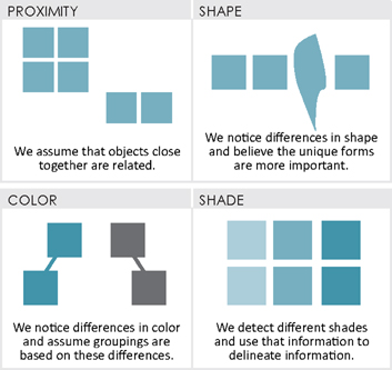
Figure 6.5
Composition cues can help a viewer navigate information
IMAGINING
Imagining tasks allows us to explore potential ways to convey ideas. These representations can be thought of as signs since they signal information to the audience. When exploring your ideas, consider whether the audience has seen similar information before and whether any metaphors might support their understanding.28An important frame of reference in this process is the study of semiotics, which can be briefly explained by how meaning is made from signs, which are categorized as either icons, indexes, or symbols based on their likeness to the object they represent.29

Figure 6.6
Semiotics can explain how viewers might interpret visual representations
DEVELOPING
Once your content has been determined, it’s important to consider the specifics of how it will be represented – with icons, indexes, or symbols, and with concrete or abstract representations. Think of these representations as answers to the questions of who, what, when, how much, where, and how.30
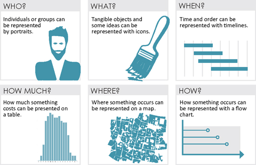
Figure 6.7
Visual representations can be thought of as answers to questions
REPRESENTATION STYLES
In his book Exercises in Visual Thinking, Ralph Wileman offered a taxonomy (classification system), highlighting a range of ways an object can be represented.31 In Wileman’s system, objects can be presented through pictorial symbols (the most realistic representation), graphic symbols (icons or outlines of the object), or verbal symbols (written words).
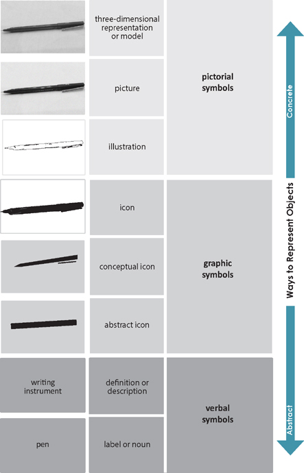
Figure 6.8
Representation tactics
EXERCISE 6.1 REPRESENTATION TACTICS
Create a series of representations similar to the one above for both an object and a verb of your choice. Then discuss your representations with a peer to determine what method would be most appropriate for your typical audience.
Media
There is an innate relationship between representation tactics and the media in which they will be shared. Below is an overview of potential media options that designers can leverage in their presentations.
SCREEN-BASED PRESENTATIONS
Screen-based presentations typically coincide with a verbal presentation, meaning that the audience is receiving information from two sources – thus inciting a battle between looking at the screen and listening to the presenter. In this scenario the speaker dictates how content is offered and when. Since the audience have little choice in the matter, they can easily grow bored or overwhelmed. Arbitrary symbols can aggravate this effect since they take longer for viewers to process. This is why presentation slides should avoid long written passages.
Appropriate symbols: high Sensory, low Arbitrary
PRINT MEDIA
Print media is essentially any paper-based format, such as books, brochures, posters (or boards) and magazines. When you flip through a book or magazine, or approach presentation boards, you can see the entire page at once, which means that as a viewer, you get to determine how to scan the content – where to look and when.
Since viewers can determine their speed, both arbitrary and sensory symbols can be used. However, designers working in this media need to consider how to guide their viewers’ eyes through content.
Appropriate symbols: Sensory or Arbitrary
PHYSICAL MODELS
A physical model is a prototype or miniaturized version of the final design outcome. Since they replicate features of the actual design and offer something for viewers to touch and feel, physical models have an inherent appeal to our senses.
Appropriate symbols: high Sensory
INTERACTIVE MEDIA
Interactive media such as apps, social media, and websites appeal to our innate desire to engage with content by altering it, and focusing on or filtering out content. While opinions are mixed regarding the long-term effect of these sources on our capacity to process information, their growing use will likely change audience expectations for design presentations.
Appropriate symbols: high Sensory
VIDEOS
By engaging sight and sound, videos provide a multi-sensory experience, and they are becoming more widespread in design communications. Videos typically follow a linear format, wherein the video’s producer dictates the sequence and pacing of the content. This means that there is little time for viewers to process information, so symbols need to be easy to recognize and interpret.
Appropriate symbols: high Sensory
ORGANIZING GRAPHIC REAL ESTATE
Regardless of media, even the best of story props will be missed or misinterpreted if they reside in a poorly planned composition. So it’s important to carefully organize the space surrounding your representations.
ORGANIZING GRAPHIC REAL ESTATE
All media face real or implied graphic boundaries. Within these limits, you’ll need to maximize your opportunities to sway the audience. Consider the extents of your composition as graphic real estate, and similar to locating a building on a city lot, the location of your graphic elements such as images and text can have favorable or detrimental effects. As such, designers need to be mindful of borders, sightlines, and open spaces. Lacking this consideration can make even the best story props look sloppy and ill-considered, which can leave your audience bored, confused, and generally off message – and frankly, make you look bad. So, to make your stories come alive, consider employing principles of visual hierarchy.
VISUAL HIERARCHY
Lacking cues that suggest importance, viewers may wander aimlessly through content. Visual hierarchy can influence what viewers see first as well as the order in which their eyes travel from one element to the next.
To plan your visual hierarchy, first determine what is most significant and place it accordingly. Consider natural reading preferences, which eye scanning studies suggest follow a pattern corresponding to the letters F or Z in left-to-right reading countries.32 Think of newspaper layouts where items aimed at piquing interest, like headings or compelling images, are placed at the top of the page, above the fold. To keep the viewer moving forward, you’ll also want to place a stimulating object near the end of the sequence, thus pulling the eyes toward it.
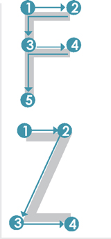
Figure 6.9
Readers in most Western cultures typically scan information in F- or Z-like patterns
TOOLS OF EMPHASIS
An important consideration in visual hierarchy is understanding how to emphasize the elements you feel are most important. Consider the images below; the left composition is scattered with no clear focus, while the right iteration makes use of alignment, negative space, and scale to create a sense of visual hierarchy.

Figure 6.10
The left composition fails to lead the eye, while the right arrangement incorporates tools of emphasis like alignment, negative space, and scale to prioritize information
GRID
Creating an implied grid can help you leverage the tools of emphasis by providing an innate structure to your composition. This structure helps to keep the final composition balanced and intentional. The Golden Ratio and the Rule of Thirds can be used to compose your grid.

Figure 6.11
Implied grids can be used to organize a graphic composition
Grid Elements
Grids are composed of a few basic elements: column lines are vertical, flow lines are horizontal, and margins mark borders.
With these elements in mind, you can also create your own grid by adopting uniform spacing or creating a new grid to follow your predetermined rules.

Figure 6.12
Grid lines can be regularly or irregularly spaced
ALIGNMENT
Your content can be anchored to your grids by aligning it to either a column or flow line. Alignment provides organization, which makes the composition appear more intentional and aids viewers in navigating the information.
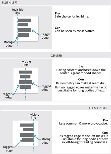
Figure 6.13
Alignment strategies
EXERCISE 6.2 UNDERLINING ORGANIZATION
To leverage implied grids, it’s best to start by studying how they are used in design communications. Consider the following:
Make copies of 2–3 pages from different design magazines.
Over these copies, mark lines indicating implied grids and determine if objects are positioned along this grid via flush left, center, or flush right alignment.
Would you make any changes to this underlining strategy?
NEGATIVE SPACE
Negative space sounds, well… negative, and some designers hesitate to use it. However, negative space, or if you prefer, white space (though not always white), is an area of relief around an important object. Negative space sets off forms through contrast and gives viewers’ eyes a place to rest so that they can, in turn, focus on the actual content. It’s a fundamental tool of emphasis since it helps viewers to categorize and cluster information. What negative space is not, however, is left over space. Effective negative space is intentional. Larger areas of negative space help to reduce the perception of clutter. Also, negative space in the center of a layout can be disorientating for viewers, so avoid trapping it away from the edges of a composition.
The following images are alternative layouts for the right side of an earlier page spread. Consider which iteration most effectively integrates negative space.
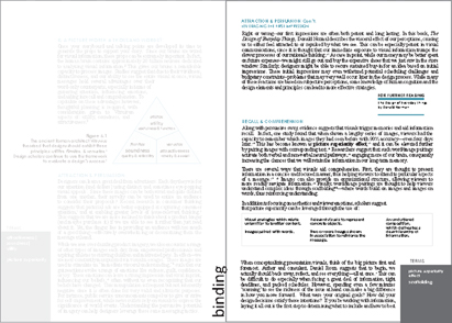
Figure 6.14
Trapped negative space does little to declutter the page
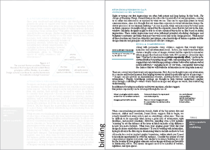
Figure 6.15
Too little negative space can leave viewers feeling overwhelmed
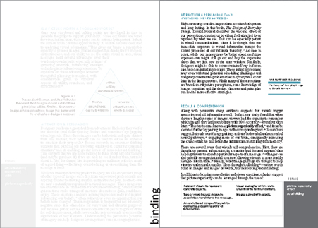
Figure 6.16
Larger areas of negative space at the edges of the page give viewers some respite
AVOIDING NOISE
Noise in graphic design is essentially visual clutter, which distracts an audience from the message. To avoid visual noise, consider the following:
AIM TO:
Use proximity to show relationships.
Related items or those that are to be compared should be adjacent.
Use implied grids to place content.
Grid lines can be used to anchor your content, providing balance.
Create a cohesive visual presentation.
Use only a few select fonts, forms, and graphic treatments.
Create a simple composition.
Every element on the page should reinforce your design story.
AVOID:
Heavy borders.
They tend to pull the eyes away from content.
Overlapping images.
The tension at the area of overlap can draw attention away from the content itself.
Unnecessary graphic elements.
Gradients, watermarks, and embellishments can distract viewers from your message.
Placing large & dark elements at the top of the page.
This causes the composition to feel top-heavy and out of balance.
TESTING YOUR COMPOSITION
To test your visual hierarchy, have someone close their eyes then quickly reopen them in front of your composition. Ask them what they noticed first. If their response doesn’t align with your intent, consider reemphasizing your message and deemphasizing whatever drew their attention.
TYPOLOGY
Cave paintings and hieroglyphs seem to indicate that our earliest ancestors were predominately visual communicators. However, as human language grew in sophistication, and literacy rates increased, so too did our ancestors’ preference for word-based communication. This meant visuals were somewhat marginalized, with images added to text to: provide embellishment, represent, organize or clarify content, or aid reader recall.33
However, strategies such as data visualization, information graphics, and annotated pictures/tables are becoming more prevalent.34 These strategies give designers the ability to more fully capitalize on the inherent advantages of visual communication by placing information in a visual context. Being able to see the information allows viewers to rapidly interpret it by noticing patterns, recognizing problems, and even identifying potential solutions. While such representations vary in aesthetic character, they seek to integrate words with imagery, thus offering a more cohesive explanation of information.
When designing your visual story props, consider the relationship between text and images. Ask yourself the following:
Are images within text or text within images?
Which is more prominent?
Which is developed first?
Which of the following strategies would be most effective?
| TEXT FIRST35 Images are added to bodies of text to either: |
|
| Embellish | Organize |
| Goal: to add decoration | Goal: to cluster and differentiate content with charts & diagrams |
| Represent | Aid Recall |
| Goal: to make content more tangible with concrete images | Goal: to help the audience remember content by targeting multiple neural pathways |
| IMAGES FIRST Text is added to images to either: |
|
| Clarify | Organize/Clarify |
| Goal: to reduce ambiguity with labels & captions | Goal: to cluster and differentiate content with headings & insets |
| Elaborate | Aid Recall |
| Goal: to expand on information with descriptions | Goal: to help the audience remember content by targeting multiple neural pathways |
EXERCISE 6.3 WORD TO IMAGE RELATIONSHIPS
To explore the relationship between text and images, locate 7–10 samples of design communication from websites and magazines.
Which of the strategies from above do they use?
Are these relationships effective for garnering attention & aiding comprehension?
PSYCHOLOGY OF TYPE
Type can play an influential role when telling design stories. In her book Visual Design Solutions, Connie Malamed suggested that typefaces “provide subtle meaning beyond the design itself,”36 meaning that type can convey particular tones, moods, and attitudes to viewers. In fact, studies on the rhetorical perceptions of typography suggest that fonts are often characterized as either elegant, direct, or friendly.37

TYPE TERMS
You’ll need to ensure that any font, or family of characters you choose is legible at the distance the audience will be from your work. So consider both your font and text size by viewing them as your audience will, using the same media and at the same distance.
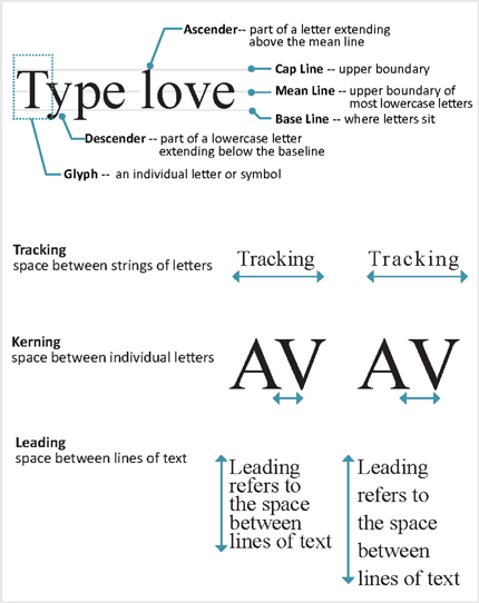
FONTS
It’s best to use to use only a few fonts or typefaces. Aim to limit font changes only to draw distinctions. For instance, you may want to distinguish copy text from display type. Copy text forms the overall narrative (think paragraphs), while display type is reserved for headings and text with emphasis. Since headings are aimed at calling attention, their fonts can be more distinctive. See font categories below:

Figure 6.17
Test your font sizes at the distance that they’ll be viewed
FONT CONSIDERATIONS
It’s important to understand how large a font will appear in real life. Fonts should rarely be smaller than 10pt, and slightly larger fonts work better for older audiences.
If you are moving files between Macs and PCs, look for open type fonts. Emphasis can be added with italics, boldface, or by using pullout text, but be careful not to overuse these tactics as they can dilute your message if used too frequently. All caps text should only be used for headings and short labels or phrases; avoid it for paragraphs.
OBTAINING FONTS
If you desire to use fonts other than what’s already installed on your computer, they can be downloaded from reputable websites. Also, font recognition websites allow designers to identify fonts they have seen while they’re on the go by uploading photos of signs, flyers, and posters.
FONT SOURCES
| Font Downloads | Font Recognition |
| DaFont | What the Font |
| Font Squirrel | Font Squirrel |
| Typekit |
COLOR
Color is one of the most versatile, but demanding tools in the design storyteller’s toolkit. Thoughtful applications of color can work to gain an audience’s attention, evoke their emotions, signify meanings, and be used to code information. For some, however, colors can be hard to distinguish, and our perceptions of color can be somewhat complex and nuanced. Color perceptions vary, depending on our respective cultures, histories, and preferences.38 For example, brides in Western cultures wear white to signify their purity, and red in Eastern cultures to promote their luck.
Complicating a designer’s decisions on color is the fact that a color’s surroundings can alter its appearance. Nearby lighting conditions and adjacent colors can have surprisingly dramatic influences on a color. To avoid surprises, designers should consider the environments where their selected colors will be viewed, and how viewers might react to them.

Figure 6.18
A color’s surroundings can influence its appearance.
PSYCHOLOGY OF COLOR
Color’s influence on human behavior is known as color psychology. While there is too much research on color to cover everything in this text, some general guidelines bear mentioning.
COLOR PERCEPTIONS
| Bright colors are associated with “showiness”39 and excitement.40 | Reds, yellows, and oranges are considered dominant, stimulating colors, so they often appear more prominent in a composition.43 |
| Neutral colors are considered understated and elegant.41 | |
| Dark colors evoke a sense of strength, or boldness.42 | Greens and blues are considered calming and appear recessive in a composition.44 |
Colors are commonly thought to embody certain attributes. Consider some common color connotations.
COLOR CONNOTATIONS45 46
| BLUE-trust, security, stability | YELLOW-playful, confident |
| RED-exciting, stimulating | GREEN-growth, nature (sustainable) |
| BROWN-ruggedness | BLACK-luxury, elegance |
EXERCISE 6.4 COLOR CONNOTATIONS
To understand how colors perceptions are leveraged in brand messaging, locate 2–3 websites from companies or organizations you consider to embody each of the following attributes: trusted, sustainable, & confident.
Compare their brand’s colors against the common color connotations listed above.
Do your findings support the connotations?
CHOOSING A COLOR PALETTE
Color palettes are sets of colors used in a design. It’s best to keep these sets small since too many colors can cause viewer fatigue and confusion. At the same time, a dull palette can leave viewers uninterested. To avert fatigue, but secure viewer interest, it’s best to pair brightly saturated colors with neutrals such as grey, white, black, tan, or navy.
Established palette frameworks can aid color selection.

Figure 6.19
Palette frameworks
Palette Resources
| Online tools can help identify palette options: | ||
| Adobe Color | ColorExplorer.com | Design Seeds |
| COPASO | MudCube | TinEye Labs |
USING COLOR
Usability refers to the way in which color can be understood, and used.47 To enhance color usability, consider the following:
WHEN USING COLOR
Use color consistently.
The same colors should be used on the same types of content.
Use color to aid visual hierarchy.
Bright and deeply saturated colors will be noticed first.48
Use culturally appropriate colors.
When working with unfamiliar cultures, do advance research.
Use a limited color set.
Aim to use no more than seven colors.49
When selecting colors, also consider those with color vision deficiencies, which is about 8% of the population.50 A commonly held misconception is that colorblind individuals see in black, white, and grey only. However, they are more likely to be unable to perceive differences between colors, most commonly between red and green.
RESOURCES FOR UNDERSTANDING COLORBLINDNESS
| Coblis | Color Blind Check app | Vischeck |
| Contrast-A |
CONTRAST
An important aspect of color is contrast, which basically means difference, and we are wired to notice it.51 As such, contrast can be a powerful tool for directing eyes toward important information, but, in order to work, contrast needs to be clearly different. In fact, it is recommended that one use a 3:1 luminance contrast ratio between a pattern and its background and 10:1 between text and background.52 That means text should be 10 times darker (or lighter) than its background. Inverted text (light text on a dark background) should be avoided for longer narratives.53 You can check your contrast levels at Checkmycolours.com.

Figure 6.20
Inverted text is more difficult to read, especially if there is relatively little contrast
COLOR MANAGEMENT
There are a few technical terms and issues that should be noted in color management. For one, screens and printers do not speak the exact same language; ergo, each has its own color mode. CMYK corresponds to commercial print work (e.g., Cyan, Magenta, Yellow, Key for Black) — think of toner colors. RGB is used for on-screen viewing (e.g., Red, Green, Blue). Additionally, Pantone® is a proprietary color management system that can be used to match 1,867 specific colors. Failure to understand these systems may cause your work to appear different from what you expected. So be sure to view your work in advance on the medium in which you will be sharing it.
BRINGING IT ALL TOGETHER
Wirtten|Spoken|Visual
The best visual packages work hand-in-hand with your other communication channels (i.e., written summaries & verbal presentations).
So, consider the context of your presentation carefully. Will you be there to explain the content? Or, will your content need to stand alone, such that viewers will need to derive meaning from the words and graphics alone?

Figure 6.21
Communication channels are interrelated
To align your communication channels, determine:
The appropriate quantity of labels (written + visual)
Standalone documents will likely require more contextual labeling.
How might you gesture toward the content? (verbal + visual and written)
How to incorporate speaker triggers without forcing the audience to read at length? (verbal + visual)
SLIDE DECKS
Designers often give screen-based presentations, and while there is nothing inherently wrong with the software used to produce slide decks, design storytellers should be wary of relying on their templates. Apart from some kitschy backgrounds, these templates tempt designers to force their content into formats not befitting their goals. This can cause a disconnect between the verbal, written, and visual communication channels. For instance, a slide that contains too much text compels the audience into either listening to the presenter or reading the content. Perhaps even worse, is that speakers may inadvertently start reading from the slides themselves.
Consider the following two slides, which both convey the same content.

Figure 6.22
Avoid forcing content into a template
SLIDE DECKS
Methods for Integrating Content
Storytellers keep their audiences on the edge of their seats by sharing information on a “need to know basis.” Design storytellers can leverage this suspense by incorporating tactics of progressive disclosure in their slide decks. This means that rather than including extended prose and lengthy bulleted lists, information is instead parsed out onto separate slides.

Figure 6.23
The top slide introduces the subtopic, and primes the audience for an impending comparison. However, only the first part of the information is discussed in detail.
The bottom slide elaborates on the second part of the information. The previously shown process is now grayed out, which allows viewers to recall it without dwelling on it.
ORIENTATING THE AUDIENCE
Audiences like to have a sense of how the presentation is unfolding. This includes how far they have come, how much is left to go, and what the current topic is. However, this doesn’t mean that you have to go over this information explicitly — doing so might be boring. Instead, orientate your audience by incorporating a visual table of contents (such as metaphorical binder tabs) or purposeful transition from one sub-theme to the next, like chapters intros in a book.

Figure 6.24
The top slide introduces the current sub-topic in the order of the presentation, while the content itself suggests what topics will be discussed in subsequent slides.
The bottom slide acts an introduction for a sub-theme. For greater effect, the slide can be reused at the beginning of each sub-theme by changing the number and title.
SLIDE COMPOSITION
To avoid overwhelming audiences, compose each slide so that it contains just enough content to maintain interest, and trigger your talking points.

Figure 6.25
Consider how much content to place on each slide
POSTER PRESENTATIONS
Some presentations are given from posters or larger boards. Since all information is visible at once, the presenter has less control over what viewers see and when, making visual hierarchy especially critical.
Figure 6.26
Examine the use of implied grids, alignment, and negative space in both the top & bottom poster presentations
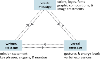
ESTABLISHING A BRAND IDENTITY
A personal brand is your face to the world. It’s a cohesive expression of you and your values through various components including logos, fonts, colors, graphic composition, and image styles. A successful brand identity should allow one to identify your work, even without seeing the entire package.
BRAND IDENTITY TOOL KIT
A complete brand identity is comprised of a number of markers that range across communication channels.

Eric Ibsen
is the chief design officer for Forge. Eric provides design & marketing leadership in a mid-size architectural firm. His emphasis is on the importance & value of quality design.
STORYTELLING IN PRACTICE
How do stories drive the vision of a brand?
In the re-branding of our practice, we found, through research, that our clients and other stakeholders were as interested in the experience as the end-product or the design itself. This led us to the conclusion that our marketing focus should be on our emphasis of the stakeholder experience, not the design. There was less interest in our credentials than the importance of solid relationships.
So the story we tell is one of starting out as a traditional firm, focused on design and documentation, enjoying several decades of success and stability, though not growing. More recently, we found ourselves competing on the basis of project images, work we had done for other clients. Increasingly, this beauty-contest approach was subject to opinion and very difficult to manage. We came to the conclusion that most of our competitors were as capable as we were and that the real distinction was the people. What made us different and better was how our team engaged, not only our clients, but the contractors, engineers, consultants, public agencies, and other project partners.
Playing this back to existing and new clients, we’ve quickly recognized that a better conversation or exchange was taking place and that this would be our point of distinction and competitive advantage. It also put us in a leadership role, seen as partner in the project, not relegated to design and documentation as a service. This has changed our business.
LOGOS
Even the tiniest of images can tell a story. A recognizable logo makes an impression, helping an audience identify with the given person (or company) and get a sense of their values. The key to designing a logo is making it simple and clear while still representing your message through either explicit or subtle maneuvers.
Consider making your logos in a vector-based program so that they can be scaled up without losing quality. Also, since these images may be used in multiple formats, it’s a good idea to keep them crisp with high contrast, so that they look good in print and on-screen.
LOGO CONSIDERATIONS
Limit the number of colors used.
Ensure that it is legible in black & white since it may be copied.
Confirm that size and proportions allow for its use across media.
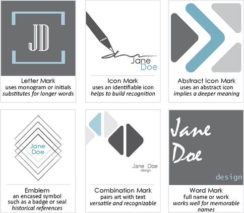
Figure 6.27
The type of logo used depends on the messaging goals and available content
EXERCISE 6.5 EVALUATING LOGOS
On a separate sheet of paper, list the messages you think each of the above logos convey. Then exchange your assessments with someone else.
Were your evaluations similar or different?
Then find 2–3 design firm logos & list the messages you believe their logos send.
List successful & unsuccessful attributes of each.
EXERCISE 6.5 CREATING A LOGO
An important aspect of telling your story is branding it with a logo. This logo can be used on multiple items such as your resume, letterhead, presentation introductions, and even on social media. This exercise will help you generate and refine ideas for this simple, yet invaluable representation of your personal story.
1Find 10 professional identity logos (either from individuals or design firms). Analyze them for:
Novelness
Does the logo have a unique character & style?
Does the logo look like another, or share similarities with another image?
Clarity
What does the logo say about the creator?
Does the logo convey a set of values?
Simplicity
Is the logo distilled to its simplest elements?
Can anything be removed from the logo without losing message?
Reproducibility
Does the logo have scalability (can it be made larger & smaller)?
Would it be legible if copied in black and white?
Share your analysis with a peer and discuss if they feel the same way about the logos.
2 Using the themes from the Point of View Exercise in Chapter 3, determine what values you want your logo to convey. For example, if you want it to speak to your high energy, then a potent logo with highly saturated colors would likely work well. On the other hand, if you want to convey sophistication, a logo with intentional negative space would be effective.
3 Based on the values you have identified, generate a series of 10–12 quick sketches. Using the table above, obtain feedback on your sketches from at least 5 other people. Try to gain feedback from both individuals that are close to your work and those that are less familiar with your ideas.
4 Based on the feedback, eliminate half of the options and refine the other half. At this point, it might be valuable to produce these iterations digitally. Then, get feedback from 3 new individuals based on the factors in the table above.
5 Based on that round of feedback, develop 3 iterations to a more final stage, including final colors, and fonts. Print these iterations at various scales on at least 3 different printers.
6 Seek feedback on your final 3 printed iterations. Then, determine which iteration most successfully conveys your values.
CREATING YOUR VISUALS
There are many ways to create your visual story props. You can use your own sketches, which can be digitized. There are also many resources for the production of digital graphics. If you are producing work digitally, consider whether you want vector-based graphics, which can be scaled without losing quality, or raster-based, which allow for fine color calibration. See Chapters 7 & 8 for a list of software options and resources.
SUMMARY
We acquire a great deal of information through our eyes. Consequently, visual messages play a vital role in design storytelling. Imagery allows designers to attract attention and persuade their audience, then help that audience to both understand and recall the message. To create visuals for a design story, aim to first Scan the information you have, then seek to Understand it by determining what it means and what is important. Imagine the possibilities with signaling tactics such as icons, indexes, and symbols. Finally, develop the content, by exploring frameworks and representation tactics, which can range from abstract to realistic representations.
Often, your graphics can be enhanced by integrating labels and the typeface you select should be legible and support your intended tone. It’s best to limit your fonts to one for copy and another for headings.
Color is a versatile tool, but consideration needs to be made as to how it’s perceived and how best to manage it for your media. For your visual messages to be successful, they need to be placed within compositions that consider visual hierarchy and tools of emphasis. Regardless of media (slide show, board presentation, etc.), thoughtful planning can help your visual messages reinforce your design story.
FOR CONSIDERATION
ADAPTING THE MESSAGE TO THE MEDIA
Considering that design stories can be told with paper-based, on-screen, physical, and interactive props, evaluate how your story would need to adapt to each.
TERMS
| attractiveness|soundness|utility | glyph | raster |
| arbitrary cues | kerning | RGB |
| brand identity | leading | semiotics |
| body copy | negative space | sensory cues |
| compositional cues | noise | speaker triggers |
| copy | open type | tracking |
| contextual labeling | picture superiority effect | typeface |
| CMYK | pull out text | vector |
APPLICATION 6.0
Recall your ideas from Chapter 5 and start to sketch ideas for your upcoming presentation. Remember to keep your goals in mind as well as how to make each representation clear, vivid, and memorable. Consider the following:
1The Hook
Goal: To garner attention by appealing to the audience’s emotions
Are you conveying information that explains who, what, when, how much, where, or how?
What representation method would work best, abstract or concrete?
Are these depictions aimed at appealing to emotional or intellectual interests?
Sketch a few ideas based on your talking points.
These will be refined in Chapters 7 & 8.
Exploration of the Problem
Goal: To illustrate the relevance & magnitude of the problem
Are you conveying information that explains who, what, when, how much, where, or how?
What representation method would work best, abstract or concrete?
Are these depictions aimed at appealing to emotional or intellectual interests?
Sketch a few ideas based on your talking points.
These will be refined in Chapters 7 & 8.
Sharing the Solution & Its Benefits
Goal: To highlight how your design will resolve the problem at hand
Are you conveying information that explains who, what, when, how much, where, or how?
What representation method would work best, abstract or concrete?
Are these depictions aimed at appealing to emotional or intellectual interests?
Sketch a few ideas based on your talking points.
These will be refined in Chapters 7 & 8.
The Finish
Goal: To prompt action within and beyond the room
Are you conveying information that explains who, what, when, how much, where, or how?
What representation method would work best, abstract or concrete?
Are these depictions aimed at appealing to emotional or intellectual interests?
Sketch a few ideas based on your talking points.
These will be refined in Chapters 7 & 8.