Chapter Goal: As with Smart Filters in Photoshop that are used on Smart Objects, you can apply single or multiple effects to Illustrator objects that are non-destructive before you commit. This chapter will explore some of the Illustrator effects and review some of the Photoshop effects that I consider true distorts. These distorts can be combined with other stylized effects.
In this chapter, we will also look at how to store your effects and graphic styles for future distortions and where you can purchase other effects through the Adobe Creative Cloud.
You can find the projects for this chapter in the Chapter 11 folder.
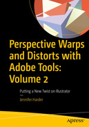
Effect Menu
Illustrator Effect menu
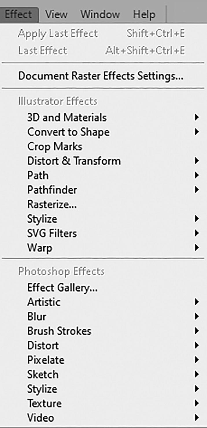
Properties panel and Appearance panel

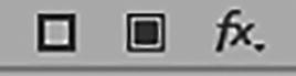
FX (Effects) menu from the Properties and Appearance panels

Appearance panel with effects placed in different locations
This provides endless possibilities and combinations that can make your objects appear different based on order.

Appearance panel with Delete Selected Item button clicked
Use Edit ➤ Undo or use the History panel if you need to undo a step or state.
We will be working with the Appearance panel in more detail in this chapter’s project.
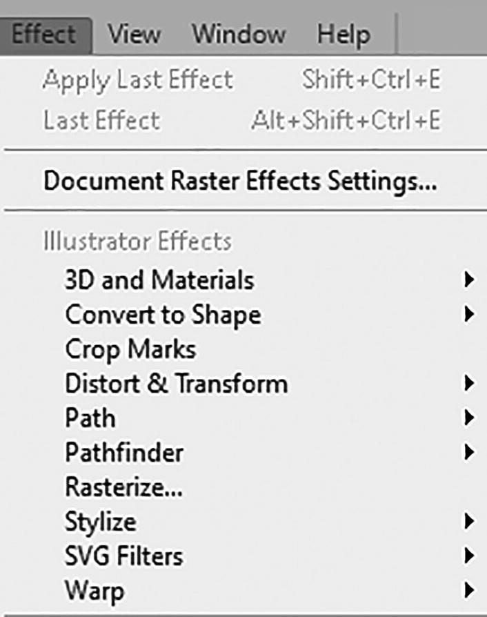
Illustrator Effects section of Effect menu, with Document Raster Effects Settings
The setting Document Raster Effects Settings applies to raster images, 3D, and Photoshop effects. We’ll look at that setting later in the chapter. Refer to Figure 11-6.
Illustrator Effects
I will discuss some of my favorite effects here, then briefly mention some of the other effects in this menu as well. I will also point out some of the tools and commands in the Object menu that they are equivalent to, but now as live effects.
Create a new document, as you did in Chapter 1, if you want to practice with some of the effects.
3D and Materials
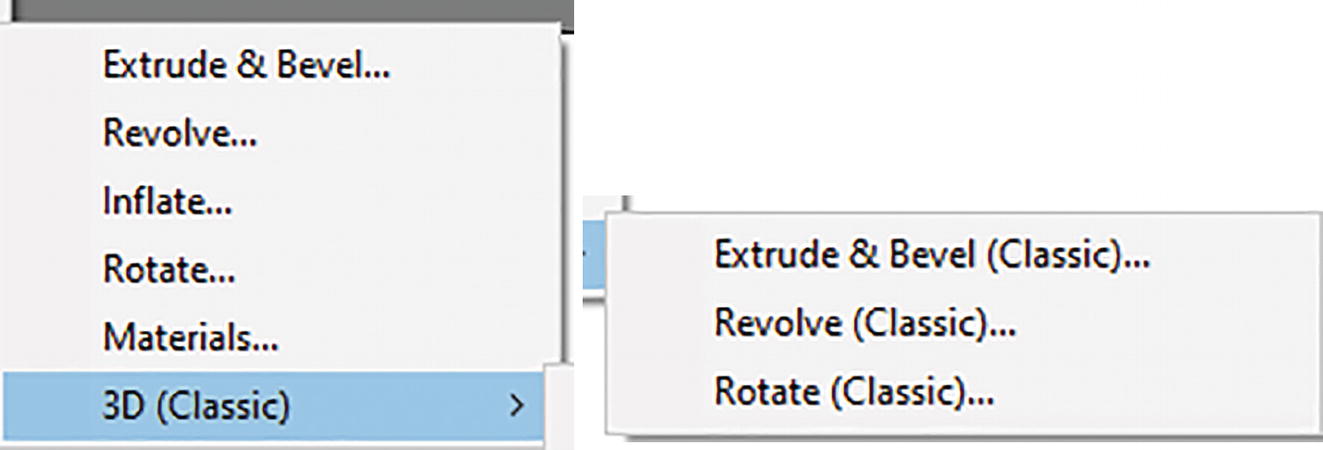
Effect sub-menus for 3D and Materials
Because these are complex effects, we will look at it separately in Chapter 13, comparing classic and new features.
Convert to Shape
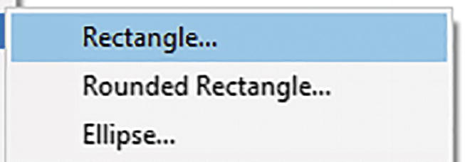
Effect sub-menu for Convert to Shape
Choosing one of these shape options brings up the Shape Options dialog box, where you can set the following options:
Size: Absolute or Relative
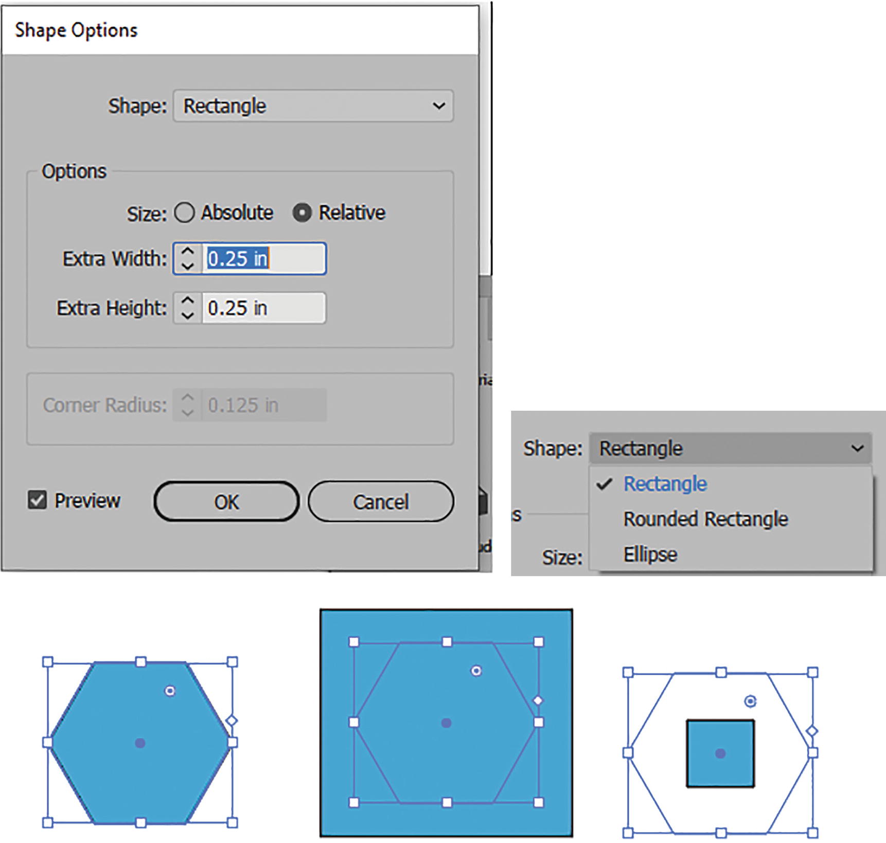
Shape Options dialog box with various rectangle settings on a hexagon for Relative and Absolute
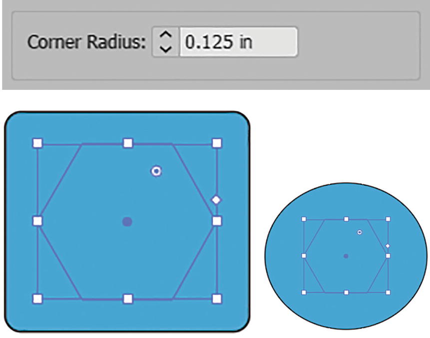
Shape options for rounded rectangle corner radius and circle options on hexagon shape
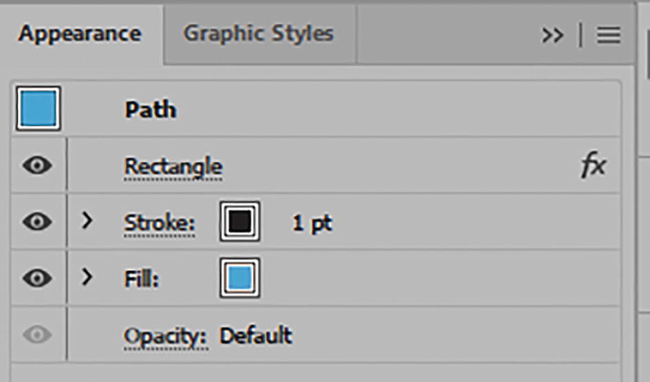
Appearance panel with Rectangle effect
Crop Marks
Crop Mark effect applied to a rectangle
Distort & Transform
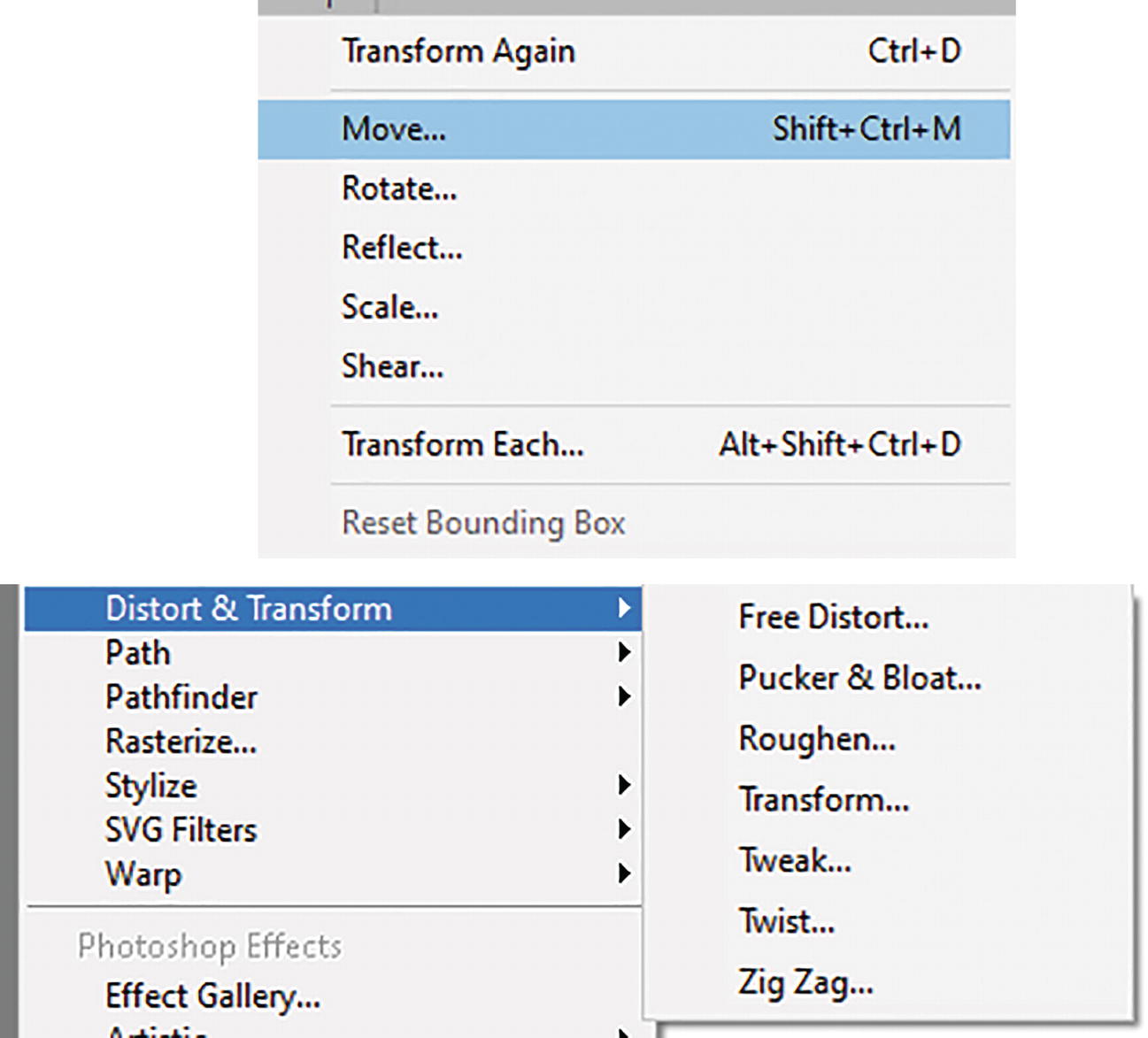
Object ➤ Transform commands and sub-menu for Distort & Transform
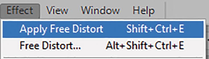
Free Distort
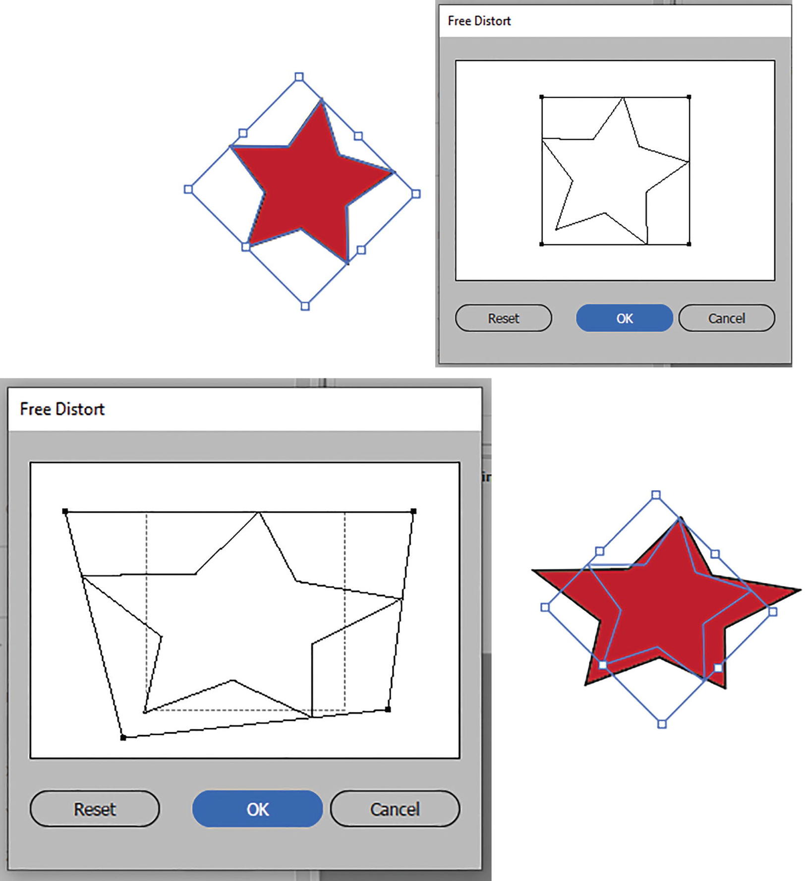
Free Distort dialog box with preview of shape
Pucker & Bloat
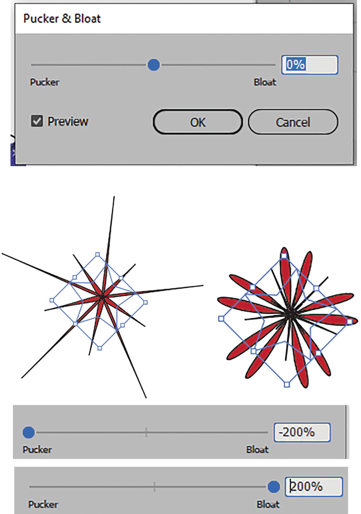
Pucker & Bloat dialog box with preview of various settings and sliders
Pucker & Bloat settings and shape rounded with Direct Selection tool
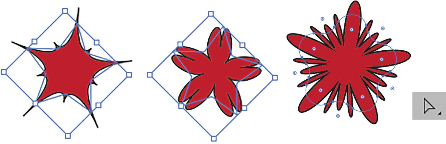
You can further alter the design if you, with your Direct Selection tool, round the star’s corners afterward, and then the Pucker or Bloat updates automatically. Refer to Figure 11-16.
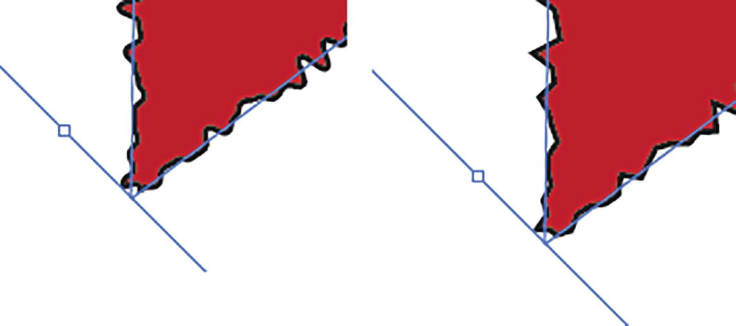
Roughen
For an overall shape, Roughen is a better alternative than working with the Liquify tools of Scallop, Crystalize, and Wrinkle. In the Roughen dialog box, with the preview enabled, set the Size slider (0%–100%). Set to Relative, the star is more distorted; set to Absolute, it has less distortion. Choosing Absolute sets the Size increments to inches (0–1.39 in) or the current increments rather than percents.
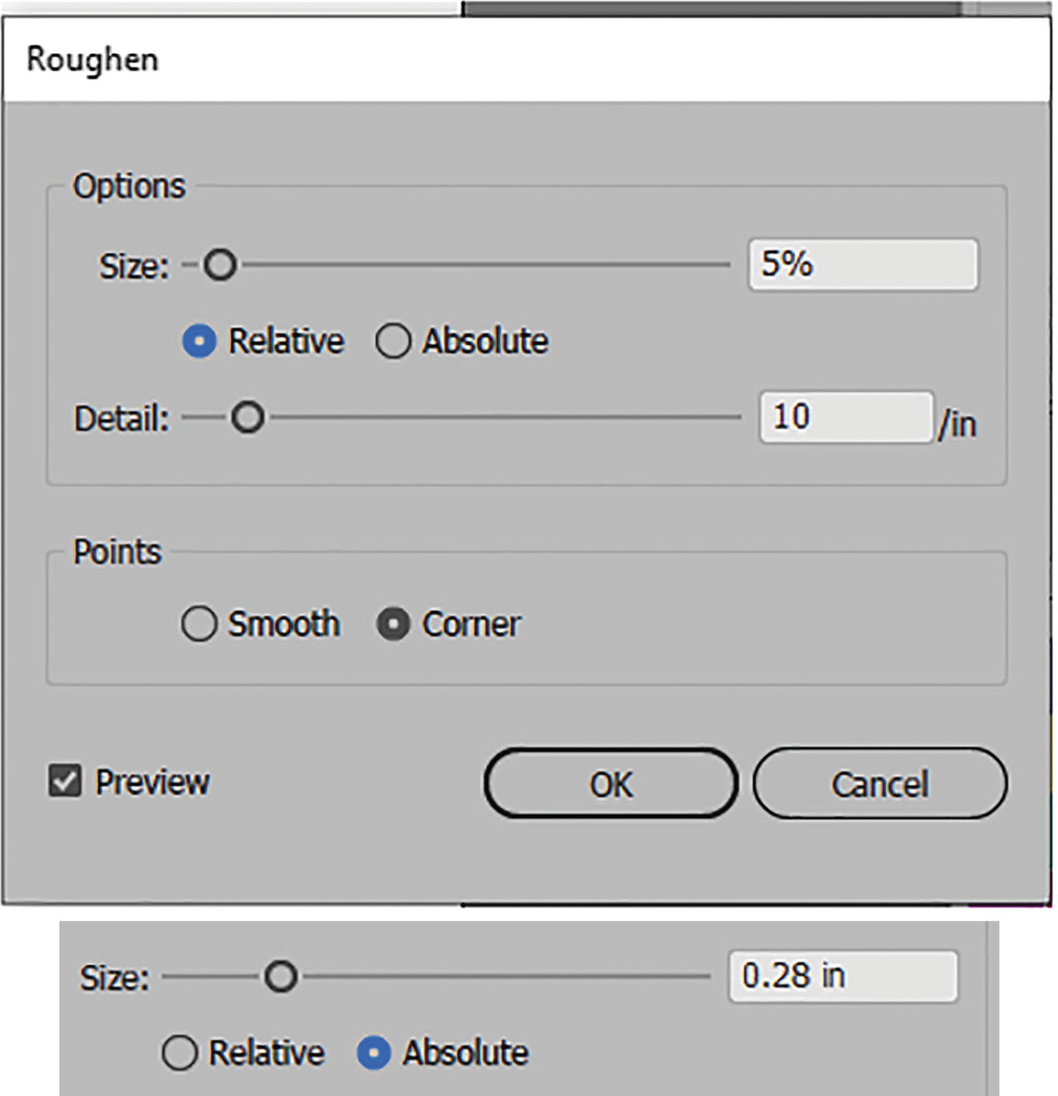
Roughen dialog box with options of Relative and Absolute
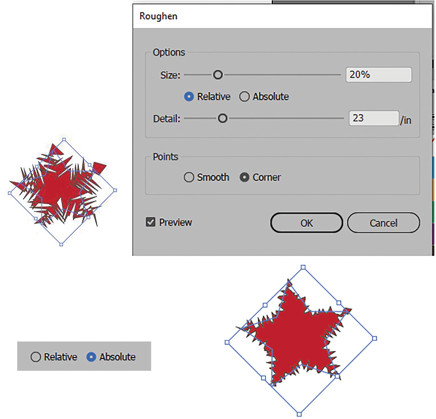
Roughen dialog box with options of Relative and Absolute and previews of stars
Points settings of Smooth and Corner for Roughen tool
Transform
This Transform Effect dialog box is similar to working with the Object ➤ Transform ➤ Transform Each dialog box from Chapter 3, as it lets you choose similar transformation settings, such as the following:
Scale: Horizontal and Vertical from 0% to 200%
Move: Horizontal and Vertical, currently set to inches, and can move in a negative or a positive direction.
Rotate Angle: 0°–360° angles can be positive or negative.
Options: Enable or disable these various settings: Transform Objects, Transform Patterns, Scale Strokes & Effects, Reflect along the X and Y axes, Random movement setting.
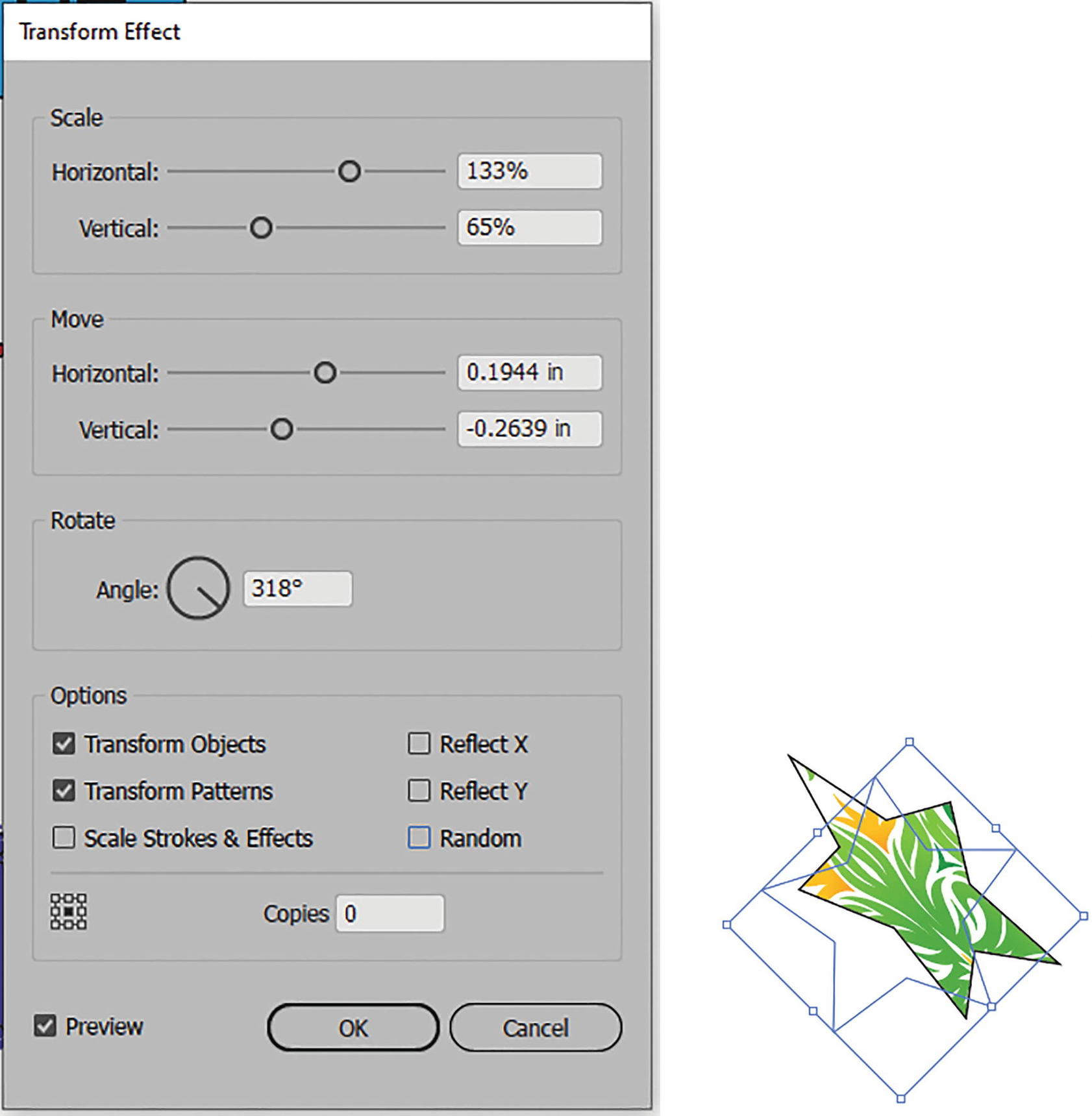
Transform Effect dialog box with preview of star based on settings
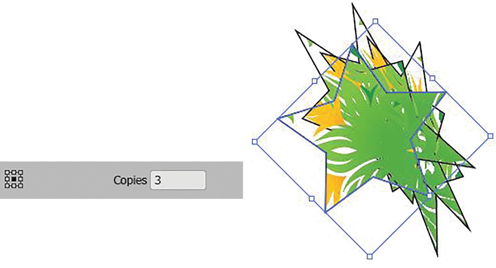
Copies of star created with the Transform Effect dialog box
Only Scale Corners is not an option in this menu. Click OK to commit your settings. Refer to Figure 11-20.
Tweak
For an overall shape, the Tweak effect is a better alternative than working with the Liquify tools for warp seen in Chapter 5.
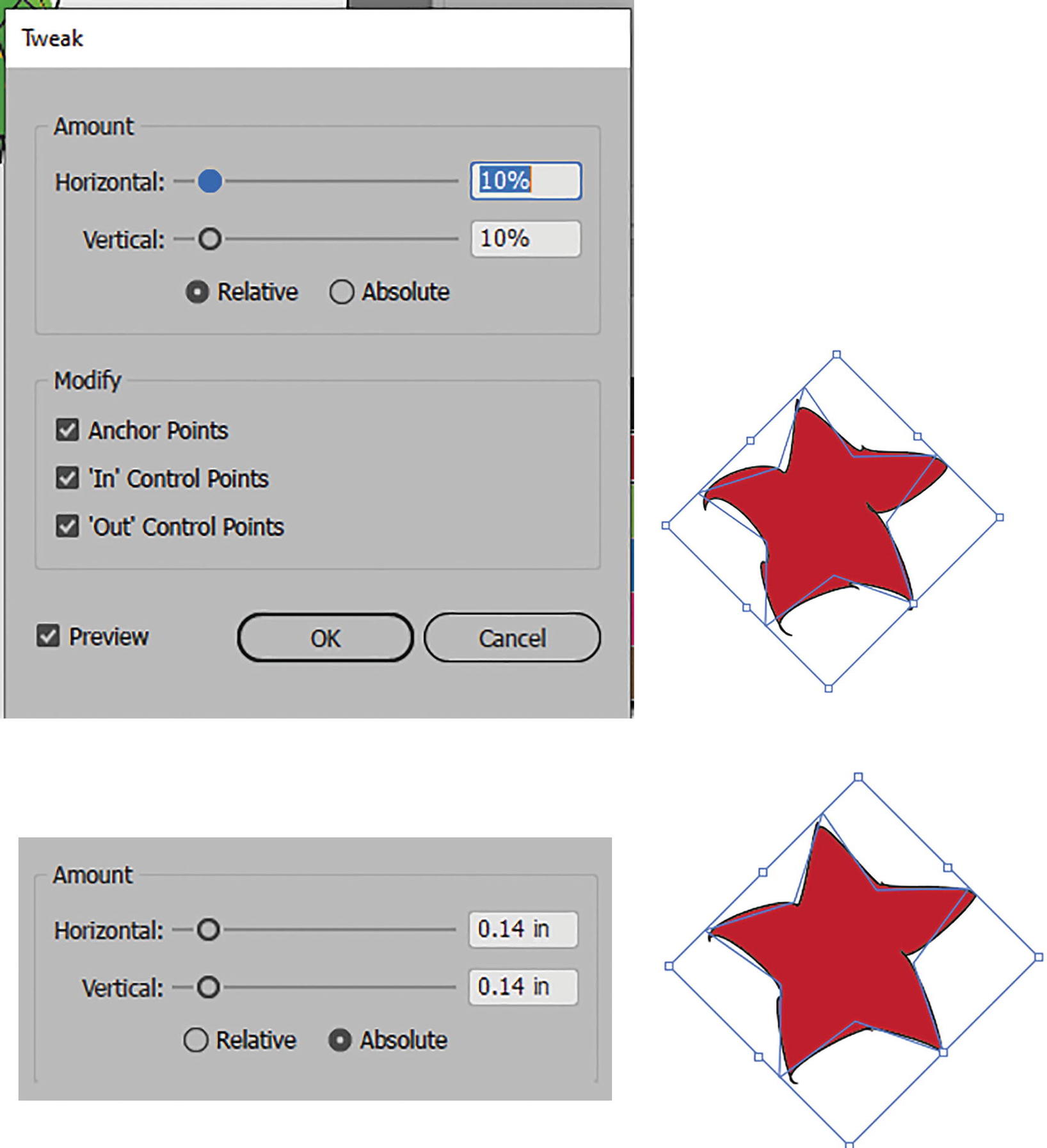
Tweak dialog box with previews of Relative and Absolute settings
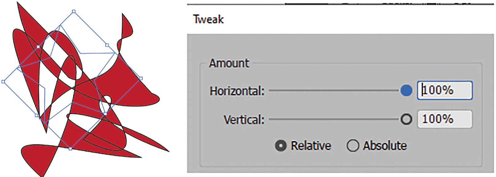
Tweak dialog box with preview settings for relative tweaks
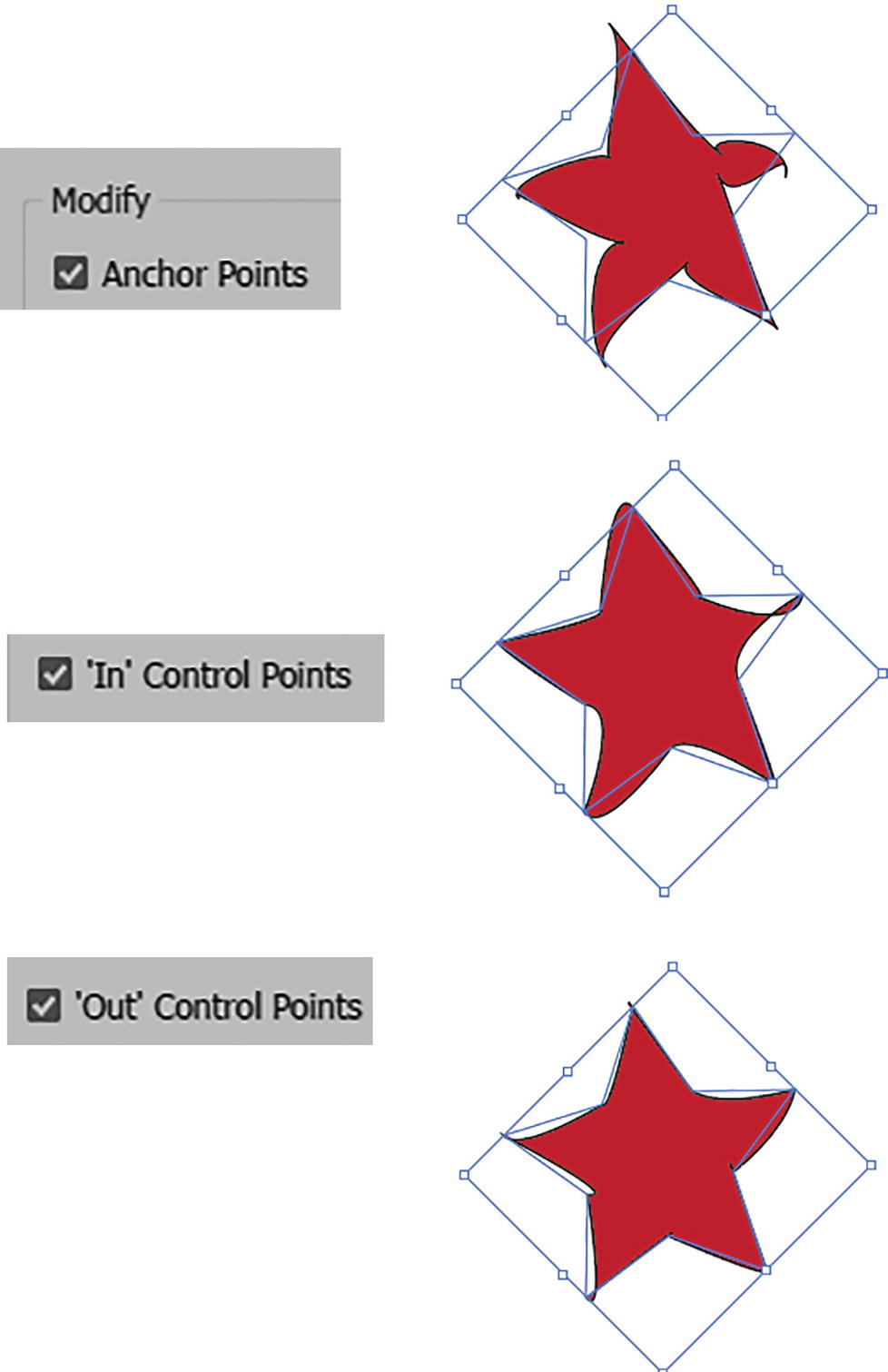
Tweak dialog box with preview settings for Modify checkboxes
By default, they are all enabled. Click OK to commit the settings. Refer to Figure 11-22 and Figure 11-24.
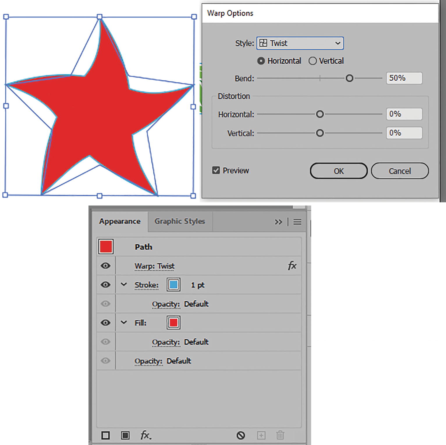
Twist
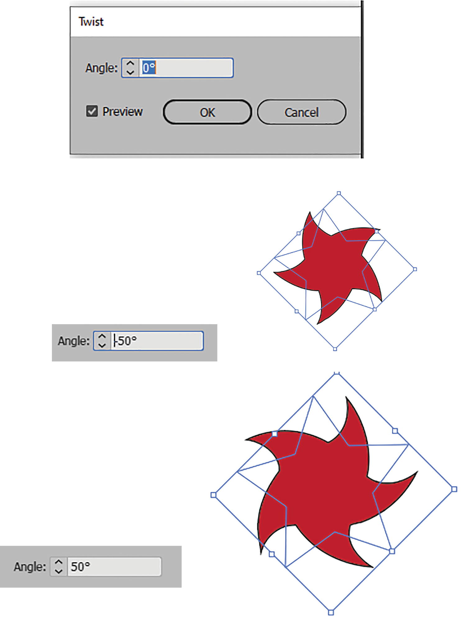
Twist dialog box with preview settings of angles
Click OK to commit your settings. Refer to Figure 11-25.
As mentioned earlier, where you move your effect in the Appearance panel will control whether the fill, stroke, or both fill and stroke are affected by the twist. Refer to Figure 11-26.
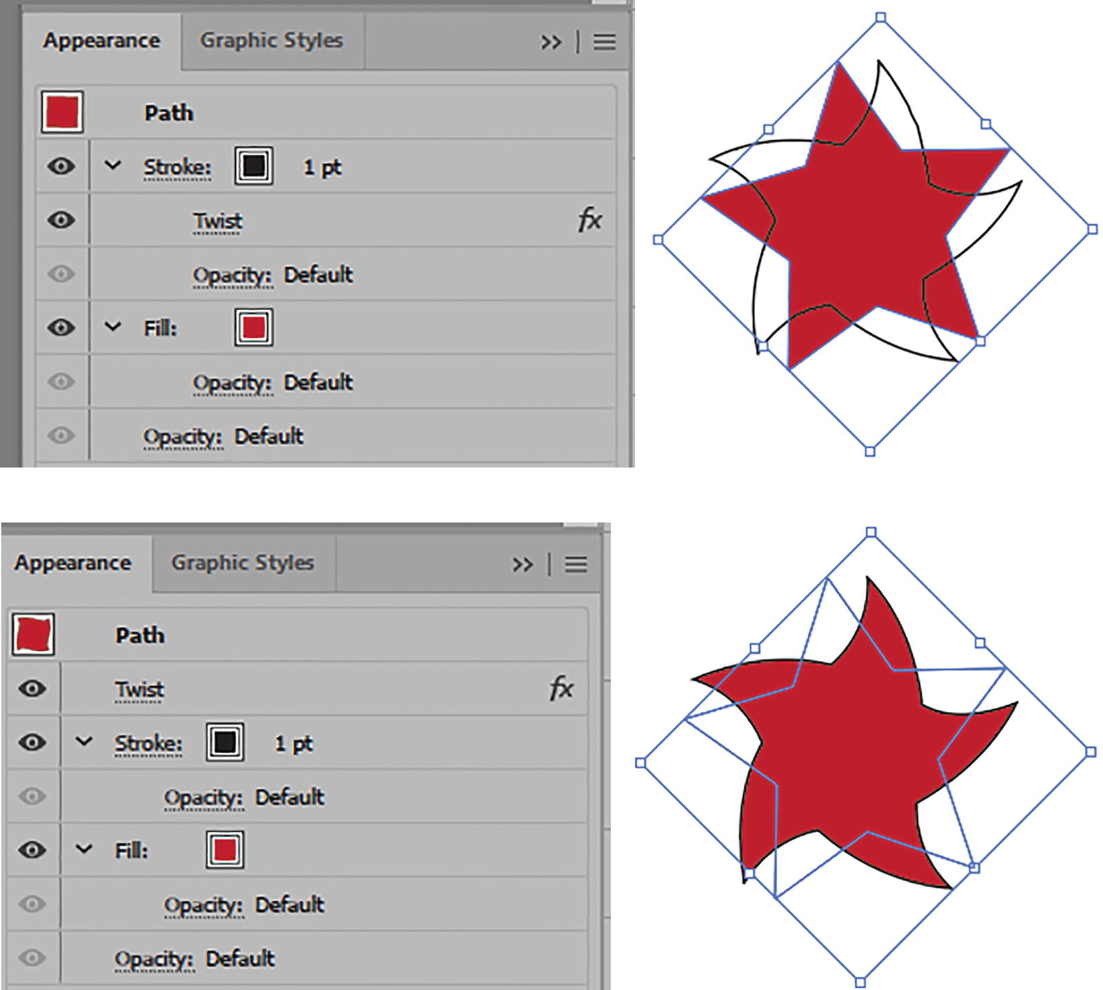
Appearance panel with Twist effect applied to the stroke and above the fill and stroke
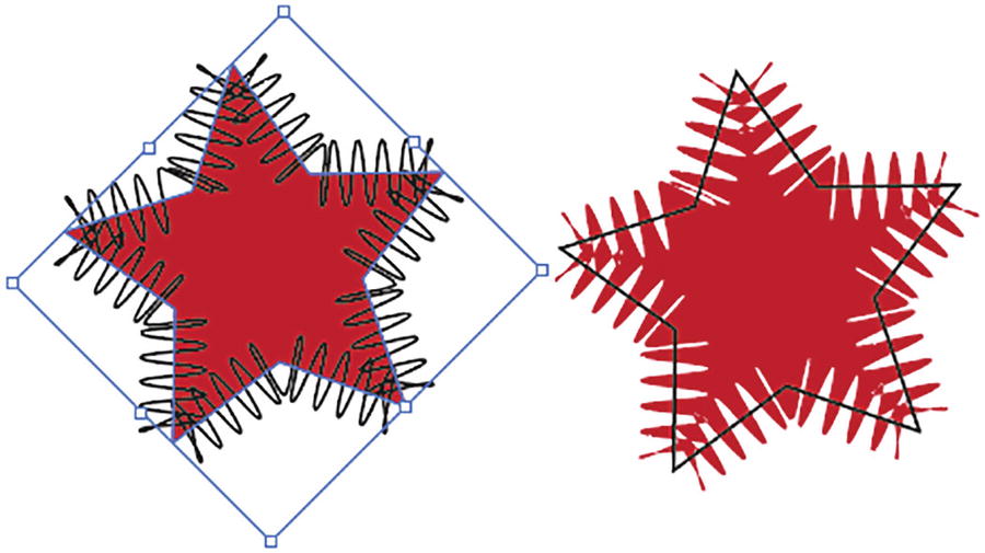
Zig Zag
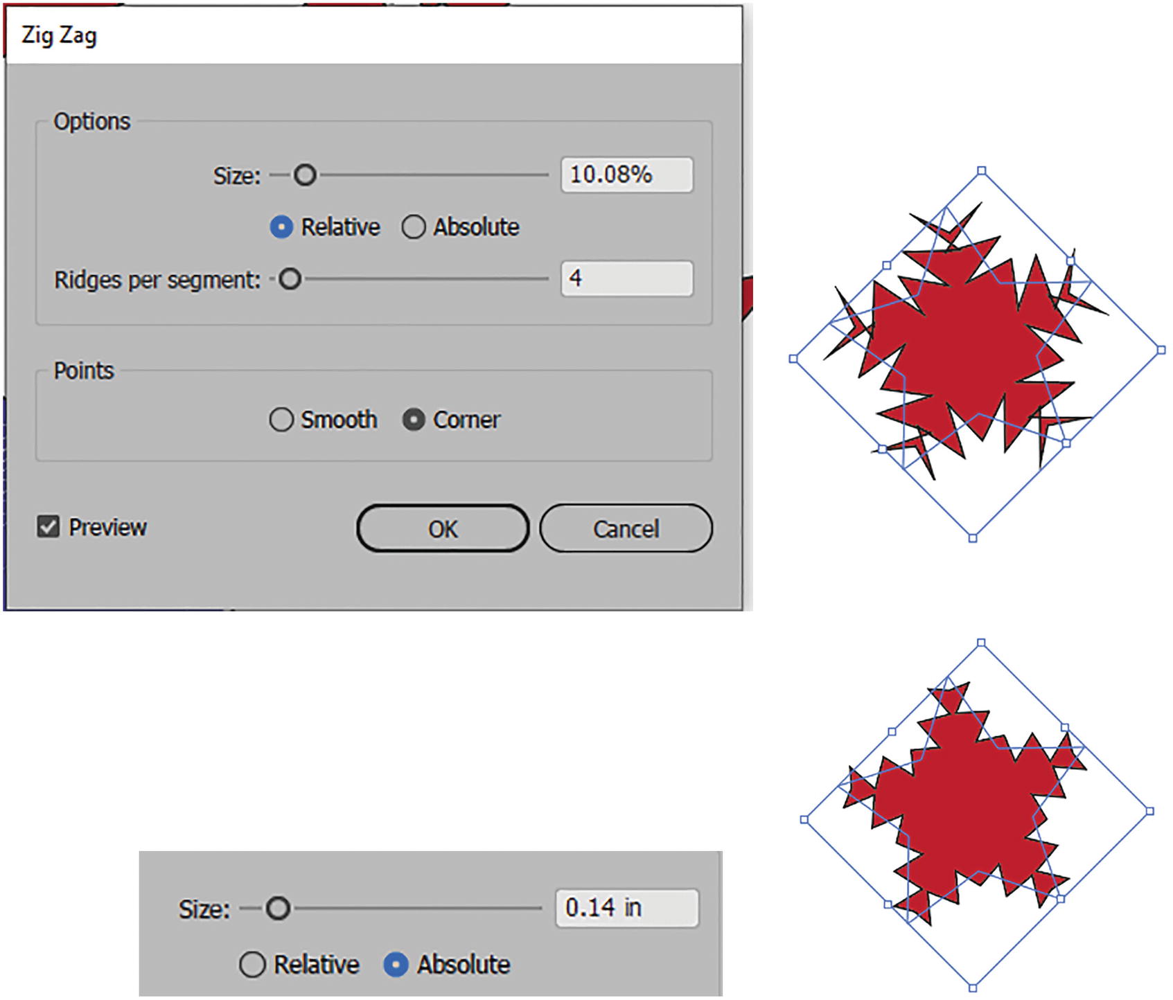
Zig Zag dialog box with previews of Relative and Absolute
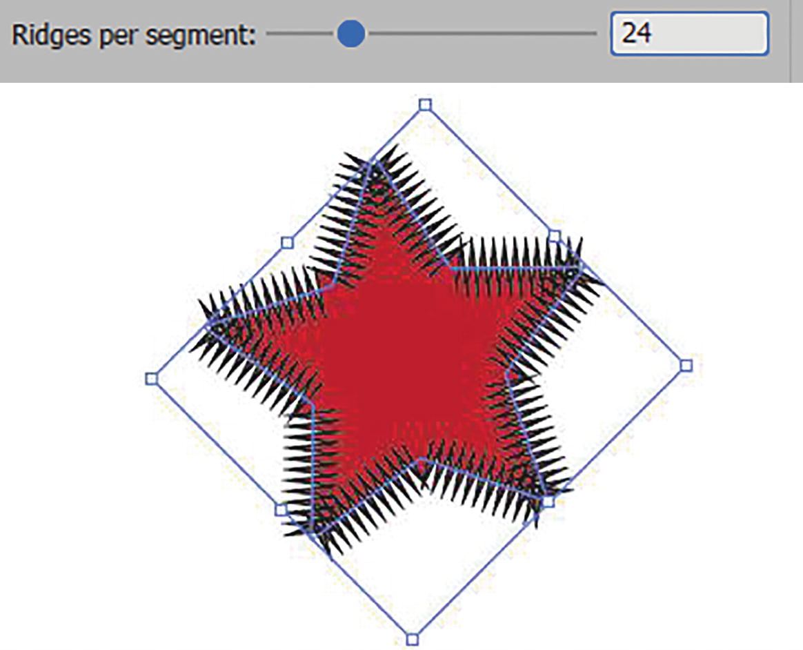
Zig Zag dialog box with preview of Ridges per segment setting

Zig Zag dialog box with preview of Points: Smooth setting
Zig Zag applied only to the stroke and then only to the fill using the Appearance panel
Try moving the zig-zag effect in the Appearance panel to the stroke or fill for a unique design. Refer to Figure 11-30.
Path
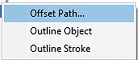
Effect sub-menu for Path
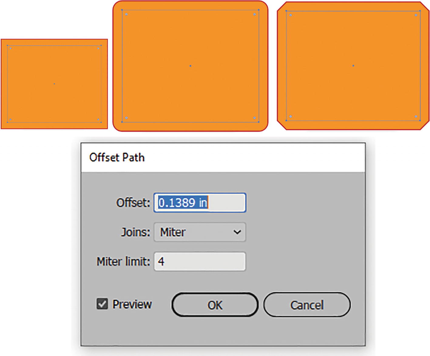
Offset Path dialog box and various joins applied to a rectangle
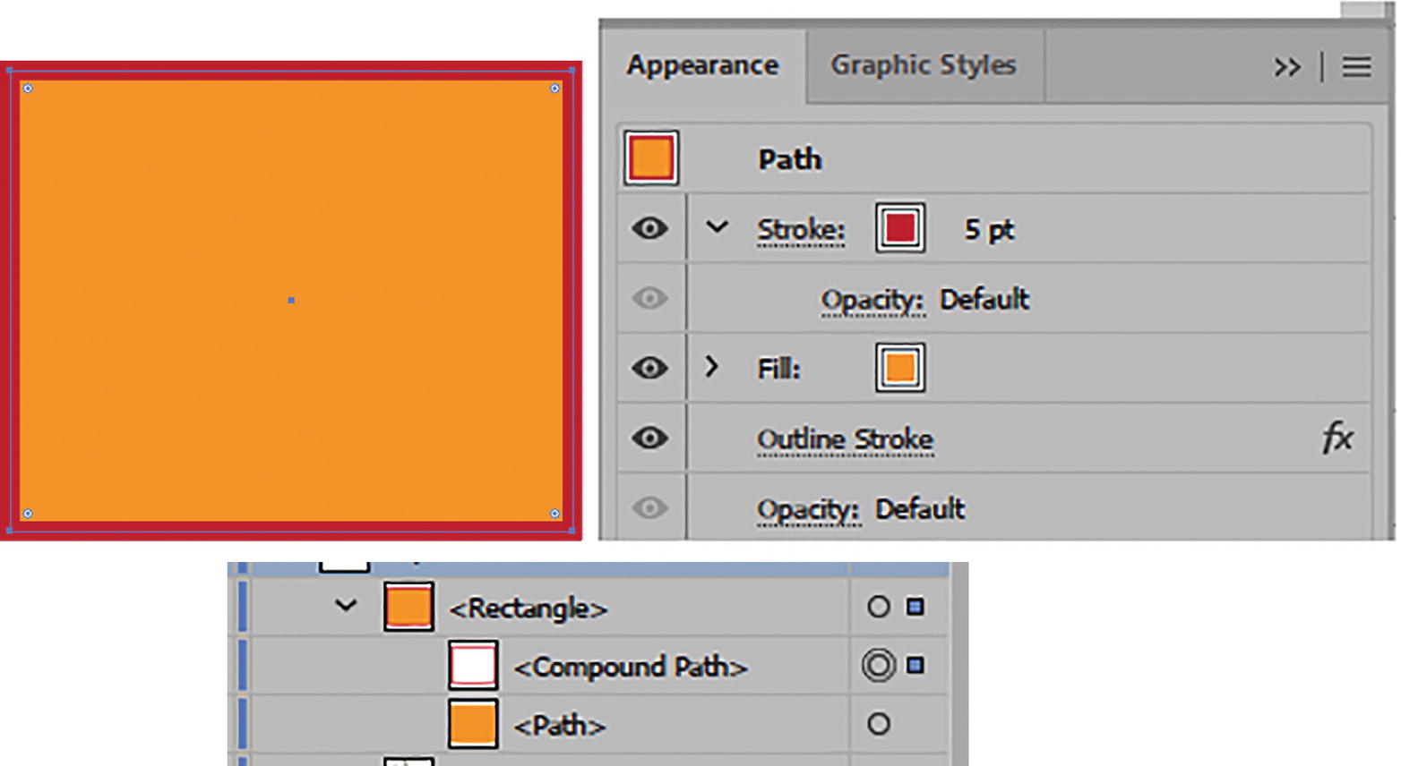
Outline stroke applied to a rectangle in the Appearance panel and then expanded as a compound path, as seen in the Layers panel
Pathfinder
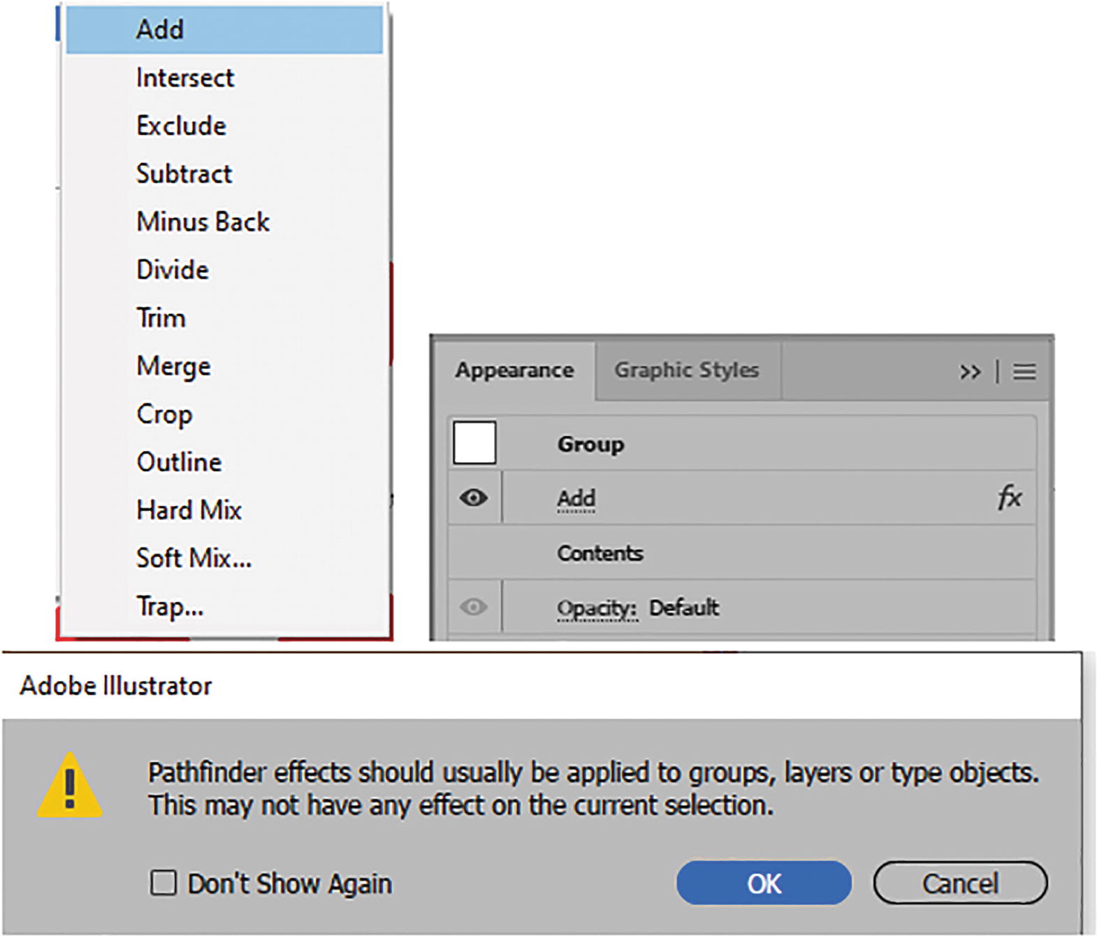
Effect sub-menu for Pathfinder, one of the Pathfinder effects in the Appearance panel, and warning message if the Pathfinder effect is not applied to a group
For examples of these, refer to my file pathfinder2.ai.
Some of the names in the list are a bit different than the ones seen in the Pathfinder panel. For example, Add is the equivalent to Unite, and Subtract is equivalent to Minus Front. Refer to Figure 11-34.
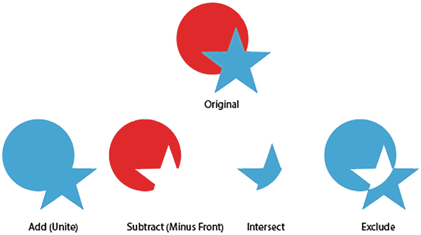
Original group shapes and Pathfinder effects for Add, Subtract, Intersect, and Exclude
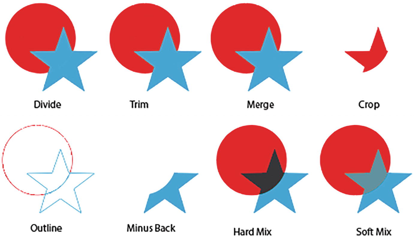
Pathfinder effects on grouped shapes for Divide, Trim, Merge, Crop, Outline, Minus Back, Hard Mix, and Soft Mix

Trap options on grouped shapes
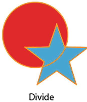
Divide effects can appear different if the grouped shapes have a stroke
Some additional features found here that are not in the Pathfinder panel include Hard Mix, Soft Mix, and Trap. Refer to Figures 11-36 and 11-37.

Appearance panel with Pathfinder effect added, and Pathfinder Options dialog box
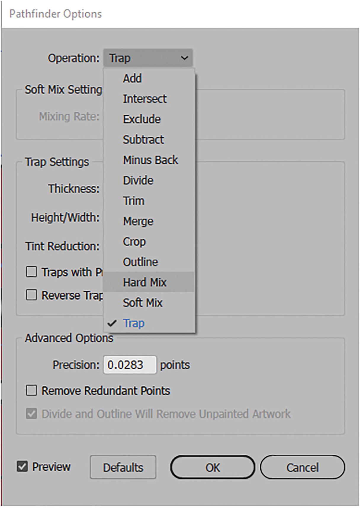
Pathfinder Options dialog box with Trap option selected
Hard Mix and Soft Mix can produce some interesting color effects to type and grouped objects, similar to blending modes, and if you want to know more about these Pathfinder settings make sure to review my file and this link: https://helpx.adobe.com/illustrator/using/combining-objects.html.
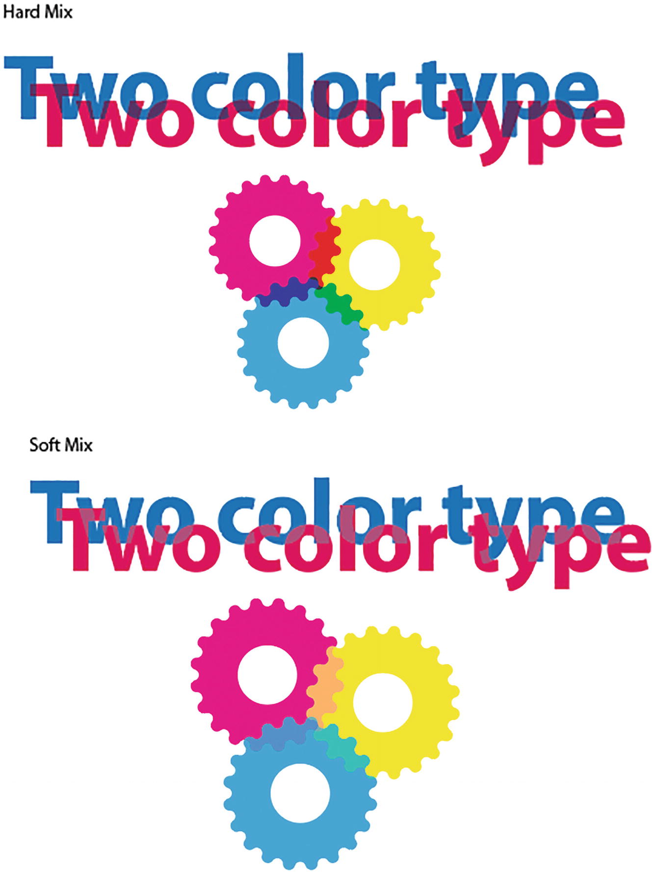
How Hard Mix and Soft Mix Pathfinder effects appear on type and logos
The Trap setting is more for print to resolve color issues of gaps when printing certain color combinations and is not relevant to this book. The trap is so small it will not create much of a visual effect in these examples. Refer to Figure 11-37.
Once you exit the dialog box, click OK or Cancel. Refer to Figure 11-40.
Rasterize

Rasterize dialog box, and preview of effect on a vector pattern
You can set additional settings for the color models CMYK, Grayscale, and Bitmap.
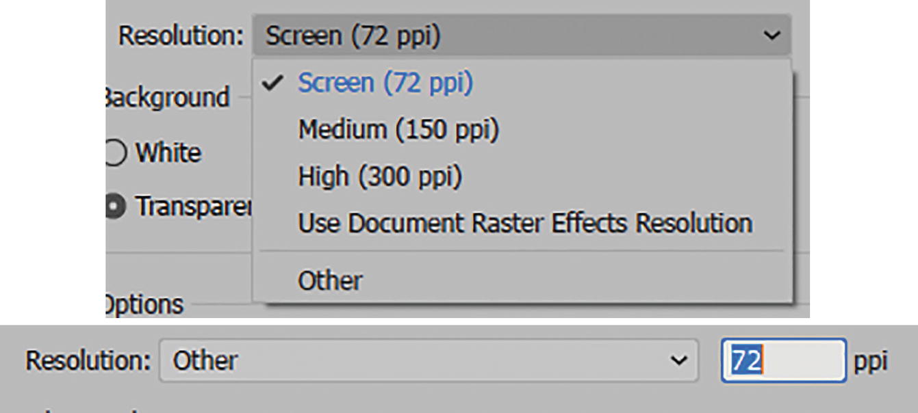
Raster dialog box setting a custom resolution
The background can be set to White or Transparent. Refer to Figure 11-42.
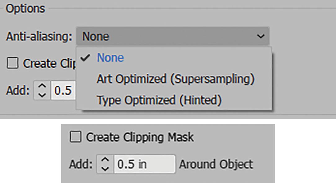
Raster dialog box options for anti-aliasing and adding space around object
You can create a clipping mask and add some white space around the object. The white space will be visible if you disabled Create Clipping Mask. This will not be completely apparent unless you use Object ➤ Expand Appearance.
Click OK to confirm settings or Cancel to exit the dialog box. Refer to Figure 11-42.
Stylize
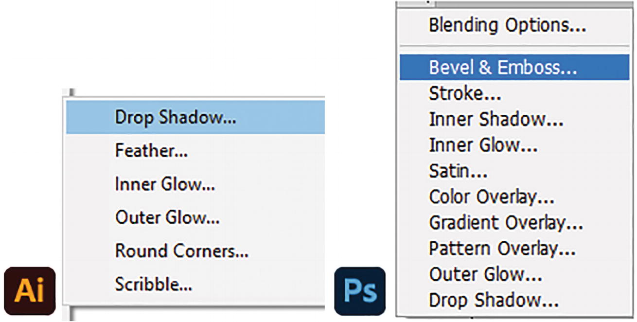
Effect sub-menu for Stylize in Illustrator, and the Layer Style options in Photoshop for comparison
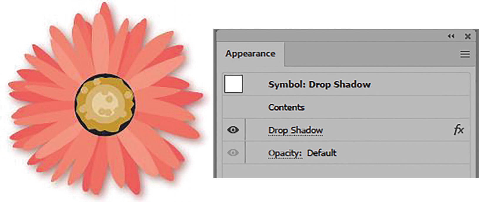
Drop Shadow
Feather
Inner Glow
Outer Glow
Drop Shadow

Preview of Drop Shadow effect on star, Drop Shadow dialog box, and blending mode options
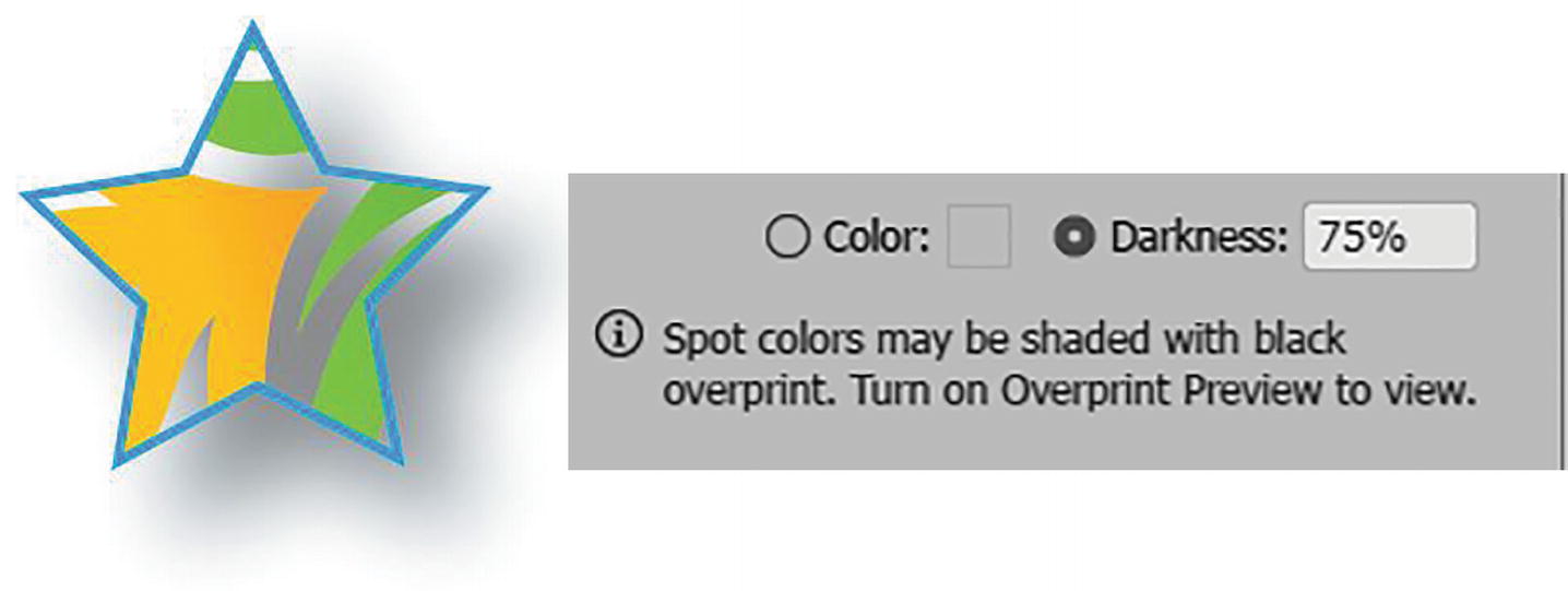
Preview of Drop Shadow effect on star with darkness option
Click OK to commit your settings and exit the dialog box. Refer to Figure 11-46.
Feather

Preview of Feather effect on star, with Feather dialog box
Click OK to commit your settings and exit the dialog box. Refer to Figure 11-48.
Inner Glow

Preview of Inner Glow effect on star, with Inner Glow dialog box

Preview of Inner Glow effect on star, with glow set to center
Use the Inner Glow dialog box when you want to create an inner shadow, as there is no specific effect for this, but set the mode to Multiply and color to Black rather than Screen mode and Color: White. Refer to Figure 11-51.

Preview of Inner Glow effect on star, changed to black for a shadow with Inner Glow dialog box
Click OK to commit your settings and exit the dialog box. Refer to Figure 11-51.
Outer Glow
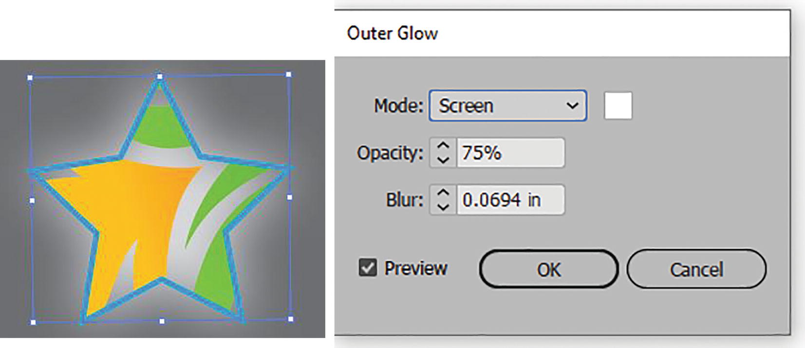
Preview of Outer Glow effect on star on gray background, with Outer Glow dialog box
Additionally, you can set the Opacity (0%–100%) and Level of Blur options.
Click OK to commit your settings and exit the dialog box. Refer to Figure 11-52.
Photoshop Layer Styles and Illustrator Equivalents
Comparison of Photoshop Layer Styles and Illustrator Effects
Photoshop Layer Style | Illustrator Equivalent or Similar Effects on Paths, Shapes, and Type |
|---|---|
Blending Options | Use your Transparency panel and Blending Mode options. Refer to Chapter 8. |
Bevel & Emboss (Contour & Texture) | Effects ➤ 3D & Materials ➤ Extrude & Bevel. Refer to Chapter 13. Use Gradients panel for stroke. Refer to Chapter 8. Some SVG filters. Refer to next section. |
Stroke | Toolbars panel with Control panel to alter stroke and colors from Swatches panel. Or use the Appearance panel. |
Inner Shadow | Effect ➤ Stylize ➤ Inner Glow, but change the color to black and adjust the blending mode. |
Inner Glow | Effect ➤ Stylize ➤ Inner Glow. |
Satin | Effect ➤ Stylize ➤ Feather for a simple feather. Use the Gradient Mesh tool or a freeform gradient for more complex satin. Refer to Chapter 8. |
Color Overlay | Toolbars panel with Control panel to alter fill and colors from Swatches panel. Use Appearance panel as well as the Transparency panel and adjust opacity and blending mode. See Chapter 8. |
Gradient Overlay | Toolbars panel with Control panel to alter fill and gradients from Swatches panel. Use Appearance panel as well as the Transparency panel and adjust opacity and blending mode. See Chapter 8. |
Pattern Overlay | Toolbars panel with Control panel to alter fill and patterns from Swatches panel. Use Appearance panel as well as the Transparency panel and adjust opacity and blending mode. See Chapter 8. |
Outer Glow | Effect ➤ Stylize ➤ Outer Glow. |
Drop Shadow | Effect ➤ Stylize ➤ Drop Shadow, or use some SVG filters. |
Other effects in the Stylize menu that you will find are Round Corners and Scribble.
Round Corners

Star selected and Round Corner effect from the dialog box applied
Scribble
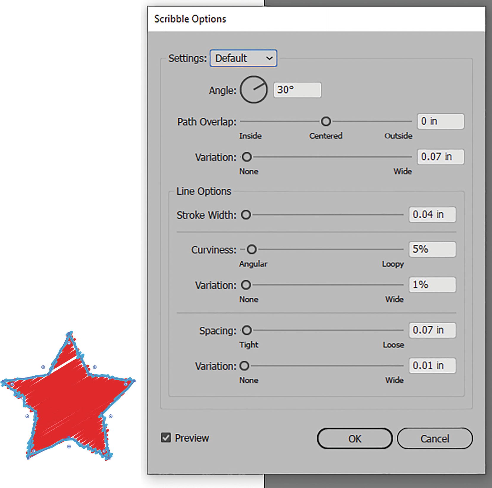
Star selected and Scribble effect from the dialog box options applied
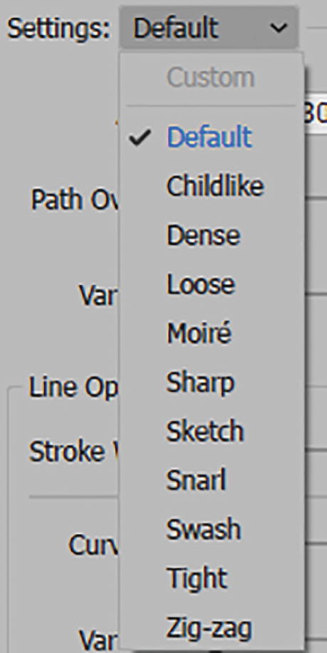
Scribble Options dialog box, Settings list

Scribble Options dialog box, with preview of a setting of Snarl on the star
To create a custom setting, you can alter the angle (0°–360°). The angle can be negative or positive.
Path Overlap moves the slider from Centered (0) to Inside (-13.89 in–0 in) or Outside (0 in – 13.89 in).
Set the Variation slider from None to Wide (0 in–13.89 in).
Set the Line Options: Stroke Width (0 in–13.89 in).
Change Curviness setting from Angular to Loopy (0%–100%) and Variation from None to Wide (0%–100%).
Change Spacing from Tight to Loose (0 in–13.89 in) and its Variation from None to Wide (0 in–13.89 in). Refer to Figure 11-56.
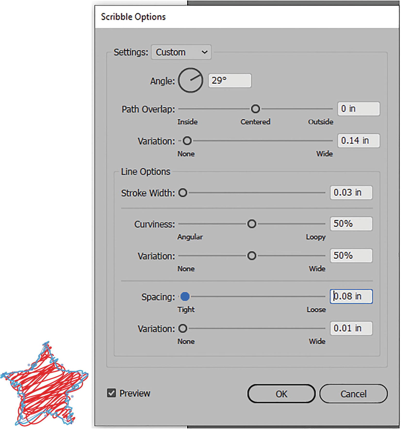
Scribble Options dialog box with a setting of Custom on the star previewed
Click OK to commit the settings and exit the dialog box. Refer to Figure 11-57.
SVG Filters (Scalable Vector Graphics)
Many of these filters can be used one at a time but have no additional dialog box settings that you can see at first, so as a beginner you must use them at their default settings. SVG is ideal if you plan to build SVG graphics for the web that you want to scale for viewers with different screen sizes and resolutions. These kinds of filters can be scaled for the web and still retain quality. See https://helpx.adobe.com/illustrator/using/svg.html.
However, they can be used in any AI file, even if you are not planning to use them for a website.
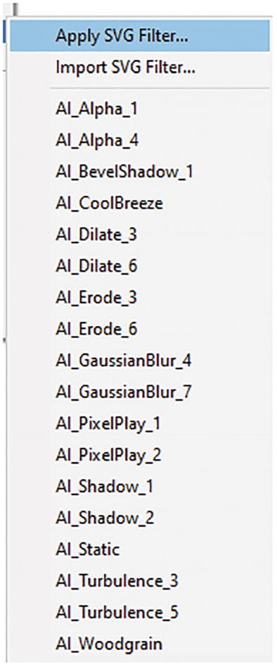
Effect sub-menu for SVG filters
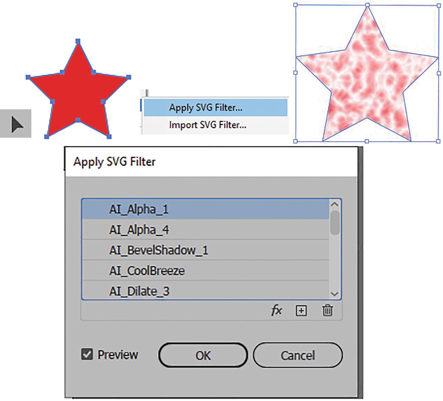
Star selected with Selection tool and Apply SVG Filter chosen; previewing effects in the Apply SVG Filter dialog box with first filter AI_Alpha_1 applied
To edit, you must understand SVG coding, and to access that coding you need to, in this case, click on the FX button while the filter is selected. Refer to Figure 11-59.
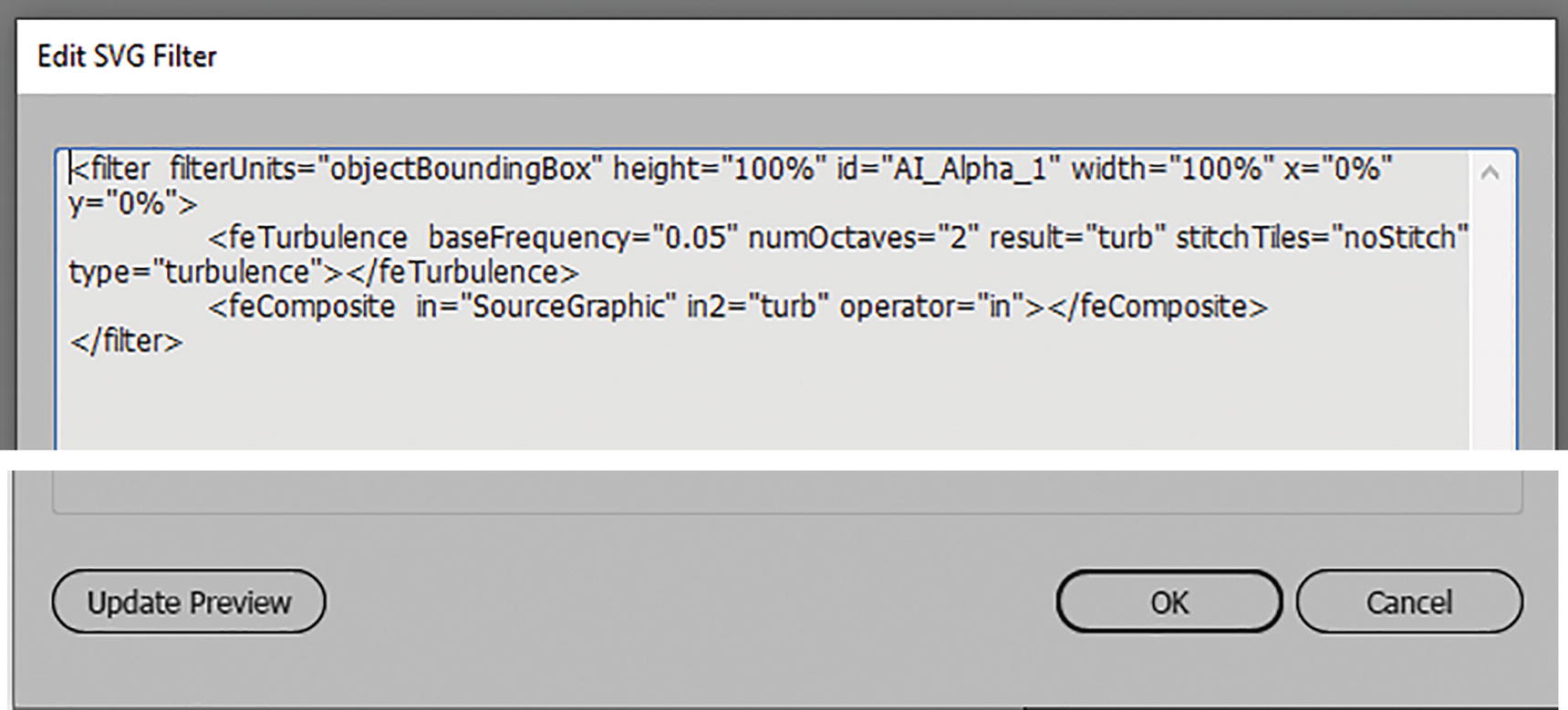
Edit SVG Filter dialog box
In this case, just click Cancel to exit.
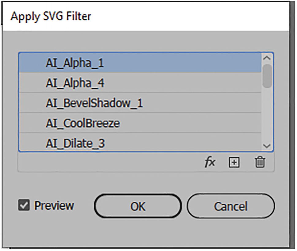
Apply SVG Filter dialog box
When you have selected the filter you want, click OK to commit. Refer to Figure 11-61.
You can also import additional SVG filters that other users have created, and these can be accessed from files on your desktop.
Later in the chapter, I will show you where in the Adobe Creative Cloud desktop you can look to find additional effects.
Warp
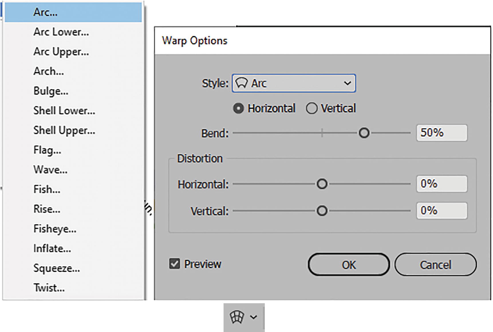
Effect sub-menu for Warp, and Warp Options dialog box, and Envelope Distort option in Control panel
In this case, when an object or text is selected and one of the Warp effects is applied from the list or dialog box, there is no real difference other than that the effects are live and you do not have to rely on an envelope mesh to create the distortion. You could try this as an alternative to warping the text on the clown poster in Chapter 10.
Applying warp effect options and editing using the Appearance panel
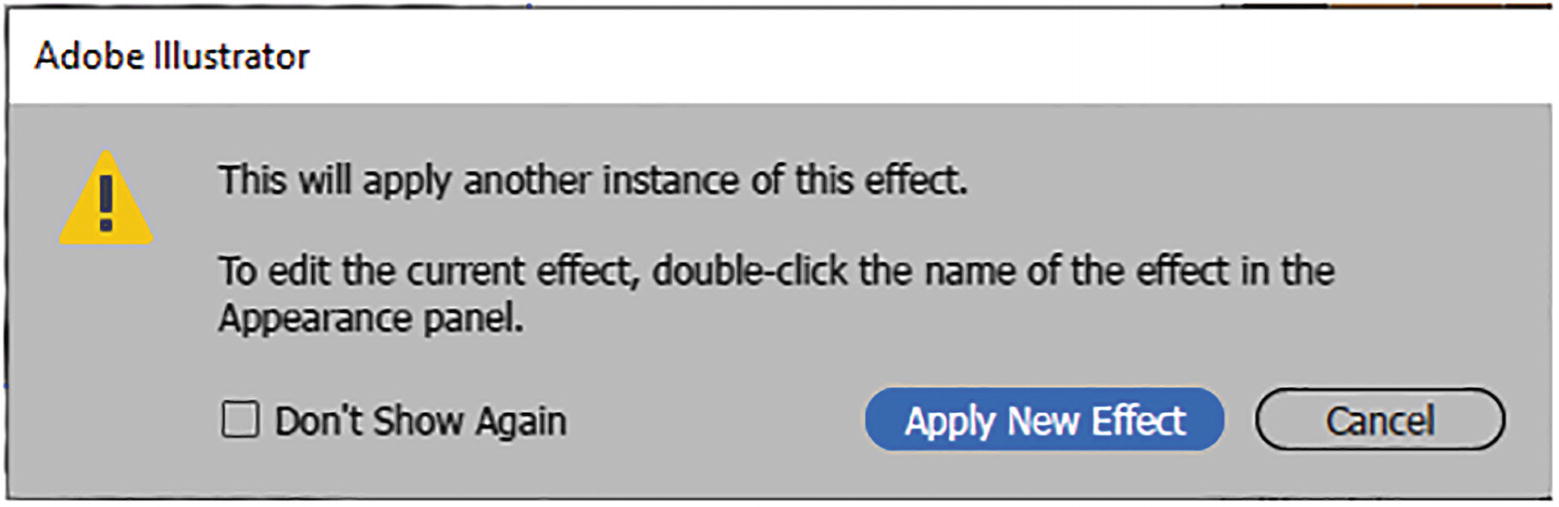
Alert message when certain effects are applied twice
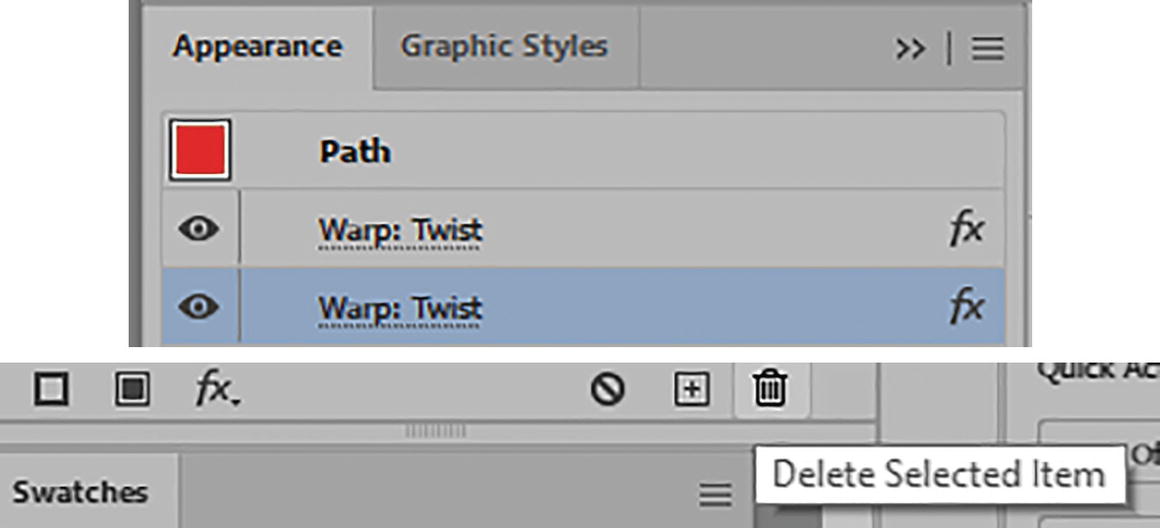
Appearance panel with the duplicate warp selected, and then Delete Selected Item icon is clicked to remove
Applying Effects Again
In other situations, you may want to apply effects again.
Effect menu option to apply the same effect again
For either choice, you may see the warning alert first before the effect is applied or you enter the dialog box. Refer to Figure 11-64.
Applying Different Multiple Effects and Editing Objects

Use the Appearance panel to apply more than one effect to a selected path
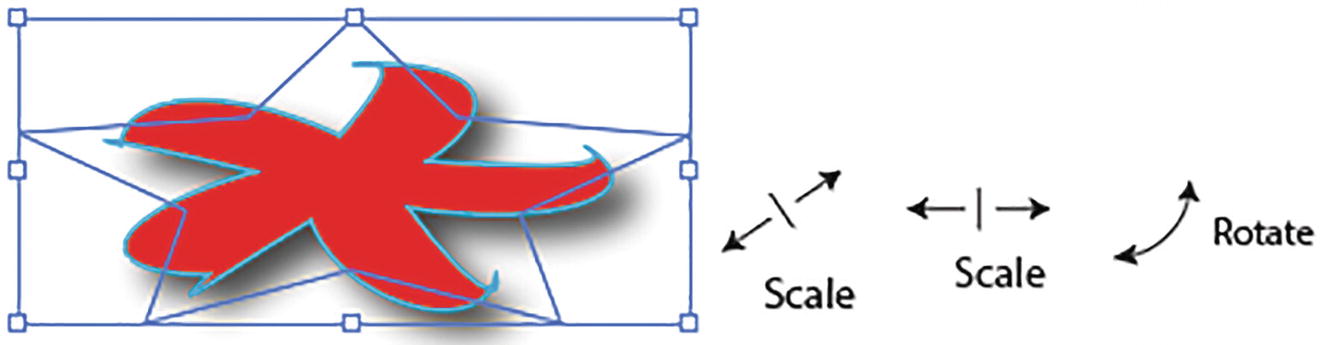
Afterward, scale and rotate your selected path with the bounding box handles
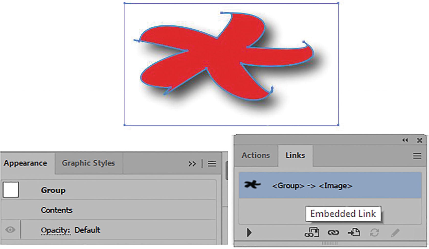
An expanded group shape in the Appearance panel and embedded shadow image in Window ➤ Links panel
You can use Edit ➤ Undo right away if you want the effect to remain live.
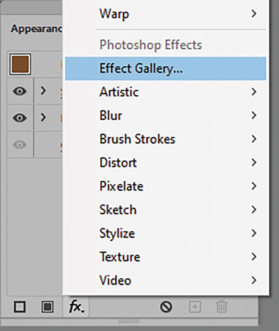
Effect ➤ Photoshop Effects
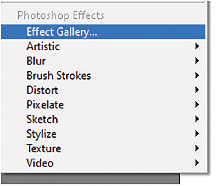
Effect menu section for Photoshop effects
If you are working with File ➤ Place Linked or Embedded Graphics within an Illustrator document, check the Window ➤ Links panel to confirm this. Then you would need to check in the Effects panel before you apply Photoshop effects to see what the current Document Raster Effects Settings are in its dialog box. Refer to Figure 11-71 and Figure 11-72.
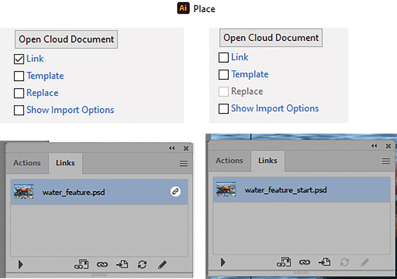
After you place a raster image you can use the Links panel to determine whether it is linked or embedded in the Illustrator document

Effect menu Document Raster Effects Settings dialog box
Changing these settings will break the link with the graphic styles that are applied to the images. In addition, changing these settings may affect the appearance of currently applied raster effects.
However, because we are working with vector objects in Illustrator in this chapter, you can ignore this area. Refer to Figure 11-72.
Effect Gallery
Artistic
Brush Strokes
Distort
Sketch
Stylize
Texture
Choosing any effects from these menus will open the filter gallery.
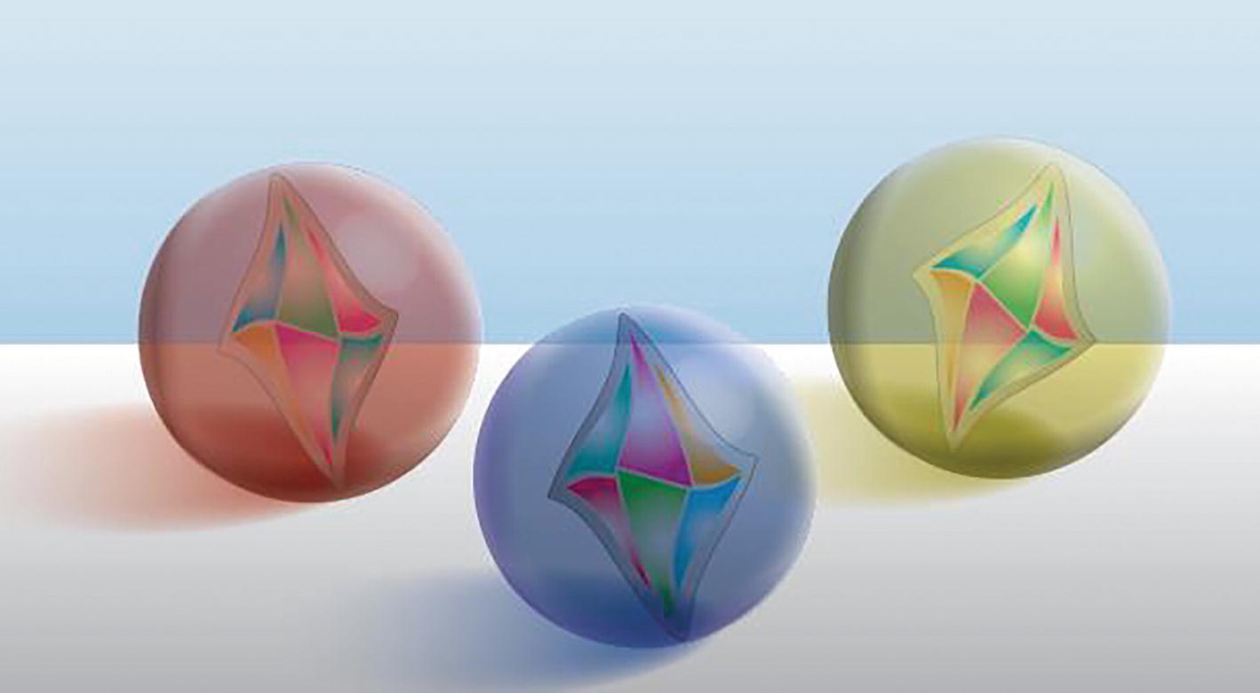
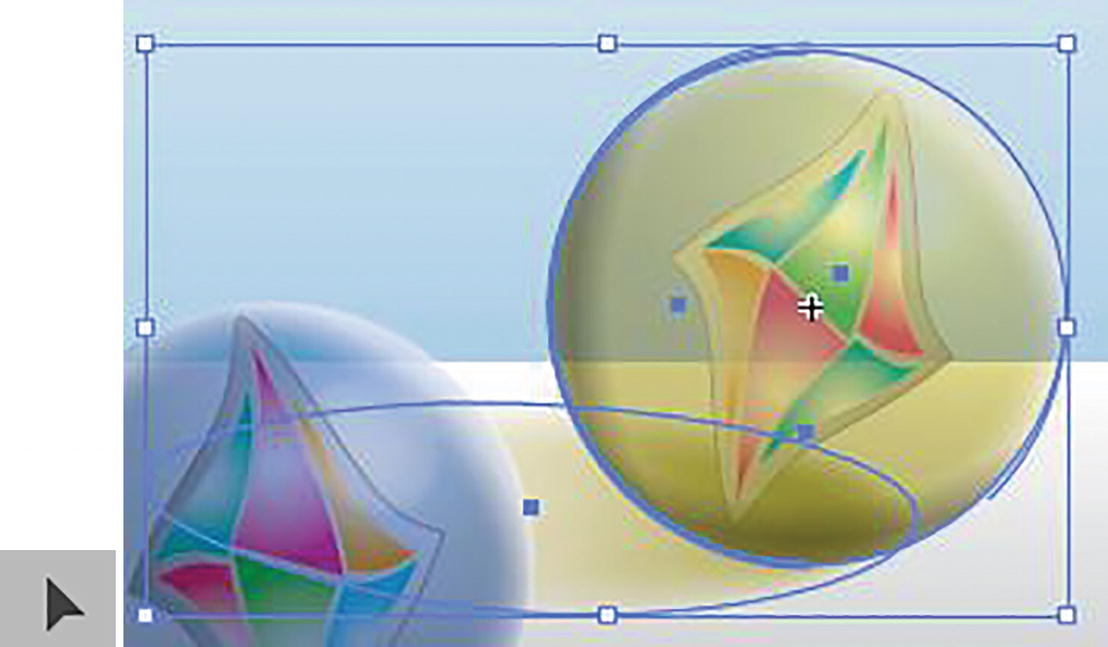
Object paths of illustration of marbles
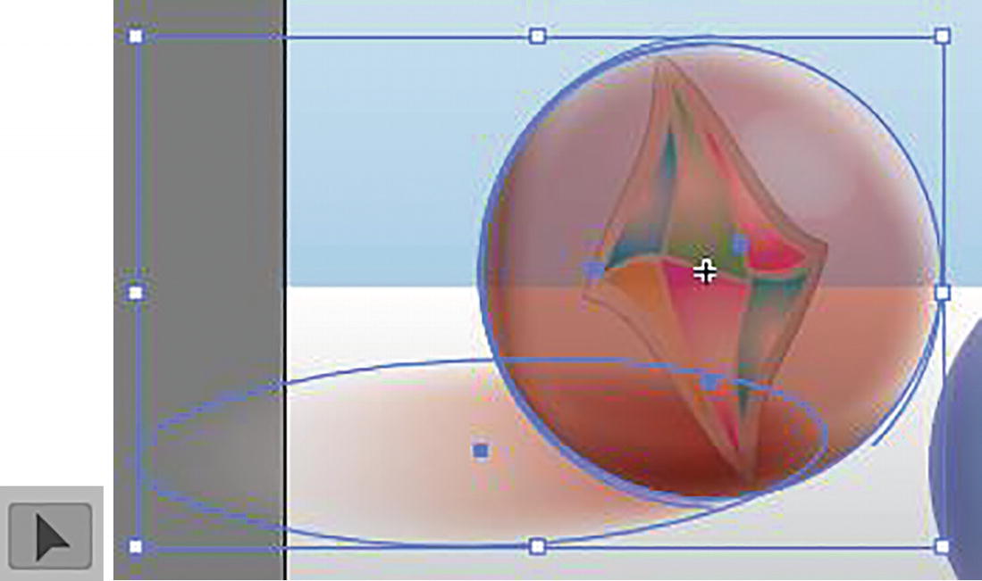
Use the Selection tool to select an object path
Effect Gallery Workspace
I will give a brief tour and show some basic examples.
Navigation area of Effect Gallery Workspace
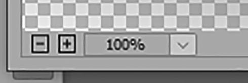
For additional navigation, use the Hand tool to drag your image about on the preview stage. Hold down the Ctrl/CMD key and click to zoom in. Hold down the Alt/Option key and click if you need to zoom out to see the whole image. The key combinations of Ctrl/CMD + + and Ctrl/CMD + - and Ctrl/CMD + 0 (Full Screen) will work as well.
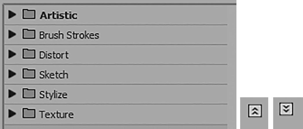
Effect folder options in Effect Gallery Workspace, and Hide/Show folders button
If you need to hide these folders for more room, click on the double arrow in the corner, and then click on it again to show the folders. In this case, you want to see all the folders.
Now, let’s look at some examples in each of the folders.
Artistic Effects

Effect Gallery options for the Artistic folder

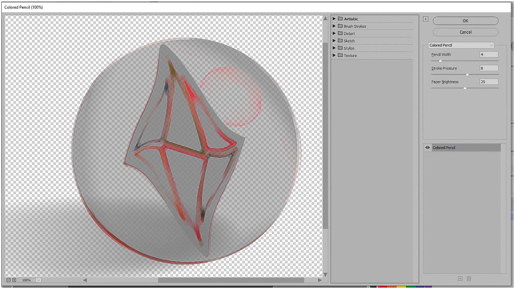
Preview and options in the Effect Gallery for Colored Pencil
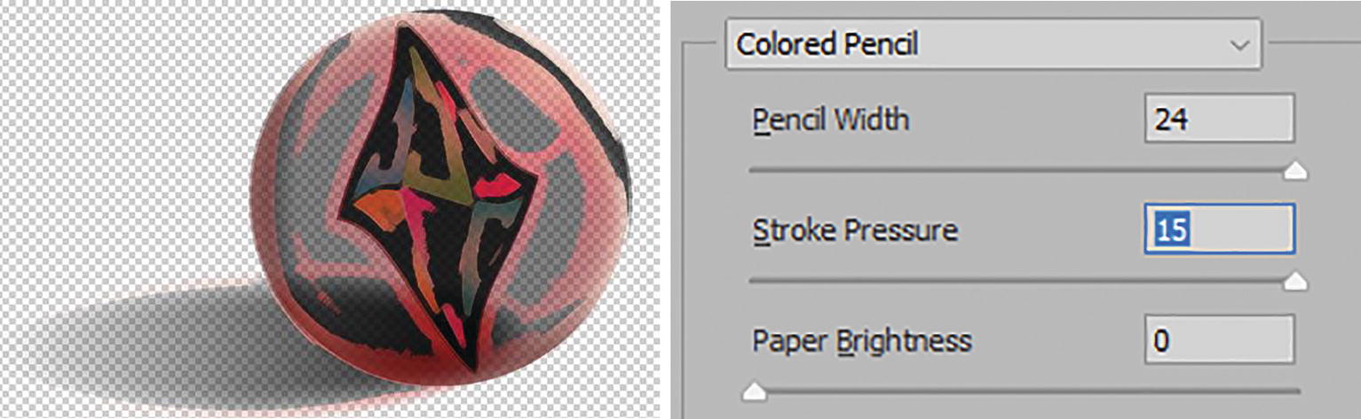
Preview and options in the Effect Gallery for Colored Pencil
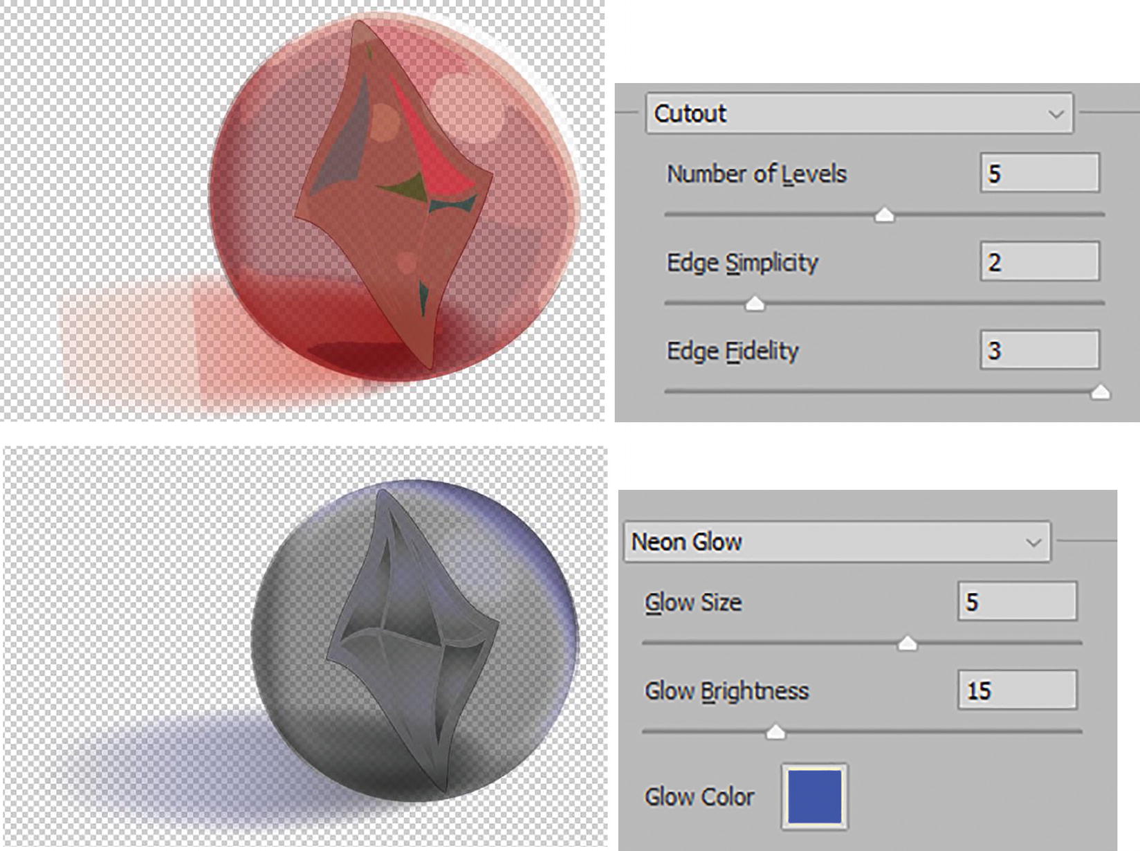
Previews and options in the Effect Gallery for Cutout and Neon Glow
In the case of Neon Glow, however, you can change the glow color from the Workspace using the Color Picker.
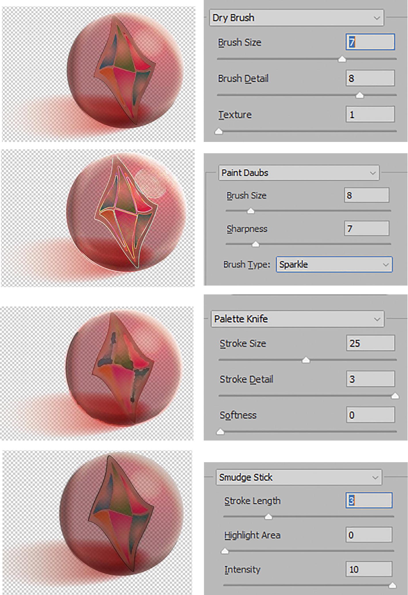
Previews and options in the Effect Gallery for Dry Brush, Paint Daubs, Palette Knife, and Smudge Stick

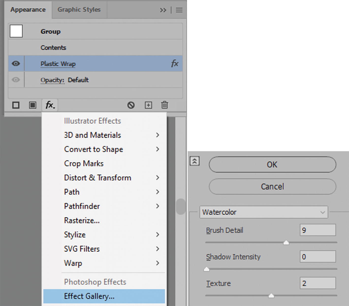
Previews and options in the Effect Gallery for Fresco, Poster Edges, and Watercolor
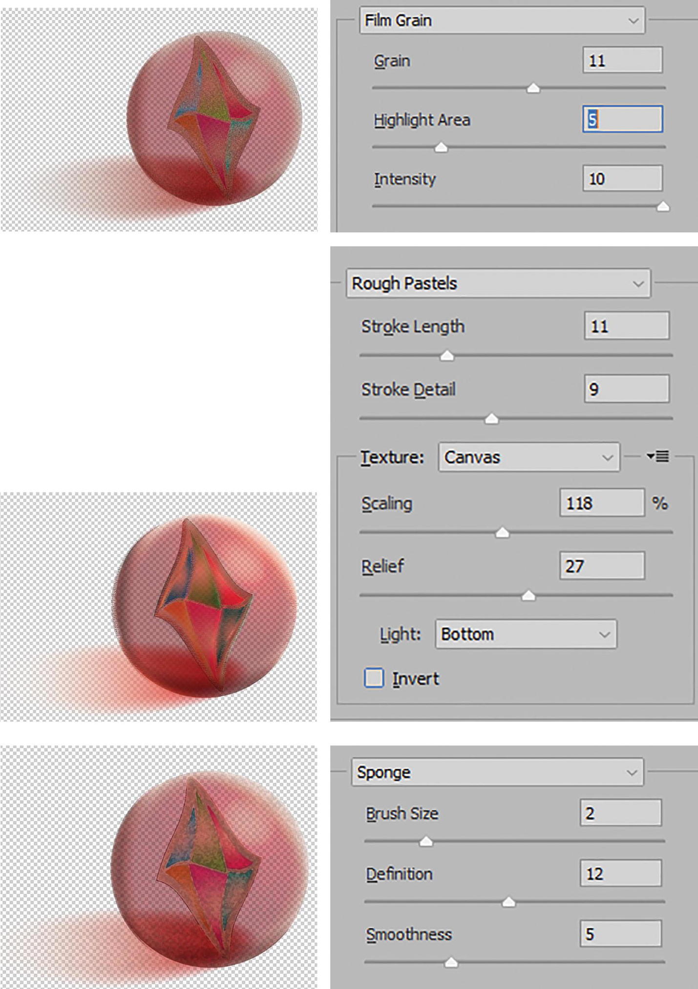
Previews and options in the Effect Gallery for Film Grain, Rough Pastels, and Sponge

Preview and options in the Effect Gallery for Underpainting
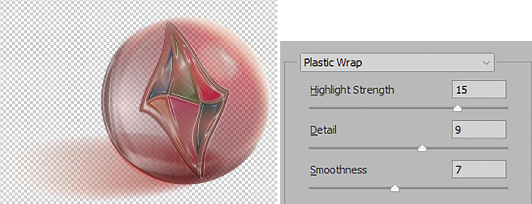
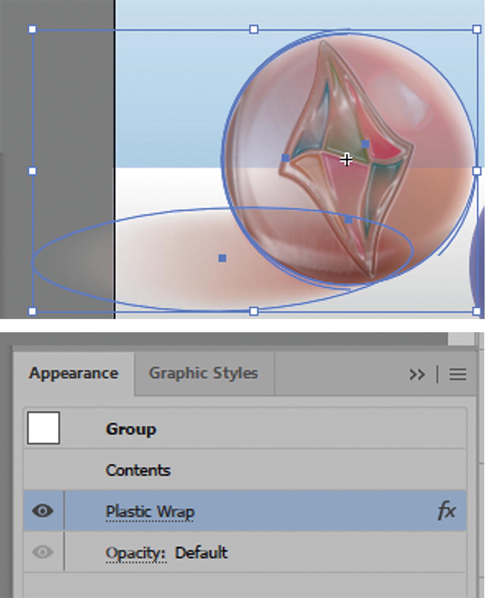
Preview and options in the Effect Gallery for Plastic Wrap
Underpainting and Rough Pastels allow you to not only change the texture but also upload a texture as seen in Photoshop. This custom texture is a grayscale (.psd) file and is often used as a repeating pattern. While not required for this book, if you would like to review how the pattern could be created and used, review Perspective Warps and Distorts with Adobe Tools: Volume 1. In this case, I have supplied a texture file called Pattern4_Texture_r2, which you can locate and load via the texture menu. Refer to Figure 11-87.

Some effects allow you to load custom .psd textures
Brush Strokes Effects
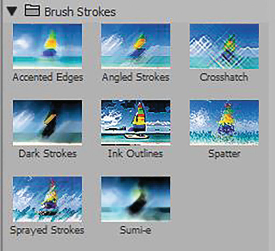
Effect Gallery options for the Brush Strokes folder
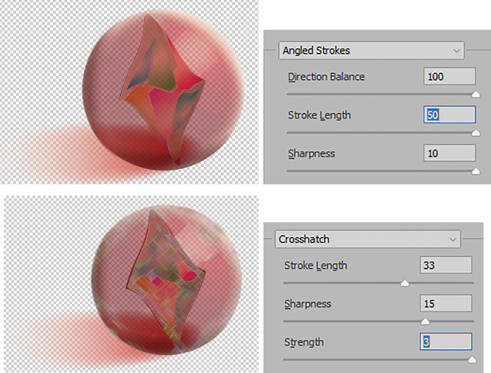
Previews and options in the Effect Gallery for Angled Strokes and Crosshatch
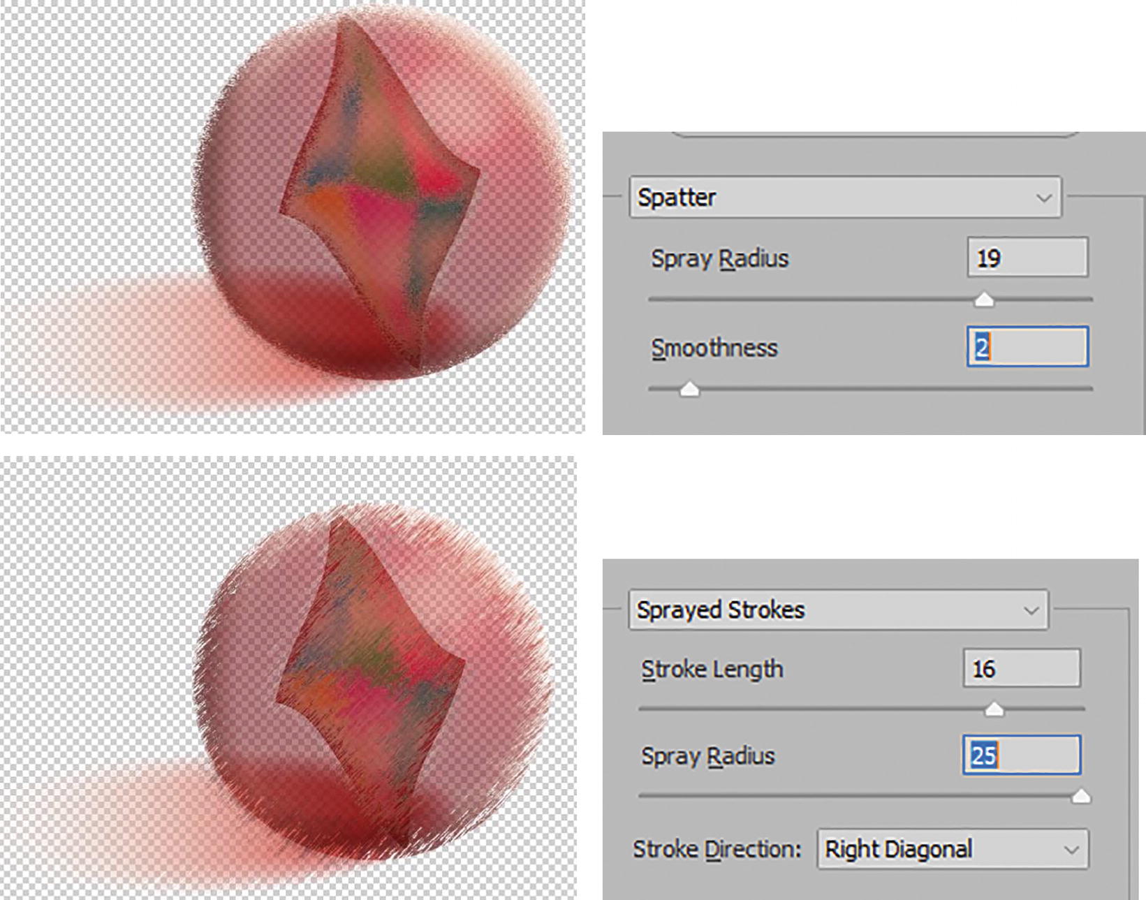
Previews and options in the Effect Gallery for Spatter and Sprayed Stokes
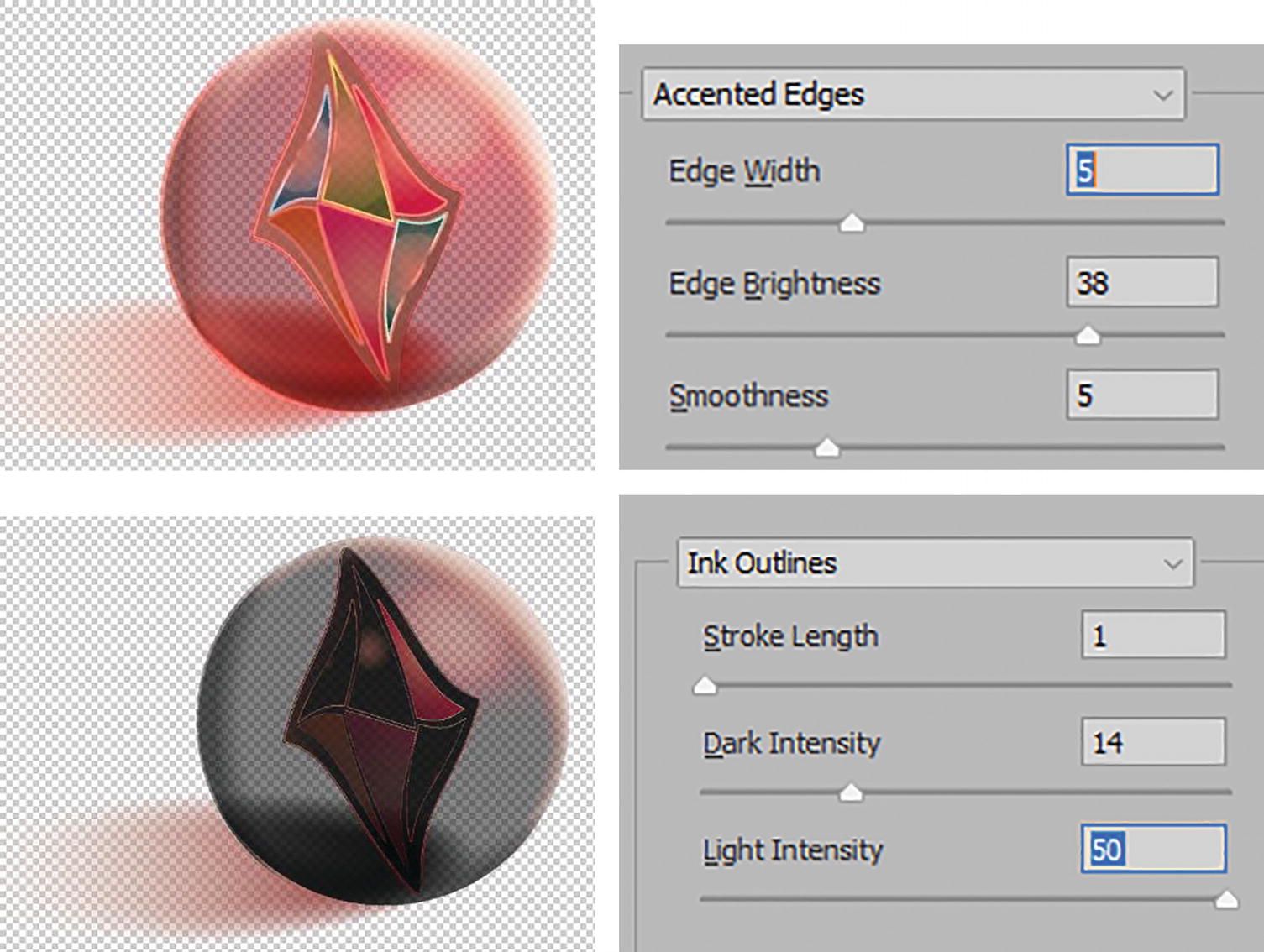
Previews and options in the Effect Gallery for Accented Edges and Ink Outlines
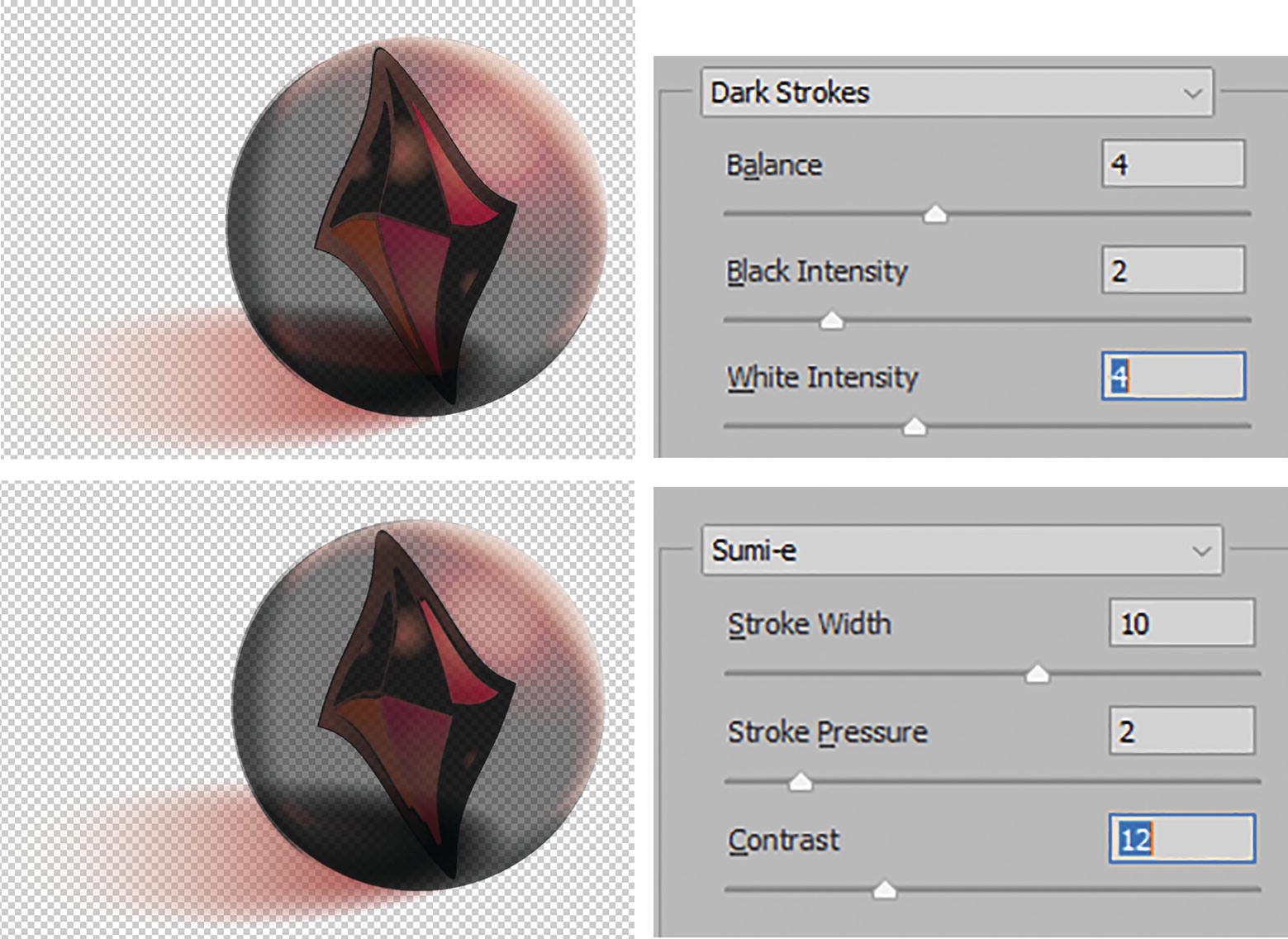
Previews and options in the Effect Gallery for Dark Strokes and Sumi-e
Distort Effects
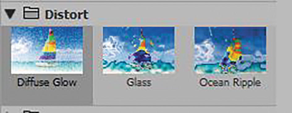
Effect Gallery options for the Distort folder
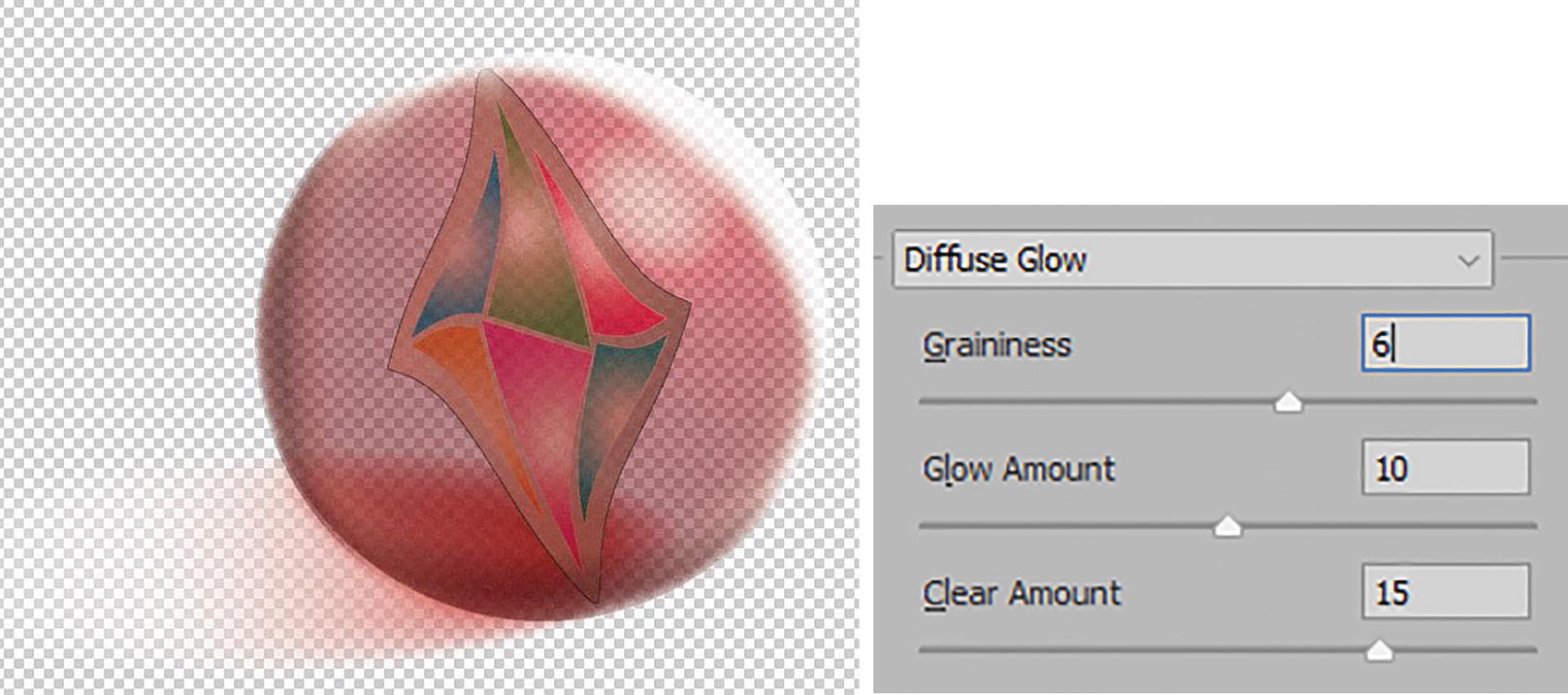
Preview and options in the Effect Gallery for Diffuse Glow
The Glow Amount (0–20) sets how much white or black is added to the image and is based on the current colors in the image, and Clear Amount (0–20) will also set the amount of whiteness. Note: Unlike in Photoshop, there are no foreground or background colors; only fills and strokes of the current object or path set the color.

Preview and options in the Effect Gallery for Glass
You can set the sliders: For Distortion (0–20), the higher the distortion the less visible the image is. Then for Smoothness (1–15), the higher the smoothness the less textured it is. Refer to Figure 11-95.
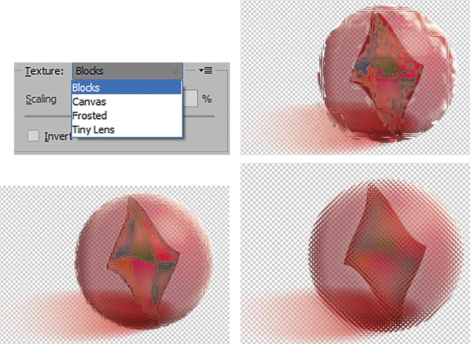
Previews and options in the Effect Gallery for Glass texture
Likewise, you can also load a custom grayscale (.psd) texture.
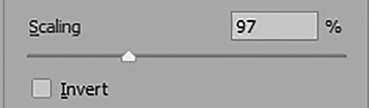
Glass effect Scaling options
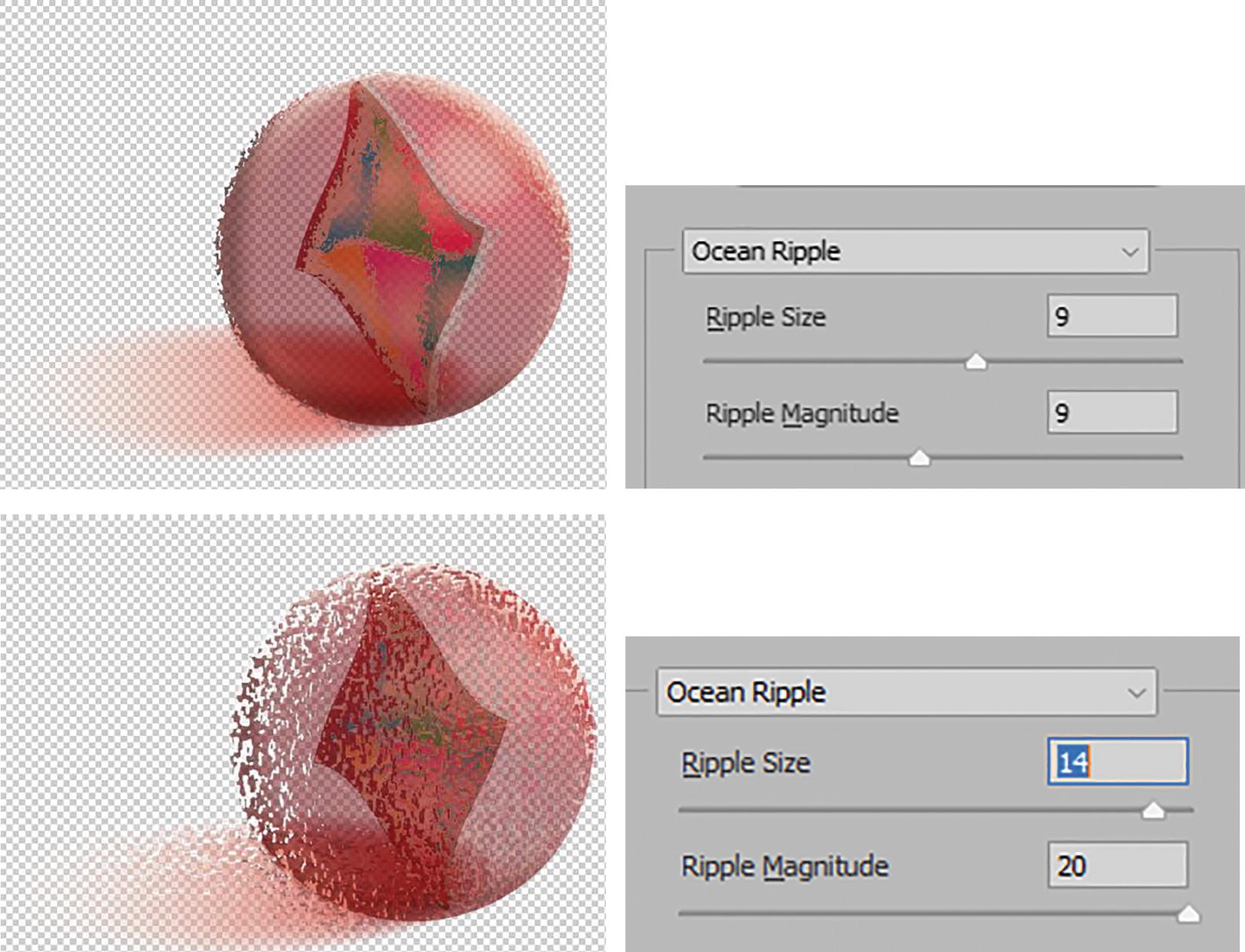
Previews and options in the Effect Gallery for Ocean Ripple
Sketch Effects
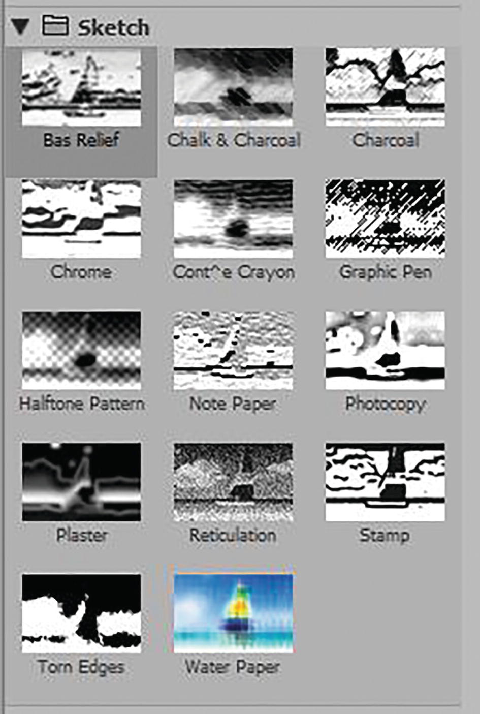
Effect Gallery options for the Sketch Folder
This folder is more for creating black-and-white sketch images.

Previews and options in the Effect Gallery for Bas Relief, Photocopy, and Plaster
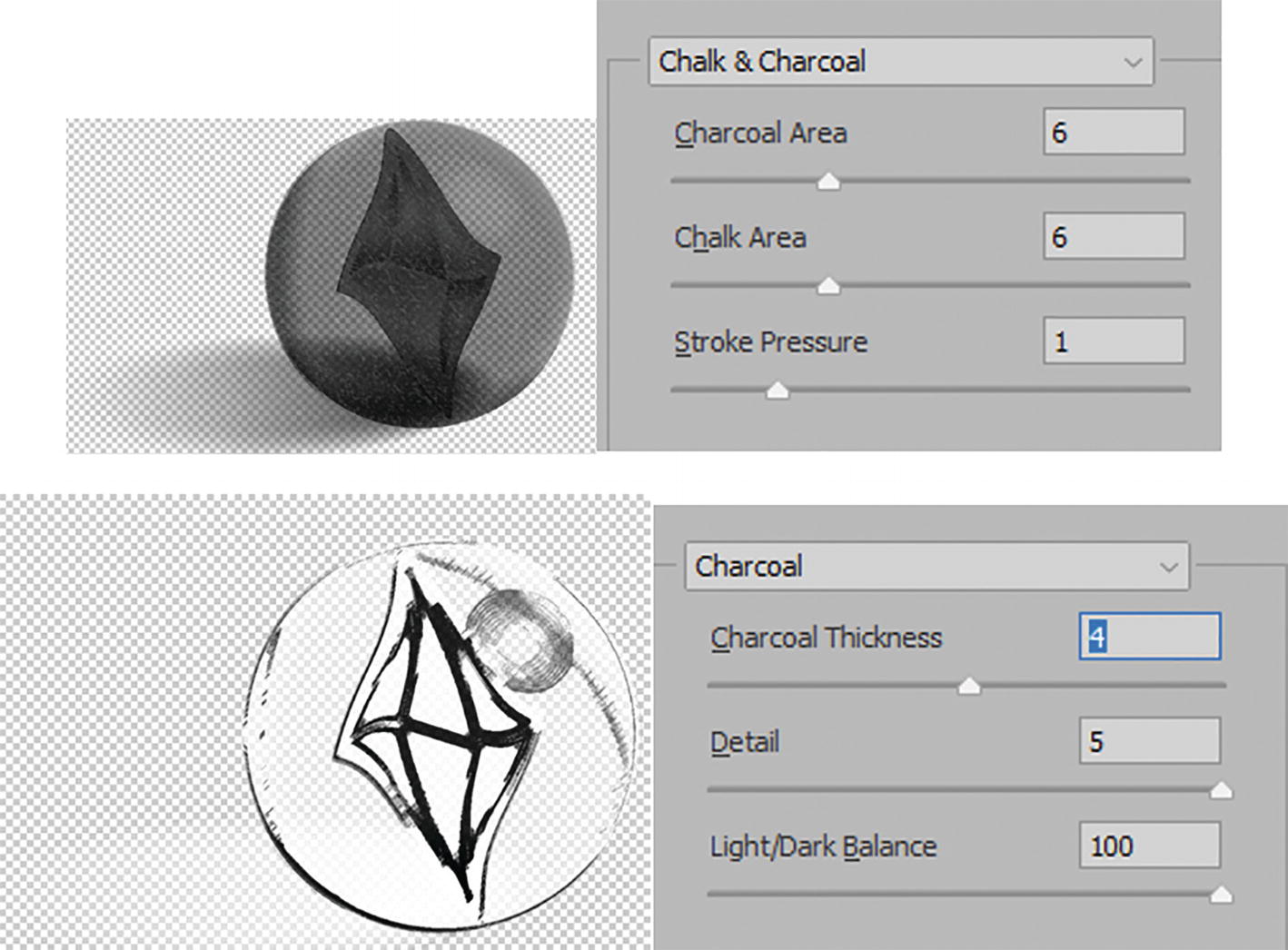
Previews and options in the Effect Gallery for Chalk & Charcoal and Charcoal
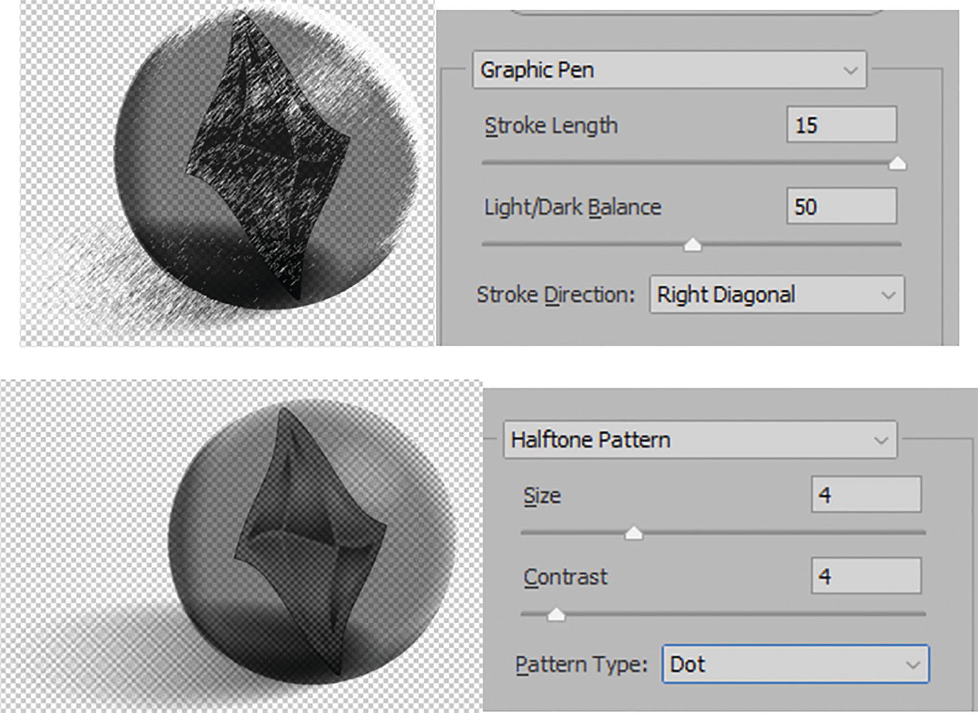
Previews and options in the Effect Gallery for Graphic Pen and Halftone Pattern
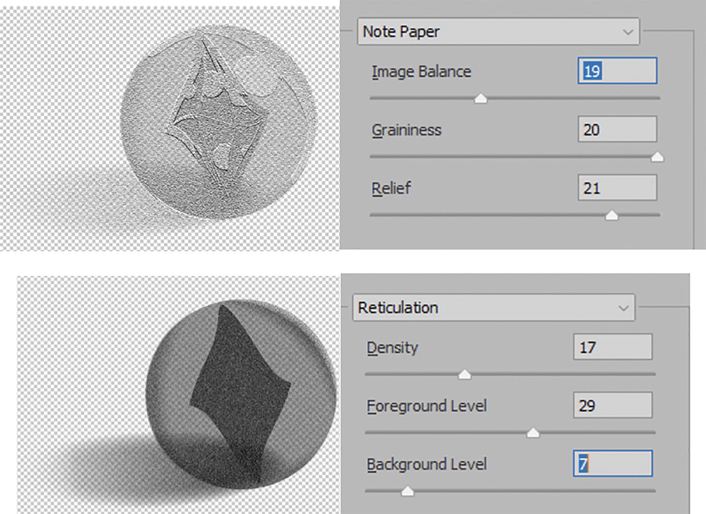
Previews and options in the Effect Gallery for Note Paper and Reticulation
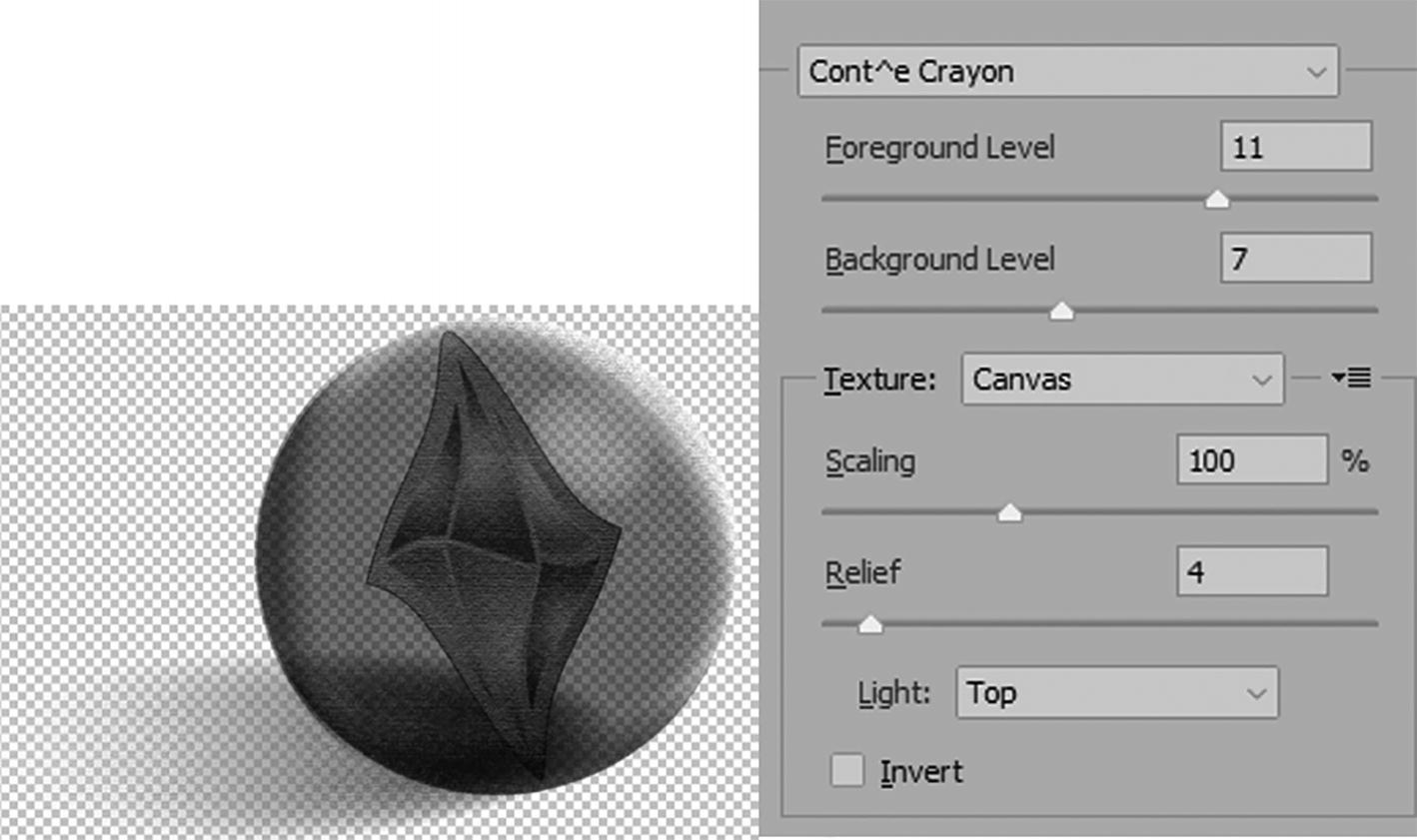
Preview and options in the Effect Gallery for Cont^e Crayon
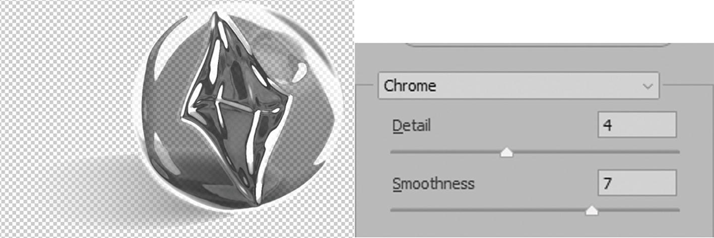
Preview and options in the Effect Gallery for Chrome
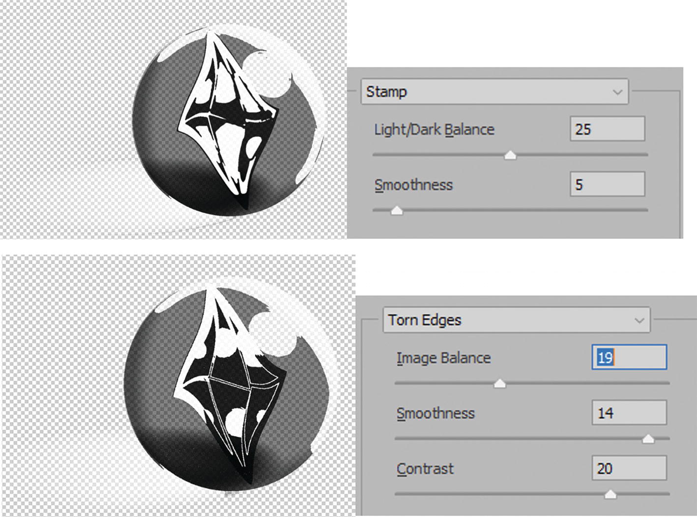
Previews and Options in the Effect Gallery for Stamp and Torn Edges
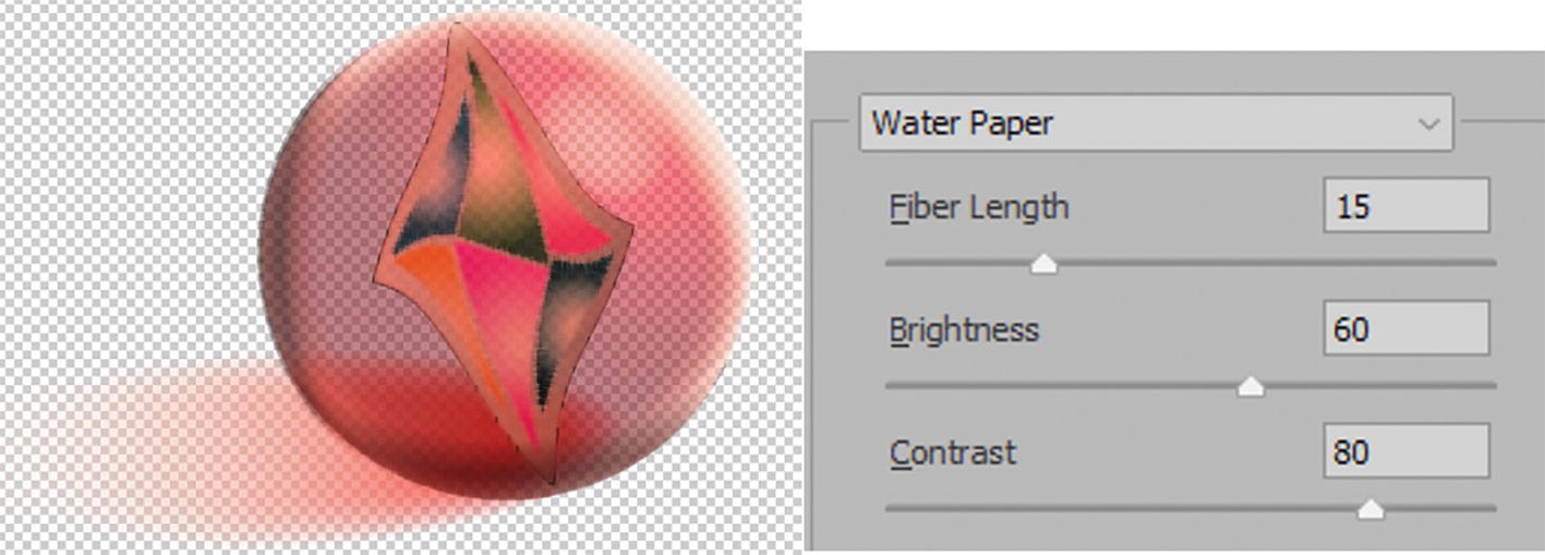
Preview and options in the Effect Gallery for Water Paper
Unlike in Photoshop, these color options are not controlled by the current foreground and background colors, as there are only stroke and fill available in the Toolbars panel. In this case, grayscale options are your only choice, and then you can edit your appearance later with additional fills.
Stylize Effect

Effect Gallery option for the Stylize folder, and previews and options for Glowing Edges
Texture Effect
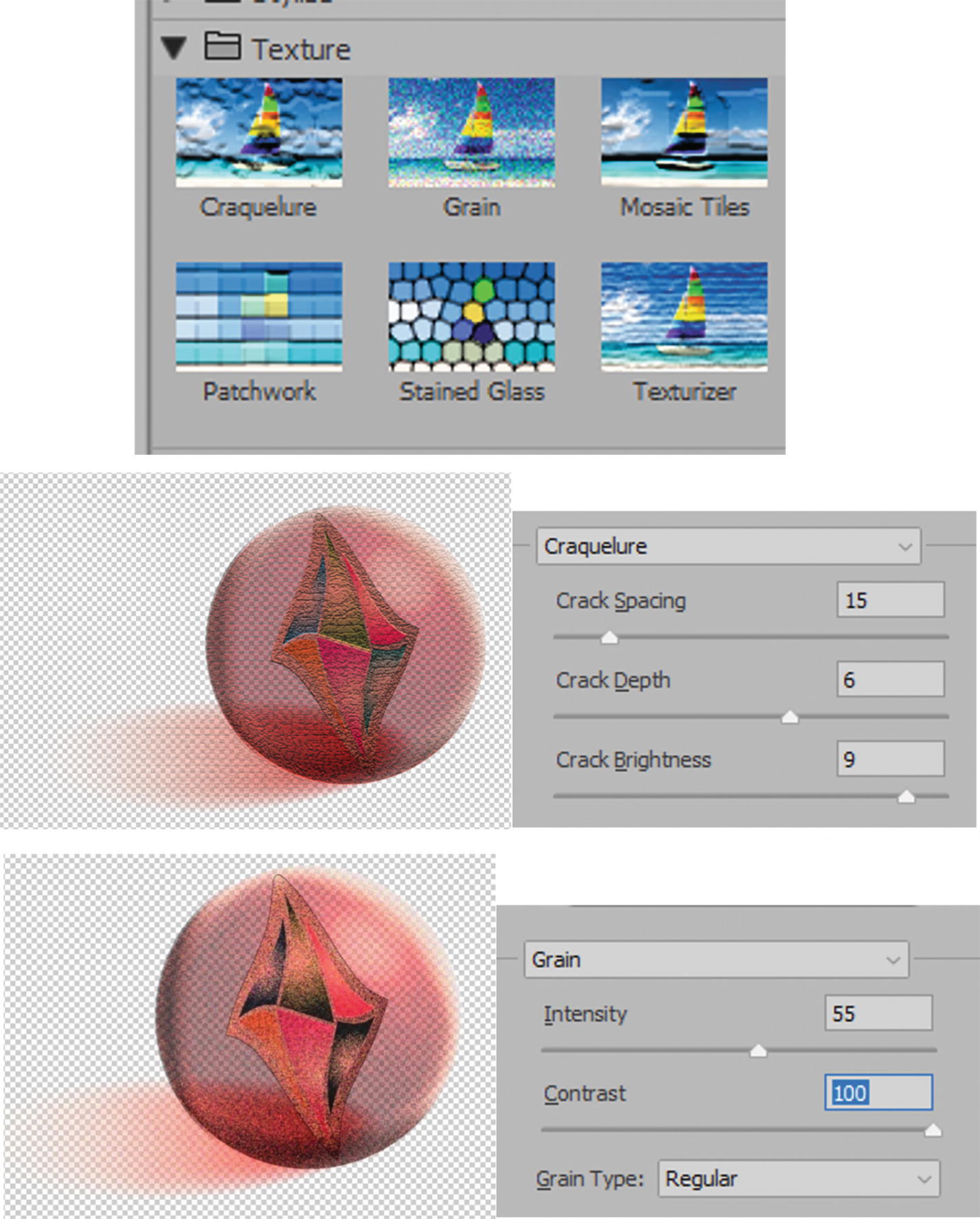
Effect Gallery option for the Texture folder, and previews and options for Craquelure and Grain
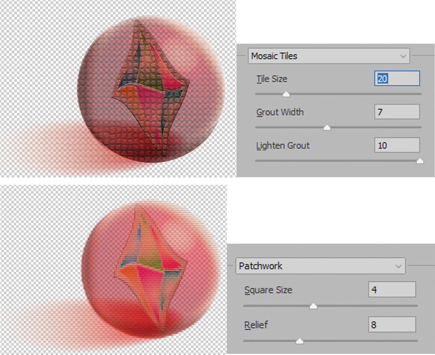
Previews and options in the Effect Gallery for Mosaic Tiles and Patchwork

Preview and options in the Effect Gallery for Stained Glass and Texturizer
Stained Glass: Though it does not have any extra options for texture, it is interesting as it does let you create an almost organic, cell-like structure. Use the sliders to adjust Cell Size (2–50) and Border Thickness (1–20). The border color is the current dominant gray in the image. Light Intensity (0–10) is radial from the center of the object. Refer to Figure 11-111.
For Texturizer, you can load a custom grayscale (.psd) texture as well. As mentioned in an earlier note, refer to Figure 11-87, if interested in working with a custom texture grayscale image, you can add it to the Effect Gallery. If this is something you want to try, you can use the file Pattern4_Texture_r2.psd to test and then use the Texturizer menu to locate and load the texture. Refer to Figure 11-111.
Choose an Effect

Effect Gallery menu list, effect visible and hidden, and adding and deleting effects grayed out as you can only add one at a time
However, unlike Photoshop, you cannot add multiple effects together in the Effect Gallery, and the Add Effect and Delete Effect buttons are unavailable. This is the same for when you work with an embedded image in Illustrator. Refer to Figure 11-112.
Effect Gallery OK and Cancel buttons
Appearance panel with effect from the Effect Gallery applied to group object
Use the Appearance Panel to Edit Effects
Use the Appearance panel to enter the Effect Gallery again and apply another effect
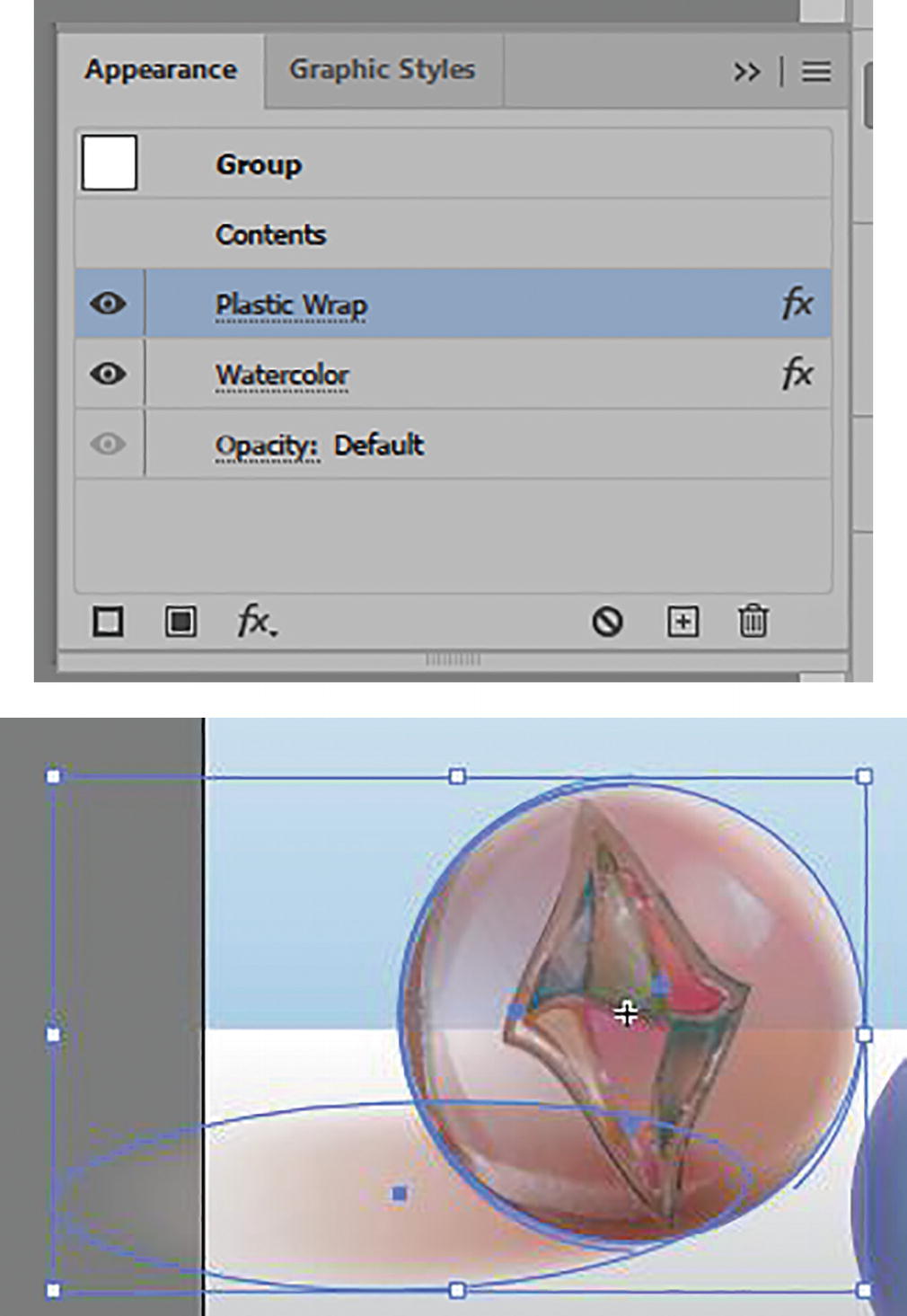
Two effects in the Appearance panel applied to the group object
In the Appearance panel, you now have the two effects.
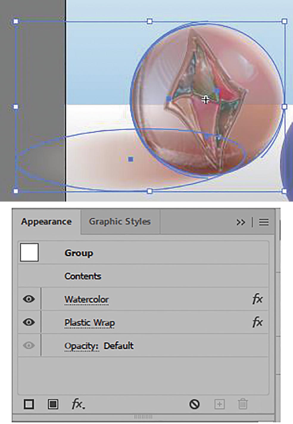
Order changed in the Appearance panel and how they appear on the grouped object
Order reset in the Appearance panel of the effects and how they appear on the grouped object
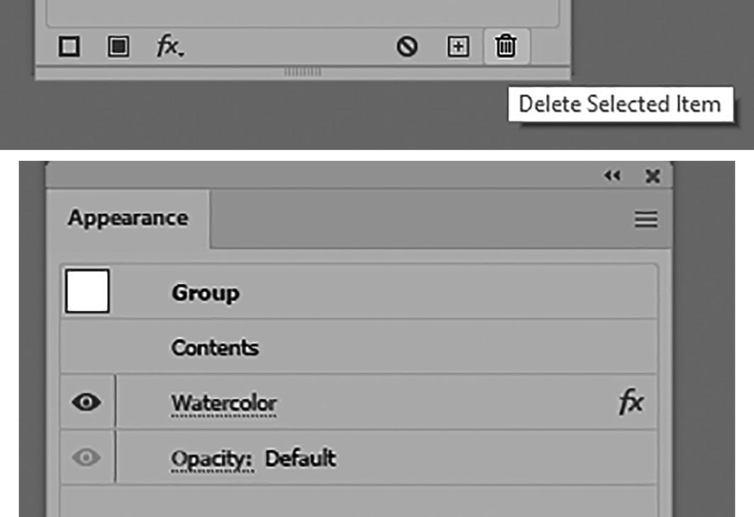
Icon in the Appearance panel to delete, and result
Use Edit ➤ Undo to undo that last step.
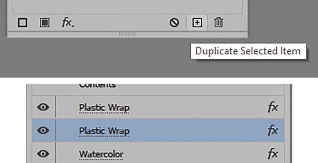
Icon in the Appearance panel to duplicate selected item, and result
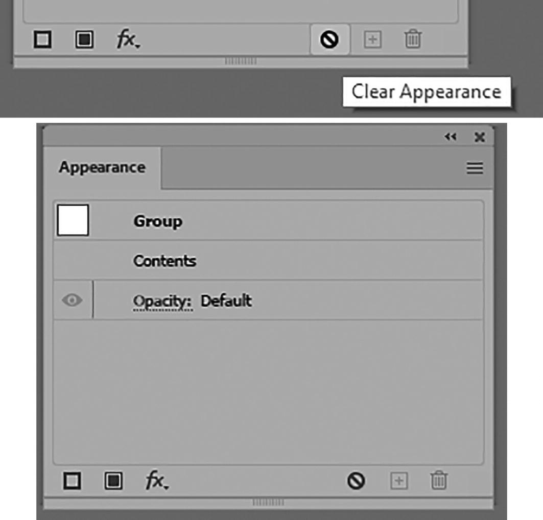
Icon in the Appearance panel to clear appearance, and the result
Current settings in the Appearance panel and how they appear on the grouped object
I will show examples of some of these effects again in the upcoming project.
In the Appearance panel, next to the Effects menu on the lower left there are two other icons. They are Add New Stroke and Add New Fill. These can be used to add a new stroke or fill to an object rather than duplicate one that is selected. Refer to Figure 11-123.
Add New Stroke and Add New Fill icons next to the FX menu in the Appearance panel
Blur, Pixelate, and Video Effects
Outside of the gallery are a few additional effects that can also be found in Photoshop Effects. These are the menus for Blur, Pixelate, and Video.
We will ignore the Video filters De-Interlace and NTSC Colors as they are not part of this topic on distort. Refer to Figure 11-124.

Effect menu Photoshop Effects Video sub-menu options
Blur Effects
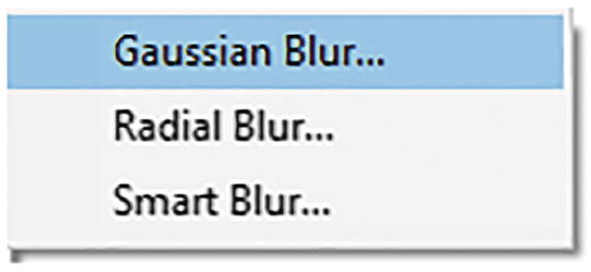
Effect menu Photoshop Effects Blur sub-menu options
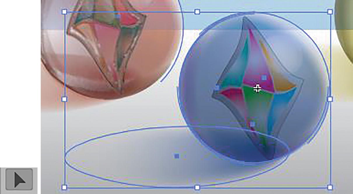
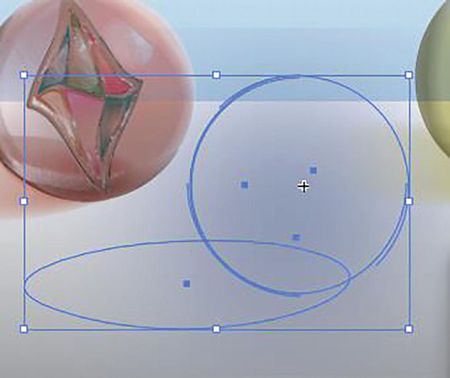
Use the Selection tool to select a grouped object
Gaussian Blur
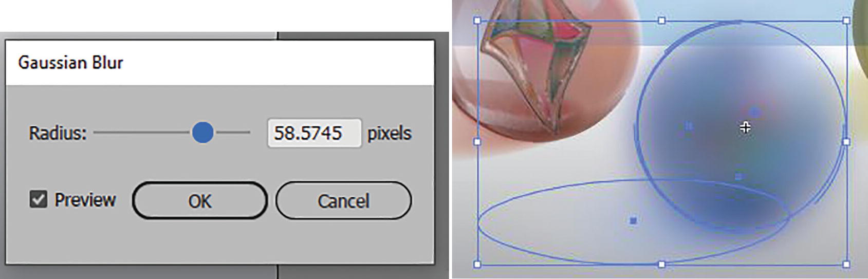
Gaussian Blur dialog box and preview of blur on selected object
High-radius Gaussian Blur settings can cause a box-like blur
Click OK if you want to commit the settings or Cancel to exit and try another effect. Refer to Figure 11-127.
Radial Blur
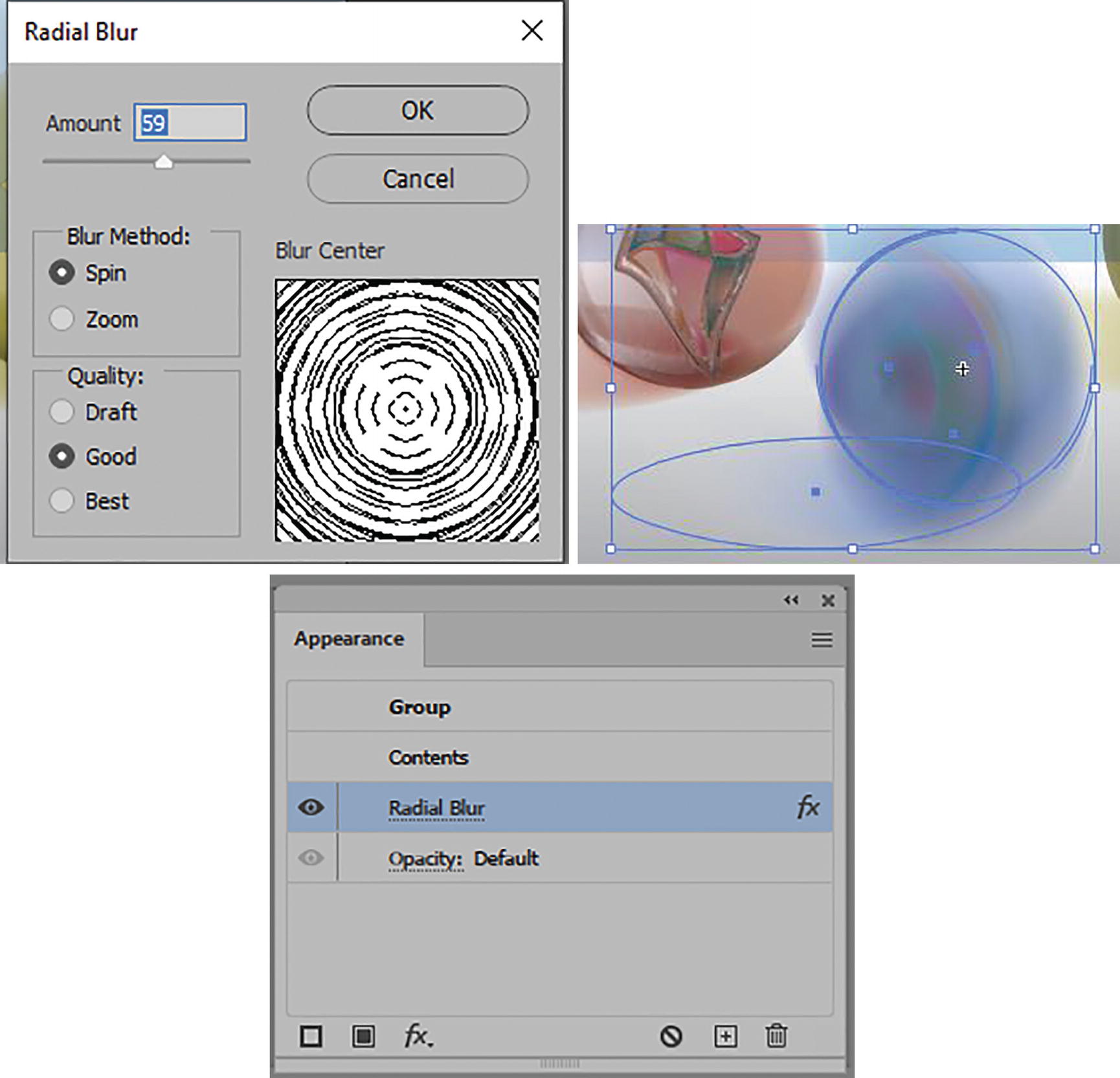
Radial Blur dialog box and how it appears on the object after you have exited, and then edit using the Appearance panel
In the dialog box you can set the following:
Amount (1–100).
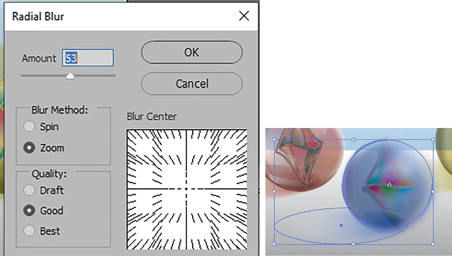
Radial Blur dialog box and Zoom setting options
Quality: Draft, Good, or Best. Best will take longer to process and is similar to Good, which is the default.
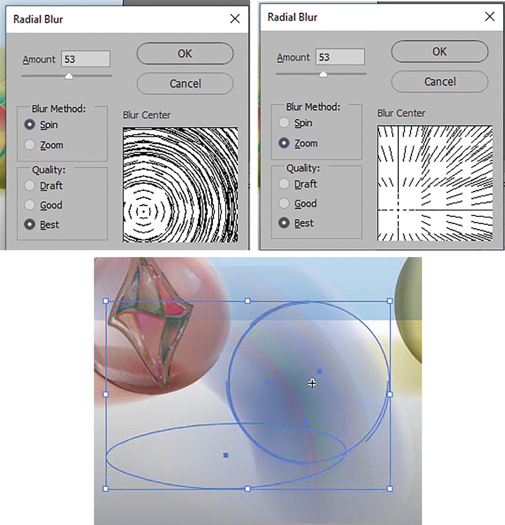
Radial Blur dialog box and blur center altered and blur on object
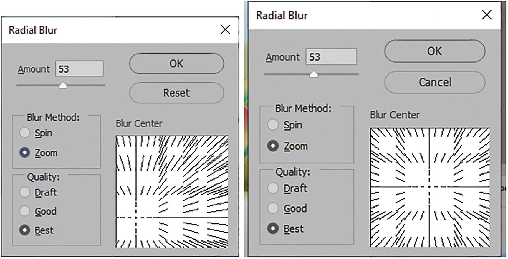
Radial Blur dialog box and resetting the blur center
Click OK to commit your settings and exit the dialog box, or Cancel without committing the change. Refer to Figure 11-132.
Smart Blur

Smart Blur dialog box
You can then set the Radius (0.1–100), Threshold (0.1–100), Quality (Low, Medium, High), and Mode (Normal, Edge Only, Overlay Edge).
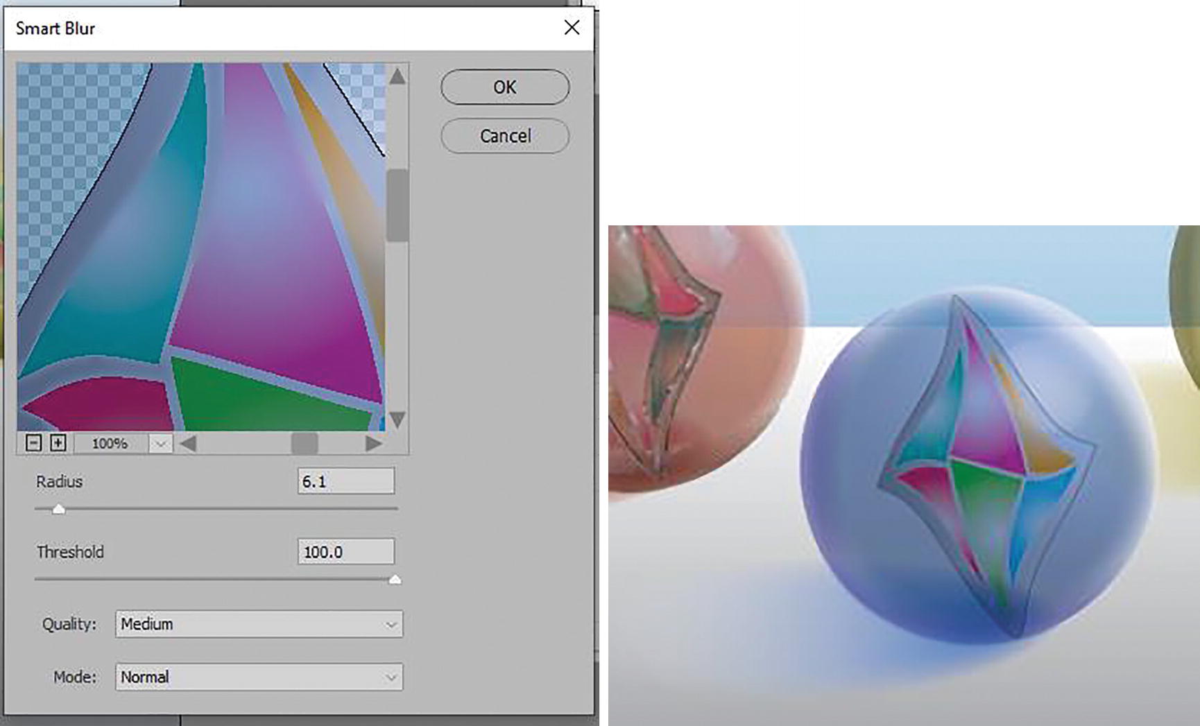
Smart Blur dialog box and result of blur effect on group object marble
Pixelate Effects
Effect menu Photoshop Effects Pixelate sub-menu options
Select the grouped object with the Selection tool
Color Halftone

Color Halftone dialog box and effect in Appearance panel and on the group object
To test, leave your Max. Radius setting at 8 pixels and the Screen Angles (Degrees) at Channel 1: 108, Channel 2: 162, Channel 3: 90, and Channel 4: 45, and click OK. This kind of design could be used for a comic book illustration. Refer to Figure 11-137.
Crystallize
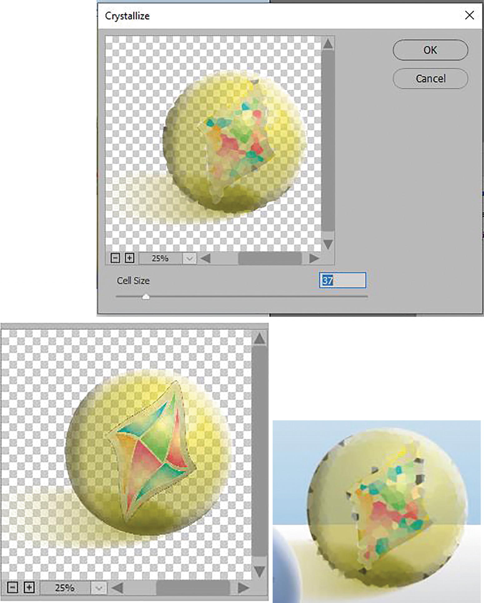
Crystallize dialog box and preview of before and after of the effect
Click OK to commit the settings, or Cancel to exit. Refer to Figure 11-138.
Mezzotint
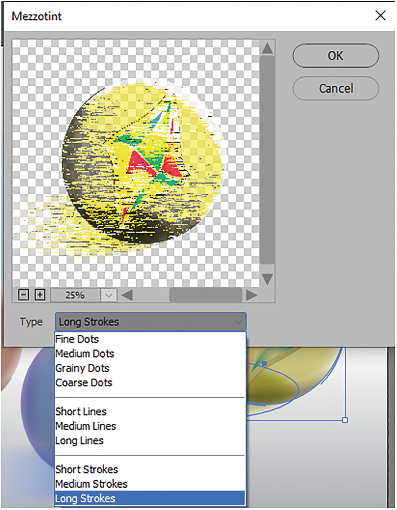
Mezzotint dialog box with settings and preview
Click OK if you have chosen a type, or Cancel to exit. Refer to Figure 11-139.
Pointillize

Pointillize dialog box with settings and preview
Click OK to commit the settings or Cancel to exit.
If you are looking for another mosaic-like effect to try on your embedded images, try Object ➤ Create Object Mosaic. Here is a link to information on that topic:https://helpx.adobe.com/illustrator/using/creating-sketches-mosaics.html
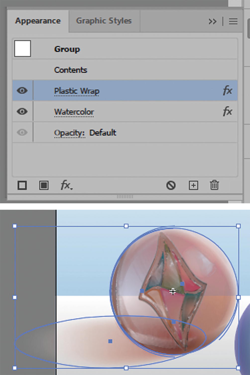
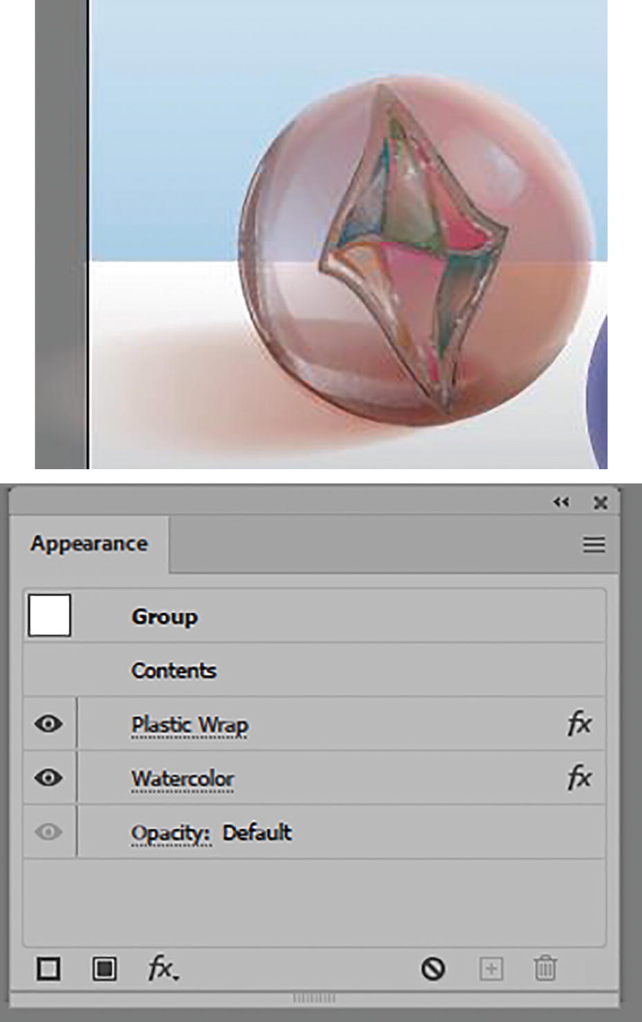
You can see how I used the similar effects of Plastic Wrap and Watercolor on all three marbles in my file marbles_final.ai.
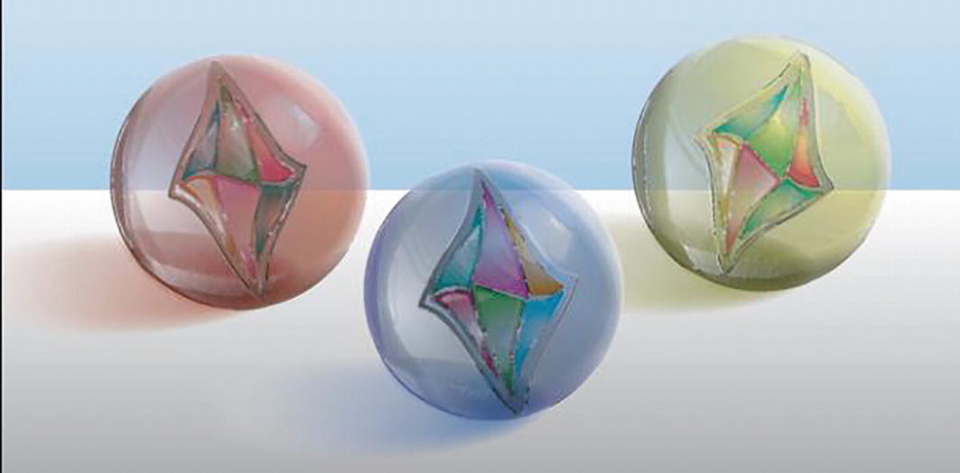
Marbles with Plastic Wrap and Watercolor effects applied
Save any of your open projects at this point.
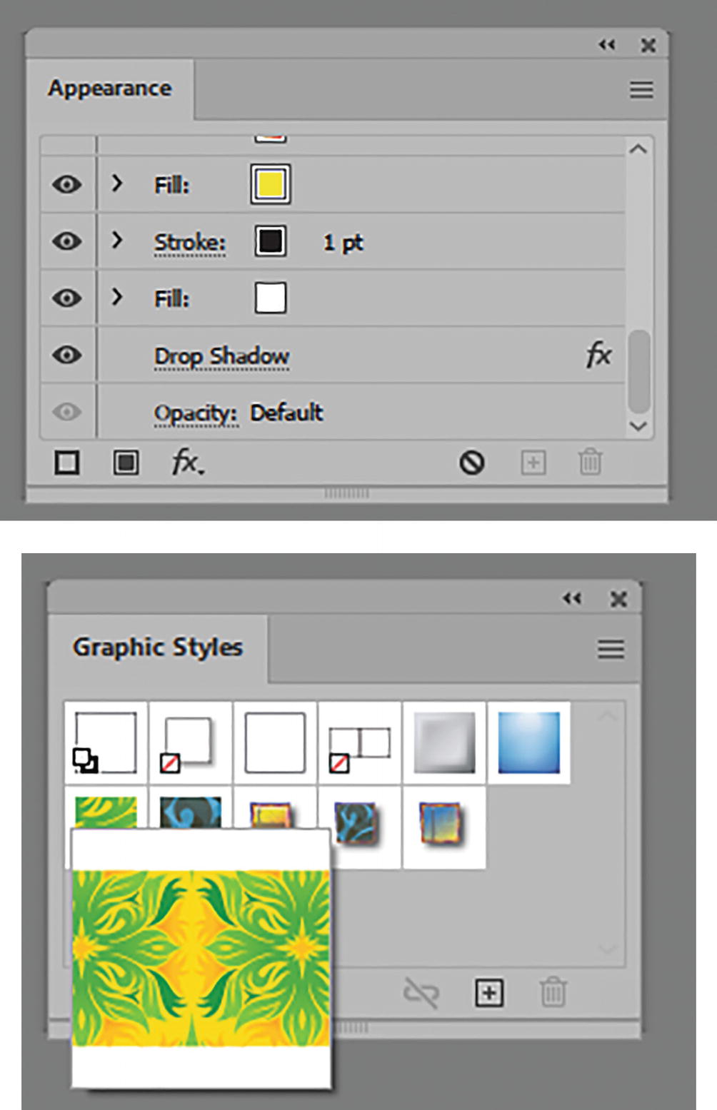
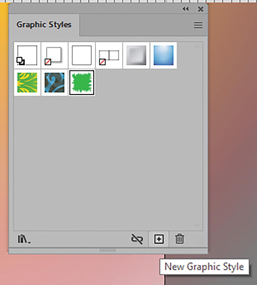
Graphic Styles Panel Review for Storage
In your own projects, once you have created a combination of strokes, fills, and effects that you like in the Appearance panel, you can store them in the Window ➤ Graphic Styles panel.
For an example, open graphic_style_start.ai. You can save a copy of the file if you need to practice.
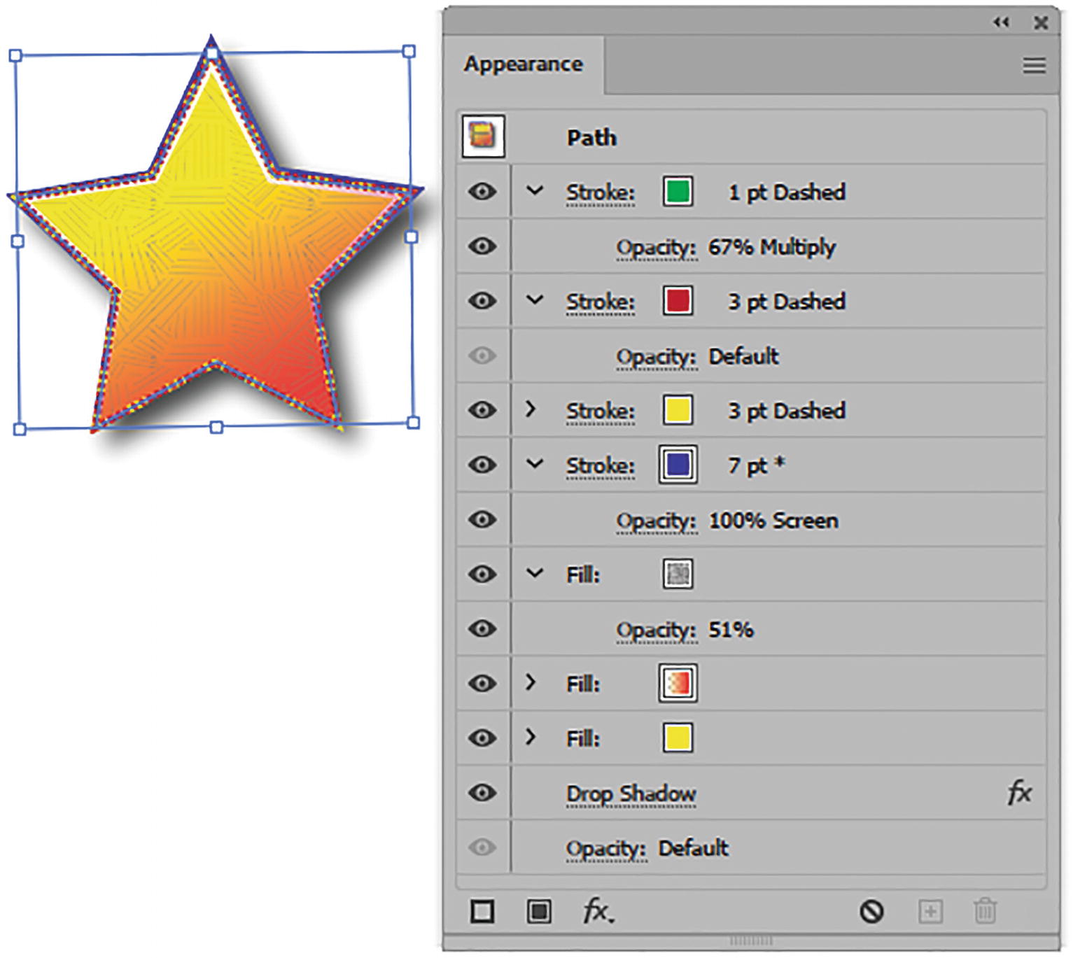
A star with multiple settings applied in the Appearance panel
A rectangle with no effects applied
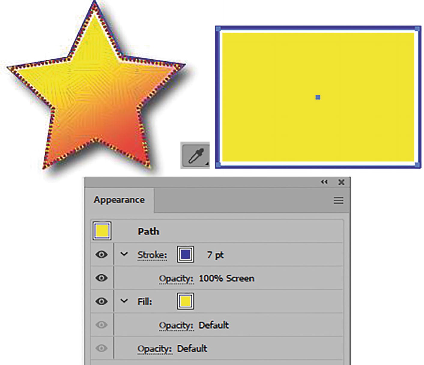
Using the Eyedropper tool to apply the star’s settings does not apply them all, as seen in the Appearance panel

Select the star

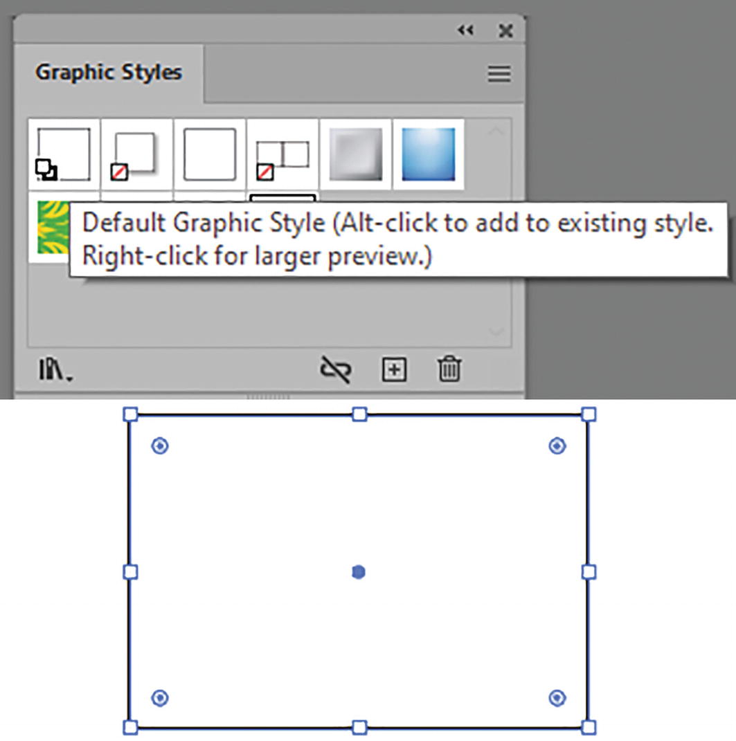
Use the Graphic Styles panel to store the current object’s appearance settings
This adds the graphic style to the panel.

Select the rectangle and use the Graphic Styles panel to apply the new settings
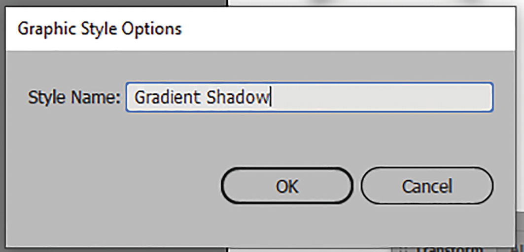
Graphic Style Options dialog box
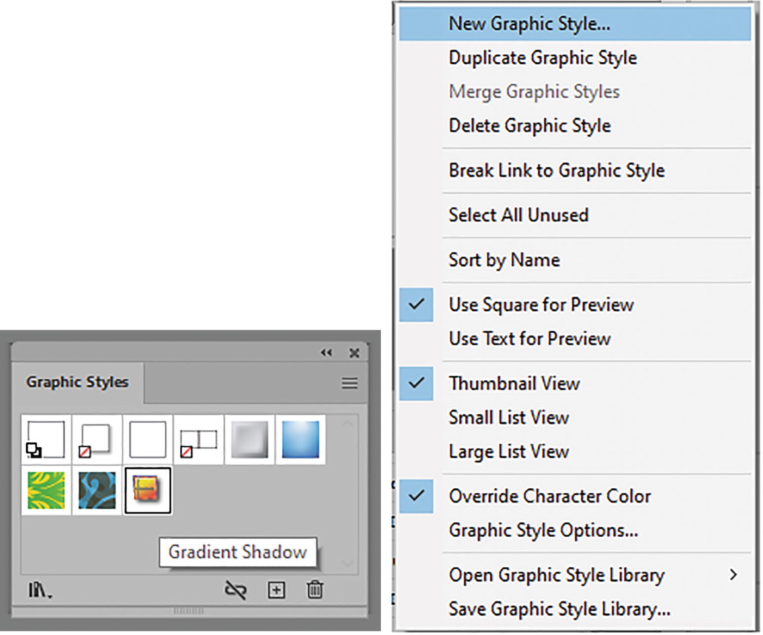
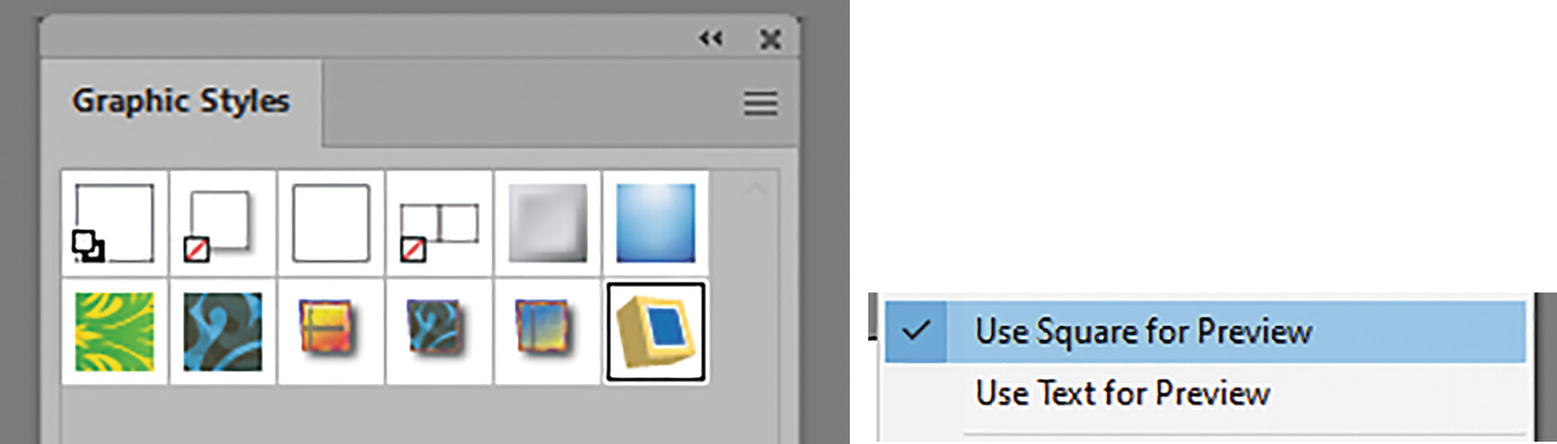
Graphic Styles panel with menu options and selected graphic style
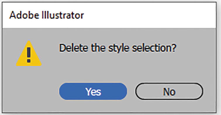
Alert message that appears when you delete a style
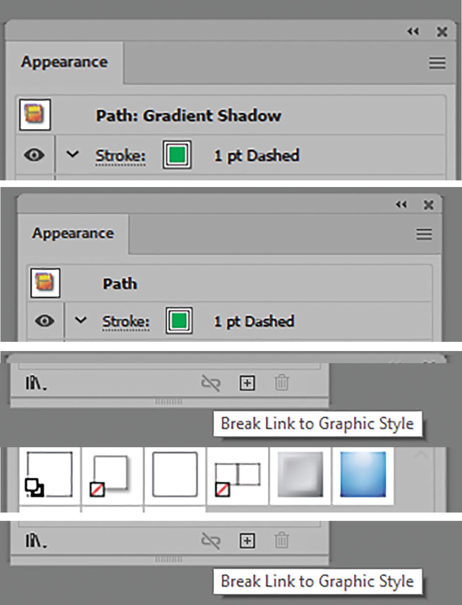
Appearance panel settings change for selected object when you click Break Link to Graphic Style icon

Graphic Styles menu option for merging two selected graphic styles, the dialog box, and the two styles merged in the panel
Graphic style settings to reset the style on a rectangle
Adding another style to the original in the Appearance panel and viewing a larger preview of the graphic style in the Graphic Styles panel
Right-clicking on a style will make the preview of the graphic style larger. Refer to Figure 11-154.
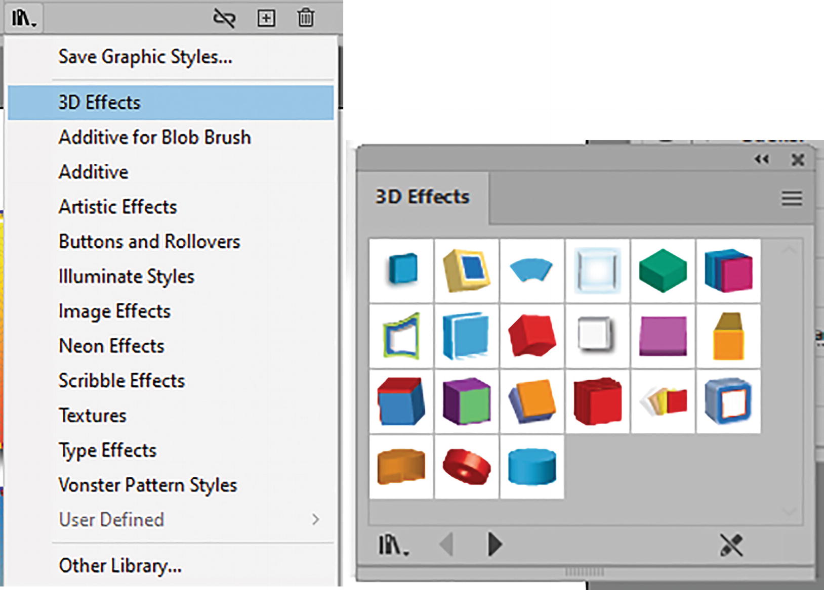
Accessing more libraries from the Graphic Styles panel, and one library open
New graphic style added to the panel
Your own graphic style libraries can be stored as .ai files. These can be opened in the file when you choose from the menu Other Library.
Adding Graphic Styles to Type, Including Gradients
Earlier, in Chapters 9 and 10, I mentioned that you could not add a gradient to type directly without creating outlines. However, there is a way to get around this—and keep the type live—with graphic styles.
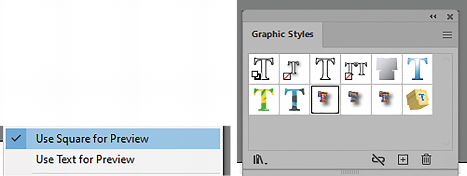
Viewing a text preview of the graphic styles using the panel menu
In the Panels menu, Override Character Color is set as the default so that the text color updates. Refer to Figure 11-158.

Applying a gradient to the text using the panel menu settings
You can then select the text that you want to apply the graphic style to. In this case a gradient was applied to the type fill via the Appearance panel.
Resetting the preview of the graphic style using the menu settings
For additional information on graphic styles, see https://helpx.adobe.com/illustrator/using/graphic-styles.html.
Graphic Styles and Symbols
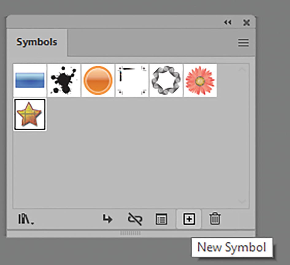
Adding a new symbol to the Symbols panel with graphic styles applied
Also, in the Graphic Styles panel and Symbols panel, you can store your freeform gradient as well as linear and radial gradients with their custom-set angles and aspect ratios.
How Can You Apply Effects to Symbols as Well?

Applying graphic styles to a symbol
Applying graphic styles to a symbol and how it appears in the Appearance panel
We will look at this in more detail in Chapter 12.
Keep in mind that, as in Chapter 6 when you worked with the Blend tool, with some complicated group objects with multiple gradients and effects you should work on a copy of the object to avoid some errors. Use Object ➤ Expand Appearance first.
You can view some of these graphics in my file graphic_style_final.ai.
Project: Blowing in the Wind, Part 7, Adding Texture with Effects
Continuing with our girl on the farm, we will now start to add textures to the mountains, as well as some ground areas. We will also look at how we can use one of the filters to create simplistic designs for a tree in the distance, which will be near the farmhouse once it is built in Chapter 13.
Open Landscape1_7_start.ai. Save a copy if you want to practice.
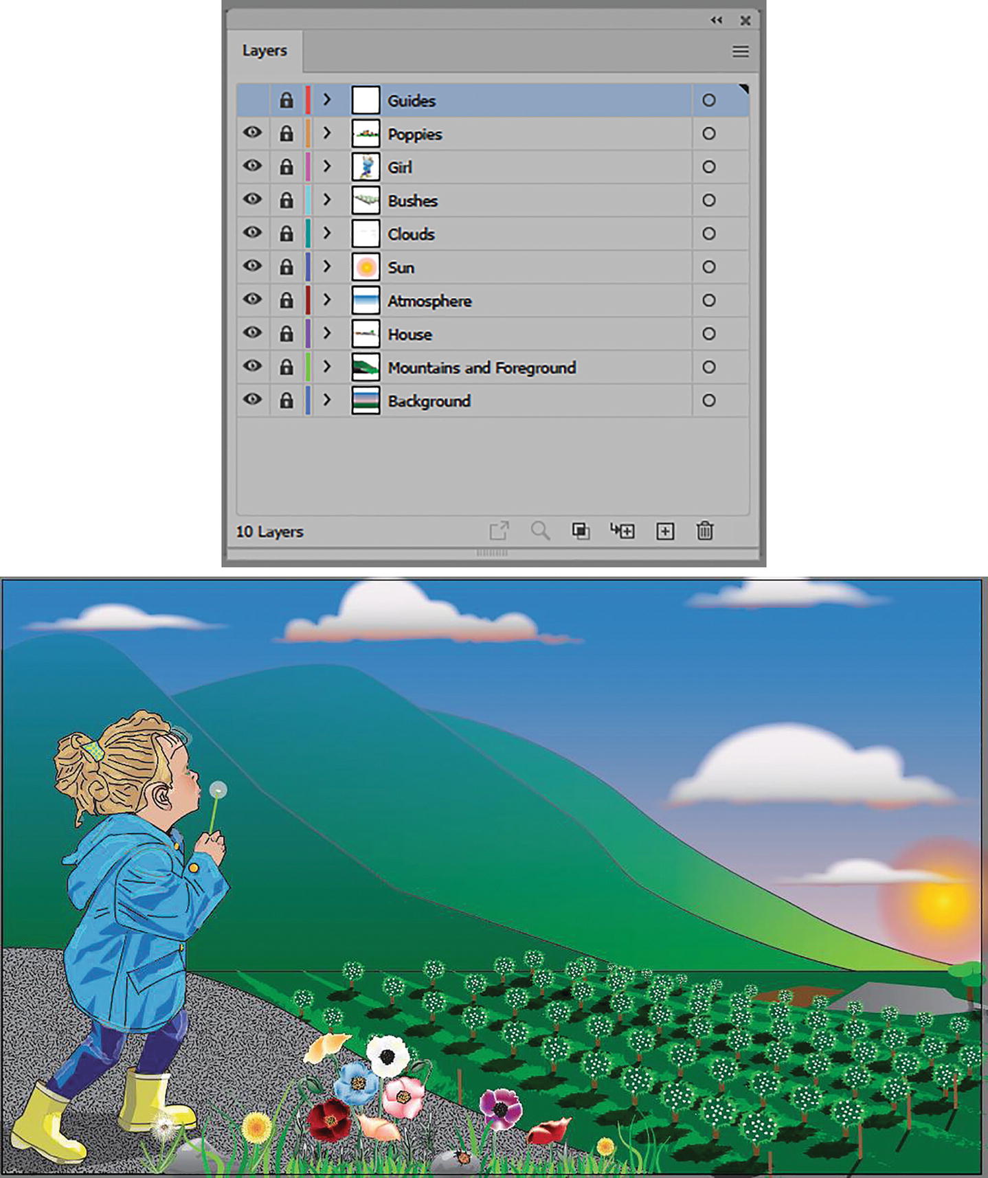
Layers panel and current image of the landscape
Unlock the Background layer
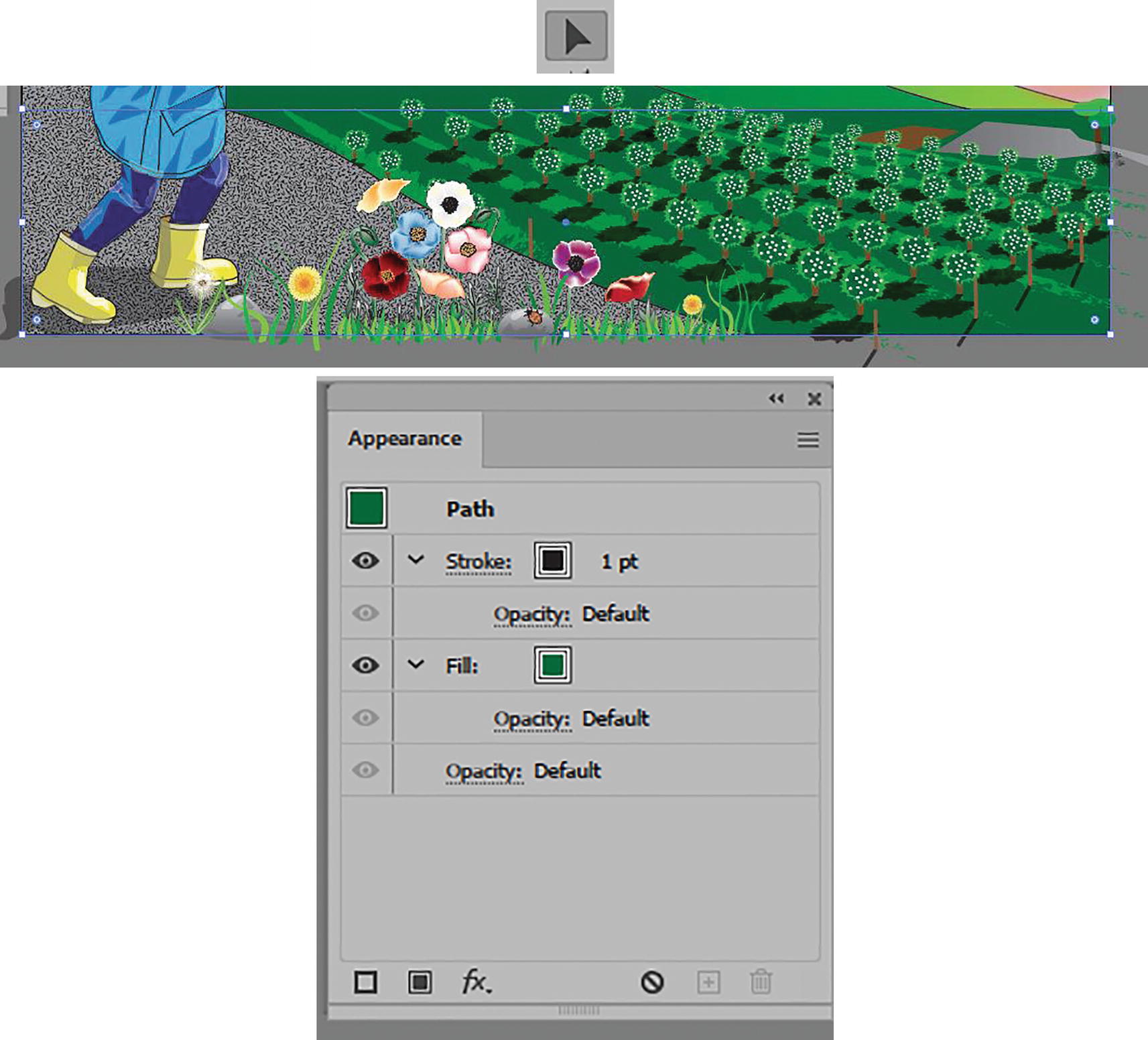
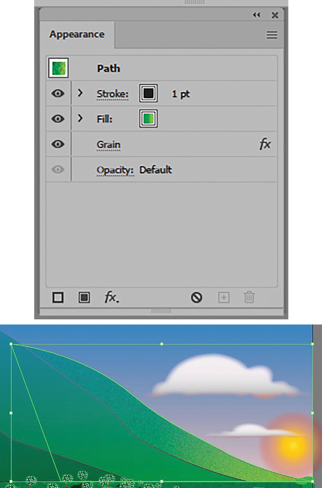
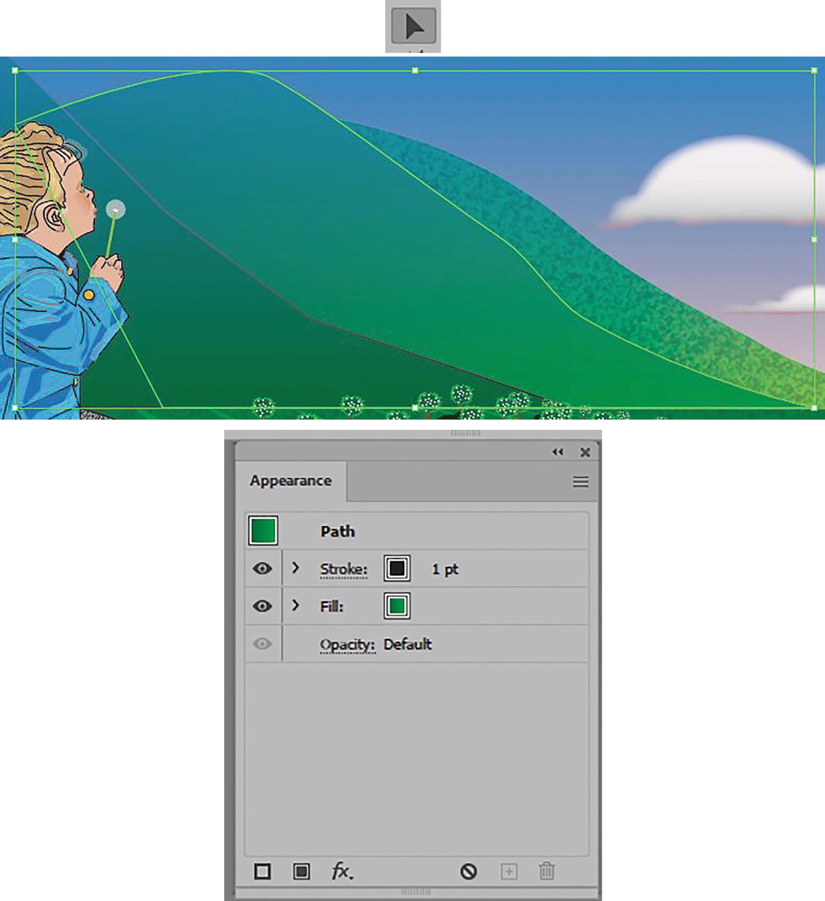
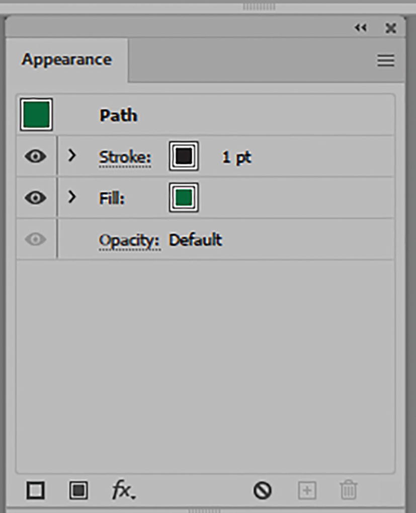
Select the green ground with the Selection tool, and look at Appearance panel

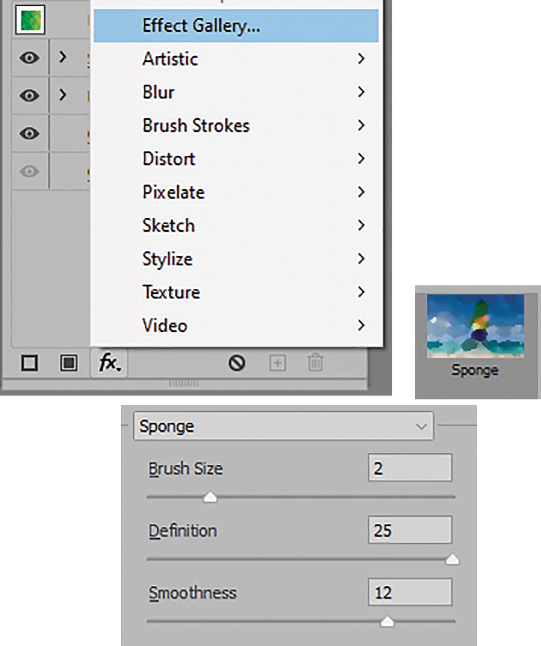
Use the Appearance panel to access the Effect Gallery and Sponge effect
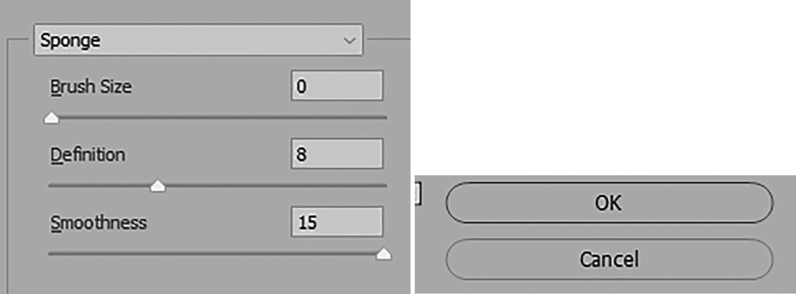
Set Sponge effect settings and click OK to commit
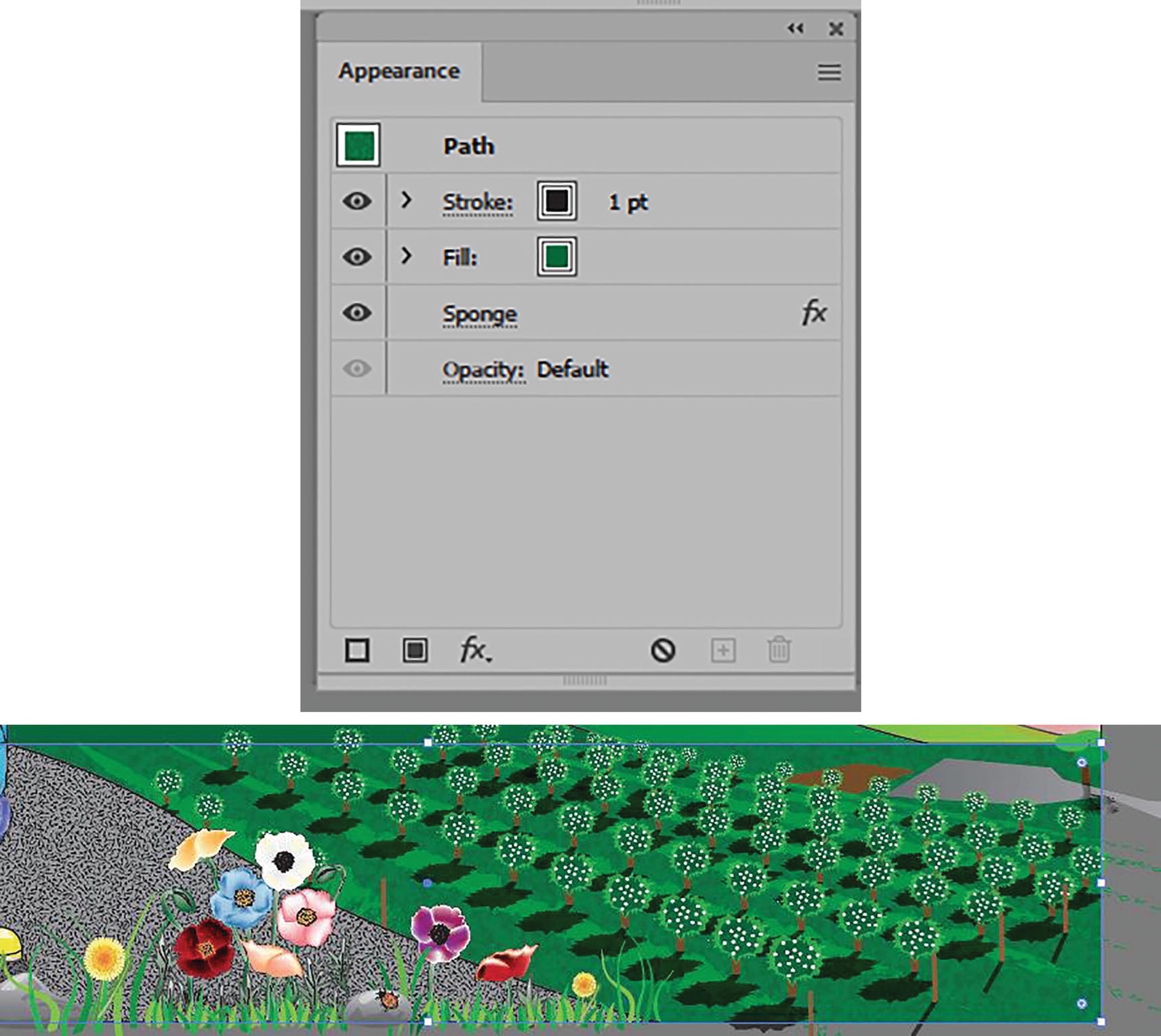
Current setting in the Appearance panel and how they appear on the screen
This is all we need to do to this layer.

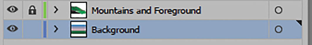
Lock the Background layer and unlock the Mountains and Foreground layer

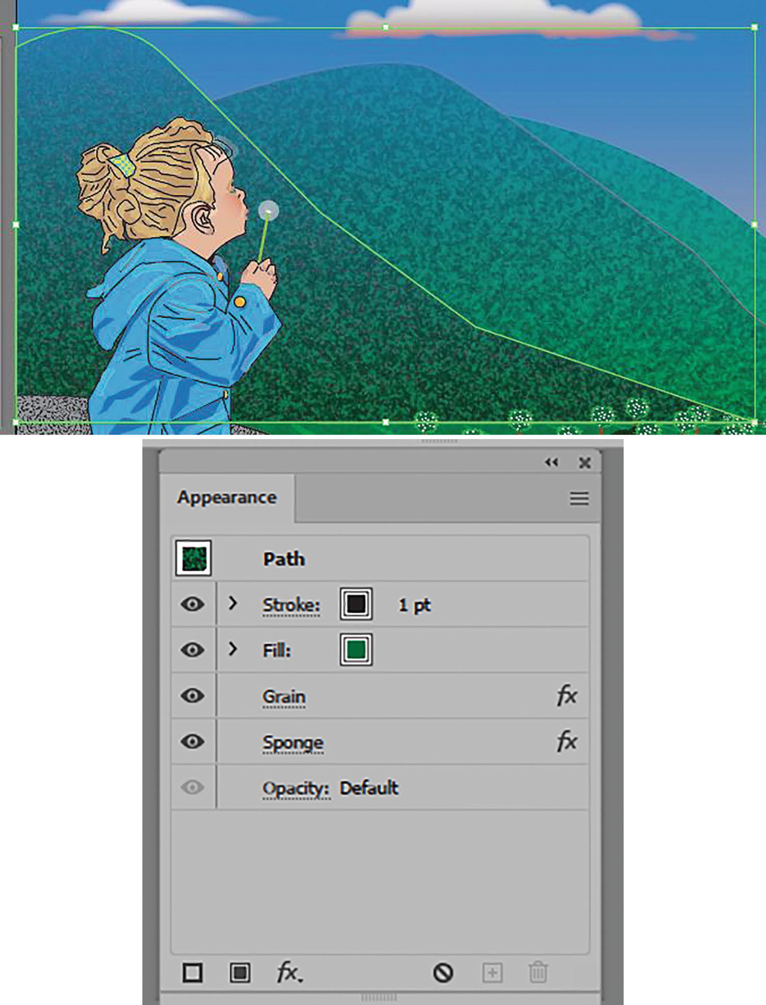
Right mountain selected with Selection tool
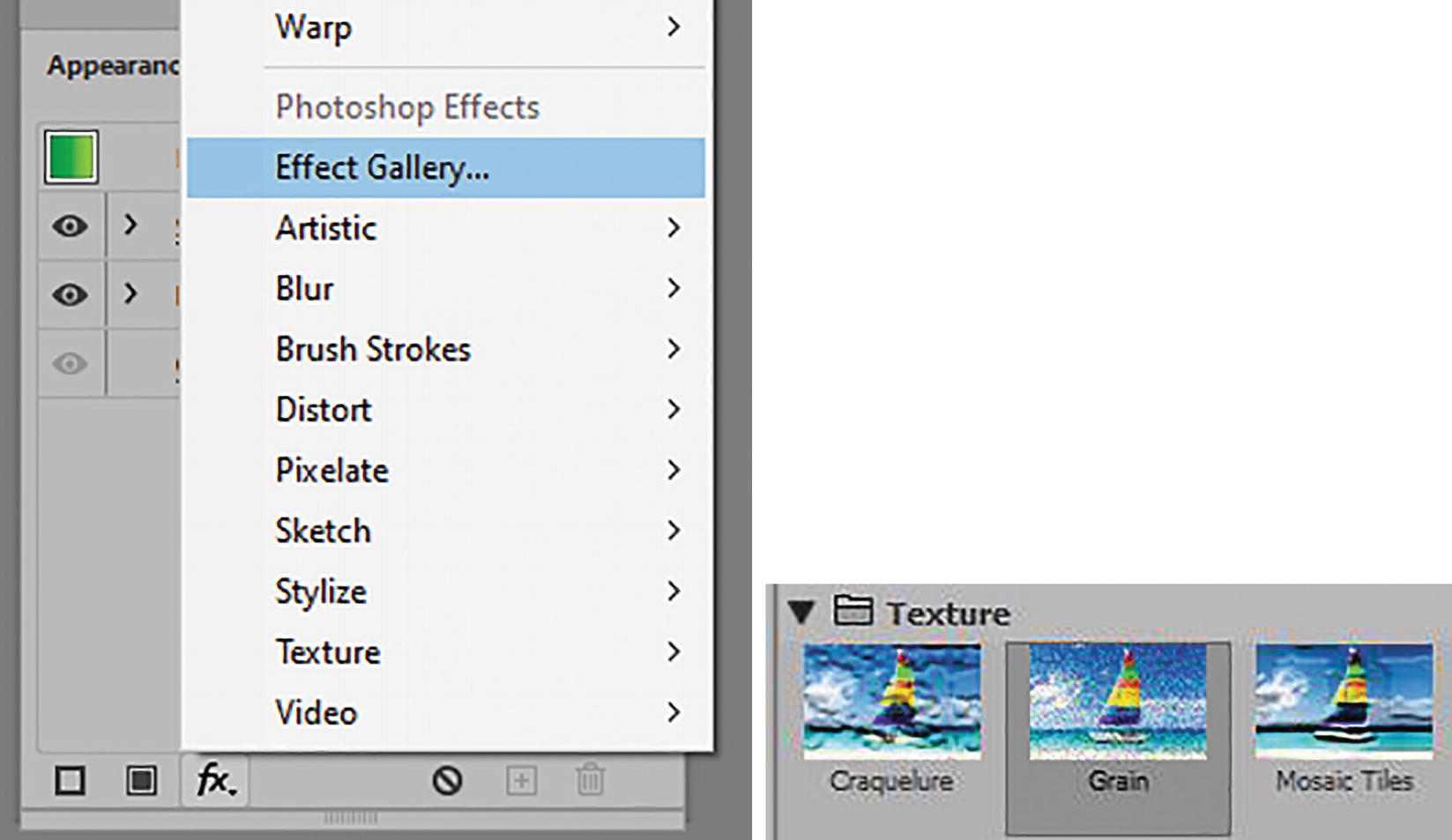
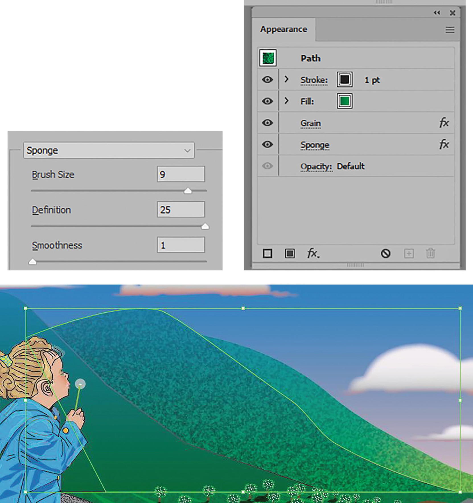
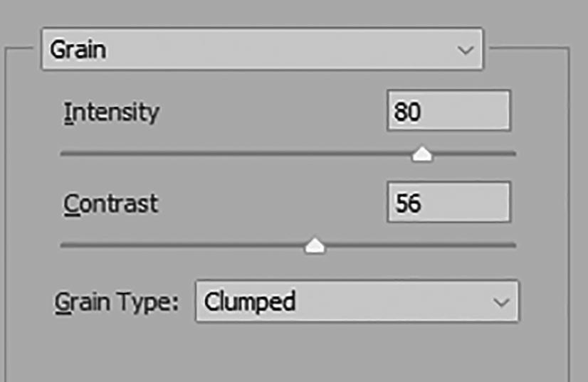
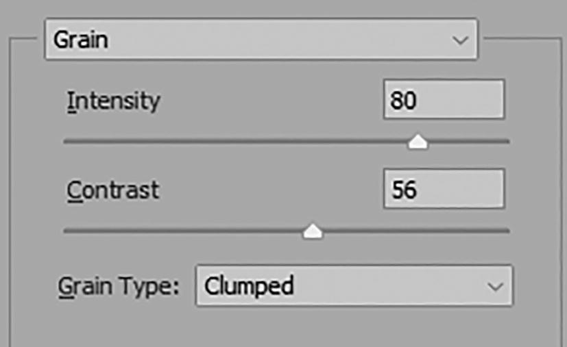
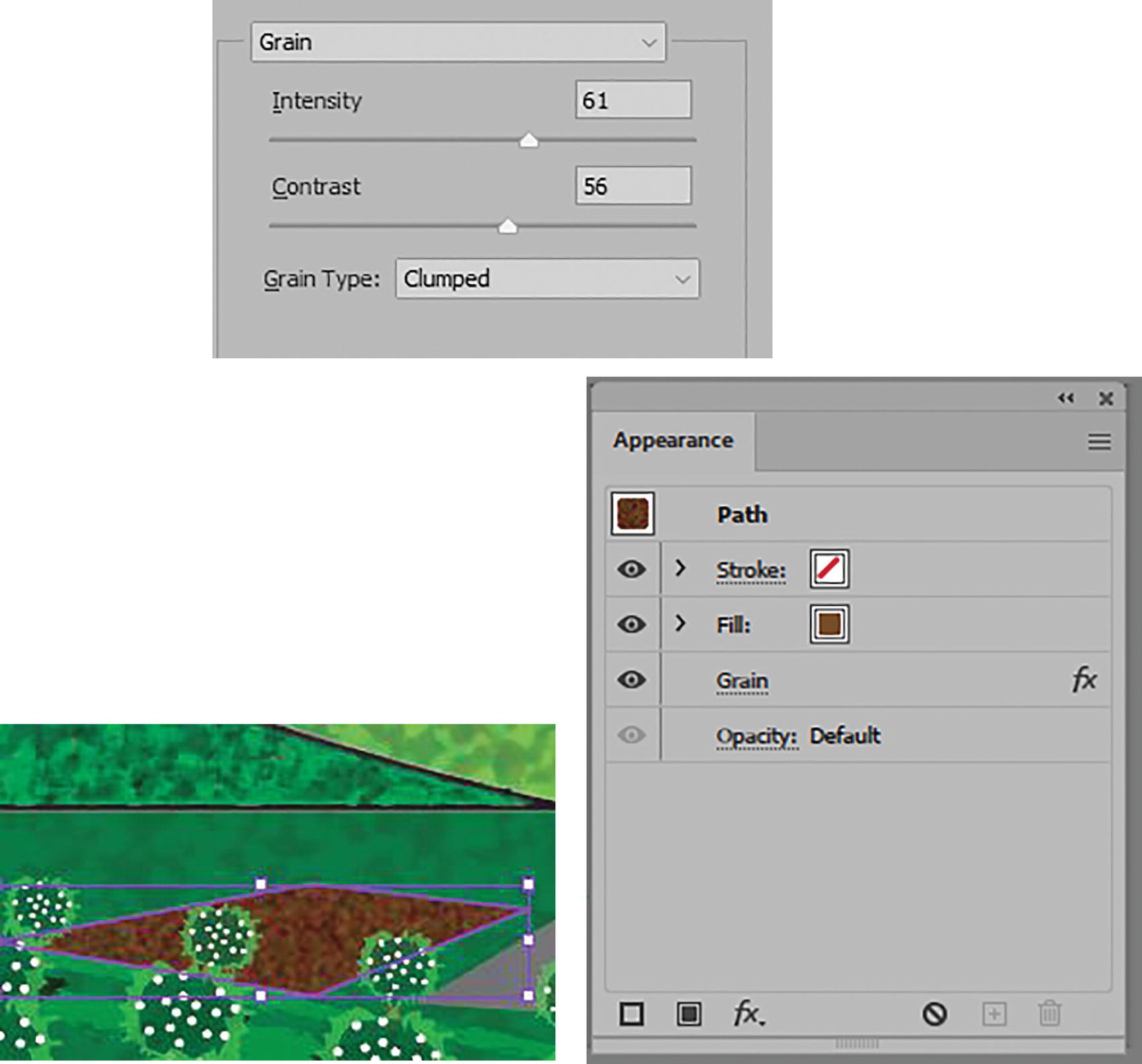
Use the Appearance panel to access the Effect Gallery and Grain texture

Set Effect Gallery Grain effect settings and click OK to commit
Current setting in the Appearance panel and how it appears on the screen
Use the Appearance panel to access the Effect Gallery and choose Sponge; set the new settings
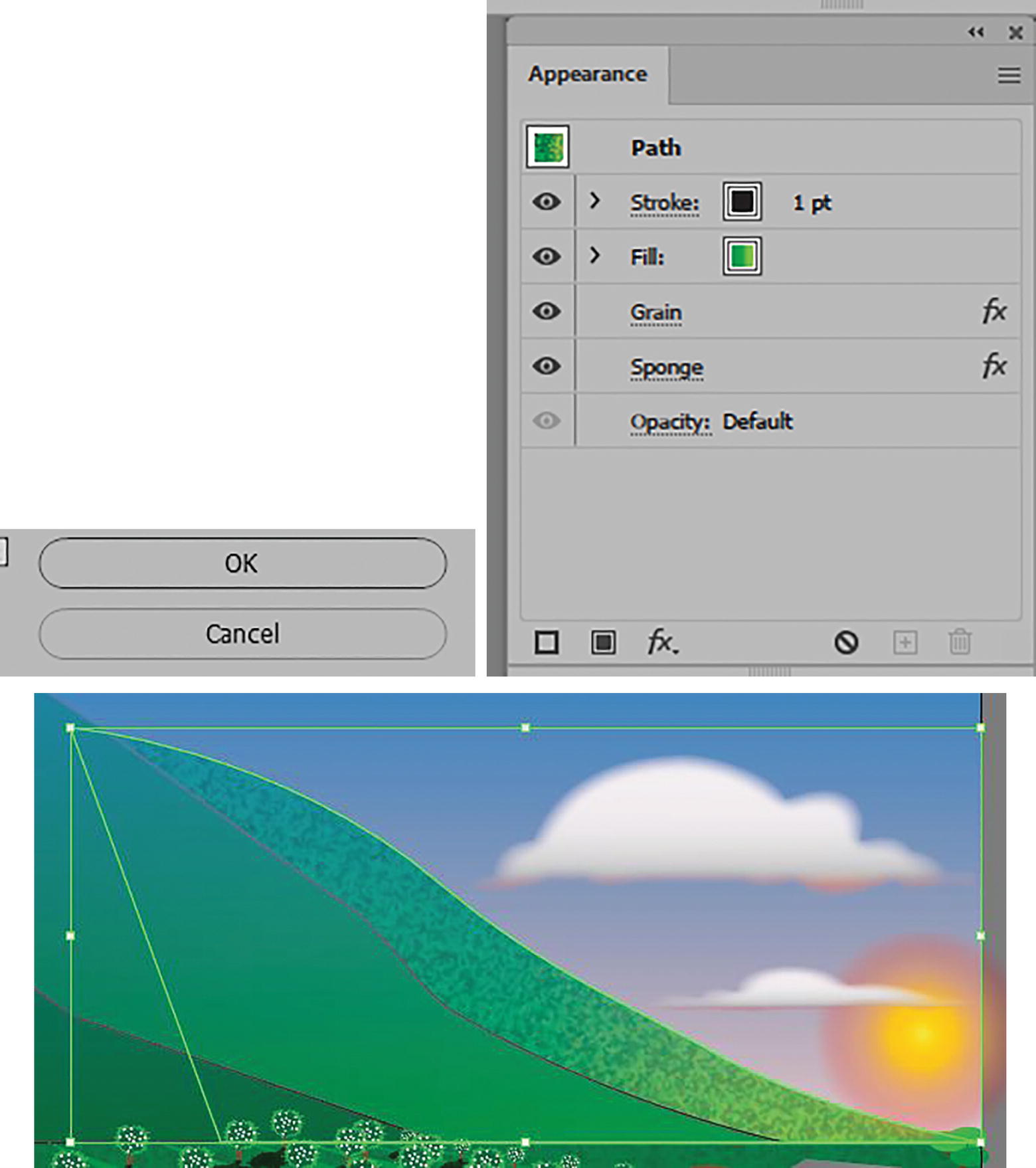
Click OK to commit settings, then look at the current settings in the Appearance panel and see how it appears on the screen
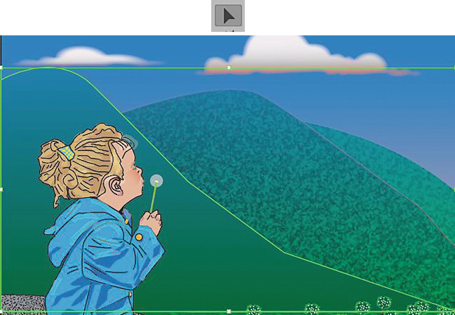
Middle mountain selected with Selection tool

Set Effect Gallery Grain effect settings
Set Effect Gallery Sponge effect settings and look at current setting in the Appearance panel and how it appears on the screen
Left mountain selected with Selection tool
Current settings in the Appearance panel
Set Effect Gallery Grain effect settings

Set Effect Gallery Sponge effect settings
Look at current settings in the Appearance panel and how it appears on the screen

Foreground selected with Selection tool and settings in Appearance panel
To this object we will only add the effect of grain to make the ground look more gravel-like.
Set Effect Gallery Grain effect settings
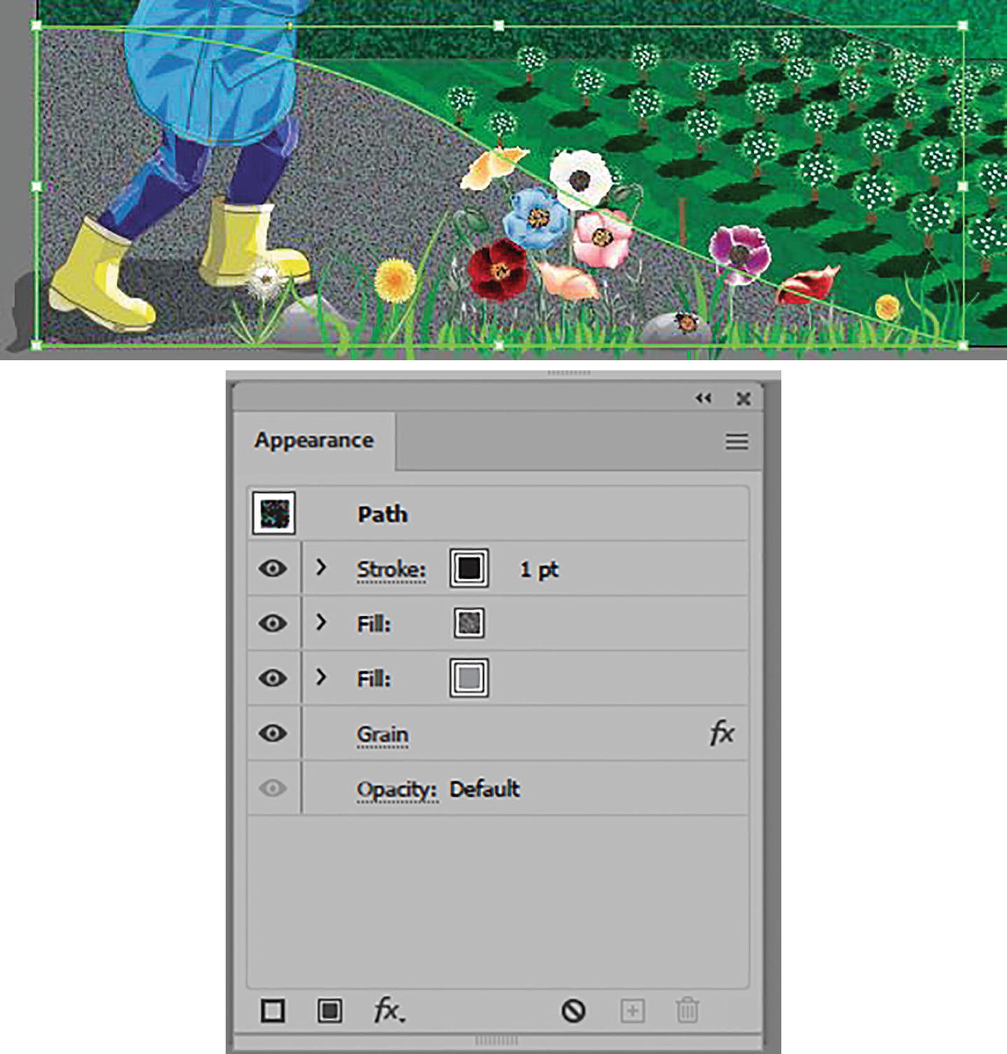
Look at the current settings in the Appearance panel and how it appears on the screen
The ground is darker, more random, and more gravel-like. Save your document at this point.
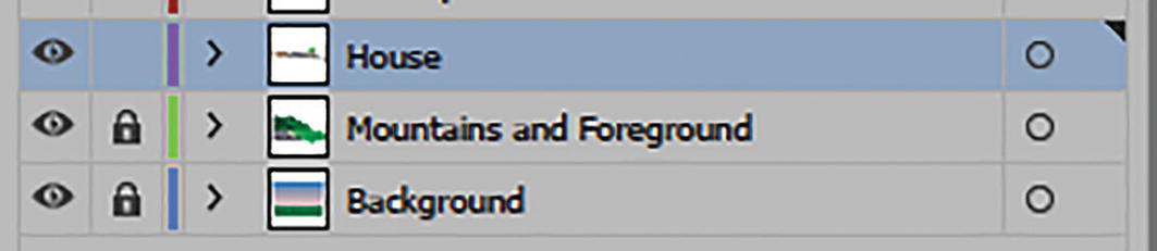
Lock Mountains and Foreground layer and unlock House layer
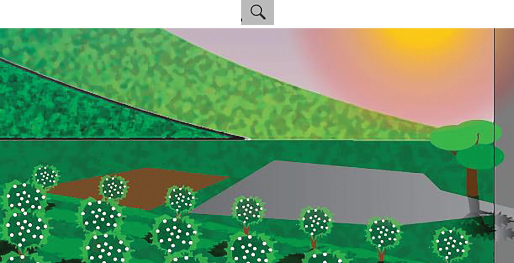
Zoom into the area where the house will be
This is the location for the 3D farmhouse that we will add in Chapter 13. We do not have to add any texture to the gray road and foundation as you would not notice that at this distance, and it already has a gradient applied to it.
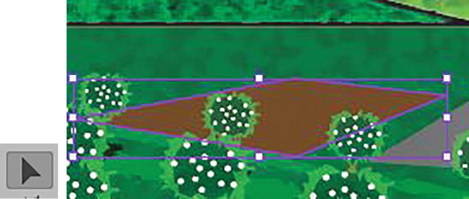
Use the Selection tool to select the garden area
Use the Appearance panel to enter the Effect Gallery
Effect Gallery Grain effect settings, and view on screen and in the Appearance panel
The effect is now added to the Appearance panel.
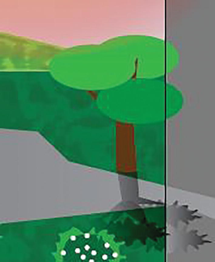
Tree on the House layer
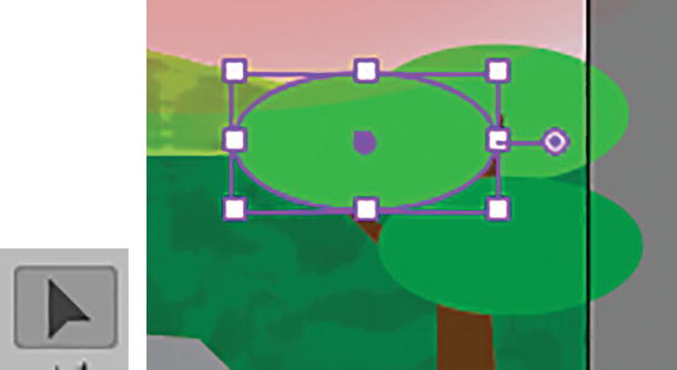
Select the ellipse with the Selection tool

Use the Appearance panel to select the Roughen effect
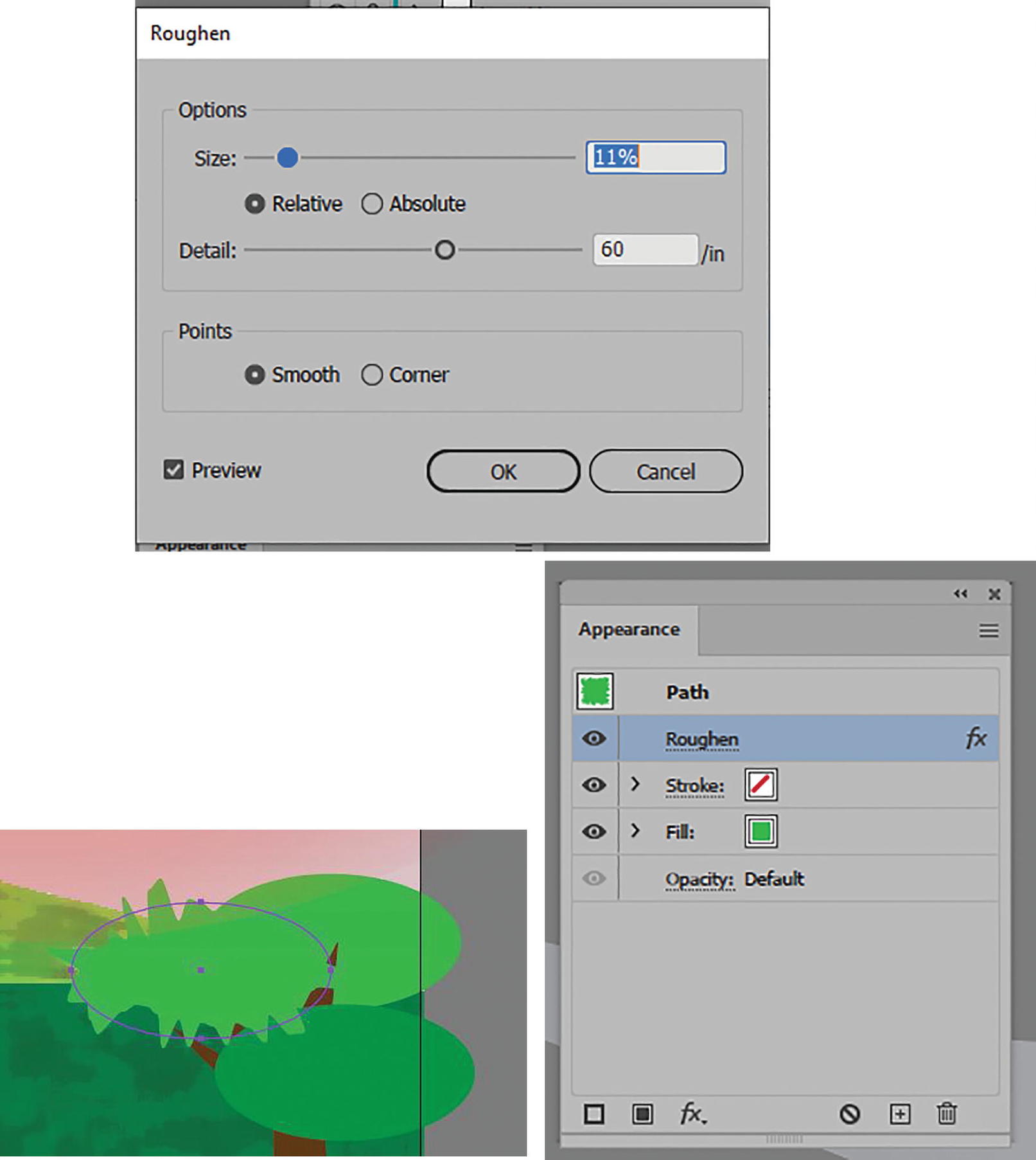
Roughen dialog box and setting applied, and effect in the Appearance panel
Effect added to Graphic Styles panel
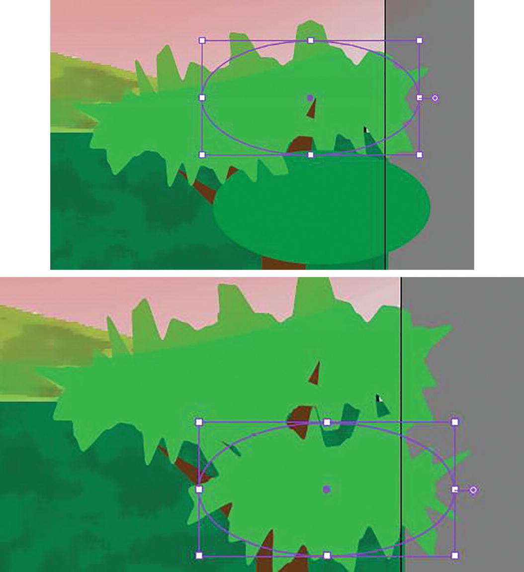
Roughen effect applied to selected ellipses with the Graphic Styles panel

Use the Appearance panel to alter the fill color of one of the Roughen ellipses
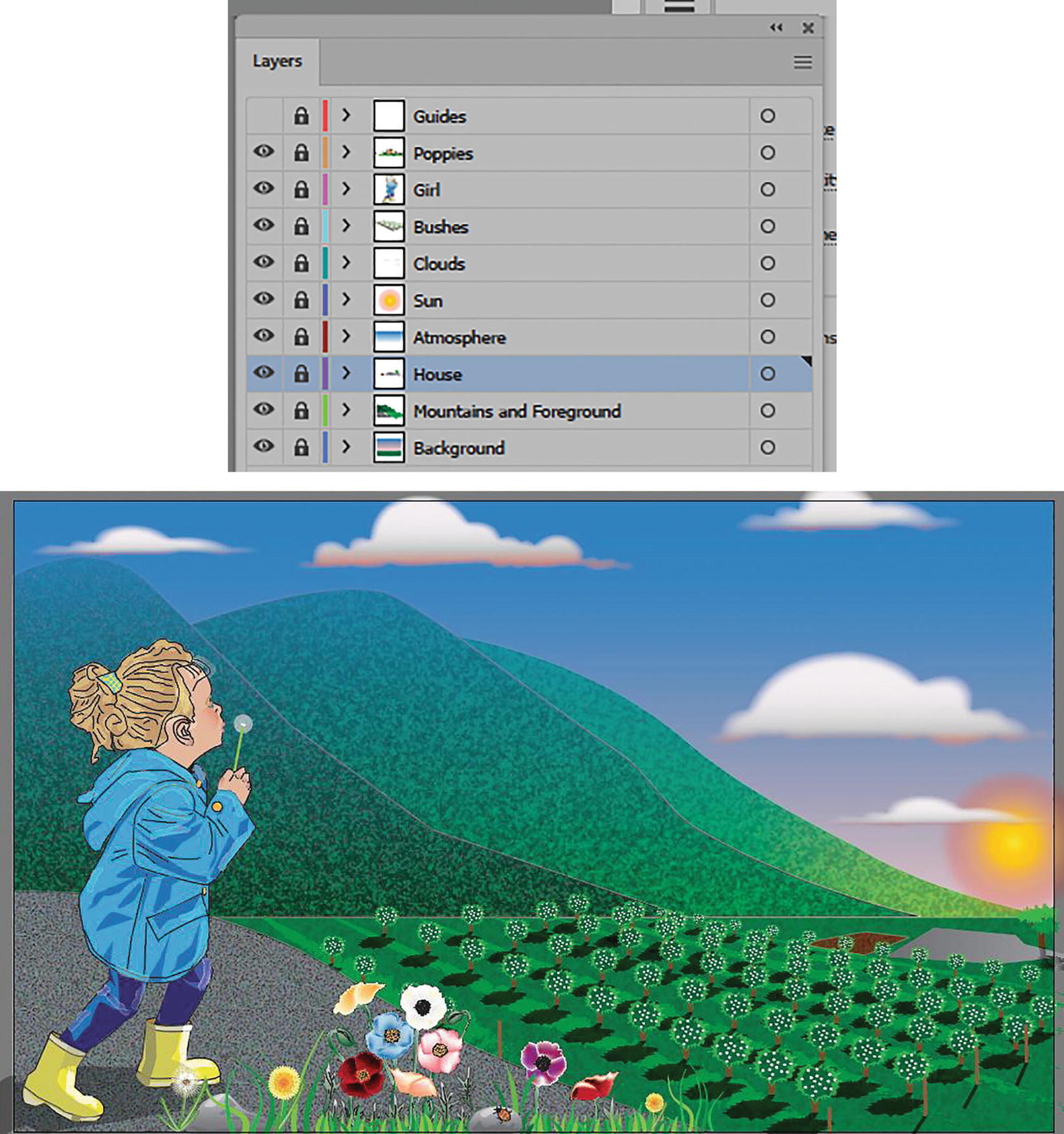
Lock the House layer and view the image so far
You can see the final result in the file Landscape1_7_final.ai.
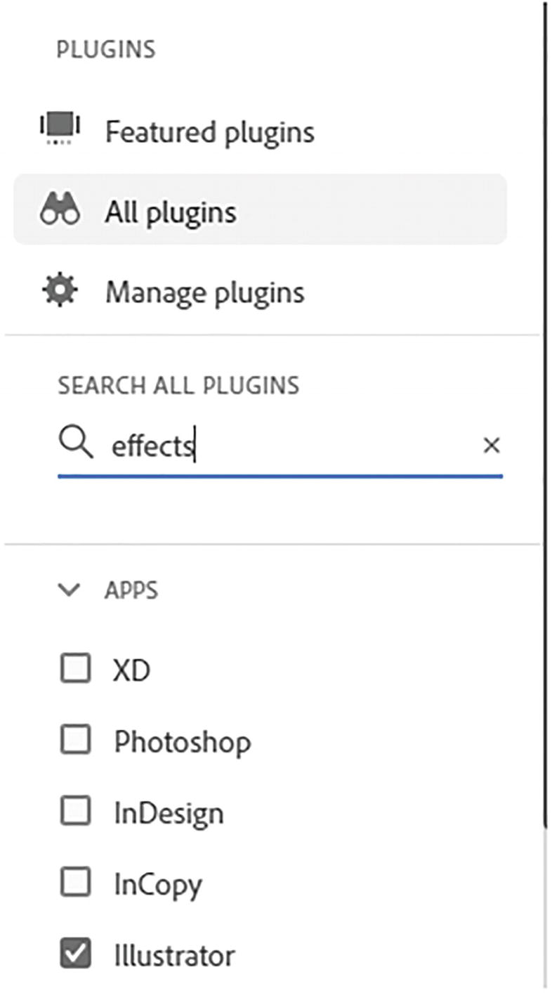
Where to Acquire Additional Effects via Creative Cloud
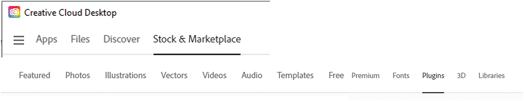
Creative Cloud desktop options for plugins
Under All Plugins on the left, check off Illustrator.
Use the Creative Cloud Desktop to search for other plugin effects
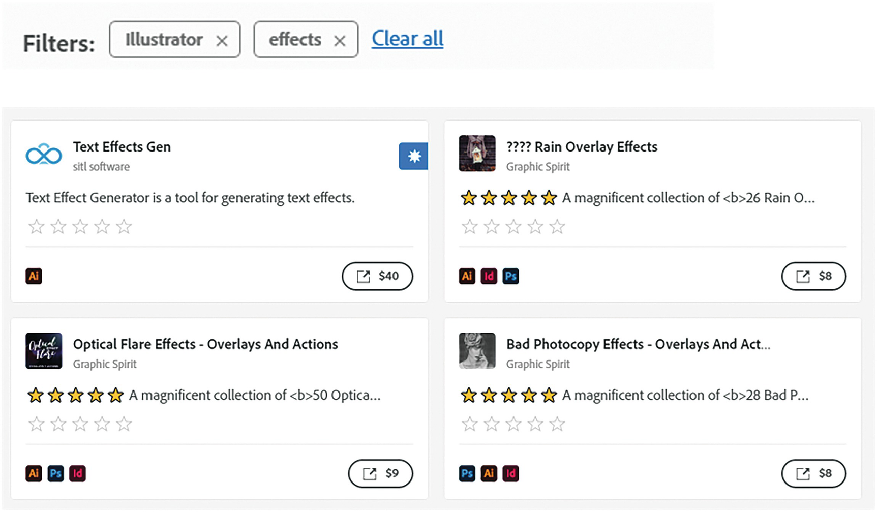
Use the Creative Cloud Desktop to review the effects that were filtered
Summary
As you have seen in this chapter, Illustrator provides a variety of Illustrator and Photoshop effects that we can apply to objects and their paths. These are created using the Appearance panel and are stored in the Graphic Styles panel for when we need to use them again. Now that we have applied styles to our objects, we can continue with the project. In the next chapter, we will look at how to work with symbols and the specific Symbolism tools in the Toolbars panel.