
Chapter 8. Planning a strategy and expanding your insight
- Planning your strategy
- Project history and metric trending
- Everything’s a component
So far, you’ve installed SonarQube and begun analyzing your projects, and you’ve taken an in-depth look at each of SonarQube’s Seven Axes of Quality, the seven ways SonarQube measures what’s right or wrong with your code. If you’re typical (and don’t worry, you probably are typical) you’re wondering how you’ll ever get through all the things SonarQube points out that need work.
It may be intimidating, but it’s probably also clear that what SonarQube offers is too valuable to walk away from. So now what? As with any big job, the best thing to do is break it down into small, manageable chunks, and that’s what the next few chapters will help you do. In part 2, we’ll help you see how to begin fitting SonarQube and what it has to say into your daily and weekly routines with Continuous Inspection, code reviews, and IDE integration.
We’ll start in this chapter by giving you some background knowledge that’s useful in dealing with SonarQube, such as a better understanding of the history of your project, which SonarQube builds through data snapshots, and project events and how they relate to the database housekeeping algorithms. We’ll also show you some of the other views of your data SonarQube gives you. Part 1 of this book focused mainly on the default dashboard and metric drilldowns, but if raw numbers don’t speak to you, there’s still hope. SonarQube offers several other presentations, and in this chapter you’re likely to find one that gives you what you need.
Before we get to the other presentation formats, we’ll begin with what’s probably foremost in your mind right now: how to whittle down your technical debt. We’ve spent quite a while explaining what SonarQube’s numbers mean and helping you understand why you should care. Now that you’re sold, we’ll help you figure out what to do about the problems SonarQube helps you identify.
8.1. Planning your strategy
In chapter 1, we asked you to imagine that your CEO’s Aunt Betty was a customer, one with a tiny account and big opinions. When she was hit by bugs in a new release, the CEO went through the roof and demanded that you find a way to measure quality and show improvement. Now that you’ve got SonarQube up and running, you certainly have a way to measure quality—but it’s not measuring very much of it. In your gut, you’ve known it all along, but now you’re facing clear evidence that years of developer turnover and jumping to the hottest new framework every few years without removing the old one have left your project in a shambles. Worse, your CEO has seen the numbers too. Where he was raging before, now he’s almost too quiet. You know you’ve got to come up with a plan. Fast.
First, don’t panic. Unless you’re lucky enough to be on a relatively new project, you’re probably facing a technical debt that built up over years. It’s perfectly reasonable to expect that it will take at least months, if not years, to clean up. (And once you show your CEO that you’ve got a plan, he’ll probably calm down and agree.)
Second, remember that the best way to approach a problem of any size is to break it down into smaller pieces. Even though they’re all important, and no one quality axis in isolation will give you the full picture, you can’t address all seven axes at once. So tackle them one at a time. Now that you’ve understood and assessed the full weight of all seven, start with the one or maybe two that call out to you the loudest from the project dashboard. That could be any of them; but for most people, issues are the sore thumb, because they’re about the things in your project that are demonstrably wrong. So that’s what we’ll focus on here.
The third step is getting the team on board. Diverting some of your time to quality remediation and away from new features will require buy-in and backing, not just across the development team (including testers, architects, and project managers) but also from management and your business partners. For the technical folks on your team, showing them what SonarQube has to say usually gets their attention and some degree of buy-in. For the nontechnical types, like your business partners and certain levels of management, you’ll probably need to pitch SonarQube as an investment—not necessarily in quality, because that may be a bit too esoteric. Instead, be candid about the fact that low-quality code is harder to maintain. It takes longer, and the process of making changes is more error-prone than it should be. Allowing time for remediation now will help you give them what they want (more features and fewer bugs, delivered faster) in the future.
The next step is to pick the exact metric or metrics you want to track and decide how you’ll approach them; that’s what we’ll spend our time on in this section. We’ll begin by looking at what to consider when picking a metric you want to track long term, and then discuss a few strategies for improving it.
Before we move on to that, we need to touch on the final step: keeping everyone focused. Choosing a metric to work on and getting everyone excited about it won’t do much good if the effort trails off after a month. To keep the technical staff focused, weekly code reviews can work wonders. We’ll go into detail on SonarQube’s code-review functions in chapter 10. To keep your nontechnical teammates on board, you’ll probably want to exploit the history and trending graphs we’ll show you later in the chapter. Just seeing the graphs move in the right direction should help your teammates stay motivated, too.
8.1.1. Picking a metric
We’ve already said we’ll focus here on issues, so we could say that the target metric for this discussion is “issues.” But that’s a bit vague. It will be easier to rally the troops and keep them rallied if the target metric is specific and everyone is on the same page about what it means. Narrowing the field to issues still leaves a number of specific metrics you could choose, and picking one isn’t as straightforward as it may seem. To show you why (and lead you to our favorite issues metric), let’s walk through the pros and cons of a few.
Rules Compliance Index
Focusing on the Rules Compliance Index (RCI) is tempting because it’s a high-visibility number. It’s shown in the default filter (the front page) and again on the default dashboard in the rules compliance widget shown in figure 8.1.
Figure 8.1. The rules compliance widget appears on the default dashboard, making the RCI a prominent gut-check metric. It also shows the count of issues at each level of severity.

It’s also tempting to use RCI because everyone loves a good percentage, right? The problem is, it’s based partly on project size. So a developer could inadvertently cause a drop in the RCI by cleaning up duplications, which is behavior you want to encourage. That’s because the RCI is calculated by dividing a Weighted Issues (WI) score by the project’s number of lines of code (LOC). Eliminate lines of code, and you torpedo your RCI score, discouraging behaviors that benefit the project.
Conversely, adding a few new domain classes with lines and lines of issue-free getters and setters will boost your RCI without fixing a single issue.
While we’re talking about the RCI, note that the problem isn’t limited to that metric. Any of SonarQube’s percentages will suffer from similar side effects. These percentages are good gut-check metrics, but for tracking progress, they’re probably not what you want.
Count of Blocker and Critical-level issues
By focusing on the specific counts of high-value issues, you’re choosing metrics that aren’t impacted by changes to the project’s LOC. Additionally, meeting a goal for these numbers means high-value changes for your project. And if you’re working with a single project or a group of projects that are similar metrics-wise, this may be exactly the right way to go.
But if you’re setting goals across a set of diverse projects, you may have a hard time balancing where to set a goal based on these numbers between projects that are already in decent shape and those that need a lot of work.
Additionally, a developer who notices a few Major-level issues in another part of the file he’s working on and cleans them up while he’s in there has improved the project’s quality, but he’s had no impact on the target metrics. That tiny disincentive could be the difference between cleaning up those Major issues and letting them lie to move on to other work.
Weighted Issues
The WI metric, which is part of the RCI, is also immune to swings in a project’s LOC count. Unlike the Blocker and Critical counts, choosing WI as your focus metric has the additional advantage that nearly every issue eliminated has an impact on the goal you set against it, because the WI formula includes everything but Info-level issues. The exact formula is as follows:
(Blockers * 10) + (Criticals * 5) + (Majors * 3) + Minors
Thus although fixing 10 Minors counts toward a goal, developers are incented to go after the more important issues first.
Additionally, it may be easier with a WI-reduction goal to find a balance between the needs of healthy projects and those that need a bit more attention. Because a project’s WI score encompasses nearly all its issues, setting a target reduction number in WI points lets teams with cleaner projects work through their Blockers and Critical issues and then move on to the Majors, and so on, while the teams with greater challenges focus on their highest-value issues.
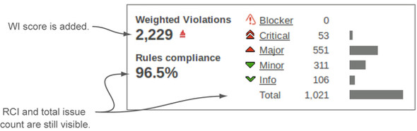
WI ticks a lot of the boxes as a desirable metric to track, but it does have one minor downside: it’s not visible by default. It’s not shown in either the default filter or the default dashboard. But you can easily add it to your filters, and chapter 13 tells you how. There are also a number of ways you can add the metric to your dashboard, including a WI-focused version of the issues widget that’s shown in figure 8.2 (available in the Widget Lab plugin). This is our favorite issues-related metric for long-term tracking, but you’ll have to make an effort to see this number if it’s what you choose for your focus.
Figure 8.2. This version of the issues widget includes all the metrics in the standard rules compliance widget, and it also shows the project’s WI score. (Issues used to be called violations.)

If issues aren’t your target, your candidate metrics will be different, but you should take similar factors into account—particularly when looking at percentages. Once you’ve picked a metric to focus on, you need to decide how you’re going to approach it. What follows are a number of methods we’ve seen work well. Each method is effective on its own, but don’t think you have to choose just one approach. Many of these methods work well together.
8.1.2. Holding your ground
The first approach we’ll look at is just holding your target metric steady. It can be alternately stated as “Just don’t let it get any worse.” This may sound like sandbagging, but for a project under active, heavy development, this approach can be surprisingly challenging—particularly for a team whose members have varying degrees of experience.
In addition to teams with very active development, this may be a good approach for teams that are new to the world of SonarQube and a bit intimidated by the thought of having to improve quality while they do the “real work” of satisfying customer needs. In that case, a first goal of treading water for a while lets the team get comfortable with SonarQube before being asked to step up and start moving the numbers in the right direction.
If you do take this approach, you may be surprised to find that after an initial adjustment period, the numbers do begin moving in the right direction. In our experience, good developers are passionate about good code, and once they see (and accept) what’s wrong in their projects, they’ll want to fix it. Like straightening a crooked picture, they’ll be compelled to put it right.
8.1.3. Moving the goal posts
The next method is a bit like weight training, where you start with a weight you can just manage and work at it until lifting it becomes easy. Then you increase the weight and begin again.
In this case, you start with a limited analysis (either by using only the most important rules or by analyzing only the most critical parts of your code), then you clean up the problems, and then you make it harder (by adding either more rules to your rule set or more code to your analysis). In other words, every time your coding team cleans up the project, you move the goal posts.
The main benefit of this approach is that you’re never faced with an overwhelming task. And if your whole team understands at the outset that the goal posts will be moving, this could be a great way to handle your project’s initial cleanup.
The downsides of this method are as follows:
- It messes up your trending. Each time your project approaches or attains perfection, you change the goal, and quality seems to plummet. If you like this approach, but the trending is important, you may be able to use the sonar.projectDate analysis property discussed in appendix B to retroactively apply the enhanced profile.
- If your goal is rule-based, this approach limits your ability to use the teaching aspect of SonarQube’s rules. Seeing what code is flagged with issues helps developers learn to write better code. Hide some of those best practices, and even the best developers may inadvertently add Majors that you’ll hold them accountable for later, while they’re fixing the Blocker- and Critical-level issues you’re showing them now.
8.1.4. Boy Scout approach: leave the class better than you found it
The Boy Scout approach builds on the “holding your ground” method. Rather than stopping at “don’t add any new issues,” it says that you clean up the existing issues in files you touch in the normal course of satisfying customer needs.
Because this approach limits your quality-centric changes to classes that need testing attention anyway, it should help limit the impact of the team’s quality-remediation changes on the QA folks. The downside of this approach is that frequently modified classes quickly reach squeaky-clean status while your code backwaters continue to stagnate.
If you choose this method, you need to decide how rigorously to apply it. For instance, typically you’d like developers to fix all the issues in the classes they have to modify anyway. But if Susan needs to make one small change in a large, complex, issue-riddled class, should she be required to clean up the entire thing? Or would it be enough in this case to limit her changes to only cleaning up the method she needed to modify?
Stick with this approach, and eventually even your backwaters should be cleaned up, but it may take a while. If “eventually” isn’t fast enough for you, you may want to combine this approach with one or both of the next two methods.
8.1.5. SonarQube time: worst first
This approach is a combination of two distinct mechanisms. The first is SonarQube time, or setting aside a specific amount of time each week (or each sprint) for quality remediation. Teams that use this approach refer to it as SonarQube time because it’s when they’re explicitly focused on what SonarQube has to say. The rest of the week, they’re practicing the Boy Scout method or at the least holding their ground. But for a certain number of hours every week, they’re working through what SonarQube reports and knocking out problems.
During those hours they use a worst-first approach, picking the file or class that scores the worst against the team’s target metric and working through it, fixing problems. This can require a little coordination if multiple folks are taking their SonarQube time at once, but otherwise this is a great approach if you have the freedom to dedicate time for quality on a regular basis.
There’s another whole dashboard that makes this approach an easy one to take. The Hotspots dashboard is composed mainly of hotspot widgets, each set to show a different metric. If your target metric isn’t included, you can easily add another widget instance or edit one of the existing instances to show your target metric. You can also choose the number of files to show. Figure 8.3 shows the hotspot metrics widget set to show the five worst (highest-scoring) files for weighted issues.
Figure 8.3. The hotspot metrics widget provides an easy reference for which files or classes have the highest score for any given metric. You can have as many instances of the widget as you like, each configured to a different metric.

8.1.6. Re-architect
If none of the previous methods seems right to you, it may be because a more drastic approach is in order. In The Mythical Man-Month (Addison-Wesley, 1975) Frederick Brooks advised that when you’re working with new concepts or technologies, you should plan to “build a system to throw away” so that your second system, the one you’ll actually use, can incorporate the lessons you learned the first time around.
Clearly, that’s not always practical, and we’re not necessarily advocating here that you toss your current project code. We are saying that sometimes you find yourself with a project that’s such a conglomeration of disparate ideas and technologies that patching up issues, or adding tests, or eliminating duplications would be like putting a Band-Aid on a broken leg.
If you find yourself in that situation, your best bet is likely re-architecting. Many times that can be accomplished without huge, disruptive change. For instance, switching (or unifying) frameworks can often be done gradually, migrating one piece of the code at a time from the old framework to the new and giving everyone involved time to accommodate the changes.
Whether you do it slowly or suddenly, in the process of refactoring you’re likely to remove large swathes of issue-riddled, duplicative, poorly structured code. Because you’re more attuned to quality now, the code you replace it with will be cleaner, better structured, and more thoroughly tested. (Right?) Almost as a side effect of making your code base more maintainable, your SonarQube metrics will improve.
When it’s needed, this is the best approach to take. The hardest part is facing—and then selling—that it’s needed.
8.1.7. The end game
Now you’ve seen approaches to remediation that run the gamut in terms of aggressiveness from seemingly passive (the “holding your ground” approach) to rather bold (re-architecting). We hope we’ve presented at least one that will work for you. Just keep in mind that it’s only a starting point.
Yes, we’ve advised you to pick one metric and focus on it, but you won’t be finished when you’ve mastered it. This is a long-haul effort for a couple of reasons. The first is that addressing only one quality axis isn’t enough. Eventually, you’ll want them all under control. You’ll begin by choosing one or two metrics, but as you whip each quality axis into shape, you’ll want to add another one, and another, and so on, until you’ve got a handle on all seven.
As you add axes, give some critical thought to the order that makes the most sense for you. For instance, working on getting your API documented before tackling duplications may not be the best approach. Similarly, if you’re faced with a combination of low test scores and high complexity, you may not want to spend a lot of time writing tests for code you know you need to refactor.
The second reason code quality is a long-haul undertaking is that once you’ve started seeing some quality wins, you won’t want to backslide. Code reviews and Continuous Inspection, which we’ll talk about in chapter 9, can help prevent that, but eventually you’ll want to set quality gates as backstops. For instance, you may say that you can’t release a new version to production if there are any Blocker or Critical issues (maybe limit this rule to new issues at first) or if test coverage has dropped. Assuming you have management backing to delay a production release, then these kind of criteria can help keep code quality top-of-mind.
You’ll gain that management backing as you begin to show progress and get some quality wins under your belt. But you may wonder how you’ll track changes and show that progress. That’s next.
8.2. History and trending
It’s all well and good to pick a metric and try to move it in the right direction (or hold it steady for a while), but what’s the mechanism for keeping track? Are you supposed to write down the number for your metric’s starting point and do the math every time? In a word, no.
One of the best things about SonarQube is that it doesn’t just give you a look at the current state; it offers trending as well. We promised that in chapter 1, and it’s finally time to deliver. We’ll look at differentials in chapter 9; they give you a quick comparison of current state against one of three points in history, but there are other mechanisms for tracking trends in SonarQube. They’re up next.
8.2.1. Time Machine
SonarQube offers an entire dashboard devoted exclusively to trending. It’s called the Time Machine, and it also touches most of the Seven Axes of Quality. Additionally, it provides something else we promised in chapter 1 but haven’t delivered on yet: graphs! Figure 8.4 gives an overview.
Figure 8.4. The Time Machine dashboard is composed of multiple instances of the history table widget, each configured for a different quality axis, and the timeline widget, at upper left, which gives a granular history of up to three metrics.

This dashboard is focused on showing not current state, but your project’s progress over time. Sure, you’ve added 40 new features, but has that come at the cost of quality? And if so, in what areas? The Time Machine dashboard can help you answer those questions. It’s composed of multiple instances of the history table widget and one copy of the timeline widget. As with each of the dashboards, you can edit the Time Machine dashboard to change the balance if you like, and each widget instance is itself configurable.
At upper left on the Time Machine dashboard, the timeline widget offers a colorful, granular view across each snapshot in your project’s history. It covers up to three metrics and is one of SonarQube’s sexiest out-of-the-box widgets. Figure 8.5 shows a close-up.
Figure 8.5. The timeline widget, at the dashboard’s upper left, offers a colorful, granular graph of your project’s history. There’s no fixed y-axis, though, so mouse over the graph to have the relevant values shown in the legend.

Although graphs are typically intuitive—that’s the beauty of a graph, after all—you can’t take the timeline at face value. Because there’s no fixed y-axis, each line in the graph is relative only to itself. A line in this widget can jump the full height of the graph for a change of hundreds, and it can jump the full height of the graph for a change of less than one. Figure 8.6 illustrates the point.
Figure 8.6. Don’t let your intuition rule too strongly when you’re reading the timeline widget’s graphs. Because each line in the graph is essentially an independent sparkline, you need to mouse over the graph to see the numeric values whenever they show what looks like a large jump. As the bottom two figures show, a line can jump the full height of the graph for a change of less than 1: .7 in this case. The upper two figures show the opposite end of the spectrum, with a full-height jump for a change of 196.

Despite the mild caution required with the timeline widget, it’s still an excellent tool to give at-a-glance trending of key project metrics over time. By default, it shows complexity (which you want to see headed down), rules compliance (which should be headed up), and test coverage (which we hope is also headed up).
The other widget on the Time Machine dashboard is the history table widget. Each instance gives you precise values for up to 10 specific metrics and sparklines for those values at points in your project’s history. Figure 8.7 gives you a closer view.
Figure 8.7. The history table widget shows sparklines and historical values of up to 10 metrics. By default, it shows the first value on record, the last value on record, and the value from the last time the project’s version number changed. The sparklines to the right reflect only those values shown in the widget, not the kind of detailed graphing that’s available from the timeline widget shown in figure 8.6.

By default, those points in time are the first analysis on record, the last analysis on record, and the analysis for the most recent version event. We’ll cover events in detail next; but briefly, when you change the value of the sonar.projectVersion analysis property, it triggers a version event, and that snapshot is marked for special treatment. One of the ways that snapshot is treated differently is that it’s eligible to be shown in the history table widget.
Both the number of metric rows and the number of snapshot columns are adjustable. As you increase the number of snapshot columns, you see additional version event snapshots, working backward from the ones already showing. Because the spark-lines this widget shows reflect only the values displayed in the table, rather than the values from the fully detailed project history, the more snapshot columns you include, the more detailed your sparklines.
Now let’s take a closer look at exactly what those version events are.
8.2.2. Events and database cleanup
We’ve breezed over the topics of events and database cleanup previously. Now it’s time to get into the details. Essentially, events are special flags on your project snapshots, and snapshots with event flags get special treatment. Specifically, they’re exempt from database cleanup.
It’s analogous to old-fashioned photo snapshots. Take one every day or multiple times every day, and you’ll have a lot without long-term value. But snapshots from events (graduations, holidays, and vacations, for example) have long-term significance. Those you hold on to. SonarQube does the same thing.
There are four kinds of events:
- Version— The value of the sonar.projectVersion analysis property changes. These events can also be set retroactively by a project administrator.
- Profile— A change is made to the rule profile against which your project is analyzed. This is when rules are added, removed, or edited.
- Alert— An alert status changes. You can set alert thresholds on rule profiles. When your project crosses a threshold in either direction, an event is recorded.
- Other— The project administrator manually sets an event on a snapshot.
Why is it even a question? Because each snapshot holds a lot of data. If you run multiple analyses a day, that adds up to a lot of snapshots and a whole lot of data over time; so SonarQube does regular housekeeping. You may have noticed lines at the end of your analysis logs that start with “Keep one snapshot per ....” That’s the database cleanup we’ve been talking about. It’s run for each project as part of the analysis. By default, SonarQube keeps the following snapshots:
- One per day— After the first 24 hours
- One per week— After the first month (4 weeks)
- One per month— After the first year (52 weeks)
- None— After 5 years (260 weeks)
Like many other settings, these thresholds are editable, both globally and at the project level; we’ll show you how in chapter 14 for the global level and in chapter 15 for the project level. In case you ever need to know (you probably won’t), we’ll also show you how to manually clean out snapshots in chapter 15.
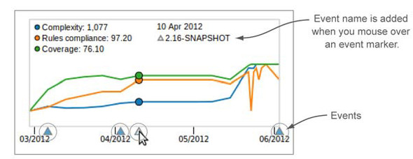
Now that you have a better understanding of events, we want to point out a feature of the timeline widget that we left out before: it shows events (see figure 8.8).
Figure 8.8. Each event in a project’s history is marked by a blue triangle on the X axis. Mouse over the triangle to add its name to the graph.
8.3. Everything’s a component
In this chapter we promised you multiple ways to look at your data, and the next one is based on a concept that we haven’t talked much about yet. SonarQube treats each project, module, package, and file as a component. That means just as it calculates metrics at the project level, SonarQube also calculates them for each module, submodule, package, and file in those projects. You can easily get a test-coverage score not just for a project as a whole, but also for each package and class it contains.
You can see this concept at work starting from SonarQube’s default front page, with the treemap widget at lower right, like the one shown in figure 8.9.
Figure 8.9. The treemap defaults to a subblock for each project, with relative block size indicating Lines of Code, and block color (cool, grassy green to angry red) indicating rules compliance. Click in the unlabeled part of the block to drill in to a treemap of that block’s components. Click-through on the block’s name to land at a dashboard for that component.
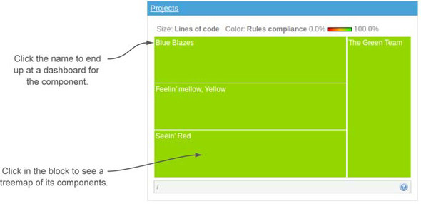
Assuming you’ve got multiple projects under analysis, you’ll see the treemap broken up into multiple subrectangles, one for each project. The size and color of those blocks convey two key metrics. Block size reflects LOC; and color, which ranges from a cool, grassy green to an angry red, ties to rules compliance. In general, the closer a block is to an angry red, the more quickly you should pay attention to it.
The treemap gives you two different ways to drill in. Click the block label (the component name) to land at a dashboard for the component you’ve chosen, whether that’s a project or something at a lower level, and click in the unlabeled portion of the block to drill in to a treemap for the chosen component’s subcomponents. Drill down far enough, and you’ll find yourself looking at filenames. Clicking the filename opens the file detail pop-up.
8.3.1. Project component view
Next, let’s drill in to a project and choose the Components link in the left rail. The presentation you see looks a lot like a filter. But instead of showing the projects in your SonarQube instance, it shows the modules or packages in your project, with a few key metrics for each (configuring which metrics is like configuring a filter, which is covered in chapter 14). Figure 8.10 shows part of the Components view for SonarQube.
Figure 8.10. The Components view shows a filter-style listing of the modules or packages in your project.
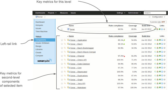
Click an item in the filter list, and you’ll find yourself at the Components view for that item. Of course, the component names in the list change, but little else does. As proof of that, figure 8.11 shows a drill-in from the Components view shown in figure 8.10.
Figure 8.11. The breadcrumb trail that’s added at upper left in the interface shows how deeply you’ve drilled in to the Components view.

Continue clicking in the textual component list, and eventually you end up at a level that only shows filenames. Just as with the treemap, once you’re at that level, your click-through (on the magnifying glass) pops open the file’s detail view in a new window.
If you’re not paying attention, it can be easy to get lost in the Components view drilldown. Fortunately, each click adds a link to the breadcrumb trail at upper left to help you keep yourself oriented and allow you to walk back up the trail. As with the Components drilldown, figure 8.12 shows there’s little to differentiate a component-level dashboard from the one at the project level except the breadcrumb trail.
Figure 8.12. As with the drilled-in version of the Components view, the default dashboard looks almost the same from level to level. This version of the dashboard reflects a few of the suggestions we’ve been making, including the use of the Widget Lab plugin’s WI rules compliance widget in place of the standard rules compliance widget at upper right, and the addition of a treemap widget.

8.3.2. No package history
Once you’re drilled in to components at any level below the project, the dashboard link in the left rail also takes you to a dashboard for that component. Most of the left-rail links work correctly for components, with the exception of the Time Machine.
The dashboard in figure 8.12 is supposed to start at upper left with a timeline widget, which is borrowed from the Time Machine dashboard. The colorful graph the widget offers is a nice addition to what might otherwise be a mass of grey. But when you get to the package level, you don’t get a graph from the timeline widget. It only says “No history.”
You get similarly disappointing results when you check the Time Machine dashboard at the package level, because although SonarQube generates its metrics at all levels, it only keeps them long-term at the project and module levels. Metrics beyond the last analysis aren’t kept for packages and classes, which helps keep the SonarQube database size down to a manageable level and improves performance. So the timeline widget says “No history,” and the history table widgets only show you the most recent value for each metric. No sparklines or pretty graphs anywhere in sight.
This behavior is the default. You can easily have SonarQube archive package metrics (globally or only for selected projects), but be aware that doing so will swell your database and potentially degrade performance.
8.4. Related plugins
The related plugins for this chapter play on the “other ways to view your data” theme. The first one, Tab Metrics, provides insight into the metrics collected at the file level. The second, Widget Lab, gives you an alternate dashboard widget for issues.
8.4.1. Tab Metrics
The Tab Metrics plugin can be installed easily through the update center and requires no configuration. In the file detail view, it adds a new Metrics link, which lists the current value for every metric available for the file, as shown in figure 8.13.
Figure 8.13. The Tab Metrics plugin adds a tab to the file detail view that lists every metric available for the file.
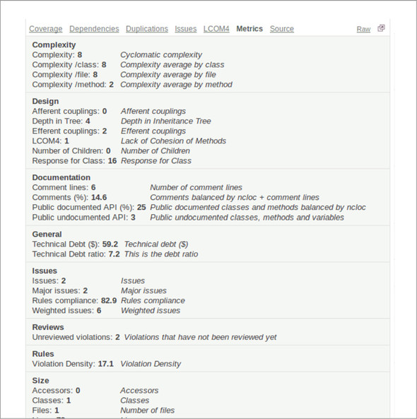
The metrics are shown grouped by SonarQube’s own internal categories. To the right of each metric name and value is the metric description. Often the description is the same as the name, but sometimes it offers a useful expansion.
Be aware that the plugin shows both SonarQube’s core metrics and metrics introduced and computed by other plugins.
8.4.2. Widget Lab
Widget Lab was already covered earlier in this chapter, when we talked about picking a metric. If your focus is issues, we urged you to consider using the Weighted Issues metric as your target. Normally that’s not a very visible metric. You can make it appear in filters, but at a project level there’s no way to see it. That’s where Widget Lab’s WI rules compliance widget comes in. It gives you all the metrics in the standard rules compliance widget, plus WI at upper left, as figure 8.14 (repeated from figure 8.2) shows.
Figure 8.14. You can use Widget Lab’s WI rules compliance widget to put WI front and center on your project dashboards.
8.5. Summary
SonarQube analyzes your projects against up to seven different quality axes (depending on the language). For some projects, that can add up to a lot of things that need to be worked on. Instead of being overwhelmed by the size of your technical debt, we hope this chapter has helped you get started by choosing one or two metrics to focus on and creating a plan of attack for moving them in the right direction.
As you pick your target metric, remember that it’s best to avoid percentages because they can be skewed by changes in project size. If you decide to make issues your initial focus, we think Weighed Rule Violations makes a great target metric.
We’ve given you a number of strategies to consider (although certainly not an exhaustive list). As you decide which strategy or set of strategies you’ll use, don’t hesitate to start with the “holding your ground” method if you need to. It’s a great way to bring attention to a new push for quality while the team gets used to SonarQube and to the idea of having its code quality measured. At the other extreme, if it’s called for, you may need to re-architect. In the middle are a number of strategies that can work well together: moving the goal posts, the Boy Scout method, and SonarQube time/worst first. Once you’re comfortable with SonarQube and making good progress on your first metric, you’ll want to add more to your focus, until you’ve got them all under control.
Whatever metric and strategy you begin with, your campaign may benefit from using some of the other ways SonarQube provides to view your data, such as the Hotspots and Time Machine dashboards for deeper insight into project history.
Also in this chapter, you’ve seen how to drill in to your project for module- and package-level metrics. You’ve learned about project snapshots and the importance of events, and now you know how SonarQube decides which snapshots to keep and which to discard.
In the next chapter, we’ll explore trending more fully as part of a discussion of Continuous Inspection, which can help keep your team focused on code quality from day to day.