
Chapter 1. An introduction to SonarQube
This chapter covers
- Why SonarQube
- Running your first analysis
- The Seven Axes of Quality
- Languages SonarQube covers
- Interface conventions
For as long as software developers have been writing code, we’ve been asking ourselves and our teammates, “Did we do it right?” Until fairly recently, there weren’t a lot of good answers.
Unless you worked for NASA, the answer was “Well, it compiles.” Or, “Um, it seems to work.” And then there’s the perennial favorite: “The users aren’t complaining.”
Sometimes that was enough. Until the users did start complaining. Or until we had to add new features. Which is when we realized just how “not right” we had done it.
More recently, people have tried to answer these questions with automated test suites. But how do you know you’ve written enough tests? What about the things tests can’t cover?
As much as developers have struggled to understand when they’ve “done it right,” their bosses have struggled even more. It’s easy enough to evaluate salesmen (product sold), and lawyers (cases won), and factory workers (whatzits produced with acceptable quality). But how do you evaluate a coder?
In the past, people have been so stuck for an answer that they’ve resorted to the factory worker model. Only instead of whatzits, lines of code were counted. Not even “lines of code with acceptable quality,” just “lines of code.” Because measuring quality was hard.
Now it’s not. Welcome to SonarQube.
1.1. Why SonarQube
Imagine that your CEO’s aunt is also a customer. It’s not a big account; in fact, it’s tiny. But she makes his favorite pie, so her opinion matters more than it should. Unfortunately, the last release had a couple of bugs that mattered to her, so he’s been on the warpath ever since. He’s started ranting about quality and demanding numbers. He says that if you don’t come up with a way to measure quality and show improvement, he will. The glint in his eye says you won’t like it.
Now what? Now it’s time for SonarQube, which will help you manage your code quality, instead of letting your code quality (and Aunt Betty) manage you.
SonarQube is a free and open source “code quality platform.” It gives you a moment-in-time snapshot of your code quality today, as well as trending of lagging (what’s already gone wrong) and leading (what’s likely to go wrong in the future) quality indicators. For test coverage (a leading indicator), a score of 50% may not look great, but what was it last month? If you’re up from 35%, it’s high-fives all around. Down from 70%? Time to shape up.
SonarQube doesn’t just show you what’s wrong. It also offers quality-management tools to actively help you put it right: IDE integration, integration for Jenkins, a popular Continuous Integration server, and code-review tools.
SonarQube’s commercial competitors in the code-quality space offer some of those things too (depending on which one you’re looking at); but they seem to focus their definition of quality mainly on bugs and complexity, whereas SonarQube’s offerings span what its creators call the Seven Axes of Quality. We’ll cover them in more detail soon, but in brief, SonarQube addresses not just bugs but also coding rules, test coverage, duplications, API documentation, complexity, and architecture. Some of the other players in this space also hit unit-test coverage and API documentation, but no one else seems to address all Seven Axes.
Because it’s free, it would be easy enough to say, “Why not SonarQube? Might as well try it.” Although that’s a perfectly valid reason to give it a shot, once you put it through its paces you’ll see that even if it weren’t free, SonarQube would be well worth the investment. That’s because software quality is something every system stakeholder cares about, not just end users.
Note
SonarQube hasn’t always been called that; it used to be named just plain Sonar.
From a tester’s standpoint, SonarQube is worth attention because it will help you pinpoint the spots where automated testing is thin or nonexistent. It may also help target manual penetration and security testing.
From a developer’s standpoint, SonarQube is worth the effort because it helps you grow as a coder. From language-specific subtleties to thread safety and resource management, SonarQube can show you what you’re getting wrong—or doing sub-optimally—and point you in the right direction for fixing it. That guidance isn’t just for the folks fresh out of school. Experienced programmers can learn from SonarQube, too, even if it’s only that their super-elegant code will be unreadable to the new guy. Plus, let’s face it; everyone has off days, and SonarQube helps coders find their goofs and fix them quickly.
From a software architect’s standpoint, SonarQube is worth the time because it helps you keep an eye on whether your cleanly delineated initial design is being degraded over time with creeping dependency cycles. It can show you whether the internal coding rules are being followed, and it can help you spot rising complexity that needs to be refactored.
From a project management standpoint, SonarQube is worth the focus because testing alone isn’t enough. It can only show whether software does what it’s supposed to do: its level of external quality. On the other hand, SonarQube analyzes and fosters internal quality: whether an application will run optimally and be readily maintainable and extensible down the road.
From a business standpoint, SonarQube offers a strong ROI because its acquisition and setup costs are low, and its intuitive interfaces mean that very little training is required. Add to that the fact that its adoption within an organization is typically viral, and you’ve got a minimal investment that produces what quickly become significant results.
Finally, from a management standpoint, SonarQube is worth the investment because it gives you metrics. Like the stereotypical charts that salesmen are measured by, with SonarQube in the fold, you’ve now got trending available on abstract measures of code quality. It even offers charts, like the one in figure 1.1.
Figure 1.1. Trending is a core feature of SonarQube, with changes represented in a variety of formats, including this spark line-style graph that can be added to any dashboard.

In nearly every industry, serious leaders track metrics. Whether it’s manufacturing defects and waste, sales and revenue, or baseball’s hits and RBIs, there are metrics that tell you how you’re doing: if you’re doing well overall, and whether you’re getting better or worse.
Now we’ve got those metrics for software, packaged and presented through a standardized, centralized, server-based quality platform (nothing to install client-side!) that uses code-quality tools already respected in the industry, such as FindBugs, PMD, and JaCoCo for Java; and Gallio, Gendarme, and FxCop for C#. Those results are presented in a fairly intuitive web front end that also offers RSS feeds of the Alerts raised when the quality thresholds you set are crossed.
1.1.1. Proven technologies
If SonarQube uses existing tools, you might ask why you need it at all. Why not just run those tools alone? There are a couple of reasons. The first is that the tools generate laundry lists of potential problems. They don’t generate metrics, and, for the most part, they don’t offer tracking or trending from analysis to analysis.
Numbers aside, of course those tools can be run without SonarQube. But are they? Any developer can download FindBugs or Gallio and point it at his code, but does he? How often? With what settings? Are they the same ones that the coder in the next cube is using? And what’s the visibility of those quality reports to the team at large? SonarQube answers all these questions by applying standardized rule sets, not just from analysis to analysis on a given project, but potentially across your entire stable of projects. It also offers its own rules and measurement algorithms, such as an enhanced duplication-detection mechanism that shows you cut-and-paste not just in a given project, but across projects as well.
With all that going on behind the scenes in SonarQube, you might think you need a PhD to use it. In fact, analysis is easy to set up, and the SonarQube interface is surprisingly intuitive, as you’ll begin to see shortly. Additionally, SonarQube’s review functions and integration for the Eclipse IDE make it easy to transparently manage the fix for whatever SonarQube tells you might be wrong.
1.1.2. Multilingual: SonarQube speaks your language
If you’ve heard of Sonar or SonarQube before, it may have been in the context of Java. SonarQube is written in Java, and it started as a way to measure the quality of Java projects, but it’s no longer limited to analyzing just Java. There is an ever-growing list of languages you can analyze through SonarQube by adding plugins, many of which are provided by the SonarQube community and offered for free.
The SonarQube community has two mailing lists: one for users and another for developers. You can search the archives or get instructions on joining either one here: http://sonarsource.org/support/support/.
Similarly, the other “language of SonarQube” is also easily changed with plugins. The interface is in English by default, but the community supports a number of localization plugins. So if you and your teammates are more comfortable in French, Spanish, Greek, Chinese, or Japanese than English, you can accommodate them to make it as easy as possible to use SonarQube.
Whatever language you speak, whatever language you code in, once you decide to begin using SonarQube you can manage your code quality from a proactive, rather than a reactive, standpoint. Start using it regularly, and you can begin to manage your quality, rather than letting your quality manage you.
1.2. Running your first analysis
At this point, we’ll assume that you’re bowled over by the possibilities and chomping at the bit to get started. It’s not hard. Next we’ll look at installation, then we’ll give you a high-level walk-through of running an analysis, and we’ll finish with a look at the SonarQube interface.
1.2.1. Installation considerations
First you’ll need to download SonarQube, set up a database for it, and turn it on. All that’s covered in appendix A, but before you jump in, there are a few things you’ll want to take into account as you plan your setup.
If your interest is piqued but you’re not ready to install SonarQube for a trial run yet, take a peek at Nemo, SonarQube’s public instance: http://nemo.sonarsource.org. Here you’ll see analyses of many open source projects and get a feel for what SonarQube can show you on large and small code bases alike. Just be aware that this is a showcase for SonarSource, the company behind SonarQube, so what you’ll see is a tricked-out version of what you’ll get from SonarQube out of the box.
In addition to having customized the interface, the SonarSource guys are also using Nemo to show off their commercial plugins for SonarQube. The ones you’re most likely to notice on this site are the Developer Cockpit plugin, which is the only way to get metrics not on projects but on the developers behind them, and the Views plugin, which lets you aggregate quality metrics across multiple projects. Although SonarQube itself is free, you won’t get everything you see on Nemo without spending some money.
Ideally, you’re going to put SonarQube and its database on two separate hosts (to split the CPU load) that are side by side on the network. Network I/O is one of the biggest determinants in how long an analysis takes, so make sure you’ve got as fat a network pipe between the hosts as possible.
Once you’ve set up your database, configured SonarQube, and started it, open a browser and head to port 9000 of your SonarQube host. If you’re running it locally, then your target URL is http://localhost:9000. When your browser is able to connect, SonarQube is up and running.
At this point, you’re ready to begin collecting those metrics we’ve talked so much about; you’re ready to run your first analysis. If you have a choice of where to run it from, then the closer you can get to your SonarQube server and database, networkwise, the better. Running it on the SonarQube host is best of all.
If you’re in a Maven-centric Java shop, then you’ve got a few things to add to your pom.xml file, detailed in appendix B, and you’re good to go. You’ll also want to refer to appendix B if you need to integrate analysis into an Ant script. But the third option, SonarQube Runner, which we cover briefly in the next section and in detail in appendix B, is tidy enough that you may be tempted to <exec> it from Ant.
1.2.2. Analyzing with SonarQube Runner
Before you can run your first analysis, you need one more download: the SonarQube Runner, which actually runs the analysis. The analysis is accomplished by setting some properties and firing off the sonar-runner executable.
Project-specific values are set at runtime, either on the command line or in a properties file. The simplest possible project properties file would look something like the following listing.
Listing 1.1. sonar-project.properties

Listing 1.1 assumes that the project under analysis is written in Java and that you’ve set the database connection values in the global properties file as described in appendix B. It omits tests, the compiled byte code, and dependencies, all of which you’d want included in a full analysis. But if you’ve put sonar-runner in your path, it’s runnable as follows:
cd [path to project root]
sonar-runner
Execute these steps, and your analysis begins immediately, with each step logged to the console and prefixed with a timestamp. The time to run an analysis varies by project size and, as mentioned earlier, network speed.
While you wait for your analysis to complete, you may want to flip to appendix B, which gives you a fuller idea of the analysis properties you can set. We’ve made the list as complete as we can, but SonarQube is under constant active development, so it’s possible to have new properties with each release. Each language-specific plugin also typically adds its own properties to the mix.
1.2.3. Analyzing multilanguage projects
If you’ve browsed ahead to the analysis properties in appendix B and you have a project that uses multiple languages, you might be scratching your head at this point. For instance, a typical web project might use Java or C# for the back end and JavaScript on the client side, but appendix B shows that the sonar.language property (which specifies which language to use in a project analysis) only accepts one value. “Wait,” you’re saying. “I’ve got Java, JavaScript, and XML in my project, and I can only analyze one of them?”
Yes and no. You can analyze all of them. You can’t do it all in one analysis.
Each SonarQube project is about a single language. So what you’ll need to do is set up a separate analysis—a separate SonarQube project—for each language. This means that you’ll have a SonarQube Runner properties file for each language, and you’ll run an analysis for each properties file. (Maven folks, you’ll still run your primary analysis through Maven, but you’ll want to use SonarQube Runner for the rest.)
But whether you’re using SonarQube Runner, Maven, or Ant to run your analysis, you need to make sure you give SonarQube a way to differentiate between, say, your Java evaluation of a project and the JavaScript analysis of the project. Don’t assume that SonarQube will pick up on the difference in the specified language. It only differentiates projects by projectKey, not by projectKey and language. Reuse the same projectKey for each language, and each subsequent analysis against a new language will overwrite the previous one (which will do bizarre things to your quality trends). You may want to vary sonar.projectName as well, but that’s only for your own convenience. It’s not as crucial, and it can easily be changed later if you find yourself getting confused. In chapter 14, we’ll show you how to set up filters (project lists) for each language, so if you wanted to keep the names the same, you could still easily tell each aspect of, say, Project Blue apart by whether you’re looking at the list of Java analyses, the JavaScript results, or the Flex list.
1.2.4. Seeing the output: SonarQube’s front page
Once your analysis is complete, you’ve got your first set of metrics. Point your browser back to port 9000 of your SonarQube host to begin seeing them. When you arrive, you’ll find yourself looking at something much like figure 1.2, which shows a welcome message on the left and, on the right, two different views of the results of an initial local analysis of the open source Apache Tomcat project.
Figure 1.2. SonarQube’s front page is the default filter, which lists a few choice metrics about each project under analysis.
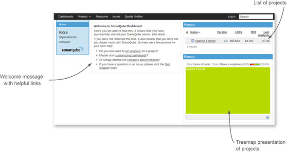
Figure 1.2 shows SonarQube’s default front page, which is your 30,000-foot view of code quality. The widget (box) at upper right lists all projects under analysis, with some key data points for each. The widget at lower right is a treemap of those same projects. With one project in SonarQube, it’s a solid, colored box; but as you’ll see in later chapters, that changes as you add more projects.
1.2.5. Drilling in: the dashboard
In either the project list or the treemap, click-through on the name of your project to reach the project dashboard. From the 30,000-foot view at the front page, you’ve just dropped to 10,000 feet. The view from this altitude looks something like figure 1.3.
Figure 1.3. SonarQube’s default dashboard
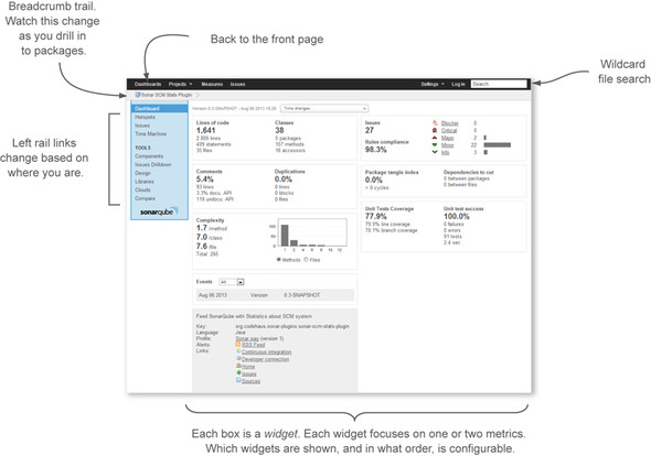
There’s a lot to take in on the default project dashboard (other dashboards are available), and it’s difficult to generalize about it as a whole except to say that you’d like to see the bar graph weighted to the left. Each box here is called a widget. Generally, widgets are focused representations of a single facet of code quality. The widgets on the default dashboard show three types of metrics. The first kind is like a golf score; lower is better. The second is like bowling; high score wins. And the third is like age, which could go either way depending on your perspective, but which is just a value-neutral report of the current state.
Before we move on to the metrics, let’s linger a moment on golf and bowling. It’s no accident that we’ll be comparing the metrics ahead to those two games. On the face of it, they each have you competing against other players, but unless you’re on a professional tour and playing for prize money, you’re really competing against yourself. You want to play better today than you did yesterday. It’s the same thing with SonarQube; it’s not about benchmarking, it’s about having better code today than you did before.
Now let’s look at some metrics.
Size
The size metrics widget at upper left falls in the neutral category. It tells you how many lines of code, methods, classes, and packages it found during the analysis, as shown in figure 1.4.
Figure 1.4. The size metrics widget shows how many lines of code, methods, classes, and packages were found during analysis.

We should make a distinction at this point between lines of code (often referred to as LOC) and physical lines, which SonarQube also reports. The number of physical lines in your project is a raw count of the number of times someone presses the Enter key, whether or not there’s any content on the line. Lines of code, on the other hand, is meant to be a count of the number of “working” lines in your project. The LOC definition is language-specific, but SonarQube calculates it for Java by subtracting comments and blank lines from physical lines.
Why do you care? Because we’re about to start showing you some percentages, and LOC is the bottom number in most of them.
Events
The two widgets in the bottom of the left column are also neutral. Second from the bottom, the events widget gives you a quick list of events recorded on the project, as shown in figure 1.5.
Figure 1.5. The events widget gives a quick list of events recorded for the project.
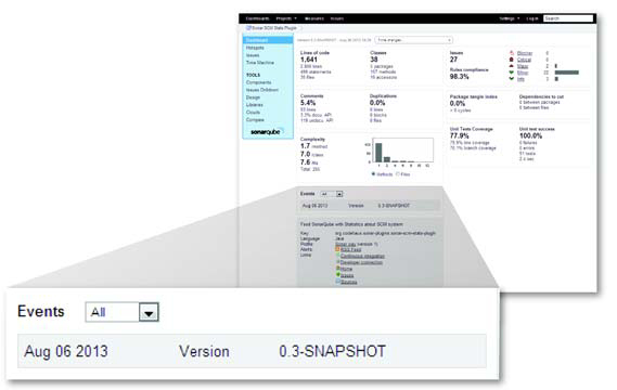
There are several types of events, one of which is a change to the project version string that you pass in to the analysis. That’s the lone event shown in figure 1.5. With the first project analysis, SonarQube recorded a version string “change,” from nothing to something.
Events are significant, at least in part because they flag an analysis snapshot for long-term retention. Every time an analysis is performed, a snapshot of the project state is taken. That could quickly add up to a lot of snapshots, bloating the database, but SonarQube’s rigorous housekeeping routines keep that from happening. Those routines are preconfigured to sane but tunable defaults. For more on that, see chapter 13.
Description
The description widget at lower left is a brief curriculum vitae of your project, showing the language and ID you set during analysis. It also shows the name of the rule set, or profile, applied in the last analysis, as shown in figure 1.6. Because multiple rule sets exist, knowing which one was used can make a difference.
Figure 1.6. The description widget shows basic data about your project and its last analysis.

Finally, the description widget ends with a link to an RSS feed of Alert events on the project. We mentioned earlier that there are several types of events. One type of event relates to Alert thresholds you can set on a rule profile. When those thresholds are crossed in either direction, an Alert is raised (chapter 13 covers setting Alerts). For instance, you may choose to set an Alert when test coverage falls below 80%, or when the number of Blocker-level issues exceeds 0. These rule-based events are what the RSS feed gives you.
1.3. Seven Axes of Quality
The remainder of the widgets on the default dashboard relate to what the creators of SonarQube call the Seven Axes of Quality (and sometimes the Seven Deadly Developer Sins). First, let’s be clear: axes here is the plural of axis. This has nothing to do with the seven dwarves or the pickaxes they carry into the mine every day. Instead, think geometry, where an axis is a line against which you measure distance or height (as in achievement).
Here’s where we roll up our sleeves and dig in to the quality metrics of a project that we promised you at the beginning of the chapter. The axes that SonarQube measures a project against are as follows:
- Potential bugs
- Coding rules
- Tests
- Duplications
- Comments
- Architecture and design
- Complexity
In this section, we’ll give you a high-level understanding of what each axis is about. In the rest of part 1, we’ll go into detail on the metrics for each axis and give you a little practical advice on how to start patching any problems SonarQube shows you.
1.3.1. Potential bugs and coding rules
The issues widget, shown in figure 1.7, is a two-for-one. The creators of SonarQube list potential bugs and coding rules as separate axes, but for reporting they group them together under issues. Generally, you can consider issue counts as lagging quality indicators; they show what’s already gone wrong.
Figure 1.7. The issues widget combines potential bugs and coding rules under the issues banner.
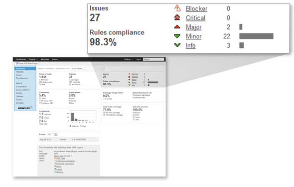
Taken together, potential bugs and coding rule infractions span a continuum, from setting up a logic path through the code that’s guaranteed to lead to a null pointer dereference, to not putting the open curly brace on the line the team has agreed to. Teetering between the two are things like flouting industry-standard naming conventions and writing one-line conditionals without using curly braces.
Given those examples, it’s clear that some issues are worse than others. That’s why SonarQube ranks them at different severities: Blocker, Critical, Major, Minor, and Info. The rules-compliance percentage you see at lower left in the issues widget gives perspective. It’s based on the number and severity of issues versus the lines of code in the project. Whereas the issues counts are golf-style metrics, the rules-compliance index is like bowling: higher is better.
Looking ahead, chapter 2 covers the importance of issues, even the ones that don’t seem all that critical at first blush. Later, in chapter 10, we’ll talk about issue management, and in chapter 13, we’ll show you how to make the priority SonarQube places on an issue line up with your own.
1.3.2. Tests
Next in the list is unit-test coverage, which is a bit like double-entry bookkeeping, in that each unit of work in your program should ideally be balanced by a test verifying that it works correctly. In fact, in test-driven development, the test side of the books is always entered first.
The test coverage widget, shown in figure 1.8, shows how well that coverage equation balances and whether your tests are passing, failing, or erroring-out. The percentages in this widget are bowling-style metrics, the failure and error counts are like golf, and the test count and duration are neutral. All the metrics here are leading indicators; if they head south, your quality may follow. For an in-depth look at unit tests, see chapter 3.
Figure 1.8. The test coverage widget reports on how well your code base is covered by unit tests, and how those tests are doing.

1.3.3. Comments and duplications
The comments and duplications widget is another two-for-one. To return to sports, comments are like bowling, and duplications are like golf. Both are leading quality metrics (nothing’s gone wrong yet, but it could). The widget is shown in figure 1.9.
Figure 1.9. The comments and duplications widget covers two quality axes, showing both how well your public methods are documented (high scores are good) and how many duplications you need to eliminate (high scores are bad).
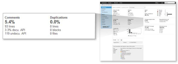
Comments
There are two main types of code comments: the ones inline in any method (public or private) that are intended to notate some detail of the code logic, and the ones outside a public method that are intended to communicate how and why to use it (the API comments). The first kind is often referred to as a code smell. Like house guests and leftovers, this kind of comment tends to get stale. The logic changes, but the comments don’t; or the comments get separated from what they refer to. The second kind of comment (the API documentation) is what’s measured by SonarQube.
This is a measure of maintainability. It looks at how often you’re going to make the caller of your method read the code to understand what she’s getting into, versus reading intentional documentation that (ideally) explains what should be passed in, what will be returned, and perhaps even what will happen in between.
Comments are measured because they’re part of what makes a system easy (or not) to work on. They’re measured with the idea that coders should spend their time writing the systems their users need, not trying to figure out what the last guy thought he was doing when he coded the method you need to call. We’ll go in-depth on comments in chapter 5.
Duplications
On the face of it, code duplications may not seem like a big deal. And at first, they might not be.
The problem is that although copy-paste, the source of duplications, is often expedient, it’s not efficient in the long term. Somewhere in the same book that Murphy’s Law came from is the truism that the more places a chunk of logic has been duplicated into, the more likely it is that it will need to be changed, probably with a high level of urgency or criticality.
That’s why duplications are something you want to get on top of as quickly as possible, which is what SonarQube’s duplications metrics let you do. Chapter 4 covers this topic in detail.
1.3.4. Architecture and design
Winston Churchill said, “However beautiful the strategy, you should occasionally look at the results.” He wasn’t talking about software quality, but he could have been.
One side of the architecture and design axis is the tidiness of a program’s architecture. Not the way it was originally charted out: undoubtedly, the original plan had a Zenlike elegance and simplicity. What SonarQube measures is how it was implemented—how clean it is today. Do classes in package A include classes in package B, and vice versa? If so, either they should have been one package to start with, or you’ve got a big mess to sort out. Either way, you’ve got some cleaning up to do.
From that perspective, whether architecture is a leading or lagging quality indicator is up for debate. Is this a measure of what has already gone wrong in the implementation (lagging), or an indication of how hard the code base will be to understand and maintain in the future (leading)? Either way, it deserves attention, and unless you’ve caught it early, it isn’t likely something that can be cleaned up in an afternoon. The package design widget, shown in figure 1.10, gives you the high-level view of that cleanup in golf-style numbers.
Figure 1.10. The package design widget shows how clean your design implementation is, giving you high-level figures showing how much work needs to be done to make the implementation as clean as the original design undoubtedly was.

The other side of the architecture and design axis is addressed by the LCOM4 and response for class widgets, and we’re cheating a little by showing them to you here. They’re no longer on the default dashboard because the creators of SonarQube think the concepts behind them are “too hard.” Chapter 6 will make them seem easy, though. They’re shown in figure 1.11. In a nutshell, you want to see these graphs weighted to the left because that means your classes are small and simple.
Figure 1.11. The LCOM4 and response for class widgets show how your code stacks up from an object-oriented design perspective. Ideally, both graphs would be weighted to the left, meaning that the classes in your program are small and simple.

Because these are golf-style metrics, we’ll use a golf example. Consider a Ball object. It should bounce. And maybe roll. But that should be about all it has to know how to do. Start layering in things like handicap calculation, club selection based on wind speed, distance to the pin, and grass friction, and you’ve probably gone too far. That’s what the LCOM4 number is about. How many responsibilities does a given class have? One isn’t the loneliest number in this case, it’s the perfect number. Anything over two is definitely a candidate for refactoring.
Response for Class (RFC) is also in the Keep It Simple, Smiley (KISS) realm, but a bit more esoteric. Something of a corollary to LCOM4, it’s a measure of how many interactions a class initiates within itself or with other classes. For instance, if the Ball class reaches out to the Grass object to read friction, calls the Green object to see how far away it is, calls getWindSpeed() from the Weatherman class, and maybe even asks Golfbag for its list of clubs, it’s initiating interactions with a lot of other classes. Not only is this a red flag from a design perspective, but it’s also likely that the Ball class is harder to understand and therefore harder to maintain than it should be. One study of C++ programs even showed that as RFC went up, bug density did, too.
Architecture, design, and complexity are covered in depth in chapter 6 at the file level and in chapter 7 at the package level and above.
1.3.5. Complexity
Oddly, the explanation of the complexity axis is fairly simple. It’s a little more complicated than this, but essentially, these metrics are about how many pairs of curly braces (real or implied) your method has. The premise of this leading indicator is that the more pairs of curly braces there are, the more complex the logic is. And the more complex the logic, the harder it is to understand and maintain. That means complexity is another golf-style metric—lower is better—and the complexity graph, shown in figure 1.12, is another that you’d like to see weighted to the left.
Figure 1.12. The complexity widget shows the distribution in your program of high-complexity methods or classes. The more complex a program is, the more difficult it becomes to maintain; so, ideally, this graph will be weighted to the left.

Now that you’ve seen the quality metrics SonarQube offers for its first language, Java, it’s time to talk about what SonarQube offers for the rest of its languages.
1.4. The languages SonarQube covers
Earlier we said that SonarQube can analyze multiple languages. Now it’s time to spell out what those languages are and what kinds of metrics are available for each one. Table 1.1 lists most of the other languages, but because the list of language plugins is always growing, we won’t claim it’s exhaustive. For each language, you’ll see the license model and the types of metrics (and therefore the quality axes) that are available for it.
Table 1.1. Languages SonarQube can analyze
|
Language |
Paid/Free |
Metrics |
|---|---|---|
| ABAP | Paid | Size, comments, complexity, duplications, issues. |
| C | Free (but closed source) | Size, comments, complexity, duplications, issues. |
| C++ | Free | Size, comments, complexity, duplications, issues. |
| C++ | Paid | Size, comments, complexity, duplications, issues. (This is not a misprint. There are both free and paid plugins for C++.) |
| C# | Free | Size, comments, complexity, duplications, tests, issues. C# analysis is made available by a suite of plugins, many of which rely on external tools that you’ll need to install separately. On the other hand, this is the one case where you get to pick and choose which underlying tools to apply in your analysis. You’ll need to install those underlying tools separately, as well. |
| Cobol | Paid | Size, comments, complexity, duplications, issues. Language-specific metrics such as outside and inside control-flow statements and LOC in data divisions. |
| Delphi | Free | Size, comments, complexity, design, duplications, tests, issues. |
| Drools | Free | Size, comments, issues. |
| Flex/ActionScript | Free | Size, comments, complexity, duplications, tests, issues. |
| Groovy | Free | Size, comments, complexity, duplications, tests, issues. |
| JavaScript | Free | Size, comments, complexity, duplications, tests, issues. |
| Natural | Paid | Size, comments, complexity, duplications, issues. |
| PHP | Free | Size, comments, complexity, duplications, issues. |
| PL/I | Paid | Size, comments, complexity, duplications, issues. |
| PL/SQL | Paid | Size, comments, complexity, duplications, issues. |
| Python | Free | Size, comments, complexity, duplications, issues. |
| Visual Basic 6 | Paid | Size, comments, complexity, duplications, issues. |
| Web (JSP, JSF, XHTML) | Free | Size, comments, complexity, duplications, issues. |
| XML | Free | Size, issues. |
The paid language plugins listed here all come from SonarSource, the originators of SonarQube. Regardless of the author of the plugin, most can be installed from within SonarQube, and chapter 14 will give you the details. Once you’ve installed your language plugins, configure your sonar-runner.properties file (be sure to specify the language under analysis with the sonar.language property!), and run your analysis. You don’t have to do anything else; it just works. It’s that simple.
Through the rest of the book, the majority of examples are Java-centric. But please keep in mind that unless we explicitly state that something’s Maven-only or Java-only, it applies to other languages as much as it applies to Java (assuming the language plugin supports the metrics in question).
1.5. Interface conventions
If you’ve got the SonarQube dashboard in front of you, you’ve noticed that most of the metrics on it are links. And if you’re even mildly curious, which we’re betting you are, you’ve clicked-through on a few of them, from the 10,000-foot view at the dashboard to the low-level intricacies of the issues themselves. So at this point, we want to explain some of the interface conventions you’re seeing and that you’ll continue to notice as you work with SonarQube.
1.5.1. Hierarchy: packages and classes in a metric drilldown
Every metric on the dashboard clicks-through to a metric drilldown, which is designed to help you find the specific files (and sometimes the specific lines) that you need to work on to start moving those project-level metrics the dashboard reports. A typical drilldown is shown in figure 1.13.
Figure 1.13. Drilldowns in SonarQube start with the chosen metric and its value in the top row. That’s followed by a row of hierarchical widgets: modules (if any—there aren’t any here) in the left-most box, then directories/packages, then classes/files. Each widget’s contents are sorted by its metric value. Click any module or package to filter widgets to its right.

There are some variations on the theme, but generally you’ll see the metric in question at the top of the page followed by a row of hierarchical widgets. If it’s a multi-module project, then this row will have three widgets, with the modules on the left and packages/directories in the middle. For single-module projects, there are only two widgets, with packages/directories on the left. In either case, a list of files is shown on the right.
Each widget is sorted by metric value with the worst first. You can click a module to filter the directory and file lists, or click a directory/package to see only its files. With or without module and package filtering, you can click a filename at any time to see its details.
1.5.2. File details
When you click a file, the file detail view, shown in figure 1.14, is added to the page below the module/package/file hierarchy. You see the full filename at the top, followed by a series of links, which act like tabs. Which link is selected depends on the metric under examination.
Figure 1.14. The file details view offers a consolidated spot to see most of the metrics SonarQube’s gathered on a particular file. The Source tab shows the file’s full contents.

Some of the metrics, such as duplications, have dedicated tabs in the file detail view that are tailored to that metric’s clear communication. Other metrics, such as complexity, take you straight to the Source tab. When you end up at the Source tab, it’s typically because the metric in question relates to the file as a whole, rather than a small section of it, and there’s no good way to zoom in on the issue. Instead, SonarQube tells you what you’re looking for and then shows you the source so you can see for yourself how complex the class is or how documented or undocumented the API is.
1.5.3. Trend arrows
The final interface convention to show you is the trend arrows you’ll see throughout the interface after your second analysis, starting with the front page. They come in three colors—red, green, and grey—and if you guessed that the colors mean bad, good, and neutral, you’re right.
As we show you how to take full advantage of SonarQube in the coming chapters, it will be important to keep in mind that almost none of the changes we’ll show you how to make to SonarQube will take effect until the next analysis. That’s because SonarQube mostly shows you metrics, and metrics are only calculated during analysis; so you can twiddle settings all you like, but they won’t affect what’s already been calculated and stored. To see the effect of your changes, you’ll need to reanalyze.
Just installed a new plugin and eager to see the results? Wait until the next analysis. Tweaked your settings and looking for the change? Wait until the next analysis. Moved your project from one rule set to another? Wait until... Oh, you get it. Okay.
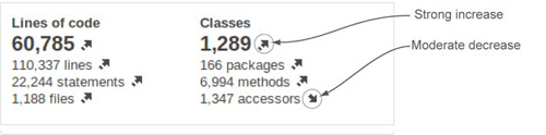
Trend arrows show the 30-day trend of a given metric. You won’t see them after the first analysis of a project because there’s no trend yet. Make some code changes and re-analyze, and they should pop into view. An arrow alone shows a moderate change, and an arrow with a line indicates a strong one. Figure 1.15 shows a project’s size metrics widget, with strong to moderate increases in all metrics.
Figure 1.15. Trend arrows are used throughout the SonarQube interface to indicate the 30-day trend of a metric. Red, green, and grey arrows indicate bad, good, and neutral changes. Arrows alone show moderate increases. An arrow with a line shows a strong increase.
Metrics that are expressed as percentages, such as the rules compliance index, or averages, such as complexity/method, aren’t eligible for trend arrows. Otherwise, when you don’t see an arrow, it means there has been no change, or only a weak one.
Those with sharp eyes have noticed that we’ve only scratched the surface when it comes to the options in the SonarQube interface. For instance, a double-handful of left-rail links were spread across the front page and in the project dashboard that we haven’t even touched on yet. Don’t worry, we’ll get there—eventually.
1.6. Related plugins
Out of the box, SonarQube is a pretty incredible tool. But there are plugins that can make it even better. We’ll end almost every chapter with a list of plugins related to the functionality discussed in the chapter, and we’ll tell you how they enhance the relevant aspect of SonarQube.
If you decide to add any of these plugins, you’ll find that installation is pretty easy for a logged-in administrator from within SonarQube (see chapter 14 for details). Now we’ll talk about our first couple of plugins: Technical Debt, and Views.
1.6.1. Technical debt
At the heart of SonarQube is the concept of technical debt: the cumulative cost of work that’s been put off or done poorly enough that it needs to be refactored. Because measuring technical debt is a core principle of SonarQube, it’s not surprising that its creators would come up with a set of technical debt metrics—in dollars and days. What is surprising is that it’s not included in the core functionality, but available instead as a plugin.
Once you’ve installed the plugin and restarted SonarQube, add the widget to your dashboard and run a new analysis. When it’s done, you’ll see something like what’s shown in figure 1.16 on your dashboard.
Figure 1.16. Technical debt is designed to communicate the full liability of unaddressed issues in your code base clearly—what they could potentially cost you, and where they’re coming from.

The dollar and man-day values come directly from the other metrics on your dashboard. How many issues and duplications do you have? How much of your API is uncommented? How out-of-hand are your design and complexity?
The Technical Debt plugin takes all those numbers and multiplies each one by an estimate of how long it will take to fix an average issue of each type. That gives an hour figure, which is easily turned in to man-days. For the dollar number, the plugin multiplies by the configured cost per man-day. Simple, but often painful, calculations.
The percent figure is called the debt ratio. It’s the total debt, divided by the total possible debt—the worst-case scenario—times 100. Presumably, it’s included to ease the sting of the other numbers.
Each of these calculations is based on tunable estimates. The daily rate of a developer defaults to $500, but it’s easily changed. Time to fix an average coding issue defaults to six minutes, but again, it’s tunable. Chapter 14 will show you how.
1.6.2. Views
Although SonarSource offers the Technical Debt plugin for free, it charges for the Views plugin. What makes it compelling enough that you may want to pony up is the cross-project aggregation it offers.
The Views plugin’s functionality is most likely to appeal to managers and executives who need quick visibility of SonarQube’s leading and lagging quality metrics across multiple projects in a group, or across multiple groups. There’s no other way to get this cross-project view except to manually update spreadsheets, a tedious and error-prone process.
Instead, the Views plugin offers those aggregations not just on “report update day,” but at a whim at the filter (list of projects) level. It also provides a dashboard for each aggregation that shows totals and percentages calculated across every member of the collection. Once you start drilling in to an aggregate view (clicking-through from the dashboard), you’ll get aggregate drilldowns that let you identify culprit projects while retaining the ability to continue drilling down to see the granular issues in the projects and files themselves.
1.7. Summary
Measuring software quality used to be hard. Instead of even trying, people did silly things like measuring lines of code instead. Then the creators of SonarQube, the SonarSource folks, came along and used existing tools that find problems in software and derived metrics from their output, making quality trackable and trendable. They added their own tools and metrics as well. They wrapped all those metrics in SonarQube’s intuitive interface, added review functionality and IDE integration, and ... gave it away.
The beneficiaries of this generosity are the developers, testers, code architects, and managers whose teams use SonarQube. Oh yes, and end users too.
SonarQube was originally written to analyze Java, but plugins extend the offerings to an ever-growing list of other languages. Each SonarQube “project” is about a single language, but you can use multiple properties files to analyze every aspect of a complex project. For instance, you can get quality metrics not just for the Java back end of a web application, but for its XML and JavaScript, too.
In this chapter we’ve walked through your first SonarQube analysis using the SonarQube Runner and a basic properties file. Once the analysis was complete, we looked at the results on SonarQube’s front page, the default filter, and drilled down to the details on the project dashboard.
The default dashboard is centered on SonarQube’s Seven Axes of Quality:
- Potential bugs
- Coding rules
- Tests
- Duplications
- Comments
- Architecture and design
- Complexity
After getting a high-level understanding of each axis, you saw a few interface conventions that you’ll be seeing regularly; the package/class hierarchy in metric drilldowns, the file detail view that’s added below it, and the trend arrows you see on filters and dashboard widgets.
In the next chapter we’ll focus more deeply on those first two quality axes, with a look at issues and why they should never be ignored.