
The second column inside h:panelGrid of home.xhtml looks like:
<a:outputPanel id="contactsList">
<ui:include src="main/contactsList.xhtml"/>
</a:outputPanel>
As for groups, we used a placeholder surrounding the ui:include tag.
Now let's focus on creating the data table open the /view/main/contactsList.xhtml file and add the first snippet of code for dataTable:
<h:form>
<rich:dataTable id="contactsTable"
reRender="contactsTableDS"
rows="20"
value="#{homeContactsListHelper.contactsList}" var="contact">
<rich:column width="45%">
<h:outputText value="#{contact.name}"/>
</rich:column>
<rich:column width="45%">
<h:outputText value="#{contact.surname}"/>
</rich:column>
<f:facet name="footer">
<rich:datascroller id="contactsTableDS"
for="contactsTable"
renderIfSinglePage="false"/>
</f:facet>
</rich:dataTable>
<h:outputText value="#{messages['noContactsInList']}"
rendered="#{homeContactsListHelper.contactsList.size()==0}"/>
</h:form>
We just added the rich:dataTable component with some columns and an Ajax data scroller at the end.
RichFaces provides its own version of h:dataTable, which contains more features and is better integrated with the RichFaces framework.
The first important additional feature, in fact, is the skinnability support following the RichFaces standards.
Other features are row and column spans support (we will discuss it in the Columns and column groups section), out-of-the-box filter and sorting (discussed in the Filtering and sorting section), more JavaScript event handlers (such as onRowClick, onRowContextMenu, onRowDblClick, and so on) and the reRender attribute.
Like other data iteration components of the RichFaces framework, it also supports the partial-row update (see Chapter 10, Advanced Techniques for more information).
Implementing Ajax data pagination using RichFaces is really simple just decide how many rows must be shown in every page by setting the rows attribute of dataTable (in our case, we've chosen 20 rows per page), and then "attach" the rich:datascroller component to it by filling the for attribute with the dataTable id:
<rich:datascroller id="contactsTableDS"
for="contactsTable"
renderIfSinglePage="false"/>
Here you can see another very useful attribute (renderIfSinglePage) that makes the component hidden when there is just a single page in the list (it means the list contains a number of items that is less than or equal to the value of the rows attribute).
A thing to keep in mind is that the rich:datascroller component must stay inside a form component (h:form or a:form) in order to work.
Customizing rich:datascroller is possible not only by using CSS classes (as usual), but also by personalizing our own parts using the following facets:
pagescontrolsSeparatorfirst, first_disabledlast, last_disablednext, next_disabledprevious, previous_disabledfastforward, fastforward_disabledfastrewind, fastrewinf_disabled
Here is an example with some customized facets (using strings):
<rich:datascroller id="contactsTableDS" for="contactsTable" renderIfSinglePage="false">
contacts listdata pagination<f:facet name="first">
<h:outputText value="First" />
</f:facet>
<f:facet name="last">
<h:outputText value="Last" />
</f:facet>
</rich:datascroller>
Here is the result:
You can use an image (or another component) instead of text, in order to create your own customized scroller.
Another interesting example is:
<rich:datascroller id="contactsTableDS" for="contactsTable"
renderIfSinglePage="false">
<f:facet name="first">
<h:outputText value="First"/>
</f:facet>
<f:facet name="last">
<h:outputText value="Last"/>
</f:facet>
<f:attribute name="pageIndexVar" value="pageIndexVar"/> <f:attribute name="pagesVar" value="pagesVar"/>
<f:facet name="pages">
<h:panelGroup>
<h:outputText value="Page #{pageIndexVar} / #{pagesVar}"/>
</h:panelGroup>
</f:facet>
</rich:datascroller>
The result is:
By setting the pageIndexVar and pagesVar attributes, we are able to use them in an outputText component, as we've done in the example.
A useful attribute of the component is maxPages that sets the maximum number of page links (the numbers in the middle), which the scroller shows therefore, we can control the size of it.
The page attribute could be bound to a property of a bean, in order to switch to a page giving the number a simple use-case could be using an inputText and a commandButton, in order to let the client insert the page number that he/she wants to go to.
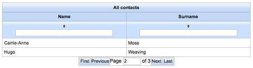
Here is the code that shows how to implement it:
<rich:datascroller
for="contactsList" maxPages="20" fastControls="hide"
page="#{customDataScrollerExampleHelper.scrollerPage}" pagesVar="pages"
id="ds">
<f:facet name="first">
<h:outputText value="First" />
</f:facet>
<f:facet name="first_disabled">
<h:outputText value="First" />
</f:facet>
<f:facet name="last">
<h:outputText value="Last" />
</f:facet>
<f:facet name="last_disabled">
<h:outputText value="Last" />
</f:facet>
<f:facet name="previous">
<h:outputText value="Previous" />
</f:facet>
<f:facet name="previous_disabled">
<h:outputText value="Previous" />
</f:facet>
<f:facet name="next">
<h:outputText value="Next" />
</f:facet>
<f:facet name="next_disabled">
<h:outputText value="Next" />
</f:facet>
<f:facet name="pages">
<h:panelGroup>
<h:outputText value="Page "/>
<h:inputText value="#{customDataScrollerExampleHelper. scrollerPage}" size="4">
<f:validateLongRange minimum="0" />
<a:support event="onkeyup" timeout="500" oncomplete="#{rich:component('ds')}. switchToPage(this.value)" />
</h:inputText>
<h:outputText value=" of #{pages}"/>
</h:panelGroup>
</f:facet>
</rich:datascroller>
As you can see, besides customizing the text of the First, Last, Previous, and Next sections, we defined a pages facet by inserting h:inputText connected with an integer value inside a backing bean. We also added the a:support tag, in order to trim the page change after the keyup event is completed. We've also set the timeout attribute, in order to call the server every 500 ms and not every time the user types.
You can see a screenshot of the feature here:
Now we would like to add a header for every column of the dataTable; the simplest way is to just put a facet inside the rich:column component, this way:
<rich:column>
<f:facet name="header">
<h:outputText value="my header" />
</f:facet>
...
</rich:column>
This method also works for the standard h:dataTable component RichFaces enhances the table heading capabilities by allowing grouping, using the rich:columnGroup component.
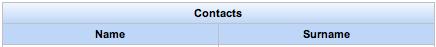
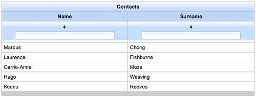
Therefore, coming back to our application, we can put the following code inside the rich:dataTable tag in order to define the header of the dataTable:
<rich:dataTable ... >
<f:facet name="header">
<rich:columnGroup>
<rich:column colspan="2">
<h:outputText value="Contacts"/>
</rich:column>
<rich:column breakBefore="true">
<h:outputText value="Name"/>
</rich:column>
<rich:column>
<h:outputText value="Surname"/>
</rich:column>
</rich:columnGroup>
</f:facet>
...
And the result will be as follows:
Using the RichFaces version is also very convenient for extending the dataTable behavior on row rendering.
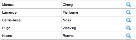
Let's take a simplified version (without header, footer, and datascroller) of the contactsList table:
<rich:dataTable id="contactsTable"
value="#{homeContactsListHelper.contactsList}"
var="contact">
<rich:column>
<h:outputText value="#{contact.name}"/>
</rich:column>
<rich:column>
<h:outputText value="#{contact.surname}"/>
</rich:column>
<rich:column>
<a:commandButton image="/img/view.png" />
</rich:column>
</rich:dataTable>
It is a normal dataTable and looks like:
Now let's do a little editing by adding the two attributes span and breakBefore:
<rich:dataTable id="contactsTable"
value="#{homeContactsListHelper.contactsList}"
var="contact">
<rich:column colspan="2">
<h:outputText value="#{contact.name}"/>
</rich:column>
<rich:column breakBefore="true">
<h:outputText value="#{contact.surname}"/>
</rich:column>
<rich:column>
<a:commandButton image="/img/view.png" />
</rich:column>
</rich:dataTable>
With the above attributes, it looks like:
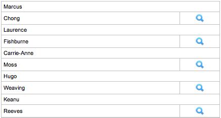
What has happened?
We've told to the first column to "span" (you might know the meaning because it's a standard html table column attribute) two columns and the second one to "break before" rendering it, in the sense of closing the row (putting the HTML</tr> tag).
So, the first column fills the space of two columns and the second one is rendered in another row; simple, isn't it?
You can also use the rowSpan attribute in order to span rows instead of columns, as for standard HTML tables.
We can have the same result using a rich:columnGroup component instead of the breakBefore attribute, as in the following example:
<rich:dataTable id="contactsTable"
value="#{homeContactsListHelper.contactsList}"
var="contact">
<rich:column colspan="2">
<h:outputText value="#{contact.name}"/>
</rich:column>
<rich:columnGroup>
<rich:column>
<h:outputText value="#{contact.surname}"/>
</rich:column>
<rich:column>
<a:commandButton image="/img/view.png"/>
</rich:column>
</rich:columnGroup>
</rich:dataTable>
As we can see, the result is exactly the same.
Another use of rich:column and rich:columnGroup is to define a complex table header as we have done in our application, as shown in the previous section.
rich:column contains very useful attributes other than span, breakBefore, and the filtering and sorting attributes (that we are going to see in the next section), which we don't find in the standard h:column component.
For example, in our application, we used the width attribute in order to set the width for every column without using a CSS class just for that.
Another important feature that we've seen in a simple example in Chapter 3 is the out-of-the-box filtering and sorting support that the rich:dataTable component offers.
In order to add this feature to our table, let's just edit the rich:column tags for name and surname, as shown in the following code:
<rich:column width="45%"
sortBy="#{contact.name}"
filterBy="#{contact.name}">
<h:outputText value="#{contact.name}"/>
</rich:column>
<rich:column width="45%"
sortBy="#{contact.surname}"
filterBy="#{contact.surname}">
<h:outputText value="#{contact.surname}"/>
</rich:column>
You will have a working sort and filter feature for your table just by adding these two attributes!
In Chapter 10, we will explain a more customized way to manage filtering and sorting.
We need a toolbar at the bottom of the table that will contain action buttons for different kinds of action (we will add the button to add a new contact in the next section).
We have seen the rich:toolbar component in the Chapter 5, Making the Application Structure, so just add this code after the code for rich:datascroller:
<rich:toolBar>
<rich:toolBarGroup>
<!-- my action buttons here -->
</rich:toolBarGroup>
</rich:toolBar>
We've seen the connection of the table with a backing bean called homeContactsListHelper let's create it!
Let's create a new package called main inside book.richfaces.advcm.modules, and create a new class called HomeContactsListHelper inside it.
The Seam component is very simple, as it has just to retrieve the contacts list from the database (groups are not managed by now) it might look like the following:
@Name("homeContactsListHelper")
@Scope(ScopeType.CONVERSATION)
public class HomeContactsListHelper {
@In(create=true)
EntityManager entityManager;
@In(required = true)
Contact loggedUser;
private List<Contact> contactsList;
public List<Contact> getContactsList() {
if (contactsList ==null) {
// Creating the query
String query="from Contact c where c.contact.id=:fatherId";
// Getting the contacts list
contactsList = (List<Contact>)
entityManager.createQuery(query)
.setParameter("fatherId",
loggedUser.getId())
.getResultList();
}
return contactsList;
}
public void setContactsList(List<Contact> contactsList) {
this.contactsList = contactsList;
}
To summarize the @Name annotation defines the name of the Seam component/JSF backing bean, @Scope defines the scope of the component, we inject (using the @In annotation) the entityManager component (to query the database using JPA) and the contact instance referring to the logged user, who we outjected during the login phase.
In addition, the bean has a property called contactsList that is lazy initialized into the getContactsList() method by querying the database.
As we are using the conversation scope, we would like to start the conversation when entering the home page. There are different ways to do this in our case, let's open the /view/home.page.xml file and add the following content:
<begin-conversation join="true" />
So, now when the user navigates to the home page, a new conversation is created if there is none. If not, the existing one would be kept (join="true").