For the third column, we would like to show three different statuses:
So, let's open the home.xhtml page and insert the third column inside the panel grid with the three statuses:
<a:outputPanel id="contactDetail">
<a:outputPanel rendered="#{homeSelectedContactHelper. selectedContact==null}">
<rich:panel>
<h:outputText
value="#{messages['noContactSelected']}"/>
</rich:panel>
</a:outputPanel>
<a:outputPanel
rendered="#{homeSelectedContactHelper. selectedContact!=null and homeSelectedContactHelper. selectedContactEditing==false}">
<ui:include src="main/contactView.xhtml"/>
</a:outputPanel>
<a:outputPanel
rendered="#{homeSelectedContactHelper. selectedContact!=null and homeSelectedContactHelper. selectedContactEditing==true}">
<ui:include src="main/contactEdit.xhtml"/>
</a:outputPanel>
</a:outputPanel>
Here, we have put the main a:outputPanel as the main placeholder, and inside it we put three more instances of a:outputPanel (one for every state) with the rendered attribute in order to decide which one to show.
The first one just shows a message when homeSelectedContactHelper.selectedContact is set to null:
The second instance of a:outputPanel will include the main/contactView.xhtml file only if homeSelectedContactHelper.selectedContact is not null, and we are not in editing mode (so homeSelectedContactHelper.selectedContactEditing is set to false); the third one will be shown only if homeSelectedContactHelper.selectedContact is not null, and we are in the edit mode (that is homeSelectedContactHelper.selectedContactEditing is equal to true).
Before starting to write the include sections, let's see how the main bean for the selected contact would look, and connect it with the data table for selecting the contact from it.
Let's create a new class called HomeSelectedContactHelper inside the book.richfaces.advcm.modules.main package; the class might look like this:
@Name("homeSelectedContactHelper")
contact detailHomeSelectedContactHelper class, creating@Scope(ScopeType.CONVERSATION)
public class HomeSelectedContactHelper {
@In(create = true)
EntityManager entityManager;
@In(required = true)
Contact loggedUser;
@In
FacesMessages facesMessages;
// My code here
}
This is a standard JBoss Seam component as we've seen in the other chapters; now let's add our properties.
The bean that we are going to use for view and edit features is very simple to understand it just contains two properties (namely selectedContact and selectedContactEditing) and some action methods to manage them.
Let's add the properties to our class:
private Contact selectedContact;
private Boolean selectedContactEditing;
public Contact getSelectedContact() {
return selectedContact;
}
public void setSelectedContact(Contact selectedContact) {
this.selectedContact = selectedContact;
}
public Boolean getSelectedContactEditing() {
return selectedContactEditing;
}
public void setSelectedContactEditing(Boolean selectedContactEditing) {
this.selectedContactEditing = selectedContactEditing;
}
As you can see, we just added two properties with standard the getter and setter.
Let's now see the action methods:
public void createNewEmptyContactInstance() {
setSelectedContact(new Contact());
}
public void insertNewContact() {
// Attaching the owner of the contact
getSelectedContact().setContact(loggedUser);
entityManager.persist(getSelectedContact());
facesMessages.addFromResourceBundle(StatusMessage.Severity.INFO, "contactAdded");
}
public void saveContactData() {
entityManager.merge(getSelectedContact());
facesMessages.addFromResourceBundle(StatusMessage.Severity.INFO, "contactSaved");
}
public void deleteSelectedContact() {
entityManager.remove(getSelectedContact());
// De-selecting the current contact
setSelectedContact(null);
setSelectedContactEditing(null);
facesMessages.addFromResourceBundle(StatusMessage.Severity.INFO, "contactDeleted");
}
public boolean isSelectedContactManaged() {
return getSelectedContact() != null && entityManager.contains(getSelectedContact());
}
It's not difficult to understand what they do, however, in order to be clear, we are going to describe what each method does.
The method createNewEmptyContactInstance() simply sets the selectedContact property with a new instance of the Contact class it will be called by the "add contact" button.
After the user has clicked on the "add contact" button and inserted the contact data, he/she has to persist this new instance of data into the database. It is done by the insertNewContact() method, called when he/she clicks on the Insert button.
If the user edits a contact and clicks on the "Save" button, the saveContactData() method will be called, in order to store the modifications into the database.
As for saving, the deleteSelectedContact() method will be called by the "Delete" button, in order to remove the instance from the database.
A special mention for the isSelectedContactManaged() method it is used to determine if the selectedContact property contains a bean that exists in the database (so, I'm editing it), or a new instance not yet persisted to the database. We use it especially in rendered properties, in order to determine which component to show (you will see this in the next section).
We will use the contacts list in order to decide which contact must be shown in the detail view.
The simple way is to add a new column into the dataTable, and put a command button (or link) to select the bean in order to visualize the detail view.
Let's open the contactsList.xhtml file and add another column as follows:
<rich:column width="10%" style="text-align: center">
<a:commandButton image="/img/view.png"
reRender="contactDetail">
<f:setPropertyActionListener value="#{contact}"
target="#{homeSelectedContactHelper.selectedContact}"/>
<f:setPropertyActionListener value="#{false}"
target="#{homeSelectedContactHelper.selectedContactEditing}"/>
</a:commandButton>
</rich:column>
Inside the column, we added the a:commandButton component (that shows an image instead of the standard text) that doesn't call any action it uses the f:setPropertyAction method to set the homeSelectedContactHelper.selectedContact value to contact (the row value of the dataTable), and to tell to show the view box and not the edit one (setting homeSelectedContactHelper.selectedContactEditing to false).
After the Ajax call, it will re-render the contactDetail box in order to reflect the change.
Also, the header must be changed to reflect the column add:
<rich:dataTable ... >
<f:facet name="header">
<rich:columnGroup>
<rich:column colspan="3">
<h:outputText value="Contacts"/>
</rich:column>
<rich:column breakBefore="true">
<h:outputText value="Name"/>
</rich:column>
<rich:column>
<h:outputText value="Surname"/>
</rich:column>
<rich:column>
<rich:spacer/>
</rich:column>
</rich:columnGroup>
</f:facet>
...
We incremented the colspan attribute value and added a new (empty) column header.
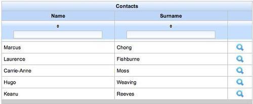
The new contacts list will look like the following screenshot:
Another feature we would like to add to the contacts list is the "Add contact" button. In order to do that, we are going to use the empty toolbar we put in the first section of the chapter.
Let's add a new action button into the rich:toolBar component:
<a:commandButton image="/img/addcontact.png" reRender="contactDetail" action="#{homeSelectedContactHelper.createNewEmptyContactInstance}"> <f:setPropertyActionListener value="#{true}"
target="#{homeSelectedContactHelper.selectedContactEditing}"/> </a:commandButton>
This button will call the homeSelectedContactHelper.createNewEmptyContactInstance() action method in order to create and select an empty instance and will set homeSelectedContactHelper.selectedContactEditing to true in order to start the editing; after those Ajax calls, it will re-render the contactDetail box to reflect the changes.
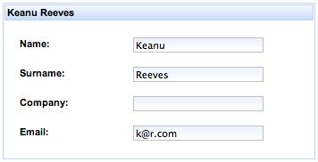
We are ready to implement the view contact detail box; just open the /view/main/contactView.xhtml file and add the following code:
<h:form>
<rich:panel>
<f:facet name="header">
<h:outputText
      value="#{homeSelectedContactHelper.selectedContact.name}
      #{homeSelectedContactHelper.selectedContact.surname}"/>
</f:facet>
<h:panelGrid columns="2" rowClasses="prop"
                                               columnClasses="name,value">
<h:outputText value="#{messages['name']}:"/>
<h:outputText
         value="#{homeSelectedContactHelper.selectedContact.name}"/>
<h:outputText value="#{messages['surname']}:"/>
<h:outputText value="#{homeSelectedContactHelper.selectedContact.surname}"/>
<h:outputText value="#{messages['company']}:"/>
<h:outputText value="#{homeSelectedContactHelper.selectedContact.company}"/>
<h:outputText value="#{messages['email']}:"/>
<h:outputText value="#{homeSelectedContactHelper.selectedContact.email}"/>
</h:panelGrid> </rich:panel>
<rich:toolBar>
<rich:toolBarGroup>
<a:commandLink ajaxSingle="true"
                                      reRender="contactDetail"
                                      styleClass="image-command-link">
<f:setPropertyActionListener value="#{true}"
target="#{homeSelectedContactHelper.selectedContactEditing}"/>

<h:graphicImage value="/img/edit.png" /> <h:outputText value="#{messages['edit']}" />
</a:commandLink>
</rich:toolBarGroup>
</rich:toolBar>
</h:form>
The first part is just rich:panel containing h:panelGrid with the fields' detail. In the second part of the code, we put rich:toolBar containing a command link (with an image and a text) that activates the edit mode it, in fact, just sets the homeSelectedContactHelper.selectedContactEditing property to true and re-renders contactDetail in order to make it appear in the edit box.
We also added a new CSS class into the /view/stylesheet/theme.css file to manage the layout of command links with images:
.image-command-link {
text-decoration: none;
}
.image-command-link img {
vertical-align: middle;
padding-right: 3px;
}
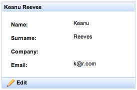
The view box looks like:
We are now ready to develop the edit box.
When in the edit mode, the content of the /view/main/contactEdit.xhtml file will be shown in the contact detail box let's open it for editing.
Let's add the code for creating the main panel:
<h:form>
<rich:panel>
<f:facet name="header">
<h:panelGroup>
<h:outputText
value="#{homeSelectedContactHelper.selectedContact.name} #{homeSelectedContactHelper.selectedContact.surname}"
rendered="#{homeSelectedContactHelper.selectedContactManaged}"/>
<h:outputText
value="#{messages['newContact']}"
rendered="#{!homeSelectedContactHelper.selectedContactManaged}"/>
</h:panelGroup>
</f:facet>
<!-- my code here -->
</rich:panel>
contact detailediting<!-- my code here -->
</h:form>
This is a standard rich:panel with a customized header it has two h:outputText components that will be shown depending on the rendered attribute (whether it's a new contact or not).
Tip
More than one component inside f:facet
Remember that f:facet must have only one child, so, to put more than one component, you have to use a surrounding one like h:panelGroup or something similar.
Inside the panel, we are going to put h:panelGrid containing the components for data editing:
<rich:graphValidator>
<h:panelGrid columns="3" rowClasses="prop"
columnClasses="name,value,validatormsg">
<h:outputLabel for="scName" value="#{messages['name']}:"/>
<h:inputText id="scName" value="#{homeSelectedContactHelper.selectedContact.name}"/>
<rich:message for="scName" styleClass="messagesingle"
errorClass="errormsg"
infoClass="infomsg"
warnClass="warnmsg"/>
<h:outputLabel for="scSurname"
value="#{messages['surname']}:"/>
<h:inputText id="scSurname"
value="#{homeSelectedContactHelper.selectedContact.surname}"/>
<rich:message for="scSurname"
styleClass="messagesingle"
errorClass="errormsg"
infoClass="infomsg"
warnClass="warnmsg"/>
<h:outputLabel for="scCompany"
value="#{messages['company']}:"/>
<h:inputText id="scCompany"
value="#{homeSelectedContactHelper.selectedContact.company}"/>
<rich:message for="scCompany"
styleClass="messagesingle"
contact detaileditingerrorClass="errormsg"
infoClass="infomsg"
warnClass="warnmsg"/>
<h:outputLabel for="scEmail"
value="#{messages['email']}:"/>
<h:inputText id="scEmail"
value="#{homeSelectedContactHelper.selectedContact.email}"/>
<rich:message for="scEmail" styleClass="messagesingle"
errorClass="errormsg"
infoClass="infomsg"
warnClass="warnmsg"/>
</h:panelGrid>
<rich:graphValidator>
Nothing complicated here, we've just used h:outputLabel, h:inputText, and rich:message for every Contact property to be edited; it appears as follows:
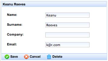
At the end of the panel, we would like to put the toolbar containing the action buttons for inserting, saving, canceling, and deleting the selected contact shown.
In order to do that, let's insert the following code after the rich:panel closing tag (and before the h:form closing tag):
<rich:toolBar>
<rich:toolBarGroup>
<!-- my action buttons here -->
</rich:toolBarGroup>
</rich:toolBar>
Let's start inserting the insert action buttons for a new contact:
<a:commandLink reRender="contactsList,contactDetail"
action="#{homeSelectedContactHelper.insertNewContact}"
rendered="#{!homeSelectedCon tactHelper.selectedContactManaged}" styleClass="image-command-link">
<f:setPropertyActionListener value="#{null}"
target="#{homeContactsListHelper.contactsList}"/>
<h:graphicImage value="/img/insert.png"/>
<h:outputText value="#{messages['insert']}"/>
</a:commandLink>
This button persists the new contact into the database (by calling the homeSelectedContactHelper.insertNewContact() method) and, using f:setPropertyActionListener, it sets the contactsList property to null, so the list will be read again from the database (reflecting the changes) after that, it re-renders the list and the detail box to reflect the changes.
Let's see the button code to cancel the insertion:
<a:commandLink ajaxSingle="true" reRender="contactDetail" rendered="#{!homeSelectedContactHelper. selectedContactManaged}" styleClass="image-command-link">
<f:setPropertyActionListener value="#{false}" target="#{homeSelectedContactHelper. selectedContactEditing}"/>
<f:setPropertyActionListener value="#{null}" target="#{homeSelectedContactHelper. selectedContact}"/>
<h:graphicImage value="/img/cancel.png"/>
<h:outputText value="#{messages['cancel']}"/>
</a:commandLink>
This button doesn't call any action method, but it only sets the selectedContact property to null and the selectedContactEditing property to false to "cancel" the insertion action.
We highlighted the ajaxSingle property this is a very important feature used to avoid the form submission when the button is clicked (so, in this case, when the user clicks on the Cancel button, the form data is not submitted with the Ajax request). We will see it more in depth at the end of the section.
The other button we are going to add is the Save button:
<a:commandLink reRender="contactsList,contactDetail"
action="#{homeSelectedContactHelper.saveContactData}"
rendered="#{homeSelectedContactHelper.selectedContactManaged}"
styleClass="image-command-link">
<f:setPropertyActionListener value="#{false}"
target="#{homeSelectedContactHelper.selectedContactEditing}"/>
<f:setPropertyActionListener value="#{null}"
target="#{homeContactsListHelper.contactsList}"/>
<h:graphicImage value="/img/save.png"/>
<h:outputText value="#{messages['save']}"/>
</a:commandLink>
It simply saves the property modification, sets the contact list property to null, (so, it will be read again from the database) and, sets the edit mode to false (so, the contact detail will be shown).
The Cancel button for an existing contact is almost the same as the one for new contacts:
<a:commandLink ajaxSingle="true" reRender="contactDetail"
rendered="#{homeSelectedContactHelper.selectedContactManaged}"
styleClass="image-command-link">
<f:setPropertyActionListener value="#{false}"
target="#{homeSelectedContactHelper.selectedContactEditing}"/>
<h:graphicImage value="/img/cancel.png"/>
<h:outputText value="#{messages['cancel']}"/>
</a:commandLink>
The only difference is that it doesn't set the selectedContact to null as we would like to see the contact in view mode after canceling the editing.
The last button we are going to insert is the one for deletion:
<a:commandLink ajaxSingle="true" reRender="contactDetail,contactsList"
action="#{homeSelectedContactHelper.deleteSelectedContact}"
rendered="#{homeSelectedContactHelper.selectedContactManaged}" styleClass="image-command-link">
<f:setPropertyActionListener value="#{null}" target="#{homeContactsListHelper.contactsList}"/>
<h:graphicImage value="/img/delete.png"/>
<h:outputText value="#{messages['delete']}"/>
</a:commandLink>
It calls the homeSelectedContactHelper.deleteSelectedContact() method that sets to null the selectedContact and the selectedContactEditing (it is a different way to do what we've done for the other action buttons using f:setPropertyListener components). It then sets to null the contactsList property and re-renders the contactList and the contactDetail boxes.
Here is a screenshot of the edit box with the toolbar:
The ajaxSingle property is very useful to control the form submission when ajaxSingle is set to true the form is not submitted and, just the Ajax component data is sent.
This attribute is available in every Ajax action component and we can use it to call an action from a button, skipping the form validation (like the JSF immediate property does), or to send the value of just an input into a form without validation and submitting the other ones.
The second use case can be used, for example, when we need an input menu that dynamically changes the value of other inputs without submitting the entire form:
<h:form>
<!-- other input controls -->
<h:selectOneMenu id="country"
value="#{myBean.selectedCountry}">
<f:selectItems value="#{myBean.myCountries}">
<a:support event="onchange" ajaxSingle="true"
reRender="city" />
</h:selectOneMenu>
<h:selectOneMenu id="city"
value="#{myBean.selectedCity}">
<f:selectItems value="#{myBean.myCities}">
</h:selectOneMenu>
<!-- other input controls -->
</h:form>
In this example, every time the user selects a new country, the value is submitted to the bean that recalculates the myCities property for the new country, after that the city menu will be re-rendered to show the new cities.
All that without submitting the form or blocking the changes because of some validation problem.
What if you would like to send more than one value, but still not the entire form?
We can use Ajax regions (we will see in the next sections), or we can use the process attribute. It contains a list of components to process while submitting the Ajax action:
<h:form>
<!-- other input controls -->
<h:inputText id="input1" ... />
<h:selectOneMenu id="country"
value="#{myBean.selectedCountry}">
<f:selectItems value="#{myBean.myCountries}">
<a:support event="onchange"
ajaxSingle="true"
process="input2, input3"
reRender="city" />
</h:selectOneMenu>
<h:inputText id="input2" ... />
<h:inputText id="input3" ... />
<h:selectOneMenu id="city"
value="#{myBean.selectedCity}">
<f:selectItems value="#{myBean.myCities}">
</h:selectOneMenu>
<!-- other input controls -->
</h:form>
In this example, we also wanted to submit the input2 and the input3 values together with the new country, because they are useful for retrieving the new cities list just by setting the process attribute with the id list and during the submission, they will be processed. Thus input1 will not be sent.
Also, for action components such as buttons, you can decide what to send using the ajaxSingle and process attributes.
Tip
Form submission and processing
We speak about form "submission" to simplify the concept and make things more understandable. In reality, for every request, all of the form is submitted, but only the selected components (using ajaxSingle and/or process attributes) will be "processed". By "processed" we mean "pass through" the JSF phases (decoding, conversion, validation, and model updating).
For every contact, we would like to add more customizable fields, so let's use the ContactField entity connected to every Contact instance.
First of all, let's create a support bean called HomeSelectedContactOtherFieldsHelper inside the book.richfaces.advcm.modules.main package.
It might look like this:
@Name("homeSelectedContactOtherFieldsHelper")
@Scope(ScopeType.CONVERSATION)
public class HomeSelectedContactOtherFieldsHelper {
@In(create = true)
EntityManager entityManager;
@In(required = true)
Contact loggedUser;
@In
FacesMessages facesMessages;
@In(required = true)
HomeSelectedContactHelper homeSelectedContactHelper;
// my code
}
A notable thing is highlighted we injected the homeSelectedContactHelper component, because to get the list of the customized fields from the database, we need the contact owner. We also set the required attribute to true, because this bean can't live without the existence of homeSelectedContactHelper in the context.
Now, let's add the property containing the list of personalized fields for the selected contact:
private List<ContactField> contactFieldsList;
public List<ContactField> getContactFieldsList() {
if (contactFieldsList == null) {
// Getting the list of all the contact fields
String query = "from ContactField cf where cf.contact.id=:idContactOwner order by cf.id";
contactFieldsList = (List<ContactField>)
entityManager.createQuery(query) .setParameter("idContactOwner", homeSelectedContactHelper.getSelectedContact() .getId()).getResultList();
}
return contactFieldsList;
}
public void setContactFieldsList(List<ContactField> contactFieldsList) {
this.contactFieldsList = contactFieldsList;
}
As you can see, it is a normal property lazy initialized using the getter. This queries the database to retrieve the list of customized fields for the selected contact.
We have to put into the bean some other method useful to manage the customized field (adding and deleting field to and from the database), let's add those methods:
public void createNewContactFieldInstance() {
// Adding the new instance as last field (for inserting a new field)
getContactFieldsList().add(new ContactField());
}
public void persistNewContactField(ContactField field) {
// Attaching the owner of the contact
field.setContact(homeSelectedContactHelper.getSelectedContact());
entityManager.persist(field);
}
public void deleteContactField(ContactField field) {
// If it is in the database, delete it
if (isContactFieldManaged(field)) {
entityManager.remove(field);
}
// Removing the field from the list
getContactFieldsList().remove(field);
}
public boolean isContactFieldManaged(ContactField field) {
return field != null && entityManager.contains(field);
}
The createNewContactFieldInstance() method will just add a new (not yet persisted), empty instance of the ContactField class into the list.
After the user has filled the values in, he/she will press a button that calls the persistNewContactField() method to save the new data into the database.
In order to delete it, we are going to use the deleteContactField() method, and to determine if an instance is persisted into the database or not, we are going to use the isContactFieldManaged()method.
Now, let's open the /view/main/contactView.xhtml file and add the code to show the personalized fields after h:panelGrid i shows the standard ones:
<a:repeat value="#{homeSelectedContactOtherFieldsHelper.contactFieldsList}" var="field">
<h:panelGrid columns="2" rowClasses="prop" columnClasses="name,value">
<h:outputText value="#{field.type} (#{field.label}):"/>
<h:outputText value="#{field.value}"/>
</h:panelGrid>
</a:repeat>
We are using a new RichFaces data iteration component that permits us to iterate over a collection and put the data we want (the rich:dataTable component would instead create a table for the elements list).
In our case, the h:panelGrid block will be repeated for every element of the collection (so for every customized field).
Now, let's open the /view/main/contactEdit.xhtml file and add the code for editing the customized fields into the list:
<a:region>
<a:outputPanel id="otherFieldsList">
<a:repeat value="#{homeSelectedContactOtherFieldsHelper. contactFieldsList}" var="field">
<a:repeat value="#{homeSelectedContactOtherFieldsHelper. contactFieldsList}" var="field">
<h:panelGrid columns="3" rowClasses="prop"
columnClasses="name,value,validatormsg">
<h:panelGroup>
<h:inputText id="scOtherFieldType"
value="#{field.type}"
required="true" size="5">
<a:support event="onblur" ajaxSingle="true"/>
</h:inputText>
<h:outputText value=" ("/>
<h:inputText id="scOtherFieldLabel"
value="#{field.label}"
size="5">
<a:support event="onblur"
ajaxSingle="true"/>
</h:inputText>
<h:outputText value=")"/><br/>
<rich:message for="scOtherFieldType"
styleClass="messagesingle"
errorClass="errormsg"
infoClass="infomsg"
warnClass="warnmsg"/>
</h:panelGroup>
<h:panelGroup>
<h:inputText id="scOtherFieldValue"
value="#{field.value}"
required="true">
<a:support event="onblur"
ajaxSingle="true"/>
</h:inputText><br/>
<rich:message for="scOtherFieldValue"
styleClass="messagesingle"
errorClass="errormsg"
infoClass="infomsg"
warnClass="warnmsg"/>
</h:panelGroup>
<h:panelGroup>
<a:commandButton image="/img/add.png"
reRender="otherFieldsList"
action="#{homeSelectedContactOtherFieldsHelper. persistNewContactField(field)}"
action="#{homeSelectedContactOtherFieldsHelper. persistNewContactField(field)}"
rendered="#{!homeSelectedContactOtherFieldsHelper. isContactFieldManaged(field)}">
</a:commandButton>
<a:commandButton image="/img/remove.png" reRender="otherFieldsList" ajaxSingle="true" action="#{homeSelectedContactOtherFieldsHelper. deleteContactField(field)}">
</a:commandButton>
</h:panelGroup>
</h:panelGrid>
</a:repeat>
<a:commandLink reRender="otherFieldsList"
ajaxSingle="true"
action="#{homeSelectedContactOtherFieldsHelper. createNewContactFieldInstance}"
rendered="#{homeSelectedContactHelper. selectedContactManaged}"
styleClass="image-command-link">
<h:graphicImage value="/img/add.png"/>
<h:outputText value="#{messages['addNewField']}"/>
</a:commandLink>
</a:outputPanel>
</a:region>
The code looks very similar to the one in the view box, except for the action buttons (to add a new instance, persist, save, or delete) and, for the presence of the surrounding tag a:region (highlighted). This is very important in order to make sure the form works correctly; we will see why in the next section.
Also, notice that every input component has the a:support tag as a child that will update the bean with the edited value at the onblur event (which means that every time you switch the focus to another component, the value of the last one is submitted). So, if you delete or add a field, you will now loose the edited values for other fields. It is also used for Ajax validation, as the user is informed that the value is not valid when it moves the cursor to another input.
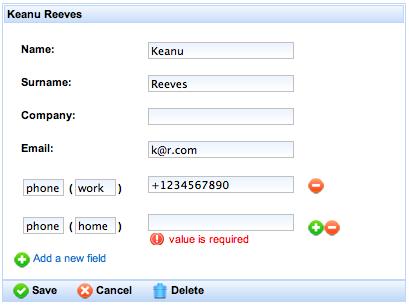
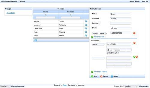
Here is a screenshot with the new feature in the edit box:
While developing a web application with RichFaces, it's very useful to know how to use Ajax containers (such as the a:region component) in order to optimize Ajax requests.
In this section, we'll discuss about the a:region component.
It is a very important component of the framework it can define Ajax areas to limit the part of the component tree to be processed during an Ajax request.
Regions can be nested during an Ajax request and the closest one will be used.
By setting to true the a:region attribute called regionRenderOnly, you can use this component to limit the elements' update In this way, in fact, only the components inside the region can be updated.
Another important attribute is selfRendered; setting this to true tells the framework to render the response basing on component tree without referring to the page code it is faster, but all of the transient elements that are not saved in the tree (such as f:verbatim or HTML code written directly without using JSF components) will be lost at the first refresh, so you can't use them in this case.
To summarize, it is very useful to control the rendering process and optimize it, in order to limit the elements of a form to send during an Ajax request without validation problems, to show different indicators for Ajax status.
Example of using a:region:
<h:form>
<a:region>
<h:inputText id="it1" value="#{aBean.text1}">
<a:support event="onkeyup" reRender="text1" />
</h:inputText>
<h:inputText id="it2" value="#{aBean.text2}" />
</a:region>
<h:inputText id="it3" value="#{aBean.text3}" />
<a:commandButton
action="#{aBean.saveTexts}"
reRender="text1,text2" />
</h:form>
<h:outputText id="text1" value="#{aBean.text1}" />
<h:outputText id="text2" value="#{aBean.text2}" />
In this example, while the user is typing in the text1 value of inputText, a:support sends an Ajax request containing only the it1 and it2 values of inputText.
In this case, in fact, a:region limits the components sent by every Ajax request originated from inside the region. So, the Ajax request will only update aBean.text1 and aBean.text2.
Tip
Wrapping only a component inside an Ajax region is the equivalent of using the ajaxSingle property set to true.
If the user clicks on the a:commandButton aBean.text1, the aBean.text2 and aBean.text3 values will be updated by the Ajax request.
Coming back to our application, as all the customized fields are inside the same form component, we surround each one with the a:region tag. In this way, the single field is submitted regardless of the other ones.
For example, without using a:region, if the user empties the name input value and then tries to insert a new customized field, the process will fail because the name input is not validated. If we use the a:region component, the name field will not be processed and a new field will be inserted.
Now that we know how to use the a:region tag, we can combine it with ajaxSingle and process in order to decide what to send at every request, and to better optimize Ajax interactions into the application.
All RichFaces data iteration components share the same working way of the standard h:dataTable. So, once you know how to use it, you are able to use all of them without any problem.
Let's have a look again at a simple version of the rich:dataTable we've used for the contacts list:
<rich:dataTable
value="#{homeContactsListHelper.contactsList}" var="contact">
<rich:column> <h:outputText value="#{contact.name}"/> </rich:column>
<rich:column>
<h:outputText value="#{contact.surname}"/>
</rich:column>
</rich:dataTable>
The result of this code is simply predictable a table with two columns, one for the name and the other one for the surname.
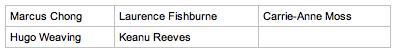
Now, let's suppose I don't want the table format but a list of contacts, all I have to do is to use the rich:dataList component the same way as the rich:dataTable one:
<rich:dataList value="#{homeContactsListHelper.contactsList}"
var="contact">
<h:outputText value="#{contact.name} #{contact.surname}"/>
</rich:dataList>
For every element, it will render a list of contacts as follows:

Exactly the same mechanism enables you to use the rich:dataOrderingList and rich:dataDefinitionList components.
A special mention for rich:dataGrid that has few differences:
<rich:dataGrid value="#{homeContactsListHelper.contactsList}"
var="contact"
columns="3">
<h:outputText
value="#{contact.name} #{contact.surname}"/>
</rich:dataGrid>
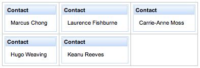
As you can see, we had to set the columns attribute to tell when to break the row and start a new one. Here is the result:
You can put any component you want inside it:
<rich:dataGrid value="#{homeContactsListHelper.contactsList}"
RichFacesdata, iteratingvar="contact"
columns="3">
<rich:panel>
<f:facet name="header">
<h:outputText value="Contact" />
</f:facet>
<h:outputText
value="#{contact.name} #{contact.surname}"/>
</rich:panel>
</rich:dataGrid>
And the result is:
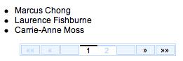
As for h:dataTable (and rich:dataTable), you can attach datascroller to every data iteration component the same way you did for your dataTable:
<h:form>
<rich:dataList id="contactsList"
value="#{homeContactsListHelper.contactsList}"
var="contact"
rows="3">
<h:outputText value="#{contact.name} #{contact.surname}"/>
</rich:dataList>
<rich:datascroller for="contactsList" />
</h:form>
Just remember to put the datascroller into form, set the for attribute, and set the rows attribute for one of the data iteration components.
The result is as follows:
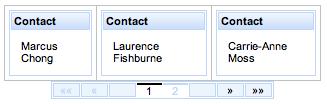
Also, in this case, there is a little exception for the rich:dataGrid component, as it doesn't have the rows attribute, but the corresponding one is elements (you can figure out why). Therefore, our example will be:
<h:form>
<rich:dataGrid id="contactsGrid"
value="#{homeContactsListHelper.contactsList}"
var="contact"
columns="3"
elements="3">
<rich:panel>
<f:facet name="header">
<h:outputText value="Contact" />
</f:facet>
<h:outputText
value="#{contact.name} #{contact.surname}"/>
</rich:panel>
</rich:dataGrid>
<rich:datascroller for="contactsGrid" />
</h:form>
And the result would appear as follows:
Another piece we would like to implement is addresses management using the ContactAddress entity. This is the same working mechanism as the customized field, so it is left as an exercise for the reader.
However, you can find the developed feature in the source code of the application.
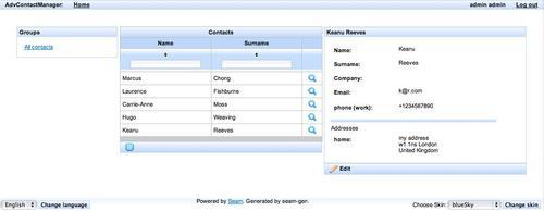
Here, we present some screenshots of the application with all the features we've seen uptil now.
We can see the Contacts list with a contact selected:
The contact editing form (you can notice the buttons to add/delete more fields and addresses) appears as follows:
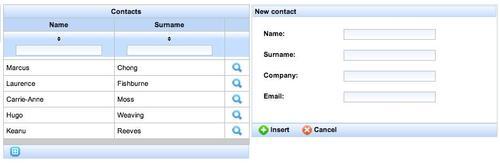
And finally, you can see the add contact form: