
It would be very useful to group our contacts and have different lists of contacts to quickly search for one or the other.
In order to do that, we are going to implement the group feature basically, you can add as many groups as you want and every contact can stay in one or more groups. Every group has a color and a description. Let's see how to implement it!
We are going to use the first box that, until now, contained just the All contacts link, In order to do that, let's open the /view/main/contactsGroup.xhtml and start writing the main table containing the All contacts link and the other group links.
Let's replace the<h:panelGrid>...</h:panelGrid> code with this one:
<table width="100%" border="0">
<tr>
<td width="14" align="center">
<h:graphicImage value="/img/right_arrow_small.png"
rendered="#{homeContactsListHelper.groupFilter==null}"/>
</td>
<td colspan="3">
<h:graphicImage value="/img/contact_small.png"/>
<a:commandLink value="#{messages['allContacts']}"
ajaxSingle="true"
style="margin-left: 5px;"
reRender="contactsList, contactsGroups">
<f:setPropertyActionListener value="#{null}"
target="#{homeContactsListHelper.contactsList}"/>
</a:commandLink>
</td>
</tr>
</table>
In this case, we didn't use the rich:dataTable component because we are mixing a standard link with a list (the groups list) that doesn't contain the All contacts link so, if you want to have a unique table containing both, you have to do it this way. Thanks to Facelets it is possible to mix normal XHTML code without any kind of problem.
As you can see in the code, we are also referring to the groupFilter property of homeContactsListHelper that is used to show the group contents in the contact list. All the contacts will be shown only if groupFilter is null, and that's why we set it to null in the All contacts link.
Moreover, the first column of the table contains a small arrow that will be visible when the groupFilter property is null (so that all contacts are shown).
In order to implement this, let's open the HomeContactsListHelper class and add the new property:
private ContactGroup groupFilter;
public ContactGroup getGroupFilter() {
return groupFilter;
}
public void setGroupFilter(ContactGroup groupFilter) {
this.groupFilter = groupFilter;
}
Now let's change the getContactList() method to make it using the new property:
public List<Contact> getContactsList() {
if (contactsList == null) {
// Creating the query
String queryString;
if (getGroupFilter() == null) {
queryString = "from Contact c where c.contact.id=:fatherId";
} else {
queryString = "select cig.contact from ContactInGroup cig where cig.id.contactGroup=:groupFilterId";
}
// Creating the query
Query query = entityManager.createQuery(queryString);
if (getGroupFilter() == null) {
query = query.setParameter("fatherId", loggedUser.getId());
} else {
query = query.setParameter("groupFilterId", getGroupFilter().getId());
}
// Getting the contacts list
contactsList = (List<Contact>) query.getResultList();
}
return contactsList;
}
Also, we want to show that the contacts list table is filter changing the table header text and color (according to the current filtered group color).
Let's open the contactsList.xhtml file and edit the header of the dataTable to look this way:
<f:facet name="header">
<rich:columnGroup>
<rich:column colspan="3">
<h:outputText value="#{messages['allContacts']}" rendered="#{homeContactsListHelper.groupFilter==null}"/>
<h:outputText value="#{messages['contactsInGroup']}: #{homeContactsListHelper.groupFilter.name}" style="color: #{homeContactsListHelper. groupFilter.color};margin-left: 5px;" rendered="#{homeContactsListHelper. groupFilter!=null}"/>
</rich:column>
<rich:column breakBefore="true">
<h:outputText value="#{messages['name']}"/>
</rich:column>
<rich:column>
<h:outputText value="#{messages['surname']}"/>
</rich:column>
<rich:column>
<rich:spacer/>
</rich:column>
</rich:columnGroup>
</f:facet>
We have the logic to filter the contacts list by group ready!
We have to create the bean that manages the groups list, the group adding, and deletion let's create a new class called GroupsListHelper inside the new package book.richfaces.advcm.modules.main.groups as follows:
@Name("groupsListHelper")
@Scope(ScopeType.CONVERSATION)
public class GroupsListHelper {
@In(create = true)
EntityManager entityManager;
@In(required = true)
Contact loggedUser;
@In
FacesMessages facesMessages;
}
Let's fill the empty Seam component with the logic to list the groups:
private List<ContactGroup> groups;
public List<ContactGroup> getGroups() {
if (groups == null) {
// Creating the query
String query = "from ContactGroup cg where cg.contact.id=:fatherId order by cg.name";
// Getting the contacts list
groups = (List<ContactGroup>) entityManager.createQuery(query)
.setParameter("fatherId", loggedUser.getId())
.getResultList();
}
return groups;
}
public void setGroups(List<ContactGroup> groups) {
this.groups = groups;
}
We have seen this kind of code for the other features we developed there is just one property with a getter and a setter; inside the getter, there is the code to lazy-load the list using standard JPA code.
Let's come back to the XHTML code open the contactsGroups.xhtml file and add the logic to list the group inside the table.
Insert the following code just before the</table> closing tag of the file:
<a:repeat value="#{groupsListHelper.groups}" var="group">
<tr>
<td width="14" align="center" valign="top">
<h:graphicImage value="/img/right_arrow_small.png" rendered="#{homeContactsListHelper.groupFilter.id==group.id}"/>
</td>
<td>
<rich:spacer width="10" height="10" style="background-color: #{group.color}"/>
<a:commandLink value="#{group.name}" reRender="contactsList, contactsGroups">
<f:setPropertyActionListener value="#{group}" target="#{homeContactsListHelper.groupFilter}"/>
<f:setPropertyActionListener value="#{null}" target="#{homeContactsListHelper.contactsList}"/>
</a:commandLink>
<rich:toolTip value="#{group.description}"/>
</td>
</tr>
</a:repeat>
Using the a:repeat tag (that, as we have seen in the other chapters, works like the other data iteration components), we are able to insert a new table row for every group.
This time the first column arrow will be shown only if the group in that row is the one being shown at that moment.
We are also using rich:spacer with a background CSS property set to the group color, in order to show a small colored square for every group; we'll see how to set the color later in this chapter.
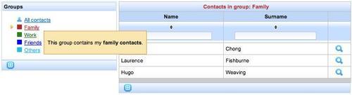
After the command link that activates the group filtering and re-renders the contacts list to show the new filtered contacts table, we can see a new tag called rich:toolTip this tag is very useful for showing a tool tip with the group description when you go over the cell of the table containing the group name.
Here is a screenshot of what we have until now:
As we've seen, the simplest way to use the rich:toolTip component is to put it inside a container with the value attribute set, like the following code:
<a:outputPanel>
<rich:toolTip value="This is the text of my tooltip!" />
</a:outputPanel>
Another way to attach a tool tip to a component is by using the for attribute as follows:
<a:outputPanel id="myPanel"> <rich:toolTip value="This is the text of my tooltip!" for="myPanel"/>
</a:outputPanel>
Very simple!
Please notice that when using the for attribute, the rich:toolTip tag does not have to be nested inside the component (an a:outputPanel in our case).
Another important feature is the Ajax loading of the content:
<a:outputPanel>
<rich:toolTip mode="ajax" value="#{myBean.myProperty}">
<f:facet name="defaultContent">
<h:outputText value="Loading... " />
</f:facet>
</rich:tooltip>
</a:outputPanel>
This code will show a tool tip with the Loading… text inside, until the content of the bound property (myProperty) is loaded using Ajax, and ready to be displayed.
There are other useful attributes ( such as showEvent, showDelay, hideDelay, followMouse, and direction) that you can use to customize the tool tip behavior. You can also use the JavaScript API to call it from inside a JavaScript method!
Let's go back to our application what we need now is the ability to add and edit a group.
We are going to do this inside the group table, so that the group that is editing (or adding) is displayed as a form with inputs for adding or editing and not as a link.
To let you understand the meaning better, this is a screenshot of the completed feature:
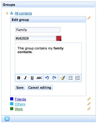
As you can see, the edit form is inside the table, at the place of the editing group (for adding the form will be at the last table row).
Let's start editing the GroupsListHelper Seam component, adding the new features we need.
First, let's add a groupEditing property that contains the group being edited:
private ContactGroup groupEditing;
public ContactGroup getGroupEditing() {
return groupEditing;
}
public void setGroupEditing(ContactGroup groupEditing) {
this.groupEditing = groupEditing;
}
Nothing new here it's just a property with getter and setter.
Now, I have to make sure that the add and edit buttons would fill this property when I click on it.
For the editing feature, I can just add the following column to the group table inside the contactsGroups.xhtml file:
<td align="center" valign="top">
<a:commandLink
reRender="contactsGroups">
<h:graphicImage value="/img/edit_small.png"/>
<f:setPropertyActionListener value="#{group}"
target="#{groupsListHelper.groupEditing}"/>
</a:commandLink>
</td>
As you can see, a:commandLink just sets the groupEditing property and re-renders the contacts group table.
For the add button, we have to use a method that creates a new ContactGroup instance and inserts it into the list.
Let's open the GroupsListHelper class again, and add the following method:
public void addGroup() {
ContactGroup newGroup = new ContactGroup();
getGroups().add(newGroup);
setGroupEditing(newGroup);
}
Now, we can add a toolbar with the add group button just below the groups table; let's switch to the contactsGroups.xhtml file and add this code after the</rich:panel> closing tag:
<rich:toolBar>
<rich:toolBarGroup>
<a:commandButton
image="/img/addgroup.png"
ajaxSingle="true"
reRender="contactsGroups"
action="#{groupsListHelper.addGroup}"/>
</rich:toolBarGroup>
</rich:toolBar>
This button we've added just calls the addGroup() method and then re-renders the contact groups table.
We have the add/edit triggers ready, now we have to display the form (instead of a simple command link) when we encounter a group that is in editing mode.
In order to do that, let's edit the contactsGroups.xhtml file, enclosing the code inside the second table column (the one that shows the square and the group link) inside the a:outputPanel tag with the rendered attribute set:
<td>
<a:outputPanel rendered="#{groupsListHelper.groupEditing.id!=group.id}">
<rich:spacer width="10" height="10"
style="background-color: #{group.color}"/>
<a:commandLink value="#{group.name}"
reRender="contactsList, contactsGroups">
<f:setPropertyActionListener value="#{group}" target="#{homeContactsListHelper.groupFilter}"/>
<f:setPropertyActionListener value="#{null}"
target="#{homeContactsListHelper.contactsList}"/>
</a:commandLink>
<rich:toolTip value="#{group.description}"/>
</a:outputPanel>
</td>
On doing that, the enclosed code will be shown only if the group being rendered is not in the edit mode.
After that panel, we have to insert the panel that contains the code for groups in the edit mode, so that the user will be able to edit the properties of a group that is in the edit mode.
In order to do so, let's add the following code after the<a/outputPanel> closing tag:
<rich:panel rendered="#{groupsListHelper.groupEditing.id==group.id}">
<f:facet name="header">
<h:panelGroup>
<h:outputText value="#{messages['editGroup']}"
rendered="#{groupsListHelper.groupEditing.id!=null}"/>
<h:outputText value="#{messages['addGroup']}"
rendered="#{groupsListHelper.groupEditing.id==null}"/>
</h:panelGroup>
</f:facet>
<a:region>
<h:panelGrid columns="1">
<h:inputText id="newGroupName"
value="#{groupsListHelper.groupEditing.name}"
required="true">
<rich:beanValidator/>
</h:inputText >
<rich:message for="newGroupName"
styleClass="messagesingle"
errorClass="errormsg" infoClass="infomsg"
warnClass="warnmsg"/>
<rich:colorPicker
value="#{groupsListHelper.groupEditing.color}"/>
<rich:editor
value="#{groupsListHelper.groupEditing.description}"/>
<a:outputPanel>
<a:commandButton value="#{messages['save']}"
action="#{groupsListHelper.saveGroupEditing}"
reRender="contactsGroups"/>
<a:commandButton
value="#{messages['cancelEditing']}"
ajaxSingle="true"
reRender="contactsGroups"> <f:setPropertyActionListener
value="#{null}"
target="#{groupsListHelper.groupEditing}"/>
</a:commandButton>
</a:outputPanel>
groupsediting form</h:panelGrid>
</a:region>
</rich:panel>
We've highlighted one new component rich:colorPicker.
This component permits the user to select a color in a visual way and is very useful and simple to use.
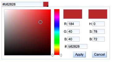
The next screenshot shows the component when opened:
You can use the CSS to customize it (as with every RichFaces component), and use two facets to override the standard ones by setting the icon facet, you can customize the icon that opens the panel, whereas, with the arrows facet, you can change the color selection arrows.
If you look at the other component, the working logic of this form is clean when the group is in the editing mode, we show this form with the ContactGroup property bound to the input component; at the end of the form, we have two buttons one to confirm and save the edited group into the database and the other to cancel the editing (that just sets groupEditing property to null and reRender the groups list).
To save the group into the database we have to add another method to the GroupsListHelper class:
public void saveGroupEditing() {
if (entityManager.contains(getGroupEditing())) {
// Save the object changes
entityManager.merge(getGroupEditing());
} else {
// Associate the new group to the current logged user
getGroupEditing().setContact(loggedUser);
// Persist the object into the database
entityManager.persist(getGroupEditing());
}
// Empty the instance (exits from edit mode)
setGroupEditing(null);
}
The last feature for group management is the delete button; first let's add the method into the GroupsListHelper class as follows:
@In (create = true)
HomeContactsListHelper homeContactsListHelper;
public void deleteGroup(ContactGroup group) {
// If the group to be deleted is selected
if (homeContactsListHelper.getGroupFilter().getId()==
group.getId()) {
// Deselect it
homeContactsListHelper.setGroupFilter(null);
homeContactsListHelper.setContactsList(null);
}
// Remove the group from the database
entityManager.remove(group);
}
In the first part of the method, we check if the group to delete is the selected one: if so, we deselect it and then remove it from the database. We have to get and set the groupFilter property that is inside the homeContactsListHelper component, that is why we injected it in a local property using the code outside the method.
Now we have to create the button in XHTML and link it with this method. Let's open the contactsGroups.xhtml file and add another column after the one for the edit:
<td align="center" valign="top">
<a:commandLink
action="#{groupsListHelper.deleteGroup(group)}"
reRender="contactsGroups,contactsList">
<h:graphicImage value="/img/delete_small.png"/>
<f:setPropertyActionListener value="#{null}" target="#{groupsListHelper.groups}"/>
</a:commandLink>
</td>
We have finished our group management features; now we have to make it possible for the user to insert contacts into the groups.
We are going to use the RichFaces drag-and-drop support to implement this feature, so we can show you how easy it is to do that.
When a user drags a contact over a group name, the contact will be inserted into that group, so let's start defining the contact table's columns, which contain the contact name and surname as a draggable area.
Let's open the contactsList.xhtml file and change the two columns containing the name and the surname in this way:
<rich:column width="45%"
sortBy="#{contact.name}"
filterBy="#{contact.name}">
<h:outputText value="#{contact.name}"/>
<rich:dragSupport dragType="contact" dragIndicator="contactDragIndicator" dragValue="#{contact}">
<rich:dndParam type="drag" name="label" value="#{contact.name} #{contact.surname}"/>
</rich:dragSupport>
</rich:column>
<rich:column width="45%" sortBy="#{contact.surname}" filterBy="#{contact.surname}">
<h:outputText value="#{contact.surname}"/>
<rich:dragSupport dragType="contact" dragIndicator="contactDragIndicator" dragValue="#{contact}">
<rich:dndParam type="drag" name="label" value="#{contact.name} #{contact.surname}"/>
</rich:dragSupport>
</rich:column>
We highlighted the important code (the one for the second column is the same) we are defining a draggable area of the contact type that uses a personalized drag indicator (we'll see it very soon) and carries the dragged contact instance as dragValue.
We also defined a drag parameter named label containing the name and surname of the contact. We are going to use it in the drag indicator.
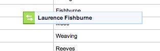
A drag indicator is an html panel following the mouse while dragging; we don't have to define our personal ones. However, in this case, we want to show some information about the dragged item (the name and surname) inside the panel.
This is the standard drag panel without dragIndicator:
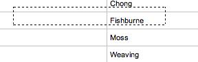
It's just a dotted rectangle that becomes green when the dragged item is over a drop panel, which accepts it.
The basic usage of the dragIndicator is really simple just put the following code at the end of the page, before the closing</ui:composition> tag:
<rich:dragIndicator id="contactDragIndicator" />
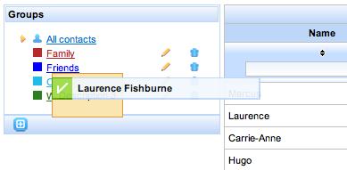
In our application, we are just passing the label value using the dndParam parameter you have seen, so the result of having a drag indicator is:
When the dragged object is over a drop panel that accepts it, the icon of the drag indicator changes, as shown in the following screenshot:
We can customize every part of the drag indicator using CSS and facets.
Now we have to create a drop area from every group that accepts the dragged items of the contact type.
Let's open the contactsGroups.xhtml file and add this code inside the commandLink group:
<a:commandLink value="#{group.name}"
style="color: #{group.color};margin-left: 5px;"
reRender="contactsList, contactsGroups">
<f:setPropertyActionListener value="#{group}" target="#{homeContactsListHelper.groupFilter}"/>
<f:setPropertyActionListener value="#{null}" target="#{homeContactsListHelper.contactsList}"/>
<rich:dropSupport acceptedTypes="contact" dropListener="#{groupsListHelper. processDropAddContactToGroup}" dropValue="#{group}"/>
</a:commandLink>
The highlighted code adds the drop support to every group link. It accepts only contact type dragged elements and carries a drop value containing the current group instance.
The drop listener defined will be called every time an element is dropped; let's define it inside the GroupsListHelper class:
public void processDropAddContactToGroup(DropEvent dropEvent) {
// Get the Contact instance
Contact droppedContact = (Contact) dropEvent.getDragValue();
// Get the ContactGroup instance
ContactGroup droppedGroup = (ContactGroup) dropEvent. getDropValue();
// Check if the contact exists
ContactInGroupId cingid = new ContactInGroupId (droppedGroup.getId(), droppedContact.getId());
// If it doesn't exist
if (entityManager.find(ContactInGroup.class, cingid) == null) { // Create the association
ContactInGroup cing = new ContactInGroup(cingid, droppedGroup,droppedContact);
// Save into the database
entityManager.persist(cing);facesMessages. addFromResourceBundle(StatusMessage.Severity.INFO, "contactAddedToTheGroup"); } else { // If it exists
groupscontact addition, drag-and-drop usedfacesMessages.addFromResourceBundle (StatusMessage.Severity.INFO, "contactAlreadyInTheGroup");
}
}
In this method, we get the dragValue and dropValue values, and use them to check if the contact is inside the group and whether or not to insert it.
This is a very simple and effective way to add drag-and-drop support to your application!
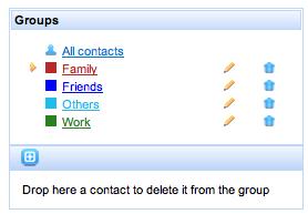
We also want to define an area below the group's toolBar where you can drop contacts that are to be deleted, inside a group.
This area must be shown only when the contact list is showing the content of a group therefore, it is shown when the homeContactsListHelper.groupFilter property is not null.
This might look like this:
We leave it as an exercise for the reader. You can find the complete source code on downloading the application code.