A skin file contains the basic settings (such as font, colors, and so on) that we'll use for all the components just by changing those settings, we can customize the basic look and feel for the RichFaces framework.
As you might know, RichFaces comes with some built-in skins (and other external plug 'n' skin ones) you can start with those skins in order to create your own custom skin.
The plug 'n' skin skins are packaged in external jar files (that you can download from the same location as that of the RichFaces framework) that must be added into the project in order to be able to use them. We will see how to create our custom plug 'n' skin in the next chapter.
Remember that the skin used by the application can be set as context-param in the web.xml file:
<context-param>
<param-name>org.richfaces.SKIN</param-name>
<param-value>emeraldTown</param-value>
</context-param>
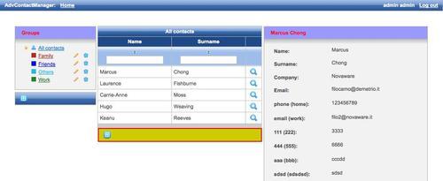
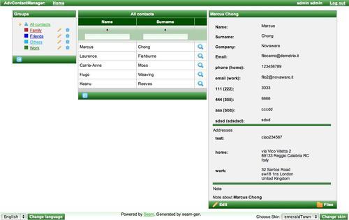
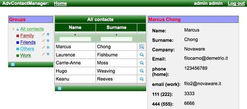
This is an example with the emeralTown skin set:
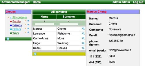
If we change the skin to japanCherry, we have the following screenshot:
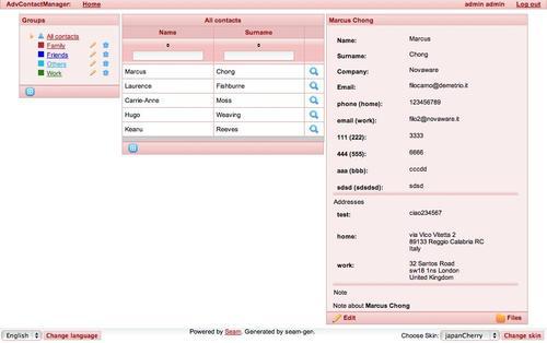
That's without changing a single line of CSS or XHTML!
Now let's start creating our own basic skin. In order to do that, we are going to reuse one of the built-in skin files and change it. You can find the skin files in the richfaces-impl-3.x.x.jar file inside the META-INF/skins directory.
Let's open the file and then open, for example, the emeraldTown.skin.properties file that looks like this (yes, the skin file is a .properties file!):
#Colors
headerBackgroundColor=#005000
headerGradientColor=#70BA70
headerTextColor=#FFFFFF
headerWeightFont=bold
generalBackgroundColor=#f1f1f1
generalTextColor=#000000
generalSizeFont=18px
generalFamilyFont=Arial, Verdana, sans-serif
controlTextColor=#000000
controlBackgroundColor=#ffffff
additionalBackgroundColor=#E2F6E2
shadowBackgroundColor=#000000
shadowOpacity=1
panelBorderColor=#C0C0C0
subBorderColor=#ffffff
tabBackgroundColor=#ADCDAD
tabDisabledTextColor=#67AA67
trimColor=#BBECBB
src/main/resourcesabouttipBackgroundColor=#FAE6B0
tipBorderColor=#E5973E
selectControlColor=#FF9409
generalLinkColor=#43BD43
hoverLinkColor=#FF9409
visitedLinkColor=#43BD43
# Fonts
headerSizeFont=18px
headerFamilyFont=Arial, Verdana, sans-serif
tabSizeFont=11
tabFamilyFont=Arial, Verdana, sans-serif
buttonSizeFont=18
buttonFamilyFont=Arial, Verdana, sans-serif
tableBackgroundColor=#FFFFFF
tableFooterBackgroundColor=#cccccc
tableSubfooterBackgroundColor=#f1f1f1
tableBorderColor=#C0C0C0
tableBorderWidth=2px
#Calendar colors
calendarWeekBackgroundColor=#f5f5f5
calendarHolidaysBackgroundColor=#FFEBDA
calendarHolidaysTextColor=#FF7800
calendarCurrentBackgroundColor=#FF7800
calendarCurrentTextColor=#FFEBDA
src/main/templatesaboutcalendarSpecBackgroundColor=#E2F6E2
calendarSpecTextColor=#000000
warningColor=#FFE6E6
warningBackgroundColor=#FF0000
editorBackgroundColor=#F1F1F1
editBackgroundColor=#FEFFDA
#Gradients
gradientType=plain
In order to test it, let's open our application project, create a file called mySkin.skin.properties inside the directory /resources/WEB-INF/, and add the above text.
Then, let's open the build.xml file and edit it, and add the following code into the war target:
<copy
tofile="${war.dir}/WEB-INF/classes/mySkin.skin.properties"
file="${basedir}/resources/WEB-INF/mySkin.skin.properties"
overwrite="true"/>
Also, as our application supports multiple skins, let's open the components.xml file and add support to it:
<property name="defaultSkin">mySkin</property>
projecttemplate, testing<property name="availableSkins">
<value>mySkin</value>
<value>laguna</value>
<value>darkX</value>
<value>glassX</value>
<value>blueSky</value>
<value>classic</value>
<value>ruby</value>
<value>wine</value>
<value>deepMarine</value>
<value>emeraldTown</value>
<value>japanCherry</value>
</property>
Tip
If you just want to select the new skin as the fixed skin, you would just edit the web.xml file and select the new skin by inserting the name into the context parameter (as explained before).
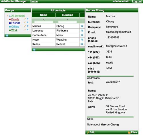
Just to make an (bad looking, but understandable) example, let's change some parameters in the skin file:
#Colors
componentRenderer classheaderBackgroundColor=#005000
headerGradientColor=#70BA70
headerTextColor=#FFFFFF
headerWeightFont=bold
generalBackgroundColor=#f1f1f1
generalTextColor=#000000
generalSizeFont=18px
generalFamilyFont=Arial, Verdana, sans-serif
controlTextColor=#000000
controlBackgroundColor=#ffffff
additionalBackgroundColor=#E2F6E2
shadowBackgroundColor=#000000
shadowOpacity=1
panelBorderColor=#C0C0C0
subBorderColor=#ffffff
tabBackgroundColor=#ADCDAD
tabDisabledTextColor=#67AA67
trimColor=#BBECBB
tipBackgroundColor=#FAE6B0
tipBorderColor=#E5973E
selectControlColor=#FF9409
generalLinkColor=#43BD43
hoverLinkColor=#FF9409
visitedLinkColor=#43BD43
# Fonts
headerSizeFont=18px
headerFamilyFont=Arial, Verdana, sans-serif
tabSizeFont=11
tabFamilyFont=Arial, Verdana, sans-serif
buttonSizeFont=18
buttonFamilyFont=Arial, Verdana, sans-serif
tableBackgroundColor=#FFFFFF
tableFooterBackgroundColor=#cccccc
tableSubfooterBackgroundColor=#f1f1f1
tableBorderColor=#C0C0C0
tableBorderWidth=2px
#Calendar colors
componenttestingcalendarWeekBackgroundColor=#f5f5f5
calendarHolidaysBackgroundColor=#FFEBDA
skin parametersbasic skin, edittingcalendarHolidaysTextColor=#FF7800
calendarCurrentBackgroundColor=#FF7800
calendarCurrentTextColor=#FFEBDA
calendarSpecBackgroundColor=#E2F6E2
calendarSpecTextColor=#000000
warningColor=#FFE6E6
warningBackgroundColor=#FF0000
editorBackgroundColor=#F1F1F1
editBackgroundColor=#FEFFDA
#Gradients
gradientType=plain
Here is the screenshot of what happened with the new skin:
How do I know which parameters to change? The official RichFaces Developer Guide contains, for every component, a table with the correspondences between the skin parameters and the CSS properties they are connected to.
What about when we need to change just a specific component's look? And what if we need to change it just for a specific page?
In these cases, we can use the CSS framework to accomplish the tasks.
For the first case, we can redefine the skin-inserted CSS classes, and for the second, we can specify our specific CSS classes for every component.
Let's come back to our example, we want to change the background for all of the panel headers.
In the official RichFaces Developer Guide, we can see that we have to redefine the CSS class rich-panel-header. Let's open the /view/stylesheet/theme.css and add the following code:
.rich-panel-header {
color: #FF0000;
background: #9999ff repeat scroll 0 0;
}
The result is as follows:
By now, all of the rich:panel components have a new header redefined by the CSS class.
If we want to change the style for a specific component, we can just pass our custom CSS classes using the *Class attributes.
In order to give an example, we are going to customize just the rich:toolBar component of the All contacts table let's open the /view/stylesheet/theme.css file and add our custom CSS class as follows:
.my-custom-toolbar {
CSS, skin parametersspecific classes, specifyingbackground: #cccc00 repeat scroll 0 0;
}
Now, let's open the /view/main/contactsList.xhtml file and set the styleClass attribute with our newly created CSS class:
...
<rich:toolBar styleClass="my-custom-toolbar">
...
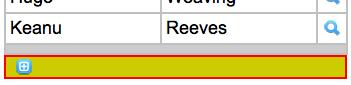
The result of this customization is as shown in the following screenshot:
You can see that only the All contacts table toolbar is customized.
You can also insert inline CSS code using the style attribute of the component:
...
<rich:toolBar styleClass="my-custom-toolbar"
style="border: 2px solid #FF0000;">
...
You can see the following result:
Even if we change the skin, our custom CSS settings will still be valid: