
6 Experimentation in action: Testing and evaluating a project
- Evaluating potential approaches for an ML project
- Objectively selecting an approach for a project’s implementation
The preceding chapter covered all the preparatory actions that should be taken to minimize the risks associated with an experimentation phase of a project. These range from conducting research that informs the options available for solving the problem to building useful functions that the team members can leverage during the prototyping phase. We will continue the previous scenario throughout this chapter, a time-series modeling project for airport passenger demand forecasting, while focusing on methodologies to be applied to experimental testing that will serve to reduce the chances of project failure.
We will spend time covering testing methodologies simply because this stage of project development is absolutely crucial for two primary reasons. First, at one extreme, if not enough approaches are tested (evaluated critically and objectively), the chosen approach may be insufficient to solve the actual problem. At the other extreme, testing too many options to too great a depth can result in an experimental prototyping phase that risks taking too long in the eyes of the business.
By following a methodology that aims to rapidly test ideas, using uniform scoring methods to achieve comparability between approaches, and focusing on evaluation of the performance of the approaches rather than the absolute accuracy of the predictions, the chances of project abandonment can be reduced.
Figure 6.1 compares the two extremes of prototyping within an ML project. The middle ground, the moderate approach, has shown the highest success rates with the teams that I’ve either led or worked with.
As this diagram shows, the extreme approaches on either side frequently result in polar opposite problems. On the left side, there exists an extremely high probability for project cancellation due to a lack of faith on the part of the business the business in the DS team’s ability to deliver a solution. Barring a case of extreme good luck, the solution that the team haphazardly selected and barely tested is likely not going to be even remotely optimal. Their implementation of their solution is equally likely to be poor, expensive, and fragile.
On the other side of the diagram, however, there exists a different problem entirely. The academic-influenced thoroughness on display here is admirable and would work well for a team conducting original research. For a DS team working in industry, though, the sheer volume of time required to thoroughly evaluate all possible solutions to a problem will delay the project far longer than most companies have patience for. Customized feature engineering for each approach, full evaluation of available models in popular frameworks, and, potentially, the implementation of novel algorithms are all sunk costs. While they are more scientifically rigorous as a series of actions to take, the time spent building each of these approaches in order to properly vet which is most effective means that other projects aren’t being worked on. As the old adage goes, time is money, and spending time building out fully fledged approaches to solve a problem is expensive from both a time and a money perspective.
For the purposes of exploring an effective approach in an applications-focused manner, we will continue with the preceding chapter’s scenario of time-series modeling. In this chapter, we’ll move through the middle ground of figure 6.1 to arrive at the candidate approach that is most likely to result in a successful MVP.
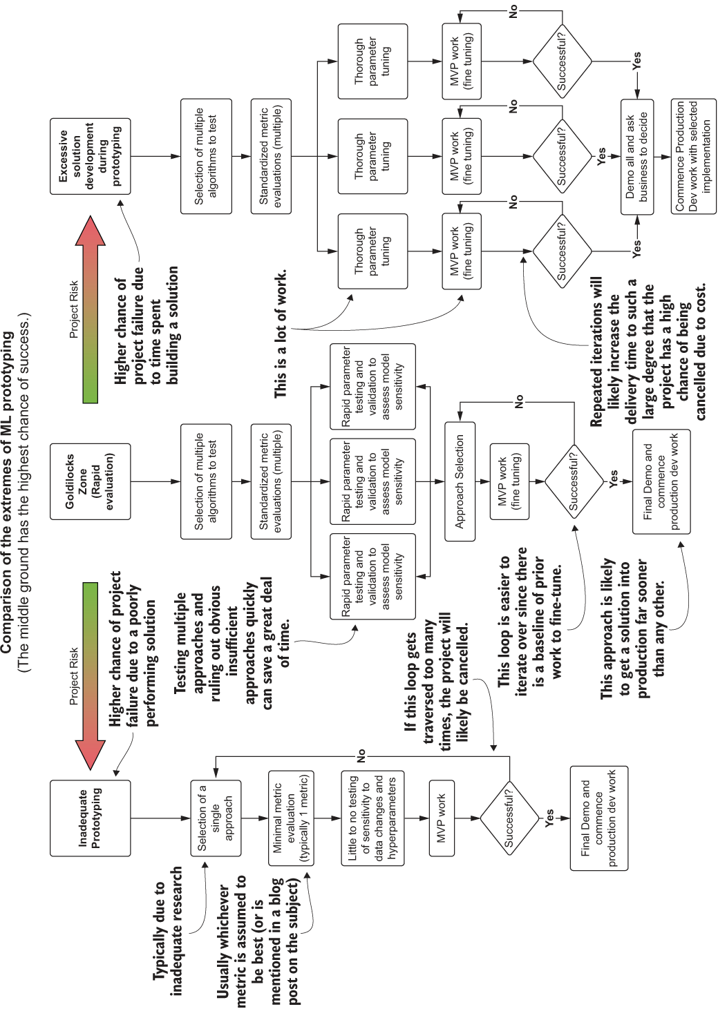
Figure 6.1 The sliding scale of approaches to ML solution prototyping work
6.1 Testing ideas
At the conclusion of chapter 5, we were left at a stage where we were ready to evaluate the different univariate modeling approaches for forecasting passengers at airports. The team is now ready to split into groups; each will focus on implementations of the various researched options that have been discovered, putting forth their best efforts not only to produce as accurate a solution as they can, but also to understand the nuances of tuning each model.
Before everyone goes off to hack through the implementations, a few more standard tooling functions need to be developed to ensure that everyone is evaluating the same metrics, producing the same reports, and generating the appropriate visualizations that can easily show the benefits and drawbacks of the disparate approaches. Once these are completed, the teams can then get into the task of evaluating and researching each of their assigned modeling tasks, all using the same core functionality and scoring. Figure 6.2 gives an overview of typical utilities, functionality, and standards that should be adhered to during the model prototyping phase of a project.
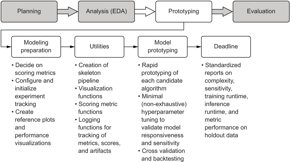
Figure 6.2 The prototyping phase work elements and their functions
As mentioned in section 5.2, this path of actions is generally focused on supervised learning project work. A prototyping phase for, say, a CNN would look quite a bit different (with far more front-loaded work in building human-readable evaluations of the model performance, particularly if we’re talking about a classifier). But in general, these pre-work actions and approaches to prototyping different solutions will save weeks of frustrating rework and confusion if adhered to.
6.1.1 Setting guidelines in code
In chapter 5, we looked at and developed a set of visualization tools and basic data ingestion and formatting functions that each team can use. We built these for two primary purposes:
- Standardization—So that each team is generating identical plots, figures, and metrics to allow for a coherent comparison between the different approaches
- Communication—So that we can generate referenceable visualizations to demonstrate to the business how our modeling efforts are solving the problem
It is critically important to meet these two needs starting at this phase of project work. Without standardization, we run the risk of making poor decisions on which approach to go with for the MVP (and the subsequent fully developed solution). In addition, we risk wasting time by multiple teams that, instead of testing their approaches, are building implementations that are effectively identical to a visualization that in essence does the same thing. Without the communication aspect, we would be left with either confusing metric score values to report, or, in the worst case, raw code to show to the business. Either approach would be a recipe for disaster in a demonstration meeting.
Before the teams break out and start developing their assigned solutions too intensely in their respective silos, we could stand to have one final analysis done by the larger team to help inform how well their predictions are performing in a visual sense. Keep in mind that, as we discussed in chapter 4, at the conclusion of this phase of experimentation the team will need to present its findings in a way that can be easily digested by a non-ML and nontechnical audience.
One of the most effective ways of achieving this communication is through simple visualizations. Focusing on showing the results of the approach’s output with clear and simple annotations can not only benefit the early phases of testing but also can be used to report on performance of the solution later, when it is in production. Avoiding confusing reports and tables of metrics with no visual cue to explain what they mean will ensure clear and concise communication with the business.
Baseline comparison visualization
To have a basic reference for more-complex models, it can be beneficial to see what the simplest implementation produces; then we can see if whatever we come up with can do better than that. This baseline, for the purposes of time-series modeling, can take the form of a simple moving average and an exponentially smoothed average. Neither of these two approaches would be applicable for the forecasting needs of the project, but their output results can be used to see, within the holdout period for validation, if our more sophisticated approaches will be an improvement.
To create a visualization that the teams can use to see these relationships for simpler algorithms, we first have to define an exponential smoothing function, as shown in the next listing. Keep in mind that this is all designed both to standardize the work of each team and to build an effective communication tool for conveying the success of the project to the business.
Listing 6.1 Exponential smoothing function to generate a comparison forecast
def exp_smoothing(raw_series, alpha=0.05):            ❶
    output = [raw_series[0]]                          ❷
    for i in range(1, len(raw_series)):               ❸
        output.append(raw_series[i] * alpha + (1-alpha) * output[i-1])
    return output
❶ alpha is the smoothing parameter, providing dampening to the previous values in the series. (Values close to 1.0 have strong dampening effects, while conversely, values near 0.0 are not dampened as much.)
❷ Adds the starting value from the series to initiate the correct index positions for the traversal
❸ Iterates through the series, applying the exponential smoothing formula to each value and preceding value
A complementary function is needed for additional analytics purposes to generate a metric and error estimation for these simple modeling fits for the time series. The following listing provides a method for calculating the mean absolute error for the fit, as well as for calculating the uncertainty intervals (yhat values).
Listing 6.2 Mean absolute error and uncertainty
from sklearn.metrics import mean_absolute_error
def calculate_mae(raw_series, smoothed_series, window, scale):
    res = {}                                                             ❶
    mae_value = mean_absolute_error(raw_series[window:],
      smoothed_series[window:])                                          ❷
    res['mae'] = mae_value
    deviation = np.std(raw_series[window:] - smoothed_series[window:])   ❸
    res['stddev'] = deviation
    yhat = mae_value + scale * deviation                                 ❹
    res['yhat_low'] = smoothed_series - yhat                             ❺
    res['yhat_high'] = smoothed_series + yhat
    return res
❶ Instantiates a dictionary to place the calculated values in for the purposes of currying
❷ Uses the standard sklearn mean_absolute_error function to get the MAE between the raw data and the smoothed series
❸ Calculates the standard deviation of the series differences to calculate the uncertainty threshold (yhat)
❹ Calculates the standard baseline yhat value for the differenced series
❺ Generates a low and high yhat series centered around the smoothed series data
NOTE Throughout these code listings, import statements are shown where needed above functions. This is for demonstration purposes only. All import statements should always be at the top of the code, whether writing in a notebook, a script, or in an IDE as modules.
Now that we’ve defined the two functions in listings 6.1 and 6.2, we can call them in another function to generate not only a visualization, but a series of both the moving average and the exponentially smoothed data. The code to generate this reference data and an easily referenceable visualization for each airport and passenger type follows.
Listing 6.3 Generating smoothing plots
def smoothed_time_plots(time_series, time_series_name, image_name, smoothing_window, exp_alpha=0.05, yhat_scale=1.96, style='seaborn', plot_size=(16, 24)):
    reference_collection = {}                                              ❶
    ts = pd.Series(time_series)
    with plt.style.context(style=style):
        fig, axes = plt.subplots(3, 1, figsize=plot_size)
        plt.subplots_adjust(hspace=0.3)
        moving_avg = ts.rolling(window=smoothing_window).mean()            ❷
        exp_smoothed = exp_smoothing(ts, exp_alpha)                        ❸
        res = calculate_mae(time_series, moving_avg, smoothing_window,
          yhat_scale)                                                      ❹
        res_exp = calculate_mae(time_series, exp_smoothed, smoothing_window,
          yhat_scale)                                                      ❺
        exp_data = pd.Series(exp_smoothed, index=time_series.index)        ❻
        exp_yhat_low_data = pd.Series(res_exp['yhat_low'],
          index=time_series.index)
        exp_yhat_high_data = pd.Series(res_exp['yhat_high'],
          index=time_series.index)
        axes[0].plot(ts, '-', label='Trend for {}'.format(time_series_name))
        axes[0].legend(loc='upper left')
        axes[0].set_title('Raw Data trend for {}'.format(time_series_name))
        axes[1].plot(ts, '-', label='Trend for {}'.format(time_series_name))
        axes[1].plot(moving_avg, 'g-', label='Moving Average with window:
          {}'.format(smoothing_window))
        axes[1].plot(res['yhat_high'], 'r--', label='yhat bounds')
        axes[1].plot(res['yhat_low'], 'r--')
        axes[1].set_title('Moving Average Trend for window: {} with MAE of:
          {:.1f}'.format(smoothing_window, res['mae']))                    ❼
        axes[1].legend(loc='upper left')
        axes[2].plot(ts, '-', label='Trend for {}'.format(time_series_name))
        axes[2].legend(loc='upper left')
        axes[2].plot(exp_data, 'g-', label='Exponential Smoothing with alpha:
          {}'.format(exp_alpha))
        axes[2].plot(exp_yhat_high_data, 'r--', label='yhat bounds')
        axes[2].plot(exp_yhat_low_data, 'r--')
        axes[2].set_title('Exponential Smoothing Trend for alpha: {} with MAE
          of: {:.1f}'.format(exp_alpha, res_exp['mae']))
        axes[2].legend(loc='upper left')
        plt.savefig(image_name, format='svg')
        plt.tight_layout()
        reference_collection['plots'] = fig
        reference_collection['moving_average'] = moving_avg
        reference_collection['exp_smooth'] = exp_smoothed
        return reference_collection
❶ Currying dictionary for data return values
❷ Simple time-series moving average calculation
❸ Calls the function defined in listing 6.1
❹ Calls the function defined in listing 6.2 for the simple moving average series
❺ Calls the function defined in listing 6.2 for the exponentially smoothed trend
❻ Applies the pandas index date series to the non-indexed exponentially smoothed series (and the yhat series values as well)
❼ Uses string interpolation with numeric formatting so the visualizations are more legible
We call this function in the next listing. With this data and the visualization prebuilt, the teams can have an easy-to-use and standard guide to reference throughout their modeling experimentation.
Listing 6.4 Calling the reference smoothing function for series data and visualizations
ewr_data = get_airport_data('EWR', DATA_PATH)
ewr_reference = smoothed_time_plots(ewr_data['International Passengers'], 'Newark International', 'newark_dom_smooth_plot.svg', 12, exp_alpha=0.25)
When it’s executed, this code will give the subteams a quick reference visualization (and the series data to compare with from the moving average and exponentially weighted moving average smoothing algorithm), shown in figure 6.3.
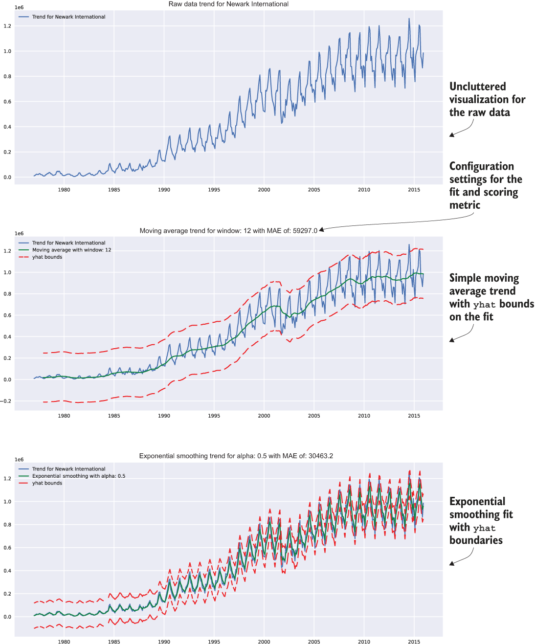
Figure 6.3 Reference trends visualization based on the usage of the smoothed_time_plots() function, as shown in listing 6.4
The goal in wrapping this boilerplate visualization code into a function (as shown in listing 6.3 and used in listing 6.4) at this stage is twofold:
- Portability—Each team can be given this function as a referenceable bit of code that can be used as a dependency to its work, ensuring that everyone is generating the exact same visualizations.
- Preparing for production—This code, as a function, can be easily ported into a visualization class as a method that can be used for not only this project, but also other forecasting projects in the future.
The focus on spending a marginal amount of time at creating reusable code may not seem worthwhile at this point, particularly with the focus that we’ve been giving to timeliness of delivery for the solution prototype. But rest assured, as projects grow in scope and the complexity extends far beyond a simple forecasting problem, the relatively small effort made at this point to prepare for modularized code now will save a great deal of time later.
The last thing the team needs to implement before moving to the model experimentation is the standardized measurement of the forecasting predictions to holdout validation data. This effort is to eliminate any chance of debate regarding the effectiveness of each implementation. We’re effectively streamlining the adjudication of each implementation’s merits by way of standardization, which will not only save time in meetings, but also provide a strong scientific methodology to the comparison of each.
If were we to leave each team to determine its own optimal evaluation metrics, comparing them to one another would be nigh impossible, leading to rework of tests and further project delays. If we were to accumulate enough of these avoidable delays, we could dramatically increase the possibility of project abandonment.
In section 5.1.3, we covered the agreed-upon metrics that the team will be using to score models: R-squared, MSE, RMSE, MAE, MAPE, and explained variance. To save a great deal of time for each subteam that will be focused on implementing the modeling tests, we should build a few functions that will make scoring and standardized reporting of the results much easier.
First, we need to actually implement MAPE, as it is not readily available as a scoring metric in Python libraries (at the time of this writing). This metric is of critical importance to assessing the overall quality of predictions across so many different time series, as it is a scaled and standardized value that can be used to compare against different forecasts without having to account for the magnitude of the series values.
It shouldn’t, however, be used as the only measurement metric, as we discussed earlier in planning for our experimentation. Having multiple metrics recorded for each experiment being conducted is going to pay dividends if we need to evaluate previous experiments based on a different metric. The following listing shows a basic MAPE implementation.
Listing 6.5 Simple MAPE implementation
def mape(y_true, y_pred):
    return np.mean(np.abs((y_true - y_pred) / y_true)) * 100
Now that we have that defined, we can create a simple series scoring function that will calculate all the agreed-upon metrics without having to litter all of the experimentation code bases with manual implementations of each calculation. This function will also allow us to embed these calculations into our visualizations without having to constantly redefine standard metric calculations throughout the code. The standard metric function that we’ll be using is shown next.
Listing 6.6 Standard error calculations for scoring forecast data
from sklearn.metrics import explained_variance_score, mean_absolute_error, mean_squared_error, r2_score                                         ❶
def calculate_errors(y_true, y_pred):                                     ❷
    error_scores = {}                                                     ❸
    mse = mean_squared_error(y_true, y_pred)                              ❹
    error_scores['mae'] = mean_absolute_error(y_true, y_pred)
    error_scores['mape'] = mape(y_true, y_pred)                           ❺
    error_scores['mse'] = mse
    error_scores['rmse'] = sqrt(mse)
    error_scores['explained_var'] = explained_variance_score(y_true, y_pred)
    error_scores['r2'] = r2_score(y_true, y_pred)
    return error_scores
❶ Imports and utilizes as many standard scoring implementations as possible that are available. There’s no reason to reinvent the wheel.
❷ Passes in the actual series and the predicted series for the forecasting validation time period
❸ Instantiates a dictionary construct for storing the scores for use elsewhere (notice the absence of print statements)
❹ Local variable declaration (since the mse value will be stored and used for the rmse metric)
❺ Calculation and usage of the mape calculation defined in listing 6.5
Conspicuously absent from this function is a print statement. This is by design for two distinctly different reasons.
First, we want to use the dictionary-encapsulated score metrics for the visualization we’re going to build for the teams to use; therefore, we don’t want to have the values simply printed to stdout. Second, it’s a bad practice to have stdout reporting in functions and methods, as this will create more work for you later when developing a solution.
Digging through code prior to a release to production to scrub out print statements (or convert them to logging statements) is tedious, error-prone, and if missed, can have performance impacts on production solutions (particularly in lazily evaluated languages). In addition, in production, no one will ever read stdout, leaving the print statements as nothing more than needlessly executed code.
For the final pre-modeling work, we need to build a quick visualization and metric-reporting function that will give each team a standard and highly reusable means of evaluating the prediction performance for each model. The following listing shows a simple example, which we will be utilizing during the model experimentation phase in section 6.1.2.
Listing 6.7 Prediction forecast plotting with error metrics
def plot_predictions(y_true, y_pred, time_series_name, value_name, image_name, style='seaborn', plot_size=(16, 12)):                 ❶
    validation_output = {}
    error_values = calculate_errors(y_true, y_pred)                    ❷
    validation_output['errors'] = error_values                         ❸
    text_str = '
'.join((
        'mae = {:.3f}'.format(error_values['mae']),
        'mape = {:.3f}'.format(error_values['mape']),
        'mse = {:.3f}'.format(error_values['mse']),
        'rmse = {:.3f}'.format(error_values['rmse']),
        'explained var = {:.3f}'.format(error_values['explained_var']),
        'r squared = {:.3f}'.format(error_values['r2']),
    ))                                                                 ❹
    with plt.style.context(style=style):
        fig, axes = plt.subplots(1, 1, figsize=plot_size)
        axes.plot(y_true, 'b-', label='Test data for
          {}'.format(time_series_name))
        axes.plot(y_pred, 'r-', label='Forecast data for
          {}'.format(time_series_name))                                ❺
        axes.legend(loc='upper left')
        axes.set_title('Raw and Predicted data trend for
          {}'.format(time_series_name))
        axes.set_ylabel(value_name)
        axes.set_xlabel(y_true.index.name)
        props = dict(boxstyle='round', facecolor='oldlace', alpha=0.5) ❻
        axes.text(0.05, 0.9, text_str, transform=axes.transAxes, fontsize=12,
          verticalalignment='top', bbox=props)                         ❼
        validation_output['plot'] = fig
        plt.savefig(image_name, format='svg')
        plt.tight_layout()
    return validation_output
❶ Sets the inputs to be indexed series values instead of a DataFrame input with field names to keep the function more generic
❷ Calls the function created in listing 6.6 to calculate all of the agreed-upon error metrics for the project
❸ Adds the error metrics to the output dictionary for use outside of simply producing a visualization
❹ Generates the string that will be applied to a bounding box element superimposed on the graph
❺ Plots the overlays of the actual and forecasted prediction data onto the same graph with different colors
❻ Creates a text box that shows all error scores along with the plotted data
❼ Writes the text contents into the text bounding box
Now, after creating these basic functions to accelerate our experimentation work, we can finally begin the process of testing various forecasting algorithms for our time-series work.
6.1.2 Running quick forecasting tests
The rapid testing phase is by far the most critical aspect of prototyping to get right. As mentioned in this chapter’s introduction, it is imperative to strive for the middle ground—between not testing enough of the various approaches to determine the tuning sensitivity of each algorithm, and spending inordinate amounts of time building a full MVP solution for each approach. Since time is the most important aspect of this phase, we need to be efficient while making an informed decision about which approach shows the most promise in solving the problem in a robust manner.
Freshly armed with useful and standardized utility functions, each team can work on its respective approaches, rapidly testing to find the most promising model. The team has agreed that the airports under consideration for modeling tests are JFK, EWR, and LGA (each team needs to test its model and tuning paradigms on the same datasets so a fair evaluation of each approach can occur).
Let’s take a look at what the teams will be doing with the different model approaches during rapid testing, what decisions will be made about the approaches, and how the teams can quickly pivot if they find that the approach is going nowhere. The exploratory phase is going to not only uncover nuances of each algorithm but also illuminate aspects of the project that might not have been realized during the preparatory phase (covered in chapter 5). It’s important to remember that this is to be expected and that during this rapid testing phase, the teams should be in frequent communication with one another when they discover these problems (see the following sidebar for tips on effectively managing these discoveries).
Wait a minute . . . how are we going to create a validation dataset?
One group drew the proverbial short straw in the model-testing phase with a forecasting approach to research and test that isn’t particularly well understood by the team. Someone on the team found mention of using a VAR to model multiple time series together (multivariate endogenous series modeling), and thus, this group sets out to research what this algorithm is all about and how to use it.
The first thing that they do is run a search for “vector autoregression,” which results in a massive wall of formulaic theory analysis and mathematical proofs centered primarily around macro-econometrics research and natural sciences utilizations of the model. That’s interesting, but not particularly useful if they want to test out the applications of this model to the data quickly. They next find the statsmodels API documentation for the model.
The team members quickly realize that they haven’t thought about standardizing one common function yet: the split methodology. For most supervised ML problems, they’ve always used pandas split methodologies through DataFrame slicing or utilizing the high-level random split APIs, which use a random seed to select rows for training and test datasets. However, for forecasting, they realize that they haven’t had to do datetime splitting in quite some time and need a deterministic and chronological split method to get accurate forecast validation holdout data. Since the dataset has an index set from the ingestion function’s formatting of the DataFrame, they could probably craft a relatively simple splitting function based on the index position. What they come up with is in the following listing.
Listing 6.8 Time split for train and test datasets (with validation check)
from dateutil.parser import parse
def split_correctness(data, train, test):                           ❶
    assert data.size == train.size + test.size,                    ❷
    "Train count {} and test count {} did not match to source count {}".format(train.size, test.size, data.size)

def generate_splits(data, date):                                    ❸
    parsed_date = parse(date, fuzzy=True)                           ❹
    nearest_date = data[:parsed_date].iloc(0)[-1].name              ❺
    train = data[:nearest_date]                                     ❻
    test = data[nearest_date:][1:]                                  ❼
    split_correctness(data, train, test)                            ❽
    return train, test
❶ A validation assertion function designed to ensure that the splits being conducted through the custom function are not dropping any rows of data between train and test
❷ Assertions like this are a prelude to “hardened code” and unit testing. We cover this more in later chapters, but for this simple example, realize that we are building a custom splitting function to ensure that it functions as the user expects.
❸ The function for generating the train and test splits for building the model and validating it
❹ Might as well allow for creative inputs here, right? “June 3rd 2005” should resolve just like “2005-06-03.” If we’re using Python, we might as well leverage this sort of flexibility. I mean, who needs type safety, anyway?
❺ A search function for finding the nearest date. (Remember, we have monthly data here; what happens if someone puts in 2008-04-17? What happens if they put in 2008-04-01? We need to have the behavior be the same regardless of which valid data is passed in.)
❻ Generates the training data up to the nearest found date
❼ Generates the test data from the next index position after where the train left off
❽ Validates that our train and test splits didn’t duplicate or drop rows from the original source DataFrame. (We didn’t have to do that in the fuzzy parsing portion because an invalid date from the parser will throw an exception.)
This team’s members, being the wonderful stewards of teamwork and comradery that they know themselves to be, immediately send this function snippet to the other teams so that they can have an easy single-line methodology for splitting their data. They even put in a creative fuzzy matching parser in case people want to use different date formats.
Just to be sure that they’ve written it correctly, they’re going to do some testing of their implementation. They want to make sure that they’re actually getting exceptions raised if the data doesn’t match up correctly. Let’s see what they test in figure 6.4.
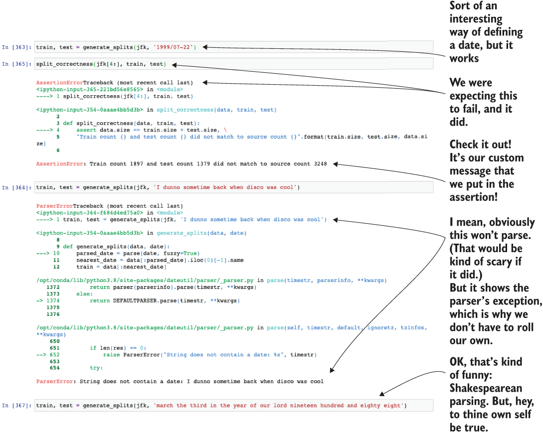
Figure 6.4 This function validation for custom logic ensures that listing 6.8 functions the way we expect.
Rapid testing of the VAR model approach
Now that we have a way to split data into train and test, let’s check back in with the team that was set up with testing out a VAR model. Without getting into excruciating detail about what this model can do, the goal of a VAR model is for simultaneous modeling of multiple time series in a single pass.
note If you are interested in learning more about these advanced approaches, there is no better resource than New Introduction to Multiple Time Series Analysis (Springer, 2006) by Helmut Lütkepohl, the creator of this algorithm.
The team looks at the example on the API docs page and starts to implement a simple test, shown next.
Listing 6.9 A rough first pass at a VAR model
from statsmodels.tsa.vector_ar.var_model import VAR                        ❶
jfk = get_airport_data('JFK', DATA_PATH)

jfk = apply_index_freq(jfk, 'MS')
train, test = generate_splits(jfk, '2006-07-08')                           ❷
var_model = VAR(train[['Domestic Passengers', 'International Passengers']])❸
var_model.select_order(12)                                                 ❹
var_fit = var_model.fit()                                                  ❺
lag_order = var_fit.k_ar                                                   ❻
var_pred = var_fit.forecast(test[['Domestic Passengers', 'International Passengers']].values[-lag_order:], test.index.size)        ❼
var_pred_dom = pd.Series(np.asarray(list(zip(*var_pred))[0], dtype=np.float32), index=test.index)                                  ❽
var_pred_intl = pd.Series(np.asarray(list(zip(*var_pred))[1], dtype=np.float32), index=test.index)                                 ❾
var_prediction_score = plot_predictions(test['Domestic Passengers'],
                                        var_pred_dom,
                                        "VAR model Domestic Passengers JFK",
                                        "Domestic Passengers",
                                        "var_jfk_dom.svg")                 ❿
❶ There’s our vector autoregressor that we’ve been talking about!
❷ Uses our super-sweet split function that can read all sorts of nonsense that people want to type in as dates
❸ Configures the VAR model with a vector of time-series data. We can model both at the same time! Cool? I guess?
❹ The VAR class has an optimizer based on minimizing the Akaike information criterion (AIC). This function attempts to set a limit on the ordering selection to optimize for goodness of fit. We learned this by reading the API documentation for this module. Optimizing for AIC will allow for the algorithm to test a bunch of autoregressive lag orders and select the one that performs the best (at least it’s supposed to).
❺ Let’s call fit() on the model and see what equation it comes up with.
❻ The documentation said to do this. It’s supposed to get the AIC-optimized lag order from the fit model.
❼ Generates the predictions. This was a bit tricky to figure out because the documentation was super vague and apparently few people use this model. We noodled around and figured it out, though. Here, we’re starting the forecast on the test dataset for both series, extracting the pure series from them, and forecasting out the same number of data points as are in the test dataset.
❽ This hurts my head, and I wrote it. Since we get a vector of forecasts (a tuple of domestic passenger predictions and international passenger predictions), we need to extract the values from this array of tuples, put them into a list, convert them to a NumPy array, and then generate a pandas series with the correct index from the test data so we can plot this. Whew.
❾ We don’t even use this for plotting (reasons forthcoming), but this obnoxious copy-pasta is to be expected from experimental code.
❿ Let’s finally use that prediction plot code created in listing 6.7 to see how well our model did!
The resulting forecast plot in the preceding code, comparing the predicted to actual data within the holdout validation period, is shown in figure 6.5.
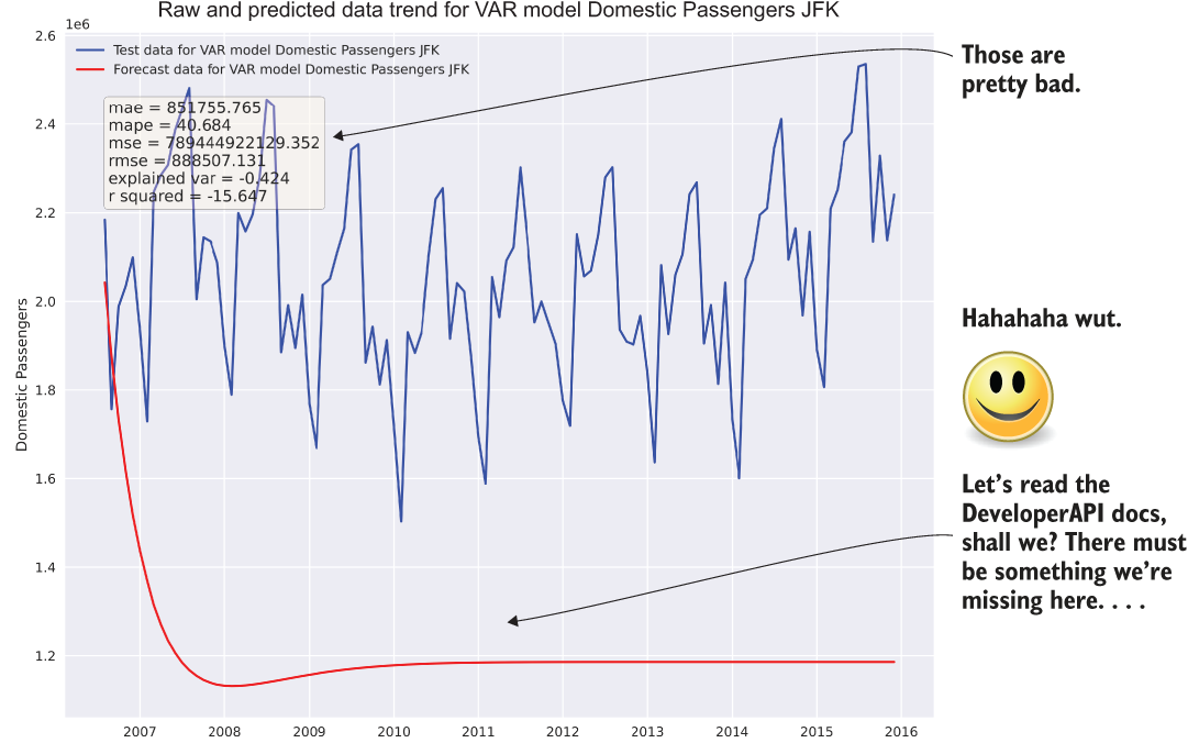
Figure 6.5 Probably should have read the API documentation
PRO TIP If I had a penny for every time I’ve either created a hot mess like that shown in figure 6.5 in a prediction (or in algorithm development code), I wouldn’t be employed right now. I’d be relaxing somewhere with my gorgeous wife and a half dozen dogs, sipping on a well-chilled cocktail and listening to the sweet sounds of the ocean lapping at a crystalline shore. Don’t get discouraged when you generate garbage. We all do it. It’s how we learn.
OK, so that was bad. Not as bad as it could have been (it didn’t predict that there would be more passengers than the number of humans that had ever lived, for instance), but it’s pretty much a garbage prediction. Let’s pretend that the team’s constitutional fortitude and wisdom are high enough that they are up for digging through the API documentation and Wikipedia articles to figure out what went wrong.
The most important aspect to remember here is that poor results are an expected part of the rapid testing phase. Sometimes you get lucky and things just work, but the vast majority of the time, things aren’t going to work out well on the first try. The absolute worst thing to do, after seeing results similar to figure 6.5, would be to classify the approach as untenable and move on to something else. With some tuning and adjustments to the approach, this model could be the best solution. If it’s abandoned after a first attempt of just using default configurations on a raw series of data, the team would never know that it could be a viable solution.
Bearing that extreme in mind, however, the other extreme is just as damaging to the project’s success. If the team members were to spend days (or weeks) reworking the approach hundreds of times to get the absolute best result from the model, they would no longer be working on a prototype; rather, they would be building out an MVP and sinking a great deal of resources into this single approach. The goal at this stage is getting a quick answer in a few hours as to whether this one out of many approaches is worth risking the success of the project.
During this next round of testing, the team discovers that the fit() method actually takes parameters. The example that they saw and used as a baseline for the first attempt didn’t have this defined, so they were unaware of these arguments until they read the API documentation. They discovered that they can set the lag periodicity to help the model understand how far back to look when building its autoregressive equations, which, according to the documentation, should help with building the autoregressive model’s linear equations.
Looking back to what they remembered (and recorded, saved, and stored) from the time-series analysis tasks that they did before starting on modeling, they knew that the trend decomposition had a period of 12 months (that was the point at which the residuals of the trend line became noise and not some cyclic relationship that didn’t fit with the seasonality period). They gave it another go, shown in the next listing.
Listing 6.10 Let’s give VAR another shot after we read the docs
var_model = VAR(train[['Domestic Passengers', 'International Passengers']])
var_model.select_order(12)
var_fit = var_model.fit(12)                                                 ❶
lag_order = var_fit.k_ar
var_pred = var_fit.forecast(test[['Domestic Passengers', 'International Passengers']].values[-lag_order:], test.index.size)
var_pred_dom = pd.Series(np.asarray(list(zip(*var_pred))[0], dtype=np.float32), index=test.index)
var_pred_intl = pd.Series(np.asarray(list(zip(*var_pred))[1], dtype=np.float32), index=test.index)                                                      ❷
var_prediction_score = plot_predictions(test['Domestic Passengers'],
                                        var_pred_dom,
                                        "VAR model Domestic Passengers JFK",
                                        "Domestic Passengers",
                                        "var_jfk_dom_lag12.svg")
var_prediction_score_intl = plot_predictions(test['International Passengers'],
                                        var_pred_intl,
                                        "VAR model International Passengers JFK",
                                        "International Passengers",
                                        "var_jfk_intl_lag12.svg")             ❸
❶ There’s the key. Let’s try to set that correctly and see if we get something that’s not so embarrassingly bad.
❷ To be thorough, let’s take a look at the other time series as well (international passengers).
❸ Let’s plot the international passengers as well to see how well this model predicts both.
After running this slightly adjusted test, the team looks at the results, shown in figure 6.6. They look better than before, certainly, but they’re still just a bit off. Upon a final review and a bit more research, they find that the VAR model is designed to handle stationary time-series data only.
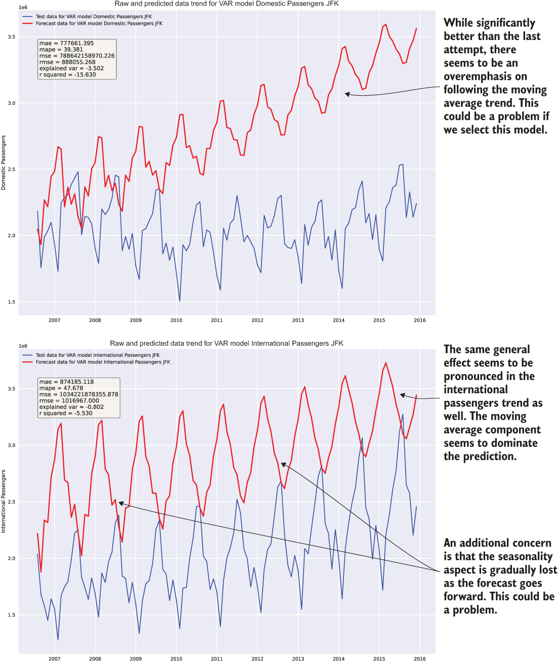
Figure 6.6 Just because this result of executing listing 6.10 is an order of magnitude better than before doesn’t mean that it’s good.
At this point, this team is done with its evaluations. The team members have learned quite a few things about this API:
- The acquisition of a forecast from this API is complex.
- Running multiple time series through this model seems to have a complementary effect to the vector passed in. This could prove problematic for divergent series at the same airport.
- With a vector being required of a similar shape, will this handle airports that began offering international flights only after they were a domestic hub?
- The loss of resolution in seasonality components means that fine detail in the predicted trend will be lost if the forecast runs too far in the future.
- The algorithm seems sensitive to the
fit()method’smaxlagsparameter. This will require extensive testing and monitoring if used in production. - The VAR model is not designed to handle nonstationary data. From the earlier tests, we know that these time series are not stationary, based on the Dickey-Fuller tests from section 5.2.1 when running code listing 6.10.
Now that this team has finished testing and has a solid understanding of the limitations of this model family (namely, the stationarity issue), it’s time to look into a few other teams’ progress (don’t worry, we won’t be going through all nine models). Perhaps they’re having more luck.
On second thought, let’s just give it one last shot. The team has a day to draw conclusions on this model, and a few more hours are still left before the internal deadline for each team, after all.
Let’s figure out that stationarity issue quickly and see if we can make the predictions just a little bit better. To convert the time series to a stationary series, we need to normalize the data by applying a natural log to it. Then, to remove the nonstationary trend associated with the series, we can use a differencing function to get the rate of change as the series moves along the timescale. Listing 6.11 is the full code for converting to a differenced scale, running the model fit, and uncompacting the time series to the appropriate scale.
Listing 6.11 Stationarity-adjusted predictions with a VAR model
jfk_stat = get_airport_data('JFK', DATA_PATH)
jfk_stat = apply_index_freq(jfk, 'MS')
jfk_stat['Domestic Diff'] = np.log(jfk_stat['Domestic Passengers']).diff()    ❶
jfk_stat['International Diff'] = np.log(jfk_stat['International Passengers']).diff()                                                  ❷
jfk_stat = jfk_stat.dropna()
train, test = generate_splits(jfk_stat, '2006-07-08')
var_model = VAR(train[['Domestic Diff', 'International Diff']])              ❸
var_model.select_order(6)
var_fit = var_model.fit(12)
lag_order = var_fit.k_ar
var_pred = var_fit.forecast(test[['Domestic Diff', 'International Diff']].values[-lag_order:], test.index.size)
var_pred_dom = pd.Series(np.asarray(list(zip(*var_pred))[0], dtype=np.float32), index=test.index)
var_pred_intl = pd.Series(np.asarray(list(zip(*var_pred))[1], dtype=np.float32), index=test.index)
var_pred_dom_expanded = np.exp(var_pred_dom.cumsum()) * test['Domestic Passengers'][0]                                                       ❹
var_pred_intl_expanded = np.exp(var_pred_intl.cumsum()) * test['International Passengers'][0]
var_prediction_score = plot_predictions(test['Domestic Passengers'],
                                        var_pred_dom_expanded,
                                        "VAR model Domestic Passengers JFK Diff",
                                        "Domestic Diff",
                                        "var_jfk_dom_lag12_diff.svg")         ❺
var_prediction_score_intl = plot_predictions(test['International Passengers'],
                                        var_pred_intl_expanded,
                                        "VAR model International Passengers JFK
                                         Diff",
                                        "International Diff",
                                        "var_jfk_intl_lag12_diff.svg")
❶ Takes a differencing function of the log of the series to create a stationary time series (remember, this is just as we did for the outlier analysis)
❷ We also have to do the same thing to the other vector position series data for international passengers.
❸ Trains the model on the stationary representation of the data
❹ Converts the stationary data back to the actual scale of the data by using the inverse function of a diff(), a cumulative sum. Then converts the log scale of the data back to linear space by using an exponential. This series is set as a diff, though, so we have to multiply the values by the starting position value (which is the actual value at the start of the test dataset series) in order to have the correct scaling.
❺ Compares the test series with the expanded prediction series
Figure 6.7 shows the final state that this team finds itself in, after having iterated on the model implementation, gone back to read the documentation fully, and done a bit of research about how the model works (at an “applications of ML level” at least). This visualization results from running the code in listing 6.11.
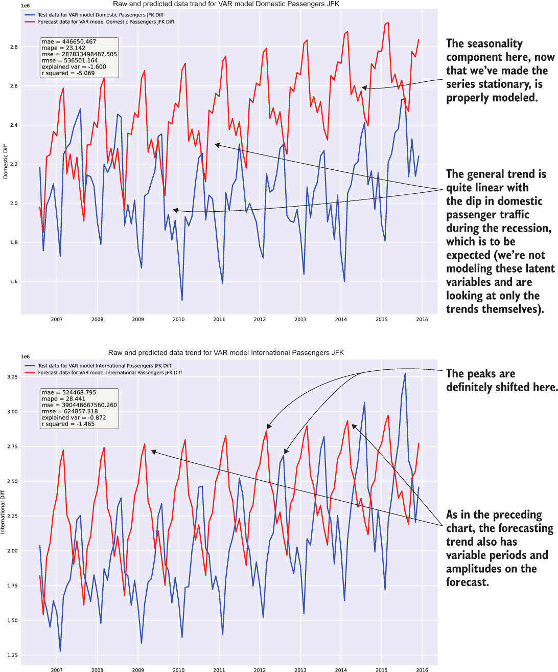
Figure 6.7 Result of executing listing 6.11
The first part of the experimentation phase is done. The team has a model that shows promise and, more important, understands the application of the model and can tune it properly. The visualizations have been recorded for them to show the results, and clean example code is written in a notebook that can be referenced for later use.
The people working on this particular model implementation, provided that they have finished their prototyping before the other groups, can be spread to other teams to impart some of the wisdom that they have gained from their work. This sharing of information will also help speed the progress of all the experiments so that a decision can be made on what approach to implement for the actual project work.
Let’s pretend for a moment that the ARIMA team members don’t get any tips from the VAR team when getting started, aside from the train and test split methodology for the series data to perform scoring of their predictions against holdout data. They’re beginning the model research and testing phases, using the same function tools that the other teams are using for data preprocessing and formatting of the date index, but aside from that, they’re in greenfield territory.
The team realizes that one of its first big obstacles is in the required settings for the ARIMA model, specifically the p (autoregressive parameters), d (differences), and q (moving average) variables that need to be assigned during model instantiation. Reading through the documentation, the team members realize that the pre-experimentation work that everyone contributed to already provides a means of finding a place to start for these values. By using the stationarity test visualization function built in chapter 5’s listing 5.14, we can get the significance values for the autoregressive (AR) parameters.
To get the appropriate autocorrelation and partial autocorrelation measurements, we’re going to have to perform the same difference function on the logarithm of the time series as the VAR team did in its final model for testing (the VAR team members were being especially nice and shared their findings) so that we can remove as much of the noise as we can. Figure 6.8 shows the resulting trend plots.
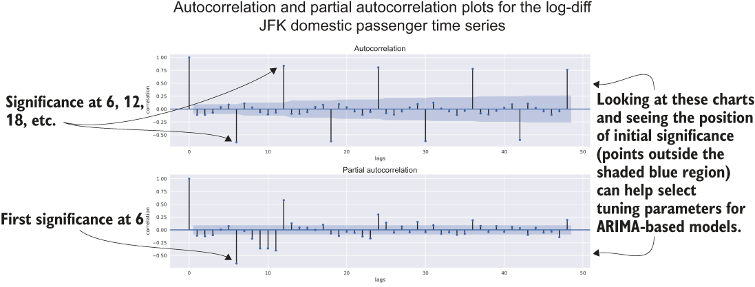
Figure 6.8 Executing the stationarity tests for the lag-diff of the JFK domestic passenger series
Much like the VAR team before them, the ARIMA team members spend a few iterations trying different parameters to get results that aren’t tragically poor. We won’t cover all those iterations (this isn’t a book on time-series modeling, after all). Instead, let’s look at the final result that they came up with.
Listing 6.12 Final state of the ARIMA experimentation
from statsmodels.tsa.arima.model import ARIMA
jfk_arima = get_airport_data('JFK', DATA_PATH)
jfk_arima = apply_index_freq(jfk_arima, 'MS')
train, test = generate_splits(jfk_arima, '2006-07-08')
arima_model = ARIMA(train['Domestic Passengers'], order=(48,1,1), enforce_stationarity=False, trend='c')                               ❶
arima_model_intl = ARIMA(train['International Passengers'], order=(48,1,1), enforce_stationarity=False, trend='c')
arima_fit = arima_model.fit()
arima_fit_intl = arima_model_intl.fit()
arima_predicted = arima_fit.predict(test.index[0], test.index[-1])
arima_predicted_intl = arima_fit_intl.predict(test.index[0], test.index[-1])
arima_score_dom = plot_predictions(test['Domestic Passengers'],
                                   arima_predicted,
                                   “ARIMA model Domestic Passengers JFK",
                                   "Domestic Passengers",
                                   "arima_jfk_dom_2.svg"
                                   )
arima_score_intl = plot_predictions(test['Domestic Passengers'],
                                    arima_predicted_intl,
                                    "ARIMA model International Passengers JFK",
                                    "International Passengers",
                                    "arima_jfk_intl_2.svg"
                                    )
❶ The ordering parameters of (p,d,q). The p (period) value was derived from the autocorrelation and partial autocorrelation analyses as a factor of the significant values calculated.
Of particular note is the absence of the stationarity-forcing log and diff actions being taken on the series. While these stationarity adjustments were tested, the results were significantly worse than the forecasting that was done on the raw data. (We won’t be looking at the code, as it is nearly identical to the approaches in listing 6.11.)
Figure 6.9 shows the validation plots and scores for a few of their tests; the log diff attempt is on the left (obviously inferior), and the unmodified series being used for training is on the right. While the right grouping of charts is by no means ideal for the project solution as is, it certainly gives the broader team an idea of the nuances and capabilities of an ARIMA model for forecasting purposes.
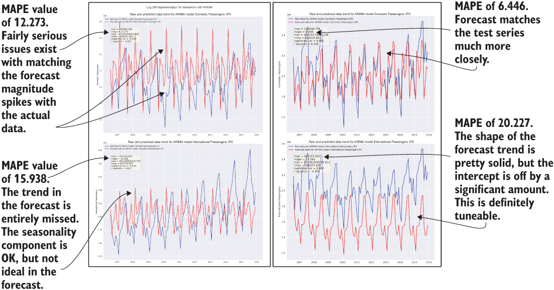
Figure 6.9 Comparison of enforcing stationarity (left) and using the raw data (right) for ARIMA modeling
These results from their testing show promise in both approaches (raw data and stationarity-enforced manipulations), illustrating that an opportunity exists for better tuning to make this algorithm’s implementation better. Armed with this knowledge and the results, this team can be ready to present its findings to the larger team in an adjudication without spending more precious time on attempting to improve the results at this stage.
Rapid testing of the Holt-Winters exponential smoothing algorithm
We’re going to be much briefer with this one (sorry, fans of time-series modeling). For this model evaluation, the team members wanted to wrap their implementation of the Holt-Winters exponential smoothing model in a function so that they didn’t have to keep copying the same code throughout their notebook cells.
The reasons that this approach is the preferred way to write even experimental code will become more obvious in the next chapter. For now, let’s just say that this team has a few more senior DS members. The next listing shows what they eventually came up with.
Listing 6.13 Holt-Winters exponential smoothing function and usage
from statsmodels.tsa.holtwinters import ExponentialSmoothing
def exp_smoothing(train, test, trend, seasonal, periods, dampening, smooth_slope, damping_slope):
    output = {}
    exp_smoothing_model = ExponentialSmoothing(train,
                                               trend=trend,
                                               seasonal=seasonal,
                                               seasonal_periods=periods,
                                               damped=dampening
                                              )
    exp_fit = exp_smoothing_model.fit(smoothing_level=0.9,
                                      smoothing_seasonal=0.2,
                                      smoothing_slope=smooth_slope,
                                      damping_slope=damping_slope,
                                      use_brute=True,
                                      use_boxcox=False,
                                      use_basinhopping=True,
                                      remove_bias=True
                                     )                                     ❶
    forecast = exp_fit.predict(train.index[-1], test.index[-1])            ❷
    output['model'] = exp_fit
    output['forecast'] = forecast[1:]                                      ❸
    return output
jfk = get_airport_data('JFK', DATA_PATH)
jfk = apply_index_freq(jfk, 'MS')
train, test = generate_splits(jfk, '2006-07-08')
prediction = exp_smoothing(train['Domestic Passengers'], test['Domestic Passengers'], 'add', 'add', 48, True, 0.9, 0.5)
prediction_intl = exp_smoothing(train['International Passengers'], test['International Passengers'], 'add', 'add', 60, True, 0.1, 1.0)     ❹
exp_smooth_pred = plot_predictions(test['Domestic Passengers'],
                                   prediction['forecast'],
                                   "ExponentialSmoothing Domestic Passengers JFK",
                                   "Domestic Passengers",
                                   "exp_smooth_dom.svg"
                                  )
exp_smooth_pred_intl = plot_predictions(test['International Passengers'],
                                   prediction_intl['forecast'],
                                   "ExponentialSmoothing International Passengers
                                    JFK",
                                   "International Passengers",
                                   "exp_smooth_intl.svg"
                                  )
❶ In development, if this model is chosen, all of these settings (as well as the others available to this fit method) will be parameterized and subject to auto-optimization with a tool like Hyperopt.
❷ Slightly different from the other models tested, this model requires at least the last element of the training data to be present for the range of predictions.
❸ Removes the forecast made on the last element of the training data series
❹ Uses a longer periodicity for the autoregressive element (seasonal_periods) because of the nature of the time series of that group. In development, if this model is chosen, these values will be automatically tuned through a grid search or more elegant auto-optimization algorithm.
In the process of developing this, this subteam discovers that the API for Holt-Winters exponential smoothing changed fairly dramatically between versions 0.11 and 0.12 (0.12.0 was the most recent documentation on the API doc website, and as such, shows up by default). As a result, team members spend quite a bit of time trying to figure out why the settings that they try to apply are constantly failing with exceptions that are the result of renamed or modified parameters.
Eventually, they realize that they need to check the version of statsmodels that was installed to get the correct documentation. (For further reading on versioning in Python, see the following sidebar.) Figure 6.10 shows the results of this group’s work, reflecting the most promising metrics yet from any of the groups.
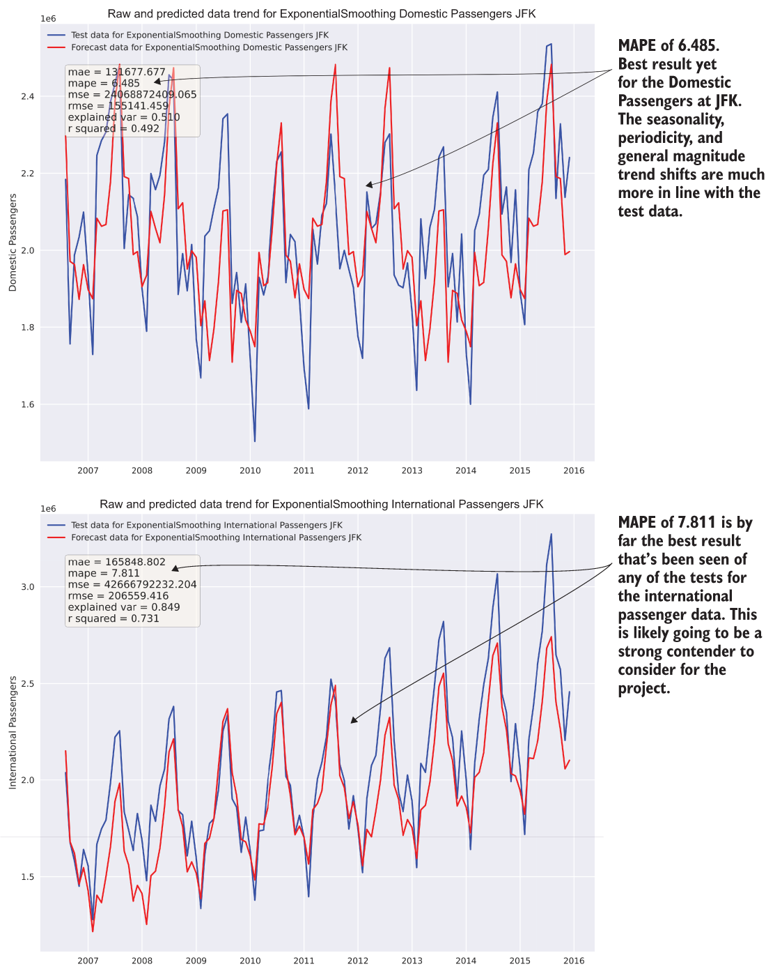
Figure 6.10 Results of the Holt-Winters exponential smoothing tests from listing 6.13. We have a clear contender!
After completing their day-long mini hackathon, the teams collate their results into simple and easy-to-digest reports on the efficacy of the algorithms’ abilities to forecast this data. Then the teams meet for a bit of a show-and-tell.
Applying the preparation steps defined throughout section 6.1, we can efficiently, reliably, and objectively compare different approaches. The standardization means that the team will have a true baseline comparison to adjudicate each approach, while the time-boxed nature of the evaluations ensures that no team spends too much time building out an MVP solution (wasting both time and computing resources) without knowing whether the approach that they’re building is actually the best one.
We’ve reduced the chances of picking a poor implementation to solve the business need and have done so quickly. Even though the business unit that is asking for an answer to their problem is blind to these internal processes, the company will have a better product by the end because of this methodical approach, as well as one that meets the project’s deadline.
6.2 Whittling down the possibilities
How does the team as a whole decide which direction to go in? Recall that in chapters 3 and 4, we discussed that after experimentation evaluation is complete, it’s time to involve the business stakeholders. We’ll need to get their input, subjective as it may be, to ensure that they’re going to feel comfortable with the approach and included in the direction choice, and that their expertise of deep subject area knowledge is weighed heavily in the decision.
To ensure a thorough adjudication of the tested potential implementations for the project, the broader team needs to look at each approach that has been tested and make a judgment that is based on the following:
- Maximizing the predictive power of the approach
- Minimizing the complexity of the solution as much as is practicable to still solve the problem
- Evaluating and estimating the difficulty in developing the solution for purposes of realistic scoping for delivery dates
- Estimating the total cost of ownership for (re)training and inference
- Evaluating the extensibility of the solution
By focusing on each of these aspects during the evaluation phase, the team can dramatically reduce risk in the project, collectively deciding on an MVP approach that will reduce the vast majority of reasons ML projects fail, end up abandoned, or get cancelled. Figure 6.11 shows each of these criteria and how they fit into the overall prototyping phase of ML project work.
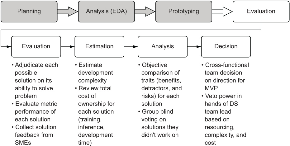
Figure 6.11 Elements of the evaluation phase to guide the path for building the MVP
Now that you have a solid idea of what a team should be looking at when evaluating an approach, let’s look at how this team will arrive at a decision on which approach to implement.
6.2.1 Evaluating prototypes properly
It’s at this point that most ML teams can let themselves be led astray, specifically in the sense of presenting only the accuracy that a particular solution brings. We’ve discussed previously in section 6.1.1 (and listing 6.7) the importance of creating compelling visualizations to illustrate in an easy-to-consume format for both the ML teams and the business unit, but that’s only part of the story for deciding on one ML approach versus another. The predictive power of an algorithm is certainly incredibly important, but it is merely one among many other important considerations to weigh. As an example, let’s continue with these three implementations (and the others that we didn’t show for brevity’s sake) and collect data about them so that the full picture of building out any of these solutions can be explored.
The team meets, shows code to one another, reviews the different test runs with the various parameters that were tested, and assembles an agreed-upon comparison of relative difficulty. For some models (such as the VAR model, elastic net regressor, lasso regressor, and RNN), the ML team decides to not even include these results in the analysis because of the overwhelmingly poor results generated in forecasting. Showing abject failures to the business serves no useful purpose and simply makes an already intellectually taxing discussion longer and more onerous. If a full disclosure about the amount of work involved to arrive at candidates is in order, simply state, “We tried 15 other things, but they’re really not suited for this data” and move on.
After deliberating over the objective merits of each approach, the internal DS team arrives at an evaluation matrix similar to figure 6.12. While relatively generic, the evaluation elements in this matrix can be applied to most project implementations. In the past, I’ve used selection criteria that are far more detailed and customized to the type of problem the project is aiming to solve, but a generic one is a good place to start.
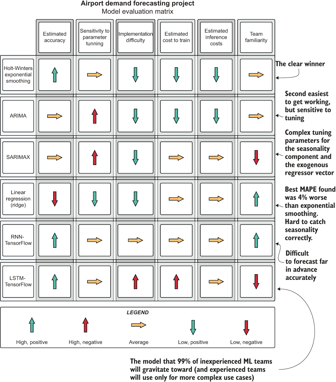
Figure 6.12 The decision matrix from the results of the experimentation prototyping phase
As you can see, it’s incredibly important to holistically evaluate an approach on elements other than its predictive power. After all, the chosen solution will need to be developed for production, monitored, modified, and maintained for (hopefully) a long time. Failing to take the maintainability factors into account can land a team with an incredibly powerful solution that is nearly impossible to keep running.
It’s worthwhile, at the stage after prototyping is done, to think deeply about what it’s going to be like to build this solution, as well as what total life-cycle ownership will be like. Is anyone going to want to improve upon it? Will they be able to? Is this something that will be relatively straightforward to troubleshoot should the predictions start to become poor? Can we explain why the model made the decisions that it did? Can we afford to run it?
If you’re unsure of any of these aspects of the proposed group of solutions, it’s best to either discuss these topics among the team until consensus is arrived at, or, at the very least, don’t propose it as a potential solution to the business. The absolutely last thing that you want from the conclusion of a project is to realize that you’ve built an abomination that you wish would just silently fade away into nothingness, never to return and rear its ugly head, pervading your waking and sleepless nights like a haunting fever dream. Choose wisely at this point, because once you commit, it’s going to be expensive to pivot to another approach.
6.2.2 Making a call on the direction to go in
Now that the data about the relative strengths and weaknesses of each approach has been assembled and the modeling approach has been decided upon, the real fun begins. Since everyone came to the conclusion that Holt-Winters exponential smoothing seems like the safest option for building these forecasts, we can start talking about architecture and code.
Before any code is written, though, the team needs to have another planning session. This is the time for the hard questions. The most important thing to keep in mind about these is that they should be answered before committing to a development direction.
Question 1: How often does this need to run?
“How often does this need to run?” is quite possibly the most important question, considering the type of model that everyone selected. Since this is an autoregressive model, if the model is not retrained at a high frequency (probably each inference run), the predictions will not adapt to new factual data coming in. The model looks at only a univariate series to make its forecasts, so having training that’s as up-to-date as possible can ensure that the forecasts adapt to the changing trend accurately.
TIP Don’t ever ask the business or any frontend developer, “So, how often do you need the predictions?” They will usually spout off some ridiculously short time period. Instead, ask, “At what point will the predictions become irrelevant?” and work back from there. The difference between a 4-hour SLA and a 10-millisecond SLA is several hundred thousand dollars of infrastructure and about six months of work.
The business is going to need to provide a minimum and maximum service-level agreement (SLA) for the “freshness” of these predictions. Give rough estimates of how long it will take to develop a solution that supports these SLA requirements, as well as how expensive the solution will be to run in production.
Question 2: Where is the data for this right now?
Since the data is provided by an external data feed, we need to be conscientious about how to create a stable and reliable ETL ingestion for both the training data and the imputation (prediction) data. The freshness of this data needs to meet the requirements of question 1’s answer (the SLA being requested).
We need to bring in the DE team members to ensure that they are prioritizing the acquisition of this feed long before we’re thinking of going into production for this project. If they are unable to commit to an acceptable date, we will have to write this ETL and populate the source tables with this data ourselves, increasing our project scope, cost, and risk.
Question 3: Where are the forecasts going to be stored?
Are the users going to be issuing business intelligence (BI) style queries to the predictions, fueling analytics visualizations in an ad hoc manner? Then we can probably write the data to an RDBMS source that we have in-house.
Is this going to be queried frequently by hundreds (or thousands) of users? Is the data going to be made available as a service for a web frontend? If so, we’re going to have to think about storing the predictions as sorted arrays in a NoSQL engine or perhaps an in-memory store such as Redis. We’ll need to build a REST API in front of this data if we’re going to be serving to a frontend service, which will increase the scope of work for this project by a few sprints.
Question 4: How are we setting up our code base?
Is this going to be a new project code base, or are we going to let this code live with other ML projects in a common repo? Are we pursuing a full object-oriented (OO) approach with the modular design, or will we be attempting to do functional programming (FP)?
What is our deployment strategy for future improvements? Are we going to use a continuous integration/continuous deployment (CI/CD) system, GitFlow releases, or standard Git? Where are our metrics associated with each run going to live? Where are we going to log our parameters, auto-tuned hyperparameters, and visualizations for reference?
It’s not absolutely critical to have answers to all of those questions regarding development immediately at this point, but the team lead and architect should be carefully considering all of these aspects of the project development very soon and should be making a well-considered set of decisions regarding these elements (we’ll cover this in the next chapter at length).
Question 5: Where is this going to run for training?
We probably really shouldn’t run this on our laptops. Seriously. Don’t do it.
With the number of models involved in this project, we’ll be exploring options for this in the next chapter and discussing the pros and cons of each.
Question 6: Where is the inference going to run?
We really definitely shouldn’t be running this on our laptops. Cloud service provider infrastructure, on-premises data centers, or ephemeral serverless containers running on either the cloud or on-prem are really the only option here.
Question 7: How are we going to get the predictions to the end users?
As stated in the answer to question 3, getting the predictions to the end users is by far the most overlooked and yet most critical part of any ML project that strives to be actually useful. Do you need to serve the predictions on a web page? Now would be a good time to have a conversation with some frontend and/or full-stack developers.
Does it need to be part of a BI report? The DE and BI engineering teams should be consulted now.
Does it need to be stored for ad hoc SQL queries by analysts? If that’s the case, you’ve got this. That’s trivial.
Question 8: How much of our existing code can be used for this project?
If you have utility packages already developed that can make your life easier, review them. Do they have existing tech debt that you can fix and make better while working on this project? If yes, then now’s the time to fix it. If you have existing code and believe it has no tech debt, you should be more honest with yourself.
If you don’t have an existing utility framework built up or are just getting started with ML engineering practices for the first time, worry not! We’ll cover what this sort of tooling looks like in many of the subsequent chapters.
Question 9: What is our development cadence, and how are we going to work on features?
Are you dealing with a project manager? Take some time now to explain just how much code you’re going to be throwing away during this development process. Let the project manager know that entire stories and epics are going to be dead code, erased from the face of the earth, never to be seen again. Explain to them the chaos of ML project work so that they can get through those first four stages of grief and learn to accept it before the project starts. You don’t need to give them a hug or anything, but break the news to them gently, for it will shatter their understanding of the nature of reality.
ML feature work is a unique beast. It is entirely true that huge swaths of code will be developed, only to be completely refactored (or thrown away!) when a particular approach is found to be untenable. This is a stark contrast to “pure” software development, in which a particular functionality is rationally defined and can be fairly accurately scoped. Unless part of your project is the design and development of an entirely new algorithm (it probably shouldn’t be, for your information, no matter how much one of your team members is trying to convince you that it needs to be), there is no guarantee of a particular functionality coming out of your code base.
Therefore, the pure Agile approach is usually not an effective way of developing code for ML simply because of the nature of changes that might need to be made (swapping out a model, for instance, could incur a large, wholesale refactoring that could consume two entire sprints). To help with the different nature of Agile as applied to ML development, it’s critical to organize your stories, your scrums, and your commits accordingly.
6.2.3 So . . . what’s next?
What’s next is actually building the MVP. It’s working on the demonstratable solution that has fine-tuned accuracy for the model, logged testing results, and a presentation to the business showing that the problem can be solved. What’s next is what puts the engineering in ML engineering.
We’ll delve heavily into these topics in the next chapter, continuing with this peanut-inventory-optimization problem, watching it go from a hardcoded prototype with marginal tuning to the beginnings of a code base filled with functions, the support for automatically tuned models, and full logging for each model’s tuning evaluations into MLflow. We’ll also be moving from the world of single-threaded sequential Python into the world of concurrent modeling capabilities in the distributed system of Apache Spark.
Summary
- A time-boxed and holistic approach to testing APIs for potential solutions to a problem will help ensure that an implementation direction for a project is reached quickly, evaluated thoroughly, and meets the needs of the problem in the shortest possible time. Predictive power is not the only criteria that matters.
- Reviewing all aspects of candidate methods for solving a problem encourages evaluating more than predictive power. From maintainability, to implementation complexity, to cost, many factors should be considered when selecting a solution to pursue to solve a problem.