
15 Quality and acceptance testing
- Establishing consistency for data sources used in ML
- Handling prediction failures gracefully with fallback logic
- Providing quality assurance for ML predictions
- Implementing explainable solutions
In the preceding chapter, we focused on broad and foundational technical topics for successful ML project work. Following from those foundations, a critical infrastructure of monitoring and validation needs to be built to ensure the continued health and relevance of any project. This chapter focuses on these ancillary processes and infrastructure tooling that enable not only more efficient development, but easier maintenance of the project once it is in production.
Between the completion of model development and the release of a project are four main activities:
- Data availability and consistency verifications
- Cold-start (fallback or default) logic development
- User-acceptance testing (subjective quality assurance)
- Solution interpretability (explainable AI, or XAI)
To show where these elements fit within a project’s development path, figure 15.1 illustrates the post-modeling phase work covered in this chapter.
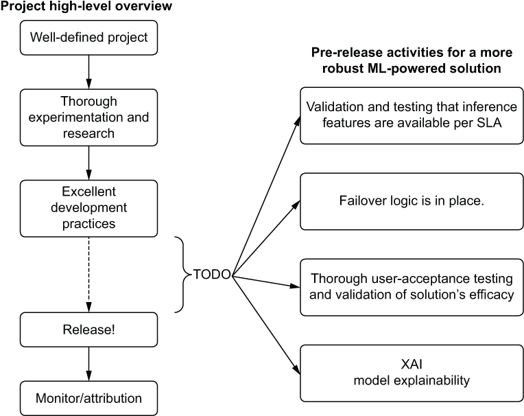
Figure 15.1 Production-grade qualification and testing phase for an ML project
These highlighted actions are generally seen as an afterthought or reactive implementation for many projects that I’ve had exposure to. While not applicable to every ML solution, evaluating each of these components is highly recommended.
Having their actions or implementations complete before a release happens can efficiently prevent a lot of confusion and frustration for your internal business unit customer. Removing those obstacles directly translates to better working relationships with the business and creates fewer headaches for you.
15.1 Data consistency
Data issues can be one of the most frustrating aspects of production stability for a model. Whether due to flaky data collection, ETL changes between project development and deployment, or a general poor implementation of ETL, they typically bring a project’s production service to a grinding halt.
Ensuring data consistency (and regularly validating its quality) in every phase of the model life cycle is incredibly important for both the relevance of the implementation’s output and the stability of the solution over time. Consistency across phases of modeling is achieved by eliminating training and inference skew, utilizing feature stores, and openly sharing materialized feature data across an organization.
15.1.1 Training and inference skew
Let’s imagine that we’re working on a team that has been developing a solution by using a batch extract of features for consistency throughout model development. Throughout the development process, we were careful to utilize data that we knew was available in the serving system’s online data store. Because of the success of the project, the status quo was simply not left alone. The business wants more of what we’re bringing to the table.
After a few weeks of work, we find that the addition of features from a new dataset that wasn’t included in the initial project development makes a large impact on the model’s predictive capabilities. We integrate these new features, retrain the model, and are left in the position shown in figure 15.2.
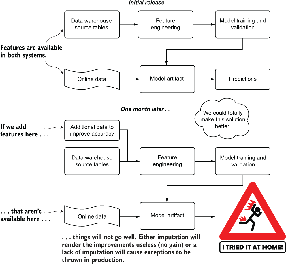
Figure 15.2 Inference skew due to a feature update
With the online feature system not able to access the data that was later included in the model revision, we have a training and inference skew problem. This problem manifests itself in two primary ways, as mentioned in figure 15.2:
- Null values are imputed.
- Null values are not handled. This may cause exceptions to be thrown, depending on the library used. This can fundamentally break the production deployment of the new model. The predictions will all be of the fallback heuristics “last hope” service.
Scenarios of mismatch between training and inference are not relegated to the presence or absence of feature data. These issues can also happen if the processing logic for creating the raw data is different between offline data in the data warehouse and the online systems. Working through these issues, diagnosing them, and repairing them can be incredibly costly and time-consuming.
As part of any production ML process, architectural validation and checks for consistency in offline and online training systems should be conducted. These checks can be manual (statistical validation through a scheduled job) or fully automated through the use of a feature store to ensure consistency.
15.1.2 A brief intro to feature stores
From a project’s development perspective, one of the more time-consuming aspects of crafting the ML code base is in feature creation. As data scientists, we spend a great amount of creative effort in manipulating the data being used in models to ensure that the correlations present are optimally leveraged to solve a problem. Historically, this computational processing is embedded within a project’s code base, in an inline execution chain that is acted upon during both training and prediction.
Having this tightly coupled association between the feature engineering code and the model-training and prediction code can lead to a great deal of frustrating troubleshooting, as we saw earlier in our scenario. This tight coupling can also result in complicated refactoring if data dependencies change, and duplicated effort if a calculated feature ever needs to be implemented in another project.
With the implementation of a feature store, however, these data consistency issues can be largely solved. With a single source of truth defined once, a registered feature calculation can be developed once, updated as part of a scheduled job, and available to be used by anyone in the organization (if they have sufficient access privileges, that is).
Consistency is not the only goal of these engineered systems. Synchronized data feeds to an online transaction processing (OLTP) storage layer (for real-time predictions) are another quality-of-life benefit that a feature store brings to minimizing the engineering burden of developing, maintaining, and synchronizing ETL needs for production ML. The basic design of a feature store capable of supporting online predictions consists of the following:
-
An ACID-compliant storage layer:
- (A) Atomicity—Guaranteeing that transactions (writes, reads, updates) are handled as unit operations that either succeed (are committed) or fail (are rolled back) to ensure data consistency.
- (C) Consistency—Transactions to the data store must leave the data in a valid state to prevent data corruption (from an invalid or illegal action to the system).
- (I) Isolation—Transactions are concurrent and always leave the storage system in a valid state as though operations were performed in sequence.
- (D) Durability—Valid executions to the state of the system will remain persistent at all times, even in the event of a hardware system failure or power loss, and are written to a persistent storage layer (written to disk, as opposed to volatile memory).
- A low-latency serving layer that is synchronized to the ACID storage layer (typically, volatile in-memory cache layers or in-memory database representations such as Redis).
- A denormalized representation data model for both a persistent storage layer and in-memory key-value store (primary-key access to retrieve relevant features).
- An immutable read-only access pattern for end users. The teams that own the generated data are the only ones with write authority.
As mentioned, the benefits of a feature store are not restricted to consistency. Reusability is one of the primary features of a feature store, as illustrated in figure 15.3.
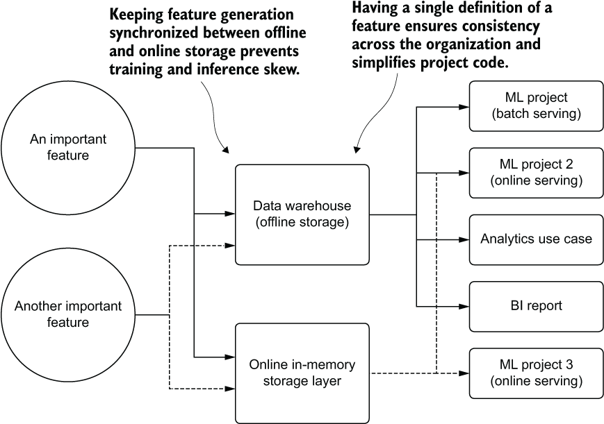
Figure 15.3 The basic concept of a feature store
As you can see, implementing a feature store carries a multitude of benefits. Having a standard corpus of features throughout a company means that every use case, from reporting (BI) to analytics and DS research is operating on the same set of source-of-truth data as everyone else. Using the feature store eliminates confusion, increases efficiency (features don’t have to be redesigned by everyone for each use case), and ensures that the costs for generating features are incurred only once.
15.1.3 Process over technology
The success of a feature store implementation is not in the specific technology used to implement it. The benefit is in the actions it enables a company to take with its calculated and standardized feature data.
Let’s briefly examine an ideal process for a company that needs to update the definition of its revenue metric. For such a broadly defined term, the concept of revenue at a company can be interpreted in many ways, depending on the end-use case, the department concerned with the usage of that data, and the level of accounting standards applied to the definition for those use cases.
A marketing group, for instance, may be interested in gross revenue for measuring the success rate of advertising campaigns. The DE group may define multiple variations of revenue to handle the needs of different groups within the company. The DS team may be looking at a windowed aggregation of any column in the data warehouse that has the words “sales,” “revenue,” or “cost” in it to create feature data. The BI team might have a more sophisticated set of definitions that appeal to a broader set of analytics use cases.
Changing a definition of the logic of such a key business metric can have far-reaching impacts to an organization if everyone is responsible for their group’s personal definitions. The likelihood of each group changing its references in each of the queries, code bases, reports, and models that it is responsible for is marginal. Fragmenting the definition of such an important metric across departments is problematic enough on its own. Creating multiple versions of the defining characteristics within each group is a recipe for complete chaos. With no established standard for how key business metrics are defined, groups within a company are effectively no longer speaking on even terms when evaluating the results and outputs from one another.
Regardless of the technology stack used to store the data for consumption, having a process built around change management for critical features can guarantee a frictionless and resilient data migration. Figure 15.4 illustrates such a process.
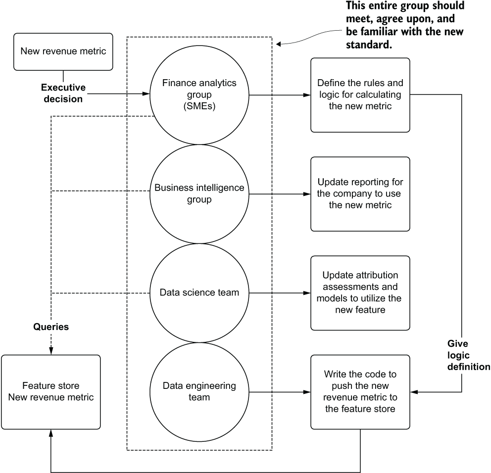
Figure 15.4 Setting a data change-point process for updating a critical feature store entry
As you can see, the new standard for reporting company revenue comes from the executive council. From this defining point, a successful feature store update process can begin. With the stakeholders present from each group that deals with company-wide utilization of this sort of data, a thorough evaluation of the proposed change can commence. Each of the producers and consumers of this data collectively agree on a course of action to ensure that the new standard becomes an actual standard at the company. After the meeting, each group knows the actions that it needs to take in order to make the migration to this new metric; the metric is defined, implemented, and synchronized through ETL to a common feature store.
Change-point processes are critical for ensuring consistency across an organization that relies on data to make informed decisions. By employing these processes, everyone is speaking the same “data language.” Discussions around the veracity of analytics, reporting, and predictions can all be standardized on the same common definition of a data term. It also dramatically improves the stability of dependent production (automated) jobs and reporting that rely on this data.
15.1.4 The dangers of a data silo
Data silos are deceptively dangerous. Isolating data in a walled-off, private location that is accessible only to a certain select group of individuals stifles the productivity of other teams, causes a large amount of duplicated effort throughout an organization, and frequently (in my experience of seeing them, at least) leads to esoteric data definitions that, in their isolation, depart wildly from the general accepted view of a metric for the rest of the company.
It may seem like a really great thing when an ML team is granted a database of its own or an entire cloud object store bucket to empower the team to be self-service. The seemingly geologically scaled time spent for the DE or warehousing team to load required datasets disappears. The team members are fully masters of their domain, able to load, consume, and generate data with impunity. This can definitely be a good thing, provided that clear and soundly defined processes govern the management of this technology.
But clean or dirty, an internal-use-only data storage stack is a silo, the contents squirreled away from the outside world. These silos can generate more problems than they solve.
To show how a data silo can be disadvantageous, let’s imagine that we work at a company that builds dog parks. Our latest ML project is a bit of a moon shot, working with counterfactual simulations (causal modeling) to determine which amenities would be most valuable to our customers at different proposed construction sites. The goal is to figure out how to maximize the perceived quality and value of the proposed parks while minimizing our company’s investment costs.
To build such a solution, we have to get data on all of the registered dog parks in the country. We also need demographic data associated with the localities of these dog parks. Since the company’s data lake contains no data sources that have this information, we have to source it ourselves. Naturally, we put all of this information in our own environment, thinking it will be far faster than waiting for the DE team’s backlog to clear enough to get around to working on it.
After a few months, questions began to arise about some of the contracts that the company had bid on in certain locales. The business operations team is curious about why so many orders for custom paw-activated watering fountains are being ordered as part of some of these construction inventories. As the analysts begin to dig into the data available in the data lake, they can’t make sense of why the recommendations for certain contracts consistently recommended these incredibly expensive components.
After spending months working through analyses, the decision is made to remove this feature from contract bidding. No one can explain why it is there, and they decide that it isn’t worth it to continue to offer it. They are keener on offering automatic dog-washing stations (car-wash style), dog-poop robots (cleaners of, not made of), park-wide cooling fans, and automated ball-throwing apparatuses. As such, a large order is placed for those items, and the fountain-sourcing contracts are terminated.
A few months later, a competitor starts offering the exact same element on contracts that we have been bidding on. The cities and towns begin to go for the competitor’s bid. When finally pressed about why, sales teams start hearing the same answer: the dogs just really love water fountains, particularly in areas that are far from people’s homes and municipal dog-watering stations. What ends up happening here is shown in figure 15.5.

Figure 15.5 Storing critical data in a silo
With no visibility into these features that were collected and used for the amenities counterfactual-based simulation model that the DS team built, the business is unable to piece together the reasons for the model’s suggestions. The data was siloed with no ill intentions, but it causes a massive problem for the business because critical data is inaccessible.
We’re not farmers. We should never be using silos. At least not data ones. If farming’s your hobby, don’t let me stop you. We should, on the other hand, work closely with DE and warehousing teams to ensure that we’re able to write data to locations that everyone can access—preferably, as we will discuss in chapter 17, to a feature store.
15.2 Fallbacks and cold starts
Let’s imagine that we’ve just built an ML-powered solution for optimizing delivery routes for a pizza company. Some time ago, the business approached us, asking for a cheaper, faster, and more adaptable solution to optimizing the delivery routes of a single driver. The prior method for figuring out which addresses a certain driver would deliver the pizzas to was done by a pathing algorithm that generated optimal routes based on ArcGIS. While capable and quite fully featured, the business wanted something that considered the temporal nature and history of actual delivery data to create a more effective route.
The team worked on an LSTM-based approach that was trained on the last three years of delivery data, creating an adversarial network with reinforcement learning that rewarded optimal pathing based on timeliness of delivery. The project quickly advanced from a science project to something that was proving its worth in a handful of regions. It was far more adept at selecting delivery sequences than the brute-force pathing that their previous production system was capable of.
After reviewing several weeks’ worth of routing data in the test markets, the business felt comfortable with turning on the system for all delivery routes. Things looked pretty good. Predictions were being served, drivers were spending less time stuck in traffic, and pizza was delivered hot at a much higher rate than ever before.
It took about a week before the complaints began pouring in. Customers in rural areas were complaining of very long delivery times at a frighteningly high rate. After looking at the complaints, the pattern began to emerge that every complaint was always with the last stop on a delivery chain. It didn’t take long for the DS team to realize what was happening. With most of the training data focused on urban centers, the volume of drop-offs and the lower proximity between stops meant that an optimized stop count was being targeted in general for the model. When this delivery count was applied to a rural environment, the sheer distances involved meant that nearly all final-stop delivery customers would be greeted with a room-temperature pizza.
Without a fallback control on the length of routes or the estimated total delivery time, the model was optimizing routes for the minimal amount of time for the total delivery run volume, regardless of how long that total estimated time would be. The solution lacked a backup plan. It didn’t have a fallback to use existing geolocation services (the ArcGIS solution for rural routes) if the model’s output violated a business rule (don’t deliver cold pizza).
A critical part of any production ML solution is to always have a backup plan. Regardless of the level of preparation, forethought, and planning, even the most comprehensive and hardened-against-failure solution will inevitably go wrong at some point. Whether the solution that you’re building is offline (batch), near-real-time (micro-batch streaming), online, or edge deployed, some condition in the near or far future will result in the model just not behaving the way that you were hoping.
Table 15.1 shows a brief list of ways for a solution’s model to malfunction and the level of impact depending on the degree of gravity of the model’s use.
Table 15.1 When models don’t play nicely
|
Self-driving car classifying a stop sign on an interstate highway. | ||
While these examples are fairly ridiculous (mostly—some are based on real situations), they all share a common thread. Not a single one has a fallback plan. They allow bad things to happen if the single point of failure in the system (a model’s prediction) doesn’t work as intended. While purposefully obtuse, the point here is that all model-powered solutions have some sort of failure mode that will happen if a backup isn’t in place.
Cold starts, on the other hand, are a unique form of model failure. Instead of a fully nonfunctional scenario that typical fallback systems handle, models that suffer from a cold-start issue are those that require historical data to function for which that data hasn’t been generated yet. From recommendation systems for first-time users to price optimization algorithms in new markets, model solutions that need to make a prediction based on data that doesn’t exist need a specific type of fallback system to be in place.
15.2.1 Leaning heavily on prior art
We could use nearly any of the comical examples from table 15.1 to illustrate the first rule in creating fallback plans. Instead, let’s use an actual example from my own personal history.
I once worked on a project that had to deal with a manufacturing recipe. The goal of this recipe was to set a rotation speed on a ludicrously expensive piece of equipment while a material was dripped onto it. The speed of this unit needed to be adjusted periodically throughout the day as the temperature and humidity changed the viscosity of the material being dripped onto the product. Keeping this piece of equipment running optimally was my job; there were many dozens of these stations in the machine and many types of chemicals.
As in so many times in my career, I got really tired of doing a repetitive task. I figured there had to be some way to automate the spin speed of these units so I wouldn’t have to stand at the control station and adjust them every hour or so. Thinking myself rather clever, I wired up a few sensors to a microcontroller, programmed the programmable logic controller to receive the inputs from my little controller, wrote a simple program that would adjust the chuck speed according to the temperature and humidity in the room, and activated the system.
Everything went well, I thought, for the first few hours. I had programmed a simple regression formula into the microcontroller, checked my math, and even tested it on an otherwise broken piece of equipment. It all seemed pretty solid.
It wasn’t until around 3 a.m. that my pager (yes, it was that long ago) started going off. By the time I made it to the factory 20 minutes later, I realized that I had caused an overspeed condition in every single spin chuck system. They stopped. The rest of the liquid dosing system did not. As the chilly breeze struck the back of my head, and I looked out at the open bay doors letting in the 27˚F night air, I realized my error.
I didn’t have a fallback condition. The regression line, taking in the ambient temperature, tried to compensate for the untested range of data (the viscosity curve wasn’t actually linear at that range), and took a chuck that normally rotated at around 2,800 RPM and tried to instruct it to spin at 15,000 RPM.
I spent the next four days and three nights cleaning up lacquer from the inside of that machine. By the time I was finished, the lead engineer took me aside and handed me a massive three-ring binder and told me to “read it before playing any more games.” (I’m paraphrasing. I can’t put into print what he said to me.) The book was filled with the materials science analysis of each chemical that the machine was using. It had the exact viscosity curves that I could have used. It had information on maximum spin speeds for deposition.
Someone had done a lot of work before I got there. Someone had figured out what the safe and unsafe thresholds were for the material, as well as the chuck drive motor.
I learned an important lesson that day. That lesson is illustrated in figure 15.6.
I was solidly in the top portion of figure 15.6. I rapidly learned, with no small amount of antagonistic reinforcement from my fellow engineers, to strive to be in the bottom portion of figure 15.6. I learned to think about what could go wrong in any solution and how important it is to have guardrails and fallback conditions when things did go wrong.

Figure 15.6 Figuring out the importance of safeguards and fallbacks in engineering work
Many times, when building an ML solution, a DS can wrongly assume that the problem that they are tackling is one that has no prior art. There are certainly exceptions (the moon-shot projects), but the vast majority of solutions I’ve worked on in my career have had someone at a company fulfilling the role that the project is meant to automate.
That person had methods, practices, and standards by which they were doing that task. They understood the data before you came along. They were, for all intents and purposes, a living, breathing version of that three-ring binder that my boss threw at me in anger. They knew how fast the chuck could spin and what would happen to the lacquer if a technician tried to sneak a cigarette break in the middle of winter.
These individuals (or code) that represent prior art will know the conditions that you need to consider when building a fallback system. They’ll know what the default conditions should be if the model predicts garbage. They’ll know what the acceptable range of your regressor’s prediction can be. They’ll know how many cat photos should be expected each day and how many dogs as well. They are your sage guides who can help make a more robust solution. It’s worth asking them how they solved the problem and what their funniest story is of when things went wrong. It will only help to make sure you don’t repeat it.
15.2.2 Cold-start woes
For certain types of ML projects, model prediction failures are not only frequent, but also expected. For solutions that require a historical context of existing data to function properly, the absence of historical data prevents the model from making a prediction. The data simply isn’t available to pass through the model. Known as the cold-start problem, this is a critical aspect of solution design and architecture for any project dealing with temporally associated data.
As an example, let’s imagine that we run a dog-grooming business. Our fleets of mobile bathing stations scour the suburbs of North America, offering all manner of services to dogs at their homes. Appointments and service selection is handled through an app interface. When booking a visit, the clients select from hundreds of options and prepay for the services through the app no later than a day before the visit.
To increase our customers’ satisfaction (and increase our revenue), we employ a service recommendation interface on the app. This model queries the customer’s historical visits, finds products that might be relevant for them, and indicates additional services that the dog might enjoy. For this recommender to function correctly, the historical services history needs to be present during service selection.
This isn’t much of a stretch for anyone to conceptualize. A model without data to process isn’t particularly useful. With no history available, the model clearly has no data in which to infer additional services that could be recommended for bundling into the appointment.
What’s needed to serve something to the end user is a cold-start solution. An easy implementation for this use case is to generate a collection of the most frequently ordered services globally. If the model doesn’t have enough data to provide a prediction, this popularity-based services aggregation can be served in its place. At that point, the app IFrame element will at least have something in it (instead of showing an empty collection) and the user experience won’t be broken by seeing an empty box.
More-sophisticated implementations can be made, upgrading a global popularity ranking to one with more fine-grained cold-start pre-generated data. At a bare minimum, the geographic region can be used as a grouped aggregation to calculate popularity of services to create a pseudo-personalized failover condition. More-sophisticated grouping assignments can be made if additional data is available for the end user, referencing those aggregated data points across the user base for grouping conditions, ensuring that more refined and granular recommendations are served. A cold-start-enabled architecture is shown in figure 15.7.
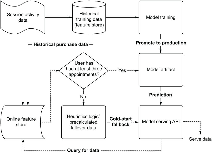
Figure 15.7 Logical diagram of a cold start solution
Building a heuristics-based solution, leveraging the deep knowledge of the use case by collaborating with the SMEs, is a solid approach for solving the cold-start issue. When a user who doesn’t have an order selection history of at least three appointments starts using the app, the model is bypassed entirely and a simple business rules pseudo-prediction is made. These cold-start solution implementations can take the following forms:
- Most popular items in user geographic location over the last month
- Most popular items bought today globally
- SME-curated collections of items
- High-inventory items
Regardless of the approach used, it’s important to have something in place. The alternative, after all, is to return no data. This simply isn’t an option for customer-facing applications that depend on some form of data to be produced from an API in order to populate elements in the interface with content. The benefit to having a cold-start alternative solution in place is that it can serve as a fallback solution as well. By a small adjustment of decision logic to check the veracity of the output coming from the model’s prediction output, the cold-start values can be served in place of the problematic data.
It can be tempting to build something complex for this cold-start default value service, but complexity should be avoided here. The goal is to build something that is exceptionally fast (low SLA), simple to adjust and maintain, and relevant enough so as not to bring attention to the end user that something was not designed correctly.
Cold-start solutions don’t apply exclusively to recommendation systems. Anytime a model is issuing predictions, particularly those with a low-SLA response requirement, some sort of value should be produced that is at least somewhat relevant to the task at hand (relevant as defined and designed by the business unit and SMEs, not by the DS team).
Failing to generate a value can, particularly for real-time use cases, break downstream systems that ingest that data. Failing to have a relevancy-dependent fallback for many systems can cause them to throw exceptions, retry excessively, or resort to system-protecting default values that a backend or frontend developer puts in place. That’s a situation that neither the engineering department nor the end user wants to see.
15.3 End user vs. internal use testing
Releasing a project to production once the end-to-end functionality is confirmed to be working is incredibly tempting. After so much work, effort, and metrics-based quantitative quality checks, it’s only natural to assume that the solution is ready to be sent out into the world for use. Resisting this urge to sprint the last mile to release is difficult, although it is absolutely critical.
The primary reasons it’s so ill-advised to simply release a project based solely on the internal evaluations of the DS team, as we covered in part 1, are as follows:
- The DS team members are biased. This is their baby. No one wants to admit to having created an ugly baby.
- Quantitative metrics do not always guarantee qualitative traits.
- The most important influence over quality predictions may be data that is not collected.
These reasons harken back to the concept of correlation not implying causality, as well as creator bias. While the model’s validation and quantitative metrics may perform remarkably well, precious few projects will have all of the causal factors captured within a feature vector.
What a thorough testing or QA process can help us do is assign a qualitative assessment of our solution. We can accomplish this in multiple ways.
Let’s imagine that we work at a music streaming service. We have an initiative to increase customer engagement by way of providing highly relevant song choices to follow along after a queued listening session.
Instead of using a collaborative filtering approach that would find similar songs listened to by other users, we want to find songs that are similar based on how the human ear would interpret a song. We use a Fourier transformation of the audio file to get a frequency distribution and then map that distribution to a mel scale (a linear cosine transformation of the log power spectrum of an audio signal that closely approximates how the human ear perceives sound). With this transformation of the data and a plot, we arrive at a visual representation of the characteristics of each song. We then, in an offline manner, calculate similarities of all songs to all other songs through the use of a tuned tri-branch Siamese Network. The feature vector that comes out of this system, augmented by additional tagged features to each song, is used to calculate both a Euclidean and a Cosine distance from one song to another. We save these relationships among all songs in a NoSQL database that tracks the 1,000 most similar songs to all others for our serving layer.
For illustration, figure 15.8 is essentially what the team is feeding into the Siamese network, mel visualizations of each song. These distance metrics have internal “knobs” that the DS team can use to adjust the final output collections. This feature was discovered early in testing when internal SME members expressed a desire to refine filters of similar music within a genre to eras of music.

Figure 15.8 Music file transformation to a mel spectrogram for use in Siamese CNN network
Now that we can see what is going on here (and the sort of information the CNN would be creating from an encoded feature), we can delve into how to test this service. Figure 15.9 shows an overview of the testing.
Figure 15.9 compares three separate forms of preproduction QA work that can be done to make qualitative assessments on our service. The next three subsections cover each of these elements—internal biased testing, dogfooding (consuming the product of our own efforts), and thorough SME review—to show the benefits of the holistic SME evaluation approach over the others.
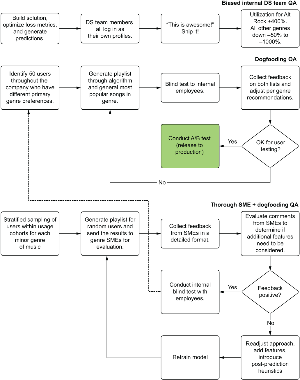
Figure 15.9 Different qualitative testing strategies. The one at the top is pretty bad as a practice.
The end goal of performing QA on ML projects, after all, is to evaluate predictions on real-world data that doesn’t rely on the highly myopic perspective of the solution’s creators. The objective is to eliminate as much bias as possible from the qualitative assessment of a solution’s utility.
15.3.1 Biased testing
Internal testing is easy—well, easier than the alternatives. It’s painless (if the model works properly). It’s what we typically think of when we’re qualifying the results of a project. The process typically involves the following:
- Generating predictions on new (unseen to the modeling process) data
- Analyzing the distribution and statistical properties of the new predictions
- Taking random samples of predictions and making qualitative judgments of them
- Running handcrafted sample data (or their own accounts, if applicable) through the model
The first two elements in this list are valid for qualification of model effectiveness. They are wholly void of bias and should be done. The latter two, on the other hand, are dangerous. The final one is the more dangerous of them.
In our music playlist generator system scenario, let’s say that the DS team members are all fans of classical music. Throughout their qualitative verifications, they’ve been checking to see the relative quality of the playlist generator for the field of music that they are most familiar with: classical music. To perform these validations, they’ve been generating listening history of their favorite pieces, adjusting the implementation to fine-tune the results, and iterating on the validation process.
When they are fully satisfied that the solution works well at identifying a nearly uncanny level of sophistication for capturing thematic and tonally relevant similar pieces of music, they ask a colleague what they think. The results for both the DS team (Ben and Julie) as well as for their data warehouse engineer friend Connor are shown in figure 15.10.
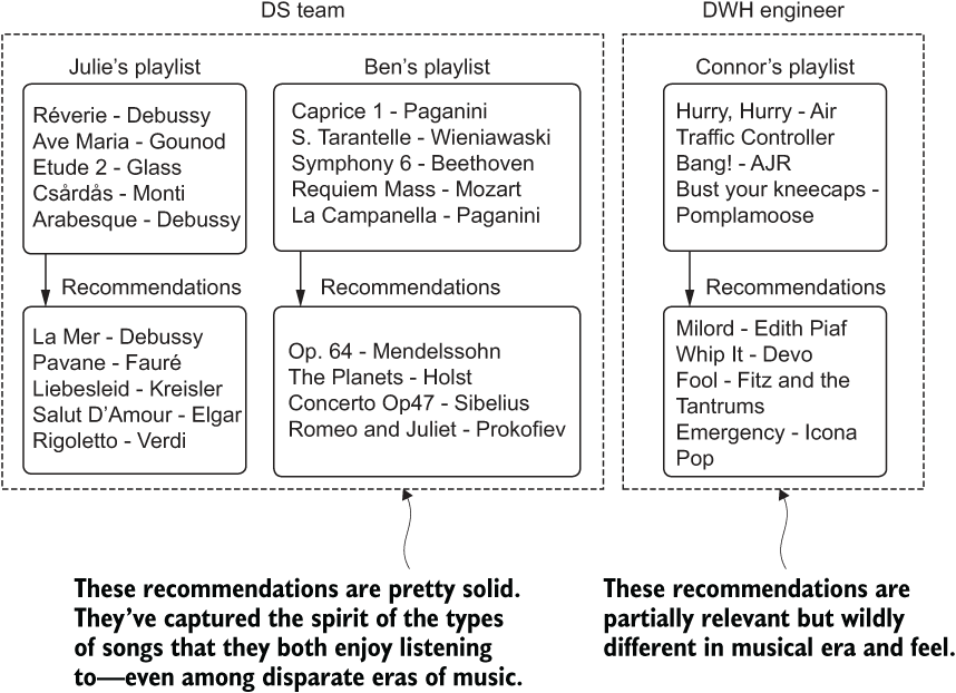
Figure 15.10 Biased feedback in qualitative assessment of model efficacy
What ends up happening is a bias-based optimization of the solution that caters to the DS team’s own preferences and knowledge of a genre of music. While perfectly tuned for the discerning tastes of a classical music fan, the solution is woefully poor for someone who is a fan of modern alternative rock, such as Connor. His feedback would have been dramatically different from the team’s own adjudication of their solution’s quality. To fix the implementation, Ben and Julie would likely have to make a lot of adjustments, pulling in additional features to further refine Connor’s tastes in alt-rock music. What about all of the other hundreds of genres of music, though?
While this example is particularly challenging (musical tastes are exceptionally varied and highly specific to individuals), this exact problem of internal-team bias can exist for any ML project. Any DS team will have only a limited view of the nuances in the data. A detailed understanding of the complex latent relationships of the data and how each relates to the business is generally not knowable by the DS team. This is why it is so critical to involve in the QA process those in the company who know most about the use case that the project is solving.
15.3.2 Dogfooding
A far more thorough approach than Ben and Julie’s first attempt would have been to canvass people at the company. Instead of keeping the evaluation internal to the team, where a limited exposure to genres hampers their ability to qualitatively measure the effectiveness of the project, they could ask for help. They could ask around and see if people at the company might be interested in taking a look at how their own accounts and usage would be impacted by the changes the DS team is introducing. Figure 15.11 illustrates how this could work for this scenario.
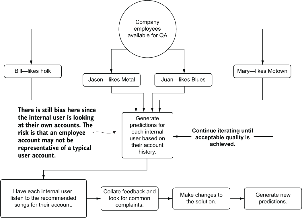
Figure 15.11 Dogfooding a project by utilizing volunteers to give subjective feedback as a user
Dogfooding, in the broadest sense, is consuming the results of your own product. The term refers to opening up functionality that is being developed so that everyone at a company can use it, find out how to break it, provide feedback on how it’s broken, and collectively work toward building a better product. All of this happens across a broad range of perspectives, drawing on the experience and knowledge of many employees from all departments.
However, as you can see in figure 15.11, the evaluation still contains bias. An internal user who uses the company’s product is likely not a typical user. Depending on their job function, they may be using their account to validate functionality in the product, use it for demonstrations, or simply interact with the product more because of an employee benefit associated with it.
In addition to the potentially spurious information contained within the listen history of employees, the other form of bias is that people like what they like. They also don’t like what they don’t like. Subjective responses to something as emotionally charged as music preferences add an incredible amount of bias due to the nature of being a member of the human race. Knowing that these predictions are based on their listening history and that it is their own company’s product, internal users evaluating their own profiles will generally be more critical than a typical user if they find something that they don’t like (which is a stark contrast to the builder bias that the DS team would experience).
While dogfooding is certainly preferable to evaluating a solution’s quality within the confines of the DS team, it’s still not ideal, mostly because of these inherent biases that exist.
15.3.3 SME evaluation
The most thorough QA testing you can conduct while still staying within the confines of your own company leverages SMEs in the business. This is one of the most important reasons to keep SMEs within the business engaged in a project. They will not only know who in the company has the deepest knowledge and experience with facets of the project (in this case, genres of music), but they can help muster those resources to assist.
For the SME evaluation, we can stage this phase of QA beforehand, requesting resources who are experts in each of the music genres for which we need an unbiased opinion regarding the quality of generated song lists. By having experts designated, we can feed them not only their own recommendations, but also those of randomly sampled users. With their deep knowledge of the nuances of each genre, they can evaluate the recommendations of others to determine if the playlists that are being generated make tonal and thematic sense. Figure 15.12 illustrates this process.
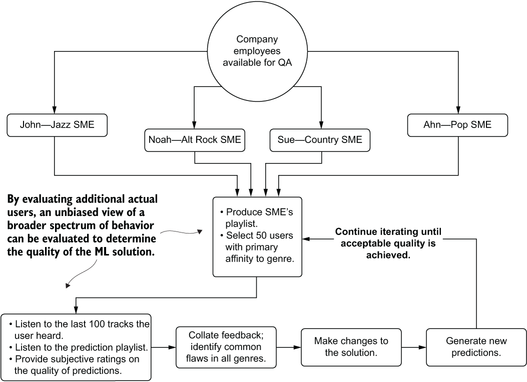
Figure 15.12 Unbiased SME evaluation of a project’s implementation
With the far more thorough adjudication in place, the usefulness of the feedback is significantly higher than any other methodology We can minimize bias while also incorporating the deep knowledge of experts into actionable changes that can be iterated over.
While this scenario focuses on music recommendations, it can apply to nearly any ML project. It’s best to keep in mind that before you start to tackle whichever project you’re working on, some human (or many humans) had been solving that problem in some way before you were called in to work on it. They’re going to understand the details of the subject in far more depth than anyone on the DS team will. You may as well try to make the best solution that you can by leveraging their knowledge and wisdom.
15.4 Model interpretability
Let’s suppose that we’re working on a problem designed to control forest fires. The organization that we work for can stage equipment, personnel, and services to locations within a large national park system in order to mitigate the chances of wildfires growing out of control. To make logistics effectiveness as efficient as possible, we’ve been tasked with building a solution that can identify risks of fire outbreaks by grid coordinates. We have several years of data, sensor data from each location, and a history of fire-burn area for each grid position.
After building the model and providing the predictions as a service to the logistics team, questions arise about the model’s predictions. The logistics team members notice that certain predictions don’t align with their tribal knowledge of having dealt with fire seasons, voicing concerns about addressing predicted calamities with the feature data that they’re exposed to.
They’ve begun to doubt the solution. They’re asking questions. They’re convinced that something strange is going on and they’d like to know why their services and personnel are being told to cover a grid coordinate in a month that, as far as they can remember, has never had a fire break out.
How can we tackle this situation? How can we run simulations of our feature vector for the prediction through our model and tell them conclusively why the model predicted what it did? Specifically, how can we implement explainable artificial intelligence (XAI) on our model with the minimum amount of effort?
When planning out a project, particularly for a business-critical use case, a frequently overlooked aspect is to think about model explainability. Some industries and companies are the exception to this rule, because of either legal requirements or corporate policies, but for most groups that I’ve interacted with, interpretability is an afterthought.
I understand the reticence that most teams have in considering tacking on XAI functionality to a project. During the course of EDA, model tuning, and QA validation, the DS team generally understands the behavior of the model quite well. Implementing XAI may seem redundant.
By the time you need to explain how or why a model predicted what it did, you’re generally in a panic situation that is already time-constrained. Through implementing XAI processes through straightforward open source packages, this panicked and chaotic scramble to explain functionality of a solution can be avoided.
15.4.1 Shapley additive explanations
One of the more well-known and thoroughly proven XAI implementations for Python is the shap package, written and maintained by Scott Lundberg. This implementation is fully documented in detail in the 2017 NeurIPS paper “A Unified Approach to Interpreting Model Predictions” by Lundberg and Su-In Lee.
At the core of the algorithm is game theory. Essentially, when we’re thinking of features that go into a training dataset, what is the effect on the model’s predictions for each feature? As with players in a team sport, if a match is the model itself and the features involved in training are the players, what is the effect on the match if one player is substituted for another? How one player’s influence changes the outcome of the game is the basic question that shap is attempting to answer.
The principle behind shap involves estimating the contribution of each feature from the training dataset upon the model. According to the original paper, calculating the true contribution (the exact Shapley value) requires evaluating all permutations for each row of the dataset for inclusion and exclusion of the source row’s feature, creating different coalitions of feature groupings.
For instance, if we have three features (a, b, and c; original features denoted with i), with replacement features from the dataset denoted as j(for example, aj) the coalitions to test for evaluating feature b are as follows:
(ai, bi, cj), (ai, bj, cj), (ai, bj, ci), (aj, bi, cj), (aj, bj, ci)
These coalitions of features are run through the model to retrieve a prediction. The resulting prediction is then differenced from the original row’s prediction (and an absolute value taken of the difference). This process is repeated for each feature, resulting in a feature-value contribution score when a weighted average is applied to each delta grouping per feature.
It should come as no surprise that this isn’t a very scalable solution. As the feature count increases and the training dataset’s row count increases, the computational complexity of this approach quickly becomes untenable. Thankfully, another solution is far more scalable: the approximate Shapley estimation.
Approximate Shapley value estimation
To scale the additive effects of features across a large feature set, a slightly different approach is performed. The Python package shap utilizes this approximate implementation to get reasonable values across all rows and features without having to resort to the brute-force approach in the original paper. Figure 15.13 illustrates the process of this approximated approach.

Figure 15.13 Approximate kernel Shapley values implementation in shap
The primary differentiator here as compared to the exhaustive search approach is in the limited number of tests conducted and the method of building coalitions. As opposed to the original design, a single row’s feature vector is not used to generate a baseline prediction. Instead, a random sampling of rows is conducted, and the feature under test is swapped out with other values from the selected subset for that feature. These new synthetic vectors are then passed to the model, generating a prediction. For each of these synthetic predictions, an absolute difference is calculated, then averaged, giving the reference vector’s feature contribution value across these coalitions. The weighting factor that is applied to averaging these values depends on the number of “modified” (replaced) features in the individual synthetic vector. For rows where more of the features are swapped out, a higher weight of importance is placed on these as compared to those with fewer mutations.
The final stage shown in figure 15.13 is in the overall per-feature contribution assessment. These feature-importance estimations are done by weighting each row’s feature contribution margin and scaling the results to a percentage contribution for the entire dataset. Both calculated data artifacts are available by using the Python shap package (a per-row contribution estimation and an aggregated measurement across the entire dataset) and can help in explaining not only a single row’s prediction but also in providing a holistic view of the feature influence to a trained model.
What we can do with these values
Simply calculating Shapley values doesn’t do much for a DS team. The utility of having an XAI solution based on this package is in what questions these analyses enable answering. Some of the questions that you’ll be able to answer after calculating these values are as follows:
- “Why did the model predict this strange result?” (single-event explanation)
- “Will these additional features generate different performance?” (feature-engineering validation)
- “How do ranges of our features affect the model predictions?” (general model functionality explanation)
The shap package can be used not only as an aid to solution development and maintenance, but also to help to provide data-based explanations to business unit members and SMEs. By shifting a discussion on the functionality of a solution away from the tools that the DS team generally uses (correlation analyses, dependence plots, analysis of variance, and so forth), a more productive discussion can be had. This package, and the approach therein, remove the burden from the ML team of having to explain esoteric techniques and tools, focusing instead on discussing the functionality of a solution in terms of the data that the company generates.
15.4.2 Using shap
To illustrate how we can use this technique for our problem of predicting forest fires, let’s assume that we have a model already built.
NOTE To follow along and see the model construction, tuning with the Optuna package (a more modern version of the previously mentioned Hyperopt from part 2), and the full implementation of this example, please see the companion GitHub repository for this book. The code is within the Chapter 15 directory.
With a preconstructed model available, let’s leverage the shap package to determine the effects of features within our training data to assist in answering the questions that the business is asking about why the model is behaving a particular way. The following listing shows a series of classes that aids in generating the explanation plots (refer to the repository for import statements and the remainder of the code, which is too lengthy to print here).
class ImageHandling:                                               ❶
    def __init__(self, fig, name):
        self.fig = fig
        self.name = name
    def _resize_plot(self):
        self.fig = plt.gcf()                                       ❷
        self.fig.set_size_inches(12, 12)
    def save_base(self):
        self.fig.savefig(f"{self.name}.png",
                         format='png', bbox_inches='tight')
        self.fig.savefig(f"{self.name}.svg",
                         format='svg', bbox_inches='tight')
    def save_plt(self):
        self._resize_plot()
        self.save_base()
    def save_js(self):
        shap.save_html(self.name, self.fig)                        ❸
        return self.fig
class ShapConstructor:                                             ❹
    def __init__(self, base_values, data, values, feature_names, shape):
        self.base_values = base_values
        self.data = data
        self.values = values
        self.feature_names = feature_names
        self.shape = shape
class ShapObject:
    def __init__(self, model, data):
        self.model = model
        self.data = data
        self.exp = self.generate_explainer(self.model, self.data)
        shap.initjs()
    @classmethod
    def generate_explainer(self, model, data):                     ❺
        Explain = namedtuple('Explain', 'shap_values explainer max_row')
        explainer = shap.Explainer(model)
        explainer.expected_value = explainer.expected_value[0]
        shap_values = explainer(data)
        max_row = len(shap_values.values)
        return Explain(shap_values, explainer, max_row)
    def build(self, row=0):
        return ShapConstructor(
base_values = self.exp.shap_values[0][0].base_values,
            values = self.exp.shap_values[row].values,
            feature_names = self.data.columns,
            data = self.exp.shap_values[0].data,
            shape = self.exp.shap_values[0].shape)
    def validate_row(self, row):
        assert (row < self.exp.max_row,
f"The row value: {row} is invalid. "
f"Data has only {self.exp.max_row} rows.")
    def plot_waterfall(self, row=0):                               ❻
        plt.clf()
        self.validate_row(row)
        fig = shap.waterfall_plot(self.build(row),
                                  show=False, max_display=15)
        ImageHandling(fig, f"summary_{row}").save_plt()
        return fig
    def plot_summary(self):                                        ❼
        fig = shap.plots.beeswarm(self.exp.shap_values,
                                  show=False, max_display=15)
        ImageHandling(fig, "summary").save_plt()
    def plot_force_by_row(self, row=0):                            ❽
        plt.clf()
        self.validate_row(row)
        fig = shap.force_plot(self.exp.explainer.expected_value,
                               self.exp.shap_values.values[row,:],
                               self.data.iloc[row,:],
                               show=False,
                               matplotlib=True
                              )
        ImageHandling(fig, f"force_plot_{row}").save_base()
    def plot_full_force(self):                                     ❾
        fig = shap.plots.force(self.exp.explainer.expected_value,
                               self.exp.shap_values.values,
                               show=False
                              )
        final_fig = ImageHandling(fig, "full_force_plot.htm").save_js()
        return final_fig
    def plot_shap_importances(self):                               ❿
        fig = shap.plots.bar(self.exp.shap_values,
                             show=False, max_display=15)
        ImageHandling(fig, "shap_importances").save_plt()
    def plot_scatter(self, feature):                               ⓫
        fig = shap.plots.scatter(self.exp.shap_values[:, feature],
                                 color=self.exp.shap_values, show=False)
        ImageHandling(fig, f"scatter_{feature}").save_plt()
❶ Image-handling class to handle resizing of the plots and storing of the different formats
❷ Gets a reference to the current plot figure for resizing
❸ Since this plot is generated in JavaScript, we have to save it as HTML.
❹ Unification of the required attributes coming from the shap Explainer to enable handling of all the plots’ requirements
❺ Method called during class instantiation to generate the shap values based on the model passed in and the data provided for evaluation of the model’s functionality
❻ Generates a single row’s waterfall plot to explain the impact of each feature to the row’s target value (composition analysis)
❼ Generates the full shap summary of each feature across the entire passed-in dataset
❽ Generates a single row’s force plot to illustrate the cumulative effect of each feature on its target value
❾ Generates the entire dataset’s combined force plots into a single displayed visualization
❿ Creates the debugging plot for the estimated shap importance of each feature
⓫ Generates a scatter plot of a single feature against its shap values, colored by the feature in the remaining positions of the vector with the highest covariance
With our class defined, we can begin to answer the questions from the business about why the model has been predicting the values that it has. We can step away from the realm of conjecture that would be the best-effort attempt at explanation through the use of presenting correlation effects. Instead of wasting our time (and the business’s) with extremely time-consuming and likely confusing presentations of what our EDA showed at the outset of the project, we can focus on answering their questions.
As an added bonus, having this game-theory-based approach available to us during development could help inform which features could be improved upon and which could potentially be dropped. The information that can be gained from this algorithm is invaluable throughout the model’s entire life cycle.
Before we look at what these methods in listing 15.1 would be producing when executed, let’s review what the business executives want to know. In order to be satisfied that the predictions coming from the model are logical, they want to know the following:
- What are the conditions that should cause us to panic if we see them?
- Why doesn’t the amount of rain seem to affect the risk?
To answer these two questions, let’s take a look at two of the plots that can be generated from within the shap package. Based on these plots, we should be able to see where the problematic predictions are coming from.
To answer the question about the rain—as well as to provide an opportunity to understand which features are driving the predictions the most—the summary plot is the most comprehensive and utilitarian for this purpose. Because it combines all of the rows of the training data, it will do a per-row estimation of each feature’s impact when run through the replacement strategy that the algorithm performs. This holistic view of the entire training dataset can show the features’ overall magnitude of impact within the scope of the problem. Figure 15.14 shows the summary plot.
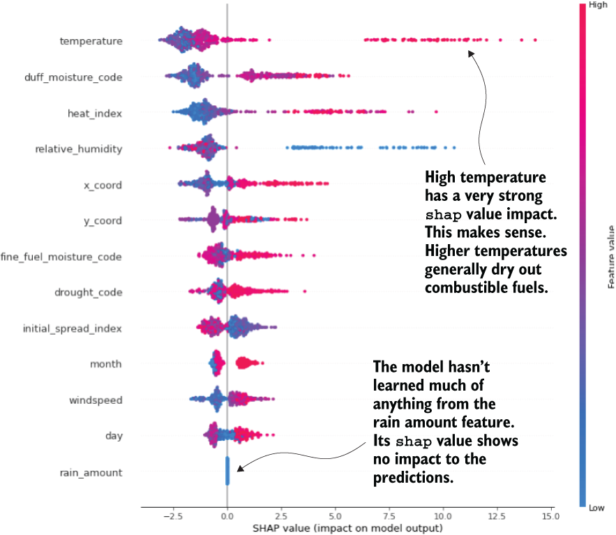
Figure 15.14 The shap summary plot, showing each feature’s substitution and prediction delta for each row
Armed with this plot, a great deal of discussion can be had with the business. Not only can you jointly explore why the rain amount values clearly aren’t making a difference in the model’s output (the plot shows that the feature isn’t even considered in the random forest model), but also how other aspects of the data are interpreted by the model.
Note Make sure that you are very clear with the business on what shap is. It doesn’t bear a relationship to reality; rather, it simply indicates how the model interprets changes to a feature within a vector on its predictions. It is a measure of the model and not on the reality of what you’re trying to model.
The summary plot can begin the discussions about why the model is performing the way it is, what improvements might be made after identifying shortcomings identified by SMEs, and how to talk with the business about the model in terms that everyone can understand. Once the initial confusion is explained away regarding this tool, with the business fully understanding that the values shown are simply an estimation of how the model understands the features (and that they are not a reflection of the reality of the problem space you are predicting within), the conversations can become more fruitful.
It is, to be clear, absolutely essential to explain exactly what these values are before showing a single one of the visualizations that the tool is capable of generating. We’re not explaining the world; we’re explaining the model’s limited understanding of correlation effects based on the data we actually collect. There is simply nothing more or less to it.
With the general discussion complete with the business and the issue of rainfall tackled, we can move on to answering the next question.
We can answer the second question, arguably the most important for the business to be worried about, with a series of visualizations. When the business leaders asked when they should panic, what they really meant was that they wanted to know when the model would predict an emergency. They want to know which attributes of the features they should be looking at in order to warn their people on the ground that something bad might happen.
This is an admirable use of ML and something that I’ve seen many times in my career. Once a company’s business units move past the trough of distrust and into the realm of relying on predictions, the inevitable result is that the business wants to understand which aspects of their problem can be monitored and controlled in order to help minimize disaster or maximize beneficial results.
To enable this discovery, we can look at our prior data, select the worst-case scenario (or scenarios) from history, and plot the impact of each feature’s contribution to the predicted result. This contribution analysis for the most severe fire in history for this dataset is shown in figure 15.15.

Figure 15.15 Waterfall plot of the most severe wildfire in history. The contribution margin of each feature can inform the business of what the model correlated to for high risk for fire.
While this plot is but a single data point, we can arrive at a more complete picture by analyzing the top n historical rows of data for the target. The next listing illustrates how simple this can be to generate with interfaces built around shap.
Listing 15.2 Generating feature-contribution plots for the most extreme events in history
shap_obj = ShapObject(final_rf_model.model, final_rf_model.X)         ❶
interesting_rows = fire_data.nlargest(5, 'area').reset_index()['index'].values                            ❷
waterfalls = [shap_obj.plot_waterfall(x) for x in interesting_rows]   ❸
❶ Instantiates the shap package’s handler to generate the shap values by passing in a trained model and the training data used to train it
❷ Extracts the five most severe area burn events in the training data to retrieve their row index values
❸ Generates the waterfall plots (as in figure 15.15) for each of the five most severe events
Armed with these top event plots and the contributions of each feature to these events, the business can now identify patterns of behavior that they will want to explain to their analysts and observers in the field. With this knowledge, people can prepare and proactively take action long before a model’s prediction would ever make it to them.
Using shap to help educate a team to take a beneficial series of actions based on a model’s inference of data is one of the most powerful aspects of this tool. It can help leverage the model in a way that is otherwise difficult to utilize. It helps to bring a much more far-reaching benefit to a business (or society and the natural world in general) from a model than a prediction on its own could ever do.
Many more plots and features are associated with this package, most of which are covered thoroughly in the companion notebook to this chapter within the repository. I encourage you to read through it and consider employing this methodology in your projects.
Summary
- Consistency in feature and inference data can be accomplished by using a rules-based validation feature store. Having a single source of truth can dramatically reduce confusion in interpretation of results, as well as enforcing quality-control checks on any data that is sent to a model.
- Establishing fallback conditions for prediction failures due to a lack of data or a corrupted set of data for inference can ensure that consumers of the solution’s output will not see errors or service interruptions.
- Utilizing prediction-quality metrics is not enough to determine the efficacy of a solution. Validation of the prediction results by SMEs, test users, and cross-functional team members can provide subjective quality measurements to any ML solution.
- Utilizing techniques such as
shapcan help to explain in a simple manner why a model made a particular decision and what influence particular feature values are having on the predictions from a model. These tools are critically important for production health of a solution, particularly during periodic retraining.