
Chapter 36. Advanced User Interface Programming
IN THIS CHAPTER
- Introduction to GDI+
- Creating Shaped Forms and Controls
- Using Visual Inheritance
- Globalizing Your User Interface
This chapter introduces you to some of the more advanced techniques that can make your Windows Forms application more appealing, better-looking, more robust, and even more aware of other cultures and languages. You will be introduced to GDI+, the 2D graphics library that is responsible for rendering graphics in Windows Forms and how to use GDI+ to create unusual interface elements such as shaped forms. You will see how to use visual inheritance to reuse the look and feel of an existing form on new and modified forms. Finally, this chapter provides an overview of globalization in Windows Forms applications.
Introduction to GDI+
GDI+ is the graphics library responsible for all graphics rendering within the .NET Framework. You can use GDI+ to draw lines and shapes, fill shapes with solid colors or gradients, perform simple animation, or even manipulate existing images found on disk or retrieved from the web.
All GDI+ rendering is done on a special GDI+ surface. These surfaces can be a Windows Form or the contained area within a control. The GDI+ surface is represented by the Graphics object in the System.Drawing namespace. When you are drawing lines and shapes or performing fill operations, they will all be done against a Graphics object.
You can create a Graphics object in one of three different ways:
- Obtain an instance of the
Graphicsclass from thePaintEventArgsargument in thePaintevent of a form or a control. This is fairly common when you are overriding the default paint routine of a form or a control. - Use the
CreateGraphicsmethod of a form or a control to return an instance of theGraphicsclass that encapsulates the drawing surface represented by that form or control. - Create an instance of
Graphicsfrom any object that inherits from theImageclass. This technique is used quite often when using GDI+ to manipulate existing images.
Obtaining a Graphics Object
To obtain a reference to the Graphics object using CreateGraphics, create a new Windows Forms application and drag a button onto the default form. Then, set the event handler for that button’s Click event to the following lines of code:
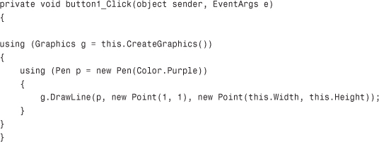
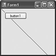
This code will draw a line from the top left of the form to the bottom right of the form using a purple line. In order to draw anything in GDI+, you must have a pen. The pen defines the style of what you are drawing. You can either create a Pen instance based on a color as shown in the preceding code or you can create a Pen from a custom brush such as a LinearGradientBrush (discussed in the “Using a Gradient Brush” section). Figure 36.1 shows the line drawn by the preceding code.
Figure 36.1 Drawing a line.
Creating a “Hello GDI+” Sample
In addition to drawing lines using GDI+, you can also draw text. The Graphics class contains a DrawString method that can be used to place text on a drawing surface such as a form or a control. When you draw the text, you must specify the text font, a brush to use when drawing the text (using custom brushes while drawing text can create some very interesting effects such as gradient-filled letters), and the location where the text will appear, as shown in the following code:
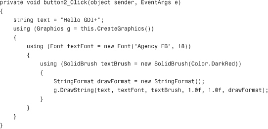
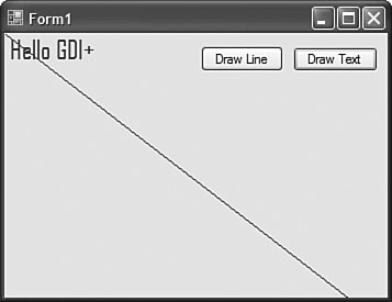
After running this sample with the button1 that you created previously still in place, you get output that has a diagonal line on the form and some colored text in the top-left corner of the form, as shown in Figure 36.2.
Figure 36.2 Drawing lines and text.
You might notice that anything you draw in response to a button click will quickly disappear if your form needs to repaint itself. This is because when the form repaints it doesn’t know that it needs to draw the line or the text. An important lesson to learn in GDI+ programming is when you should use a Paint event and when you shouldn’t. To see how this all fits together, add the following lines of code to the sample you’ve been working with:
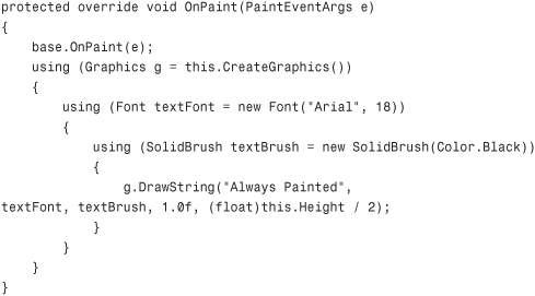
Now run the sample. You’ll see that the phrase “Always Painted” shows up immediately. If you click the Draw Line and Draw Text buttons, you should see all of the graphics. Minimize the window and then restore it. The diagonal line and the “Hello GDI+” phrase have disappeared because the form repainted, erasing all previously rendered graphics. After the form repaint, using the OnPaint overridden method, the form redrew the “Always Painted” text. This gives the impression to the end user that the phrase “Always Painted” never disappeared.
Drawing and Filling Shapes
The next sample will show you how to use pens and solid brushes to create hollow and filled shapes using the Graphics class. Start by creating a new Windows Forms application. Add four buttons to the form: Create Hollow Rectangle, Create Filled Rectangle, Create Hollow Ellipse, and Create Filled Ellipse. In this sample the names of the buttons are left as button1 through button4 respectively. Finally, add a button labeled “Clear Image” to the bottom. Next, add a PictureBox control to the form.
The code in Listing 36.1 shows all of the event handlers for the various buttons, including the Clear Image button.
Listing 36.1 Drawing and Filling Shapes
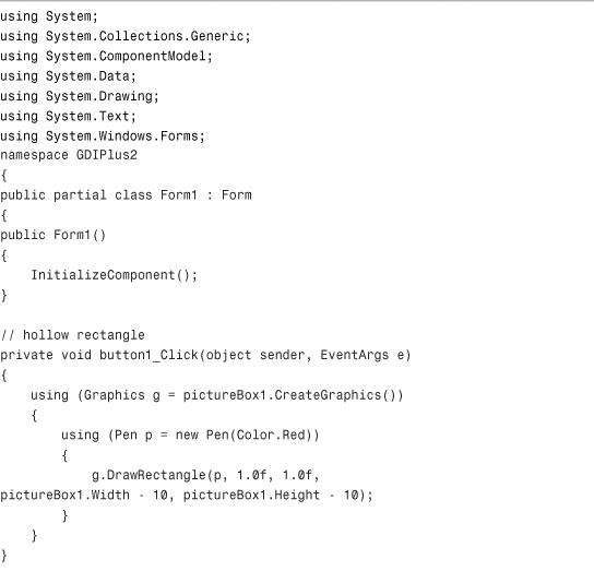
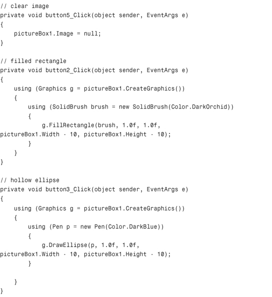

Figure 36.3 shows this application in action. Notice that the order in which you click the drawing buttons has an impact on the type of image you see on the right. Each sequential drawing instruction will draw on top of the currently rendered surface. This means that if you draw a small circle and then draw a large square over the same area, the circle will disappear.
Figure 36.3 Drawing and filling shapes.
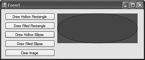
Remember that because these graphics were drawn in response to button clicks and not during the Paint event, they will disappear when the window is repainted.
Using a Gradient Brush
A gradient is a gradual transition from one color to another. This transition can also take place at any angle you choose, giving you an amazing number of choices when creating shading and color transition effects. Many user interface studies have shown that a subtle color transition for a control’s background is far easier to look at than solid colors. This is why all of the toolbars in Office 2003 aren’t solid backgrounds. They are actually vertical transitions from an aqua color to a light blue color.
The subtle application of gradient brushes to your application and your custom controls can do wonders for its look and feel. If used appropriately, they can make an ordinary application look far more professional.
To illustrate how to use gradient brushes, try rewriting the previous application. Everywhere that a SolidBrush was used, you can replace that code with the instantiation of a LinearGradientBrush. Listing 36.2 shows the new code that will replace solid fills with gradient fills.
Listing 36.2 Hollow Shapes and Gradient Fills
Run the sample and see how the new filled shapes have gradually shifting colors in them to form the gradient effect as shown in Figure 36.4. Experiment with changing the gradient’s angle (it is 90 degrees in Listing 36.2) and the start and end colors to see the variety of effects you can create.
Figure 36.4 Gradient shape filling.

Creating Shaped Forms and Controls
The shape of a Windows Form doesn’t necessarily have to be rectangular. Each form has a Region property that can be used to programmatically change the shape of a form using a GraphicsPath object. The GraphicsPath class is used to build and represent shapes. The full details of using this class to build highly complex shapes are beyond the scope of this section of the chapter, but you can find out more about this class using the online MSDN reference.
To create a form that has a customized region (shaped form), all you need to do is override the OnPaint method and change the Region property, as shown in the following code:
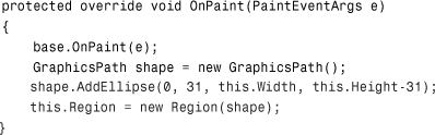
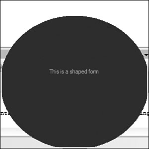
This creates an ellipse that starts 31 pixels below the top of the window, completely hiding the original window’s title bar from the new shape. Figure 36.5 shows a shaped form on top of the Visual Studio IDE. As you can see, areas of the window’s original rectangle that fall outside the shape defined in the Region property end up being transparent.
Figure 36.5 A shaped Windows form.
Although it is extremely compelling to create a Windows Form that appears as an ellipse, there is also potential for creating nice user interfaces by modifying control shapes. For example, you can create pill-shaped buttons by taking a regular rectangle and rounding the edges within the Region property of the control. Quite a few applications have made use of triangular buttons to improve their look and feel.
Using Visual Inheritance
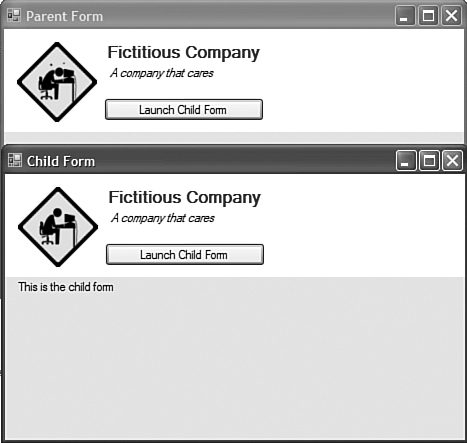
Visual inheritance is a tool that allows you to create a form that inherits from a parent form. The “visual” part of the inheritance refers to the fact that all of the control layout and property information from the parent form is provided to the child form. For example, if you wanted to create a single parent form that contained the company’s logo and the company name on it that could then be inherited by all forms used by all applications within the company, visual inheritance would do the trick.
To see how this works, create a new Windows Forms application and rename the default Form1 form to parentForm. VS 2005 will prompt you to refactor that name throughout the solution; click OK to do this. Next, add a Panel to the form with a white background and set its Dock property to Top. You can then drag a PictureBox and a Label into this top area to create your fictitious company name and logo.
To create a form that visually inherits from the parent form, right-click the project and choose Add, Windows Form, Inherited Form. Call the new form ChildForm. Within the designer it will look very much like the parent form, except that on the child form you cannot modify the properties of any of the controls on the parent form. Figure 36.6 shows the parent form and child form in action.
Figure 36.6 Visual inheritance.
Visual inheritance is just standard .NET inheritance with full design-time support. As such, you can add a property on the parent form that can be modified by the child form. For example, you can create a Slogan property on the parent form that will change the text of the company’s slogan:
public string Slogan
{
get { return label2.Text; }
set { label2.Text = value; }
}
And you can modify that slogan on the child form simply by changing the property value, as shown here:
public ChildForm()
{
InitializeComponent();
Slogan = "Our company is your company.";
}
Combining visual inheritance with other advanced GUI techniques such as using GDI+ as well as the power of the new data-binding features in Windows Forms 2.0 can create some amazing interfaces that were nearly impossible to create using previous versions of Windows Forms.
Globalizing Your User Interface
The first step to globalizing your Windows Forms user interface is in knowing how the globalization functionality works within the .NET Framework itself. You may remember from Chapter 12, “Assemblies and AppDomains,” how satellite assemblies are used to locate culture-specific resources such as alternate text and images. In short, resource files are keyed with a culture name and when they are built, directories are created beneath the output directory and resource-only assemblies called “satellite” assemblies are created.
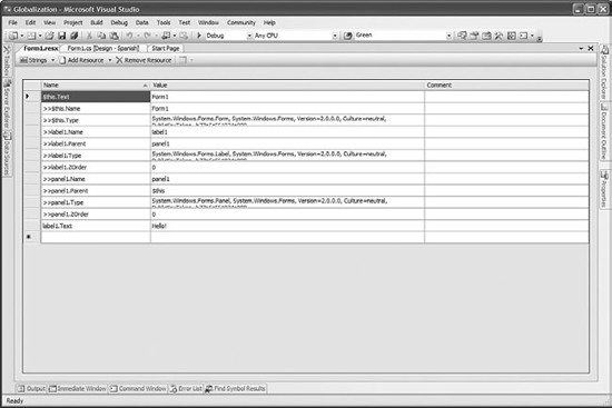
To see how all this works, start by creating an empty Windows Forms application. On the main form, find the Localizable property and change it to true. A panel and a label have been added to the main form just to have some controls to play with. In the Solution Explorer, double-click the Form1.resx file. You should see the resource editor in Figure 36.7. Each control stores its properties in a resource file.
Figure 36.7 Editing form resource data.
Another property on the main form is the Language property, which starts off as (default), meaning the neutral culture. You can select from all of the available cultures. When you change from the current language to a language that you haven’t yet done any work for, Visual Studio 2005 copies all of the default language settings to the new language. So, if your label text is “Hello” in the default language and you switch the form’s language to Spanish, the form will appear to stay the same. The designer will visually indicate that you are working on the Spanish-language version of the form, however. Change the “Hello” text in your label to “Hola” and then switch the language back and forth between (default) and Spanish. You will see that the label switches from “Hello” to “Hola.”
It’s really useful to be able to interactively set the properties of controls in different languages and switch back and forth between cultures, but that isn’t the most beneficial aspect.
The fact that you can switch between languages in the designer combined with the fact that all user-set properties are stored in a resource file gives you the ability to make layout changes given the language. For example, if a particular label in one language is three times as long as the same label in a different language, you can make changes to the layout of the form to take this into account. You don’t have to write any code that dynamically moves controls around at runtime to accommodate font sizes and string lengths.
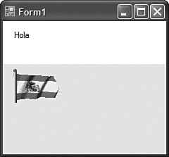
In the sample included with this chapter, there is also a PictureBox on the form. While in the (default) culture, the American flag was loaded into the PictureBox. Then, the Spanish and Canadian flags were loaded in their respective cultures (Spanish/Spain and English/Canada). The code in Listing 36.3 shows how you can programmatically change the culture of the application to see what the culture-specific content looks like at runtime.
Listing 36.3 Changing an Application’s Culture
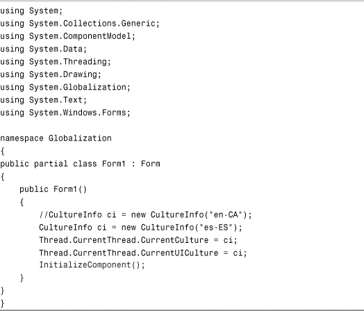
Figure 36.8 shows the application running in Spanish, including the Spanish version of the greeting and the Spanish flag.
Figure 36.8 An application running in an alternative culture.
When you combine the power of strongly typed resource classes (explained in Chapter 12), the ability to have third parties supply both visual and textual translated content, and the powerful built-in support for Unicode language sets, you end up with what amounts to the most robust and powerful development environment for creating world-aware applications on the market today.
Summary
This chapter has provided you with a look at several advanced techniques that can be used to radically increase the power and beauty of your user interfaces. You learned how to use GDI+ to directly control 2D rendering such as drawing lines, shapes, and filling shapes with solid brushes or even complex brushes such as color gradients. The chapter then illustrated how to take the GDI+ basics already provided and apply them to creating forms and controls with irregular shapes. Finally, you saw how to use visual inheritance and globalization to further enhance the power and scalability of your Windows Forms applications.