
8. Creating Charts
Charts
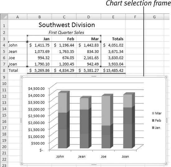
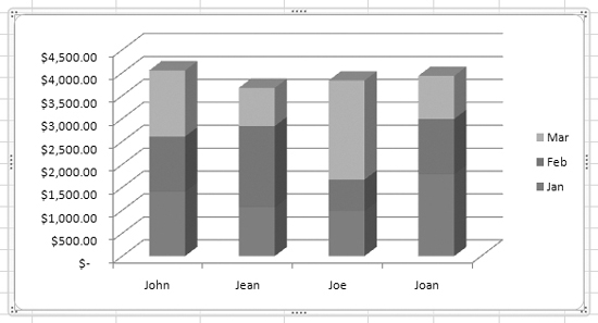
A chart is a graphic representation of data. A chart can be embedded in a worksheet (Figure 1) or can be a chart sheet of its own (Figure 2).
Figure 1. Here’s a 3-D stacked column chart embedded in a worksheet file.

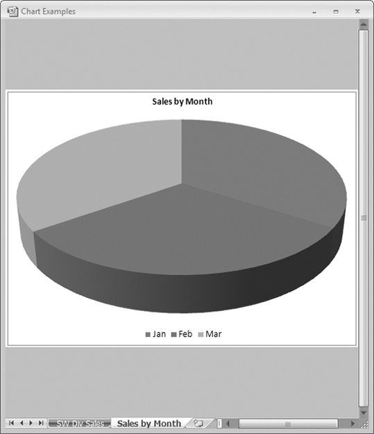
Figure 2. Here’s a 3-D pie chart on a chart sheet of its own.
With Microsoft Excel, you can create many different types of charts. The 3-D stacked column chart and 3-D pie chart shown here (Figures 1 and 2) are only two examples. Since each type of chart has at least one variation and you can customize any chart you create, there’s no limit to the number of ways you can present data graphically with Excel.
• Include charts with worksheets whenever you want to emphasize worksheet results. Charts can often communicate information like trends and comparative results better than numbers alone.
• A skilled chartmaker can, through choice of data, chart format, and scale, get a chart to say almost anything about the data it represents!
Inserting a Chart
The Insert tab’s Charts group (Figure 3) makes it easy to insert a chart based on worksheet data. You start by selecting the cells containing the data you want your chart to be based upon, then choose the type of chart you want to create. Excel creates a default version of the chart and inserts it in the worksheet window.
Figure 3. The Charts group on the Insert tab.

To insert a chart
1. Select the data you want to include in the chart (Figure 4).
Figure 4. Select all the data you want to include in the chart.

2. Click the Insert tab to display the Charts group (Figure 3).
3. Click the button for the type of chart you want to insert to display a menu of chart subtypes (Figure 5).
Figure 5. Clicking one of the buttons in the Charts group displays a menu of chart subtypes.

4. Click the button for the chart you want to insert. The chart appears in the worksheet window (Figure 6).
Figure 6. A default version of the chart is inserted in the worksheet window.
• In step 1, if you include column or row headings in your selection (Figure 4), those headings will be used as data series names, axis labels, and legend labels in the chart (Figure 6).
Worksheet & Chart Links
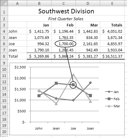
When you create a chart based on worksheet data, the worksheet and chart are linked. Excel knows exactly which worksheet and cells it should look at to plot the chart. If the contents of one of those cells changes, the chart changes accordingly (Figures 7 and 8).
Figures 7 & 8. A linked worksheet and chart before (top) and after (bottom) a change to a cell’s contents.

• Excel’s Range Finder feature places a color-coded box around ranges in a selected chart (Figure 9), making them easy to spot.
Figure 9. This illustration shows both the Range Finder feature and the SERIES formula.
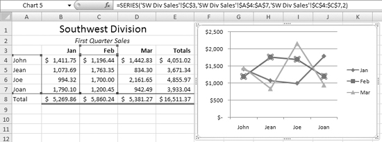
• You can see (and edit) the links between a chart and a worksheet by activating the chart, selecting one of the data series, and looking at the formula bar. In the formula bar, you should see a formula with a SERIES function that specifies the sheet name and absolute cell references for the range making up that series. Figure 9 shows an example.
• If you delete worksheet data or an entire worksheet that is linked to a chart, Excel warns you with a dialog like the one in Figure 10. Click OK and then, if you removed the data by mistake, use the Undo command or press ![]() to get the deleted data back. I tell you about the Undo command in Chapter 3.
to get the deleted data back. I tell you about the Undo command in Chapter 3.
Figure 10. If you delete cells linked to a chart, you may see a dialog like this.

Working with Chart Objects
An inserted chart is an object very similar to the graphic objects discussed in Chapter 7. It can be selected, resized, and moved.
To select a chart
Click the chart. A selection frame appears around it (Figure 6).
• You must select a chart (or one of its elements, as explained later) to make changes to it.
• When a chart is selected, the Chart Tools tabs appear at the top of the Excel application window (Figure 11).
Figure 11. When a chart is selected, the Chart Tools tabs appear at the top of the window.

To deselect a chart
Click anywhere other than on the chart. The selection frame disappears (Figure 1).
To resize a chart
1. Select the chart you want to resize.
2. Position the mouse pointer on one of the selection handles on the chart’s frame. The mouse pointer turns into a two-headed arrow (Figure 12).
Figure 12. Position the mouse pointer on a selection handle of the chart’s frame.

3. Press the mouse button and drag. The frame stretches or shrinks as you drag it (Figure 13).
Figure 13. Drag the selection handle to stretch the frame.

4. Release the mouse button. The chart resizes (Figure 14).
Figure 14. When you release the mouse button, the chart resizes.
To move a chart within the worksheet
1. Select the chart you want to move.
2. Position the mouse pointer on the chart border anywhere except on a selection handle. The mouse pointer turns into a four-headed arrow (Figure 15).
Figure 15. Position the mouse pointer on the frame’s edge.
3. Press the mouse button and drag. The chart’s frame moves with the mouse pointer (Figure 16).
Figure 16. Drag the frame into a new position.

4. When the chart is in the desired position, release the mouse button. The chart moves.
To move a chart to another sheet
1. Select the chart you want to move.
2. Click Design > Location > Move Chart to display the Move Chart dialog (Figure 17).
Figure 17. Use this dialog to move a chart to another sheet.
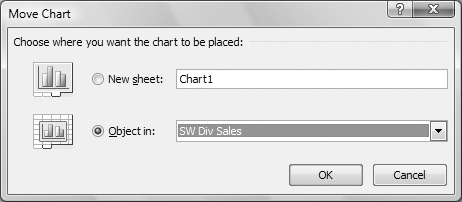
3. Select one of the option buttons:
• New sheet places the chart on its own chart sheet (Figure 2). If you select this option, you can enter a name for the sheet in the text box.
• Object in places the chart as an object in an existing sheet. Choose a sheet from the drop-down list of sheets in the current workbook.
4. Click OK. The sheet moves.
Chart Design Options
The Design tab offers a number of options to change the overall design of a selected chart. It includes five groups of options:
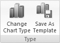
• Type (Figure 18) lets you change the chart type or save the current chart as a template for future charts.
Figure 18. The Design tab’s Type group.
• Data (Figure 22) enables you to switch the row and column data for a chart, thus changing the data layout and to select new or different data for a chart.
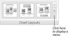
• Chart Layouts (Figure 28) offers a number of predefined layouts for chart elements such as titles and elements.
• Chart Styles (Figure 30) enables you to apply color-coordinated formatting to your chart.
• Location lets you move a chart to another sheet, as I discuss on the previous page.
In this part of the chapter I explain how to use these options to set the overall appearance of a chart.
To change a chart’s type
1. Select the chart you want to change.
2. Click Design > Type > Change Chart Type (Figure 18). The Change Chart Type dialog appears (Figure 19).
Figure 19. Use the Change Chart Type dialog to select a new type for the selected chart.
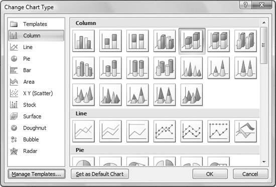
3. In the list on the left side of the dialog, select a main chart type.
4. In the main part of the dialog, click the icon for the chart subtype you want.
5. Click OK. The chart changes to the subtype you specified.
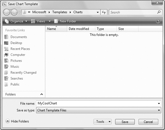
To save a chart as a template
1. Customize a chart as discussed throughout this chapter.
2. Select the chart.
3. Click Design > Type > Save As Template (Figure 18).
4. In the Save Chart Template dialog that appears (Figure 20), enter a name for the template and click Save.
Figure 20. Use the Save Chart Template dialog to save the selected chart as a design template that can be applied to other charts.
• Once a chart has been saved as a template, it appears in the Templates folder of the Change Chart Type dialog (Figure 21). This makes it easy to apply its settings to other chartes.
Figure 21. Once a chart has been saved as a template, it appears in the Change Chart Type dialog.
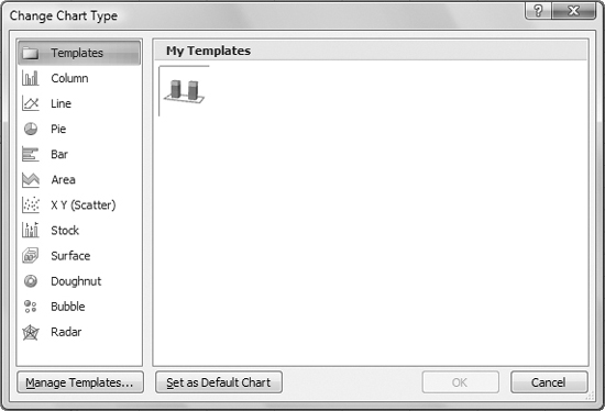
• The chart template feature can save you time if you often create charts with the same customized settings.
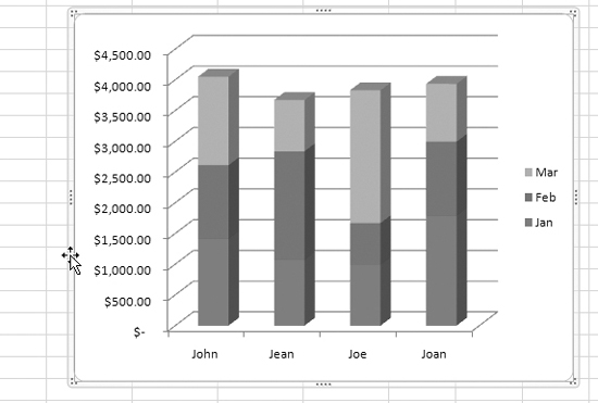
To switch row & column data
1. Select the chart you want to modify.
2. Click Design > Data > Switch Row/Column (Figure 22). The row and column data is switched (Figure 23).
Figure 22. The Data group offers two commands for working with a chart’s data.
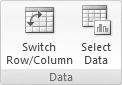
Figure 23. Clicking the Switch Row/Column button changes the chart in Figure 1 so it looks like this.

• This option is only available for certain types of charts.
• If you are unpleasantly surprised by the results of step 2, you can use the Undo command or press ![]() to revert back to the original data display. I tell you about the Undo command in Chapter 3.
to revert back to the original data display. I tell you about the Undo command in Chapter 3.
To change, add, or remove a data series
1. Select the chart you want to modify.
2. Click Design > Data > Select Data (Figure 22). The Select Data Source dialog appears (Figure 24).
Figure 24. The Select Data Source dialog offers a way to change, add, or remove a chart’s data series.
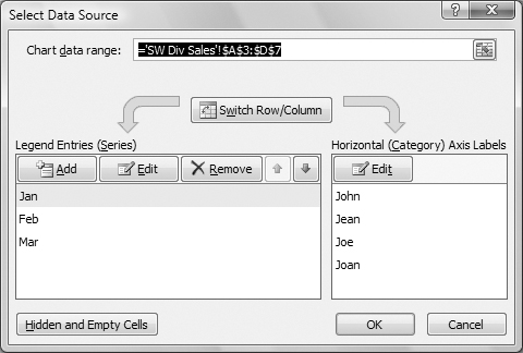
3. To change the entire chart data range, click anywhere in the Chart data range box to position the insertion point there, then use your mouse to select the new range. As you drag to select, the Select Data Source dialog collapses to move out of the way (Figure 25). When you release the mouse button, the dialog is restored with the range you selected inserted in the Chart data range box.
Figure 25. When you begin to select cells, the Select Data Source dialog collapses to get out of your way.

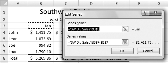
4. To change just one series, click the name of the series in the bottom half of the dialog, and click the Edit button above it. The Edit Series dialog appears (Figure 26). Position the insertion point in the field you want to change, then click or drag in the worksheet window to enter the series in the dialog. Click OK to save your changes.
Figure 26. Use the Edit Series dialog to specify cells containing a series name or data.
5. To add a legend data series, click the Add button. Then use the Edit Series dialog that appears to enter cell references for the series name and series values. Click OK to save your settings.
6. To remove a data series, select the series you want to remove and click Remove. The data series is removed from the dialog and the chart.
7. To rearrange a chart’s data:
• Click Switch Row/Column to switch the two data series. This is the same as clicking Design > Data > Switch Row/Column (Figure 22) as discussed on the previous page.
• To move a legend series up or down in the presentation order, select the series you want to move and click the up or down arrow above it. The data is rearranged in the dialog and in the chart.
8. When you are finished making changes, click OK.
• Although you can use the Select Data Source dialog to build a chart from scratch, it’s much easier to simply select the cells to be charted when inserting a chart, as discussed at the beginning of this chapter.
• Changes you make in the Select Data Source dialog are immediately reflected in your chart. If you make a mistake and really mess things up, just click Cancel instead of OK to restore the chart to its condition before you made changes.
• To specify how hidden and empty cells should appear in a chart, click the Hidden and Empty Cells button in the Select Data Source dialog. Then use the Hidden and Empty Cell Settings dialog (Figure 27) to set options for displaying these special cells.
Figure 27. You can use this dialog to indicate how hidden and empty cells should appear in a chart.

To set a chart layout
1. Select the chart you want to modify.
2. Click the Design tab to display the Chart Layouts group (Figure 28).
Figure 28. The Chart Layouts group is a single-line scrolling list of options.
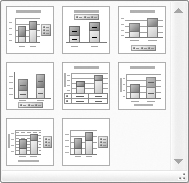
3. Click to select one of the options that appear in the single-line scrolling list (Figure 28).
or
Click the menu button in the bottom-right corner of the list (Figure 28) to display a menu of all chart layouts (Figure 29) and click to select the one you want.
Figure 29. A click displays all options in a menu.
• Chart layouts include elements such as legends, titles, and access titles—all of which can be modified, as explained later in this chapter.
To set a chart style
1. Select the chart you want to modify.
2. Click the Design tab to display the Chart Styles group (Figure 30).
Figure 30. The Chart Styles group offers a variety of color-coordinated styles for your chart.

3. Click to select one of the options that appear in the single-line scrolling list (Figure 30).
or
Click the menu button in the bottom-right corner of the list (Figure 30) to display a menu of all chart styles (Figure 31) and click to select the one you want.
Figure 31. Clicking the menu button in the Chart Styles group displays all available options in a menu.

Chart Elements
Each chart is made up of multiple elements, each of which can be selected, then modified or formatted to fine-tune the appearance of a chart.
The Layout tab (Figure 32) offers groups of options to add, remove, and modify a chart’s elements.
Figure 32. The Layout tab offers groups of options for modifying the appearance of individual chart elements.
![]()
To identify a chart element
Point to the element you want to identify. Excel displays the name (and values, if appropriate) for the element in a Chart Tip box (Figure 33).
Figure 33. Chart tips identify the chart elements and values you point to.

To select a chart element
Click the element you want to select. Selection handles or a selection box (or both) appear around it (Figure 34).
Figure 34. When you select a chart element, selection handles or a box (or both) appear around it.

Or
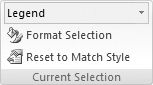
1. Click the Layout tab to display the Current Selection group (Figure 35).
Figure 35. The Current Selection group displays the name of the currently selected chart element.
2. Choose the chart element you want to format from the Chart Element drop-down list (Figure 36).
Figure 36. Choose a chart element from the Chart Element drop-down list.

• To select a single data point, select the data series and then click the point you want to select.
• Excel displays the name of a selected chart element in the Chart Element drop-down list in the Current Selection group of the Layout tab (Figure 35).
To remove a chart element
1. Select the chart element.
2. Press ![]() . The chart element disappears.
. The chart element disappears.
Labels
Labels are textual labels that appear in specific locations on a chart. You can add, remove, or modify labels with options in the Labels group of the Layout tab (Figure 37).
Figure 37. The Layout tab’s Labels group.
The Labels group offers menus for five types of labels:
• Chart Title is a title for the chart.
• Axis Titles are labels for a chart’s axes, if present.
• Legend is a list of color-coded labels identifying a chart’s data series.
• Data Labels provide additional information about specific data points.
• Data Table is a table of the worksheet data that is plotted in the chart.
To set the chart title
1. Click Layout > Labels > Chart Title to display a menu of chart title options (Figure 38).
Figure 38. You can set basic chart title options by choosing an option from this menu.

2. Choose an option to determine where the chart title should appear:
• None does not display the chart title. If one is already displayed, when you choose this option it is removed.
• Centered Overlay Title displays a centered title that’s overlaid on top of the chart’s plot area (Figure 39).
Figure 39. The Centered Overlay Title option puts a title over the chart’s plot area.

• Above Chart displays a centered title above the chart’s plot area.
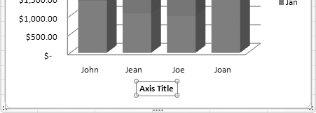
To set the horizontal axis title
1. Click Layout > Labels > Axis Titles > Primary Horizontal Axis Title to display a submenu of chart title options (Figure 40).
Figure 40. Use the Primary Horizontal Axis Title to set the title for a chart’s horizontal axis.

2. Choose a title location:
• None does not display a horizontal axis title.
• Title Below Axis displays a title below the horizontal axis (Figure 41).
Figure 41. A title below the axis.
To set the vertical axis title
1. Click Layout > Labels > Axis Titles > Primary Vertical Axis Title to display a submenu of chart title options (Figure 42).
Figure 42. Use the Primary Vertical Axis Title submenu to set the title for a chart’s vertical axis.

2. Choose a title location:
• None does not display a vertical axis title.
• Rotated Title displays a vertical axis title rotated 90°.
• Vertical Title displays a vertical axis with text reading from top to bottom (Figure 43).
Figure 43. A vertical title displayed vertically.

• Horizontal Title displays a vertical axis title displayed horizontally.
To set a legend
1. Click Layout > Labels > Legend to display a menu of chart legend options (Figure 44).
Figure 44. The Legend menu offers a variety of position options for chart legends.

2. Choose a legend location:
• None doesn’t display a legend.
• Show Legend at Right displays the legend vertically, to the right of the chart (Figure 34).
• Show Legend at Top displays the legend horizontally, above the chart.
• Show Legend at Left displays the legend vertically, to the left of the chart.
• Show Legend at Bottom displays the legend horizontally at the bottom of the chart (Figure 45).
Figure 45. Here’s an example of a legend at the bottom of a chart.

• Overlay Legend at Right displays the legend on the right, overlapping the chart’s plot area.
• Overlay Legend at Left displays the legend on the left, overlapping the chart’s plot area.
To set data labels
1. If you only want data labels on a specific data series or data point, select that series or point.
2. Click Layout > Labels > Data Labels to display a menu of data labels options (Figure 46).
Figure 46. Use the Data Labels menu to set whether data labels are displayed.
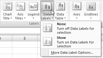
3. Choose a data labels option:
• None doesn’t display data labels for the selection.
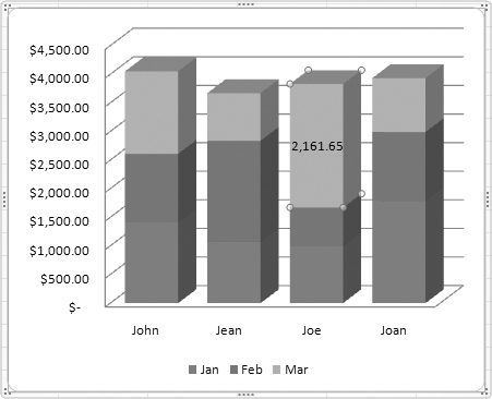
• Show displays data labels on the selection (Figure 47).
Figure 47. Here’s an example of a data label on a single selected data point.
To set a data table
1. Click Layout > Labels > Data Table to display a menu of chart data table options (Figure 48).
Figure 48. The Data Table menu.

2. Choose a data table option:
• None doesn’t display a data table.
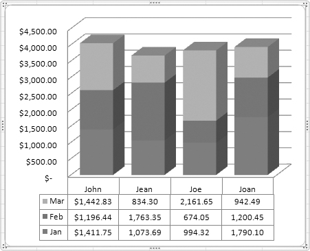
• Show Data Table displays a data table below the chart without legend keys.
• Show Data Table with Legend Keys displays a data table and legend keys below the chart (Figure 49).
Figure 49. Here’s an example of a chart wth a data table with legend keys.
To customize label text
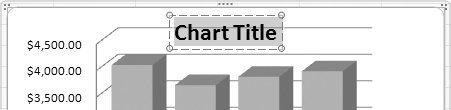
1. Select the text within the label’s selection box (Figure 50).
Figure 50. Select the default title text.
2. Type in the text you want to appear (Figure 51).
Figure 51. Type in the text you want to appear.

Axes & Gridlines
Axes are the bounding lines of a chart. 2-D charts have two axes: horizontal and vertical. 3-D charts have three axes: horizontal, vertical, and depth. Pie and doughnut charts do not have axes at all.
Gridlines, which work with axes, are lines indicating major and minor scale points along a chart’s walls. They can make it easier to follow chart points to their corresponding values on a chart axis. Pie and doughnut charts do not have gridlines.
The Layout tab’s Axes group (Figure 52) offers two menus of options:
Figure 52. The Layout tab’s Axes group.

• Axes offers commands for displaying horizontal, vertical, and depth axis options, including labels and corresponding tick marks.
• Gridlines offers commands for displaying horizonta, vertical, and depth major and minor gridlines.
To set axis options
1. Click Layout > Axes > Axes > Primary Horizontal Axis to display a submenu of horizontal axis options (Figure 53).
Figure 53. Use the Primary Horizontal Axis submenu to choose a horizontal axis option.

2. Choose a horizontal axis option:
• None does not display a horizontal axis.
• Show Left to Right Axis displays an axis with labels and tick marks that begins on the left and goes to the right. This is a standard horizontal axis (Figure 56).
• Show Axis without labeling displays an axis without labels or tick marks.
• Show Right to Left Axis displays an axis with labels that begins on the right and goes to the left.
3. Click Layout > Axes > Axes > Primary Vertical Axis to display a submenu of vertical axis options (Figure 54).
Figure 54. Use the Primary Vertical Axis submenu to set vertical axis options.

4. Choose a vertical axis option:
• None does not display a vertical axis.
• Show Default Axis displays a vertical axis with default settings calculated by Excel (Figure 1).
• Show Axis in Thousands displays a vertical axis with numbers in thousands (Figure 56).
• Show Axis in Millions displays a vertical axis with numbers in millions.
• Show Axis in Billions displays a vertical axis with numbers in billions.
• Show Axis with Log Scale displays a vertical axis with numbers in a logarithmic scale.
5. Click Layout > Axes > Axes > Depth Axis to display a submenu of depth axis options (Figure 55).
Figure 55. If you’re formatting a 3-D chart, you can set options for its depth axis.

6. Choose a depth axis option:
• None does not display a depth axis.
• Show Default Axis displays a depth axis with default settings calculated by Excel.
• Show Axis without labeling displays an axis without labels or tick marks (Figure 56).
Figure 56. Here’s an example of a 3-D chart with a left to right horizontal axis, a vertical axis with numbers in thousands, and an unlabeled depth access. In this example, a legend is a good replacement for the depth axis.

• Show Reverse Axis displays an axis with label values in reverse order.
• Remember not all charts have axes and only 3-D charts have a depth axis. If an axis option cannot be selected, that option is simply not available for the type of chart you have selected.
To set gridlines
1. Click Layout > Axes > Gridlines > Primary Horizontal Gridlines to display a submenu of horizontal gridline options (Figure 57).
Figure 57. The Primary Horizontal Gridlines submenu offers options for setting the horizontal gridlines.
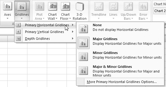
2. Choose the gridline option you want:
• None does not display any gridlines.
• Major Gridlines displays gridlines that correspond to major tick mark units for the axis scale.
• Minor Gridlines displays gridlines that correspond to minor tick mark units for the axis scale.
• Major & Minor Gridlines displays gridlines that correspond to both the major and minor tick mark units for the axis scale.
3. Click Layout > Axes > Gridlines > Primary Vertical Gridlines to display a submenu of vertical gridline options (Figure 58).
Figure 58. You can set vertical gridline options with the Primary Vertical Gridlines submenu.

4. Repeat step 2; the options are the same but for the vertical axis.
5. Click Layout > Axes > Gridlines > Depth Gridlines to display a submenu of depth gridline options (Figure 59).
Figure 59. If you’re working with a 3-D chart, you can set gridlines for the depth axis.

6. Repeat step 2; the options are the same but for the depth axis.
• I explain how to set the scale for an axis later in this chapter.
• Although gridlines can make a chart’s data easier to read, too many gridlines can clutter a chart’s walls, making data impossible to read.
Background Fill
The Layout tab’s Background group (Figure 60) includes three menus of options for formatting a chart’s background:
Figure 60. The Background group with a 3-D chart selected. If a 2-D chart is selected, only the Plot Area menu is available.

• Plot area is the part of a 2-D chart where the data is plotted.
• Chart Wall is the background of the chart. This is basically the same as plot area, but for a 3-D chart, which has two walls.
• Chart Floor is the bottom plot area for a 3-D chart.
You can use options on these menus to remove fill or display the default fill color.
• Since the default fill color is white for many charts, if you remove the fill, the chart may look the same as it does with the default fill.
• The options on these menus enable you to turn the fill on or off. I explain how to change the color of the fill later in this chapter.
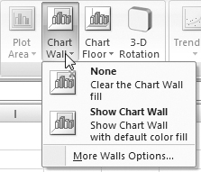
To set a 2-D chart’s background
1. Click Layout > Background > Plot Area to display a menu of plot area options (Figure 61).
Figure 61. The Plot Area menu offers options for the background of a 2-D chart.
2. Choose one of the options:
• None removes the fill from the plot area.
• Show Plot Area displays the default fill color for the plot area.
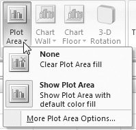
To set a 3-D chart’s background
1. Click Layout > Background > Chart Wall to display a menu of chart wall options (Figure 62).
Figure 62. Use the Chart Wall menu to set the background for a 3-D chart.
2. Choose one of the options:
• None removes the fill from the chart walls.
• Show Chart Wall displays the default fill color for the chart wall.
3. Click Layout > Background > Chart Floor to display a menu of chart floor options (Figure 63).
Figure 63. You can also set the floor fill for a 3-D chart.

4. Choose one of the options:
• None removes the fill from the chart walls.
• Show Chart Floor displays the default fill color for the chart floor.
Formatting Chart Elements
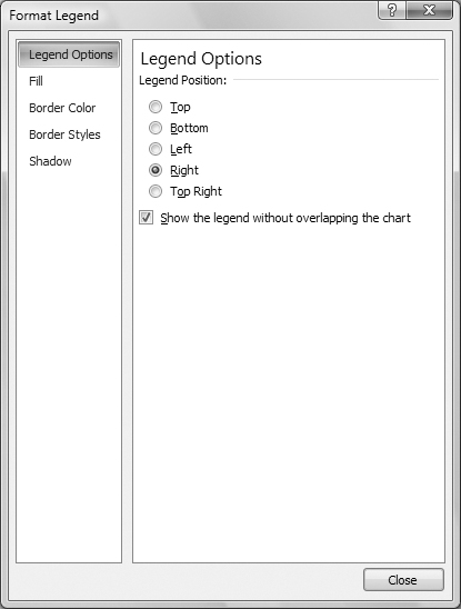
Excel can display a special Format dialog (Figured 64) for every kind of element in a chart. The dialog offers only those options that apply to the element you want to format in the type of chart that is selected.
Figure 64. The Format Legend dialog offers options for formatting a chart legend.
Although many chart elements share the same formatting options, some options are specific to a single type of chart element. As a result, the Format dialog has dozens of combinations of options, many of which are covered in the remaining pages of this chapter.
• The name of the dialog varies depending on the item being formatted.
• Table 1 provides a list of the kinds of options available for each type of chart element.
Table 1. Format dialog options for various chart elements

To open the Format dialog for a chart element
1. Select the chart element you want to format.
2. If necessary, click the Layout tab to display the Current Selection group (Figure 35).
3. Click Format Selection. The Format dialog appears for the currently selected chart element (Figure 64).
Or
Choose the More Options command at the bottom of any Layout tab menu or submenu.
To use the Format dialog
1. In the list on the left side of the Format dialog (Figure 64), click the name of the type of formatting you want to change.
2. Make changes in the main part of the dialog. Your changes take affect immediately.
3. Repeat steps 1 and 2 for each type of change you want to make.
4. When you’re finished making changes, click close to dismiss the dialog.
• You can keep the Format dialog open while you select and work with other chart elements. The options in the dialog change each time you select a different element to format.
Legend Options
The Legend Options pane of the Format dialog (Figure 64) offers the following options for the placement of a legend:
• Legend Position determines the position of the legend: Top, Bottom, Left, Right, or Top Right.
• Show the legend without overlapping the chart positions the legend so that it does not overlap other chart elements. This may cause the chart’s plot area to resize.
• To prevent the plot area from resizing when a legend is displayed, turn the Show the legend without overlapping the chart check box off.
Label Options
The Label Options pane of the Format dialog (Figure 65) enables you to specify what should be included in a selected series’ or point’s data label. It offers the following options, some of which are illustrated in Figure 66:
Figure 65. The Label Options pane of the Format dialog.
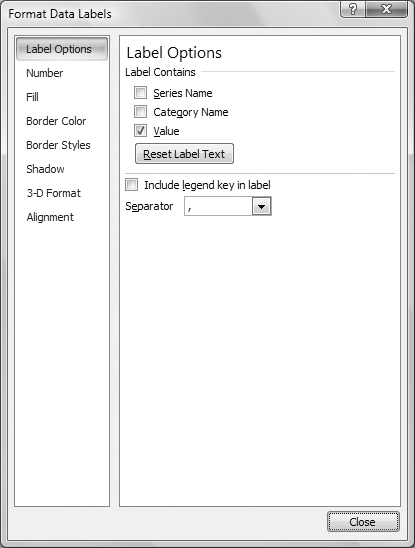
Figure 66. In this stacked column chart example, all segments include the value. The second segment down also includes the series name while the bottom segment includes the category name. As you can see, you can get pretty creative with the labels.

• Label Contains offers three possible options for display: Series Name, Category Name, Value. You can turn on any combination of these check boxes.
• Reset Label Text enables you to reset a selected label’s text to the default option. You might find this useful if you manually modified a label and want to restore it to the settings in the dialog.
• Include legend key in label displays the legend color with the label.
• Separator is the character to place between components of the label if more than one option is selected.
Data Table Options
The Data Table Options (Figure 67) enable you to specify whether a data table should include borders and legend keys:
Figure 67. The Data Table Options control the display of borders and a legend key.
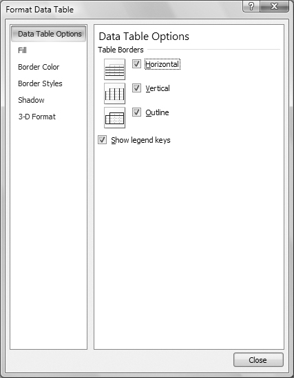
• Table Borders enables you to hide or display Horizontal, Vertical, and Outline borders.
• Show legend keys deterines whether a color-coded legend key should be included in the table.
Axis Options
The Axis Options (Figures 68, 69, and 70) control formatting of the tick marks, labels, and other features of an axis. Excel displays a different set of options depending on the axis you are formatting.
Figure 68. The category axis options for a typical category axis. Other options may appear for some chart types.
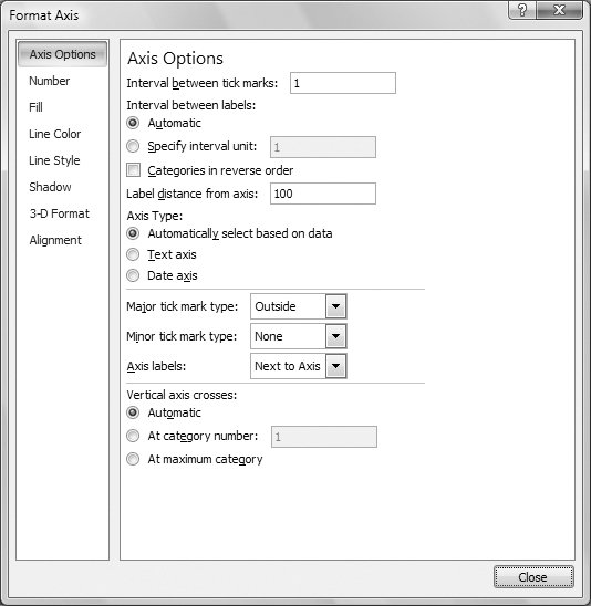
Figure 69. Value axis options for a 3-D column chart.

Figure 70. Series axis options for a 3-D column chart.

Excel distinguishes between four types of axes:
• Category axis is the axis on which categories of information are displayed. This is normally the horizontal axis, but can be the vertical axis for some chart types.
• Time scale axis is a category axis with the axis type set to time.
• Value axis is the axis on which values are displayed. This is normally the vertical axis but can be the horizontal axis for some chart types.
• Series axis is normally the depth axis on 3-D charts.
Here’s a look at the options for category, value, and series axes.
Category axis options
Axis Options for a typical category axis (Figure 68) include:
• Interval between tick marks is the number of units between tick marks.
• Interval between labels is the number of tickmarks between labels. Automatic lets Excel determine where labels should go based on available space.
• Categories in reverse order displays data in the reverse order on the axis.
• Label distance determines how far a label is from the axis. Enter a higher number to move the label farther away; enter a lower number to bring it closer.
• Axis Type lets you set the type of axis: text or date. Automatic lets Excel decide for you.
• Major tick mark type and Minor tick mark type enable you to specify whether tick marks should appear inside, outside, across the axis, or not at all.
• Axis labels determines where the axis labels should appear in relation to the axis or whether they should appear at all.
• Vertical axis crosses enables you to specify where the vertical axis should cross the horizontal axis; leave it set to Automatic to let Excel decide for you.
• You may see more or fewer options in this dialog depending on the type of chart you’re formatting. This example shows the most commonly found options.
Value axis options
Axis Options for a typical value axis (Figure 69) include:
• Minimum, Maximum, Major unit, and Minor unit enable you to specify values for the axis scale or let Excel determine values for you.
• Values in reverse order displays data in the reverse order on the axis.
• Logarithmic scale displays the axis in a logarithmic scale using the base you specify.
• Display units enables you to set the scale’s units—for example, hundreds, thousands, billions. This can help keep your chart’s axis neat when charting large values.
• Show display units label on chart displays the option you chose from the Display units drop-down list so it’s clear what units are being displayed.
• Major tick mark type and Minor tick mark type enable you to specify whether tick marks should appear inside, outside, across the axis, or not at all.
• Axis labels determines where the axis labels should appear in relation to the axis or whether they should appear at all.
• Vertical axis crosses at or Floor crosses at enables you to specify where another axis should cross this axis; leave it set to Automatic to let Excel decide for you.
• You may see different options in this dialog depending on the type of chart you’re formatting. This example shows options for a 3-D column chart.
Series axis options
Axis Options for a typical series axis (Figure 70) include:
• Interval between tick marks is the number of units between tick marks.
• Interval between labels is the number of tickmarks between labels. Automatic lets Excel determine where labels should go based on available space.
• Series in reverse order displays data in the reverse order on the axis.
• Major tick mark type and Minor tick mark type enable you to specify whether tick marks should appear inside, outside, across the axis, or not at all.
• Axis labels determines where the axis labels should appear in relation to the axis or whether they should appear at all.
Fill Options
Fill options, which are available for most chart options, enable you to specify a fill color, gradient, picture, or texture. The options that appear vary depending on the option button you select at the top of the Fill Options pane.
• No fill does not fill the element at all. There are no other options.
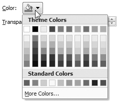
• Solid fill (Figure 71) enables you to set the color and transparency for the fill. Choose a color from the pop-up menu (Figure 72) and use the slider to set a transparency value.
Figure 71. The Fill options when Solid fill is selected.

Figure 72. Use this pop-up menu to choose a color.
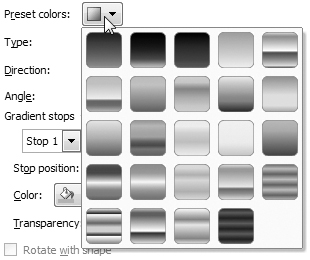
• Gradient fill (Figure 73) enables you to set up a fill with one or more gradient stops. Start by choosing one of the Preset colors (Figure 74), then set other options in the dialog to customize the gradient as desired.
Figure 73. Excel offers many options for setting up a gradient fill.

Figure 74. The Preset colors pop-up menu makes it easy to set up some colorful gradients.
• Picture or texture fill enables you to use a texture, graphic file, clipboard contents, or clip art as fill. You can set options to identify the image, tile it, and specify transparency.
• Automatic lets Excel decide how to fill the element based on other settings. There are no other options.
Border Color or Line Color
All types of chart elements offer either Border Color or Line Color options. (These two sets of options are virtually identical, so in an effort to save space, I just show Border Color options here.) The options that appear vary depending on the option button you select at the top of the pane.
• No line does not display a line. There are no other options. This option is not available for all types of chart elements.
• Solid line (Figure 75) enables you to set the color and transparency for the line. Choose a color from the pop-up menu (Figure 72) and use the slider to set a transparency value.
Figure 75. Border Color options for a solid line.

• Gradient line enables you to set options for a gradient line. This option is not available for most types of chart elements.
• Automatic lets excel determine the line color based on other settings. There are no other options.
Border Style or Line Style
All types of chart elements offer either Border Style or Line Style options. These two sets of options are virtually identical, so in an effort to save space, I just show Line Style options here (Figure 76).
Figure 76. The Line Style pane offers options for customizing a line.
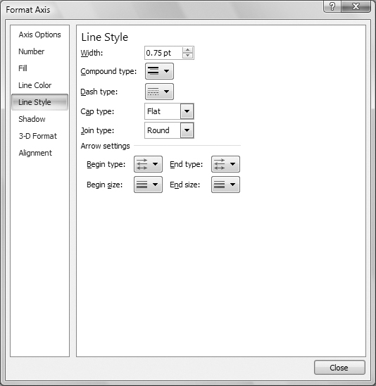
• Width is the thickness of the line, in points.
• Compound type is the style for lines consisting of multiple parallel lines.
• Dash type is the style for dashed lines.
• Cap type is the style for the end of the line.
• Join type is the style for line intersections.
• Arrow settings enable you to set styles for the beginning and ending arrows on lines. This option is not available for borders.
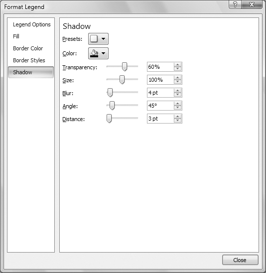
Shadow Options
All types of chart elements offer Shadow formatting options (Figure 77). Using these options can give your charts an interesting, 3-D effect—even if they aren’t 3-D charts.
Figure 77. Shadow options make it possible to create fully customized shadows.
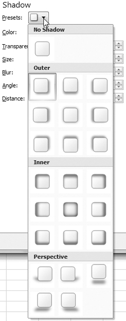
• Presets (Figure 78) enables you to choose from among many preset shadow options. You must chose an option other than No Shadow to display a shadow for the element. You can then customize the shadow with the remaining options.
Figure 78. Start by choosing one of the preset shadow options.
• Color (Figure 72) enables you to select a color for the shadow.
• Transparency determines how much you can see through the shadow.
• Size is the size of the shadow in relation to the chart element. Normally, this will be 100%.
• Blur is the thickness of the shadow.
• Angle is the angle of the shadow in relation to the object.
• Distance is the distance between the element and the shadow.
Alignment Options
Some types of chart elements offer Alignment formatting options (Figure 79):
Figure 79. Alignment options control the positioning and alignment of text elements.

• Text layout controls how text is positioned and aligned:
• Vertical alignment controls how text is aligned vertically on the chart.
• Text direction controls how text characters read: horizontally or vertically—rotated or stacked.
• Custom Angle enables you to specify an angle to display text.
• Autofit can resize the text to fit its shape. This option is only available if a shape has been applied to the element.
• Internal margin enables you to set the spacing between the text and its borders.
Number Options
You can use Number options to format chart elements that display values. As shown in Figure 80, these options are virtually identical to Number formatting options available for worksheet cells. You can learn more about these options in Chapter 6.
Figure 80. Number options for a chart element are the same as number options for a worksheet cell.

3-D Formatting Options
Excel offers two kinds of 3-D formatting options for chart elements:
• 3-D Format options (Figure 81) enable you to format any three dimensional chart element. Set options in this dialog to specify bevel, depth, contour, and surface options. You’ll find these options most useful for formatting 3-D filled images, such as columns in a column chart.
Figure 81. Use the 3-D Format options to format any three dimensional chart element.

• 3-D Rotation options (Figure 82) enable you to set the rotation of true 3-D charts. Enter the number of degrees in the X and Y boxes to change the rotation.
Figure 82. You can use the 3-D Rotation options to set the orientation for a three dimensional chart.

The best way to work with these two option panes is to experiment. Try out the settings to see how they affect your chart elements. You can always use the Undo command or press ![]() to restore the element to its original appearance.
to restore the element to its original appearance.