"The best journey is the one with the fewest steps. Shorten the distance between the user and their goal." | ||
| --Author Unknown | ||
"It takes less time to do a thing right than to explain why you did it wrong." | ||
| --H.W. Longfellow | ||
Pages are NAV 2015's object type for interactively presenting information. The page rendering routines that paint the page on the target display handle much of the data presentation detail. This allows a variety of clients to be created by Microsoft, such as Web browser resident clients, Windows RTC clients, and new tablet clients (iPad, Android, Windows). Independent Software Vendors (ISVs) have created mobile clients and even clients targeted to devices other than video displays.
One of the benefits of Page technology is the focus on the user experience rather than the underlying data structure. As always, the designer/developer has the responsibility of using the tools to their best effect. Another advantage of NAV 2015 pages is the flexibility they provide the user for personalization, allowing him/her to tailor what is displayed and how it is organized.
In this chapter, we will explore the various types of pages offered by NAV 2015. We will review many options for formatting, data accessing, and tailoring the pages. We will also learn about the Page Designer tools and the inner structures of the pages. Topics we will cover include:
- Page design and structure overview
- Types of Pages
- Page Designer
- Page components
- Page controls
- Page actions
- WDTU Page enhancement exercises
Pages serve the purpose of input, output, and control. They are views of data or process information designed for on-screen display only. They are also user data entry vehicles.
Pages are made up of various combinations of controls, properties, actions, triggers, and C/AL code.
- Controls provide the user with ways to view, enter, and edit data, choose options or commands, initiate actions, and view status
- Properties are attributes or characteristics of an object that define its state, appearance, or value
- Actions are menu items (which may be icons)
- Triggers are predefined functions that are executed when certain actions or events occur
The internal structure of a page maps to an XML structure, some of which is readily visible in the Page Designer display while the rest is in the background.
C/SIDE allows us to create pages with a number of different look and feel attributes. The standard NAV application only uses a few of the possibilities, and closely follows a set of Graphical User Interface (GUI) guidelines that provide consistency throughout the system. These guidelines are described in an interactive document named Microsoft Dynamics NAV 2015 User Experience Guidelines (UX Guide for short). Obtain a copy of this guide from the MSDN Library (https://msdn.microsoft.com/en-us/library/jj651618(v=nav.80).aspx) and study it.
Good design practice dictates that enhancements integrate seamlessly with the existing software unless there is an overwhelming justification for being different. When we add new pages or change the existing pages, the changes should have the same look and feel as the original pages unless the new functionality requires significant differences. This consistency not only makes the user's life easier, it also makes support, maintenance, and training more efficient.
There will be instances where we will need to create a significantly different page layout in order to address a special requirement. Maybe we need to use industry specific symbols, or we need to create a screen layout for a special display device. Perhaps we are going to create a special dashboard display to report on the status of work queues. Even when we are going to be different, we should continue to be guided by the environment and context in which our new work will operate.
Let's take a look at what makes up a typical page in the NAV 2015 Role Tailored Client. The page in the following screenshot includes a List page at its core (the content area).

Following is a brief description of all these options:
- Travel Buttons: They serve the same purpose as in the Explorers, that is to move backward or forward through the previously displayed pages.
- Title Bar: This displays Page Caption and product identification.
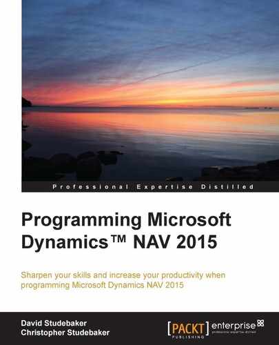
- Address Bar: This is also referred to as the Address Box and it displays the navigation path that led to the current display. It defaults to the following format, which is sometimes referred to as the breadcrumb path:

If we click on one of the right-facing arrowheads in the Address Bar, the child menu options will be displayed in a drop-down list (as can be seen in the following screenshot). The same list of options subordinate to Sales Orders is displayed both in the drop-down menu from the address bar, and in the detailed list of options in the navigation pane.
If we click in the blank space in the Address Bar to the right of the breadcrumbs, the path display will change to a traditional path format, as shown next:

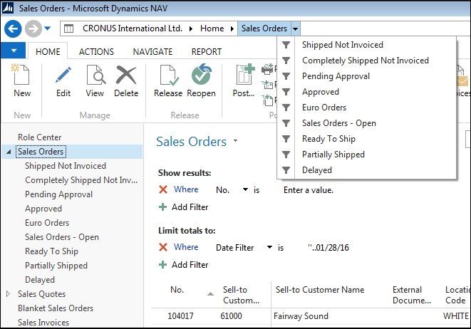
- Global Command Bar: This provides access to a general set of menu options, which varies slightly based on what is in the content area. The left-most menu in the Command Bar is accessed by clicking on the drop-down arrow at the left end of the Global Command Bar. It provides access (as shown in the next screenshot) to some basic application information and administration functions.
- FilterPane: This is where the user controls the filtering to be applied to the page display.
- Ribbon: This contains shortcut icons to actions. These same commands will be duplicated in other menu locations, but are in the Ribbon for quick and easy access. The Ribbon can be collapsed (made not visible) or expanded (made visible) under user control.
- Search Field: This allows the users to find pages, reports, or views based on the object's name (full or partial). Search finds only those objects that are accessible from the Navigation Pane.
- Navigation Pane: This contains menu options based on the active Role Center (which is tied to the user's login). It also contains activity buttons, at a minimum the Home and Departments buttons. The Departments button and its menu items are generated based on the contents of the NAV MenuSuite.
- Status Bar: This shows the name of the active company, the work date, and the current user ID. If we double-click on the company name, we can change the companies. If we double-click on the work date, we can change the work date.
- Content Area: This is the focus of the page. It may be a Role Center, a List page, or a Departments menu list.
- FactBox Pane: This can appear on the right side of certain page types (Card, List, ListPlus, Document, Navigate, or Worksheet). A FactBox can only display a CardPart, ListPart, System Part, or a limited set of predefined charts. Fact Boxes can provide no-click and one-click access to related information about the data in focus in the Content Area.