Actions are the menu items of NAV 2015. Action menus can be found in several locations. The primary location is the Ribbon appearing at the top of most pages. Other locations for actions are the Navigation Pane, Role Center Cue Groups, and the Action menu on FactBox page parts.
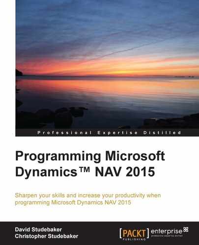
The Action Designer, where actions are defined, is accessed from the Page Designer form, by clicking View and selecting Page Actions or Control Actions (Control Actions can only be used for Role Center Cue Group actions and for NavigatePage wizard actions). When we click Page Actions (or Ctrl + Alt + F4) for the Fixed Asset page (Page 5600), we will see a list of Ribbon actions in the following screenshot as they appear in the Action Designer.
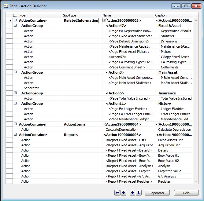
The associated Ribbon tabs for the preceding Page Action list are shown in the following images. First, the Home tab:
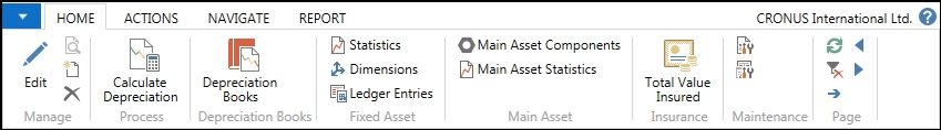
Second, the Actions tab:
Third, the Navigate tab:

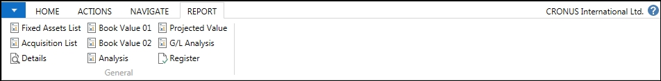
Finally, the Reports tab:
There are two default Ribbon tabs created for every Ribbon: Home and Actions. Which actions appear by default is dependent on the PageType.
Actions defined by the developer appear on a Ribbon tab and tab submenu section based on a combination of the location of the action in the Page Actions structure and the property settings of the individual action. There are a lot of possibilities, so it is important to follow some basic guidelines. These are:
- Maintain the look and feel of the standard product wherever feasible and appropriate
- On the Home tab, put the actions that are expected to be used the most
- Be consistent in organizing actions from tab to tab and page to page
- Provide the user with a complete set of action tools, but don't provide so many options that it's hard to figure out which one to use
Page Action entries can have one of four Types: ActionContainer, ActionGroup, Action, or Separator. At this time, Separators don't seem to have any effect in the rendered pages. A Page Action Type uses an indented hierarchical structure like shown in the following table:
|
Action Types |
Description |
|---|---|
|
ActionContainer |
Primary Action grouping |
|
ActionGroup |
Secondary Action grouping |
|
Action |
Action |
|
Action Group |
Secondary groups can be set up within an Action list for dropdown menus of Actions (a tertiary level) |
|
Action |
The indentation indicates this is part of a dropdown menu |
|
Separator | |
|
Action |
Action |
|
Separator | |
|
Action Group |
Back to the Secondary grouping level |
|
ActionContainer |
Back to the Primary grouping level |
An ActionContainer action line type can have one of six SubType values as shown in the following image. The SubTypes of HomeItems and ActivityButtons only apply to RoleCenter pages.
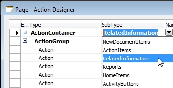
- Actions in a Reports SubType will appear on the Ribbon Reports tab, Actions in a RelatedInformation SubType will appear on the on the Ribbon Navigate tab
- Actions in an ActionItems SubType will appear on the Ribbon Actions tab
- Actions in a NewDocumentItems SubType will appear on the Ribbon in a New Documents submenu section on the Actions tab
Action Groups provide a submenu grouping of actions within the assigned tab. In the following screenshot, the Page Preview is highlighting the submenu Main Asset which is the Caption for the associated ActionGroup. In the RelatedInformation ActionContainer, we can see the other ActionGroups, Fixed Asset, Insurance, and History, matching the submenu groups on the ribbon's Navigate tab.

Following are the ActionContainer properties:
- ID: The automatically assigned unique object number of the action
- Name and Caption: Displayed in the Action Designer
- CaptionML: The action name displayed, depending on the language option in use
- Description: For internal documentation
Following are the ActionGroup properties:
- ID: The automatically assigned unique object number of the action.
- Name and Caption: Displayed in the Action Designer.
- Visible and Enabled: TRUE or FALSE, defaulting to TRUE. The Visible property can be assigned a Boolean expression, which can be evaluated during processing.
- CaptionML: The action name displayed, depending on the language option in use.
- Description: For internal documentation.
- Image: Can be used to assign an icon to be displayed. The icon source is the Activity Button Icon Library, which can be viewed in detail in the Developer and IT Pro Help.
Next is a screenshot of the Properties for an action from Page 5600 – Fixed Asset Card:

Following is an explanation of the Action properties displayed in the preceding image:
- ID: The automatically assigned unique object number of the action.
- Name and Caption: Displayed in the Action Designer.
- CaptionML: The action name displayed, depending on the language option in use.
- Visible and Enabled: TRUE or FALSE, defaulting to TRUE. The Visible property can be assigned a Boolean expression, which can be evaluated during processing.
- RunPageMode: Can be View (no modification), Edit (the default), or Create (New).
- ToolTip and ToolTipML: For helpful display to the user.
- Description: For internal documentation.
- Image: Can be used to assign an icon to be displayed. The icon source is the Action Icon Library, which can be viewed in detail in the Developer and IT Pro Help.
- Promoted: If Yes, show this action on the ribbon Home tab.
- PromotedCategory: If Promoted is Yes, defines the Category on the Home tab in which to display this action.
- PromotedIsBig: If Promoted is Yes, indicates if the icon is to be large (Yes) or small (No – the default).
- Ellipsis: If Yes, displays an ellipsis after the Caption.
- ShortCutKey: Provides a shortcut key combination for this action.
- RunObject: Defines what object to run to accomplish the action.
- RunPageView: Sets the table view for the page being run.
- RunPageLink: Defines the field link for the object being run.
- RunPageOnRec: Defines a linkage for the run object to the current record.
- InFooterBar: Places the action icon in the page footer bar. This only works on pages with the PageType of NavigatePage.
To summarize a common design choice, individual Ribbon actions can be promoted to the Home ribbon tab based on two settings. First, set the Promoted property to Yes. Second, set the PromotedCategory property to define the category on the Home tab where the action is to be displayed. This promotion results in the action appearing twice in the ribbon, once where defined in the action structure hierarchy and once on the Home tab. See the preceding screenshot for example settings assigning Depreciation Books action to the Process category in addition to appearing in the Fixed Assets category on the Navigation tab.
In the Navigation Pane on the left side of the Role Tailored Client display, there is a Home Button where actions can be assigned as part of the Role Center page definition. The Navigation Pane definition is part of the Role Center. When defining the actions in a Role Center page, we can include a group of actions in an ActionContainer group with the SubType of HomeItems. These actions will be displayed in the Home Button menu on the Navigation Pane.
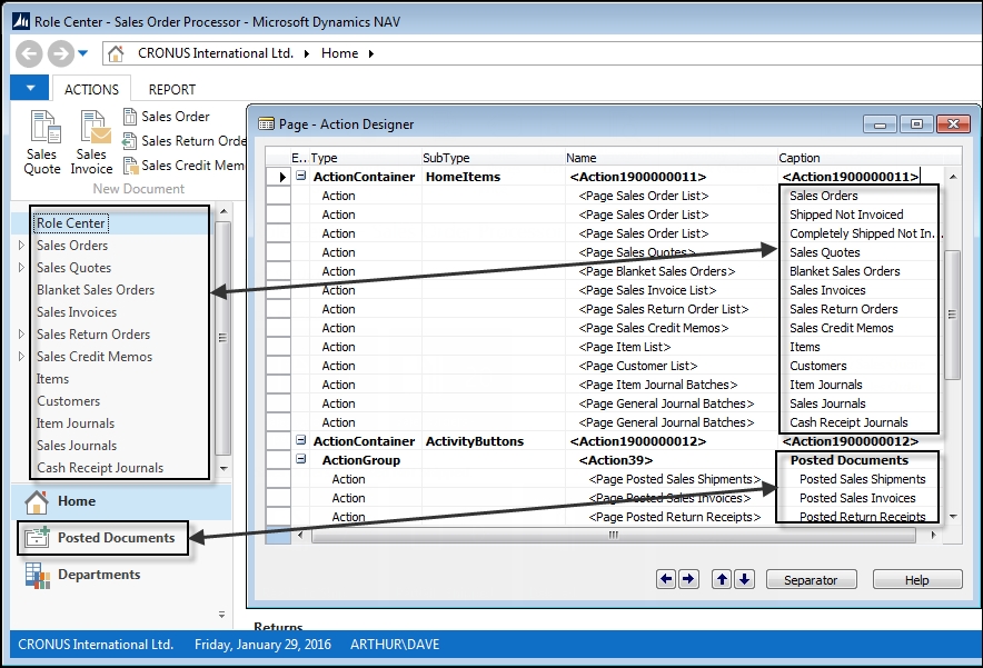
Additional Navigation Pane buttons can also be easily defined in a Role Center page action list. First, define an ActionContainer with the SubType of ActivityButtons. Each ActionGroup defined within this ActionContainer will define a new Navigation Pane Activity button. The next screenshot is a combination showing a) the RTC for the Sales Order Processor Role Center on the left, focused on the Navigation Pane, and b) the Action Designer contents that define the Home and Posted Documents buttons showing on the right.
The actions that appear on the right, which aren't visible in the Navigation Pane on the left, are in submenus indicated by the small outline arrowheads to the far left of several entries including Sales Orders and Sales Quotes. NAV will automatically do some of this grouping for us based on the pages referenced by the actions, including Cue Group Actions.
The primary location where each user's job role-based actions should appear is the Navigation Pane. The Role Center action list provides detailed action menus for the Home button and any appropriate additional Navigation Pane button. Detailed page/task specific actions should be located in the Ribbon at the top of each page.
As mentioned earlier, a key design criterion for the NAV Role Tailored Client is for a user to have access to the actions they need to get their job done; in other words, tailor the system to the individual users' roles. Our job as developers is to take full advantage of all these options, to make life easier for the user. In general, it's better to go overboard in providing access to useful capabilities, than to make the user search for the right tool or use several steps in order to get to it. The challenge is to not clutter up the first-level display with too many things, but still have the important user tools no more than one click away.