One of the key features of NAV 2015 is the Role Tailored user experience centered on Role Centers tied to user work roles. The Role Tailored approach provides a single point of entry and access into the system for each user through their assigned Role Center. The user's Role Center acts as their home page. Each Role Center focuses on the tasks needed to support its users' jobs throughout the day. Primary tasks are front and center, while the Action Ribbon and Departments Menu provide easy access to other functions only a click or two away.
The standard NAV 2015 distribution from Microsoft includes 23 different Role Center pages, identified for user roles such as Bookkeeper, Sales Manager, Shop Supervisor, Purchasing Agent, and so on (Page 9011 is identified as a Foundation rather than as a Role Center or RC). Some localized NAV distributions may have additional Role Center pages included. It is critical to realize that the Role Centers supplied out of the box are not generally intended to be used directly out of the box. Only a portion of the 23 supplied Role Center pages have been fully configured. Three of those are:
- 9004 – Bookkeeper
- 9005 – Sales Manager
- 9006 – Order Processor
The 23 Role Center pages should be used as templates for custom Role Centers tailored to the specific work role requirements of the individual customer implementation.
One of the very critical tasks of implementing a new system is to analyze the work flow and responsibilities of the system's intended users and configure Role Centers to fit the users. In some cases, the supplied Role Centers can be used with minimal tailoring. Sometimes, it will be necessary to create complete new Role Centers. Even then, we will often be able to start with a copy of an existing Role Center Page, which we will modify as required. In any case, it is important to understand the structure of the Role Center Page and how it is built.
The following screenshot shows Page 9006 – Order Processor Role Center:

The components of the Role Center highlighted in the preceding image are:
A general representation of the structure of a Role Center Page is shown in the following outline:

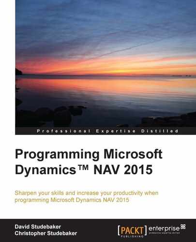
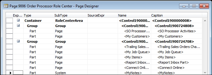
We need to understand the construction of a Role Center Page so that we are prepared to modify an existing Role Center or create a new one. First, we'll take a look at Page 9006 – Order Processor Role Center in the Page Designer.
The Role Center page layout should look familiar, because it's very similar in structure to the pages we've designed previously. What's specific to a Role Center page? There is a Container control of SubType RoleCenterArea. This is required for a Role Center page. There are two Group Controls, which represent the two columns (left and right) of the Role Center page display. Each group contains several parts, which show up individually in the Role Center display.
Role Center page properties are accessed by highlighting the first blank line on the Page Designer form (the line below all the defined controls), then clicking on the Properties icon, or we could right-click and choose the Properties option, or click on View | Properties or press Shift + F4. Note that PageType is RolieCenter, and there is no Source Table. The page properties not shown in this image are all default values:

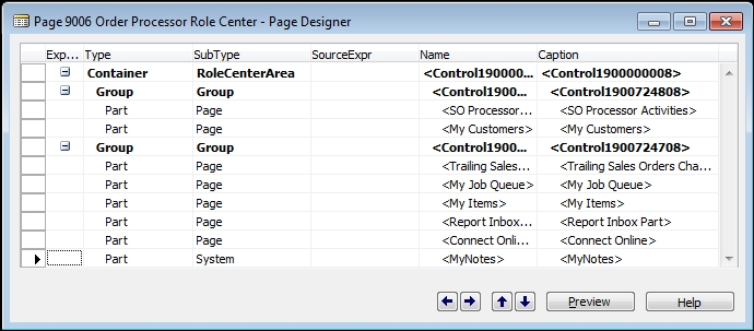
Since the Group Control has no underlying code or settings, we'll take a quick look at the first Part Control's Properties. The PagePartId property is Page SO Processor Activities.
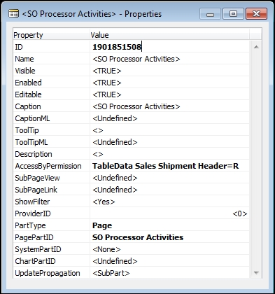
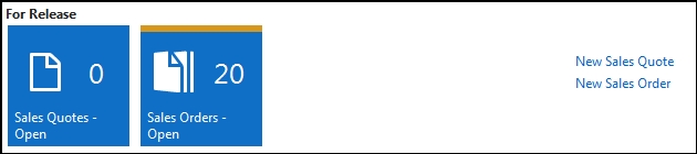
Now we'll focus on Page 9060 – SO Processor Activities. Designing that page, we see the layout shown in the next screenshot. Comparing the controls we see here to those of the Role Center, we can see this Page Part is the source of the Activities section of the Role Center Page. There are three CueGroup Controls – For Release, Sales Orders Released Not Shipped, and Returns. In each CueGroup, there are Field Controls for the individual Cues.
An individual Cue is displayed as an iconic shortcut to a filtered list through a FlowField, or to a Query or other data source through a Normal field. The stack of papers in the Cue icon resulting from a filtered value represents an idea of the number of records in that list. The actual number of entries is also displayed next to the icon (see the Sales Orders - Open example in the following screenshot). The purpose of this type of Cue is to provide a focus and single click access to a specific user task. The set of these Cues is intended to represent the full set of primary activities for a user, based on their work Role:
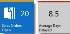
NAV 2015 provides another Cue format, like the Average Days Delayed Cue in the preceding image, which is based on a calculated value stored in a Normal field.
In the Properties of the SO Processor Activities page, we see this is a PageType of CardPart tied to SourceTable Sales Cue.

Next, we want to Design the referenced table, Sales Cue, to see how it is constructed.

As we see in the preceding image, there is a simply structured table, with an integer field for each of the action Cues and a decimal field for the information Cue, all of which were displayed in the Role Center we are analyzing. There is also a key field, two fields identified as Date Filters, and a field identified as a Responsibility Center Filter.
When we display the properties of one of these integer fields, Sales Orders - Open, we find it is a FlowField providing a Count of the Sales Orders with a Status of Open.

If we inspect each of the other integer fields in this table, we will find a similar FlowField setup. Each is defined to fit the specific Cue to which it's tied. If we think about what the Cues show (a count) and how FlowFields work (a calculation based on a range of data records), we can see this is a simple, direct method of providing the information necessary to support the Cue displays. Clicking on the action Cue (the count) then opens up the list of records being counted. The information Cue is tied to a decimal field which is computed by means of a function (shown in the following image) in the Cue table which is invoked from the Role Center page when the Cue is displayed:

The following screenshot shows the list of Cue tables. Each of the Cue tables contains a series of FlowFields and other fields that support a set of Cues. Some Cue tables service more than one of the Role Center pages:

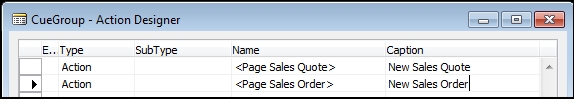
Another set of Role Center page components to analyze are Cue Group Actions. While the Cues are the primary tasks that are presented to the user, the Cue Group Actions are a related secondary set of tasks displayed to the right of the Cues.
Cue Group Actions are defined in the Role Center in essentially the same way as Actions are defined in other page types. As the name implies, Cue Group Actions are associated with a Control with the SubType CueGroup. If we right-click on the CueGroup Control, one of the options available is Control Actions (as shown in the following screenshot):

When we choose Control Actions, the Action Designer form will be displayed showing the two CueGroup actions in the For Release CueGroup in the SO Processor Role Center page. If we open Properties, we will see the "New" functionality is accomplished by setting the RunPageMode property to Create.
Now that we have covered the components of the Activities portion of the Role Center page, let's take a look at the other components.
Returning to Page 9006 in Page Designer, we examine Properties of the System Part Control. This Page Part is the one that incorporates a view of the user's Notes data into the Role Center. Looking at this control's properties, we see a PartType of System and a SystemPartID of MyNotes (which displays as My Notifications).

Let's look at the second Group in Page 9006, the Group that defines the right hand column appearing in the Role Center page. There are five Page Parts and a System Part defined.
If we look again at the display of the Role Center page generated by this layout, we will see a chart (Trailing Sales Orders), followed by two ListParts (My Items and Report InBox), and in turn followed by the System Part (My Notifications). The two Page Parts, My Job Queue and Connect Online, do not appear. These two Page Parts have been defined by the developer with the Visible property equal to FALSE, which causes them not to display unless the Role Center Page is customized by the user (or an administrator or developer) and the part added to the visible part list.

The first Page Part in the second Group provides for a Chart to display using the Chart Control Add-in included in NAV 2015. The Chart Control Add-in is documented in the Developer and IT Pro Help in Displaying Charts Using the Chart Control Add-in. In the Page 9006, the Page Part Trailing Sales Orders Chart invokes Page 760 of the same name. Looking at Page 760 in the Page Designer, we see the following layout:
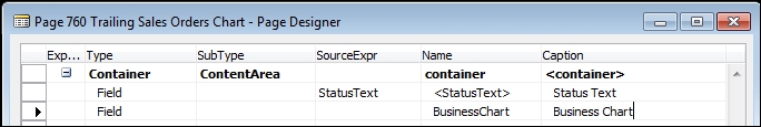
The properties of the Field named Business Chart look like the following:

Note that the property ControlAddIn contains the necessary information to access the Chart Control Add-in. This property provides access to the screen, shown in the following screenshot, where the Client Add-ins are listed that are available for use in our NAV system. An Add-in is a Microsoft .NET Framework assembly (a module external to NAV but registered with the system) that lets us add customer functionality to a NAV Windows Client. The Client Add-in screen shown next displays after clicking on the lookup arrow at the right end of the ControlAddIn property:

Three of the Page Parts in Role Center Page 9006 provide data that is specific to the individual user. They track "My" data, information important to the user who is logged in. If we Design any one of the pages, we can open the page properties to find out what table the page is tied to. Then viewing any of those tables in the Table Designer, we will see that a highly ranked field is User ID. An example is the My Item table:

The User ID allows the data to be filtered to present user specific information to each user. In some cases, this data can be updated directly in the Role Center Page Part; for example, in My Customers and My Items. In other cases, such as My Job Queue, the data is updated elsewhere and is only viewed in the Role Center Page Part. If our users needed to track other information in a similar manner, such as My Service Contracts, we could readily plagiarize the approach used in the standard Page Parts.
The last major Role Center Page components we're going to review are the Navigation Pane and the Action Ribbon. Even though there are two major parts of the Role Center Page that provide access to action choices, they both are defined in Action Designer section of Page Designer.
The display of Action Controls in a Role Center page is dependent on a combination of the definition of the controls in the Action Designer, certain properties of the page, and configuration/personalization of the page. Many of the default Role Centers provided with the product are configured as examples of possibilities of what can be done. Even if one of the default Role Centers seems to fit our customer's requirements exactly, we should create a copy of that Role Center page as another page object and reconfigure it. That way we can document how that page was set up and make any necessary tweaks.
We're going to start with Role Center Page 9006, because it is used as the default Role Center and is used in many other examples. Copy Page 9006 into Page 50020 – WDTU Role Center using the sequence Object Designer | Page | Design | File |Save As… , with a new page object ID of 50020 and object Name of WDTU Role Center.
Once we have the new page saved, in order to use this page as a Role Center we must create a Profile for the page. This is done within the Role Tailored Client (RTC) and is typically a System Administrator task. Invoke the RTC and click on the Departments menu button in the Navigator Pane. Then click on Administrator: Application Setup | Role Tailored Client | Lists: Profiles. Click on the New icon and create a new profile like the following one:

For the purpose of easy access to this Role Center for testing, we could also checkmark the Default Role Center box. Then, when we invoke the RTC, our test Role Center will be the one that displays (if no other profile is assigned to this user). Another approach to testing is to assign our User ID to use this Profile.
When we are doing development work on a Role Center, we can run the Role Center as a page from the C/SIDE Object Designer in the same way as other pages. However, the Role Center page will launch as a task page on top of whatever Role Center is configured for the active user. The Navigation Pane of the Role Center being modified will not be active and can't be tested with this approach. In order to test all the aspects of the Role Center page, we must launch it as the assigned Role Center for the active user.
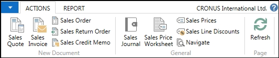
A major area where action choices are presented in a Role Center (and also in other page types) is in the ribbon. The ribbon for the standard Page 9006 – Order Processor Role Center, as delivered from Microsoft, looks like the following:

After we have created our Role Center copy, the ribbon for Page 50020 – Order Processor RC WDTU looks like the following:
When we compare the available actions in the two ribbon images, we see most of the same actions, but displayed quite a bit differently. Two of the report actions available in the standard ribbon don't show up in the Page 50020 ribbon, but if we take a look at the report tab on the ribbon, we'll see that they are available there.
If we made the same kind of analysis of some of the other default Role Centers, we would find similar results. When the page is copied to another object number, the appearance of the ribbon changes, losing detail. As it turns out, many of the default Role Centers have been manually configured by Microsoft as part of the effort to show good examples of Role Center ribbon design. Thus, we should start with a fresh copy of our Role Centers when designing for our customer, so that we know what tailoring has been done and are in control of the design.
The actions for a page are defined and maintained in Action Designer. Action Designer is accessed from within the Page Designer. Open our new Page 50020 - WDTU Role Center in the Page Designer, then either press Ctrl + Alt + F4 or View | Page Actions to open the Action Designer to view the current set of actions defined for this page.
For our newly created Page 50020, cloned from Page 9006, the Action Designer contents look like the following:

The actions enclosed in rectangles are the ones that are assigned to the ribbon. Whether or not they are actually displayed, how they are displayed, and where they are displayed are all controlled by a combination of the following factors:
- The structure of the controls within the action list
- The properties of the individual actions
- The customizations/personalizations that have been applied by the developer, administrator, or the user
The first column of each action control is the Type. In hierarchical order, the action control entries can be ActionContainer, Action Group, Action, or Separator. The specific SubType of each ActionContainer entry determines the area, Ribbon, or Navigation Pane, in which the subordinate groups of actions will appear.

If the SubType is HomeItems or ActivityButtons (Page Control SubTypes that can only be used in Role Center pages), the indented subordinate actions will appear in the Navigation Pane. All the other SubTypes (NewDocumentItems, ActionItems, and Reports) will cause their subordinate actions to appear in the Role Center Ribbon. These three SubTypes are not limited to use in Role Center pages. The SubType
RelatedInformation is not intended for use in Role Center pages, but only in other page types.
An ActionGroup control provides a grouping of actions, which will appear as a category in the Ribbon. This is one way of defining a category to display in the ribbon. For actions to appear within the category on the ribbon, those Action controls must follow the ActionGroup and be indented. If an ActionGroup is indented within a parent ActionGroup, it will generate a drop-down list of actions.
The other type of action control is the Separator. In the NAV 2015 Action Ribbon, the separator controls don't appear to do anything.
If we compare the control entries in the preceding Action Designer screenshot to the action icons that display in the screenshot of the unmodified Page 50020 ribbon, we see the following:
- The action control entries of the
NewDocumentItemsandActionItems ActionContainers appear on the Actions tab of the ribbon. ActionItems is intended for task related functions while NewDocumentItems is intended for those actions that cause a new document to be opened. - All the control entries in the
NewDocumentItems ActionContainerappear in the New Document Category in the Action Ribbon. - The control entries in the
ActionItems ActionContainerappear in the General Category of the ribbon. - One action, Refresh, is a default action that is automatically generated and assigned to the Page Category.
- All the control entries in the
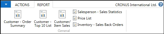
ReportsActionContainerare in the General Category on the Reports tab of the Action Ribbon.
If we were creating a Role Center to be used in a real production environment, we are likely to be defining a new Activities Page, new Cues, a new or modified Cue table, new FactBoxes, and so on. But since our primary purpose here is learning, we're going to take the shortcut of piggybacking on the existing role center and simply add our WDTU actions to the foundation of that existing role center.
There are several steps to be taken to define our WDTU Role Center Ribbon. The same end result, from the user's point of view, can be achieved using different approaches. We can also perform the development steps in different sequences. For the WDTU ribbon work, we will use the Developer tools.
The steps we need to do for our WDTU actions are:
- Define one or more new ribbon categories for the WDTU actions
- Create the WDTU action controls in the Action Designer
- Assign the WDTU action controls to the appropriate ribbon categories
- Finalize any look and feel items
Because some of the original Order Processor Role Center ribbon layout disappeared when we cloned Page 9006 to Page 50020, we will also want to recreate that layout. For this part of our ribbon definition effort, because we want to learn more ways to accomplish implementation goals, we will use the Configuration/Personalization tools.
The steps needed to replicate the Page 9006 ribbon layout are:
- Define the needed ribbon categories
- Assign the action controls to the appropriate categories
- Finalize any look and feel items
The normal sequence of defining an Action Ribbon is to complete the work that utilizes development tools, then proceed with the work that can be done by an implementer or system administrator (or even an authorized user). So we will work on the WDTU portion of the Action Ribbon first, and then follow with the work of replicating the original layout.
Let's add the following functions to the WDTU portion of the Action Ribbon:
- Radio Show List page
- Playlist page
- Radio Show Types page
- Playlist Item Rates page
- Item List (filtered for Playlist Items) page
- Record Labels page
We'll put the first two items in a category named WDTU Operations and the other four items in a category named WDTU Data Maintenance.
There are at least two ways available to set up the categories. One involves assigning values to the Page Property PromotedActionCategoriesML (which appears to be originally intended to support NAV's MultiLanguage capabilities rather than Ribbon layout customization, simply because it is using a ML property).

To enter the PromotedActionCategoriesML data shown in the preceding screenshot, first we click on the ellipsis on the property and enter the desired headings, as shown in the following image:

There are 10 PromotedActionCategoriesML slots available. The first three are assigned by default categories of New, Process, and Report, but can be renamed (the default names are retained in this example). The category slots must be referred to by their default names (New, Process, Report, Category4, Category5, …, Category10) when referred to in code. In the standard product, the CategoryN names are used in a number of pages. Category4 up through as high as Category7 are used in Pages 88 Job Card, 950 Time Sheet, 5900 Service Order, 1027 Job WIP Cockpit, 8629 Config. Wizard, and 9500 Debugger.
To add an action, access the Page – Action Designer screen, go to the bottom of the list of existing actions, add a line of Type Action, and then open the Properties screen for that line. Click on the RunObject property Value field and select the object to be run, in this case it is Page Radio Show List. Next, define the target ribbon menu category, caption, icon display size, and icon to represent this menu option.
Individual actions are assigned to appear in a specific category through the action's properties. Promoted is set to Yes and the PromotedCategory is (in this case) set to Category4 which has been assigned to display as WDTU Operations. Note that the Image property was also assigned; as a general rule, an image should be assigned for all action controls to indicate functionality to the user.

Let's do the same thing for one of our WDTU Maintenance actions, the Radio Show Types page. We'll set
Promoted to Yes, the PromotedCategory to Category5, the Caption to Radio Show Types, and the Image to Entry. The Ribbon resulting from the two actions being Promoted and assigned looks like the following image. Using this method of defining and assigning Categories causes a new Home tab to be added to the ribbon.

Another way of defining Categories and assigning actions to them is through the use of ActionGroups. This approach seems quite a bit simpler. We need to make the proper ActionGroup entries in the
Action Designer with the appropriate Action entries indented under them, as shown in the following image. We should also choose appropriate images and decide which entries should be promoted so that they stand out.

To get all our actions on the Actions tab, we must remove the Category references from the properties. The resulting Ribbon looks like the following image. Note that this time the WDTU categories and actions appear on the Actions tab and there are no entries on the Home tab:

The procedures and interface tools we use to do Configuration are also used by users to do Personalization. Both terms refer to revising the display contents and format of a Role Center as it appears to one or more users. As it says in the Help Walkthrough: Configuring the Order Processor Role Center:
We could replace the WDTU Category assignments we just made using ActionGroups by defining Categories and assigning actions using Configuration. The result would look exactly the same to our users. But instead, let's use Configuration to quickly restore the layout of the actions that were in Role Center Page 9006. We can run page 9006 to see what that layout is (or reference the earlier snapshot of the Page 9006 ribbon).
A couple of important points:
- Configuration is tied to a specific profile. Other profiles using the same Role Center page do not see the same Configuration layout.
- Configuration can only be done by the Owner of a Profile. When we created our WDTU Test Profile, we did not assign an owner so that will have to be done now.
- Profile setup can be accessed in the RTC in Departments | Administration | Application Setup | Role Tailored Client | Profiles. This can also be found by entering the word Profile in the RTC Search box. The Owner ID for a Profile can be updated there by an Administrator with sufficient Permissions.
A Role Center ribbon is configured by opening the Role Tailored Client in Configuration mode with the focus on the Profile we want to configure. Personalization doesn't require this step. This is done from the DOS Command prompt using a command line essentially similar to:
"C:Program Files (x86)Microsoft Dynamics NAV80
RoleTailored ClientMicrosoft.Dynamics.Nav.Client.exe"
 -configure -profile:"WDTU Test"
For additional information, refer to the Developer Help (either resident or in MSDN) How to: Open the Microsoft Dynamics NAV Windows Client in Configuration Mode.
Tip
In NAV 2015, there is an option field called the UI Elements Removal Tool in the NAV Server Administration tool. Depending on the setting, the system administrator can limit the accessible User Interface (UI) elements to be either only those on objects available in the license or to which the user has access permission. For more information on this feature, see the Help How to Specify When UI Elements are Removed.
Once the Role Center displays, click on the arrowhead to the right of the Microsoft Dynamics icon (1 in the following screenshot image), then on Customize option (2 in the following image), followed by the Customize Ribbon option (3 in the following image).

This will take us to the following screen:

As we can see, using the Customize Ribbon screen we can Create Groups (referred to as Categories elsewhere), add new actions to those available on the ribbon, remove actions (that is, make them not visible), reorganize ribbon entries, and even create new tabs or rename existing items. In sum, everything that we've done so far to customize the Role Center Ribbon can be done through this screen. The big difference is that Customization (a general term encompassing both Configuration and Personalization) is specific to a single profile, while the other modifications will apply to all the profiles.
As part of our Personalizing, we might use the Create Tab, Move Up, and Move Down options to rearrange the actions on the ribbon, moving the WDTU actions to their own ribbon tab. When we are done configuring the ribbon for the WDTU Test Profile, the WDTU portion might look like the following image:

The Navigation Pane is the menu list that makes up the leftmost column on a Role Center. A Navigation Pane can have two or more buttons. The required two buttons are Home and Departments.
The basic contents of the Home button for a Role Center are defined in the Action Designer in the ActionContainer of SubType HomeItems.
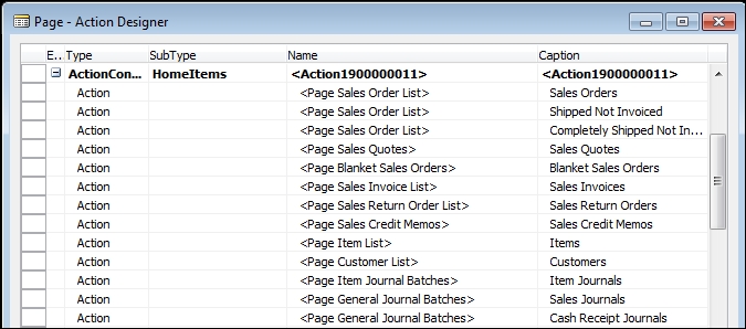
In addition to the action controls defined in the Action Designer, the Navigation Pane Home menu list includes all the Cue entries that appear in the Activities Pane of the Role Center. We can see the combined sets of action options in the following screenshot. Note that there are a number of indented (nested) options within groups such as Sales Orders, Sales Quotes, and Sales Credit Memos. These groups have been set up using the same type of Configuration tools that we just used for the ribbon:

We can access the Configuration/Personalization tools either through the arrow next to the drop down arrowhead to the left of the ribbon (as shown earlier) or through the very tiny icon at the bottom right of the Navigation Pane (highlighted by an arrow in the preceding image).
The other required Navigation Pane button, the Departments button, has its menu entries generated based on the contents of the MenuSuite object. If we click on the Departments button, a screen like the following will be displayed:

Other Navigation Pane buttons can be defined and populated by means of ActionGroup entries with the ActionContainer ActivityButtons in the Action Designer, as shown in the following screenshot:

Navigation Pane buttons can also be added, renamed, repopulated, and made not visible through the Customize Navigation Pane… option in the page Customization submenu.