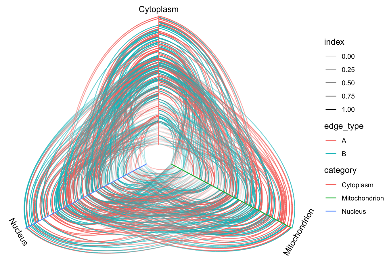
Hive plots are a nice way of plotting networks, especially when you have three node types or some sort of directional structure. You can create a hive plot out of the same sort of data we already have, like so:
ggraph(graph, 'hive', axis = 'category') +
  geom_edge_hive(aes(colour = edge_type, alpha = ..index..)) +
  geom_axis_hive(aes(colour = category)) +
  theme_void()
Here, we set up the layout type to be hive and specify the attribute on which to make the axis category. The edge description in geom_edge_hive() is pretty much like it was previously, with an alpha argument called ..index.. that adds a transparency element to the edges based on how early they are plotted. The geom node is replaced with geom_axis_hive(), in which we use aes() to map a color to the category. The resultant plot looks like this: