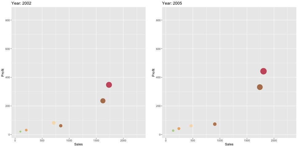
In this exercise, we have sales and profits for several companies across multiple years. We want to create a scatterplot (which shows pairs of values between sales and profit) animated through time.
- Start by installing the library:
install.packages('devtools')
devtools::install_github('thomasp85/gganimate')
- Load the necessary libraries:
# Load required package
library(gapminder)
library(ggplot2)
library(gganimate)
# Basic scatter plot
- Load the data and set the colors that will be used later:
data = read.csv("./companies.csv",stringsAsFactors = FALSE)
colors = c("A"="#AB5406","B"="#EC9936","C"="#BE1826","D"="#9B4A06","E"="#FDD6A2","F"="#9ACD62")
- Execute the ggplot function. Note that labs(), transition_time(), and ease_aes() are specific to the gganimate function, and are not ggplot elements:
p = ggplot(data, aes(Sales, Profit, size = Profit,colour=Company)) +
 geom_point(alpha = 0.7, show.legend = FALSE) +
 scale_colour_manual(values = colors) +
 scale_size(range = c(2, 12)) +
 labs(title = 'Year: {frame_time}', x = 'GDP per capita', y = 'life expectancy') +
 transition_time(Year) +
 ease_aes('linear')
- Animate, and save the output into a .gif file:
animate(p, nframes = 48, renderer = gifski_renderer("./gganim.gif"))
Here, we pick just two frames at random out of the total of 48: