
2. Computers and Color: Color by the Numbers
Computers know nothing about color except what we humans tell them. They’re just glorified adding machines that juggle ones and zeros to order. One of the many ways we use numbers on the computer is to represent color. To do that, we need some kind of mathematical model of color. Applying mathematical models to reality is always tricky, but it’s particularly so when dealing with something as slippery and subjective as color. The great mathematician, Sir Isaac Newton, made many important discoveries about color, but as far as we know he never tried to model it mathematically. Instead he went onto simpler subjects like inventing calculus and discovering the mechanical laws of the universe.
In Chapter 1, we explained that color is really something that only happens in our heads—it’s the sensation we experience in response to different wavelengths of light. When we talk about measuring color, what we’re measuring isn’t really color itself, but rather the stimulus that evokes the sensation of color—the makeup of the light hitting our retinas. We can correlate light measurements with the color people experience, but the correlation isn’t perfect.
In this chapter, we’ll examine the various number systems we use to represent color, explain what these numbers mean, and show how, without color management, the same set of numbers will produce very different colors in different situations.
Color by the Numbers
In the previous chapter, we explained how it’s possible to produce all the colors people can see using only red, green, and blue light—the “additive” primary colors. When we reproduce color on a physical device, whether it’s a monitor, a piece of transparency film, or a printed page, we do so by manipulating red, green, and blue light.
In the case of true RGB devices such as monitors, scanners, and digital cameras, we work with red, green, and blue light directly. With film and printing, we still manipulate red, green, and blue light, but we do so indirectly, using CMY pigments to subtract these wavelengths from a white background—cyan absorbs red light, magenta absorbs green light, and yellow absorbs blue light—hence the term “subtractive” primary colors. Most digital color is encoded to represent varying amounts of either R, G, and B or C, M, and Y, or, in commercial printing and some (but not all) desktop printers, C, M, Y, and K (for BlacK). (See the sidebar “Why CMYK?”)
Unfortunately, these mathematical models of color are quite ambiguous. You can think of an RGB or CMYK file as containing, not color, but rather a recipe for color that each device interprets according to its own capabilities. If you give 20 cooks the same recipe, you’ll almost certainly get 20 slightly different dishes as a result. Likewise, if you send the same RGB file to 20 different monitors, or the same CMYK file to 20 different presses, you’ll get 20 slightly (or in some cases, more than slightly) different images. You can readily see this in any store that sells television sets. You’ll see 20 televisions all lined up, of various makes and models, all tuned to the same station, and all producing somewhat different colors. They’re receiving the same recipe but their different characteristics generate different visible results. This even happens within the same make and model of television.
The RGB and CMYK models originated in the analog rather than the digital world. Neither was designed as an accurate mathematical description of color: they’re really control signals that we send to our various color devices to make them produce something that we eventually experience as color. So you should always think of RGB or CMYK numbers as tuned for a specific device.
Analog Origins
The numbers in RGB and CMYK files don’t really represent color. Instead, they represent the amounts of colorants—the things our devices use to make a color. Both RGB and CMYK were used in the analog world long before they were translated to the digital world.
CMYK printing has been around as a mass-market commercial process since the early 1920s, and until pre-press went digital in the 1970s, CMYK separations were made optically by photographing the original art through C, M, Y, and neutral-density (for the black plate) filters. The earliest scanners used analog RGB signals. The scanners’ RGB signals were typically converted directly to analog CMYK, which was used to expose film from which printing plates were made. When we started making color digitally, we simply used digital RGB and digital CMYK to mimic their analog predecessors. In short, it was the easiest way to make the transition to digital color, but not necessarily the best way.
Monitor RGB
When we display color on a monitor, we do so by spraying streams of electrons that strike phosphors. Phosphors are chemical and mineral compounds that emit light when they’re struck (the technical term is excited) by a beam of electrons. Color monitors use three different phosphors painted on the inside of the faceplate that emit red, green, and blue light, respectively. By varying the strength of the electron beam, we can make the phosphors emit more or less red, green, and blue light, and hence produce different colors (see Figure 2-1).
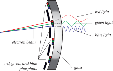
But the precise color that the monitor produces depends on the type of phosphors used, their age, the specific circuitry and other characteristics of the monitor, and even the strength of the magnetic field in which the monitor is located. All monitors’ phosphors produce something we recognize as red, green, and blue, but there are at least five quite different phosphor sets in common use, and the phosphors can vary substantially even in a single manufacturing batch. Factor in individual preferences for brightness and contrast settings, and it’s highly unlikely that any two monitors will produce the same color from the same signal, even if they’re two apparently identical monitors bought on the same day.
Scanner RGB
When we capture color with a scanner or digital camera, we do so using monochromatic light-sensitive sensors and red, green, and blue filters. Each sensor puts out a voltage proportional to the amount of light that reaches it through the filters, and we encode those analog voltages as digital values of R, G, and B. The precise digital values a scanner or camera creates from a given color sample depend on the makeup of the light source and the transmission characteristics of the filters. As with monitor phosphors, scanner and camera filters vary from vendor to vendor, and they also change with age. Scanner lamps also vary both from vendor to vendor and with age, and the light source in a digital camera capture can range from carefully controlled studio lighting to daylight that varies from exposure to exposure, or even, with scanning-back cameras, over the course of a single exposure. So it’s very unlikely that two capture devices will produce the same RGB values from the same color sample.
Printer CMYK
When we print images on paper, we usually do so by laying down dots of cyan, magenta, yellow, and black ink. In traditional halftone screens, the spacing is constant from the center of one dot to the next, but the dots vary in size to produce the various shades or tints. Many desktop printers and some commercial press jobs use different types of screening, variously known as error diffusion or stochastic screens, where each dot is the same size, and the color is varied by printing a greater or smaller number of dots in a given area (see Figure 2-2, and the sidebar, “Pixels, Dots, and Dithers,” on the next page).

But the precise color that the printer produces depends on the color of the inks, pigments, or dyes, the color of the paper stock, and the way the colorants interact with the paper, both chemically and physically. Inkjet printers commonly show color shifts over time (most obvious in neutrals) when ink and paper aren’t appropriately matched. Color laser printers and color copiers are very susceptible to humidity change. On a commercial press, the color can vary with temperature, humidity, prevailing wind, and the state of the press operator’s diet and marriage, but that’s another story! So it’s very unlikely that two different printing devices will produce the same color from the same set of CMYK values.
Digital Evolutions
The point of the previous section is that RGB and CMYK are fundamentally analog concepts—they represent some amount of colorants: the dyes, inks, phosphors, or filters we use to control the wavelengths of light. RGB devices such as televisions, monitors, scanners, and digital cameras to this day, and for the forseeable future, all have analog components—things that work in terms of continuous voltages: magnets, lenses, mirrors, and phosphors and filters baked in chemical labs. CMYK printers still deal with the idiosyncracies of chemical inks, dyes, and pigments on sheets of mashed wood pulp that we call “paper.”
However, RGB and CMYK numbers are nevertheless ... numbers. This has made them ripe for adoption into the digital age where numbers themselves take the form of bits and bytes (see “How the Numbers Work,” on the next page).
Over the years we’ve seen more and more analog components replaced by digital. The Darwinian force that drives this evolution is, very simply, money. Digital components are faster, cheaper, and (most importantly from the point of view of color management) repeatable and predictable. All of these benefits translate directly into monetary savings.
But keep in mind two things about this evolution. First, it’s incremental. Companies usually produce products that are small improvements over previous technologies—despite what their marketing brochures say. New products and subcomponents of products must coexist with old, and new technologies must be usable by people who have worked with old components for years. Second, because of this incremental evolution, digital RGB and CMYK are often designed to mimic their analog predecessors. The result has been that digital color-reproduction equipment often has odd little idiosyncracies that might not be there if the things had been designed from the ground up to be digital, or mostly digital, devices.
An example is the evolution of the imagesetter, the output device that generates the film used to image plates for offset lithography. Imagesetters evolved from the analog methods of imaging film using photographic techniques—for example, projecting a photographic negative through a fine screen to produce a halftone image (hence the terms “screening” and “screen frequency”). This analog photographic process was replaced by computers controlling lasers that precisely exposed the film microdot by microdot, but these imagesetters still needed traditional analog darkroom equipment, chemistry, and photographically skilled technicians to develop the film. However, bit by bit, even the darkroom processing was replaced by digitally controlled processor units that control all aspects of film development.
But why did we need film at all? Because extremely expensive (and therefore not expendable) printing presses had almost as expensive platemakers that required film for platemaking, and because creating an analog proof from the film was the only affordable method in place for creating a contract between the print client and printer (premium jobs sometimes use actual press proofs—in effect, separate press runs for proofing only—but they’re brutally expensive). Nowadays, however, as platemaking and digital proofing technologies become more reliable, film itself is being skipped (with obvious cost benefits), and the digital process is being extended from the computer right up to the platesetter itself, even including digital platemakers that image the plates right on the press rollers.
What does all this mean for digital RGB and CMYK numbers and color management? It means that all the digital computation and control of the numbers exercised by color management are only as good as their ability to model the behavior of analog components. Digital color management alters the numbers to compensate for the behavior of the various analog components. As such, the strengths and weaknesses of color management lie entirely in how well our digital manipulations model the behavior of the analog parts, including that most important analog “device” of all, the viewer’s eye.
In a moment we’ll examine the key parameters that describe the analog behavior of color-reproduction devices. But first, we should examine the digital part of digital color—the numbers—a bit more closely.
How the Numbers Work
Let’s pause for a moment and examine the systems we use for representing—or, more accurately, encoding—colors as numbers in a computer. We’ll take this the opportunity to clarify a few points that often confuse people about the basics of digital color, which propagates into confusion about color management. Even if you’re extremely familiar with the basics of bits, bytes, tones, and colors, this section is worth reviewing as we make a few key points about the difference between colors-as-numbers and colors as “Real World” experiences.
The system computers use for encoding colors as numbers is actually quite simple: colors are comprised of channels, and each channel is subdivided into tone levels. That’s it! We start with a simple model of color perception—the fact that colors are mixtures of red, green, and blue in various intensities—and then we adapt this model for efficient storage, computation, and transportation on computers. The number of channels in our encoding system is usually three, to correspond to our basic three-primary way of seeing colors. The number of tone levels in our encoding system is usually 256, to correspond to the minimum number of tone levels we need to create the illusion of continuous tone—to avoid the artifacts known as banding or posterization, where a viewer can see noticeable jumps between one tone level and the next (see Figure 2-3).
Figure 2-3 Levels and posterization

Why 256 Levels?
This number, 256, seems arbitrary and mysterious to some people, but it crops up so many times in computers and color that it’s worth making your peace with it. It’s not that mysterious. We want to be able to represent enough tone levels so that the step from one tone level to the next is not visible to the viewer. It turns out that the number of tone levels needed to produce the effect of a smooth gradient is about 200 for most people. So why not encode only 200 levels? Why 256? For two reasons.
Headroom
It’s useful—in fact, essential for color management—to have some extra tone levels in our data so that the inevitable losses of tone levels at each stage of production (scanning, display, editing, conversion, computation, printing) don’t reintroduce banding.
Bits
The second reason is just that we use bits to represent these tone level numbers. Seven bits would let us encode only 128 tone levels (27), which would be a surefire way to get banding in our skies and blotches on the cheeks of our fashion models. Eight bits lets us encode 256 tone levels (28), which gives us just enough, plus a little headroom. The third reason we go with eight bits is that computer storage is already organized in terms of bytes, where a byte is a unit of exactly eight bits. This quantity of eight bits is already so useful—for example, it’s perfect for storing a character of type, which can be any of 256 letters and punctuation marks in a western alphabet—that it seems a cosmic coincidence that a byte is also the perfect amount of memory to encode tone levels for the human visual system. Engineers love those cosmic coincidences!
Millions of Colors
So 8-bit encoding, with its 256 tone levels per channel, is the minimum number of bits we want to store per channel. With RGB images, storing eight bits for each of the three channels gives us 24 bits total (which is why many people use the terms “8-bit color” and “24-bit color” interchangeably to mean the same thing). The number of colors encodable with 256 tone levels in each of three channels is 256 × 256 × 256, or (if you pull out your calculator) about 16.8 million colors! Quite a lot of encodable colors for our 24 bits (or three little bytes) of storage!
Although this basic 3-channel, 8-bit encoding is the most common because it’s based on human capabilities, we can easily expand it as needed to encode more colors for devices other than the human eye, either by adding channels or by increasing the number of bits we store for each channel. For example, when we’re preparing an image for a CMYK printer, we increase the number of channels from 3-channel to 4-channel encoding, not because we need more encodable colors (in fact, we need fewer) but because it’s natural to dedicate a channel to each of the four inks.
Similarly, we often go from 8-bit to 16-bit encoding when saving images captured with a scanner capable of discerning more than 256 levels of RGB (the so-called “10-bit,” “12-bit,” and “14-bit” scanners—although, because we store files in whole bytes, there are no 10-bit, 12-bit, or 14-bit files, only 8-bit or 16-bit files).
A key point to remember is that this is all talking about the number of encodings, the set of numeric color definitions we have available. But just as in the San Francisco Bay Area there are far more telephone numbers than there are actual telephones, with computer color the number of encodable colors far exceeds the number of reproducible colors. In fact, it far exceeds the number of perceivable colors. And even if we make devices such as high-end scanners that can “perceive” more tone levels than the human eye, we can always expand our encoding model to handle it. All that matters is that each perceivable color has a unique encoding, so there are always more encodable colors than we need—just as the phone company must ensure that every telephone has a unique telephone number, so it had better have more telephone numbers than it really needs.
We make this point because it’s a key step to understanding the difference between colors as abstract numbers and how those numbers are actually rendered as colors by “Real World” devices—printers, monitors, scanners, etc. When you look at how those numbers are actually interpreted by a device, the number of actual “Real World” colors, drops dramatically! (See the sidebar “Color Definitions and Colors.”)
So while it’s useful to understand how the numbers work—why we see numbers like 256 or 16.8 million crop up everywhere—don’t forget that they’re just numbers ... until they’re interpreted by a color device as colors.
In the next section we’ll look at what gives the numbers a precise interpretation as colors. These are the analog parts of our color devices, the things that color management systems need to measure to know how to turn number management into color management.
Why the Numbers Vary
In the coming chapters we’ll look at the specifics of measuring the behavior of display devices (monitors), input devices (scanners and digital cameras), and output devices (printers and proofing systems), but here we’ll look briefly at the basic parameters that vary from device to device.
All devices vary in certain basic parameters. These are the things you’ll measure if you are making your own profiles, and which must remain stable for your color management system to work effectively.
The three main variables are
• The color and brightness of the colorants (primaries).
• The color and brightness of the white point and black point.
• The tone reproduction characteristics of the colorants.
These concepts aren’t new to color management or unique to digital devices. They’re all variables introduced by analog components like inks on paper, phosphors and analog voltages in monitors, and filtered sensors in scanners. While digital components rarely vary much, analog components vary a great deal in design, manufacturing, and condition.
Colorants (Primaries)
The first, most obvious factor that affects the color a device can reproduce are the colorants it uses to do so. On a monitor, the primaries are the phosphors. In a scanner or digital camera, the primaries are the filters through which the sensors see the image. In a printer, the primaries are the process inks, toners, or dyes laid down on the paper, but, because the subtractive color in CMYK printers is a bit more complicated than the additive color in RGB monitors, we usually supplement measurements of the primaries with measurements of the secondaries (the overprints—Magenta+Yellow, Cyan+Yellow, and Cyan+Magenta) as well (see Figure 2-4).
Figure 2-4 Subtractive primary and secondary colors

The exact color of the colorants determines the range of colors the device can reproduce. This is called the color gamut of the device. We care not only about the precise color of the primaries, but also how bright they are. In technical terms we often refer to the density of the primaries, which is simply their ability to absorb light.
White Point and Black Point
Besides the primaries, the other two points that define the gamut and hence need to be measured and monitored in a device are the white point and black point. Books (and people) often talk about the white point and black point in very different terms: with the white point, they’re usually concerned with the color of white, while with the black point they’re more concerned with the density (the darkness) of black. In fact, we can talk about both color and density of either the white point or the black point—the difference is only a matter of emphasis. With the white point, the color is more important than its density, and with the black point, the density is more important than its color.
The color of the white point is more important than its density because the eye uses the color of this white as a reference for all other colors. When you view images, the color of white on the monitor or the color of the white paper on a printed page affects your perception for all the other colors in the scene. This white point adaptation is an instantaneous and involuntary task performed by your eye, so the color of white is vital. This is why, as we’ll see in Chapter 6, we often sacrifice some brightness during monitor calibration to get the color of the white point correct. Similarly, when looking at a printed page, it’s important to remember that the color of the white point is determined as much by the light that illuminates the page as by the paper color itself.
With black point the emphasis shifts toward density as a more important variable than color. This is because the density of black determines the limit of the dynamic range, the range of brightness levels that the device can reproduce. Getting as much dynamic range as possible is always important, as this determines the capacity of the device to render detail, the subtle changes in brightness levels that make the difference between a rich, satisfying image and a flat, uninteresting “mistake.”
On a monitor, we try to calibrate so that we get just enough brightness differences near the bottom end to squeeze some extra detail out of our displayed shadows.
On a printer, we can improve both the color and the density of the black point by adding our friend K to the CMY colorants. Adding K lets us produce a more neutral black point than we could with our somewhat impure C, M, and Y inks, and using four inks rather than three gets us much denser (darker) blacks than we could using only C, M, and Y.
On a scanner, the software lets you change the density of the white and black points from scan to scan either manually or automatically, but for color management we need to use a fixed dynamic range, so we generally set the black and white points to the widest dynamic range the scanner can capture.
Measuring the color and density of the white and black points is usually one of the steps in preparing to use any device in a color management system. You also need to watch out for changes in these values over time, so that you know when to adjust either the device itself, or your color management system, accordingly.
Tone Reproduction Characteristics
Measuring the precise color and density of the primaries, white point, and black point is essential, but these points only represent the extremes of the device: the most saturated colors, the brightest whites, and the darkest darks. To complete the description of a device, the color management system also needs to know what happens to the “colors between the colors” (to paraphrase a well-known desktop printer commercial).
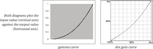
There are several ways to measure and model devices’ tone-reproduction characteristics. The simplest, called a tone reproduction curve (TRC), defines the relationship between input values and resulting brightness values in a device. Most analog devices have similar curves that show gain (increase) in the darkness levels that affect the midtones most and taper off in the hightlights and shadows. In monitors, scanners, and digital cameras this is called a gamma curve. Printers exhibit a slightly different dot gain curve, but the two are similar (see Figure 2-5).
Figure 2-5 Tone reproduction curves
Some printers have much more complicated tonal responses that can’t be represented adequately by a simple curve. In these cases, we use a lookup table (LUT), which records representative tonal values from light to dark.
When you take measurements in the process of calibrating or profiling a device for color management, you’re measuring the tone-reproduction characteristics of the device as well as the primaries and black/white points. You should try to get a feel for the things that can alter these tonal characteristics—such as changing to a different paper stock, or adjusting the contrast knob on your monitor—because when a device’s tone-reproduction characteristics change, you’ll have to adjust your color management system to reflect the changes.
Device-Specific Color Models
We call RGB and CMYK device-specific or device-dependent color models, because the actual color we get from a given set of RGB or CMYK numbers is specific to (it depends on) the device that’s producing the color. Put simply, this means two things:
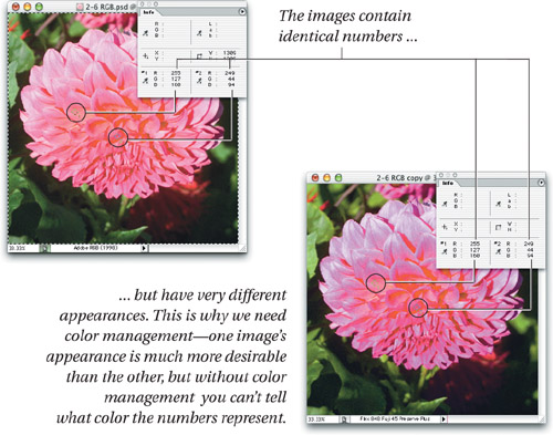
• The same set of RGB or CMYK numbers will produce different colors on different devices (or on the same device with different paper, if it’s a printer or a press—see Figure 2-6).
Figure 2-6 Same numbers, different color
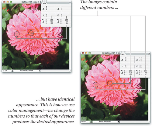
• To produce the same color on different devices, we need to change the RGB or CMYK numbers we send to each device—see Figure 2-7.
Figure 2-7 Same color, different numbers
The problems we face as a consequence are
• How do we know what color the numbers in an RGB or CMYK file are supposed to represent? In other words, what does “255, 0, 0” mean? Yes, it means “red,” but precisely what red? The red of your monitor, or Chris’s or Fred’s? The red sensor in your scanner or Bruce’s digital camera?
• How do we know what RGB or CMYK numbers to send to a device to make it produce a desired color? In other words, even if we know precisely what “red” we’re talking about, what RGB numbers do we send to Chris’s monitor, or what CMYK percentages do we send to Fred’s color laser printer to reproduce that precise red ... if it’s possible to reproduce it at all?
Color management systems allow us to solve both problems by attaching absolute color meanings to our RGB and CMYK numbers. By doing so, the numbers cease to be ambiguous. Color management allows us to determine the actual color meaning of a set of RGB or CMYK numbers, and also lets us reproduce that actual color on another device by changing the numbers we send to it. But to do so, color management has to rely on a different kind of numerical model of color, one that’s based on human perception rather than device colorants.
Device-Independent Color Models
Fortunately, we have several numerical models of color that are device-independent. Instead of using the numbers required to drive a particular device to produce color, device-independent color models attempt to use numbers to model human color perception directly.
The device-independent color models in current use are based on the groundbreaking work we mentioned in Chapter 1 by a body of color scientists and technicians known as the Commission Internationale de l’Eclairage, or CIE—in English, the name means “International Commission on Illumination”—and the CIE is the international standards body engaged in producing standards for all aspects of light, including color.
In 1931, the CIE produced a mathematical model of color with the formidable-sounding name CIE XYZ (1931). This model was unique in that it tried to represent mathematically the sensation of color that people with normal color vision would experience when they were fed a precisely defined stimulus under precisely defined viewing conditions. Since that original work was done, the CIE has produced a wild alphabet soup of color models with equally opaque names—CIE LCh, CIELUV, CIE xyY, CIELAB, and so on, all of which are mathematical variants of CIE XYZ.
You don’t need to know the differences between the various models in order to use color management effectively. In fact, outside of measuring the colors a device produces as part of the profiling process, you needn’t deal with any of the CIE models directly. But it is important to understand the distinction between device-dependent models like RGB and CMYK, and device-independent models like CIE XYZ and CIELAB.
RGB and CMYK just tell machines how much colorant to use: they tell us nothing about the actual color the machines will produce in response. The CIE models describe the specific color that someone with normal color vision would see under very precisely described viewing conditions, but tell us nothing about what we need to do to make a particular monitor, scanner, or printer produce that color. To manage color in the real world, we need to use both device-independent and device-specific color models.
CIE LAB
The CIE color model you’re most likely to interact with is CIE LAB (LAB). You can actually save images in the LAB model, and edit them in Adobe Photoshop, Heidelberg’s LinoColor, and several other applications. LAB also plays a central role in color management, as you’ll learn in the next chapter.
If you’ve ever tried editing a LAB file in Photoshop, you’ve probably concluded that LAB is not the most intuitive color space around. It is, however, based on the way our minds seem to judge color. It uses three primaries, called L* (pronounced “L-star”), a*, and b*. L* represents lightness, a* represents how red or green a color is, and b* represents how blue or yellow it is. (Remember, red-green and blue-yellow are opponent colors—they’re mutually exclusive. There’s no such thing as a greenish-red or a bluish-yellow.)
LAB, by definition, represents all the colors we can see. It’s designed to be perceptually uniform, meaning that changing any of the primaries by the same increment will produce the same degree of visual change. In practice, it’s not perfect, but it is pretty darn good, and more to the point, nobody has as yet presented an alternative that is both a clear improvement and can be implemented using the computing power available on today’s desktop. Many of the problems we have with LAB stem from the fact that we use it to do things for which it was never intended (see the sidebar, “LAB Limitations”).
Despite its flaws, CIE LAB allows us to control our color as it passes from one device to another by correlating the device-specific RGB or CMYK values with the perceptually based LAB values that they produce on a given device. LAB acts as a form of universal translation language between devices, or, as Bruce is wont to say, “a Rosetta stone for color.” It allows us to express unambiguously the meaning of the colors we’re after.
At some point in your color management travails, you’ll almost certainly run into a situation where CIE colorimetry says that two colors should match, but you see them as being clearly different. LAB does have some inherent flaws. It’s not as perceptually uniform as it’s supposed to be. It also assumes that colors along a straight hue-angle line will produce constant hues, changing only in saturation. This assumption has proved false, particularly in the blue region, where a constant hue angle actually shifts the hue toward purple as blue becomes less saturated. But it’s also helpful to bear in mind the purpose for which LAB was designed.
The design goal for LAB was to predict the degree to which two solid color samples of a specific size, on a specific background color, under very specific lighting, at a specific viewing distance and angle, would appear to match to someone with normal color vision. It was never designed to take into account many of the perceptual phenomena we covered in Chapter 1, such as the influence of surround colors. Nor was it designed to make cross-media comparisons such as comparing color displayed on a monitor with color on reflective hard copy.
Yet color management systems try to make LAB do all these things and more. When we color-manage images, we do so pixel by pixel, without any reference to the surrounding pixels (the context) or the medium in which the pixels are finally expressed (dots of ink on paper or glowing pixels on a monitor). So it’s not entirely surprising that the model occasionally breaks down. If anything, it’s surprising that it works as well as it does, considering the limited purpose for which it was designed.
The good news is that the theory and practice of color management are not dependent on LAB, even though most color management systems today use LAB as the computation space. The basic theory stays the same and the practice—the “Real World” part of this book—does not depend too much on the computation model. As developers come up with fixes and workarounds to LAB’s flaws, as well as alternative color models, they can just swap out LAB like an old trusty car engine that has served us well. In the meantime, LAB continues to be the worthy workhorse of the color-management industry.

But there’s another aspect to the device-dependence problem that color management addresses.
Mismatching—the Limits of the Possible
We use color management to reproduce faithfully the colors in our source file on one or another target device—a monitor, a printer, a film recorder, or a commercial press. But it’s often physically impossible to do so, because each of our devices is limited by the laws of physics as to the range of tone and color it can reproduce.
Device Limitations—Gamut and Dynamic Range
All our output devices (both printers and monitors) have a fixed range of color and tone that they can reproduce, which we call the devices’ color gamut. The gamut is naturally limited by the most saturated colors the device has to work with, its primaries. You can’t get a more saturated red on a monitor than the red of the monitor’s phosphor. You can’t get a more saturated green on a printer than you can get by combining solid cyan and yellow ink.
Output devices (printers and monitors) also have a finite dynamic range—the range of brightness differences they can reproduce. On a monitor the darkest black you can display is the black that results if you send RGB value 0,0,0 to the monitor (which, if you have turned the brightness control too high, may be quite a bit brighter than all the phosphors completely off). The brightest white on a monitor is the white you get when all three phosphors (R, G, and B) are glowing at maximum—although you usually have to calibrate your monitor to a less-bright white point in order to get a more color-accurate white. On a printer, the brightest white you can render is the whiteness of the paper, and the darkest black is the highest percentages of the four inks you can print on top of each other without resulting in a soggy mess (usually considerably less than all four inks at 100%).
Input devices (scanners and digital cameras) don’t have a color gamut because there is no sharp boundary between colors that they can “see” and colors that they can’t—no matter what you put in front of them, they’re going to see something. Instead, we say they have a color mixing function, the unique mixture of red, green, and blue values that they will produce for each color sample. This leads to a problem known as scanner metamerism, which we described in Chapter 1, but is not the same as the gamut issue we are describing here.
However, although scanners don’t have a specific gamut, we can often think of the effective “gamut” of the materials—usually photographic prints or transparencies—that you scan with the scanner, and this effective gamut is usually much wider than any output device you will be using to reproduce these scans. Digital cameras don’t have a fixed gamut since they capture color directly from the real world and have to cope with it in all its multi-hued glory. This makes them tricky to profile.
Although input devices don’t have a fixed gamut, they do have a fixed dynamic range, the range of brightness levels in which the scanner or digital camera can operate and still tell brightness differences. Below a certain level of darkness—or density—a scanner or digital camera can no longer distinguish between brightness levels, and just returns the value 0, meaning “man, that’s dark!” Similarly, above a certain level of brightness, the device can’t capture differences in brightness—rarely a problem with scanners, but all too common with digital cameras. Input devices typically have a wider dynamic range than we can reproduce in our output.
This difference between device gamuts and dynamic ranges leads to a problem. If our original image has a wider dynamic range or a wider color gamut than our output device, we obviously can’t reproduce the original exactly on that output device.
There’s no single “correct” solution to this problem of variable gamuts and dynamic ranges. You “can’t get theah from heah,” as they say in New England, so you have to go somewhere else instead.
Tone and Gamut Mapping
The dynamic range of our printers, be they desktop color printers, film recorders, or printing presses, is limited by the brightness of the paper at the highlight end, and by the darkest black the inks, dyes, or pigments can produce on that paper at the shadow end. A film recorder has a wider dynamic range than an inkjet printer, which in turn has a wider dynamic range than a printing press. But none of these output processes comes close to the dynamic range of a high-end digital camera. Even a film recorder can’t quite match the dynamic range of film exposed in a camera. So some kind of tonal compression is almost always necessary.
Similarly, a film recorder has a larger gamut than an inkjet printer, which again has a larger gamut than a printing press, and the gamuts of all three are smaller than the gamut of film, so we need some strategy for handling the out-of-gamut colors.
Gamut size isn’t the only problem. We typically think of a monitor as having a larger gamut than CMYK print, and this is true, but monitor gamuts don’t wholly contain the gamut of CMYK print. Even though the monitor has a larger gamut, there are some colors we can produce with CMYK ink on paper that monitors simply can’t display, particularly in the saturated cyans and the blues and greens that lie adjacent to cyan. So the mismatches between various device gamuts can be as much due to the shapes of those gamuts as to their size—see Figure 2-9.
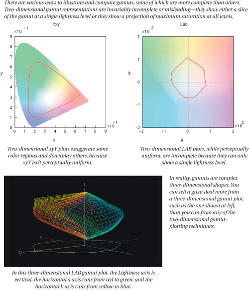
Figure 2-9 Gamut plots, gamut sizes, and gamut mismatches
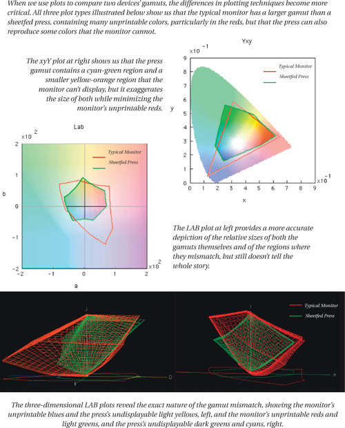

Color management systems use various gamut-mapping strategies that let us reconcile the differing gamuts of our capture, display, and output devices, but it’s important to recognize that not only is there no “correct” way to handle out-of-gamut colors, it’s also pretty unlikely that any gamut-mapping strategy, or any automatic method of compressing tone and color, will do equal justice to all images. So color management doesn’t remove the need for color correction, or the need for skilled humans to make the necessary decisions about color reproduction. As we’ve said before, perception of color is uniquely human, and its judgment is decidedly human as well. What color management does do is to let us view color accurately and communicate it unambiguously, so that we have a sound basis on which to make these judgements.
A good many tools are available for visualizing gamuts in both two and three dimensions, but the one we always keep coming back to is Chromix ColorThink, developed by our friend and colleague Steve Upton. (We used it to make most of the gamut plots that appear in this book.) If you’re the type who finds a picture worth a thousand words, and you’d like to be able to see representations of device gamuts and color conversions, we think you’ll find that ColorThink’s graphing capabilities alone are worth the price of admission (though it does many other useful things too). It’s available at www.chromix.com.
One final point about gamuts: a device’s color gamut isn’t the same thing as a device’s color space. The gamut simply represents the limits—the whitest white, the blackest black, and the most saturated colors of which the device is capable. A device’s color space includes not only the gamut boundary, but also the tonal information that tells you what goes on inside that boundary. For example, a newspaper press will likely have a fairly large discontinuity between paper white and the lightest actual color it can lay down, because newsprint can’t hold small dots of ink. That fact isn’t conveyed by the gamut, but is a property of the device space. So the gamut is one of the important properties of a device’s color space, but not the only important property.
Color Is Complex
If all this sounds dauntingly complicated, that’s because we’re laying out the complexity of the issues color management must address. Actually using a color management system isn’t that complicated, despite what sometimes seems like a conspiracy on the part of applications vendors to make it appear that way. But if you don’t understand the underpinnings of color management, it may seem like magic. It isn’t magic, it’s just some pretty cool technology, and in the next chapter we’ll look in detail at how color management actually performs the complex tasks of changing the numbers in our files to make the color consistent.