
3. Color Management: How It Works
For 1400 years, reading Egyptian hieroglyphics was a lost art. In 1799, a chance discovery by a soldier in Napoleon’s conquering army changed all that. The Rosetta stone, as his find was named, allowed the brilliant French linguist Jean François Champollion to unlock the secret of hieroglyphics because it contained the same text in three different scripts, hieroglyphics, demotic script, and Greek, the last two of which were already known.
Depending on your background and training, RGB or CMYK numbers may seem about as comprehensible as Egyptian hieroglyphics: fortunately, thanks to the work of the CIE that we introduced in Chapter 1, color management is able to use the perceptually based CIE LAB and CIE XYZ color spaces as a Rosetta stone for color, letting us translate our color from one set of device-specific RGB or CMYK numbers to another.
In Chapter 2 we broke the sad news that the numerical systems we most often use for representing color on our computers—RGB and CMYK—are fundamentally ambiguous. They aren’t descriptions of color. Instead, they’re control signals, or instructions, that make devices like monitors and printers produce something that we can experience as color. In this chapter we’ll discuss how a color management system (CMS) works to reconcile the RGB and CMYK control signals with the perceptually based CIE numbers.
Color management systems have to perform two critical tasks:
• They have to figure out what perceived colors our RGB and CMYK numbers represent.
• They have to keep those colors consistent as we go from device to device.
Most discussions of color management focus on the second task, but it’s important to realize that until you do the first, the second is impossible—you can’t match a color until you know what it is! It’s also useful to set realistic expectations—see the sidebar, “The WYSIWYG Myth,” later in this chapter.
The details of implementing color management and using it in our applications can be insanely complex, since each application vendor seems to insist on developing its own unique interface and terminology, but the fundamental workings of color management systems are relatively simple. Color management systems really do only two things:
• They attach a specific color meaning to our RGB or CMYK numbers, making them unambiguous. With color management, we always know what color a given set of numbers represents.
• They change the RGB or CMYK numbers that we send to our various devices—a monitor display, an inkjet printer, an offset press—so that each produces the same colors.
Some CMS implementations may appear to do more complicated things, but on closer examination, anything a CMS does always boils down to a combination of these two tasks. In Part III of this book we’ll discuss the many ways you can use a CMS, but in this chapter we’ll look at what a CMS actually does.
Once you understand what a CMS really does, you’ll find that it’s a lot easier to wade through all the various menus and dialog boxes that applications use to control color management. First, though, let’s look briefly at why we need color management in the first place.
The Genesis of Color Management
In the old days, life was a lot simpler. We didn’t need color management in what we might call the one-input-one-output workflow. All images were scanned by a professional operator using a single scanner producing CMYK tuned to a single output device. Spot colors were handled either by mixing spot inks or by using standard CMYK formulas in swatch books. Accurate monitor display was unheard of. The system worked because the CMYK values the scanner produced were tuned for the output device, forming a closed loop that dealt with one set of numbers.
Fast-forward to the third millennium. For input, we now have not only high-end drum scanners, but also high-end flatbed scanners, desktop flatbeds, desktop slide scanners, and digital cameras. On the output end, we not only have more diverse web and sheetfed presses with waterless inks, soy inks, direct-to-plate printing, and HiFi color, but also digital proofers, flexography, film recorders, silk screeners, color copiers, laser printers, inkjets, and even monitors as final output devices. This diversity breaks the old closed-loop workflow into a zillion pieces.
The result is a huge number of possible conversions from input to output devices (see Figure 3-1). Instead of one input and one output device, today we have to deal with a very large number (which we’ll arbitrarily label m) of input devices and an equally large number (which we’ll arbitrarily label n) of output devices. With an m-input/n-output workflow, you need n×m different conversions from input to output. We’ll let you do the math, but if you have more than a handful of inputs or outputs, which most of us do, things quickly become unmanageable.
Figure 3-1 n×m input to output conversions

The ingenious solution provided by color management is to introduce an intermediate representation of the desired colors called the profile connection space, or PCS. The role of the PCS is to serve as the hub for all our device-to-device transformations. It’s like the hub city for an airline. Rather than have separate flights from 10 western cities (San Francisco, Seattle, Los Angeles, etc.) to 10 eastern cities (Boston, Atlanta, Miami, etc.) for a total of a hundred flights, the airline can route all flights through a major city in the middle, say Dallas, for a total of only 20 flights.
The beauty of the PCS is that it reduces the m×n link problem to m + n links. We have m links from input devices to the PCS, and n links from the PCS to the various output devices (see Figure 3-2). We need just one link for each device.
Figure 3-2 n+m input to output conversions

Each link effectively describes the color reproduction behavior of a device. This link is called a device profile. Device profiles and the PCS are two of the four key components in all color management systems.
The Components of Color Management
All ICC-based color management systems use four basic components:
• PCS. The profile connection space allows us to give a color an unambiguous numerical value in CIE XYZ or CIE LAB that doesn’t depend on the quirks of the various devices we use to reproduce that color, but instead defines the color as we actually see it.
• Profiles. A profile describes the relationship between a device’s RGB or CMYK control signals and the actual color that those signals produce. Specifically, it defines the CIE XYZ or CIE LAB values that correspond to a given set of RGB or CMYK numbers.
• CMM. The CMM (Color Management Module), often called the engine, is the piece of software that performs all the calculations needed to convert the RGB or CMYK values. The CMM works with the color data contained in the profiles.
• Rendering intents. The ICC specification includes four different rendering intents, which are simply different ways of dealing with “out-of-gamut” colors—colors that are present in the source space that the output device is physically incapable of reproducing.
The PCS
The PCS is the yardstick we use to measure and define color. As we hinted earlier in this chapter, the ICC specification actually uses two different spaces, CIE XYZ and CIE LAB, as the PCS for different profile types. But unless you’re planning on writing your own CMS, or your own profile-generation software (in which case you’ll need to learn a great deal more than the contents of this book) you needn’t concern yourself greatly with the differences between the two. The key feature of both CIE XYZ and CIE LAB is that they represent perceived color.
It’s this property that makes it possible for color management systems to use CIE XYZ and CIE LAB as the “hub” through which all color conversions travel. When a color is defined by XYZ or LAB values, we know how humans with normal color vision will see it.
Profiles
Profiles are conceptually quite simple, though their anatomy can be complex. We’ll look at different kinds of profiles in much more detail in Chapter 4, All About Profiles, (or for a truly geek-level look at the contents of profiles, see Appendix A, Anatomy of a Profile). For now, though, we’ll concentrate on their function.
A profile can describe a single device, such as an individual scanner, monitor, or printer; a class of devices, such as Apple Cinema Displays, Epson Stylus Photo 1280 printers, or SWOP presses; or an abstract color space, such as Adobe RGB (1998) or CIE LAB. But no matter what it describes, a profile is essentially a lookup table, with one set of entries that contains device control signal values—RGB or CMYK numbers—and another set that contains the actual colors, expressed in the PCS, that those control signals produce (see Figure 3-3).

A profile gives RGB or CMYK values meaning. Raw RGB or CMYK values are ambiguous—they produce different colors when we send them to different devices. A profile, by itself, doesn’t change the RGB or CMYK numbers—it simply gives them a specific meaning, saying, in effect, that these RGB or CMYK numbers represent this specific color (defined in XYZ or LAB).
By the same token, a profile doesn’t alter a device’s behavior—it just describes that behavior. We’ll stress this point in Chapter 5 when we discuss the difference between calibration (which alters the behavior of a device) and profiling (which only describes the behavior of a device), but it’s a sufficiently important point that it bears repeating.
Converting colors always takes two profiles, a source and a destination. The source profile tells the CMS what actual colors the document contains, and the destination profile tells the CMS what new set of control signals is required to reproduce those actual colors on the destination device. You can think of the source profile as telling the CMS where the color came from, and the destination profile as where the color is going to.
The CMM
The Color Management Module, or CMM, is the software “engine” that does the job of converting the RGB or CMYK values using the color data in the profiles (see the sidebar, “What Does CMM Stand For?”). A profile can’t contain the PCS definition for every possible combination of RGB or CMYK numbers—if it did, it would be over a gigabyte in size—so the CMM has to calculate the intermediate values. (See the sidebar, “Why Do We Need CMMs At All?”)
The CMM provides the method that the color management system uses to convert values from source color spaces to the PCS and from the PCS to any destination spaces. It uses the profiles to define the colors that need to be matched in the source, and the RGB or CMYK values needed to match those colors in the destination, but the CMM is the workhorse that actually performs the conversions.
When do you care about the CMM?
You rarely have to interact with the CMM—it just lurks in the background and does its thing. But if you have multiple CMMs—Bruce’s Mac has CMMs loaded from Adobe, Agfa, Apple, Heidelberg, Kodak, and X-Rite, for example—it’s often useful to know which one is being used for any given operation.
Why should you care? Well, ICC-compliant CMMs are designed to be interoperable and interchangeable, but they differ in their precision and their calculations of white point adaptation and interpolation (using the profile points as guides), and some profiles contain a “secret sauce” tailored for a particular CMM.
The differences in precision tend to be subtle and often profile-specific. If you have multiple CMMs installed, and you get strange results from one, it’s always worth trying another.
The different math for white point adaptation can be more obvious. As we explained in Chapter 2, Computers and Color, white comes in many different flavors, and our eye adapts automatically to the flavor of white with which it’s currently confronted, judging all other colors in reference to that white. So we usually convert the white of the source space to the white of the destination space when we do color conversions. Some CMMs have difficulty doing this with some profiles, translating white to a “scum dot” with one percent of ink in one or more channels, instead of paper white. Switching to a different CMM will often cure this problem.
The differences in math for interpolation can range from subtle to dramatic. Many CMMs have fixed notorious problems with LAB, such as skies that seemed to turn noticeably purple, by implementing clever tricks in the interpolation mathematics.
The practice of building “secret sauce” into profiles directly contravenes the goal of an open, interchangeable profile format. Kodak is the main offender in this case. If you use a profiling tool that builds in customizations for a particular CMM, you may get slightly better results using the preferred CMM, but in our experience, the differences have been so slight that we question the value of the practice.
How the CMM is chosen
Profiles contain a tag that lets them request a preferred CMM when it’s available, though they must be able to use any ICC-compliant CMM if the preferred one is unavailable. This becomes an issue on Mac OS if you set the choice of CMM to Automatic in the ColorSync control panel. Doing so allows each profile to select its preferred CMM. It also means that unless you do a lot of detective work, you’ll have no idea which CMM is in use at any given moment.
The Macintosh and Windows operating systems, and almost all color-managed applications, let you override the profiles’ preferred CMM and choose a specific CMM for all color-management tasks. We recommend that you choose one CMM and stick to it, experimenting with others only if you run into a specific problem or if you’re trying to get a specific advantage touted by a CMM vendor.
Rendering Intents
There’s one more piece to the color-management puzzle. As we explained in Chapter 2, each device has a fixed range of color that it can reproduce, dictated by the laws of physics. Your monitor can’t reproduce a more saturated red than the red produced by the monitor’s red phosphor. Your printer can’t reproduce a cyan more saturated than the printer’s cyan ink. The range of color a device can reproduce is called the color gamut.
Colors present in the source space that aren’t reproducible in the destination space are called out-of-gamut colors. Since we can’t reproduce those colors in the destination space, we have to replace them with some other colors, or since, as our friends from New England are wont to remark, “you can’t get theah from heah,” you have to go somewhere else. Rendering intents let you specify that somewhere else.
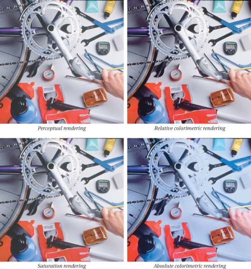
The ICC profile specification includes four different methods for handling out-of-gamut colors, called rendering intents (see Figure 3-4). Perceptual and saturation renderings use gamut compression, desaturating all the colors in the source space so that they fit into the destination gamut. Relative and absolute colorimetric renderings use gamut clipping, where all out-of-gamut colors simply get clipped to the closest reproducible hue.
• Perceptual tries to preserve the overall color appearance by changing all the colors in the source space so that they fit inside the destination space while preserving the overall color relationships, because our eyes are much more sensitive to the relationships between colors than they are to absolute color values. It’s a good choice for images that contain significant out-of-gamut colors.
• Saturation just tries to produce vivid colors, without concerning itself with accuracy, by converting saturated colors in the source to saturated colors in the destination. It’s good for pie charts and other business graphics, or for elevation maps where saturation differences in greens, browns, or blues show different altitudes or depths, but it’s typically less useful when the goal is accurate color reproduction.
• Relative colorimetric takes account of the fact that our eyes always adapt to the white of the medium we’re viewing. It maps white in the source to white in the destination, so that white on output is the white of the paper rather than the white of the source space. It then reproduces all the in-gamut colors exactly, and clips out-of-gamut colors to the closest reproducible hue. It’s often a better choice for images than perceptual since it preserves more of the original colors.
• Absolute colorimetric differs from relative colorimetric in that it doesn’t map source white to destination white. Absolute colorimetric rendering from a source with a bluish white to a destination with yellowish-white paper puts cyan ink in the white areas to simulate the white of the original. Absolute colorimetric is designed mainly for proofing, where the goal is to simulate the output of one printer (including its white point) on a second device.
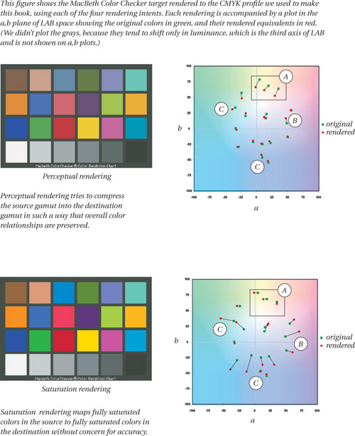

In most cases, the differences between perceptual, relative colorimetric, and saturation rendering are quite subtle. Absolute colorimetric rendering produces very different results from the other three since it doesn’t perform white point scaling, and hence is usually used only for proofing. Notice the difference in the saturated reds between the perceptual and relative colorimetric treatments of the image below, and the hue shift of the reds in the saturation rendering.
When you use a CMS to convert data from one color space to another, you need to supply the source profile and the destination profile so it knows where the color comes from and where the color is going. In most cases, you also specify a rendering intent, which is how you want the color to get there. When you aren’t given a choice, the application chooses the profile’s default rendering intent, which is set by the profile-building application and is usually the perceptual rendering intent.
Color Management in Action
Let’s look at how the different color-management components interact. We’ve told you that a CMS does only two things:
• Assign a specific color meaning to RGB or CMYK numbers.
• Change the RGB or CMYK numbers as our color goes from device to device, so that the actual color remains consistent.
We accomplish the first by assigning or embedding a profile in our document. We accomplish the second by asking the CMS to convert from the assigned or embedded source profile to a chosen output profile.
Assigning and Embedding Profiles
Most color-managed applications let you assign a profile to images and other colored objects. For example, Photoshop allows you to assign a profile to an image. When you do so, you’re defining the meaning of the RGB or CMYK values in the image by assigning the image a profile that describes where it came from, such as a scanner or digital camera. A page-layout document may have multiple images or illustrations in a single document and will allow you to assign a profile to each one. For example, you may have some scanned images and some digital camera captures. You’d want to assign the scanner profile to the scans, and the digital camera profile to the camera captures, so that the CMS knows what actual colors the scanner RGB and digital camera RGB numbers represent.
Most color-management-enabled applications also let you embed profiles inside documents such as images or page-layout files when you save them. Doing so lets you transfer documents between applications or computer systems without losing the meaning of the RGB or CMYK values used in those documents (see Figure 3-5).
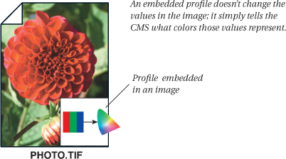
Note that assigning or embedding a profile in a document doesn’t change the RGB or CMYK numbers; it simply applies a specific interpretation to them. For example, if we embed the profile for Bruce’s Imacon scanner in an RGB document, what we’re doing is telling the CMS that the RGB numbers in the document represent the color that the Imacon scanner saw when it recorded these RGB numbers.
Some people find it counterintuitive that if we assign a different profile—for example, the Adobe RGB (1998) working space—the RGB numbers in the image don’t change, but the image’s appearance does. It does so because we’ve changed the meaning of the RGB numbers—the actual colors those numbers represent.
Assigning or embedding a profile is a necessary first step before you can convert the color for output on another device. This may be done automatically by scanner or camera software, it may be done explicitly by the user, or it may be done implicitly by a color-managed application—most color-managed applications let you specify default RGB and CMYK profiles, which they automatically assign to color elements that don’t already have a profile embedded. This assigned or embedded profile is used as the source profile when you ask the CMS to perform a conversion.
Converting with Profiles
To convert an image from one profile’s space to another’s—actually changing the RGB or CMYK numbers—we have to specify two profiles, a source profile and a target or destination profile. The source profile tells the CMS where the numbers in the document come from so that it can figure out what actual colors they represent. The destination profile tells the CMS where the document is going to so that it can figure out the new set of RGB or CMYK numbers needed to represent those same actual colors on the destination device (see Figure 3-6).
Figure 3-6 Converting with profiles

For instance, if Chris shoots an image with a digital camera, he ends up with an RGB image—but not just any RGB image, rather a “Chris’s Nikon D1 RGB” image. So he needs a profile for the digital camera in order to tell the CMS how Chris’s Nikon D1 sees color. That is the source profile—it describes where the color numbers came from and what perceived colors they represent. Chris wants to convert the image to CMYK so it can go into a magazine article—but not just any CMYK image, rather a “Color Geek Monthly CMYK” image. So he needs a profile for Color Geek Monthly’s press to tell the CMS how the press reproduces colors. Now the CMS has the necessary information to figure out which perceived colors the original image RGB numbers represent and which CMYK values it needs to send to the press to reproduce those colors.
It may seem counterintuitive, but converting colors from one profile’s space to another’s doesn’t change the color appearance—preserving the color appearance is the whole point of making the conversion.
The usefulness of converting colors becomes clearer when you consider why you use conventional color-correction techniques. When you print out an image on an inkjet printer and it comes out too green overall, with an excessively yellow gray balance in quarter-tones and too much cyan and yellow in shadows, what do you do? You color-correct it using curves, hue/saturation, replace color, and any other tools you feel comfortable with, until it prints out the way you want. You’re changing the numbers in the image to produce the color appearance you want. Conversions made with profiles find the proper device values for you, automatically.
Color management doesn’t take a bad image and make it look good on output. Instead, it makes the output faithfully reflect all the shortcomings of the original. So color management doesn’t eliminate the need for color correction. Instead, it simply ensures that once you’ve corrected the image so that it looks good, your corrections are translated faithfully to the output device.
How Conversions Work
First, the conversion requires you to select four ingredients:
The source profile
This may be already embedded in the document, it may be applied by the user, or it may be supplied by a default setting in the operating system or application.
The destination profile
This may be selected by a default setting in the operating system or application, or selected by the user at the time of conversion (for example, choosing a printer profile at the time you print).
The CMM
This may be chosen automatically as the destination profile’s “preferred” CMM, or selected by the user either at the time of conversion, or as a default setting in the operating system or application.
A rendering intent
This may be selected by the user at the time of conversion, or as a default setting in the operating system or application. Failing that, the “default” rendering intent in the destination profile is used.
The color management system then performs the series of steps shown in Figure 3-7.
Figure 3-7 A color space conversion

That’s really all that a CMS ever does. Some CMS implementations let you do multiple conversions as a single operation—Photoshop, for example, lets you print an inkjet proof that simulates a press from an image that’s in an RGB editing space. But when you break it down, all that’s happening is conversions from one profile’s space to another’s, in sequence, with different rendering intents at each step.
Conversions and Data Loss
It may seem from the foregoing that you can simply convert your color from device space to device space as needed. Unfortunately, that’s not the case: if you’re dealing with typical 8-bit per channel files, where each channel contains 256 possible levels, each conversion you put the file through will lose some of these levels due to rounding error.
Rounding errors happen when you convert integers between different scales—for example, 55 degrees Fahrenheit and 56 degrees Fahrenheit both convert to a brisk 13 degrees Centigrade as a product of rounding to the nearest integer value. The same kinds of errors occur when you convert 8-bit RGB or CMYK channels to PCS values.
To put this in context, we should hasten to point out that almost any kind of useful editing you perform on files made up of 8-bit channels will result in some levels getting lost. So it’s not something to obsess about. But it is something to bear in mind.
The High-Bit Advantage
If you start with 16 bits of data per channel, your color suffers much less from rounding error, because instead of having only 256 possible input values per channel, you have at least 32,769, and possibly as many as 65,536! (Photoshop’s implementation of 16-bit color uses values from 0 to 32,768. To those who would say that this is 15-bit color, we point out that it takes 16 bits to represent, and it has an unambiguous center value, 16,384, which is useful in many operations.)
In either implementation, you’ll still get rounding errors, but you have so much more data to start with that they become insignificant. There’s no such thing as a free lunch, but high-bit conversions come pretty close. However, just converting an existing 8-bit per channel file to 16 bits won’t buy you much—you have to start out with real high-bit data to get real benefits.
Rounding error is simply something you need to keep in mind when constructing color-managed workflows—you generally want to put your color through as few conversions as possible.
Color Management Is Simple
We’ve deliberately kept things conceptual in this chapter, and we’ve left out a lot of details. But until you understand the basic things that a CMS does, the details won’t make any sense. Keep in mind the fundamental concepts behind color management—an assigned or embedded profile describes the actual colors represented by RGB or CMYK numbers, and a conversion from one profile to another keeps those actual colors consistent by changing the numbers that get sent to the output—and the details, which we’ll continue to feed you throughout this book, will make a great deal more sense.