
9. Evaluating and Editing Profiles: Color Orienteering
In Bruce’s native land, Scotland, many otherwise-normal people happily spend rainy Saturday afternoons tramping across heath and bog, peering through wet glasses at the map in hand, pondering how to relate its contents to the ankle-deep water in which they’re standing. They’re indulging in the grand British pastime of orienteering—negotiating terrain using a map as their guide.
Evaluating and, optionally, editing profiles is a lot like orienteering. The profile is the map, and the device is the territory, but now you’re looking at the map from the middle of the territory, possibly in ankle-deep water, and figuring out just how closely the two correspond.
One view of evaluating profiles is that it’s an exercise in determining how lost you are. Another is that it’s fundamentally futile to try and put a metric on people’s subjective preferences. We think it makes sense to find out how inaccurate your maps are. Once you know, you can decide to make them more accurate by editing them to better match the territory, or you can decide to allow for the inaccuracies and learn to head in the right general direction while keeping an eye on the nuances of the terrain.
We have one more reason for putting profiles through some kind of systematic evaluation. Almost all color matches are the product of at least two profiles. If you don’t take the necessary steps to evaluate each profile’s accuracy in isolation, it’s hard to pinpoint the culprit when things go awry.
Judging the Map
Compasses, sextants, and other such devices are indispensable tools for navigation, but at some point, you have to simply look at where you are. By the same token, measurements play an essential role in color management, but when it comes to evaluating profiles, your eye has to be the final arbiter—if it doesn’t look right, it’s wrong.
But beware of mirages: back in Chapter 1, we pointed out some of the many tricks your eyes can play on you. So when you evaluate a profile, you need to set up your viewing environment so that you can say with certainty that any problems you see do, in fact, lie with the profile.
Your eye must be the final judge, but it doesn’t have to be the only judge. We’ll show you some objective tests that can help determine a profile’s colorimetric accuracy. But these only apply to colorimetric renderings—perceptual renderings always involve subjective judgments, because there’s no single correct way to reconcile two different gamuts. So objective tests, while they’re useful, don’t tell the whole story. At some point, you have to make subjective judgments, and to do that, a stable viewing environment is critical.
You may be tempted to edit profiles to fix problems that really lie in the device calibration or the data collection. We can tell you from bitter experience that doing so is akin to buying a one-way express ticket to the funny farm. It’s often quicker and easier to recalibrate and/or reprofile to fix the problem at its source. We tend to use profile editing as a last resort (though it’s also an integral part of our workflows), so throughout this chapter we’ll point out which problems can be fixed more easily through other means, and which ones are amenable to profile edits.
Viewing Environment
Back in Chapter 3, we pointed out that virtually all the color matches we create are metameric in nature—that is, they’re dependent on the light source under which we view them. So when you come to evaluate profiles, it’s vital that you view hard-copy samples under a controlled light source such as a D50 light box. But simply plonking an expensive light box into an otherwise-imperfect viewing situation is like sticking a Ferrari engine into an AMC Pacer—it’ll cost you plenty, but it may not get you where you wanted to go.
Some color management purists insist that you must work in a windowless cave with neutral gray walls, floor, and ceiling, and a low ambient level of D50 light, while wearing black or neutral gray clothing. We agree that this represents an ideal situation for evaluating color matches, but it’s a distinctly less-than-ideal situation for most other human activities. (We know shops where rooms just like this improved color matching but dramatically increased employee sick days.)
So rather than insisting on ideal conditions, we offer a series of recommendations for reasonable ones. We’ll let you decide just how far you want to go towards the ideal.
Surfaces
Surfaces within your field of view—walls, floor, ceiling, desktop—should be as neutral as humanly possible. You most certainly don’t want strong colors intruding into the field of view because they’ll throw off your color judgment. But pastels can be just as insidious: Bruce moved into a workspace with very pale pink walls, and he found that until he painted them white, he introduced cyan casts into all his images!
If you decide that neutral gray is the way to go, Chris has compiled some paint recommendations from a variety of sources:
• Sherwin-Williams paint code: 2129 ZIRCOM. You’ll want flat paint rather than glossy. (Matt Louis, Louis Companies, Arlington, Texas)
• California photographer Jack Kelly Clark recommends mixing one gallon of Pittsburgh Paint’s pastel-tint white base #80-110 with Lamp Black (B-12/48 PPG), Raw Umber (L-36/48 PPG), and Permanent Red (O-3/48 PPG). Write those numbers down and take them with you to the paint store if you want to try the mix yourself.
• A similar Kelly-Moore Paint Co. formula from photographer John Palmer uses a pastel-tint white as a base with three colors to create an interior, flat latex similar to Munsell 8 gray: Lamp Black (4/48 PPG), Raw Umber (27/48 PPG), and Violet (2/48 PPG).
If all this seems a bit extreme, the main consideration is to ensure that the field of view you use to evaluate hard copy is neutral, and that color in the room doesn’t affect the light you use to view the hard copy. Bear in mind that white walls tend to reflect the color of the ambient light—it’s manageable as long as you’re aware of it and take steps to control it. Glossy black isn’t ideal either, as it can cause distracting reflections.
Lighting
The ISO (International Standards Organization) has set standards for illumination in the graphic arts. For example, ISO 3664 specifies D50 as the standard illuminant for the graphic arts. It also specifies luminosity of 500 lux for “Practical Appraisal” and 2,000 lux for “Critical Comparison.” See the sidebar, “Counting Photons,” for a definition of lux, lumens, and candelas. The standard takes into account the fact that both apparent saturation and apparent contrast increase under stronger light (these effects are named for the scientists who first demonstrated them—the Hunt effect and the Stevens effect, respectively).
But the standard wasn’t created with monitor-to-print matching in mind—it mandates that the ambient illumination for color monitors should be less than or equal to 32 lux and must be less than or equal to 64 lux. For monitor-to-print matching, all these values are way too high—the ISO has acknowledged this, and is still working on standards for this kind of match. So until these standards are published and ratified (which may take several years), we offer some practical advice that we’ve gleaned empirically (that is, by trial and error) over the years.
While it might be mostly a concern for the upcoming board game Color Geek Trivia–Millennium Edition, we should be clear that D50 is an illuminant with a very specific spectral power distribution that no artificial light source on the planet can replicate. The term used for most light sources is correlated color temperature for which there are invariably multiple spectra. 5000 K is an example of correlated color temperature, not an illuminant. Different 5000 K light sources have different spectra and produce slightly different appearances.
Ambient light
If you’re working with a CRT monitor, you need low ambient light levels because CRTs just aren’t very bright. The color temperature of the ambient light isn’t terribly important: what is important is that you shield both the face of the monitor and the viewing area for hard copy from the ambient light. Filtered daylight is OK. Full sun from a west-facing window is not, both because it’s too bright and because it imparts a lot of color to your surroundings.
With some of the latest LCD displays, such those from Apple and EIZO, you can use much higher ambient light levels simply because these displays are so much brighter than CRTs, but the same rules about excessive coloration are as applicable to LCDs as to CRTs.
You can increase the apparent contrast of CRT monitors significantly by using a hood to shield the face of the monitor from the ambient light. High-end CRTs often include a hood, but if yours didn’t, you can easily fashion one for a few dollars from black matte board and adhesive tape—it’s one of those investments whose bang for the buck is simply massive. It’s also a good idea to wear dark clothing when you’re evaluating color on a monitor, because light clothing causes reflections on the screen that reduce the apparent contrast.
Hard-copy viewing light
Unless your profile building application has additional options, the color science on which ICC profiles are based is designed to create color matches under D50 lighting, so for your critical viewing light D50 illumination would be ideal, but as we’ve already pointed out, there’s no such thing as an artificial light source with a D50 spectrum. So-called D50 light boxes are really “D50 simulators.” The minimum requirement is a light box with a 5000 K lamp and a Color Rendering Index (CRI) of 90 or higher. The best available solution is a 5000 K light box that lets you vary the brightness of the light, so that you can turn it up when you’re comparing two hard-copy samples and turn it down to match the brightness of the monitor when you’re comparing hard copy with the monitor image.
Tip: Tailor the Profile to the Light Source
A few packages (such as GretagMacbeth’s ProfileMaker Pro 4.1 and later) let you build profiles tailored to the spectral power distribution of specific physical light sources—they include spectral measurements for some common light boxes and also let you define your own. So instead of D50 LAB, you can end up with “GTI Lightbox LAB.” This lets you make very critical color judgments under your viewing light, the trade-off being that those judgments may not translate perfectly to other viewing conditions. If you use this feature, use some other light source as a reality check—we really like filtered daylight!
A variable-intensity 5000 K light box is a fairly expensive piece of equipment, but if you’re serious about color management, it’s a worthwhile investment. But it’s not the be-all and end-all, either. As previously mentioned, many artificial light sources have spectra with more pronounced spikes than the relatively smooth spectrum our sun produces, and with some inksets, such as the pigmented inks used in some inkjet printers, which also have fairly spiky spectra, you may see significant differences between two 5000 K light sources, though you’re unlikely to see differences with press inks.
Bruce always uses daylight, preferably filtered, indirect daylight, as a reality check. Whenever he’s measured daylight anywhere close to sea level, it’s been significantly cooler than D50—typically between 6100 K and 6400 K—but the smoother spectrum eliminates some of the strange behavior that results from the combination of a light source with a spiky spectrum and an inkset with a spiky spectral response curve. We also like the 4700K Solux lamps—while they’re a tad warm, they produce a very smooth spectrum with an extremely high CRI of 98. See www.solux.net for more information.
Monitor-to-print comparisons
CIE colorimetry wasn’t designed to handle monitor-to-print comparisons—color monitors didn’t exist when the models on which color management is based were being developed. Nevertheless, it’s capable of doing a surprisingly good job.
Some pundits will tell you that it’s impossible to match a monitor image and a printed one, because the experience of viewing light reflected from paper is simply too different from that of viewing light emitted from glowing phosphors. In a very narrow sense, they may be right—one important difference between hard-copy and monitor images is that with the former, our eyes can invoke color constancy (also known as “discounting the illuminant”—see “Color Constancy” in Chapter 1, What Is Color?), whereas with the latter, we can’t since the illuminant is the image.
This may help to explain why so many people have difficulty matching an image on a monitor calibrated to a 5000 K white point with a hard-copy image in a 5000 K light box. There may be other factors, too—a lot of work remains to be done on cross-media color matching—but whatever the reason, the phenomenon is too well reported to be imaginary.
We offer two pieces of advice in achieving monitor-to-print matching:
• Match the brightness, not the color temperature.
• Don’t put the monitor and the light box in the same field of view.
When given a choice between 5000 K and 6500 K, we calibrate our monitors to 6500 K because it’s closer to their native white point; we can obtain a better contrast ratio than we can at 5000 K, which requires turning down the blue channel. We dim the light box to match the contrast ratio of the monitor—a sheet of blank white paper in the light box should have the same apparent brightness as a solid white displayed on the monitor. If you’re happy working with a 5000 K monitor, by all means continue to do so, but no matter what the white point, it’s critical that you throttle back the light box to match the brightness of the monitor.
The second trick is to place the light box at right angles to the monitor so that you have to look from one to the other. This accomplishes two goals: it lets you use your foveal vision—the cone-rich area in the center of your retina where color vision is at its most acute—and it allows your eye to adapt to the different white points. (Short-term memory has been shown to be very accurate when it comes to making color comparisons.)
We’ve been using these techniques to do monitor-to-print matching for several years, and we find them very reliable. Does the monitor image perfectly match the print? Probably not. But frankly, short of a press proof, we’re not sure that we’ve ever seen a proof that matched the final print perfectly. Laminated proofs, for example, tend to be a little more contrasty, and perhaps a shade pinker, than the press sheet—not to mention their inability to predict wet trap or print sequence—but we’ve learned to filter out these differences. You have to learn to interpret any proofing system, and the monitor is no exception.
Evaluating Profiles
Once you’ve ironed all the kinks out of your viewing environment, you can safely start evaluating your profiles. One of the trickier aspects of profile evaluation is being sure which profile is responsible for any problems you might see, because most of the color-matching exercises we go through need at least two profiles, sometimes more.
Anything that you view on-screen goes through your monitor profile, so the monitor is the first device to nail down—once you know you can rely on your monitor profile, you can use it as a basis for comparison. If you just trust it blindly, and it’s flawed, you’ll create a huge amount of unnecessary work for yourself. Once you’ve qualified your display profile, it’s much easier to use it as an aid in evaluating your input and output profiles.
Checking the Display
Your display is not only the first device you need to nail down, it’s also the one type of device where calibration and profiling are usually performed as a single task. Since it’s much more common to find problems with the calibration than with the profile, you need to check the calibration first—if it’s bad, the resulting profile will be, too.
Monitor Calibration
The two most common problems with monitor calibration are incorrect black-point setting and posterization caused by trying to apply a gamma that’s too far away from the monitor’s native gamma for the 8-bit tables in the video card to handle.
To check the calibration, you need to take the profile out of the display loop and send RGB values directly to the display. To do so, set your monitor profile as the default RGB space in the application of your choice so that RGB is interpreted as monitor RGB, and hence sent directly to the screen with no conversions.
Tip: Use Proof Setup in Photoshop
In Photoshop 6 or later, choose View>Proof Setup>Monitor RGB to send the RGB values in the file directly to the monitor. When you choose Monitor RGB, Photoshop automatically loads the Monitor RGB profile in Proof Setup and checks “Preserve Color Numbers,” effectively taking your monitor profile out of the loop.
We generally use Photoshop for this kind of testing, though almost any pixel-based editing application should serve.
Black-point check
Setting the correct black point is the biggest challenge for monitor calibrators for two reasons:
• The monitor output is relatively unstable at black and near-black.
• Most of the instruments used for monitor calibration are relatively inaccurate at black or near-black—they attempt to compensate by averaging a lot of measurements.
Be warned that the following test is brutal at showing the flaws in most monitor calibration and can lead to significant disappointment! (See Figure 9-1.)
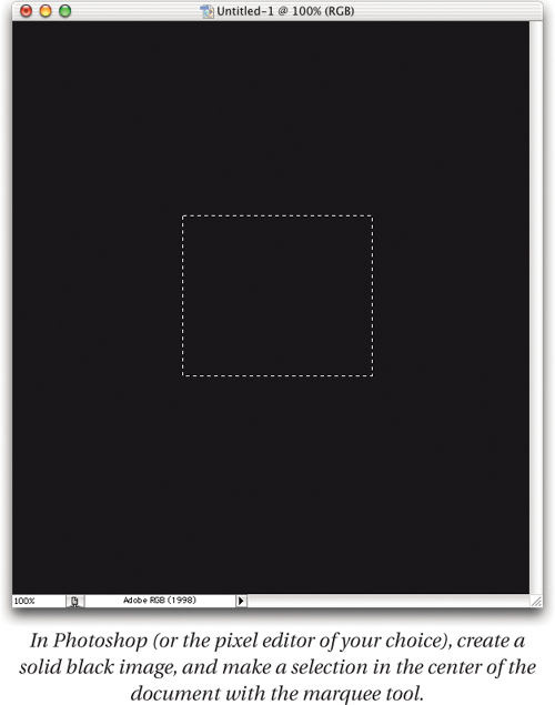
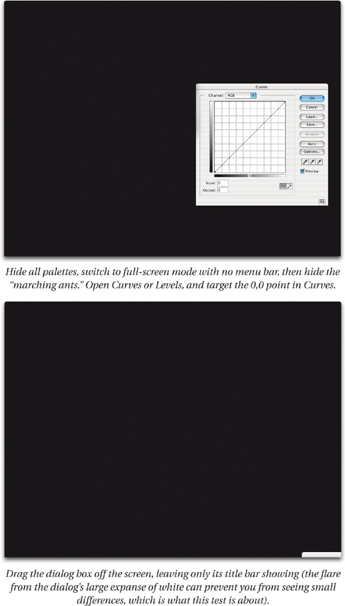
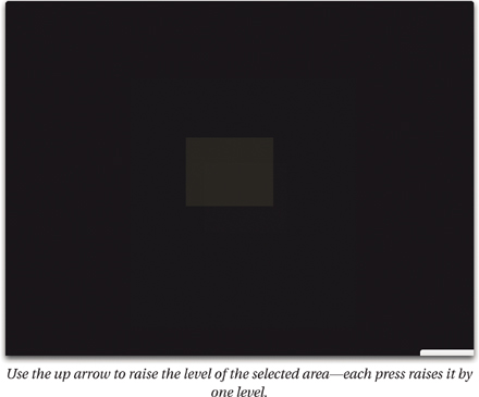
With excellent calibration systems, you may see a difference between level 0 and level 1. More typically, you won’t see a change until somewhere around levels 5 to 7, or sometimes even higher. If you don’t see any change when cycling through the first 12 levels, your black point is definitely set too low and you should recalibrate, requesting a slightly higher black point.
If the first few levels that are visible have a color cast, you may have set the bias controls incorrectly (if your monitor has them). Try making a small adjustment to the bias—for example, if the first few levels are red, try lowering the red bias slightly. Then recalibrate.
Gamma check
To refine the gamma setting, display a black-to-white gradient. We usually flip the top half of the gradient horizontally to produce a test image like the one shown in Figure 9-2.
Figure 9-2 Gradient test image
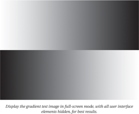
If your application allows it, display the gradient in full-screen mode, hide all other user interface elements, and then look at the gradient closely. In an ideal situation, you’ll have a perfectly smooth, dead-on-neutral gradient, and black will fade smoothly into the nonpicture area of the monitor.
In practice, this rarely happens. You’ll almost certainly see some slight banding or posterization in the shadow areas, and you may see some color where you should see neutral gray. Make sure that you’re looking at raw RGB sent straight to the monitor—at this point, you’re checking the calibration, not the profile.
Color crossovers in a raw RGB gradient almost always indicate a fatally flawed calibration tool. If you’ve adjusted the R, G, and B bias controls on your monitor, it’s possible to introduce color crossovers, so if you see them, the first thing to try is to reset the bias controls to the factory defaults. If you still see color where you should see grays, and you’re absolutely sure that you aren’t looking at the gradient through a profile, you need to toss your calibration tool and get one that works—this isn’t something that you can fix with any amount of recalibration or profile editing.
More commonly, you’ll see some slight amount of posterization in the shadows and three-quarter tones. Until the video card manufacturers decide that higher-precision videoLUTs are more important than the number of shaded polygons the card can draw per nanosecond, we’ll all have to live with some slight irregularities in tonal response, but you can often improve the smoothness of the calibration by recalibrating, and by changing the requested gamma to something closer to the native gamma of the display system. Color management needs to know your monitor gamma, but it doesn’t really matter what the absolute value is, only that it’s known—so feel free to experiment with different gammas between 1.8 and 2.4 or so, and choose the one that gives you the smoothest gradient.
There are so many combinations of monitor and video card that we can’t give you any magic numbers. Try raising the requested gamma by 0.1. If the posterization gets worse, try lowering it by 0.1. Eventually, you’ll find the best compromise. When you’ve done so, don’t forget to generate a new profile!
Monitor Profile
Monitor profile problems are relatively rare—flaws are usually either in the monitor calibration, or, in cases of gross mismatches between screen display and printed output, in the printer profile that serves as the source in the conversion from print RGB or CMYK to monitor RGB. Nevertheless, some monitor profiles may work better than others. If your profiling tool offers the ability to build different types or sizes of profiles, you may find that one type works much better than another.
Repeat the gradient test shown in Figure 9-2, but this time, set your working space to a gamma 2.2 profile such as sRGB or Adobe RGB, or simply assign one of these profiles to the gradient image, so that you’re displaying the gradient through the monitor profile. If you see color crossovers that weren’t visible in the raw display test, it’s possible that your profile contains too much data—we often see LUT-based monitor profiles producing poorer results than simpler matrix or gamma-value profiles, so don’t assume that bigger is always better.
Reference images
Of course, you’d probably rather look at images than at gray ramps. But the classic mistake many people make when evaluating a monitor profile is to make a print, then display the file from which the print was made, and compare them. The problem is that the display of the print file is controlled as much by, or even more by, the printer profile used to make the print as it is by the monitor profile, so you can be fooled into trying to fix problems in the printer profile by editing the monitor profile—which is like trying to fix the “empty” reading on your car’s gas gauge by tweaking the gauge instead of putting gas in the tank.
When it comes to comparing a monitor image with a physical reference, the only reliable way to make sure that the monitor profile is the only one affecting the image is to compare an image in LAB space with the actual physical sample from which the LAB measurements were made. There are very few sources for a physical sample and a matching colorimetrically accurate digital file—Kodak’s now-discontinued ColorFlow ICC Profile Tools supplies a stringently manufactured photographic print with an accompanying digital file, but we don’t know of any other vendor who does this. So unless you own ColorFlow, you’ll need to use a little ingenuity. Here are some of the techniques we use.
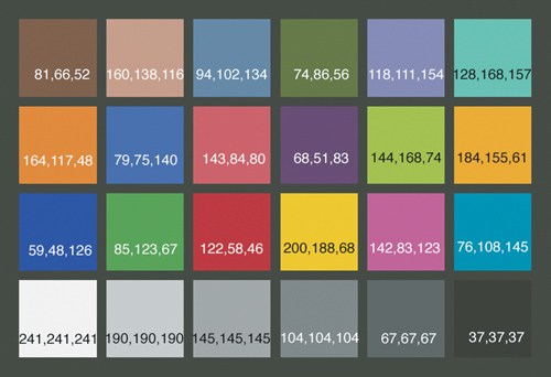
The Macbeth ColorChecker
The Macbeth ColorChecker, made by GretagMacbeth, has long been used by photographers to check colors, and is available from any decent camera store. GretagMacbeth has never published LAB values for the 24 patches, but the LAB values shown in Figure 9-3 are ones that Bruce has collected and averaged over the years from various Macbeth targets in various stages of wear (with considerable help from Bruce Lindbloom and Robin Myers). Or you can simply measure the 24 patches yourself.
Figure 9-3 The Macbeth ColorChecker

Then, create a LAB image in Photoshop (or any other application that lets you define LAB colors), and compare the physical color checker, appropriately illuminated, with the image on screen. With CRT monitors, the saturated yellow patch (row 3, column 4) is outside the monitor’s gamut, so you’ll likely see a slightly more orangey-yellow. LCD monitors can hit the yellow, but may miss the sky-blue patch in row 3, column 6. But in either case, both the color relationships and the tonal values of the gray patches should be preserved reasonably well.
Scanner targets
If you have a scanner target, then you have a physical target and the LAB values of the colors it contains. All you need to do is create an image of the target containing those LAB values. Creating hundreds of LAB patches in Photoshop, though, is too much pain even for us, but fortunately, there’s a solution, and it’s free—see the sidebar, “Measurements to Pixels and Back,” on the facing page.
Use the procedure outlined above for the Macbeth Color Checker to compare the physical target to the LAB image on screen. You’ll likely have more out-of-gamut colors than you would with the Macbeth target, but the relationships between all but the most-saturated colors should be preserved.
Printer targets
Leverage your printer target! You’ve printed a target and measured it. Turn the measurements into pixels—see the sidebar, “Measurements to Pixels and Back” on the facing page—and compare the on-screen image with the printed target under appropriate illumination.
Your printer target will likely contain more patches than a scanner target, and fewer of them will lie outside the monitor’s gamut, so it can give you a good idea of your monitor profile’s color performance.
We don’t advocate editing monitor profiles. It’s not a philosophical objection—we simply haven’t found it effective. If you find a display problem that you can more effectively solve by editing the monitor profile rather than by recalibrating and reprofiling, please let us know—we’ll gladly eat our words, if not our hats!
Input Profiles
Scanner profiles are, as we noted in Chapter 7, Building Input Profiles, relatively easy to build. Scanners have a fixed, reasonably stable light source, and as long as you make sure the software settings remain consistent, they usually behave quite predictably. Digital camera profiles are much, much harder, both because cameras function under a huge variety of light sources, and because they have to capture photons reflected from a much wider variety of objects than do scanners. That said, there are a few tests that you can apply to either one.
Basic Test for Input Profiles
The first simple test is to open the scan or digital-camera capture of the profiling target in Photoshop, and assign the input profile to it. Then compare the image on your calibrated monitor with the appropriately illuminated physical target. If assigning the profile doesn’t improve the match, you should probably just start over, double-checking your methodology. If the match is improved (as we’d hope), you may want to use a more objective test.
Objective Test for Input Profiles
This test uses a simple principle: we check the profile by comparing the known LAB values in the profiling target with the LAB values predicted by the profile. In an ideal world, they’d be identical, but in our experience, this never happens. If you care why, see the sidebar, “Objective Objectives,” on the facing page. The reasons we do objective tests on input profiles are to help us understand and optimize our capture device’s behavior, to identify problem areas in the profile that may respond to editing, and to help us understand what we see when we do subjective tests with images.
To perform tests such as this one, you have a choice. You can use tools that are available at no cost but that require considerable work on your part, or you can spend money on Chromix ColorThink Pro, which does a great deal of the work for you and has many other invaluable capabilities. We’ll cover both approaches.
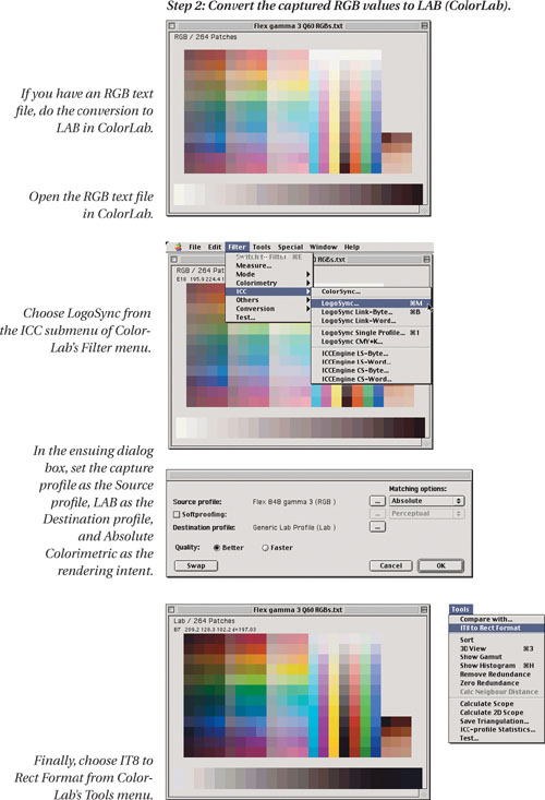
First, the free method: You can employ the ever-useful Logo ColorLab (see the sidebar, “Measurements to Pixels and Back,” earlier in this chapter) to make the comparison. You need two TIFF images of the target with one pixel per color patch: a LAB image of the target values, and an image containing the LAB values predicted by the profile, which is a little trickier.
Some profiling tools save the RGB values they capture from the target scan as a text file, which you can then open in ColorLab. Others, including those from GretagMacbeth and Heidelberg, store the captured RGB values right inside the profile as a “private” tag—private in name only, because you can extract the data by opening the profile with a text editor, then open the text file in ColorLab.
For those that do neither, you can downsample the target scan or digital camera capture to one pixel per patch using Nearest Neighbor interpolation in Photoshop, or build a 1-pixel-per patch image manually in Photoshop. Building the target by hand is time-consuming but more accurate than resampling.
A third alternative is to create a text file by hand, sampling the RGB values and entering them into the text file—we generally use Excel to do so. If you’re building either a text file or an image by hand, it’s easier if you start out with a template. For text, open the target description file in Excel, and replace the LAB values with your captured RGBs (don’t forget to change the Data Format definition). If you want to build an image, open the target description file in ColorLab, then save it as an image. Figure 9-4 shows the steps required to make the comparison.
Figure 9-4 Comparing actual and predicted LAB values


This test provides a decent metric for comparing input profiles built from the same target. For example, your profiling tool may provide several options for profile size. This test lets you determine which option gives the most accurate profile (see Figure 9-5).
Figure 9-5 Comparing large and small profiles
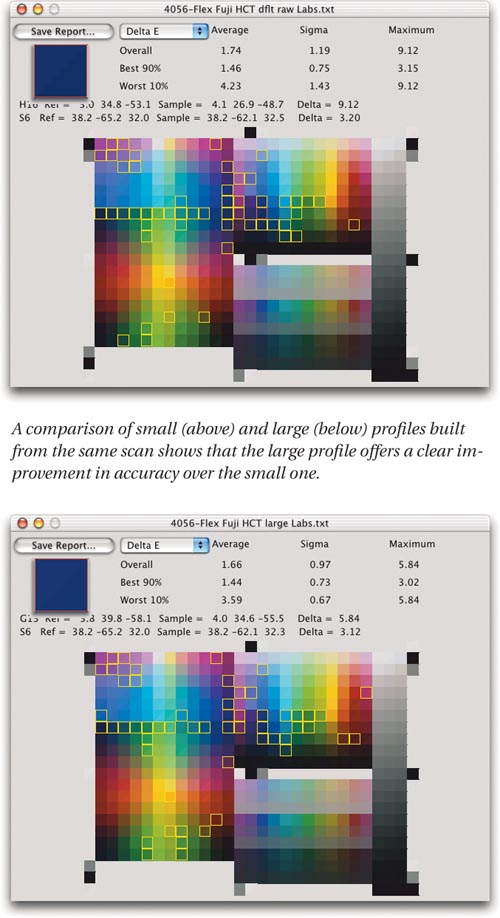

Colorimetric accuracy is important, but it’s not the only concern. Sometimes we have to sacrifice accuracy for smoothness, for example. A profile that renders many colors very accurately at the cost of heavily posterized images is usually less useful than one that distorts colors slightly but produces smooth transitions between tones and colors.
Figure 9-6 shows a typical scanner profile evaluation. Note that we decided to improve shadow detail by raising the scanner gamma and reprofiling, rather than editing the profile.
Figure 9-6 Scanner profile evaluation

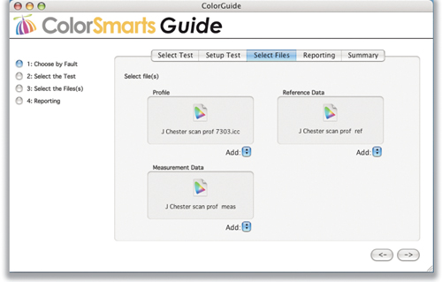
Alternatively, you can perform the preceding tests using ColorThink Pro, which does most of the work for you. If your profiling tool saves the capture data in the profile, setting up the comparison is very easy indeed, as shown in Figure 9-7. ColorThink Pro automatically extracts the requisite data from the chosen files, then goes ahead and makes the comparison.
Figure 9-7 ColorThink input test setup
For profiles that don’t contain the capture data, you can create a one-pixel-per-color image of the target capture using any of the methods previously outlined, then feed it to ColorThink Pro to create a Color List. In either case, ColorThink Pro guides you through the comparison, and produces a report like the one shown in Figure 9-8. The Test Feedback window shows the summary results, including overall, minimum, and maximum delta-e, along with the same information for the best 90% and for the worst 10%. The Color Worksheet shows the delta-e for each individual color sample, along with a user-configurable color label that indicates the delta-e range in which it falls.
Figure 9-8 ColorThink input profile evaluation

ColorThink Pro also lets you make the comparison shown in Figure 9-6. Simply load the target reference data, then the profiles. You can toggle between the different profiles to see the delta-e values between reference and sample, as shown in Figure 9-9.
Figure 9-9 Comparing multiple profiles in ColorThink
Subjective Tests for Input Profiles
Any test that looks at the rendering of images is necessarily subjective. The key in evaluating an input profile is to select a representative sample of images, with low-key and high-key elements, pastels as well as saturated colors, and neutrals. Profiling involves a series of trade-offs, and if you judge the trade-offs on a single image, you’re likely to regret it later. Of course, you need to use some common sense as well. If you are scanning or photographing only people, then you’ll be more concerned with skin tones and you’ll want a suitable set of test images to reflect a variety of skin tones.
It’s also helpful to include a few synthetic targets as a reality check: they can often show you problems that natural images may mask or miss. Two such images that we use regularly are the Granger Rainbow, developed by Dr. Ed Granger, and the RGBEXPLORER8, developed by Don Hutcheson, both of which are shown in Figure 9-10. Note that we’re constrained by the limits of our printing process in how faithfully we can reproduce these targets—the RGB versions will look quite different on your monitor!

The point of looking at synthetic targets like these isn’t to try to get them to reproduce perfectly—that ain’t gonna happen—but rather to provide clues as to why your images behave (or misbehave) the way they do. Sudden jumps in tone or color on the synthetic targets may happen in color regions that are well outside anything you’re likely to capture, or they may lie in a critical area. It’s up to you to decide what to do about them, but we believe that you’re better off knowing they’re there.
In the case of RGB input profiles, we use the synthetic targets by simply assigning the profile in question to the target and seeing what happens. Often, the synthetic targets make problem areas very obvious. We always make our final decisions by evaluating real images, but synthetic targets can be real time-savers in showing, at a glance, why the profile is reproducing images the way it does. Figure 9-11 shows a good example of this. One digital camera profile, applied to images, seemed a little weak in the reds and muddy in some yellows, but simply looking at a collection of images made it hard to pin down the specific flaw that one profile had and another did not. A single glance at the Granger Rainbow, with each profile applied, makes it very clear where the deficiencies lie!
Figure 9-11 Synthetic target evaluation

Editing Input Profiles
With good scanners, we find we rarely need to edit the profile—the key parameter is finding the “ideal” gamma or tone curve for the scanner—but with low-end scanners that don’t provide sufficient control, or sufficiently consistent control, we may resort to profile editing.
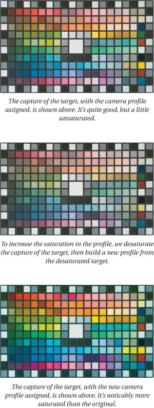
The simplest way to edit input profiles globally—that is, all rendering intents simultaneously—is to edit the capture of the profiling target. The only catch is that you have to make edits in the opposite direction from the behavior you want in the profile. If the profile’s results are too dark, you need to darken the target; if there’s a red cast, you need to add red, and so on.
This is very much a seat-of-the-pants procedure that absolutely requires a well-calibrated and profiled monitor, but it has the advantage that it doesn’t require profile editing software, just an image editor. Small changes can make big differences to the profile—with practice you can be surprisingly precise in edits to tone, saturation, and even to hue in selective color ranges—but it’s a fairly blunt instrument, and it affects all the rendering intents. So if you go this route, proceed with caution (see Figure 9-12).
Figure 9-12 Editing the target
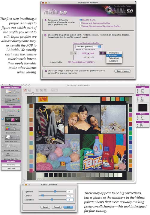
For more precise edits, or for edits to a specific rendering intent, you need some kind of profile-editing software. Most of the high-end profiling packages offer editing in addition to profile creation. They all have different user interfaces, but they work in generally the same way: they let you open an image that’s in the profile’s space, and use it as a reference to make edits. It should go without saying (but we’ll say it anyway) that for this to work, your monitor calibration and profile need to be solid.
Edit order
There’s a classic order in which to make profile edits—it’s the same order that traditional scanner operators use for image corrections—and we generally advocate sticking with it, with one exception, which is: fix the biggest problem first! Because if you don’t, it often covers up other problems that suddenly become visible after you’ve done a lot of work.
The classic order for profile edits is
• global lightness and contrast adjustments
• tone curve adjustments
• gray balance adjustments
• global saturation adjustments
• selective color adjustments
The order isn’t arbitrary: it’s designed so that the likelihood of an edit undoing the edits that went before is reduced, if not completely eliminated, so unless there’s a huge problem staring you in the face that you need to correct before you can make any sensible decisions about other issues, stick to it.
Figure 9-13 shows typical editing sessions for a good midrange scanner. The scanner profile requires only minor tweaks, which is typical.
Figure 9-13 Scanner profile editing
Digital camera profiles are more difficult to handle than scanner profiles, for three reasons:
• They don’t use a fixed light source.
• They’re more prone to metamerism issues than scanners.
• There’s often no target reference against which to edit them.
If your work is all shot in the studio, you can and should control the lighting. If you have controlled lighting, and you gray-balance the camera, you shouldn’t have many more problems than with a scanner profile. Ideally, you should edit the profile in the studio, with a reference scene set up, so that you can compare the digital capture to a physical object.
One problem you’re unlikely to find in a scanner is camera metamerism, where the camera either sees two samples that appear identical to us as different, or more problematically, where the camera sees two samples that appear differently to us as identical. (Scanners aren’t immune to this either, but if you’re scanning photographic prints or film, you’re scanning CMY dyes—digital cameras have to handle the spectral responses of real objects, which are a lot more complex.)
This isn’t something you can fix with profile editing—you’ll simply have to edit those images in which it occurs. So if a color is rendered incorrectly in a single image, check other images that contain similar colors captured from different objects to determine whether it’s a profile problem that you can fix by profile editing or a metamerism issue that you’ll have to fix by image editing.
With field cameras, you have no way of knowing the light source for a given exposure. If you shoot TIFF or JPEG, gray-balancing (or white-balancing) is the key to keeping the variations in lighting under reasonable control. If you shoot raw, be aware that you’re profiling the entire raw conversion, including white balance setting. You also have the problem of what to use as a reference when editing the profile.
We find that the best approach is to create a reference image by combining a wide variety of image types shot under varying conditions, and aim for a profile that helps them all more or less equally. You can include a few images that contain a known target such as the Macbeth ColorChecker, but resist the temptation to edit the profile so that it reproduces the color checker perfectly without checking what it does to other images.
Figure 9-14 shows a typical field camera profile editing session. In this example, we used Kodak’s newly revamped Custom Color ICC, which allows us to use Photoshop as a profiling editing tool, but the process is the same for any profile editor, and it involves several steps.
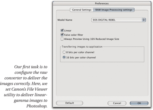
• We set the raw converter to deliver linear gamma images.
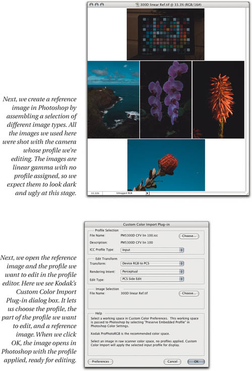
• We make a reference image by ganging several different captures into a single document that we’ll use to judge the edits.
• We open the reference image and the profile in the profile editor.
• We make the edits to the profile, using the reference image as a guide.
• We save the edited profile.
Figure 9-14 Digital camera profile editing


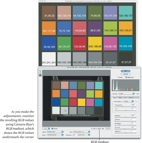
Calibrating Camera Raw
If you use Adobe Camera Raw as your preferred raw converter, you’ve likely already realized that you can’t use custom camera profiles, because the profiles are hardwired into the Camera Raw plug-in. The good news here is that most of the heavy lifting has already been done for you. But the built-in profiles may not match your specific camera exactly, so Thomas Knoll was kind enough to include Calibrate controls in the Camera Raw plug-in. There are many ways to use these, but we’ll offer a relatively simple procedure that we’ve found effective.
To carry out the calibration, you need a physical target—we use the old 24-patch Macbeth ColorChecker, but the newer ColorChecker SG includes the original 24 patches so you can use it instead if you wish—and an accurate RGB version of the ColorChecker.
RGB Color Checker
If you’re a true fanatic, you can measure the Color-Checker yourself, create a Lab file of the color patches in Photoshop, then convert it to RGB in Photoshop using Absolute Colorimetric rendering. In theory, you should be able to carry out this exercise using any of the four RGB spaces—sRGB, ColorMatch RGB, Adobe RGB (1998), or ProPhoto RGB—that Camera Raw supports. In practice, we find that it’s highly desirable if not essential to build the calibration in ProPhoto RGB, perhaps because Camera Raw uses a linear-gamma space with ProPhoto RGB primaries to do much of its processing.
If you’re less fanatical or simply lazy, you can download a ProPhoto RGB version of the ColorChecker, with the RGB values entered on each patch to simplify matching, from www.coloremedies.com/realworldcolor/downloads.html. It’s shown in Figure 9-15.
Figure 9-15 ProPhoto RGB Color Checker
Shooting the target
To obtain the best results, you need to ensure that the target you shoot is evenly lit, and that the shot is correctly exposed. An ideal exposure should produce values around level 238-243 for the white patch with no Exposure adjustments in Camera Raw.
Setup for calibrate
Arrange the windows on screen so that you can see both the ProPhoto RGB ColorChecker and the target capture in the Camera Raw window. You’ll use the ProPhoto RGB ColorChecker as the aim point when you adjust the Calibrate controls—see Figure 9-16.
Figure 9-16 Setup for Calibrate

Tonal adjustments
Before you can adjust the Calibrate controls, you’ll need to make tonal adjustments using the Exposure, Shadows, Brightness, and Contrast sliders to make the gray patches approximately match the values in the reference ProPhoto RGB image.
The four aforementioned controls work together to define a 5-point curve, as follows:
• Exposure sets the white point, and Shadows sets the black point.
• Brightness adjusts the midtone without affecting black or white, like the gray slider in Photoshop’s Levels command.
• Contrast applies an S-curve around the midpoint set by Brightness, again without affecting black or white—see Figure 9-17.
Don’t try to aim for perfection. The white patch will always end up darker than in the reference file. You should, however, be able to get the remaining five gray patches to match the reference within three or four levels. Once you’ve done so, white-balance the image by clicking on the second-to-lightest gray patch. After white-balancing, you may need to go back and tweak the Brightness and Contrast sliders slightly.
Tip: Use the Arrow Keys to Adjust Values
This exercise becomes a great deal easier if you keep the cursor on the patch you’re evaluating so that you can see the RGB values in Camera Raw’s readout. Use Tab to move to the next field and Shift-Tab to move to the previous one, and use the Up and Down arrow keys to change the values in each field.
Once you’ve set the tonal behavior, you can continue on to setting the Calibrate controls, but before you do so, check the blue, green, and red patches on the third row (these are the patches where you’ll focus your attention). In most cases, the red value in the red patch will be higher than the one in the reference, and the blue value in the blue patch will be lower than in the reference. Use the Saturation slider to get the best compromise in terms of matching the red value in the red patch, the green value in the green patch, and the blue value in the blue patch to those in the reference image before proceeding to the Calibrate tab.
Calibrate adjustments
The Calibrate adjustments let you tweak the hue and saturation of the primaries for the camera’s built-in Camera Raw profiles. If you’re concerned that the adjustments you’ve made so far lock you into always using these tonal moves, or that the choice of ProPhoto RGB means that the calibration is only valid for ProPhoto RGB, put your mind at rest.
The Calibrate controls let you adjust the relative hue and saturation of the camera RGB primaries, and these adjustments remain valid for any tonal settings and any output space. The adjustments you’ve made so far simply massage the target capture to make it easier to use the ProPhoto RGB reference image as a guide.
In theory, you should be able to make the edits in any order, but in practice we find that things go more smoothly when we adhere to the following order: shadow tint; green hue and saturation; blue hue and saturation; red hue and saturation. For each color’s controls, the hue slider adjusts the other two colors unequally to affect the hue, and the saturation slider adjusts the other two colors equally to affect the saturation.
• Start by sampling the black patch on the target to check the neutrality of the shadows. There should be no more than one level of difference between the three channels on the black patch. If the difference is greater than that, adjust the shadow tint slider to get the black patch as neutral as possible.
• Continue with the green patch. Adjust the green saturation slider to get approximately the right amount of red and blue relative to green in the green patch, and adjust the green hue to fine-tune the proportions of red and blue relative to each other.
• Next, move to the blue patch—you may find that the blue value for the blue patch has moved closer to the target value due to the green tweaks. Use the blue saturation slider to balance red and green relative to blue, and the blue hue slider to balance red and green relative to each other.
• Finally, sample the red patch. Use the red saturation slider to adjust blue and green relative to red, and the red hue slider to adjust blue and green relative to each other.
Remember that you’re adjusting color relationships here. It’s much more important to get the right relationship between red, green, and blue than it is to produce a close numerical match, though with skill and patience it’s possible to get very close to the nominal values. So, for example, if the red patch has a red value of 132, as compared to the reference red value of 122, take the target values for green and blue, and multiply them by 132/122, or 1.1. So instead of aiming for a green value of 58, you’d aim for 64, and instead of a blue value of 46, you’d aim for 51. You’ll also notice that each adjustment in the Calibrate tab affects all the others adjustments in the Calibrate tab. A second iteration of adjustments will often help you get much closer. Figure 9-18 shows typical calibrate adjustments applied to the target capture, in this case from a Canon EOS 1D Mk II.
Figure 9-18 Calibrate adjustments

Special cases
The calibration you build using the Calibrate tab is usually good for any light source. However, some cameras have an extremely weak blue response under tungsten lighting, so you may have to make a separate calibration for tungsten. And if you have the misfortune of having to shoot under fluorescent lighting, the very spiky nature of the typical fluorescent spectrum may require you to special-case it too.
Once you’re done, you can save the Calibrate settings as a Settings Subset, and apply them to images, or incorporate them into the Camera Default.
Output Profiles
We never edit monitor profiles, and we try to edit input profiles as little as possible, but we almost always wind up editing output profiles. Output devices tend to be less linear than capture devices or displays, they often use more colorants, and their profiles must be bidirectional so that we can use them for proofing as well as for final conversion—so they’re by far the most complex type of profile.
That said, the techniques we use for evaluating output profiles are very similar to those we use for input profiles. Unless our evaluations reveal gross flaws, we tend to be cautious about editing the LAB-to-device (BtoA) side of the profile, except possibly to make slight changes to the perceptual rendering intent or to make a very specialized profile. But we find we often have to make some edits to the device-to-LAB side to improve our soft proofs.
Before doing anything else, we always recommend looking at a synthetic target such as the Granger Rainbow or the RGB Explorer (see Figure 9-7), with the profile assigned to it in the case of RGB profiles, or converted to the profile in the case of CMYK profiles.
You’ll probably see posterization somewhere—bear in mind that real images rarely contain the kinds of transitions found in these targets—so that shouldn’t be a major concern. But if you see huge discontinuities, areas of missing color, or the wrong color entirely, stop. The problem could lie in the printer calibration or media settings, in your measurements, or in the parameters you set while building the profile. So go back and recheck all the steps that went into building the profile, because you won’t get good results from this one. Figure 9-19 shows typical appearances for the Granger Rainbow converted to output profiles. If what you see looks much worse than any of these, you need to back up and figure out where you went wrong.
Figure 9-19 Granger Rainbow through profiles

Objective Tests for Output Profiles
We do objective tests on output profiles not to provide an objective benchmark of profile accuracy, but to help us understand the profile’s behavior, and to identify problem areas that may respond to profile editing—see the sidebar, “Objective Objectives,” earlier in this chapter. (Bruce also does them for fun, but even he thinks that’s weird.)
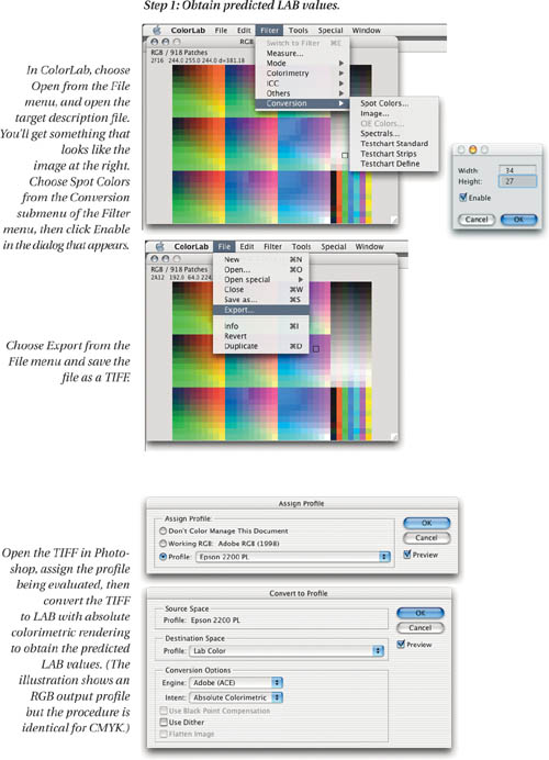
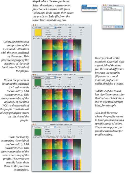
The fundamental principle for objective evaluations is to compare the device’s known behavior with the behavior the profile predicts. We do that by comparing the actual measurements of the target—the color we know the device produces in response to a set of numbers—with the LAB values the profile predicts. We obtain the predicted LAB values by taking the target file, assigning the device profile to it, and then converting to LAB with absolute colorimetric rendering. This lets us see what’s happening in the colorimetric AtoB1 (device-to-PCS) table.
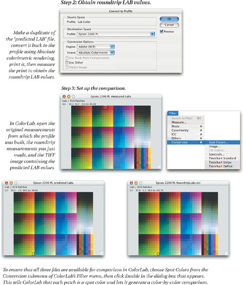
But since output profiles are bidirectional, we go further. We take the predicted LAB values, print them through the profile, measure the print, and compare the measurements to the predicted LAB values. This lets us see what’s happening in the colorimetric BtoA1 (PCS-to-device) table. We usually see higher delta-e values on this side of the profile because it’s computed, whereas the AtoB table is based on actual measurements.
Lastly, we “close the loop” by comparing the original measurements with those from the predicted LAB image printed through the profile. Usually the errors in the AtoB and BtoA tables are in opposite directions, producing a lower delta-e between the two measurement files than between either measurement file and the values predicted by the profile. If you get higher delta-e values in this comparison than in the others, the errors are moving in the same direction on both sides of the profile—this may be a sign of bad measurements, so check them. If you’re quite sure they’re OK, you may want to edit both sides of the profile identically, though this is quite a rare situation.
As with input profiles, you have the choice of using free tools and doing a lot of work, or spending some money and using Chromix ColorThink Pro to make the comparisons much more easily. And as with input profiles, we’ll cover both methods here.
You can use ColorLab to convert the RGB or CMYK device values to LAB, but we prefer to do that in Photoshop, since it lets us choose different CMMs easily. The CMM can make a big difference to the results—if your profiling package is designed to prefer a particular CMM, you can use this same test to determine whether the preferred CMM actually produces better results, and if so, how much better.
Figure 9-20 shows the steps needed to evaluate the AtoB colorimetric table, the BtoA colorimetric table, and the roundtrip result, using Logo ColorLab to convert text to pixels and vice versa.
Figure 9-20 Output profile objective testing
Tip: If ColorLab Doesn’t Work...
ColorLab is unsupported software, and as such, it usually has some bugs. In the current Mac OS X version as of this writing, ColorLab 2.8, the Compare with feature seems to be broken. We have no idea when or if this will get fixed, so we offer an alternative. The MeasureTool component of GretagMabeth’s ProfileMaker 4.1.5, which is still available for download, can do the same comparisons in demo mode, unlike MeasureTool 5.0, which requires a dongle to do so.
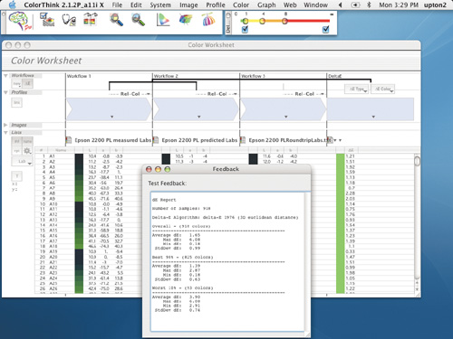
Alternatively, you can make the comparison a good deal more easily using ColorThink Pro. You’ll need to open the profiling target in Photoshop and assign the printer profile, then convert it to Lab, to obtain a printable target containing the predicted Lab values and to print that target through the printer profile. But ColorThink Pro can show you the predicted Lab values, so you don’t need to wrestle with extracting the Lab data from Photoshop.
If you’re already a ColorThink user, you’ll find that ColorThink Pro is a very worthwhile upgrade with a wealth of options that simplify both numeric and visual color comparisons. Figure 9-21 shows the comparison between the three sets of measurements.
Figure 9-21 ColorThink Pro profile evaluation
We’ve long relied on Chromix ColorThink as an indispensable tool for visualizing color—all the 3D gamut plots in this book were produced using ColorThink, for example. While it’s no slouch at providing numerical feedback, what sets ColorThink apart is the way it lets you model and analyze color issues visually.
The new ColorThink Pro builds on the solid foundation provided by the original, and adds extremely useful new capabilities, of which we can show only two here.
Figure 9-22 shows Colorthink Pro’s metamerism test, which shows you how spectrally measured colors will appear under different lighting. It can help you decide whether or not your printer needs illuminantspecific profiles.
Figure 9-22 ColorThink Pro metamerism test

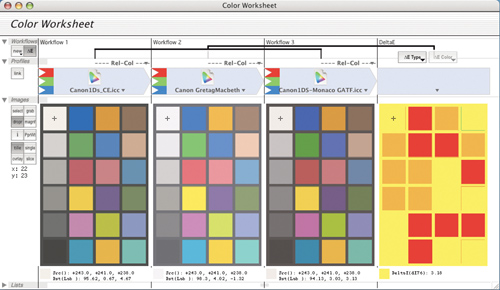
Another new feature in Color-Think Pro is the Color Worksheet, which allows you to simulate and analyze all sorts of workflows from the simple to the very complex. Figure 9-23 shows a Color Worksheet that tracks the conversions from an RGB to a CMYK destination to an RGB proof, and lets you track exactly what happens to the color at each stage of the process.
Figure 9-23 ColorThink Pro Color Worksheet

If you often have the need to analyze color problems, and especially if you like to think visually, we can’t recommend ColorThink Pro too strongly.
If one profile or CMM seems to produce more accurate results than another, double-check by looking at the Granger Rainbow—accuracy often comes at the expense of smoothness. Don’t make any hard-and-fast decisions yet—to fully evaluate the profile, you still have some work to do.
Subjective Tests for Output Profiles
Objective tests give you a good idea of a profile’s overall accuracy—how much slop there is in the system—and the specific color areas where it has trouble. They’re useful in determining the profile’s ability to reproduce spot colors accurately, and to simulate other devices’ behavior as a proofer. But they tell you very little about the profile’s ability to print images. To do that, you need—you guessed it—to print images!
When you evaluate a profile’s image-handling capabilities, you need to use a variety of image types with shadow and highlight detail, saturated colors, neutrals, skin tones, and pastels. The images must be in either LAB or a well-defined device-independent RGB space—such as Adobe RGB (1998) or ColorMatch RGB—to make sure that your evaluation isn’t compromised by shortcomings in the input profile. (You can’t use an original print or transparency to make the comparison, because the profiled print would then be the result of the input profile plus the printer profile.) Print your test images using both relative colorimetric and perceptual renderings.
You need to carry out two comparisons for each rendering intent. Compare the printed image, under suitable lighting, with the original image you were trying to reproduce (if you’re evaluating a CMYK output profile, look at the original RGB image) on your calibrated and profiled monitor. This comparison looks at the colorimetric and perceptual BtoA (PCS-to-device) tables, which control the way the output device renders color.
Then convert the images to the profile you’re evaluating, and compare its appearance on your calibrated and profiled monitor—this looks at the colorimetric AtoB (device-to-PCS tables), which control the soft proof of the printed image on your monitor.
If you’re happy with both, you’re done, and you can skip the rest of this chapter. It’s more likely, though, that you’ll find flaws with one or the other.
The two key questions you need to ask are, in this order:
• Does the screen display of the image converted to the profile match the print?
If the answer is yes, we recommend that you don’t try to edit the profile, but instead soft-proof images and make any necessary optimizations as edits to individual images (see “Soft-Proofing Basics” in Chapter 10, Color Management Workflow). It’s a great deal easier to achieve predictable results editing images than it is editing profiles.
If the answer is no, we suggest that you edit the AtoB tables to improve the soft-proof before you even think about editing the BtoA tables. Most profile editors work by displaying your edits on an image that’s displayed through the profile, so fixing the display side of the profile is pretty much essential before you can turn your attention to the output side.
• Does the print provide a reasonable rendition of the original image?
If the answer is yes, fix the AtoB tables if necessary or just use the profile as is. If it’s no, do you see problems with both rendering intents, or just with one? If you only see problems with perceptual rendering, and your profiling package allows you to change the trade-offs between hue, saturation, and lightness in the perceptual intent, you may want to generate a new profile with different perceptual rendering parameters rather than editing. If you see real problems with the relative colorimetric rendering too, it’s a candidate for editing.
Editing Output Profiles
Output profile editing isn’t for the faint of heart. You’re standing ankle-deep in a bog, you’ve decided that the map needs fixing, and all you have to fix it with is your eyeballs and a laundry marker. With care, practice, and skill, it’s possible to make profiles more useful by editing them, but it’s a great deal easier to screw them up beyond recognition.
With that cautionary note in mind, here are the types of edits that we think are rational to attempt:
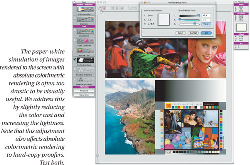
• Globally editing all the AtoB tables to improve soft-proofing. We typically make small changes to white point, overall contrast, and saturation (see Figure 9-24).
Figure 9-24 Editing the AtoB white point
• Making small changes to selective colors in all the AtoB tables to improve soft-proofing (see Figure 9-25).
Figure 9-25 Selective color in the AtoB tables

• Making small changes to the BtoA0 (perceptual) table only, to improve the printed output of out-of-gamut colors, but only after you’ve finished editing the AtoB tables: unlike the first three types of edit, this one actually changes the printed output. You may be better off generating a new profile with different perceptual mapping—if your profiling package offers these controls, make a new profile rather than editing this one.
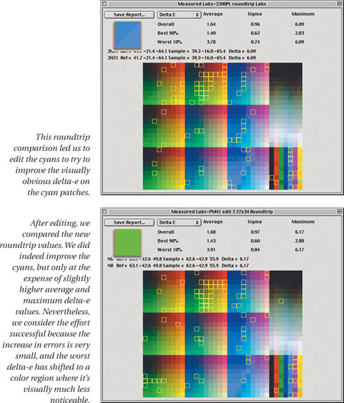
You can also edit the colorimetric BtoA table to try to reduce the maximum errors, or to improve the reproduction of specific colors, but be warned—it’s like trying to adjust a cat’s cradle. You pull on one part of the color range, and another part moves. It’s possible to reduce the maximum error, or improve the reproduction of specific colors that concern you, but only at the cost of increasing the overall average error. Within limits, this may be a perfectly sensible thing to do.
If your goal is to reduce maximum error, consider where in the color range it’s happening. A LAB delta-e of 10 is a great deal more obvious in a light blue than it is in a light yellow, for example. So look at where the errors are showing up, and decide if they’re visually objectionable enough to justify compromising the color in other areas (see Figure 9-26).
Figure 9-26 Reducing maximum delta-e errors
Edit, Reprofile, or Update?
When you’re new to profile editing, you’ll be tempted to edit the profile to fix problems that are really better addressed by either adjusting the device’s behavior (perhaps by linearizing) and reprofiling, or reprofiling with different profile parameters. Going all the way back to the beginning and starting over may seem like a lot more work than editing the profile, but in the long run it’s usually the easiest course.
Remember that a profile is the result of a lengthy process that’s subject to all the variables we discussed in Chapter 5, Measurement, Calibration, and Process Control. Small changes in the variables early in the process tend to get amplified in the profile creation process.
If your profile has problems that are big enough to make you contemplate editing them, take a moment to reflect on all the steps that went before. Are both the device and the instrument correctly calibrated? Did you let the printer target stabilize? Are all your measurements correct? Did you set the separation parameters for your CMYK profile optimally? All these factors can have a surprisingly large impact on the resulting profile.
If the device has changed in a way that defies recalibration, or calibration isn’t an option with your particular device, and the result is a shift in tone reproduction, you may be able to update the profile. Some packages offer the ability to reprint a linearization target, and update an existing profile. If the magenta in a color laser printer is printing heavier today, for example, updating may be adequate. But if you’ve changed to a new magenta inkset on press or in an inkjet, you’ll most likely have to make a new profile. Subtle changes in paper stock can often be addressed by profile updating. The way to find out is to give it a try—updating a profile is quicker and easier than either editing the profile or making a new one.
Profiling Is Iterative
Getting good profiles requires rigorous attention to detail, a reasonably stable device, a reasonably accurate instrument, and a reasonably good profiling package. Getting great profiles takes a good deal more work. We often go through multiple iterations of calibrating the device, measuring, profiling, evaluating, editing, evaluating again, going back and adjusting the device, and then repeating the whole process. Eventually, you’ll reach the point of diminishing returns no matter how picky and obsessive you are, but just where that point occurs is a subjective call that only you can make.
Where Do We Go from Here?
We’ve just about run the analogy of profile as map into the ground, but it still has a little life left in it. In this chapter, we’ve shown you how to determine the accuracy of the map, and how to improve at least some aspects of its accuracy. In the next part, we’ll talk about how to use the maps to get to where you need to go.