
1. What Is Color?: Reflections on Life
“It’s not easy being green,” sang the velvet voice of Kermit the Frog, perhaps giving us some indication of how the frog felt to be a felt frog. While none of us may ever know the experience of “being green,” it’s worth reflecting (as we are all reflective objects) on the experience of “seeing green.”
You don’t have to be a color expert to use color management. But if you’re totally unfamiliar with the concepts behind the technology, color management may seem like magic. We don’t expect you to become as obsessed with color as we are—indeed, if you want any hope of leading a normal life, we advise against it—but we do recommend that you familiarize yourself with the fundamentals we lay out in this chapter.
• They’ll help you understand the problem that color management addresses. The whole business of printing or displaying images that look like realistic depictions of the things they portray depends on exploiting specific properties of the way humans see color. Color management is just an extension of that effort.
• They’ll explain some of the terminology you’ll encounter when using color management software—terms like colorimetric, perceptual, and saturation, for example. A little color theory helps explain these terms and why we need them.
• The strengths and weaknesses of color management are rooted in our ability (or inability) to quantify human color vision accurately. If you understand this, your expectations will be more realistic.
• Color theory explains why a color viewed in a complex scene such as a photograph looks “different” from the same color viewed in isolation. Understanding this helps you evaluate your results.
• You need to understand the instruments you may use with color management. This chapter explains just what they measure.
But we have to ’fess up to another reason for writing this chapter: color is just really darned interesting. While this chapter sets the stage and lays the foundation for other chapters in this book, we hope it will also spark your curiosity about something you probably take for granted—your ability to see colors. If you’re intimidated by scientific concepts, don’t worry—we won’t bombard you with obscure equations, or insist that you pass a graduate course in rocket science. It’s not absolutely necessary to understand all of the issues we cover in this chapter to use color management. But a passing familiarity with these concepts and terms can often come in handy. And you may well come to realize that, although you’ve probably done it all your life, in reality “it’s not easy seeing green.”
Where Is Color?
If you want to manage color, it helps to first understand just what it is, so let’s start by examining your current definition of color. Depending on how much you’ve thought about it—if you’re reading this book, you’ve probably done so more than most—you may have gone through several definitions at various times in your life, but they’ve probably resembled one of the following statements:
Color is a property of objects
This is the first and most persistent view of color. No matter how much we may have philosophized about color, we all still speak of “green apples,” “red lights,” and “blue suede shoes.”
Color is a property of light
This is the textbook counterclaim to the view of color as a property of objects. Authors of color books and papers love to stress that “light is color” or “no light, no color.”
Color happens in the observer
This concept captures our imagination when we encounter optical illusions such as afterimages, successive contrast, and others that don’t seem to originate in the objects we see. Color is something that originates in the eye or the brain of the observer.
The correct answer, of course, is a blend of all three. All are partially true, but you don’t have to look far to find examples that show that none of the three statements, by itself, is a complete description of the experience we call color.
Color is an event that occurs among three participants: a light source, an object, and an observer. The color event is a sensation evoked in the observer by the wavelengths of light produced by the light source and modified by the object. If any of these three things changes, the color event is different (see Figure 1-1)—in plain English, we see a different color.

We find it interesting that the three ingredients of the color event represent three of the hard sciences: physics, chemistry, and biology. Understanding how light affects color takes us into the physics of color; understanding how objects change light involves the chemistry of surfaces and how their molecules and atoms absorb light energy; and understanding the nature of the observer takes us into biology, including the neurophysiology of the eye and brain, and the threshold of the nether regions of psychology. In short, color is a complex phenomenon.
The next sections explore this simple model of the color event in more detail. We begin with light sources, then move on to objects, and then spend a bit more time with the subject most dear to you and us, namely, you and us (the observers).
Light and the Color Event
The first participant in the color event is light. The party just doesn’t get started until this guest arrives. But all light isn’t created equal: the characteristics of the light have a profound effect on our experience of color. So let’s look at the nature of light in more detail.
Photons and Waves
Many a poor physics student has relived the dilemma faced by eighteenth-century scientists as to whether light is best modeled as a particle (the view held by Sir Isaac Newton) or as a wave (as argued by Christian Huygens). Depending on the experiment you do, light behaves sometimes like a particle, sometimes like a wave. The two competing views were eventually reconciled by the quantum theorists like Max Planck and Albert Einstein into the “wavicle” concept called a photon.
You can imagine a photon as a pulsating packet of energy traveling through space. Each photon is born and dies with a specific energy level. The photon’s energy level does not change the speed at which the photon travels—through any given medium, the speed of light is constant for all photons, regardless of energy level. Instead, the energy level of the photon determines how fast it pulsates. Higher-energy photons pulsate at higher frequencies. So as these photons all travel together at the same speed, the photons with higher energy travel shorter distances between pulses. In other words, they have shorter wavelengths. Another way to put it is that every photon has a specific energy level, and thus a specific wavelength—the higher the energy level, the shorter the wavelength (see Figure 1-2).

The wavelengths of light are at the order of magnitude of nanometers, or billionths of a meter (abbreviated nm).
The Spectrum
The spectrum refers to the full range of energy levels (wavelengths) that photons have as they travel through space and time. The part of this spectrum that tickles our eye is a small sliver from about 380 nm to about 700 nm that we call the visible spectrum, or simply, light (see Figure 1-3).
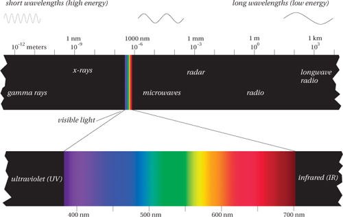
Our eyes respond only to this tiny sliver of the full electromagnetic spectrum, and they have varying responses to different parts of this sliver—the different wavelengths evoke different sensations of color. So we’ve come to associate the different wavelengths with the colors they evoke, from the reds at the low-energy end (longer wavelengths at about 700 nm) through the oranges, yellows, and greens to the blues and violets at the high-energy end (shorter wavelengths at about 380 nm). Of course, there’s nothing in the electromagnetic spectrum itself that prevents us from naming more or fewer than six bands. Newton, for example, labeled a seventh band, indigo, between the blues and violets. (Many historians believe that Newton was looking for symmetry with the seven notes of the musical octave.)
But no matter how many bands you label in the spectrum, the order—reds, oranges, yellows, greens, blues, and violets—is always the same. (Fred and Bruce spent early years in a British school system, and were taught the mnemonic “Richard of York Gained Battles in Vain,” while in the U.S., Chris was introduced to the strange personage of Mr. “ROY G. BiV.”) We could reverse the order, and list them from shortest to longest wavelength (and hence from highest to lowest energy and frequency—the lower the energy, the lower the frequency, and the longer the wavelength), but green would always lie between blue and yellow, and orange would always lie between yellow and red.
In the graphic arts, we’re mainly concerned with visible light, but we sometimes have to pay attention to those parts of the spectrum that lie just outside the visible range. The wavelengths that are slightly longer than red light occupy the infrared (IR) region (which means, literally, “below red”). IR often creates problems for digital cameras, because the CCD (charge-coupled-device) arrays used in digital cameras to detect light are also highly sensitive to infrared, so most digital cameras include an IR filter either on the chip or on the lens.
At the other end, just above the last visible violets, the range of high-energy (short-wavelength) photons known as the ultraviolet (UV) region (literally, “beyond violet”) also raises some concerns. For example, paper and ink manufacturers (like laundry detergent manufacturers) often add UV brighteners to make an extra-white paper or extra-bright ink. The brighteners absorb non-visible photons with UV wavelengths, and re-emit photons in the visible spectrum—a phenomenon known as fluorescence. This practice creates problems for some measuring instruments, because they see the paper or ink differently from the way our eyes do. We address these issues in Chapters 5 and 8.
Spectral Curves
Other than the incredibly saturated greens and reds emitted by lasers, you’ll rarely see light composed of photons of all the same wavelength (what the scientists call monochromatic light). Instead, almost all the light you see consists of a blend of photons of many wavelengths. The actual color you see is determined by the specific blend of wavelengths—the spectral energy—that reaches your eye.
Pure white light contains equal amounts of photons at all the visible wavelengths. Light from a green object contains few short-wavelength (high-energy) photons, and few long-wavelength (low-energy) photons—but is comprised mostly of medium-wavelength photons. Light coming from a patch of magenta ink contains photons in the short and long wavelengths, but few in the middle of the visible spectrum.
All of these spectral energies can be represented by a diagram called the spectral curve of the light reflected by the object (see Figure 1-4).

Light Sources
A light source is just something that emits large quantities of photons in the visible spectrum. Just as with objects, we can draw the spectral curve of the light energy emitted by the light source at each wavelength (see Figure 1-5).
We care about several main kinds of light sources:
• Blackbody radiators are light sources whose photons are purely the result of thermal energy given off by atoms. Lightbulbs and stars such as our sun are examples of near-perfect blackbodies. The wavelength composition (i.e., “color”) of radiation emitted by a blackbody radiator depends only on its temperature, and not what it’s made of. So we use color temperature as a way of describing the overall “color” of a light source. (See the sidebar “The Color of White” later in this chapter.)
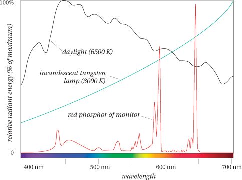
• Daylight is the result of our most familiar blackbody radiator, the sun, and an enormous filter we call the atmosphere. It’s probably the most important of all light sources since it’s the one under which our visual system evolved. The exact wavelength composition of daylight depends on the time of day, the weather, and the latitude (see the black curve in Figure 1-5).
• Electric discharge lamps consist of an enclosed tube containing a gas (such as mercury vapor or xenon) that’s excited by an electric charge. The charge raises the energy level of the gas atoms, which then re-emit the energy as photons at specific wavelengths, producing a “spikey” spectral curve. Manufacturers use various techniques, such as pressurizing the gas or coating the inside of the tube with phosphors, to add other wavelengths to the emitted light. Fluorescent lamps are the most common form of these lamps. The phosphors coating the inside of the tube absorb photons emitted by the gas and re-emit them at other wavelengths.
• Computer monitors are also light sources—they emit photons. CRT (cathode-ray tube) monitors use phosphors on the inside of the front glass to absorb electrons and emit photons at specific wavelengths (either red, green, or blue). The red phosphor in particular is characteristically spikey (see the red curve in Figure 1-5). We’ll describe monitors in more detail, including other types of monitors such as LCDs, in Chapter 6.
Illuminants
The word illuminant refers to a light source that has been measured or specified formally in terms of spectral energy. The CIE (Commission Internationale de l’Eclairage, or the International Commission on Illumination)—a body of color scientists and technologists from around the world that has accumulated a huge amount of knowledge about color since the 1920s—has specified a number of CIE Standard Illuminants.
• Illuminant A represents the typical spectral curve of a tungsten lamp (a standard lightbulb). This is the green curve in Figure 1-5.
• Illuminant B represents sunlight at a correlated color temperature of 4874 K. This is seldom used, if ever.
• Illuminant C is an early daylight simulator (correlated color temperature 6774 K). It has been replaced by the D illuminants, although you occasionally still find it.
• Illuminants D is a series of illuminants that represent various modes of daylight. The most commonly used D illuminants are D50 and D65 with correlated color temperatures of 5000 K and 6504 K, respectively. The D65 spectral curve is the black curve in Figure 1-5.
• Illuminant E is a theoretical “equal energy” illuminant that doesn’t represent a real light source, and is mostly used for calculations.
• Illuminants F is a series of “fluorescent” illuminants that represent the wavelength characteristics of various popular fluorescent lamps. These are named F2, F3, and so on, up to F12.
The Object and the Color Event
The second participant in the color event is the object. The way an object interacts with light plays a large role in determining the nature of the color event, so in this section we examine the various ways that objects interact with light, and the ways that this interaction affects our experience of color.
Many of the light sources we use—such as lightbulbs or sunlight—produce light in a characteristic way that gives us a handy terminology to describe the color of light: color temperature. Every dense object radiates what’s called thermal energy. Atoms re-emit energy that they’ve absorbed from some process such as combustion (burning of fuel) or metabolism (burning off those fries you had for lunch). At low temperatures, this radiation is in the infrared region invisible to humans, and we call it heat. But at higher temperatures the radiation is visible and we call it light.
To study this phenomenon, physicists imagine objects where they have eliminated all other sources of light and are only looking at the radiation from thermal energy. They call these objects blackbody radiators. If you’re standing in a pitch-black room, you are a blackbody radiator emitting energy that only an infrared detector, or an owl, can see. Stars (such as our sun) are almost perfect blackbodies as they aren’t illuminated by any other light source, and the light they emit is almost entirely from the heat their atoms have absorbed from the furnaces in the stars’ cores. A lightbulb in a dark room is an almost-perfect blackbody radiator—all the light is from a heated filament of tungsten. A candle is mostly a blackbody (although if you look closely, you can see a small region of blue light that’s due to direct energy released by the chemical reaction of burning wax rather than absorption and re-emission of energy). To see a blackbody in action, turn on your toaster in a darkened kitchen.
Figure 1-6 shows the spectral curves of a blackbody at various temperatures. (Temperatures are in kelvins (K), where a kelvin is a degree in the physicist’s temperature scale from absolute zero.) At lower temperatures, the blackbody gives off heat in the low-energy/long-wavelength part of the visible spectrum, and so is dominated by red and yellow wavelengths. At 2000 K we see the dull red we commonly call “red hot.” As the temperature gets higher, the curve shifts gradually to the higher-energy/shorter wavelengths. At 3000 to 4000 K, the light changes color from dull red to orange to yellow. The tungsten filament of an incandescent lightbulb operates at about 2850 to 3100 K, giving its characteristic yellowish light. At 5000 to 7000 K, the blackbody’s emitted light is relatively flat in the visible spectrum, producing a more neutral white. At higher temperatures of 9000 K or above, short wavelengths predominate, producing a bluer light.

This is the system we use to describe colors of “white light.” We refer to their “color temperature” to describe whether the light is orange, yellowish, neutral, or bluish. Purists will remind you that the correct term is actually correlated color temperature as most emissive light sources—including daylight (which is filtered by the earth’s atmosphere), fluorescent lamps, and computer monitors—aren’t true blackbody radiators, and so we’re picking the closest blackbody temperature to the apparent color of the light source.
Reflection and Transmission
An object’s surface must interact with light to affect the light’s color. Light strikes the object, travels some way into the atoms at the surface, then re-emerges. During the light’s interaction with these surface atoms the object absorbs some wavelengths and reflects others (see Figure 1-7), so the spectral makeup of the reflected light isn’t the same as that of the incoming light. The degree to which an object reflects some wavelengths and absorbs others is called its spectral reflectance. Note that if you change the light source, the reflectance of the object doesn’t change, even though the spectral energy that emerges is different. Reflectance, then, is an invariant property of the object.
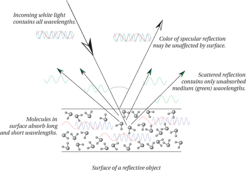
A transmissive object affects wavelengths in the same way as the reflective object just described, except that the transmissive object must be at least partially translucent so that the light can pass all the way through it. However, it too alters the wavelength makeup of the light by absorbing some wavelengths and allowing others to pass through.
The surface of a reflective object or the substance in a transmissive object can affect the wavelengths that strike it in many specific ways. But it’s worth pausing to examine one phenomenon in particular that sometimes bedevils color management—the phenomenon known as fluorescence.
Fluorescence
Some atoms and molecules have the peculiar ability to absorb photons of a certain energy (wavelength), and emit photons of a lower energy (longer wavelength). Fluorescence, as this phenomenon is called, can sometimes change one type of visible wavelength into another visible wavelength. For example, the fluorescent coating inside a sodium lamp absorbs some of the yellow wavelengths emitted by the electrically excited sodium vapor, and re-emits photons of other wavelengths in order to produce a more spectrally balanced light.
But fluorescence is most noticeable when the incoming photons have wavelengths in the non-visible ultraviolet range of the spectrum, and the emitted photons are in the visible range (usually in the violets or blues). The result is an object that seems to emit more visible photons than it receives from the light source—it appears “brighter than white.”
Many fabric makers and paper manufacturers add fluorescent brighteners to whiten the slightly yellow color of most natural fibers. To compensate for the slow yellowing of fabrics, many laundry detergents and bleaches have fluorescent brighteners, often called “bluing agents” (because they convert non-visible UV light to visible blue). We all have fond memories of groovy “black lights”—lamps designed to give off light energy in the violet and ultraviolet wavelengths—and their effects on posters printed with fluorescent inks, on white T-shirts, and yes, even on teeth, depending on the brighteners in the toothpaste we had used!
Fluorescence crops up in unexpected places in color management—we’ll alert you when they are something to look out for. For now, it’s enough to know that fluorescence can be an issue in three cases:
• Whenever a measurement instrument (a spectrophotometer, colorimeter, scanner, digital camera, or film) is more responsive to UV light than our eye is (which has no response at all).
• Whenever artificial light sources (such as lamps, flashbulbs, or scanner lamps) emit more or (more likely) less UV than daylight, which includes a sizeable amount of UV.
• Whenever a colorant (ink, wax, toner, etc.) or paper used for printing has fluorescent properties that make it behave unpredictably depending on the light source used to view it (as unpredictability is the nemesis of color management).
The Observer and the Color Event
Of the three participants in our simple model of the color event, you, the observer, are by far the most complex. Your visual system is way more complex than a blackbody radiator or a hemoglobin molecule, so much so that we still have a great deal to learn about it. It starts with the structures of the eye, but continues through the optic nerve and goes deep into the brain. In this section, we look at various models of human vision that form the basis of color management.
Trichromacy: Red, Green, Blue
If there’s one lesson you should take from this chapter, it’s that the fundamental basis for all color reproduction is the three-channel design of the human retina. Other features of human vision—such as opponency, color constancy, and nonlinearity, all of which we cover in this section—are important, but the fact that the human eye has three types of color sensors (corresponding roughly to reds, greens, and blues) is what lets us reproduce colors at all using just three pigments on paper, or just three phosphors in a monitor.
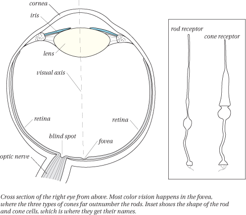
The eye
Your eye is one of the most beautiful structures in nature. (We hope you don’t think we’re being too forward.) Contrary to popular belief, the main task of focusing light into an image at the back of the eye is handled not by the lens, but by the cornea, the curved front layer of the eye. The lens makes minor focus adjustments as the tiny muscles that hold it in place adjust its shape, but it does two important things for color vision. First, the lens acts as a UV filter, protecting the retina from damaging high-energy ultraviolet light—so even if the retina could see into the UV range (and some experiments show that it can), the lens is partly responsible for our inability to see UV light, unlike other visual systems, such as honeybees, birds, scanners, and digital cameras. Second, the lens yellows as we age, reducing our ability to see subtle changes in blues and greens, while our ability to see reds and magentas is hardly affected. Our discrimination in the yellows is always fairly weak, regardless of age.
The retina: rods and cones
The retina is a complex layer of nerve cells lining the back of your eye (see Figure 1-8). The nerve cells in the retina that respond to light are called photoreceptors, or often just receptors. Receptors come in two types, called rods and cones because of their shapes. Rods provide vision in low-light conditions, such as night vision. They’re sensitive in low levels of light and are largely blinded by daylight conditions. Cones are a more recent development in the evolution of the mammal retina and function in bright light conditions. We have far more rods than cones throughout most of the retina (about 120 million rods to about 6 million cones), except in a little indentation in the very center of the retina, called the fovea, where cones outnumber rods (about 150,000 cones, with a small number of rods, falling off to a completely rod-free region in the center of the fovea called the foveola). This center region, where you have the highest density of photoreceptors, also provides the best acuity (for example, to read these letters, you’re focusing the image of the letters on your fovea). It’s also where your primary color vision happens.
Three types of cones
While all the rods in your retina are essentially the same, the cones fall into three types. One responds primarily to the long wavelengths of light and has little response in the middle or short wavelengths. One responds primarily to the middle wavelengths, and the third responds to the short wavelengths (see Figure 1-9). Many people call these the red cones, green cones, and blue cones, respectively, because of the colors we normally associate with these three regions of the spectrum, but it’s less misleading to refer to them as the long-, medium-, and short-wavelength cones (or L, M, and S), respectively.

Trichromacy and tristimulus
Two related and often confused terms are trichromacy and tristimulus. The term trichromacy (also known as the three-component theory or the Young-Helmoltz theory of color vision) refers to the theory, now well verified, that we have three receptors for color (the three types of cones).
The term tristimulus refers to experiments and measurements of human color vision involving three color stimuli, which the test subject uses to match a target stimulus (see Figure 1-10). In other words, trichromacy refers to our three color receptors, and tristimulus refers to the experiments that use three stimuli to verify and measure trichromacy. The most comprehensive tristimulus model has been defined by the CIE and forms the basis for color management.
Figure 1-10 Tristimulus experiment

The importance of trichromacy for the graphic arts is that we can simulate almost any color by using just three well-chosen primary colors of light. Two colors are not enough—no matter how carefully you choose them, you cannot duplicate all colors with two primaries. And four colors is unnecessary—any color you can produce with four colors of light you can reproduce with just a well-chosen three.
Additive primaries
It’s the trichromatic structure of the human retina that makes possible what we know as the additive primary colors (see Figure 1-11). If you choose three light sources with overlapping spectra that divide up the visible spectrum roughly into thirds, each one adds wavelengths that tickle one or more of your eye’s three receptors. Divide the spectrum roughly into thirds and you get three light sources that we would call red, green, and blue. Starting from black (no wavelengths), the three colors add wavelengths—hence “additive color”—until you get white (all wavelengths in even proportions).

Subtractive primaries
Trichromacy is also the source of our subtractive primaries—cyan, magenta, and yellow (see Figure 1-11). Rather than adding wavelengths to black, they act to subtract wavelengths from an otherwise white source of light. In other words, the term “cyan ink” is just a name for “long-wavelength-subtractor,” or simply “red-subtractor”—it subtracts long (red) wavelengths from white light (such as that reflected from otherwise blank paper). Similarly, magenta ink is a “medium-wavelength-subtractor,” or a “green-subtractor.” And yellow is a “short-wavelength-subtractor,” or a “blue-subtractor.”
But the bottom line is that both additive and subtractive primaries work by manipulating the wavelengths that enter our eyes and stimulate our three cone receptors. This manipulation, when done cleverly, stimulates our three receptors in just the right proportions to make us feel like we are receiving light of a certain color.
There are still a few more points to make about trichromacy.
Color spaces
The three primary colors not only allow us to define any color in terms of the amount of each primary, they also allow us to plot the relationships between colors by using the values of the three primaries as Cartesian coordinates in a three-dimensional space, where each primary forms one of the three axes. This notion of color spaces is one you’ll encounter again and again in your color management travails.
Relationship with the spectrum: why not GRB or YMCK?
Have you have ever wondered why we have the convention that RGB is always written in that order (never GRB or BRG)? Similarly, CMYK is never written YMCK (except to specify the order in which inks are laid down, or when adding a twist to a certain Village People song). Well, now you know why:
• The colors of the spectrum are usually listed in order of increasing frequency: red, orange, yellow, green, blue, and violet—ROYGBV.
• The additive primaries divide this spectrum roughly into thirds, corresponding to the reds, greens, and blues. So ROYGBV leads to RGB.
• We write the subtractive primaries in the order that matches them to their additive counterparts (their opposites). Thus RGB leads to CMY.
You may find this last convention handy for remembering complementary colors. For example, if you’re working on a CMYK image with a blue cast, and can’t remember which channel to adjust, just write RGB, and then under it CMY. The additive primaries match their subtractive complements (Y is under B because yellow subtracts blue). So to reduce a blue cast, you increase Y, or reduce both C and M.
Artificial trichromats (scanners, cameras, etc.)
We also use trichromacy to make devices that simulate color vision. The most accurate of these are colorimeters, which we’ll describe later in this chapter. A colorimeter tries to duplicate the exact tristimulus response of human vision. More common examples of artificial trichromats are cameras, which use film sensitive to red, green, and blue regions of the spectrum, and scanners and digital cameras, which use sensors (CCDs) with red, green, and blue filters that break the incoming light into the three primary colors. When the “receptors” in these devices differ from our receptors, the situation arises where they see matches that we don’t and vice versa. We discuss this phenomenon, called metamerism, later in this chapter.
Opponency: Red-Green, Blue-Yellow
Some fundamental features of human color vision not only are unexplained by trichromatic theory, but seem to contradict it.
The strange case of yellow
Many of us grew up with the myth that the primary colors are red, yellow, and blue—not red, green, and blue. Studies have shown that more cultures have a name for “yellow” than have a name even for “blue”—and our own color naming reveals a sense that “yellow” is in a different, more fundamental category than, say, “cyan” and “magenta”. Even though Thomas Young first demonstrated that you can make yellow light by combining red and green light, it seems counterintuitive. In fact, it’s difficult to imagine any color that is both red and green at the same time.
Other effects unexplained by trichromacy
The fact that we can’t imagine a reddish green or a greenish red is evidence that something more is going on than just three independent sensors (trichromacy). The same holds for blue and yellow—we can’t imagine a yellowish blue. The effects of simultaneous contrast and afterimages shown in Figures 1-12 and 1-13 are other examples—the absence of a color produces the perception of its opposite. Finally, anomalous color vision (color blindness) usually involves the loss of color differentiation in pairs: a person with anomalous red response also loses discrimination in the greens, and a person who has no blue response also has no yellow response.
Figure 1-12 Simultaneous contrast

Figure 1-13 Successive contrast

Opponency
Experiments and observations by Ewald Hering in the late 1800s focused on these opponent pairs. Why is it that we can have reddish-yellows (orange), blue-greens, and blue-reds (purples), but no reddishgreens and no yellowish-blues? To say that something is both red and green at the same time is as counterintuitive as saying that something is both light and dark at the same time. The opponent-color theory (also known as the Hering theory) held that the retina has fundamental components that generate opposite signals depending on wavelength. The key point is that the color components in the retina aren’t independent receptors that have no effect on their neighbors, but rather work as antagonistic or opponent pairs. These opponent pairs are light-dark, red-green, and yellow-blue.
Reconciling opponency and trichromacy
While the advocates of the opponency and trichromacy theories debated for many years which theory best described the fundamental nature of the retina, the two theories were eventually reconciled into the zone theory of color. This holds that one layer (or zone) of the retina contains the three trichromatic cones, and a second layer of the retina translated these cone signals into opponent signals: light-dark, red-green, yellow-blue. The zone theory has held up well as we continue to learn more about the layer structure of the retina, and use simple neural-net models that explain how opponent signals can emerge from additive signals (see Figure 1-14).
Figure 1-14 Trichromacy and opponency in the retina

Opponency and trichromacy in the CIE models
If all this opponency and trichromacy stuff is about to make your head explode, let us assure you that it’s very relevant to color management. In Chapter 2 we’ll look at the CIE models of color vision, which are used as the basis for color management computations, but the important point here is that many of the CIE models—such as CIE LAB used in Photoshop and in most color management systems (CMSs)—incorporate aspects of both trichromacy and opponency. CIE LAB is based on the results of tristimulus experiments such as the one described in Figure 1-10, but it represents colors in terms of three values that represent three opponent systems: L* (lightness-darkness), a* (red-green opposition), and b* (blue-yellow opposition).
So using LAB, we can convert trichromatic measurements (measurements made with instruments that duplicate the responses of our cone receptors) to values in an opponent-color system. Achieving this wasn’t simple, and it’s far from perfect (as we will discuss in Chapter 2), but it’s very clever, and surprisingly successful as a model, particularly when you consider that it was designed simply as a test of the reigning theories of color vision, not as a workhorse for computer calculations for the graphic arts industry.
Metamerism
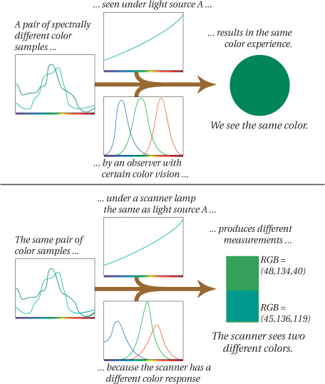
If you’ve encountered the term “metamerism” you’ve probably heard it referred to as a problem or as an “error” of human vision. But—as programmers love to say—it’s not a bug, it’s a feature. Not only is metamerism inherent in trichromatic vision, it’s the feature that makes color reproduction possible.
In simple terms, metamerism is the phenomenon whereby two different color samples produce the same color sensation. By “different color samples” we mean two objects that have different spectral characteristics. So, remembering our light-object-observer definition of color, if the objects are different but they produce the same “color” (the same color sensation), this match may be dependent on (1) the light illuminating both color samples, or (2) the observer viewing the two color samples. Under different lighting, or to a different observer, the two samples may not match.
Two spectrally different color samples that produce the same color sensations are called metamers. Or we say that the two colors are metameric under certain lighting or to a certain type of observer.
You may run into different, seemingly contradictory definitions of metamerism. For example, many books give one of the following two definitions:
• Metamerism is when two color samples produce the same color sensation under certain lighting.
• Metamerism is when two color samples produce different color sensations under certain lighting.
Actually, metamerism is when both of these events happen to the same pair of color samples. The two color samples match under some, but not all, lighting. The first statement focuses on the match that can be made using radically different spectra. The second statement focuses on the fact that the match is tenuous. The reason you need to understand metamerism is that virtually all our color-matching activities rely on making a metameric match between two colors or sets of colors—comparing a chrome on a light table with a scanned image on a monitor, or comparing a proof with a press sheet. It’s highly unlikely that the two samples will have identical spectral curves, but thanks to metamerism, we can make them match—at least in some lighting conditions.
Relationship between two color samples
Metamerism is always a relationship between two color samples—a single color sample can’t be metameric any more than it can be identical. You may hear some people refer to “a metameric color,” or talk about a printer having “metameric inks,” but we think that this usage is both confusing and wrong. A printer with inks that were truly metamers of each other would be pointless—the inks would all appear to be the same color under some lighting condition. What they really mean is that the inks have spectral properties that make their appearance change more radically under different lighting conditions than most other inks.
Why metamerism happens
Metamerism happens because the eye divides all incoming spectra into the three cone responses. Two stimuli may have radically different spectral energies, but if they both get divided up between the three cone types, stimulating them in the same way, they appear to be the same color.
In the terms of our light-object-observer model (remember Figure 1-1), the color “event” is a product of three things: the wavelengths present in the light source; the wavelengths reflected from the object or surface; and the way the wavelengths are divided among the three receptors (the cones in the eye).
What matters isn’t the individual components, but the product of the three. If the light reaching your eye from object A and object B produces the same cone response, then you get the same answer—the same color sensation (see Figure 1-15).

Metamerism in everyday life
If you’ve ever bought two “matching” items in a store—a tie and a handkerchief, or a handbag and shoes—only to find that they look different when viewed in daylight or home lighting, you’ve experienced metamerism. Fred has pairs of white jogging socks that match when he puts them on indoors, but when outdoors one looks noticeably bluer than the other, probably (he theorizes) because they were washed separately using laundry detergents with different UV brighteners. Catalog-makers cite as a common problem the fact that a clothing item shown in a catalog doesn’t match the color of the item received by the customer—perhaps a result of a metameric match that was achieved in the pressroom that failed in the customer’s home.
These examples illustrate the fragile nature of all color-matching exercises—when we match colors, we’re almost always creating a metameric match under a specific lighting condition. That’s why we use standard lighting conditions when we evaluate proof-to-press matches.
In theory, if the catalog publisher knew the conditions under which the catalog would be viewed, she could tailor the color reproduction to that environment, but in practice, it’s just about impossible to know whether prospective customers will look at the catalog in daylight on their lunch hour, under office fluorescent lighting, at home under incandescent lighting, or curled up by a cozy fire under candlelight.
Ultimately, metamerism problems are something we simply have to accept as part of the territory, but if you’re working in an extreme case—like designing a menu for a fancy restaurant that will be viewed mostly under candlelight—you may want to test important matches under a variety of viewing conditions.
Metamerism is your friend
You need to make peace with metamerism. Many people first encounter metamerism as a problem—a color match achieved at great effort under certain lighting fails under different lighting because of odd properties of certain inks or paper. But it’s not, as some people describe, an error of our visual system. It’s just an inevitable side-product of the clever solution evolution produced for deriving wavelength, and hence color information, using only three types of sensors.
More importantly for color management, metamerism is what makes color reproduction possible at all. Metamerism lets us display yellows or skin tones on a computer monitor without dedicated yellow or skin-color phosphors. Metamerism lets us reproduce the green characteristic of chlorophyll (the pigment found in plants) without chlorophyll-colored ink—or even an ink we would call green (see Figure 1-16)!
Figure 1-16 Metamerism in action

Without metamerism, we’d have to reproduce colors by duplicating the exact spectral content of the original color stimulus. (Incidentally, this is what we have to do with sound reproduction—duplicate the stimulus of the original sound wavelength by wavelength.) If you think your ink costs are high today, imagine if you had to have thousands of colors of ink instead of just four!
Camera and scanner metamerism
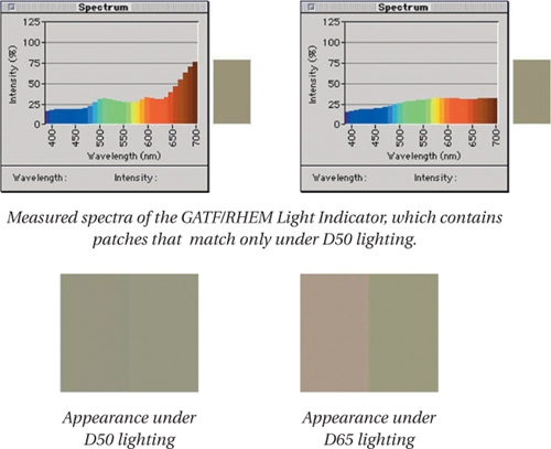
We mentioned that a metameric relationship between two color samples is dependent not only on the light source, but also on the specific observer viewing the two samples. A pair of color samples can produce one color sensation to one observer, but a different color sensation to a second observer. This “observer metamerism” is sometimes an issue with color management when the observer is one of our artificial trichromats.
If a scanner’s red, green, and blue detectors respond differently than our cone sensors, the scanner can see a metameric match where you and I see separate colors, or conversely, a pair of samples may appear identical to us but different to the scanner (see Figure 1-17). This is sometimes called scanner metamerism, and we shall see in Chapter 8 that this is the reason it’s difficult to use a scanner as a measurement device for making profiles. Similarly, if a film or digital camera has different sets of metameric matches than we do, we would call this camera metamerism, and while there’s little that color management can do about it, you need to be aware of it as an issue.
Figure 1-17 How scanner metamerism happens
Non-Linearity: Intensity and Brightness
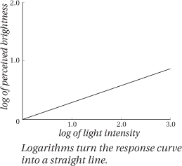
Another important property of the human visual system is that it’s nonlinear. All this means is that our eyes don’t respond in a one-to-one fashion to the intensity (the number of photons reaching your eye as you might count them with a light meter) by reporting brightness (the sensation you feel) to the brain. When you double the intensity, you don’t see the light as twice as bright. If things were that simple, if you drew a graph of intensity versus brightness, this would be a straight line as in Figure 1-18a, and we would call this linear response. Instead the relationship between intensity and perceived brightness looks like the graph in Figure 1-18b. To perceive something about twice as bright, we have to multiply the intensity by about nine!
Figure 1-18 Linear and non-linear response

This non-linearity is common in human perception. If you double the intensity of a sound, you don’t hear it as twice as loud. If you put two sugar cubes in your coffee instead of your normal one, you don’t taste it as twice as sweet. The degree of non-linearity varies for different senses, but they often shape as Figure 1-18b.
Our non-linear responses are what allow our sensory systems to function across a huge range of stimuli. The difference in intensity between a piece of paper illuminated by daylight and the same piece of paper illuminated by moonlight is about 1,000,000:1. But nerve cells can respond (in the number of nerve firings per second) only at a range of about 100:1, so a huge number of inputs have to map to a small number of outputs. Non-linearity lets our sensory systems operate over a wide range of environments without getting overloaded.
The good news is that just because our response is non-linear doesn’t mean it’s complicated. We could have evolved a totally wacky response curve instead of the nice simple one in Figure 1-18b. Instead, this simple curve resembles what mathematicians call a power curve. In fact, using the trick of graphing the logarithms of intensity and brightness simplifies the curve even more, turning it into a straight line that can be characterized by its slope. (If you aren’t familiar with logarithms, see the sidebar, “What’s a Logarithm, and Why Should I Care?”) Many of the scales we use to measure perception are logarithmic scales, including decibels, which measure perceived loudness, and optical density (OD), which measures how dark or light an object appears.
The non-linear nature of our response to light impinges on color management in several ways, but the most important is that the various devices we use to measure light have linear responses. To relate these measurements to human perception, we have to translate them from the linear realm of light to the non-linear realm of perception (see “We Cannot Truly Measure Color, Only Light,” later in this chapter.
So next time someone accuses you of being non-linear, you can respond, “yes I am, and glad to be that way!”
Achromatic Component: Brightness
The term brightness refers to our perception of intensity (the number of photons reaching our eye). Of the three color attributes—brightness, hue, and saturation—we tend to think of brightness as different from the other two, in part because we can detect variations in brightness even when there isn’t enough light (or enough different wavelengths in the light) to see color.
On a dark night, our vision is produced by our rods, which have no color response, but we can still see differences in brightness, and if we view objects under monochromatic light, everything takes on the color of the light, but again we still see differences in brightness.
Brightness describes the quantity of light (“how much”), while hue and saturation describe the quality of light (“what kind”). Detecting variations in brightness is the fundamental task of vision itself, while color, as established by hue and saturation, is just icing (albeit some tasty icing). Vision is fundamentally about “counting photons,” while color deals with “categorizing” these photons into differing types.
What’s a Logarithm, and Why Should I Care?
A logarithm is a handy way to express numbers that vary over huge ranges. For example, if a set of values ranges from 0 to 1,000,000, you’ll probably want much more precision when you compare values between 1 and 10 than you will when comparing values in the 100,000 to 1,000,000 range. For example, you might notice when the price of a movie ticket goes up from $7 to $8, but when buying a house you probably don’t care as much about the difference between $247,637 and $247,638. The numbers at the upper end are not only unwieldy, they have an unnecessary amount of precision.
Logarithms are a nice way to deal with this problem. Instead of imagining all the numbers from 0 to 1,000,000 lined up on a huge ruler so that the distance between any two numbers is always the same, a logarithmic scale compresses the distance between any two numbers as the numbers get higher. In this way, the distance between 0 and 10 is the same as the distance between 10 and 100. So between 0 and 10 you have tick marks for 1, 2, 3, etc. but between 10 and 100 you have tick marks for 10, 20, 30, etc. You end up with a ruler that looks like Figure 1-19.
Figure 1-19 A logarithmic scale

The nifty thing about such a scale is that when you take a non-linear response function like that shown in Figure 1-18b, and graph the logarithms of the values (what’s called a log-log graph), the result is a straight line again (see Figure 1-20)!
Figure 1-20 A log-log graph of Figure 1-18b
This is why, when we measure some physical value with the purpose of predicting how our nervous system perceives that stimulus, we use some sort of logarithmic quantity. For example, what we call density is a logarithmic function derived from a measurement of light intensity and gives us a measurement of perceived darkness. Another example is the unit we call a decibel, which is also a logarithmic function derived from sound intensity, and which gives us a measurement of perceived loudness.
So color scientists often speak of the achromatic and chromatic attributes of a source of light or color. The achromatic attribute is brightness as we perceive it independently from color, and the chromatic attributes are those that we commonly associate with color, independent of brightness. Most mathematical models of human color vision, including the ones that lie at the heart of color management, treat brightness separately from the chromatic attributes. We discuss these models in Chapter 2, Computers and Color.
Brightness vs. lightness
In color science, we draw a distinction between brightness and lightness. For most purposes, the two words mean the same thing—they both refer to the eye’s (non-linear) perception of intensity. But the strict definition is that lightness is relative brightness. In other words, lightness is the brightness of an object relative to an absolute white reference. So lightness ranges from “dark” to “light” with specific definitions of black and white as the limits, while brightness ranges from “dim” to “bright” with no real limits. The distinction matters because we can measure lightness and assign specific numerical values to it, while brightness is a subjective sensation in our heads.
Chromatic Components: Hue and Saturation
Brightness is a property of all vision, but hue and saturation pertain only to color vision. Together, they’re known as the chromatic components of color vision, as distinct from the achromatic component of brightness.
Hue
Defining the word hue as an independent component of color is like trying to describe the word “lap” while standing up. There are multiple definitions for hue—some more vague than others. We’ve even seen hue defined as “a color’s color.”
The most precise definition is that hue is the attribute of a color by which we perceive its dominant wavelength. All colors contain many wavelengths, but some more than others. The wavelength that appears most prevalent in a color sample determines its hue. We stress the word “appears” because it may not be the actual dominant wavelength—the color sample simply has to produce the same response in the three cone types in our eyes as the perceived dominant wavelength would. In other words, it produces a metameric match to a monochromatic light source with that dominant wavelength.
A more useful and equally valid definition of hue is that it’s the attribute of a color that gives it its basic name, such as red, yellow, purple, orange, and so on. We give these names to a region of the spectrum, then we refine individual color names by adding qualifiers like bright, saturated, pale, pure, etc. Thus, red is a hue, but pink is not—it can be described as a pale or desaturated red. The set of basic names that people use is quite subjective, and varies from language to language and culture to culture. As you’ll see later in this chapter when we talk about psychological aspects of color, this connection between hue and color names can be fairly important to color reproduction.
Saturation
Saturation refers to the purity of a color, or how far it is from neutral gray. If hue is the perceived dominant wavelength, saturation is the extent to which that dominant wavelength seems contaminated by other wavelengths. Color samples with a wide spread of wavelengths produce unsaturated colors, while those whose spectra consist of a narrow hump appear more saturated. For example, a laser with a sharp spike at 520 nm would be a totally saturated green (see Figure 1-21).
Figure 1-21 Spectra and saturation

Representations of hue, saturation, and brightness
Most hue diagrams and color pickers represent hue as an angle around some color shape, and saturation as the distance from the center. For example, the Apple color picker accessed from most Macintosh graphics applications shows a disk with neutral grays in the center and saturated pure hues at the edge. The disk is a cross section of the full space of possible colors, so each disk represents all the colors at a single brightness level. Brightness is represented as a third axis ranging from black to white along which all these cross sections are piled, resulting in a color cylinder, sphere, or double cone (see Figure 1-22). You choose colors by first picking a brightness value, which takes you to a certain cross section, then choosing a point on the disk representing the hue (the angle on the disk) and the saturation (the distance from the center of the disk).
Figure 1-22 Hue, saturation, and brightness

Measuring Color
All the preceding knowledge about color would fall into the category that Fred likes to call “more interesting than relevant” if we couldn’t draw correlations between what we expect people to see and things we can physically measure. The whole purpose of color management is ultimately to let us produce a stimulus (photons, whether reflected from a photograph or magazine page) that will evoke a known response (the sensation of a particular color) on the part of those who will view it.
Fortunately, we are able to draw correlations between perceived color and things we can measure in the real world, thanks to the people who have not only figured out the complexities of human vision but have modeled these complexities numerically. We need numerical models to manipulate and predict color using computers, because computers are just glorified adding machines that juggle ones and zeroes on demand. We’ll look at the numerical models in more detail in Chapter 2, Computers and Color, but first we need to look at the various ways we can count photons and relate those measurements to human perception, because they form the foundation for the models.
We Cannot Truly Measure Color, Only Light
“Measuring color” is really an oxymoron. We’ve pointed out that color is an event with three participants—a light source, an object, and an observer—but the color only happens in the mind of the observer. One day we may have both the technology and a sufficient understanding of the human nervous system to be able to identify which of the zillions of electrochemical processes taking place in our heads corresponds to the sensation of fire-engine red, but for now, the best we can do is measure the stimulus—the light that enters the observer’s eye and produces the sensation of color. We can only infer the response that that stimulus will produce. Fortunately, thanks to the work of several generations of color scientists, we’re able to draw those inferences with a reasonable degree of certainty.
We use three main types of instruments to measure the stimuli that observers—our clients, our customers, our audience, and ourselves—will eventually interpret as color. They all work by shining light with a known spectral makeup onto or through a surface, then using detectors to measure the light that surface reflects or transmits. The detector is just a photon counter—it can’t determine the wavelength of the photons it is counting—so the instrument must filter the light going to the detector. The differences between the three types of instruments—densitometers, colorimeters, and spectrophotometers—are the number and type of filters they use, and the sensitivity of their detectors.
• Densitometers measure density, the degree to which reflective surfaces absorb light, or transparent surfaces allow it to pass.
• Colorimeters measure colorimetric values, numbers that model the response of the cones in our eyes.
• Spectrophotometers measure the spectral properties of a surface; in other words, how much light at each wavelength a surface reflects or transmits.
Densitometry
Densitometry plays an indirect but key role in color management. Density is the degree to which materials such as ink, paper, and film absorb light. The more light one of these materials absorbs, the higher its density. We use densitometry as a tool for process control, which is (to grossly oversimplify) the art and science of ensuring that our various devices are behaving the way we want them to. In prepress, we use densitometers to assure that prepress film is processed correctly. In the pressroom, we use densitometers to make sure that the press is laying down the correct amount of ink—if it’s too little, the print will appear washed out, and if it’s too much, the press isn’t controllable and ink gets wasted.
We also use densitometers to calibrate devices—changing their behavior to make them perform optimally, like doing a tune-up on your car. We use densitometers to linearize imagesetters, platesetters, and proofers, ensuring that they produce the requested dot percentages accurately. Some monitor calibrators are densitometers, though colorimeters and spectrophotometers are more often used. We discuss calibration and process control in more detail in Chapter 5, Measurement, Calibration, and Process Control.
You may never use a densitometer—they’re quite specialized, and most of their functions can be carried out equally well by a colorimeter or a spectrophotometer—but it’s helpful to understand what they do.
Reflectance (R) and transmittance (T)
Densitometers don’t measure density directly. Instead, they measure the ratio between the intensity of light shone on or through a surface, and the light that reaches the detector in the instrument. This ratio is called the reflectance (R) or the transmittance (T), depending on whether the instrument measures reflective materials such as ink and paper, or transmissive materials such as film.
Densitometers use filters that are matched to the color of the material you are measuring, so that the detector sees a flat gray. Pressroom densitometers, for example, have filters matched to the specific wavelengths reflected by cyan, magenta, yellow, and black inks, so that they always measure the dominant wavelength. This means first that you have to know and tell the densitometer exactly what it is measuring, and second, that you can only use a densitometer to measure materials for which it has the appropriate filter.
Density is a logarithmic function
Density is computed from the measurement data using a logarithmic function, for several reasons. First, as we’ve seen, the human eye has a non-linear, logarithmic response to intensity, so a logarithmic density function correlates better to how we see brightness. Second, it correlates better with the thickness of materials like printing inks or film emulsions, which is one of the main functions of densitometers. Third, a logarithmic scale avoids long numbers when measuring very dark materials (such as prepress films).
To see what this means, imagine a surface that reflects 100% of all the light that strikes it—a so-called perfect diffuser. Its reflectance, R, is 1.0, and its density is 0. If we consider other surfaces that reflect half the light, one-tenth the light, and so on, we derive the following values:

Notice how a number like 5.0 is far more convenient than 0.00001?
One of the characteristic requirements for a densitometer is that it has a very wide dynamic range. In fact, the dynamic range of other devices (e.g., scanners and printers), media (prints vs. film), or even images (low-key, high-key) is expressed in terms of density units, typically abbreviated as D (density) or O.D. (optical density). For example, the dynamic range of a scanner is expressed in terms of the Dmin (minimum density) and Dmax (maximum density) at which the scanner can reliably measure brightness values.
Colorimetry
Colorimetry is the science of predicting color matches as typical humans would perceived them. In other words, its goal is to build a numeric model that can predict when metamerism does or does not occur. To be considered a success, a colorimetric model must do both of the following:
• Where a typical human observer sees a match (in other words, metamerism) between two color samples, the colorimetric model has to represent both samples by the same numeric values.
• Where a typical human observer sees a difference between two color samples, not only should they have different numeric representations in the model, but the model should also be able to compute a color difference number that predicts how different they appear to the observer.
The current models available aren’t perfect, but thanks to the pioneering work of the CIE, they’re robust enough to form the basis of all current color management systems. If CIE colorimetry is all just so much alphabet soup to you, the one key fact you need to know is that the various CIE models allow us to represent numerically the color that people with normal color vision actually see. Compared to that one insight, the rest is detail, but if you want to really understand how color management works and why it sometimes fails to work as expected, it helps to have a basic understanding of these details. So let’s look at the body of work that forms the core of color management, the CIE system of colorimetry.
The CIE colorimetric system
Most modern colorimetry and all current color management systems are based on the colorimetric system of the CIE, which we introduced at the beginning of this chapter. This system contains several key features.
• Standard Illuminants are spectral definitions of a set of light sources under which we do most of our color matching. We introduced you to the Standard Illuminants A through F, but in the graphic arts world, the two most important are D50 and D65.
• The Standard Observer represents the full tristimulus response of the typical human observer, or in plain English, all the colors we can see. Most colorimeters use the 2° (1931) Standard Observer, but there’s also a 10° (1964) Standard Observer. The latter arose as a result of later experiments that used larger color samples that illuminated a wider angle of the fovea and found a slightly different tristimulus response. It’s rare that you’ll encounter the 10° observer, but we’d be remiss if we didn’t mention it.
• The CIE XYZ Primary System is a clever definition of three imaginary primaries derived from the Standard Observer tristimulus response. (The primaries are imaginary in that they don’t correspond to any real light source—it’s impossible to create a real light source that stimulates only our M or S cones—but the response they model is very real.) Not only does every metameric pair result in the same XYZ values, but the primary Y doubles as the average luminance function of the cones—so a color’s Y value is also its luminance.
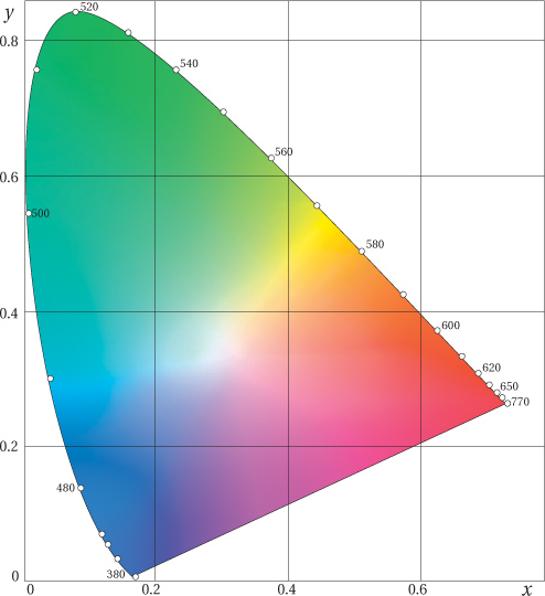
• The CIE xyY diagram is a mathematical transformation of XYZ that makes a useful map of our color universe. It shows additive relationships—a straight line between two points represents the colors that can be created by adding the two colors in various proportions (see Figure 1-23). But it’s important to note that XYZ and xyY don’t factor in the non-linearity of the eye, and so the distances are distorted.
Figure 1-23 The xy chromaticity chart
• The uniform color spaces (LAB, LUV) are two color spaces that were defined by the CIE in an attempt to reduce the distortion in color distances. Both compute the lightness value L* in exactly the same way—it’s approximately the cube root of the luminance value Y (which is a rough approximation of our logarithmic response to luminance). Both attempt to create a space that is perceptually uniform—in other words, distances between points in the space predict how different the two colors will appear to a human observer. As a result, the spaces also have features that resemble hue, saturation, and brightness, and (in the case of L*a*b*) our three opponent systems. LAB has largely replaced LUV in most practical applications, and while it isn’t perfect (it exaggerates differences in yellows and underestimates them in blues, for example), it’s pretty darn useful. The quest for a perfectly uniform color space continues, but thus far LAB has stood the test of time.
• Color difference (ΔE) calculations offer an easy way to compute the color difference between two samples. If you measure the two colors, plot them as points in the uniform space, and then compute the distance between them, that distance will by definition, correlate well to the difference a human observer will see. This value is called ΔE (pronounced “delta-E”—delta is the Greek letter ‘D’ we commonly use to represent a difference).
Colorimeters
Colorimeters measure light through filters that mimic approximately the human cone response, and produce numerical results in one of the CIE color models. Most colorimeters have user-selectable reporting functions that let you obtain the color’s values in CIE XYZ, CIE LAB, CIE LUV, or other colorimetric spaces, as well as measuring the ΔE value between two color samples.
While colorimeters are very flexible in their reporting functions, they have important limitations in the colorimetric assumptions they must make. Specifically, they’re limited to a specific Standard Illuminant and Standard Observer, though some colorimeters let you switch between different illuminants (such as a D50 and a D65 option).
Colorimeters can’t detect metamerism. They can tell whether or not two samples match under the specific illuminant they use, but they have no way of telling if that match is metameric—dependent on the illuminant—or if the samples really do have identical spectral properties that would make them match under all illuminants. Fortunately, for most color-management purposes, computing a color match under a single illuminant is enough.
Colorimetry and color management
Colorimetry is the core of color management, because it allows us to define color unambiguously as it will be seen by humans. As you’ll learn in Chapter 2, Computers and Color, the systems we use to represent color numerically in our everyday image, illustration, and page-layout files are fundamentally ambiguous as to the actual color they represent. Colorimetry allows color management systems to remove that ambiguity. And in Chapter 3, Color Management—How It Works, you’ll see how colorimetry lets color management systems compute the numbers that we send to our various color-reproduction devices—monitors, desktop printers, proofing systems, and printing presses—to ensure that they reproduce the desired colors. For now, just accept the fact that color management systems feed on colorimetry.
Spectrophotometry
Spectrophotometry is the science of measuring spectral reflectance, the ratio between the intensity of each wavelength of light shone onto a surface and the light of that same wavelength reflected back to the detector in the instrument. Spectral reflectance is similar to the reflectance (R) measured by a densitometer and then converted to density, with one important difference. Density is a single value that represents the total number of photons reflected or transmitted. Spectral reflectance is a set of values that represent the number of photons being reflected or transmitted at different wavelengths (see Figure 1-24). The spectrophotometers we use in the graphic arts typically divide the visible spectrum into 10 nm or 20 nm bands, and produce a value for each band. Research-grade spectrophotometers divide the spectrum into a larger number of narrower bands, sometimes as narrow as 2 nm, but they’re prohibitively expensive for the types of use we discuss in this book.
Spectrophotometry and color management
Spectral data has direct uses in graphic arts—such as when some press shops check incoming ink lots for differences in spectral properties—but spectrophotometers are more often used in color management as either densitometers or colorimeters.
The spectral data spectrophotometers capture is a richer set of measurements than those captured by either densitometers or colorimeters. We can compute density or colorimetric values from spectral data, but not the other way around. With spectral data, we can also determine whether or not a color match is metameric, though color management doesn’t use this capability directly.
In color management, a spectrophotometer’s real value is that it can double as a densitometer or colorimeter or both, and it is usually more configurable than the densitometer or colorimeter at either task. Sometimes a dedicated densitometer or colorimeter may be better suited to a specific task such as measuring the very high densities we need to achieve on prepress film, or characterizing the very spiky response of the red phosphor in a monitor. But in most cases, a spectrophotometer is a versatile Swiss Army knife of color measurement.
Where the Models Fail
The CIE colorimetric models are pretty amazing, but it’s important to bear in mind that they were designed only to predict the degree to which two solid color swatches, viewed at a specific distance, against a specific background, under a specific illuminant, would appear to match. Color management takes these models well beyond their design parameters, using them to match complex color events like photographic images. In general, color management works astonishingly well, but it’s important to realize that our visual system has complex responses to complex color events that the CIE models we currently use don’t even attempt to address. A slew of phenomena have been well documented by—and often named for—the various color scientists who first documented them, but they typically point to one significant fact: unlike colorimeters and spectrophotometers, humans see color in context.
So there’s one caveat we’ll make repeatedly in this book: while color management uses colorimetry for purposes of gathering data about device behavior, the ultimate goal of color management is not to get a colorimetric match, but rather to achieve a pleasing image. Sometimes a colorimetric match is great, but sometimes that match comes at the expense of other colors in an image. And sometimes two colors can differ colorimetrically and yet produce a visual match when we view them in context.
Features like simultaneous and successive contrast (see Figures 1-12 and 1-13) and color constancy (see the next section) aren’t modeled by colorimetry and can’t be measured using a colorimeter. Sometimes it’s an advantage to have an instrument that isn’t distracted by these issues—such as when you are collecting raw data on device behavior to feed to a color management system or profile maker. But when it comes time to evaluate results, don’t reach for your colorimeter as a way to judge success. A well-trained eye beats a colorimeter every time when it comes to evaluating final results.
Here are just a few visual phenomena that color management ignores.
Color Constancy
Color constancy is one of the most important features of the visual system, and it’s so ingrained a mechanism that you’re rarely aware of it. Color constancy, sometimes referred to as “discounting the illuminant,” is the tendency to perceive objects as having a constant color, even if the lighting conditions change. In other words, even if the wavelength composition (the spectral energy) of the light coming from the object changes, our visual system picks up cues from surrounding objects and attributes that change to the lighting, not to the object.
What may surprise you is how basic a feature color constancy is to the nervous system. It doesn’t involve memory, much less higher-level thought at all, but seems to be rooted in low-level structures in our visual system. In fact, color constancy has been verified in animals with as simple a nervous system as goldfish (see Figure 1-25). In humans, color constancy seems to be the result of center-surround fields similar to those responsible for opponency, but instead of occurring in the second layer of the retina, as opponency is, the center-surround fields responsible for color constancy seem to be located in the visual cortex of the brain, and they’re far more complex than those responsible for opponency.

Devices don’t have color constancy
Cameras don’t have color constancy. Film doesn’t change its response depending on the illumination in the scene. This is why a photographer has to match the film response to the lighting. Digital cameras with automatic white balance do change their response depending on the illumination in the scene, but they don’t do so in the same way humans do. If a digital camera captures an image of a white horse standing in the shade of a leafy tree, it will faithfully record the greenish light that’s filtered through the leaves and then reflected from the horse, producing a picture of a green horse. But humans know there’s no such animal as a green horse, so they “discount the illuminant” and see the horse as white.
Similarly, colorimeters can’t measure color constancy. They duplicate the tristimulus response of the eye to isolated colors while ignoring the surrounding colors. But even when a device like a scanner does measure the colors surrounding an isolated sample, the exact nature of color constancy is so complex that we don’t yet have a usable mathematical model that would let color management compensate for it.
Color constancy and color management
While color management does not have a model of color constancy to work with, it can do many things without it. The important thing for color management to do is to preserve the relationships between colors in an image. This is the difference between what we call perceptual and colorimetric renderings (see Chapter 3, Color Management—How It Works). When it’s possible to render some but not all of the colors with complete colorimetric accuracy, it’s often perceptually more pleasing to render them all with the same inaccuracy than to render some faithfully and some not.
Color constancy is one reason why neutrals are important: neutrals—especially the highlights in a printed picture that take their color from the paper—form the reference point for colors. If the neutrals are off, the entire image appears off, but it’s hard to pinpoint why. It takes training to “ignore” color constancy and say, “the neutrals are blue” when your visual system is trying to say, “the neutrals are neutral.”
A final point about color constancy and color management: color constancy presents an argument that the color temperature of lighting isn’t as important as some people think. It still is important, but not at the expense of everything else. For example, when calibrating your monitor, you usually have the choice between setting your monitor to a D50 or D65 white point. (Monitor calibration, and the differences between D50 and D65 white points, are described in Chapter 6, but you don’t need to understand these details to understand this point.) Many people choose D50 in order to match the exact white point color of the viewing environment, which is usually a D50 lighting booth. But we, along with many other practitioners, recommend D65 because we think you’ll be happier looking at a bright white D65 monitor than a dingy yellow D50 one, even if the D50 monitor is colorimetrically closer to the D50 lighting booth. Matching brightness levels between two viewing environments may be as important as, or even more important than, matching the color temperature—color constancy does a lot to adapt to slight differences in color temperature.
Psychological Factors: Color Names and Memory Colors
Now we turn to the psychological attributes of color. These involve aspects of judgment that are not well understood. Some of these psychological attributes may be learned. Some may even be cultural. But these attributes relate to the way we talk about color in our language.
Names and color reproduction
Earlier in this chapter, we defined hue as the attribute of a color by which it gets its basic name. This connection between hue and basic names isn’t just a philosophical nuance, but may be one of the most important things to remember about color reproduction. If nothing else, it sets a minimum bar for reproduction quality. We’re generally fussier about discrepancies in hue than we are about discrepancies in brightness or saturation between a target color and its reproduction, or between a displayed color and its print. If the hue is different enough to cross some intangible boundary between color names—such as when your reds cross slightly into the oranges, or your sky crosses a tad into the purples—then people notice the hue shift more, perhaps because they now have a way to articulate it. The good news is that this is often the first step in solving the problem—by being able to put a name to the hue shift, you can begin to look for the source of the problem (too much yellow ink in the reds or too much magenta in the blues).
Memory colors
One effect that all graphic artists are aware of is that of memory colors. These are the colors such as skin tones, green grass, or sky blue that we are very familiar with. These colors matter more than others because we have such a strong memory of them. As our friend (and color-management critic) Dan Margulis likes to say, the color on the left of Figure 1-26 is a color, but the one on the right is a COLOR. The evaluation of the quality of a color reproduction is weighted by the fact that some colors are more important to get “right” than others. We put “right” in quotes because our ingrained memory of these colors is often quite inaccurate. Even if everything is colorimetrically perfect, if the skin tones aren’t what the viewer expects, the image looks “wrong”; if the skin tones fit the expectation, but a sweater went a little too red, few people will notice, unless the picture is in a sweater catalog.
Figure 1-26 A color and a COLOR!

In summary, there are psychological aspects of human color perception that we can’t (yet) model mathematically, so color management simply can’t address them. Even the best color management must leave room for human intervention at strategic points. And you have to be aware of where color management needs your help, as we’ll be pointing out throughout the book.
Lessons for Color Management
We conclude this long chapter on color science with a summary of some of the main lessons we should keep in mind for color management.
• Lighting is important ... our eye is best designed to work under certain conditions ...
• ... but it’s not absolute. The visual system has a tremendous ability to adapt. (See the section, “Color Constancy.”)
• Watch out for fluorescence with certain papers or inks, or when making scanner profiles. (See the section, “Fluorescence.”)
• Metamerism is the basis for color matching and hence the basis for color management. (See the section, “Metamerism.”)
• Train yourself to see your red, green, blue response. With practice, you can recognize all colors as mixtures of red, green, and blue. (See the section, “Trichromacy: Red, Green, Blue.”)
• Train yourself also to think in blue-yellow, red-green opponencies. If you want to reduce the yellow in an RGB image, which has no yellow channel, you can increase its opponent color, the blue channel. (See the section, “Opponency: Red-Green, Blue-Yellow.”)
• Watch for hue shifts that move a color into a different color name category. These will be obvious to viewers and signal a significant problem. (See the section “Psychological Factors: Color Names and Memory Colors.”)
• There are colors, and there are COLORS (COLORS have different values to us emotionally). (Again, see the section, “Psychological Factors: Color Names and Memory Colors.”)
• Colorimetry is the basis for the quantification of colors. Color management is based on mathematical models of color closeness provided by colorimetry. (See the section, “Colorimetry.”)
• Colorimetry isn’t perception. Relationships between colors are more important than the colors themselves. This is an important point to understand when we look at the difference between colorimetric and perceptual renderings. (See the section, “Color Constancy.”)