Hour 5. Understanding Microsoft Design Style Principles
What You’ll Learn This Hour:
• Why design matters to developers
• The influencers of the Microsoft design language
• The Microsoft design style principles
• How the grid system works
• How content is displayed in different resolutions and device sizes
• How to work with Blend for Visual Studio
• How to simulate different devices using Blend
• How to run Blend in interactive mode
As we continue to build up our foundation of what makes up a Windows Store app, we must understand the Microsoft design style principles and the Microsoft design language itself. During this hour, we explain why, as developers, we need to care about design when it comes to creating Windows Store apps. We look at some of the influencers of the language and how it came to be. We dig into to the principles and understand how they differ from the actual language. We look at using a grid to make sure everything is lined up in our apps correctly. We discuss some concerns such as dots per inch (DPI) and resolution. Then we wrap up by opening the Blend for Visual Studio design tool to see how to create great-looking applications with it.
Understanding Why Design Matters to Developers
This is a book for developers. So why are we discussing user experience (UX) and user interface (UI) principles for creating Windows Store apps? As we continue to build up our foundation of what makes up a Windows Store app, understanding the Microsoft design language and the Microsoft design style principles is important. Even as developers, we need to understand the big points of designing our Windows Store apps. After all, if an app does not adhere to the design principles, it will not be admitted to the Windows Store. So we must look at exactly what these design principles are and how they affect us as developers when we write the code. This is extremely important when a single developer is creating the entire app, but it is also beneficial even when developers are working with designers. The lines between the developer and designer roles are blurring more every day.
We can create a perfectly functioning app with zero bugs that performs extremely well, but if it doesn’t look good, no one will care. Even worse, no one will use it. We have to make sure our apps not only function properly (which the vast majority of this book talks about), but also look good (which this hour and Hour 6, “Customizing the Style of Our Apps,” are devoted to). Fortunately, Microsoft has made the process of getting up and running using the Microsoft design language very easy. We saw it in action when we created the Split App and Grid Apps projects during Hour 2, “Trying Out File | New | Project”: Those project templates were laid out using the Microsoft design language. To truly make these Windows Store apps, we need to add other items, but the look and feel and navigation are in place as a starting point.
Understanding the concepts around the Microsoft design principles is important. When we are architecting our apps, we must think about the flow the user will go through when working with the app. We can create better-functioning apps when we see how the user interface needs to be consistent. For example, by using the built-in controls, we can avoid placing unnecessary chrome and buttons in our apps. We can use the app bar or the settings pane. We discuss the how of implementing these controls in Part IV, “Making It a Windows Store App”; during this hour, we delve into the why aspect of creating apps in this manner.
Exploring How the Microsoft Design Style Came into Existence
The “way-finding graphics” at transportation centers were originally the inspiration of the Microsoft design language. These are the signs that tell travelers where baggage claim is at the airport or which way they need to go for a particular concourse. Figure 5.1 shows examples of these signs.

Figure 5.1. Microsoft design style was greatly influenced by “way-finding graphics” found in transportation centers.
The codename Microsoft used for this design language was originally Metro. Many places currently online still reference that codename. Metro style and Microsoft design style are one and the same.
These way-finding graphics have their roots in Swiss design. They focus on the functional, from the modern design approach of Bauhaus (pronounced “bow house”). The Bauhaus school, founded in 1919, believed in a fierce reductionism. Everything should be reduced to its essence and focus on the functionality. Another belief was that everything should be beautifully crafted and engineered.
The International Typographic Style from the Swiss also focuses on the functional using clean, crisp typography, as in Figure 5.1. This flat, clear, clean style is seen in airports, subways, and train stations. The style is very direct; it is clear, honest, and beautiful. How can a style be honest? Tony Howard describes this well in the following video: http://youtube.com/watch?v=TL3-LpMSKbQ. He states:
In way-finding, people have got to believe what they are reading [and] believe what they are seeing. ... [The style has] got to give people confidence [that] what they are reading is believable. That you give people the right information at the right place, that it says the right thing in the right way. Because people feel under pressure, they don’t want to have to weave their way through a whole range of text or a whole range of styles before they actually get the message. They need to get the message immediately.
The style described is beautiful, clear, clean, direct, and honest. Swiss design focuses on cleanliness, readability, and beautiful graphic design. The tools of Swiss design are the typography; a grid system; and bold, flat color. We see how the grid system affected the Microsoft design style in the upcoming section “Examining the Grid System.”
Beyond the general philosophy of the Bauhaus school and the concrete examples of the International Typographic Style in Swiss design, additional inspiration came from cinematography. This is motion design: Motion can provide emotional impact.
In the 1959 movie North by Northwest, Saul Bass did the opening credits sequence (see http://youtube.com/watch?v=1fNabF8bq_o). Those opening credits provide emotion. For a more modern example, consider the movie Catch Me If You Can, directed by Stephen Spielberg (http://youtube.com/watch?v=gaLDyrun_Cc). We can also find excellent examples of motion design by searching YouTube for “kinetic typography.” For example, Jarret Heather set the Jonathan Coulton song Shop Vac to kinetic typography to produce a music video (see http://youtube.com/watch?v=y4sOfO8Ei1g). All of these examples show how motion can have an impact on emotion.
Obviously, Bauhaus and modern design, Swiss design and International Typographic Style, and cinematography motion design have all influenced the Microsoft design style. The goal of Microsoft design is to reduce to the essence (modern design); be clear, honest, and beautiful (Swiss design); and, finally, bring the content to life (motion design). The key to the Microsoft design language is content (what the user wants to see) before chrome (how the user navigates the content).
Understanding the Microsoft Design Style Principles
Naturally, these principles are not rules; they are guidelines. However, they are proven to work. Thus, it makes sense for us to utilize these principles. In some cases, an app will not pass certification if some principles are not applied. In other cases, our apps (especially games) need to break away from these principles—and that is acceptable.
Microsoft design style principles are abstract concepts—and the Microsoft design language gives concrete examples of how those principles are applied. We discuss each of the five main pillars of the Microsoft design style principles here. As we do, we illustrate how to turn the principle into something we can use to make our apps better.
Pride in Craftsmanship
Pride in craftsmanship is all about sweating the details. It is about making something the best it can possibly be. We need to devote time and energy to the small things that many people see over and over again. We need to make our apps complete and polished everywhere. Our apps need to be safe. We cannot create an app that will be compromised and give an unauthorized entity access to the user’s data. Ours apps need to be reliable. Bugs happen, but we need to make every effort to produce apps that perform reliably across all devices. We have to be deliberate in creating the app this way. Pride in craftsmanship can’t be “added on” at the end.
The app’s design needs to have balance, symmetry, and hierarchy. This means that the app needs to have different font sizes for different content. It needs to have some things big and some things small. If everything were one size, content would just fade out. We can accomplish all this is by using the grid system.
Using the Grid System
The grid system, or layout pattern, helps us lay our app’s UI elements on a page. It helps us follow a consistent pattern for each piece of the page, such as margins and page headers. The general layout is considered to be the Windows Store app silhouette. That is, each app that is content focused has the same amount of left margin and top margin. The Back button is always in the same location. Essentially, if we laid apps on top of each other, their silhouettes would match up. This does not mean that all the apps need to look the same. On the contrary, each can—and should—look different from other apps. The grid system offers flexibility in how we lay out our content. The key is that items such as the margins make our apps consistent with a Microsoft design style.
Each grid is made up of units and subunits. A unit is 20×20 pixels. A subunit is a 5×5 pixel block. Each unit has 16 (4×4) subunits. Figure 5.2 shows the top-left portion of the display area.

Figure 5.2. The grid system consists of units (20×20 pixels) and subunits (5×5 pixels).
We discuss the different views an app can be run in during Hour 13, “Working with Fullscreen, Filled, Snapped, and Portrait Views.” For now, we just need to know that four different modes exist: Fullscreen, Filled, Snapped, and Portrait. In Fullscreen, the app takes up the entire screen, and the orientation is landscape. In Filled, another app is snapped beside our app. Because the other app is snapped, we have less area. This area is called Filled mode. All apps must support the third mode, Snapped mode. This mode is relevant when the user wants to run an app in a pane that is 320 pixels wide. This option is available only if the resolution width is greater or equal to 1,366. Typically, apps in Snapped mode scroll vertically instead of horizontally, but this isn’t required. Some apps, such as games, can’t really function in Snapped view. In these situations, the game should pause or the app should make it clear that it needs to be unsnapped to be useful. If possible, apps need to provide functionality in Snapped view, though. The final mode is Portrait mode, where the orientation of the device is portrait.
We discuss the CSS we need to write to make sure our app looks right in each mode. Our apps are not required to support Portrait mode, but we shouldn’t be restrictive if the app could display content in Portrait mode.
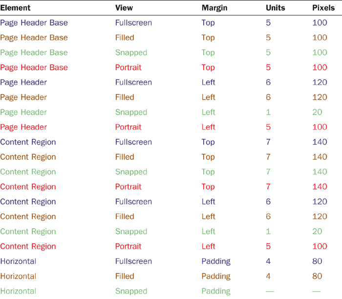
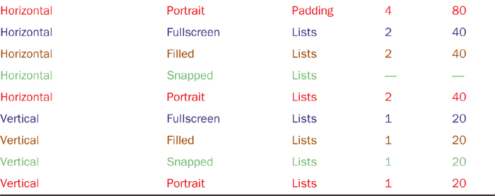
In the grid system, we need to adhere to certain layout patterns. For example, the page header is positioned 5 units (or 100 pixels) from the top. The left margin of the header and content is 6 units (or 120 pixels).
Table 5.1 lists the different elements of an app and tells where they should be located in the grid system based on the view (Fullscreen, Filled, Snapped, or Portrait) the app is in.
Table 5.1. Grid Positions for Common Elements in the Different Display Modes
To make sure our apps are lining up as expected, I’ve created an image called 2560x1440-MicrosoftDesignStyle-Grid.pdn. This is a Paint.NET file, but I also exported it as a Photoshop (.psd) file. The file has a few layers. The first is the background, which should be transparent. The second layer consists of the subunit grid lines, spaced for every 5 pixels. So the first line is on row 4 because images are 0 based. The next layer contains the unit grid lines, spaced for every 20 pixels. This layer also includes color-coded lines. The first colored line is a blue horizontal line to represent where the Page Header Base should be (5 units/100 pixels from the top). The second colored line is an orange horizontal line to represent where the Content Region starts (7 units/140 pixels from the top). The final colored line on the unit layer is the vertical red line that represents the left margin for the Page Header and the Content Region (6 units/120 pixels from the left). These are set in the correct position for Fullscreen and Filled modes. We revisit this grid helper image when we get to Hour 13.
The image itself is 2,560×1,440, to accommodate the largest resolution our apps will be displayed in. The final layer in the image contains different colors for the following resolutions:
1,920×1,080 is colored purple
1,280×800 is colored green
1,366×768 is colored cyan
The resolution lines enable you to see how this grid image appears in different resolutions on different devices. We look at Blend for Visual Studio at the end of this hour, after we finish discussing the design principles. At that time, we load this image into Blend and show how it behaves based on different selections in the tool.
The full image is too large and too detailed to look good in this book, so be sure to pull up the image. A .png version is located in Hour04UIDesignExampleimages2560x1440-MicrosoftDesignStyle-Grid-unit.png. The .pdn (Paint.NET) and .psd (PhotoShop) versions are located in Hour04. Figure 5.3 shows an enlarged portion covering almost 9 units down and 14 units across (representing almost 180×280 pixels).
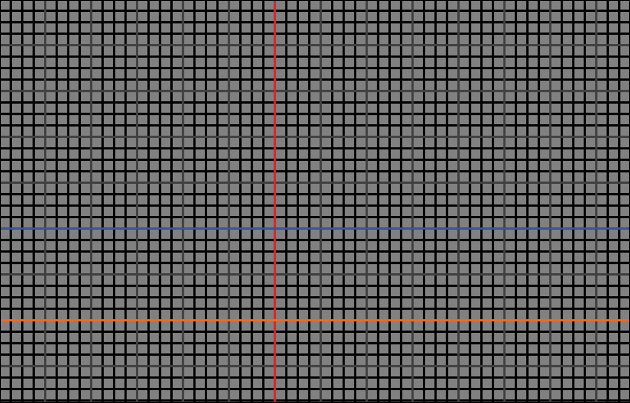
Figure 5.3. Enlarged view of the debug grid image. We can set this to the background image of our body element to make sure things are lining up correctly and we have enough spacing.
Be Fast and Fluid
The second Microsoft design style principle is that apps need to be fast and fluid. This is all about making apps responsive and ready. Apps need to be designed for touch. Using a mouse involves indirection, which means no noticeable lag. When writing apps using touch, any lag is extremely noticeable because no indirection exists; we are directly manipulating content on the screen by touching it. The app thus needs to be available and responsive to our touch. This is accomplished through the asynchronous calls we discussed in Hour 1, “Getting a Refresher on JavaScript, HTML5, and CSS3.”
Being fast and fluid also speaks to the fact that our app needs to be immersive and compelling. The app should make the user want to interact with it. It should delight the user with motion. This doesn’t necessarily involve over-the-top animations, but simple animations that provide great results. We look at animations during Hour 6.
Authentically Digital
The third Microsoft design style principle is that apps need to be authentically digital. This seems a little odd at first, but it actually makes a lot of sense. We live in a digital world. We are usually connected online. We typically utilize multiple machines. This principle tells us that we need to make full use of these facts—we need to take full advantage of the digital medium. We can create experiences in our app that may not even be possible “in the real world.” Our app should take full advantage of the hardware. It should have bold, vibrant colors. It should make beautiful use of typography. The app also needs to utilize available roaming features; we discuss this during Hour 11, “Storing Data Locally.” The concept is that we can keep track of what the user has done with our app—perhaps finished a level in our game or finished reading the article in our reader app. When the user is done, we can record that to the cloud so that if the user opens the app from an entirely different machine, he or she won’t need to find the right starting place again—the app can pull the data from the cloud and send the user to the correct article.
Do More with Less
As developers, we can sometimes create cool options in our applications and then create dialog boxes upon dialog boxes for configuring those options. (Visual Studio is a prime example of this.) The design principle of doing more with less is all about putting content before chrome. When possible, we need to enable the user to interact directly with the content. We don’t need a special mode for the user to enter into a selection state; common touch gestures can accomplish this, as we discuss during Hour 8, “Working with Multitouch and Other Input.” We don’t need to create a bunch of buttons and dialog boxes; we need to design our apps so that those are rarely needed—and if they are, we can provide either the app bar or the Settings pane. We discuss the app bar during Hour 14, “Using the App Bar and Pickers.” We discuss how to access the Settings pane during Hour 16, “Using Contracts and Extensions.”
The content must be clean, and only the most relevant elements should be on the screen, to enable people to immerse themselves in the content. The most relevant content needs to be right in front of the user. We don’t need to worry about discoverability of functionality in our app; instead, we need to focus on removing distractions. If our content is compelling, the user will love our app and gladly explore the other pieces of it.
When we are first thinking about an app to build, we need to ask the following question: “What is my app about?” The answer should be a broad concept followed by a list of what the app is trying to solve for the users. Write down each idea that comes to mind.
The next question is “What is my app great at?” Narrow this “great at” statement to a specific sentence about the problem the app is trying to solve for the user. At this point, we may be able to cross off a lot of items on the original list. The goal is to create a cohesive app that is “great at” one thing. Anything that doesn’t support that “great at” statement should be removed. This can be difficult, but it is very important to do before writing code for the app.
The last question to ask is “What should users be able to do?” Here we call out each of the app’s flows to see if it supports the “great at” statement. This is where we need to think about page navigation, and we should include only the page flows and functionality that support our “great at” statement. Deciding how the user will navigate the app can determine how information will be displayed and can even drive functionality.
Some great information on navigation design in Windows Store apps is available at http://msdn.microsoft.com/en-us/library/windows/apps/hh761500.
Win As One
The last design principle we discuss is the principle of winning as one. The concept is simple. Our apps need to fit into the UI model. We need to embrace the operating system and how it functions, not try to duplicate ways of doing something that the OS already provides. For the most part, we should stick to the main gestures. We don’t want a user to have to do some kind of special gesture when there is already a well-defined gesture available. The other big part of this principle is that our app needs to work with other apps to complete scenarios. If we have an app that manipulates images, then we want to implement a contract that says, “We accept images.” Since we are manipulating the images, we would also want to expose a contract that says, “We share images.” These contracts allow our app to talk to other apps because they are implementing the same contracts. This way, the apps don’t need to know about each other. The app simply needs to know how to expose the contract that can share images and how to consume the contract that can accept images from other apps. The users will decide whether they want to send our app an image from another app or whether they want to share the image from our app to another app. This is how all Windows Store app developers win as one. We can provide an excellent way for users to interact with our apps and have our apps work with other apps—without having to know which apps they are! We discuss contracts in detail during Hour 16.
Introducing Blend for Visual Studio
Now we look at a tool we devote most of our time to in Hour 6. Blend for Visual Studio opens the exact same solution and project files that Visual Studio uses. In fact, besides launching Blend the typical way, we can launch it from inside Visual Studio by right-clicking the project and selecting Open in Blend. To get started, we open the project in /Hour04/UIDesignExample. This example looks at the debug grid image and takes a quick tour around Blend. It is important to know that a solution can be either created in Blend and then opened in Visual Studio or, as in this case, created in Visual Studio and opened in Blend. The solution and project files are the same for both products.
Before we dig in, it is important to understand why we want to use Blend in the first place. We already have Visual Studio as our integrated development environment (IDE), so why do we need another tool? We need another tool because, although Visual Studio is great, it is solving a different problem than what Blend solves. Visual Studio is excellent for writing and debugging code. When it comes to debugging visual design, Visual Studio is better than it used to be, but it still doesn’t have the features that Blend does. Blend is even packaged with Visual Studio now, so Visual Studio arguably doesn’t even need this capability. We will see how Blend really shines at debugging CSS issues. Blend also allows for quick iteration as we are designing our application because the app is running inside Blend itself. We can thus see the exact representation of our app.
With Blend opened and our UIDesignExample project loaded, we see a screen similar to Figure 5.4.
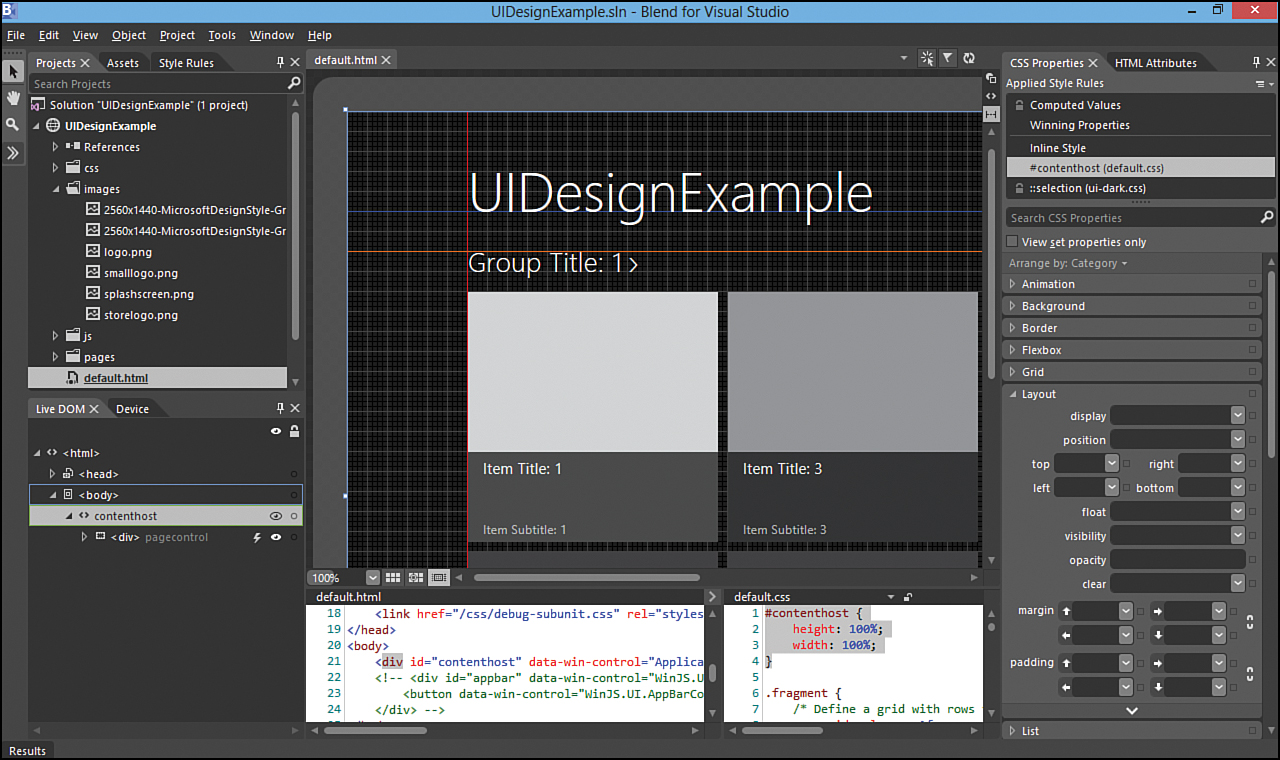
Figure 5.4. Our project opened in Blend for Visual Studio.
We briefly look at the different UI elements of the Blend editor. Blend consists of many pieces, and entire books have been written about this tool. We barely cover it here, but we do point out some of the most important parts.
The main section, in the center of the IDE, contains the surface area or artboard. This is where Blend actually runs our app. We can see exactly what the app looks like so that we can style it. Blend must be running the app because we can then style the dynamically created content.
On the far left is the Toolbox pane. We can expand the chevron to show all the HTML elements, the media (images, sound, video, and so on) in the project, and any controls we have referenced in the project (such as all the WinJS controls). Clicking the chevron displays the assets in our project as those available to the project (see Figure 5.5).
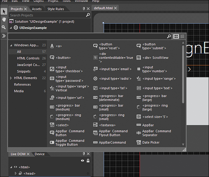
Figure 5.5. Blend enables us to drag and drop HTML elements, media elements, and referenced controls (WinJS UI controls) from the toolbox onto our pages.
Looking back at Figure 5.4, the next area of Blend is the Projects pane. This is the same projects view as in Visual Studio. The next tab is Assets, which contains the same information as the toolbox assets in Figure 5.5.
Styling Our App Using Blend
We dive into how to style apps using Blend in more detail during Hour 6. For now, we just want to get familiar with the panes that help us style our content. On the left side of the IDE is the Style Rules tab. This part of the IDE lists the style sheets we have in our project or those that our project references. For example, in this solution, which was created from the Grid App template we saw during Hour 2, we see the ui-dark.css from WinJS, as well as default.css, groupedItems.css, and itemDetail.css. These are all style sheets provided with the template. We also see the debug-subunit.css file that was added to this project to display the debug grid. We can expand any of these CSS files and navigate to a particular rule in that file. For example, if we expand default.css and then click #contenthost, we see that the default.css file is loaded on the bottom right under the artboard, and the actual #contenthost rule is selected. This is an easy way for us to quickly jump to a rule that we want to style differently.
Under the tabs we were just looking at, we see the Live DOM tab at the bottom left of the screen. As the name implies, this is the Live DOM represented in a tree control. In the Live DOM, we can expand body to start drilling down the DOM tree. We see that contenthost is the first (and only) element under body. Beside each element is an eye icon; selecting that icon makes the element (and all its children) invisible. We can select it again to make everything visible. Expanding contenthost shows that the next control is a div that is a WinJS PageControl. The lightning bolt icon signifies that the element was dynamically generated. We are thus seeing more than just any markup we have added to the page: It is the real-time representation of the DOM—it is the Live DOM. The first child under pagecontrol is a template with the class headerTemplate. The icon present for this element shows that this element is being displayed from markup created in another location (groupedItems.html, in this case). As we click between the pagecontrol div and this headerTemplate, we see that the bottom-left HTML view is switching the files. This is pretty slick!
Next, we can move to the right side of Blend and look at the HTML Attributes tab. If we still have the headerTemplate selected in the Live DOM, we can see the HTML attributes for the element in the HTML Attributes tab on the right. Blend enables us to view and set attributes on our HTML elements. We obviously have access to the actual HTML code files, but we can search for attributes and quickly find what we are looking for.
The last part of the Blend UI we look at is the CSS Properties tab. This is another great feature of Blend. In the artboard, we select the first Item Title: 1 grid element. When we click that grid element, the Live DOM panel is updated and is positioned at a generated name of _win_bind###. We discuss data binding during Hour 10, “Binding Data to Our Apps,” but for now, we can see that this content was dynamically generated (through data binding). Selecting the element in the artboard takes us to the element in the Live DOM window. The HTML window was updated with the groupedItems.html document, and the img element currently is selected. In the CSS window, ui-dark.css is loaded and the ::selection style rule is highlighted. (This is because, when we selected the element, Blend styles the element with the selection rule.)
We can also see that the CSS Properties window was updated. Applied Style Rules lists all the style rules that have been applied to the element we selected. We can check the View Set Properties Only check box to make just the properties that are affected show up. This is typically how the rules are looked at unless we are authoring the rule or adding a new property to an existing rule.
The important point to note about the list of rules is that they build on each other from the bottom up to the top. So this shows how the style is being generated through cascading. In this example, the item we selected (more specifically, the image) is styled with all the rules in Applied Style Rules. Clicking on the last item img (ui-dark.css) causes the CSS window to open the correct CSS file and then scroll to the rule in the file. Here we see the rule set:
img {
border-style: none;
}
Moving up the chain of style rules for this element, let’s look at the line that starts with .groupeditemspage. This rule is styled as
.groupeditemspage .groupeditemslist .item .item-image {
-ms-grid-row-span: 2;
}
We see that the class on the img is item-image, so this style of making the image span two rows is applied. Because this is a non-WinJS style, we can use Blend to change the style. We can do this directly in the CSS Window or by setting the properties in the UI.
The next entry in the Applied Style Rules list is Inline Style. This is where we can set or view any styles that were created inline. Using inline styles is discouraged because it causes code to become hard to maintain and impossible to override. Inline styles win over anything else set. Inline styles are the last element in the list that we can modify. We can’t modify ui-dark.css because that is the actual WinJS styles. We can modify groupedItems.css directly because it is a style in our app (even though it was created by the project template). Finally, we can set the inline style (although we really shouldn’t). Right above the inline styles is a separator. This is because the next two lines are always present and show data in different ways. These are virtual rules because they don’t actually exist in any file. The Winning Properties virtual rule shows the final rules applied to our element; it shows the actual CSS cascade. The Computed Values virtual rule shows how Windows Metro is computing the CSS property values for the selected element. For example, we see that, with Winning Properties selected, the font size (found all the way at the bottom of the CSS Properties window) of the element is 11pt. When we select the Computed Values virtual rule, we how Windows Metro has calculated the point size and made the font 14.66 pixels.
With the Winning Properties virtual rules selected, we can then select a CSS property below. If we have the rights to edit it, then it will be available. The -ms-grid-row-span property is available for us to change. When using Computed Values, we can’t make the change directly, but clicking the dot beside the property brings up a context menu where we can select the rule under the CSS Cascade section of the context menu.
We saw how we weren’t able to modify the WinJS styles ui-dark.css directly. We wouldn’t want to modify the styles in the main library because it would affect all our apps. Instead, we want to create rules in the app itself. We can do this in Blend by finding the rule we want to override, right-clicking the rule in the CSS Properties tab, and selecting Copy. Then in the Style Rules panel on the left, we can browse to the CSS file we want to paste this rule to (default.css, for example). We select the CSS file and then right-click and choose Paste. This makes an exact copy of the rule. We can then modify the style or even the rule (likely to make it more restrictive) for our app.
Understanding Device Dimensions, Resolutions, and DPI
Next to the Live DOM tab is the Device tab. This tab is one of the best features in Blend. The Device tab enables us to set the design surface area (artboard) of Blend to simulate different devices. We can also simulate different modes. Figure 5.6 shows the contents of this tab in its default state, as well as when the Display drop-down list is expanded. The first item in the Device tab is the View, where we can tell the artboard to display our app in a particular mode. In this mode, we can make sure our styles are set up the way we want. We discuss this in more detail during Hour 13. The next item in the Device tab is the Display drop-down box, in Figure 5.6. It enables us to tell Blend to make the artboard simulate a particular device.
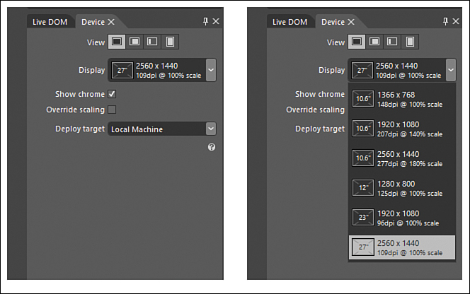
Figure 5.6. In the Device tab, Blend enables us to simulate multiple devices and every view our app can run in.
Inside the Display options, we can see different DPI values associated to the displays. DPI, or dots per inch (also known as pixels per inch), is the number of pixels on a physical device per inch. The higher the pixel density, the better the picture will be, assuming the same physical size of device. When thinking of picture quality, keep three variables in mind:
• The actual dimensions of the physical device (10 inches, 17 inches, 23 inches, and so on)
• The resolution of the of the display ( 1,366×768; 1,920×1,080; and so on)
• The DPI (96dpi, 148dpi, 207dpi, and so on)
Those three components together make up the experience of viewing information on our screens. In the past, on Windows, even though the resolutions increased, the DPI typically remained at 96dpi. Therefore, more content was viewable on the screen. This was acceptable to some people, but others wanted their icons to be larger. They could fit more icons, but the icons were smaller.
With touch on high-resolution displays, the touch targets on the device must not continually get smaller. Otherwise, we wouldn’t be able to touch the correct items; we would constantly be touching two items or the wrong items. This is evident when trying to browse web pages on a smartphone. The page needs to be zoomed in so that we can touch the link we want. On the PC, the mouse is a great precision tool that can select a single pixel. Our fingers are much broader and need a larger target.
Windows 8 solves this by displaying information according to the dimensions of the physical device, not according to the resolution. So the same content is displayed on a 10-inch slate, regardless of whether the resolution is 1,366×768 or 1,920×1,080. In the past, we would have seen more content with the larger resolution, but the content would have been much smaller. Now the content is the same, but with a higher resolution, we get better quality of what we are seeing. Figure 5.7 demonstrates this.
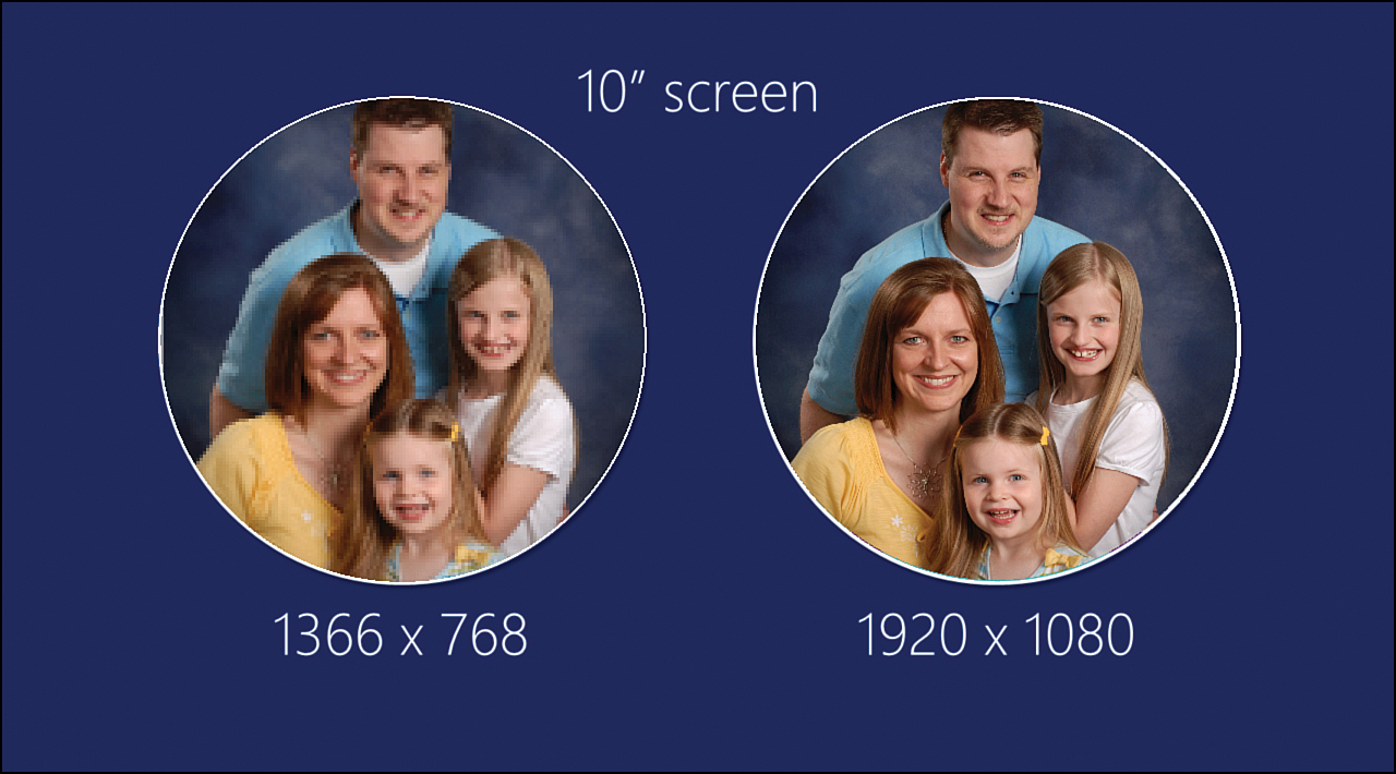
Figure 5.7. The same content on a 10-inch device, but the left side has a resolution of 1,366×768 and the right side has a resolution of 1,920×180. The content is the same size on both devices, but it is much crisper on the device with the higher resolution.
With Windows Store apps, a higher resolution now means a better image. If we have a 1,920×1,080 (HiDef) resolution on a 23-inch monitor, we will be using 96dpi. If we take that same resolution, but our device is now a 10.6-inch tablet, the device now has 207dpi. This is because, instead of just making the pixels smaller and keeping the 96dpi in place, the data on the pixels are scaled. This is done so that we aren’t trying to tap a very small target on the device. It also produces a much crisper image on the 10.6-inch screen than on the 23-inch screen—but we can see more content on the 23-inch screen.
Let’s look again at the Device tab inside Blend. We see that the display drop-down list/options box contains displays we can simulate. Our design surface simulates the display chosen.
If we run the simulator (which can be selected instead of Local Machine in the Deploy Target section of this tab), we can modify the screen size and resolution in the simulator by selecting the Change Resolution button on the right side of the simulator (almost in the center vertically). This simulates our app running using that screen size and resolution. Figure 5.8 shows the UIDesignExample running in a 23-inch device at a resolution of 1,920×1,080 (the system makes the DPI 96).
Figure 5.8. The simulator is running a 23-inch device at a resolution of 1,920×1,080 and 96dpi.
Figure 5.9 shows the same example running in the same resolution of 1,920×1,080, but this time it is on a 10.6-inch device. The system scales the content so that it is running at 207dpi (versus 96dpi, as with the 23-inch device).
Figure 5.9. The simulator is running a 10.6-inch device at a resolution of 1,920×1,080 and 207dpi.
In the touch areas in Figures 5.8 and 5.9, we see that, instead of the content just getting smaller on the smaller device, the content is actually scaled. Because the system is scaling our content, it is important that we provide three different sizes of our content that doesn’t automatically scale. We need to package with our app images that are 100 percent, 140 percent, and 180 percent, to accommodate all existing hardware and future hardware. With our static image content being produced at these levels, Windows can utilize the correct image as it scales the content. If the extra images are not provided, the scaling will be pixelated. These scale percentages are based on the ideal touch target size. A sweet spot exists in regard to the size of items that can be easily manipulated by touch. The system uses the 100 percent image when no scaling is applied. It uses the 140 percent image for 1,920×1,080 devices that have a minimum DPI of 174. It uses 180 percent for 2,560×1,440 devices that have a minimum DPI of 240.
We have two options when providing content in the three different resolutions. The first option is to append .scale-### before the extension of the image. For example, we would name our files similar to imagesfilename.scale-100.png. Again, we would need three different versions (.scale-100, .scale-140, and .scale-180). The second option is to have separate folders for the images. In this case, the image names would be the same, but we would name the folder scale-###. As expected, we would need three different folders (scale-100, scale-140, and scale-180):
Option 1: File naming convention:
imagesfilename.scale-100.jpg
imagesfilename.scale-140.jpg
imagesfilename.scale-180.jpg
Option 2: Folder naming convention:
imagesscale-100filename.jpg
images scale-140filename.jpg
images scale-180filename.jpg
Simulating the Different Views Using Blend
Still on the Device tab, let’s look at the View options in detail. We discuss how to write code to handle these different views, but for now, let’s explore how Blend can help us see exactly what our app will look like by making the artboard transform to these different views. Figure 5.10 shows the typical Fullscreen view. We can change the views by clicking the appropriate button associated to the view inside the Devices tab.
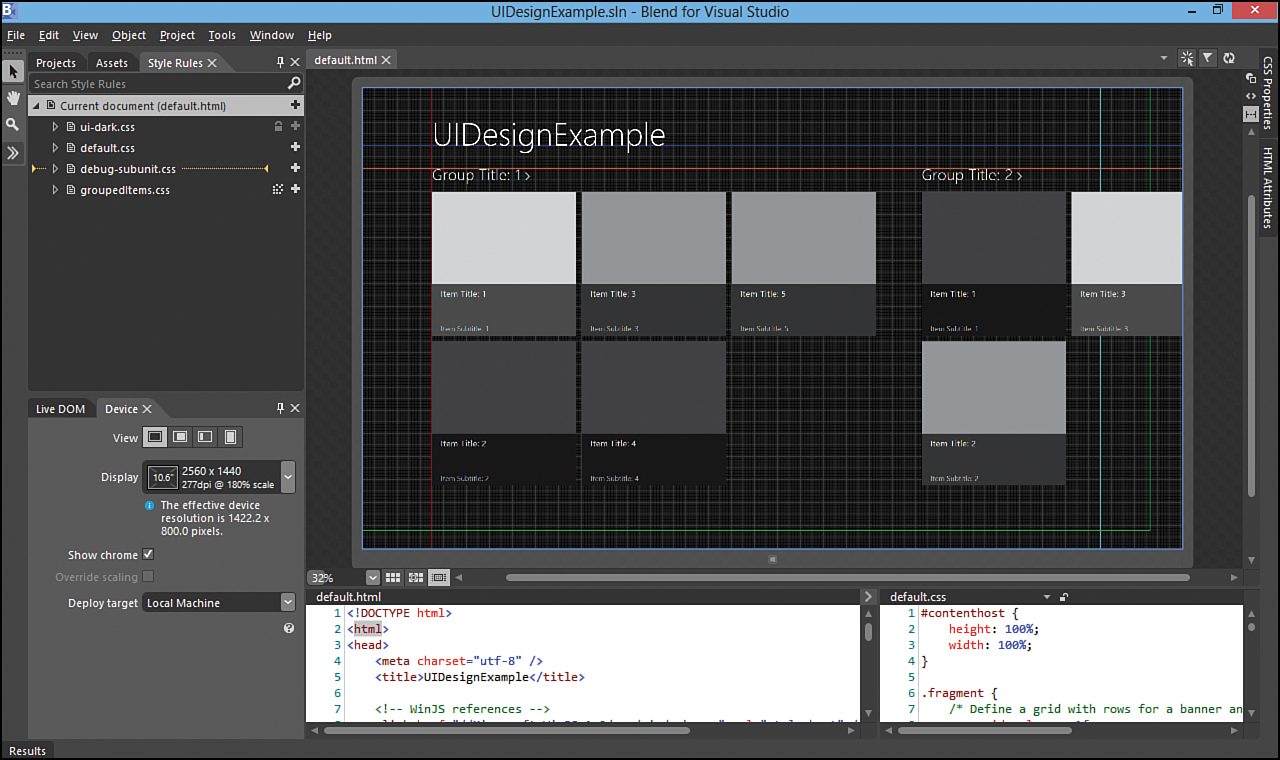
Figure 5.10. The Blend surface area displays the app in Fullscreen view.
When our app is using most of the screen but another app is snapped into view, our app is in Filled view, as in Figure 5.11.
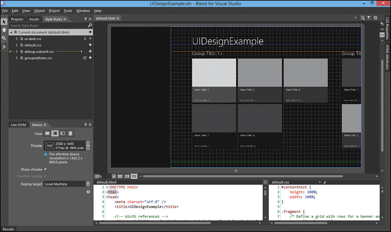
Figure 5.11. The Blend surface area displays the app in Filled view.
If our app is the one that is snapped, the artboard reacts to simulate this after changing the appropriate View button under the Device tab. See Figure 5.12.
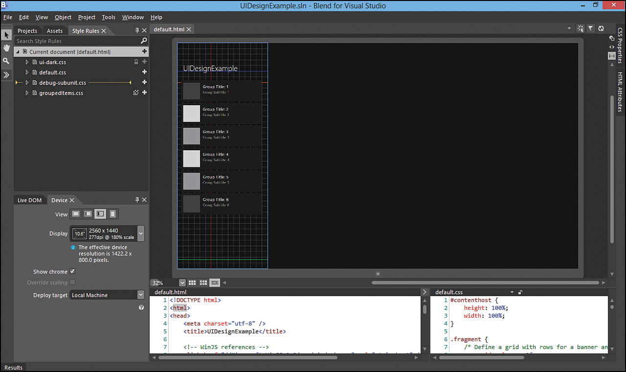
Figure 5.12. The Blend surface area displays the app in Snapped view.
Finally, we can see what our app will look like when the user rotates the device from landscape orientation to portrait orientation. See Figure 5.13.

Figure 5.13. The Blend surface area displays the app in Portrait view.
Running in Interactive Mode
In the top right of our surface area are three buttons. Working backward from right to left, we first see the Refresh button, which refreshes the artboard if it gets out of sync for some reason. In the middle is the flag icon, which is an easy way to toggle the results panel. This is where we see any output and errors, much like in Visual Studio. Finally, the button on the left enables us to run our app in interactive mode.
The artboard runs in two different modes: selection and interactive. We have seen selection mode so far. When we click an element on the page, Blend selects the element and then displays information about the element. Interactive mode, on the other hand, hides the other panes and brings the artboard to the forefront. We can then actively use the app: We can navigate to other pages or select an item, bring up a menu, and do virtually anything else we want to do with the app so that we can style it. When we have the app in the state we want it, we click on the interactive mode button again. This causes the IDE to go back in the state it was previously in, with all our panels coming back into view and the artboard in its place. However, now the artboard is showing the app in the exact state we left it. We are now in selection mode, so now we can style those elements that are in transition or that were created from JavaScript only after some event happens. Now we can select the elements that are visible and style them until we are happy with them. Interactive mode in Blend is powerful.
Further Exploration
To get a better understanding of the Microsoft design style principles and how they can help us create great apps, the video of the talk “8 Traits of Great Metro Style Apps” from Build 2011, by Jensen Harris, is a must see. Download the video and watch it at http://channel9.msdn.com/Events/BUILD/BUILD2011/BPS-1004.
Microsoft has provided Photoshop digital assets that include templates; common controls; and common components such as contracts, notifications, and tiles. These assets can be used to create a mockup, without writing any code. These assets can be found at http://msdn.microsoft.com/en-us/library/windows/apps/hh700403.aspx.
More information on scaling to different screen sizes can be found at http://blogs.msdn.com/b/b8/archive/2012/03/21/scaling-to-different-screens.aspx.
In general, anything regarding design is found at http://design.windows.com/, just as http://dev.windows.com/ includes information on anything regarding development.
When we discussed the principle of doing more with less, we touched on planning our app. We don’t have enough pages to cover that topic in detail, but it is really crucial to nail down. The article “Planning Windows Store Apps,” at http://msdn.microsoft.com/en-us/library/windows/apps/hh465427, has excellent information to read and digest. The same article has links to designing apps for accessibility. We weren’t able to cover this during this hour and don’t have a spot for it in the rest of the book, but it is important to make apps accessible to those with disabilities. This isn’t difficult and doesn’t take much time to add in. Knowing this information up front makes it even easier to add to the app as it is built instead of trying to retrofit it later. Making apps accessible is identical to making websites accessible.
Finally, take time to walkthrough this step-by-step journey of starting with a prebuilt game of concentration (memory match) and designing the entire thing using Blend for Visual Studio. Walking through the tutorial at http://msdn.microsoft.com/en-us/library/windows/apps/jj129451 makes working with Blend eventually second nature. It a long walkthrough, but it is definitely worth the effort.
The Windows SDK samples of interest for this hour are
• ARIA sample
• CSS styling for high-contrast mode sample
Summary
During this hour, we discussed how the Microsoft design style came into existence. We looked at the five design principles to follow when creating Windows Store apps:
• Pride in craftsmanship
• Be fast and fluid
• Authentically digital
• Do more with less
• Win as one
During the process, we created a grid system and hooked it up to a Grid App project. We dove into Blend for Visual Studio and looked at how to effectively use Blend to style apps and even debug CSS issues by examining the CSS Properties window. We looked at how to simulate the different views (Fullscreen, Filled, Snapped, and Portrait) available to our apps. We looked at the different dimensions, resolutions, and DPI that devices can have. We finished by seeing how to run an app in interactive mode to style secondary pages and items such as menus and flyouts. Design is extremely important; the more we think about it up front, the better our apps will be.
Q&A
Q. Can a Windows Store app be written without using Blend?
A. Yes, but apps that are styled using Blend definitely look better than those that don’t. The tool is excellent and makes the job of designing and styling apps much easier. It is well worth the effort to learn the tool.
Q. Should the WinJS style sheets be modified directly?
A. No, the files are set as read only and should not be modified. Instead, new rules should be created that overrule the existing style rules WinJS provides. Absolutely no reason exists for modifying the WinJS CSS files.
Q. How is using the Blend artboard any different from just running the app in the simulator from Visual Studio?
A. The simulator is extremely useful and can be run from within Blend or Visual Studio. However, the simulator doesn’t enable us to easily debug an app’s style. When used in conjunction with interactive mode, the artboard is a powerful combination that enables us to easily see which rules are styling which elements. By making a change, we can directly update the CSS files through Blend. That is not possible using Visual Studio.
Workshop
Quiz
1. The design principle “Be fast and fluid” speaks to the fact that our app needs to be immersive and compelling. True or false?
2. One of the items discussed with the design principle of “Authentically digital” is the concept of roaming data. At a high level, what is roaming data?
3. To test our app in portrait view, we need to make sure we have access to hardware that enables us to flip the screen. True or false?
Answers
1. True. Being fast and fluid speaks to the fact that an app needs to be immersive and compelling. Our app should make the user want to interact with it.
2. Roaming data enables us to keep track of what the user has done with our app and store settings, placeholders, completed levels, and so on in the cloud. Then when the user logs into another machine, all those settings are ready on that other machine.
3. False. Although having access to hardware definitely helps, it is not required. We can test the look and feel of our app being displayed in Portrait view by utilizing the Blend artboard and selecting the Portrait view from the Devices tab. We can also test Portrait view by running the simulator.
Activities
1. This topic is so important that it is listed again. Take time to walk through this step-by-step journey of starting with a prebuilt game of concentration (memory match) and designing the entire thing using Blend for Visual Studio: http://msdn.microsoft.com/en-us/library/windows/apps/jj129451.
2. Read the following article titled “Navigation Design for Windows Store Apps”: http://msdn.microsoft.com/en-us/library/windows/apps/hh761500.