In this chapter
In this chapter, I'll explain a bit about font technology, how to add and remove fonts from your system, how to choose and use fonts wisely, how to procure new fonts, how to create fonts of your own, and how fonts interact with Internet Explorer.
Microsoft continues the move toward improved font management in Windows XP. As in Windows 9x, NT, and 2000, when you open the Control Panel and choose Fonts, a Fonts folder opens. (In reality, it's the folder X:winntfonts; just replace X with your startup drive letter.) It is one of those specially treated system folders that magically has its own unique menu and right-click commands with options to let you do the following:
Add and remove fonts
View fonts in various ways
List fonts by similarity of looks
List only the basic font family name and hide variations such as bold and italic to make selection easier
Since the days of Windows 3.0, one of the big attractions to Windows was that it included a unified system for displaying and printing text across all Windows applications and printers.
The Macintosh had it all over the PC in the desktop publishing arena in the late 80s and early 90s, and had the PC not caught up, I think Apple would be the frontrunner in personal computers today.
Not to be outdone of course, Gates and his team caught on fast enough, developing their own font system and building it into the then quickly evolving Windows. With Windows 3.1 came TrueType fonts, and things began to work just about as well as the Macintosh. A user with only a single printer driver and one pool of fonts could effectively lay out and print complex documents across a broad spectrum of applications. Each new version of Windows has improved on the Microsoft font technology.
Windows XP benefits from all the developments of previous versions of Windows. Plus, the unstoppable march of printer technology has brought the price of full-color printing in the 1200dpi range down to below $100.
Anyone interested in fonts should first become acquainted with basic typographic nomenclature. Let's start at the top.
The word font, as used in Windows, really refers to a typeface. Those people in typesetting circles believe the term is misused in PC jargon, and you should really be calling, say, Arial a typeface. But, oh well. There goes the language (again). Fonts are specified by size as well as by name. The size of a font is measured in points. A point is 1/72 of an inch.
Windows XP comes with a basic stock of fonts (about 60). The exact number of fonts depends on the printer or printers you have installed and the screen fonts you have chosen to install.
Note
→ To learn more about installing printers, see “Printing and Faxing,” p. 191.
Fonts are readily available on the Internet these days, so finding fonts you might need is no biggie. You just download them and drop them into the Fonts folder (see the section later on adding fonts). Also, OpenType makes it easier to compress and incorporate fonts into your documents so that, when you share them with others, they are displayed correctly even if the recipient doesn't have the fonts installed in his or her system.
NOTE
From this point on, I'll use the terms OpenType and TrueType interchangeably because they are so closely related.
But what if you have older documents that were formatted with fonts not in your system and that you can't acquire? Some word processors, such as Microsoft Word, have an option to substitute missing fonts with present fonts. In Word, choose Tools, Options, Compatibility, Font Substitutions. If all the fonts you need to print the document are installed in the system, you are told that everything is hunky dory. If not, you can make changes. Check the help file for the word processing program for details.
Another kind of font substitution pertains only to PostScript printers. Because PostScript printers have internal fonts, printing is faster using them than forcing Windows to download a similar font file into the PostScript rasterizer and then commence printing. For example, the Windows Arial font and the PostScript Helvetica font are virtually identical. So, you can tell your PostScript printer driver to just use the Helvetica font in the printer whenever you print a document formatted with Arial. Likewise, Times can be substituted for Windows's Times New Roman.
A font substitution table is responsible for setting the relationship of the screen and printer fonts. In Windows NT, 2000, and XP, you can find this table on the Device Settings tab of a Printer's Properties dialog box.
Windows XP comes with a set of trustworthy TrueType fonts that will meet your needs for many occasions. Most folks get by just fine with Times New Roman, Courier New, and Arial, with maybe an occasional character from Symbol or WingDings. What else could you need? Why should you purchase or download freeware or shareware fonts? And how do you install them and choose which fonts to use in your documents? Let's look at these topics in order.
The prime reason to expand your collection of fonts is simply to make your documents look spiffier, express your message with more alacrity, or convey a specific mood such as formal, festive, or casual.
After you've settled on the font format you're going to use, your next task is to decide how to acquire the fonts. Will you pay for them or download freebies over the Net? The number of typeface designs available for Windows totals in the thousands and is still growing. With that much variety, selecting a set of fonts that's right for you can be a daunting proposition.
Having a basic understanding of font classifications is a good idea before you start purchasing fonts and designing your own documents.
The two primary categories of fonts are serif and sans-serif designs. Serifs are the little embellishments that extend from the main strokes of the character. Serifs often are added to improve readability. As the name implies, sans-serif fonts lack these embellishments, making for a cleaner look. Sans-serif fonts tend to work well for headlines (most newspapers use them), whereas serif fonts are traditionally used for body text (this book is a good example). Combining one serif and one sans-serif font in this way will look good together, but two sans-serif or two serif fonts will clash.
The next major classification of fonts has to do with the spacing between characters. In monospaced fonts, every character occupies the same amount of horizontal line space. For example, l and W get the same amount of linear space. In the following sentence you can see an example of a monospaced font:
This text is set in a monospaced font called MacmillanUSAdigital.
By contrast, proportionally spaced fonts give differing amounts of line space, depending on the character. A W gets more space than an l or an i. The body text in this book uses proportionally spaced fonts, making it easier to read. The advantage of using monospaced fonts is that they allow you to easily align columns of text or numbers when you're using a simple word processor such as Notepad or sending email. You can use the spacebar to align the items in the columns, as you would on a typewriter.
TIP
For easier alignment, numerals in most proportionally spaced fonts are monospaced. But in proportionally spaced fonts, you still have the problem with the spacebar. A press of the spacebar in a monospaced font advances the cursor one full block, just as any character does. In a proportional font, the spacebar moves the cursor only a small increment. So, it's still difficult to align rows of characters using the spacebar. If your word processing program has tab stops, setting them and then using the Tab key can help overcome this problem. Using tabs can be problematic when you're reading a document in a program other than the one it was created in, because not all programs translate tabs identically. Aligning columns in email, for example, is a dicey proposition at best because email programs use different fonts and often give users the option of choosing the display font on their own. It might or might not be a monospaced font. Using HTML-based (rich-text) email is one solution to this problem, though not all email client programs can handle it properly. See Chapter 10, “Sending Email with Outlook Express,” for more details about HTML mail.
Two other categories of fonts (after headline and body text) are ornamental and nonalphabetic symbols. Ornamental (sometimes called display) fonts have limited application. They are often fun in the short term, or for a one-shot deal such as a poster or a gag. They often attract attention but are too highly stylized to be suitable for body text, and they can distract the readers' attention from your message. Windows doesn't come stocked with any decorative fonts. One that was popular a few years ago (and overused!) was Zapf Chancery. You should use ornamental fonts sparingly and only when you want to set a special mood.
Symbol or pi fonts contain special symbols such as musical notes, map symbols, or decorations instead of letters, numbers, and punctuation marks. Good examples are Symbol, Zapf Dingbats, and WingDings.
Note
→ To learn more about symbol and other non-keyboard characters, see “Character Map,” p. 175.
Due to increased interest in typography generated by desktop publishing technology and now with the Web, the number of font designers and vendors has exploded. Fonts are included as part of cheesy applications packages, as well as in the better word processing programs. And the Web is riddled with sites pushing everything from high-class fonts from respected foundries down to $2 fonts.
Many leading font vendors, including Bitstream, Monotype, SoftKey, and others, are producing TrueType font collections. Although you can find these collections in most software stores, Web downloads are easier. Quite charitably, Microsoft has a site that lists all the type foundries known to it, with descriptions and links. Check out this very helpful site:
http://www.microsoft.com/typography/links/links.asp?type=foundries&part=1
If that link dies for some reason, check back at the primary Microsoft fonts site and click around the following:
http://www.microsoft.com/typography/default.mspx
Other sites you might find of interest are as follows:
And for some cheapie (and free) fonts, check the following:
I've also seen numerous cheapie CD-ROMs in several computer stores that pack hundreds of TrueType fonts on them.
NOTE
Although shareware and freeware TrueType fonts are plentiful, be aware that not all TrueType fonts have sophisticated hinting built in. Therefore, they might not look as good as fonts from the more respectable font foundries. Some reports from users indicate that funky font files can make your system freak out a bit. In general, though, even the free TrueType (OpenType) fonts will look very good, and you'll be hard pressed to notice the difference.
Windows XP's font management allows you to
Add new fonts to the system
Remove unnecessary fonts, freeing disk space
View fonts onscreen or print out samples of each font you have
Display groups of fonts that are similar in style
To perform any of these functions, you need to use the Fonts applet found in the Windows XP control panel. Specifically, open the Control Panel through the Start menu, select Appearance and Themes, and then click the Fonts options located in the See Also pane. This opens the windows shown in Figure 26.1.

Some font sets come with an installer. In that case, you can just run it as instructed. The fonts are dumped into the Fonts directory, and the system adds them to the Font Registry, whereupon they can be used from your applications. If no installation program came with your fonts, or if you want to add some fonts to your system that you downloaded from the Internet or otherwise acquired, just follow these steps:
Open the Control Panel as described in the previous section. The resulting folder window appears, looking much like any other folder. All fonts currently installed in the system appear in this folder, with each font style being a separate file.
Choose File, Install New Font. The Add Fonts dialog then appears. Browse to the location of the font files you want to install. Use the Network button if the files are across the LAN. It runs the Map Network Drive Wizard. After you target the source folder, all the fonts in that location are listed in the dialog box.
Note
→ To learn how to map a network drive, see “Mapping Drive Letters,” p. 630.
Select the fonts you want to install. Note that if you want an entire font family, you have to select all similarly named files. If you try to install a font that's already in your system, the installer won't let you, so don't worry about accidentally loading one you already have.
Choose whether you want the font files copied into the Fonts folder as part of the installation process. They work either way. Copying into the Fonts folder keeps things tidier, though it does make a copy of the file, using up more disk space. I like to copy them into the Fonts folder so that I know where all my fonts are. If you use this approach, you can later erase any duplicate source files to save disk space. (Fonts range from about 80 to 400KB each, averaging about 200KB.) If you choose not to copy the files, shortcut icons appear in your Fonts folder instead of normal font icons.
Click OK to finalize the operation. After the installation process is complete, all newly added fonts are added to your font list and are visible in Windows applications that offer font selection.
You can quickly acquire a large selection of fonts, thus easily forgetting what you have on hand. Several utility programs are available to help you keep track of fonts or show a little example of them in font selection lists within applications and such. Check the Web for such programs, by searching for “font,” “font tool,” or “font view.” A few examples of tools to look for include FontShow, LogotypeMaker, and FontShowcase.
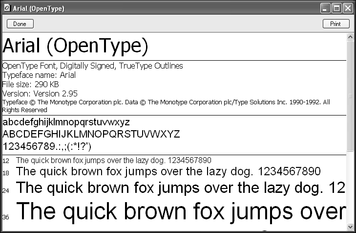
The Fonts folder has a few tricks of its own to make font management a bit easier. For starters, you can view and/or print the characters of a font easily by following these steps:
Open the Fonts folder.
Double-click any icon in the folder. The font then opens in the font viewer (Figure 26.2).
If you need printouts, just right-click a font and choose Print, or open the font as per above and click the Print button. To print multiple fonts in one fell swoop, select them first, and then choose File, Print. You get a one-page printout for each font.
Some fonts are normally hidden because they are required by the system. If a user accidentally deleted them, the system wouldn't work. For example, dialog boxes wouldn't have text in them. Unless you turn on viewing of hidden files via the Folder options in an Explorer window, you won't see these fonts. If you do turn on viewing of hidden files and then view the Fonts folder in Details view, you'll see an H in the Attributes column. Make sure not to delete or move these files.
Note
→ File viewing options are covered in “Setting Folder Options,” p. 891.
TIP
Programs that are multilingual-aware automatically use a font that contains multiple character sets. If you are using a program that is not multilingual-aware, such as Notepad, the font might appear as black boxes or lines. To make the text appear correctly, you might need to manually select a font that contains multiple character sets. Both Tahoma and Microsoft Sans Serif fonts support multiple character sets.
Fonts consume space on your hard disk. A typical TrueType font consumes between 50 and 200KB of disk space. If you're a font monger, you could easily chew up a gigabyte or two with fonts you end up never using.
TIP
A little-known fact is that even if an italic or bold font has been removed, most word processing applications for Windows, such as Microsoft Word, can still emulate it on-the-fly. It won't look as good as the real thing, but it will work.
If you get on a spring-cleaning jag and decide to remove some fonts, follow these steps:
Open the Fonts folder.
To remove an entire font family (normal, Bold, Italic, and Bold Italic), turn on the View, Hide Variations setting. If you want to remove individual styles, turn off this setting so you can see them.
Select the font or fonts you want to remove.
Press the Del key; choose File, Delete; or right-click one of the selected fonts and choose Delete.
When a dialog box asks you to confirm the removal, choose the Yes button. The font is then moved to the Recycle Bin.
TIP
You also can drag a font file to another folder, but the default is for that operation to create a copy of the font and not remove it from your arsenal of system fonts. If your aim is to organize your seldom-used fonts into folders, the easiest way would be to right-click and drag them into the new folders, and then choose Move from the resulting context menu.
When I'm running a specific program, I can't see the correct foreign-language fonts in dialog boxes, display menus, and within my documents.
You might have this problem if the program you are using doesn't understand how to use Unicode fonts. Unicode fonts are extended fonts that have support for the multiple languages built in to them. To work around this problem, you can try the following procedure:
Open the Control Panel, select Date, Time, Language and Regional Options, and then choose Regional and Language Options.
Select the Advanced tab.
Under Language for non-Unicode programs, select the language version of non-Unicode programs that you want to use.
Note that only non-Unicode programs are affected by alterations to the system locale, and you might be prevented from altering the locale setting if you don't have administrative privileges or if the network policy settings conflict.
Sometimes when I read email or another document that contains columns of text or numbers, they are out of alignment.
You can have this problem if the document was formatted with a monospaced font and you're viewing it in a proportionally spaced font. Select the text in question, and change the font to Courier, Courier New, or some other monospaced font. If your program doesn't allow altering the font of selected text, it might allow you to change the font of all displayed text. Email programs often fall into this category. Look for the relevant option setting within the application. For example, in Outlook Express, you choose Tools, Options, Read, Fonts.
I received a complex document that doesn't look right at all. I suspect something is wrong. The text is readable, but I suspect either the author of the document must have had too many drinks or some technical glitch must have happened.
This problem is yet another symptom of the document's font or of fonts not being installed in the system that's displaying it. The document probably looks just fine on the computer that its author was using. If you're not going to be printing it or proofing it for layout but care only about the textual content, don't worry about it. If you need to print the document or proof it for line breaks, layout, page arrangement, and so forth, it's imperative that you have the document's font or fonts on your computer. Have the author send you the fonts, or purchase them if they are not free. Then install them as explained in this chapter. Finally, reopen the document.
Another option is to have the author send you another version of the document with embedded fonts. Many fonts can be embedded in your documents so that they will be available on other machines, even if the typeface was not installed originally. Not all Fonts allow this. To find out about this feature plus a myriad of other pieces of data, download the Microsoft Font properties extension from http://www.microsoft.com/typography/property/property.htm. This fonts extension tool adds a number of tabs to a font's properties dialog box, including whether or not the font can be embedded (permanently and/or temporarily) and whether the document can be edited or opened read-only.
Note that even if the correct fonts are not available in the system, most layout programs indicate what they are supposed to be. To find out, click any text in question, and look at the program's toolbar. For example, Microsoft Word indicates in the Standard toolbar the name of the font in which the text is formatted. That's the font you're going to need to have in your system to see the text displayed properly.
Fonts in all my dialog boxes look very weird or unreadable.
You can have this problem for a couple of reasons. First, ensure that the regional settings are correct for your area (see “Document from Another User Is Displayed Improperly”). Next, choose Control Panel, Display, Appearance and click Message Text. Look to see what font size you have chosen for dialog box messages, and change it if necessary.
Dialog boxes that programs display can also get weird if you have removed necessary system fonts such as MS Sans Serif and MS Serif. Check the Fonts folder to see that they are available. Replace them from another system if necessary.
My icon fonts are too small (or too large).
If your screen fonts (such as text under icons on the desktop or in Explorer windows) are the wrong size, you can change the system fonts to another size. Choose Control Panel, Display Properties, Settings, General, and look for the fonts setting. Then choose another size. You might have to reboot. Also see the note in Chapter 23, “Tweaking the GUI,” about LiquidView from Portrait Displays (http://www.portrait.com), which can increase the size of many of the smaller fonts, icons, and graphic elements that make up the User Interface.