
15. Mobile and PayPal

We’re used to people accessing the Internet via personal computers, but more and more consumers are accessing the Web via smartphones and other mobile devices. This trend toward mobile access will affect the way you sell online—including the way you accept customer payments.
Suppose a potential customer sees a friend with your product and loves it, but is not near a computer? You don’t want that moment to pass; in all sales, timing is critical. And when she gets to your site, can she find the product? Can she buy it easily? PayPal Mobile gives you access to those impulse buys, with a checkout process designed for mobile devices.
Why Mobile Matters
Why is mobile e-commerce important? It’s a simple matter of numbers: mobile Web use is fast gaining on traditional computer-based Web use. You need to reach your customers no matter what type of device they use to access the Internet.
Look at the statistics. The International Telecommunication Union reports that there are more than 5 billion cellular telephone subscribers worldwide; CTIA—The Wireless Association reports that more than 300 million of these subscribers are in the U.S. CTIA also reports that 96 percent of all Americans had a mobile phone subscription at the end of 2010. IDC reports that there were close to 1.4 billion new mobile phones sold in 2010, making this the fastest-selling item in the entire consumer electronics industry.
These raw numbers dwarf those of the personal computer industry, but it gets even more interesting when you drill down to look at mobile Internet usage. In a 2009 report, the Pew Research Center found that 35 percent of all mobile phone users have used their phones to access the Internet; that’s more than a billion people worldwide, and more than a hundred thousand in the U.S alone. This mobile access will only increase; Gartner estimates that mobile Web usage will surpass PC-based access by 2013.
And these mobile users are spending money. ABI Research reports that in 2009, $1.2 billion in purchases were made from mobile devices in the U.S.; ABI expects this number to increase to $119 billion by 2015. That’s big money, and reason enough for savvy businesses to embrace the mobile Web. No business can dismiss hundreds of millions of potential customers; indeed, you want to reach Internet users no matter how they connect to the Web. A mobile phone is just another gateway to the products you sell online.
The importance of the mobile Internet is more than just numbers, of course. Customers don’t need to be sitting in front of a computer, but instead can connect to the Web via mobile phone anytime and anywhere. People always have their phones with them; this gives you nonstop connectivity to your customers.
The mobile Web also promises increased access to location-based information about your customers. Being able to target buyers based on their location lets you provide them with information about shoes if they’re in a shoe store, for example, or promotions for frozen food if they’re in a grocery store. It’s narrowcasting, as opposed to mass marketing, which should generate more effective results.
All this adds up to a channel that you can’t ignore—and a real need for upgrading your e-commerce activities to embrace mobile users.
 Note
NotePayPal’s efforts in mobile extend beyond merchant services to services aimed squarely at mobile consumers. The very popular PayPal Mobile, for example, which lets consumers shop securely on eBay, speed through checkout on other mobile sites, send money to other users, and manage their PayPal accounts, all on their mobile phones. PayPal has apps for the iPhone, Android, and BlackBerry platforms, as well as a dedicated mobile version of our website (located at http://m.paypal.com).
Creating a Mobile-Friendly Website
The first step toward embracing mobile commerce is to design a version of your website specifically for mobile devices. The mobile screen is noticeably smaller (and of different dimensions) than a computer screen; what fits comfortably on a big monitor is overkill on a mobile phone.
It’s not just about looks, either. Web functionality needs to be streamlined for mobile users. That’s because it’s more difficult to navigate a website on a phone than it is on a computer; you don’t have a mouse to move around with. For that reason, a mobile website has to be navigable with many fewer clicks than a traditional site.
 Tip
TipWhen evaluating mobile website functionality, know that some mobile Web browsers do not display some technologies well or at all. As a prominent example, Apple’s Safari browser, used on the popular iPhone, is not compatible with Flash media. If you have any Flash elements on your page, they simply won’t display on an iPhone.
If you want to play on the mobile Web, then your website has to work with phones and other mobile devices. What do you need to do to create a great-looking and fully functional mobile website? Here are some things to keep in mind.
Reduce the Number of Elements
Designing a mobile e-commerce website is all about making things simple. The first thing to simplify is the number of elements on a page. The typical mobile phone screen isn’t very large; only a few items can fit on the screen and still be legible.
To this end, you need to reduce the number of elements that appear on the screen at one time. Instead of displaying a dozen different elements, opt for a half dozen or less. Choosing those elements is most important.
When you’re reducing the number of elements on your mobile site, make sure you prioritize the ones that remain. Browsing through pages on a mobile site can be quite time consuming; users should see the most important content at the top of the first page.
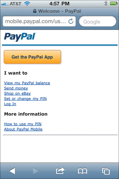
As an example, compare PayPal’s regular website (Figure 15.1) with its website for mobile users (Figure 15.2). The regular site has lots and lots of options available, in a landscape (horizontal) orientation. The mobile site, on the other hand, presents only the most important options, in a portrait (vertical) orientation, with minimal graphics. It’s a lot cleaner and to the point, and works much better on mobile devices.
Add a Search Box
When you limit the content you present on your mobile page, you reduce the number of navigational avenues into your site. Since there are fewer navigational options, it’s important to provide a way for users to find specific content. That argues for a site search box, placed prominently on the homepage. You have to give customers a way to find what they’re looking for, no matter what.
Design for Portrait Orientation
Pages on the traditional Web have a landscape orientation with horizontal menu bars, as users typically have widescreen computer monitors. Phone screens, however, are usually oriented vertically. This means you need to adjust your Web pages to be sure they display well in a vertical format.
Figure 15.1. The traditional PayPal homepage, as viewed on a personal computer.
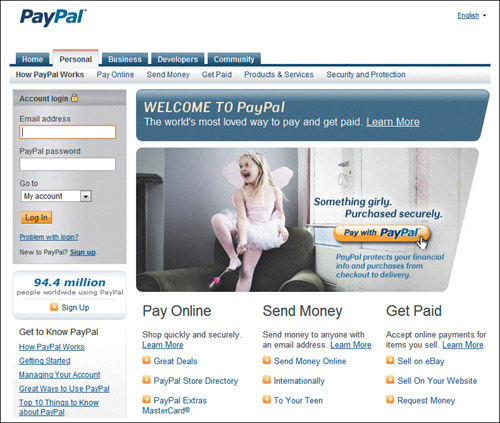
Figure 15.2. The PayPal Mobile homepage.
Limit the Use of Images
Here’s something else about really good mobile websites: they don’t use a lot of graphics. Space is at a premium, and you can’t waste it with superfluous images. In most instances, you can present content more efficiently in text than in pictures; let that drive your mobile page design.
Using text instead of images also affects the download time for your mobile pages. Mobile Web access is typically slower than a computer-based connection; everything takes longer on the mobile Web. Keep this in mind and limit the number of large elements that take a long time to download—don’t make visitors suffer through an interminable download just to look at a pretty picture.
Reduce the File Size
With cellular data network speeds in mind (and knowing that even 3G networks aren’t always speedy), you need to keep the file size for the entire web page as small as possible. You want to aim for a maximum page file size of 20KB. Smaller is better.
Don’t Clutter the Screen
When designing for the mobile screen, it’s tempting to try to cram as many elements as possible into the smaller space. Resist that temptation. White space is an important element of any page design, and even more so for small screens. Having too many elements in a small space is visually unappealing and difficult to navigate. The admonition to keep it simple applies to design as well as content.
Don’t Do Tables
If you use tables on your main website, get rid of them for your mobile site. Tables simply don’t display well on mobile devices; if a table is too wide (which it probably is), it throws off the entire page. Instead, present data in a bulleted list, or just in normal text format. Only use tables if you’re sure they fit within the allotted screen width.
Use a High-Contrast Design
Getting into the design side of things, know that not all mobile devices have great screens. Some devices simply don’t reproduce color well; some devices don’t even have color screens. To that end, pay attention to the contrast on your page, and make sure the text color is in sharp contrast to the background color. When in doubt, remember that black text on a white background works best.
Minimize Text Entry
E-commerce websites require a fair amount of data entry on the part of your customers. That said, you need to rethink how you get that customer input. It’s difficult to enter text on a mobile phone; you have to click here and press there and then tap an onscreen keyboard multiple times just to record a single letter. Consider accepting some input, such as demographic information, via simple radio buttons or lists that visitors can select from; also minimize the need to input non-alphanumeric characters and to capitalize input text. In other words, design your mobile site to require as few input keystrokes as possible.
Design for Multiple Phones
When designing a mobile website, it’s tempting to focus your mobile efforts on Apple’s iPhone, as it currently dominates the consumer smartphone market. But the iPhone isn’t the only Web-enabled phone on the market; in fact, it only owns about a quarter of the smartphone market, let alone the market for all Web-enabled phones. If you focus on the iPhone exclusively, you’ll be ignoring more than three-quarters of the potential mobile market.
This leads to the challenge of making sure your site can be displayed at a variety of screen sizes, shapes, and resolutions. Some mobile screens are tall and skinny, some are short and long, some are perfectly square. And resolution varies from 128 × 160 all the way to the iPhone 4’s 960 × 640 pixels. It’s tough to make a single site look good on all these different displays.
The best solution, then, is to keep your mobile site as clean and simple as possible, to maximize the viewing experience across multiple mobile platforms. Alternatively, you can design one site for web-kit mobile browsers (iOS, Android, etc.) and another for other feature phones. In any case, you have to take multiple phone models into account.
Adding PayPal Mobile Express Checkout to Your Mobile Website
Recognizing the growing importance of mobile e-commerce, PayPal has returned to its roots by offering a new way to accept payments. The new Mobile Express Checkout strikes a delicate balance between security and ease of use, both of which are crucial for acceptance by mobile customers.
Mobile Express Checkout provides a seamless, easy-to-use checkout experience for customers. It runs in most mobile Web browsers, using pages optimized for smaller mobile screens and mobile keyboards.
How Mobile Express Checkout Works
The mobile checkout experience begins on your mobile website when a buyer is ready to pay you. The process goes like this, as illustrated in Figure 15.3:
Figure 15.3. The Mobile Express Checkout flow, with payment on the merchant’s website.
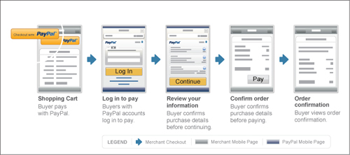
Figure 15.4. The customer login page for Mobile Express Checkout.

Figure 15.5. How non-PayPal users enter payment information with Mobile Express Checkout.

1. From your shopping cart page, the customer taps the Checkout With PayPal button.
2. This displays a login page, like the one shown in Figure 15.4. The customer logs in with his PayPal email address and password, or mobile phone ID and PIN, and then taps the Log In button.
3. An order review page now appears; the customer taps the Continue button if the information is correct.
4. When the page shown in Figure 15.5 appears, the customer enters purchase details on your website, and then taps the Pay button. Payment information is transferred to PayPal, where the payment is confirmed.
5. Your site displays an order confirmation page. (Optional.)
Figure 15.6. The Mobile Express Checkout flow, with payment on PayPal’s website.

The process is even shorter if you let the customer pay on PayPal, as shown in Figure 15.6:
1. From your shopping cart page, the customer taps the Checkout with PayPal button.
2. This displays a login page on the PayPal site. The customer logs in with his PayPal email address and password, and then taps the Log In button.
 The Emerging Mobile Market
3. An order review page now appears; the customer reviews the order and then taps the Pay Now button. PayPal processes the payment.
4. The customer is returned to an order confirmation page on your website.
Implementing Mobile Express Checkout
Mobile Express Checkout currently supports Android-based mobile devices (software versions 2.0 and 2.1), the Apple iPhone (versions 3G, 3GS, and 4), and the iPod touch (2G and 3G). At present, Mobile Express Checkout is available to merchants and customers in the United States, Canada, and the United Kingdom. Expansion into additional markets is planned.
If you already use PayPal’s Express Checkout, minimal programming changes are necessary to implement Mobile Express Checkout. All you need to do is add similar payment/shopping cart buttons to your mobile site to those you use on your regular site.
On the other hand, if you’re developing a mobile app to enhance the shopping experience, you use the mobile APIs contained in the PayPal Mobile Express Checkout Library. This Library contains all the APIs and code you need to embed your mobile implementation of Express Checkout on select mobile devices. Everything you need is available (and explained) at www.x.com, PayPal’s Developer Network website.
Using Mobile Marketing to Promote Your Website
When it comes to getting the word out about the mobile version of your website, you can turn to various mobile marketing activities that reach customers right on their mobile phones.
The most common of these marketing activities include mobile search engine optimization, mobile advertising, and marketing via mobile apps.
Mobile SEO
Now that you have a mobile website, you have to optimize it for mobile search—traditional Web searching conducted on mobile phones. And search engine optimization (SEO) is even more important in the mobile world than it is in computer-based search.
The big difference between mobile and traditional search is that while traditional Web-based search results pages show ten results or more per page, most mobile search results pages show only three or four results per screen. That makes it much more important to rank at the very top in terms of search results; lower rankings will get relegated to a subsidiary screen, with the resultant decrease in visibility and click-throughs.
The other big difference is the local nature of mobile searching. Much mobile searching is for local businesses and events: movie times, nearby restaurants, local retailers, and the like. You can take advantage of this by optimizing your mobile website for this mobile/local search.
The best way to optimize your mobile site for search is to identify keywords that help identify the location of your business. That can include any or all of the following:
• Your store address
• City name
• State name
• ZIP code, and nearby ZIP codes
• Neighborhood
• Region or regional nicknames (tri-state region or Silicon Valley, for example)
• Native nicknames (Garden State, Hoosier State, and so forth)
Add these local keywords to your regular list of keywords and mobile customers will be able to find you when they’re searching locally. This should move your site nearer the top of mobile search results pages.
Mobile Advertising
When advertising on mobile devices, you have the typical choice of a Pay-per-click (PPC) text ad or clickable image ad. Both can be effective.
A mobile text ad looks much like a normal Web-based PPC text ad, but with less copy—typically just 24 to 36 characters, followed by your destination URL or phone number. A mobile image ad looks like a traditional Web-based banner ad, but with a very small banner that fits easily on the mobile screen.
Whichever type of ad you choose, you can decide what happens when a customer taps the ad. By default, tapping a mobile ad takes the consumer to a landing page on the advertiser’s website—one designed for mobile viewing, ideally. But you can also opt to include a “call” link in your ad; tapping this link initiates a phone call to a number you specify. This is a great way to connect directly with customers on the go.
Mobile Apps
Finally, you can market your mobile website via a mobile app. The biggest market for mobile apps today is with Apple’s iPhone and iPad; Android phones also represent a significant opportunity. Most apps are delivered via an app store, such as Apple’s App Store or the Android Market, which is accessed directly from the mobile device.
Apps are extremely popular with mobile users. Nielsen Research reports that the average iPhone user has 37 apps installed on her phone; the average Android user, 22 apps; the average BlackBerry user, 10 apps.
A mobile app typically performs a single duty, or multiple duties within a defined area. Apps can display advertisements alongside more functional content, thus enabling a publisher to promote its website within the app. Publishers can also use in-app selling to market goods and services from within an application.
For marketing purposes, you need to develop an app that promotes your website and products. As such, the app needs to engage your current and future customers. The app needs to be useful, not just promotional; it can’t just be an advertisement, it has to provide real value to users.
In addition to providing utility to users, your app also needs to promote the website behind the app. It should lead users directly back to your mobile website. This isn’t just an image-building effort; you want to convert app users into customers. To that end, make it easy and worthwhile for app users to get to your website for more information or services or to make a purchase.
For that matter, you can design an app to facilitate purchases via a mobile device. If you own a restaurant that offers take-out or delivery services, you might want to design an app that lets customers order directly from their mobile phones. The key is to make your app useful and fun so it will lead directly to consumer purchases.
The Bottom Line
As more and more consumers access the Internet via their mobile phones, mobile e-commerce is becoming more important. To that end, you need to develop a mobile version of your website and employ various types of mobile marketing to promote it. You should also implement mobile checkout on your mobile site, such as that provided by PayPal’s Mobile Express Checkout.