4. The IOS Interface and User Experience
The iPod touch and iPhone screens—
they’re so small! How is it possible to
design a quality user experience on something
as tiny as 320 × 480 pixels?
Coming from a large-screen environment where we are typically designing for 960 pixel, 1024 pixel, or even wider spaces, these mobile screens at first seem impossibly small. But millions of people are buying and using these devices, and they aren’t doing it to torture themselves—we’re seeing some great user experiences on these pocket computers. They can be fun, easy, and even delightful to use.
So what makes this possible? How can we learn from Apple’s own apps and from other examples? This is what we’ll be focusing on in this chapter, as well as some of Apple’s suggestions for how to succeed on the small screen.
As we begin figuring out how to use this small piece of real estate, it’s important to take a look at everything Apple has given us. This includes walking the walk and talking the talk, so you’ll also be learning a new vocabulary.
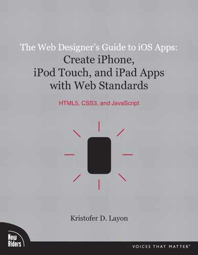
Let’s start with the real estate itself. Figure 4.1 shows our 320 × 480 pixel screen (and note that in general discussions I will refer to the current iPod touch and iPhone 3GS screen size, though I will supplement with iPhone 4 and iPad sizes where appropriate):
4.1 The standard size iOS screen for iPod touch and iPhone (pre-4), where most iOS users are.
Screen is the most common term for the entirety of the view—it’s not a window like on a desktop or laptop computer. Windows have close buttons, minimize, and enlarge buttons, and they reside on a desktop. But an iOS app screen just is—remember that this is a more immersive experience (consider screens in movie theaters), so thinking in terms of screens is a slight philosophical and practical change from designing less immersive, windows-based websites
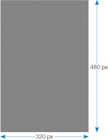
Figure 4.2 shows the New York Times app and examples of the iOS interface elements that you’ll learn how to implement in this chapter. The first element of the iOS screen you’ll be introduced to is the status bar.
4.2 The New York Times iOS application in portrait and landscape orientations.
What is the status bar?
The iOS status bar (Figure 4.3), located at the top of the screen, grounds the device screen with some key information that we’re all used to seeing. If it’s an iPhone status bar, we see our cellular signal strength (or, as is often the case, our lack of signal strength!). And regardless of the device, we also see whether we’re on a wireless internet connection and what its strength is.
The local time is centered in the status bar. And a nice feature of this area is that tapping the center of the status bar is equivalent to a “Return to top of page” link on a website. It quickly scrolls the screen back to the top. This is a user interface feature that works in any app, so that’s why all apps except video games tend to include the status bar in their design.
Finally, the rightmost element in the status bar is, of course, the battery charge indicator.
The default color of the status bar is silver, but it can also be set to black and black translucent. When using NimbleKit to trigger these native Objective-C settings, here’s how to change the status bar to black using JavaScript:
And for black translucent:
The default setting is, not surprisingly, “default.” Furthermore, if you’re not changing the color to black, don’t even worry about including this snippet in your app—it’s only necessary if you don’t want the default silver appearance.
Note: Using these examples in a NimbleKit-based app
If you want to try any of these code snippets as we go along, just open a new app in Xcode and choose the NimbleKit option as explained in the last chapter. Enter the code after <script type="text/javascript" src="NKit.js"></script> in the main.html file that is provided in the HTML subdirectory. I’m omitting opening and closing script tags in these samples to avoid repetition, so be sure to wrap these examples with <script type="text/javascript"> and </script> like so:

And if you don’t want to type them, download the code samples at iosapps.tumblr.com.
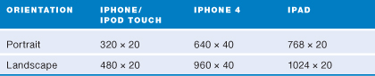
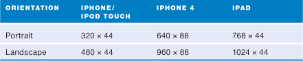
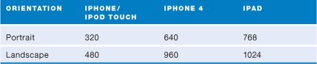
When the device is rotated and the app supports landscape orientation, the status bar expands to fill the new width. So when planning app screen designs, it’s important to take aspects like this into consideration. To help you with your planning, I will provide portrait and landscape dimensions of iOS elements for all three devices. Let’s start with the status bar. In Table 4.1, I use the design term portrait to mean the standard, upright device orientation and the term landscape to mean the rotated or “sideways” orientation.
Table 4.1 Dimensions of the iOS status bar (in pixels)
Implementing the title bar
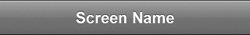
The next major element of the iOS user interface is the title bar (Figure 4.4), located immediately below the status bar in an app screen. The title bar is an absolutely critical element. As the name implies, it often confirms the title of an app upon launch. And the title bar functions much like the title of a web page in a site: It’s the landmark that helps you maintain your bearings as you move from screen to screen through the app.
The title bar has a default Apple color of blue-gray. Keeping the default color is a great design decision when you want to maximize the “nativeness” of your app.
On the other hand, setting a custom background color for the title bar is a nice design opportunity if you, your employer, or your client wants to brand an app a bit more. So I encourage you to consider this option, too. Setting a custom color can be a nice way to enhance the brand identity of an app while still keeping the familiar dimensions and gradient.
Let’s walk through how to do this. The basic JavaScript is below (and the variables you can change are highlighted)
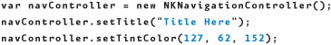
Note that the NimbleKit library item is called NKNavigationController (and not NKTitleBar). This is because as a user navigates into an app (via a table view or tab bar navigation), the NKNavigationController automatically adds native back buttons so users can return to where they started.
Regarding the title displayed in the bar, it has a limit, of course, and this depends on the device you’re using—a screen title on an iPod touch or iPhone needs to be shorter than one on an iPad. But keeping them short is a good practice anyway. If you end up choosing a title that’s too long, it will automatically be truncated with an ellipsis at the end.
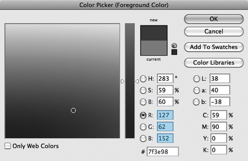
The color setting uses RGB settings just like the CSS rgb color property does. So in the previous code example, I selected a violet hue to match a client’s brand. I used Adobe Photoshop to open a file with the color palette in it, and used the Color Picker (Figure 4.5) to tell me what the RGB values were.
4.5 Using the Color Picker in Photoshop to find out a hue’s RGB values.
Note that the gradient effect comes standard with the NimbleKit title bar.
Table 4.2 shows the size of the title bar on the various iOS devices and in both portrait and landscape orientations for your planning purposes.
Table 4.2 Dimensions of the iOS title bar (in pixels)
Designing with tab bars
The tab bar (Figure 4.6) gets us into more interesting iOS user experience territory, as it’s one of the principal ways to navigate between different screens in a single application.
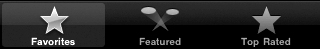
Tab bar with standard categories
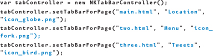
Now you’ll learn how to code the sample displayed in Figure 4.6. In this example, there are three tabs that navigate to three other pages. Each tab has two components: the titles (Favorites, Featured, and Top Rated) and an icon for each.
This first example does a lot of heavy lifting for you, because NimbleKit is able to call some of these native items that are built right into the operating system. In other words, both the titles and the icons come for free.
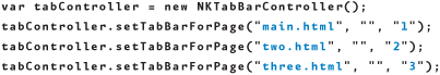
The basic JavaScript for this is (variables you can change are highlighted)
The way this works is that the page names for each tab are HTML file names. The second setting is for tab labels (covered in the next example), and the third setting refers to built-in categories and icons. The tab label settings in the previous code listing are left blank because they’re not used when calling built-in tab categories (which are automatically labeled).
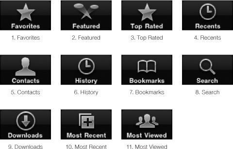
There are currently eleven built-in categories and icons (Figure 4.7).
4.7 The built-in tab navigation categories.
Note: The titles and icons are free, but not the functionality
What you get for “free” here are only the tab button titles and icons, not the associated functionality that would go with them. In other words, making a tab called Contacts doesn’t automatically create a contacts screen for you.
Tab bar with custom categories
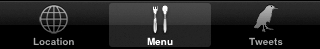
On the other hand, you may not need these categories. In that case, you’ll want to assign your own labels to the tabs. In fact, you can even design your own icons and have them integrated into a tab bar. Figure 4.8 shows a sample tab bar I’ve designed to demonstrate this.
4.8 Design your own custom tab navigation.
Here’s how the JavaScript differs for a custom version:
Take note of the items in the code that you must set:
• The first item is the page to which the tab navigates.
• The second item is the text label for the tab.
• The third item is the icon.
I’ve found that designing a PNG image that is 30 × 30 pixels with a transparent background works well for a tab icon. Of course, beyond those basic specifications, the scale and detail of the image will determine whether it is recognizable at that size. But as long as the PNG is a solid image overlaying a transparent background, the rest of the native effects (gradient, glow, and white and blue colors) are applied for free by NimbleKit and the operating system.
So what is the maximum number of tabs you can display in a tab bar navigation? For the iPod touch and iPhone it is five, and for the iPad it is eight. Except you can actually go beyond that—when you exceed the maximum number of tabs that the navigation will display, it automatically adds a More tab in the last position and puts everything else into a table view navigation (which you’ll learn more about next) (Figure 4.9).
4.9 An iPod touch/iPhone tab bar navigation with six categories, demonstrating how the More tab is automatically added by NimbleKit. Nice!
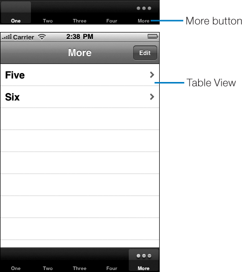
Table 4.3 shows the size specifications for the tab bar navigation, for purposes of laying out your screen design.
Table 4.3 Dimensions of the iOS tab bar (in pixels)

Navigating with table views
Table views (Figure 4.10) are at the heart of iOS applications. They are ubiquitous, from Apple apps that come installed on iOS devices (Settings, Mail, Contacts) to any app that delivers content to people.
4.10 A plain table view navigation.
This section explores some of the types of table views that are possible, and dives into how to implement them in your apps.
Plain table view
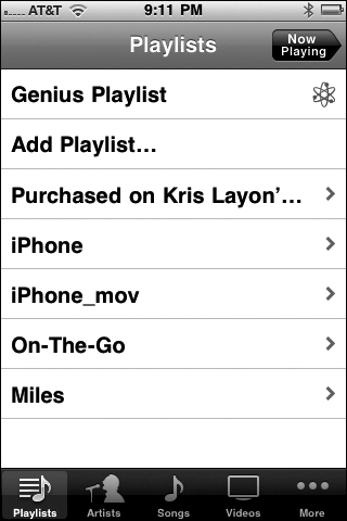
The plain table view navigation shown in Figure 4.10 is as native as it gets: it’s a plain table with no adornments, and navigates to additional screens in the app. In fact, it’s exactly like the table view shown in Apple’s iPod application (Figure 4.11).
4.11 A plain table used to show playlists in the iPod application on the iPhone.
To code the table, use NimbleKit’s NKTableView function. Here’s the JavaScript that calls the NKTableView library item shown in Figure 4.10:
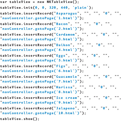
When you’re making this, you’re creating the instance of NKTableView called tableView, defining how much of the screen it takes up—in this case, the entire screen except the status and title bars—and specifying that it’s a plain table view (the alternative is grouped, which you will explore next).
After this, use insertRecord to add the desired number of rows (it will scroll, so there really isn’t a limit that I’m aware of). The six parameters available are:
• title
• subtitle
• left image
• section number
• right image
• callback
Note: Table view usability and information hierarchy: How many rows are too many?
I’m not aware of a limit to the number of rows in a table view, but that doesn’t necessarily mean there is no practical limit. If you’re considering having a ton of rows in a table view, you might be better off using a grouped table view or even multiple table views (that is, a table view that links to screens with additional table views). Consider the usability and information hierarchy concerns of how you design with this interface element.
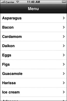
In a basic table view, you leave the subtitle and image parameters empty (images are covered in the next example). The section parameter is used to specify sections in a grouped table view; here it is set to 0 (quirk alert—otherwise the row will not display!). Finally, the callback here is scripted to put the navController function into motion and navigate to screens that would tell people more about these various foods.
Table view with images
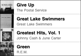
Table views can also be designed with images in them. You’ve seen this in screens like the album view in the iPod app (Figure 4.12).
4.12 The album view in Apple’s iPod app on the iPhone.
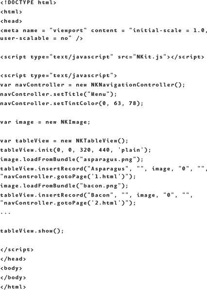
To achieve this result, use NimbleKit’s NKImage control and assign the instance a name, in this case, image. Here’s a line of JavaScript for this:
var image = new NKImage();
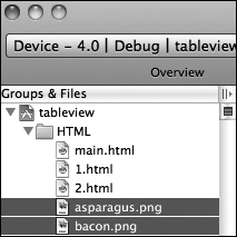
Then you need some images to pull into your table view rows. In a normal-sized row, the height is 43 pixels; you can either size your images to this or let the table view resize them for you. Prepare 72 dpi PNG images and crop them to squares exactly the way you want them. For this sample, I’ve found images of asparagus and bacon (Figure 4.13), and have deliberately left them different sizes—asparagus.png is 100 pixels square and bacon.png is 183 pixels.

Then you need to add the files to your Xcode project (go to Project and choose Add to Project) so they’re in the HTML group (Figure 4.14).
4.14 The asparagus.png and bacon.png files, now in the Xcode project.
If you begin with the same code you used in the plain table view section, the changes are highlighted as follows for activating the NKImage control within the table view rows:

Note
Where sample content includes several items or longer passages, code may be omitted in the sample to keep it short. The ellipsis (...) shows where this happens, as shown on this page when items 3–10 of the table view are not repeated in the code.
So the main.html file, after adding the image modifications, is
This changes the appearance of the top two rows, as shown in Figure 4.15.
4.15 The asparagus and bacon images displayed in their table view rows.
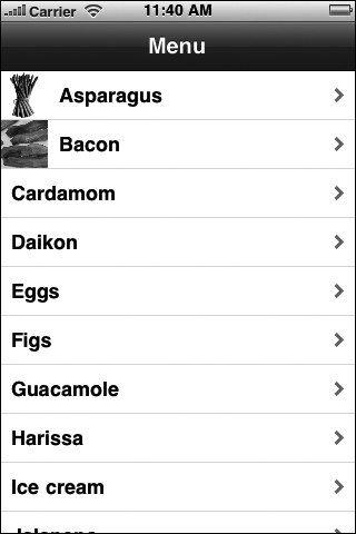
I’m certainly not advocating that you only add photos to some of the rows in a table view. I just didn’t want to hunt down images of all those foods for this example!
Grouped table view
The other main category of table view is a grouped view (Figure 4.16). These are also quite common, such as this one from the Settings app on an iPhone.
4.16 A grouped table view from the iPhone’s Settings app.
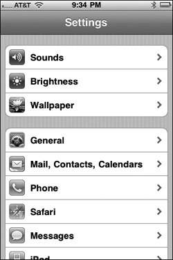
The grouped table view works well if you have items that relate to each other. With grouped views, you can also relate them visually. Let’s build one of our own to see how it works.
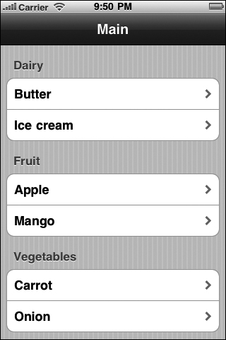
Figure 4.17 shows what you’ll be making in this example.
4.17 A grouped table view showing foods in food groups.
And the following code shows the JavaScript that makes it. I’ve highlighted the code differences between the grouped and plain examples:
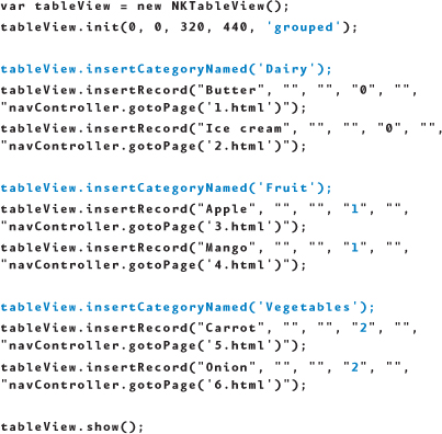
As you can see, you need to set the type in tableView.init to grouped and then add the .insertCategoryNamed lines for each group. The thing that’s a bit strange, however, is that those lines themselves do not group the items. What actually groups them is the fourth parameter of .insertRecord. So, in this example, the three groups are numbered 0, 1, and 2.
Unlike the previous elements, the table view does not have a set dimension in both width and height because the height depends on the number of rows you use. As shown in Table 4.4, table views only have set widths.
Table 4.4 Widths of the iOS table view (in pixels)
Summary
In this chapter, you learned how to design some fundamental elements that will make your apps look and behave in a way that’s familiar to owners of iOS devices. Now you can
• Plan your screen layouts better by understanding what core interface elements are called and what size they are.
• Use the status bar as a “return to top of page” button.
• Implement and customize the color of the title bar.
• Use the tab bar navigation when you have a smaller screen count for your app.
• Use the table view navigation when you have a longer list of content categories, a larger number of secondary screens, or the need to group navigation items in your app.
• Add images to a table view navigation.
Next, you’ll learn how to incorporate and style text and image content.