6. Focus on App Content: Maps
iOS apps are designed to run
natively on Apple mobile devices.
Maps help mobile natives know
where they are running.
Mapping is one of my favorite uses of my iPhone, and it’s an example of a good philosophy for mobile application design. It fits squarely into my approach about why designing custom, native apps can offer real value to people by providing a useful solution:
• Mapping is a timeless need that can surface wherever we are and regardless of what we are doing. It is both “real world” and technology agnostic—though, in this case, mobile technology can have a role as a mapping solution!
• Mapping is a generic activity that applies to any business or organization that has a geographic, bricks-and-mortar location. So it can be a key feature of a mobile app for nearly anyone.
• Mapping is about more than finding the location of a business, organization, or other venue. On a cellular iOS device, it can also be a wayfinding tool that provides detailed driving, mass transit, or walking directions from your current location to your destination.
And once you start seeing mapping as a universally appreciated function that can apply to nearly any client or employer, you start seeing all kinds of applications. Mapping is really the location of
• restaurants
• stores
• event centers
• festivals
• farmers’ markets
• medical clinics
• campgrounds
• people
• services
Clearly, this list could go on and on. But again, part of why I’m writing this book is to think aloud as a designer, and inspire you to see opportunities for designing apps that are relevant to clients and, more importantly, relevant to their customers. Mapping, then, becomes a tool that anyone should be able to relate to when discussing an iOS native app project.
The NimbleKit framework offers a handy map API that pulls in the same Google Maps view that you get in the actual Maps application that comes on the iPhone and iPad. Right out of the box, it’s fairly easy to configure, and has only one minor shortcoming at the moment, which has a relatively easy work-around.
I’ll be up-front and start with the shortcoming: Apple does not currently open up the full Google Maps API to app designers. So we can pull a live map view into our custom app and also set a pin and label it to annotate our map, but we cannot currently pull the directions feature into our app. I suspect this is part of Google’s agreement with Apple for being the default mapping tool on the iOS platform. (And we may not like it, but it is what it is.)
Fortunately, there is a nice work-around to this shortcoming: providing a link to the Maps app within the map view. In other words, even though we cannot fully incorporate directions into our own apps, we can still link to a map pin in Google Maps and have it open directly in the Maps application. It adds an additional step, but once you see how seamlessly it works, the extra step ends up feeling rather trivial.
So let’s walk through a few ways that we can pull a custom Google map view into a native app, and still have it lead to getting convenient directions from our current location. We can design all of this with a dash of HTML, a few lines of CSS, a little JavaScript, and some help from NimbleKit’s Objective-C framework.
Method one: Using NKButton
This method is pretty short and sweet. It allows us to pull in a Google Maps view, specify a pin at a particular location and label it, then add a “View in Google Maps” NKButton with a native appearance and behavior that will link to the same location in Maps so users can get driving directions. And it does this all without requiring you to do any styling or even much coding. In fact, it hardly even uses any HTML; it’s all NimbleKit and a bit of JavaScript at the beginning of the file.
I’m including this technique as well as a more custom-designed button because I want to highlight how the NimbleKit Objective-C framework often supports both native features and custom features. Learning how to do both is very useful: Sometimes the specification of an app might call for a native look, and other times your employer’s or client’s branding guidelines might lead you toward a less native, more customized styling of an element like a button by using CSS.
Planning the screen layout
This technique allows you to overlay a button on the screen contents, so we’ll do that in a single screen. And for this example we’ll dispense with any additional elements except the status bar and title bar, which are present in any screen of a content-based app.
Looking at our 320 × 480 pixel iPhone screen, here are the elements we’re starting with:
• status bar: 320 × 20 pixels
• title bar: 320 × 44 pixels
That leaves us with 416 pixels in height to work with; this comes into play in the JavaScript step of implementing this technique.
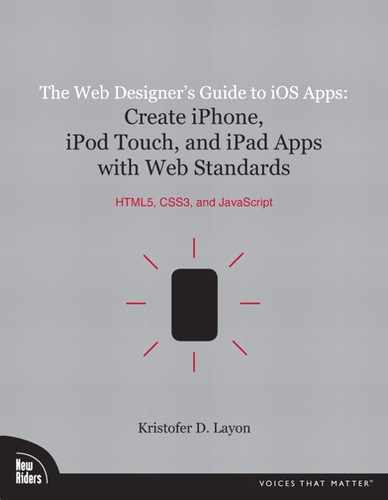
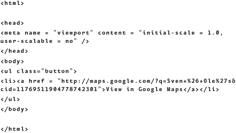
Writing the HTML
The HTML for this method is probably the shortest ever written. In fact, as a stand-alone page of code, it really doesn’t do anything until the JavaScript is added later:
Truly, that’s it. We’re just creating a shell in which to place some JavaScript, and setting the screen to not be scalable with touch gestures with the meta tag (the map will be scalable already). Thus, this method requires no CSS, as it’s not necessary for using NKButton.
Writing the JavaScript
Now we get to the interesting part: calling the NimbleKit framework into action for the embedded map view. Time to dust off some JavaScript writing skills (but it’s pretty easy).
There are four basic styles and behaviors that we call into action in this step:
1. Give the page a name in the native iPhone UI title bar.
2. Set the color of the title bar.
3. Embed the Google map view.
4. Enable a NimbleKit button to link to our location in Maps.
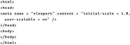
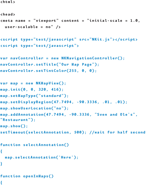
The first two steps were already detailed in Chapter 4, so here’s what I’ve done to name the screen and set the color to red:
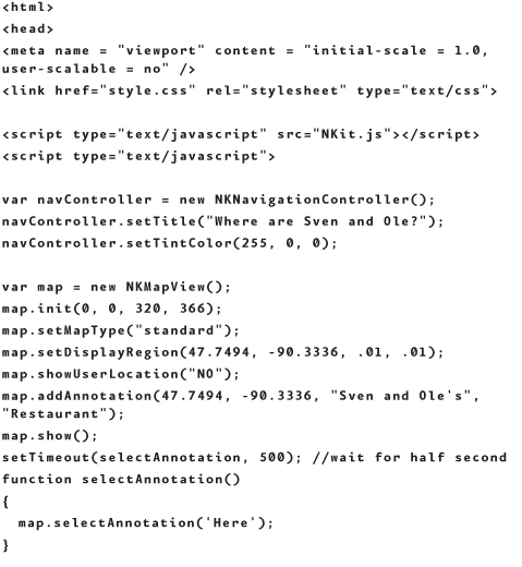
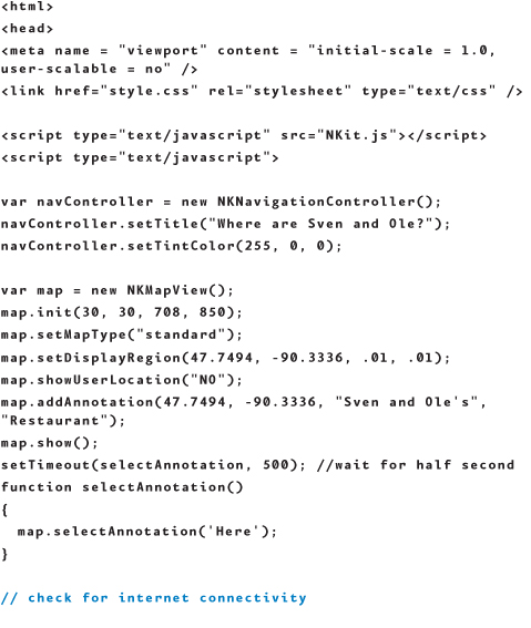
Now let’s jump to the parameters that are available in the map embed code. The first task is to create a new NKMapView, which is a variable with the name “map”:
var map = new NKMapView();
After this, define the size of the view by specifying the X and Y coordinates of its point of origin (with 0, 0 being the top left of the screen) and decide how wide and tall it should be. So, a map taking up an entire iPhone screen would have these values:
map.init(0, 0, 320, 480);
But remember that you have two other elements on the screen (the status bar and the title bar), so you need to subtract those heights from the available height to calculate the remainder:
map.init(0, 0, 320, 416);
Then set the map type. As in Apple’s Maps app, there are three settings for the type of map: standard, satellite, and hybrid. In this example, it’s set to "standard":
map.setMapType("standard")
The next part is a bit tricky and requires some experimentation: Set the geographic center of the map view and set the range that the view is covering. The format is
map.setDisplayRegion(latitude, longtitude, latitudeDelta, longtitudeDelta);
Note: Getting longitude and latitude in Google Maps
Finding longitude and latitude in Google Maps is easy if you use the right tool. I use the LatLng Tooltip (by Marcelo C). Find it by going to Google Maps Labs and enable LatLng Tooltip. You can find this and other Google Maps Labs options by clicking on the New! (with a green lab beaker icon) link in the upper right corner of the Google Maps screen, next to Help and Sign in.
Latitude and longitude are measured from the intersection of the prime meridian and the equator, so values of latitude north of the equator are positive (and south are negative), and values of longitude east of the prime meridian are positive (and west are negative). The trickier part is setting the delta values. Hopefully my experimentation here is helpful to you: The value of .01 is equal to about 5,500 feet, or approximately one mile.
In the following code example, I’ll use a restaurant called Sven and Ole’s and their real location in the town of Grand Marais, Minnesota (pay them a visit if you’re ever in northern Minnesota—they serve great pizza!):
map.setDisplayRegion(47.7494, -90.3336, .01, .01);
The next line tells the map view not to show the user’s current location. In this example, that’s not important, nor is it necessarily possible if the user is outside the range of the map view:
map.showUserLocation("no");
Next, I’ll set a pin at the location of Sven and Ole’s restaurant. It makes sense to me to initially center the map view on the restaurant, so you’ll see that the latitude and longitude match the setDisplayRegion parameters. Then come two labels or titles—the first being the main label for the pin and the second being an optional subtitle:
map.addAnnotation(47.7494, -90.3336, "Sven and Ole's",
"Restaurant");
Note: A word about NimbleKit’s MapView
NKMapView supports some additional parameters following the title and subtitle, including image, color, and an optional callback function. But I want to keep my pin like the ones I’m accustomed to seeing in the actual iOS Maps application, so I recommend keeping your map pin simple as in my example. If you want to explore these options, consult the NimbleKit documentation for NKMapView, which explains them in more detail.1
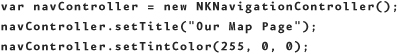
At this point, I’ll add a line of code to set a slight delay before the pin appears (to match the user experience in Maps):
setTimeout(selectAnnotation, 500);
I’ll also add a few brief lines to make the map function actually display the map and allow the pin to be selectable:
Next, I’ll define the function to navigate to the same location in Maps. I’ve called it openInMaps and in it I’m placing a URL for Sven & Ole’s location in Google Maps:

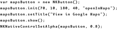
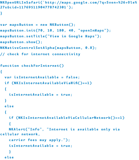
The last step is implementing NKButton so that someone using this app screen can navigate to the same location in the Maps application. The following code defines a variable mapsButton, sets the size of the button, and calls on the openInMaps function when clicked. I’ll also set the alpha (transparency) to 80 percent so that it has a nice semitransparent appearance:
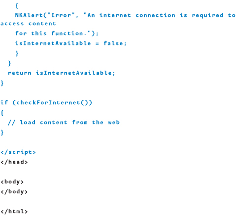
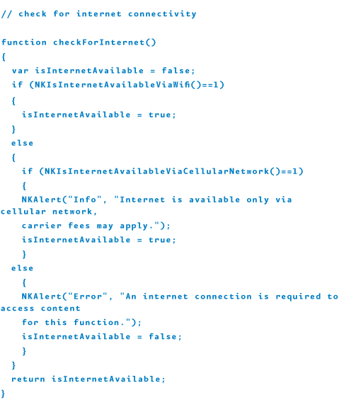
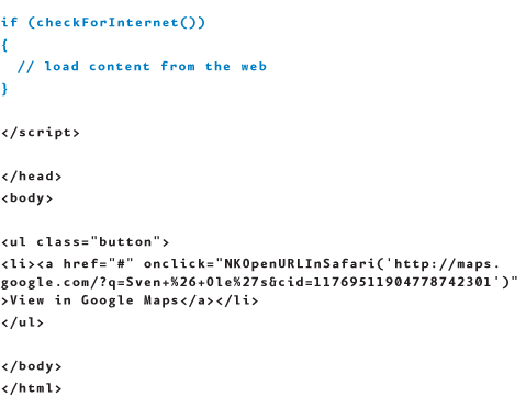
The real last step, checking for Internet connectivity and using NKAlert, was covered in Chapter 5; the code is the same as it was in that example.
Taking all these pieces together, the HTML with JavaScript now looks like this, with the NimbleKit sections highlighted:
When tested on an iPhone, the results of this work look like what’s shown in Figure 6.1.
6.1 Our app screen using NKMapView with NKButton.

You can do this exercise and still partially test it in Simulator, but because Simulator doesn’t have the Maps app on it, the button causes Google Maps to open in Safari instead. Full testing requires you to provision and test on an iPhone, iPod touch, and iPad.
Method two: Styling an HTML button
This next method uses a CSS-styled HTML button instead of NKButton. My example is only one way to style a button with CSS: The idea here is that with styles (and especially with additional elements like graphics files), you can design a more branded appearance with this detail.
Planning the screen layout
In this map example, I’ll continue using the status bar, title bar, and tab bar page layout from our previous examples. The reason for this is practical: A map screen in an app will probably be one of multiple screens. Because I like my examples to be practical and reusable for actual applications, I’ll move ahead with the map exercise using this assumption.
Looking at the 320 × 480 pixel iPhone screen, start with the same elements as we did before:
• status bar: 320 × 20 pixels
• title bar: 320 × 44 pixels
This leaves us with 416 pixels of height to work with again. But this time we’ll use some of that space for the HTML and CSS button as it cannot overlay the map like NKButton does. I’ll propose adding a button that’s 32 pixels tall below the map and giving it 50 pixels of margin on the left and right to center it, and 5 pixels of margin on top so it doesn’t directly abut the map. I’ll also style the space around the button to look similar to a native tab bar (dark gray).
With this as our plan, let’s proceed with building it out!
Writing the HTML
The HTML for this is remarkably brief, as most of this code example utilizes NimbleKit’s map architecture. About the only things we’re doing in the HTML are setting the stage for getting things wired together and creating the button that links to Maps.
To get this first step done, create a new HTML file. As with the last method, the initial code will scale the viewport to the iPhone and set user scalability to no. The embedded map will already be scalable, but we don’t want the button to be scalable as this would result in a nonnative user experience. We’ll also include a few lines to define a class named "button" and build it as an ordered list item (as you typically would when designing a navigational element in a website). So, here’s what this first step looks like:
Writing the CSS
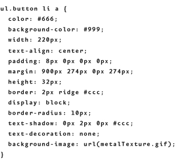
Next, style the button in a native way, giving it the native iOS UI treatment of embossed text, rounded corners, drop shadow, and so on. Here’s the CSS for this, using the specs we decided on in the Planning the Screen Layout section—put this in a file called style.css. I had to work one step ahead to get my top margin value for the button; I needed to calculate the height of the map view (366 pixels) to arrive at the top margin value (366 + 5 = 371 pixels).

Note some of the details that still make this button look native: 14-point text, the CSS3 border-radius effect, and the text-shadow all contribute to making this button fit into the iOS user interface rather smoothly. It’s just that in this case, I wanted a green button.
Of course, the point of designing a button with CSS might be to do something much more adventurous than making an otherwise native-looking button green. By making the map view narrower (with a margin surrounding it) and visually integrating a button into this chrome, you could design the button to look like nearly anything you wish. For example, you might put the map in a woodgrain frame and use a Photoshop filter to carve the text into a woodgrain background.
Anyway, I digress: After this you can experiment with button styles as much as you want because the sky is the limit. To wrap up the styling for this exercise, save the file and add a line to your HTML to call up the styles. Let’s call it style.css:
<link href="style.css" rel="stylesheet" type="text/css">
If you run this at this point, you’ll see your button but it will not properly link to Maps yet, because you haven’t added the NimbleKit code to support it.
Writing the JavaScript
The JavaScript for this method is very similar to that of the previous method, so I’ll only highlight the differences. First, remember the height value for the NKMapView that I calculated earlier for the CSS styling. I’m now putting that 366-pixel value into the function for the y-height:
map.init(0, 0, 320, 366);
And in place of the NKButton JavaScript, there’s a small onClick event doing the work instead, which changes the formatting of the link like so:
![]()
After inserting the JavaScript into the HTML file, this is what you have:
The results look like what is shown in Figure 6.2.
6.2 The embedded Google map view with a link to Maps, this time styled with a custom button.

iPad considerations
This last example targets the iPad, so it primarily changes the math involved in planning the screen real estate. But I’m also using it as an opportunity to change the design slightly. To give this example a try, open a new NimbleKit project, and choose iPad as the device.
Planning the screen layout
Starting with the 768 × 1024 pixel iPad screen, let’s begin with the same UI elements we used in the previous two examples—they’re just wider this time:
• status bar: 768 × 20 pixels
• title bar: 768 × 44 pixels
This leaves us with 960 pixels of height to work with on the iPad. That’s a lot of space, and typically we’re seeing a bit more “app chrome” (styled areas that frame content or navigation) in iPad designs. So let’s set a border area of 30 pixels around the map view and a bit more spacing around the button, too. Doing the math leaves us with a map view height of 850 pixels.
There’s nothing new in the HTML itself, so let’s jump ahead to the CSS where I’ve made a few changes.
Writing the CSS
Following through on my plan to have a bit of chrome around the iPad map view, this example has the style.css file call up a metal texture background image for the body and button, giving it an embossed metal look (you can download this GIF file from iosapps.tumblr.com; look under Table of Contents > Chapter 6). Once again, I had to work one step ahead to get the top margin value for the button. I needed to calculate the height of the map view (850 pixels) in order to arrive at the top margin value: 850 pixels + 30 pixel margin above the map + 20 pixels between the map and button = 900 pixels. So here’s the CSS for this version—note how the button margins also had to change because of the larger iPad screen:

Writing the JavaScript
The JavaScript for this method is nearly identical to that in the previous method, so I’ll only highlight the difference: the larger specification for the map view. The two values of 30 are the X and Y coordinates for where the iPad starts drawing the map view, establishing the corner and border on the upper left; 708 and 850 pixels are the width and height respectively, so you have a 30-pixel right margin plus plenty of extra space under the map view for the button and extra chrome area:
map.init(30, 30, 708, 850);
The resulting HTML file, with JavaScript, for the iPad is


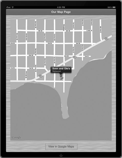
The results are shown in Figure 6.3.
6.3 The app screen using NKMapView on the iPad.
Summary
In this chapter you learned how to
• Pull in an NKMapView that displays a Google map view and supports a location pin with title and subtitle.
• Add an NKButton for linking the in-app map view to the same location in Maps, so users can get driving directions to their destination from their current location.
• Design a custom Maps button using HTML and CSS.
• Design the NKMapView scaled to the iPad, and in a way that allows for a custom chrome around the map view.
Your focus on iOS app content began with text and images and has continued with map and location content. Next you will see how your web standards skills, coupled with NimbleKit, allow you to include audio and video content in native iOS apps.