Appendix A. Additional Guiding Principles
What follows are three additional sections about topics that are critical to designing successful projects: content strategy, application planning, and application usability.
These were originally conceived as shorter sections that were to be sprinkled throughout the book, flavoring the soup, so to speak, with broad and unifying principles that you should keep in mind from beginning to end.
The trouble is, they’re all critically and equally important. But the rest of this book has a flow from preparing, to building, to the delivery of an app. So interspersing these extra sections throughout the book would have given a false impression that whichever one was last could be thought about toward the end of a project.
So this appendix is a bit of a paradox: It’s at the end of the book, but you could (and even should) read it first. And you should certainly keep it in mind from the beginning of an app project to the end of its design and delivery, and beyond to include the app’s ongoing maintenance.
In a sense, having this at the end is appropriate. Good content strategy, planning, and usability are the be-all and end-all of good design.
So here’s the final word.
Content strategy
Content. We web designers are often at a loss about how to handle content. Some quick scenarios remind me of this:
• The I-don’t-really-care-about-content designer: This person is all about deferring the responsibility of content to someone else. Heck, anyone else. Because we have plenty to focus on already, thank you very much: information hierarchy (OK, so that vaguely involves content), navigation, site structure, page layout, and the famously ambiguous but all-important look and feel.
• Mr. or Ms. Lorum Ipsum: Here’s a designer who is kind of good at feigning interest in content. But is it really a sincere interest if the words are fake?
• The I’m-a-Renaissance-man (or woman) designer: This person is pretty confident that she can just massage the kinks out of any content that’s handed to her. How hard can it be, especially with spell and grammar check turned on?
The trouble with having any of these attitudes regarding web content is that they allow us to dodge our overall responsibility for a high-quality, user-focused, and organization-focused website. Sure, we like to think that we’re just focusing on what we should—design—but in reality, we’re not fully focusing on design if we’re being cavalier about content.
And the trouble with bringing these attitudes to the design of iOS apps is that it’s even more dangerous than with websites. As you’ve already learned, there’s a lot less space or interface to design in a mobile app. You simply don’t have the luxury of saying, “Well, I have all of this design work to do—you take care of the content and tell me when it’s ready.”
Unless your app is a game, your mobile app is content.
Which means you need a content strategy.
Fortunately, content strategy is now seeing the light of day as a critical part of design projects. And one of the people who is shining a lot of light in this area is Kristina Halvorson, who gave us a wonderful book called Content Strategy for the Web.1 If there’s a recent book about content-focused design that’s a must-read, this is it. Meanwhile, here’s how some of its lessons can help us with designing iOS apps that are distributed in the App Store.
Less is more
So you thought Ludwig Mies van der Rohe, the great German Modernist architect, was the person who popularized the maxim “less is more”?
Well, you’re right. But it’s Kristina Halvorson who has applied it to websites and other digital media.
But does it really take an author and consultant to tell us this, when all we need to do is pay more attention to our own behavior when it comes to media? It’s truly a classic case of being reminded of something that should already be all too obvious.
Just think about the things we do every day that involve smaller amounts of content, versus things with longer formats.
Most days, we will all read text messages and email, check into a social network, browse some websites, maybe read part of a newspaper and, if we have any free time, perhaps watch a television show or two that is generally a half-hour or hour long.
Things we do not do every day: read an entire book (or even part of one), see a movie, watch a miniseries on television, go to the theater.
While some of these choices involve issues of cost, a lot of it just boils down to time and attention. Watching an entire film simply takes a lot of time. So it can’t happen every day, and it needs to look pretty compelling for us to schedule it into our busy lives.
Thus, a good deal of our media consumption (more) is made up of smaller amounts of content (less). Less is indeed more.
Halvorson affirms this when it regards websites, as I do when it concerns apps:
• Less content is more user-friendly: As with a well-designed website, an app better deliver its content efficiently and concisely because of our media habits. If we’re confronted with something that looks like it will take a lot of our time, people will opt out of it pretty quickly.
• Less content is easier to manage: Let’s say that an important feature of your app is its ability to run offline so that it doesn’t require an Internet connection to work. This means that all the content is contained within it. What is the schedule for reviewing and updating the project’s content? Have you and the content manager agreed on this schedule?
• Less content costs less to maintain: There is a cost to maintaining your content. Somewhere. Perhaps it’s paying an editor, or the time it takes for the owner/client/writer to write and review. Or it’s the time that you will be billing your client for updating the app with their content changes. In any of these cases, creating a large amount of content up front isn’t just a one-time issue: It’s an ongoing issue.
I’m not here to scare you away from having a content-rich app. Certainly, some reference applications’ value is entirely in their scope and depth. Content has value, so more of it can make an app more valuable. Just be sure that everyone is on board with the responsibilities of properly feeding and watering content over the long term. Consider creating an editorial calendar to help manage these issues.
Maintenance process
In addition to size and schedule issues, the maintenance of app content can vary due to a variety of factors.
iTunes Connect lacks a nifty content management module, so if your content resides inside the app (rather than online), your content management system is Xcode plus your editor of choice—on your laptop or desktop Mac. Taking the example of some reference applications that I collaborate on with a content provider, we always work backwards from my collaborator’s desired date for issuing an app update.
We do this because, for the most part, my collaborator is a publisher, the App Store is his bookstore, and I turn the crank of the printing press. Er, I mean Xcode.
So if my collaborator wants an app update to be available around June 1, I need to budget in some time for Apple to review the update (because they review updates just as they review new apps, though the update reviews seem to go a bit faster). Because I have experienced up to a two-week review period, that’s what I go with.
Then I add however much time I need to make content updates in the HTML, new images, and so on.
Then I add on a bit more time as a cushion for surprises.
Then I round up a bit, just to be safer still.
And after all of that, I emphasize to my collaborator that getting his changes to me early might help me submit the update early (this rarely works, but it’s nice to try).
The maintenance process for content delivered online may be simpler or more complex than this—it really depends on roles and responsibilities. For instance, in the example of the Twitter feed populating an app screen, who maintains the Twitter account? How often? Are the content parameters very refined or more laid-back and casual?
The strength of maintaining content in tiny bites via a ubiquitous tool like Twitter is that anyone can do it nearly anywhere. That’s the good thing.
But most people have learned that even with social media, you still need a plan and a process for making it as effective as possible. If you’re setting an expectation for fresh content at a particular interval, you better make sure to deliver on time. And if the “you” is a team of people, is everyone in agreement about who the responsible person is?
Finally, remember that content updates in an app might also lead to the updates of App Store screenshots or updates to the app’s companion website. Does your maintenance plan cover all of those bases, too?
It should.
Be focused and empathetic, but not alarmed
A colleague of Halvorson’s, Erin Anderson, helps point the way to a balanced approach to content management. Applied to managing iOS app content, the approach is to be focused and empathetic, but not alarmed.
Clever. But what does it really mean?
As Anderson reminds us, “Your content can’t please all people, all of the time.”2 The trouble with being sensitive, customer-focused designers and content providers is that we are tempted to make every customer or user happy, all the time.
But take that approach to its logical conclusion and it quickly becomes illogical, especially if we pay too much attention to the ratings and comments in the App Store. (Remember how customers can rave—and rant—in that public space?)
Clearly, when we read constructive criticism in an app review (or receive it via email), we should pay attention and act. But being disciplined about following a focused content strategy means that we are really trying to keep most people happy, most of the time. Once we think we can tweak what we deliver to keep everyone happy, we’re not only fooling ourselves, we’re probably straying from our original plan.
So with regard to making a content strategy, be of good cheer. Realize that just as on the web, the content of your app is everything. That makes it incredibly important, and thus a critical aspect to plan in detail. It’s why people will want and use your app. If you insist on keeping your iOS app content-focused, well-maintained, and governed by a plan with a structure and a schedule, you will indeed keep most people happy, most of the time.
And that’s called success.
App planning
You know the type: the client or employer who really has no idea what it takes to design their website. This is how they think:
1. Websites run on computers.
2. Computers do things really fast.
3. Web designers work on computers.
4. Therefore, web designers can design websites really fast.
And don’t get me started on the clients who think that because I love to design websites, I also love to design their PowerPoint presentation (and they need it in one hour). I mean, they’re practically the same thing, right? (And yes, it’s usually the same clients.)
But can we really fault our clients for such misunderstandings? Not really. Particularly when we’re able to make some of their content or page template updates for them quickly, or they themselves are able to swiftly and easily make site updates because we set them up on some easy-to-use content management system.
Well, the same problem can apply to designing apps, too. They also run on fast little devices, so why wouldn’t they also be designed in an instant? OMG—yet another reason for us to simultaneously love and hate those for whom we design things!
Yet this chasm between client perceptions and reality really isn’t their fault.
It’s our fault.
And we can fix it with some help from Patrick Lynch and Sarah Horton.
Lynch and Horton have been helping people understand the process of designing websites for over 17 years, since they first published the Yale Web Style Guide website in 1993. Now a book in its third edition, Web Style Guide3 is still one of my all-time favorite design books, and here’s why: It helps fix client and employee misconceptions about designing websites.
It can also help you design better apps. Read on.
Clarify roles and responsibilities
Most problems with technical projects are not actually technical in nature. They are human. But I don’t mean that the problem is the person, though I’ve thought this and I bet you have, too. Yes, you have—you can admit it.
A lot of these problems can be collected under the broad umbrella of roles and responsibilities. In fact, this perspective helps reinforce that they are people problems, doesn’t it? I mean, computers and software don’t have roles and responsibilities: They just do exactly what we tell them to, and when we mess up with our directions, they don’t do it right either. Because technology doesn’t understand roles and responsibilities: It doesn’t have any.
So as you start getting excited about a new app project, whether it’s for a client or an employer, cool your jets, step back, and start thinking about the various roles that will likely be involved:
• project manager
• information architect
• art director
• editor
• graphic designer
• coder/programmer
And there could be others.
Some of these roles may reside in the same person. Someone will manage the project, someone will structure the content, someone will determine the look and feel, and so on. These roles may involve six people, or two people, or more than six people. It just depends on the size of your project and team.
And in a way, it doesn’t really matter how many people are involved (though I generally think the fewer, the better). What matters is that the people who are involved know what they are supposed to do. But how will they know?
You need to tell them.
If you’re the only person who knows all the roles, it is your responsibility to define them for your project and have everyone agree about who does what. It’s not only in your own best interest to do so (you are setting yourself up to fail if you don’t), it’s also in the best interest of your app project.
So have a meeting. Write things down. Design a cute team roster document if you need to. Heck, give everyone a team jersey if that’s what it takes. But do not proceed with a project until the roles and responsibilities are clearly established.
Develop a project charter
Lynch and Horton offer especially helpful advice when it comes to developing a project charter for web projects and, here again, I find their ideas just as useful for designing app projects.
A project charter is a simple yet comprehensive document that defines the basic parameters of the project. It should ideally begin with the following items:
• the client’s (or client’s or employer’s organization’s) mission
• the top two or three goals for the app
• the audience of the app
• a description of how designing this app will meet the app’s goals, and support the client’s mission
• any measures of success for the app
The more of these bullet points you can define with clarity and brevity (because no one likes to read complicated, nebulous, or wordy goals), the higher the odds that you, your client, and your users will be happy with the app. Similarly, the fewer you define with clarity and brevity, the more ambiguous the project will be. This will lead to false expectations, confusion, misunderstanding, and hard feelings. And once people are unhappy, it makes for a very long and possibly unsuccessful project.
But a project charter need not stop with organizational and programmatic goals. It should also summarize the roles and responsibilities of the people involved as discussed in the previous section. And as long as it’s covering these practical matters, how about costs and budgets, deadlines and other milestones along the way, any expected advertising or marketing costs, communications plans, and so forth? Some of these items can eventually become detailed documentation in their own right, but as items in a project charter they just need to be there in some capacity. Make them short-and-sweet list items if possible, and use ballpark estimates when precise figures are not available; this will help you refine them later.
In the end, a project charter should be just a page or two of bullet points, lists, or short sentences. It should be brief enough so that you can review it regularly with the rest of your team—even if your team is just you and your employer or client. And if it is just two people, don’t think this excuses you from writing up a project charter. It doesn’t: Take any two people without a clear plan, and they are bound to disagree at some point.
Let’s face it: A project charter will not guarantee that disagreements won’t happen, either. But it will dramatically increase the odds that they are minor rather than major, and thus not showstoppers that sneak up and ruin everyone’s excitement for the project.
Diagram your app (or, build it on paper first)
The next step for a good app project plan is to diagram the entire application, screen by screen. This is another step that requires paper. Indeed, designing new media projects is not just using pixels, is it?
So why is a diagram important, if it’s faster to just start building? After all, it’s all digital—it’s pretty easy to rework and make changes.
Sure it is. At first.
Then after the tenth change, you start thinking otherwise and lose sight of the project goal. Scope creep has set in—as your passion for the project quietly creeps away, never to be seen again.
This is your life without planning diagrams.
Planning diagrams don’t need to be very sophisticated (though they can be). My suggestion is to start simple. Draw the boxes and label them by hand if you have to—we get so accustomed to using software, we sometimes forget that paper and pencil are still acceptable. And even preferable.
Or, use a program to make a project diagram. Regardless of which tool you prefer, use it to create an easy-to-understand app structure or information architecture (it’s just like a structure or information architecture for a website). Show how users of the app will start using it, and where the decision points will lead them. Be clear about how your structure supports the information hierarchies and chunking of information that will be required to make this app elegant and easy to use.
After you have everyone sign off on the diagram, you’re one step closer to having your app project not drive you insane.
Save the visuals for the end
It’s a bit more difficult to do this with apps than with websites, but try to save most of the visual development and graphic design for the end of the project.
You’ve probably experienced what it’s like to not do this. Clients love to see graphics for a project. Well-designed graphics that glow seductively on a screen make clients (and, let’s face it, us) feel great. And they help make it appear that the project is looking complete, even if it isn’t.
Remember that false expectation problem? Premature graphics are a leading cause of false project expectations.
But as I already noted, separating the look and feel from the navigation and content of an app can be a bit more difficult. On very small screens, there is less space for the eye candy. Even mocking up a table view navigation can make it look done already—there’s just not much to it.
In some cases, you may want to defer building some of the elements that can be quick to build for as long as possible. Remember that simple pencil sketches can get everyone to commit to a relatively detailed design before pixels are ever put to screen.
On the other hand, don’t get carried away with excessive documentation or postpone visual elements too long. Over time and with additional experience, you will gain the ability to gauge how much opportunity you need to create for yourself via adequate planning and documentation. Just enough will help answer questions, set realistic expectations, clarify goals, and keep everyone involved happy. Too little can leave gaps for small misunderstandings that can fester into major problems. And too much can drain goodwill from the relationships and energy from the project’s momentum.
Don’t make planning too big of a stick. Try to make it just right. If you do, happiness and success with your app project is likely to follow.
App usability
Usability consultant Steve Krug, author of Don’t Make Me Think,4 has a great set of foundational guidelines in his book about web usability entitled Billboard Design 101. These recommendations are based on years of observing how people really use websites: When users visit websites on the large screens of desktop and laptop computers, they don’t usually visit in the way that site owners and designers imagine they will.
Site owners who want to share a lot of text content seem to expect that visitors will regard the site as classical literature and take the time to carefully and lovingly read every word. In fact, given the amount of content some site owners are hoping people will read, one might think they’re actually frustrated novelists who should seek a publisher instead of putting it all on a website.
As web designers, we have to (perhaps reluctantly) admit that our expectations are similarly high, if not higher. Designers imagine visitors to our gorgeous websites—they are gorgeous, right?—being utterly captivated by the elegant beauty of our designs. They hear choirs of angels singing and feel their eyes well up with tears as they gaze upon our amazing pixel creations in total rapture.
Or something like that.
But Krug, and anyone who takes the time to do usability testing, usually encounters a vast chasm between these utopian expectations and real user behavior. People don’t clear their schedules to spend hours visiting and rhapsodizing about websites. Visitors are in a hurry, looking for information, and we can’t do much about that. Everything about the online environment speaks to instant gratification, so people behave accordingly: They glance at pages, scan text, and click on things that look like links in order to keep moving.
Take a look at those verbs again: glance, scan, click. They are all measured in fractions of a second. So these are the fractions of seconds we have to win our visitors over with some kind of ode to classical literature or art? Kind of hilarious, when you think about it (no pun intended). Though perhaps Krug should have titled his book Don’t Make Me Laugh because I’m sure, given his sense of humor, that he laughs hard and laughs often when he observes crestfallen site owners and designers sit in on usability evaluations. I’ve been there, and I know exactly what it feels like to have my high design expectations lowered.
So what does Krug recommend for this situation, and how does it apply to designing apps for iOS mobile devices? Let’s take a look, and think about it, so our app users don’t need to.
Create a clear visual hierarchy
Establishing a clear visual hierarchy is one of the most important, central services that designers can bring to bear on someone’s project and its content. In fact, it’s timeless: I was teaching undergraduates at the University of Minnesota the fundamentals of visual hierarchy in Graphic Design 101 way before they were learning much about sexy web and interactive media technologies, because it’s just as important for designing an effective poster, book, or postcard as it is for designing a good website and, now, mobile application.
Krug argues that the basic tenets of good visual hierarchy are
• Make the things that are most important the most prominent.
• Group items that belong together (and separate those that do not).
• Use nesting to add further clarity about relationships between categories and items within them.
I wholeheartedly agree with these basic rules. They have governed the printed page for centuries and allowed people to navigate large amounts of dense content (think about newspapers and dictionaries).
Some iOS suggestions regarding these guidelines:
• Be just as savvy with typography in apps as you would be with websites, but favor even fewer styles. Sizing, the use of bold, and at most a second typeface should take you as far as you need to go in creating content hierarchy on a small screen.
• Use grouped table views when you have groups of items that belong together.
• Definition lists are a nice way to nest information under labels.
Take advantage of conventions
Conventions are a bit of a paradox for designers. We like great ideas, yet the more that great ideas become imitated by others and broadly adopted into the mainstream (thus becoming a convention), the more we start to chafe a bit and want to do something different. Just to be unique and creative. To design.
But as Krug reminds us, conventions are your friends. And designing is not always creating something different.
The more that conventions are adopted, the less users and customers have to figure things out on the fly as they try to use what we have designed. And if getting people to information quickly and easily is our goal, conventions should play a big role. If instead we want an adventurous, challenging means to uncovering a tidbit of information (e.g., an “Easter egg”), then designing an obscure path is the way to go.
The latter might be great fun in the realm of gaming, but the fact is that most people want quick results. This usually means using more familiar items than unfamiliar items.
Consequently, this book emphasized becoming familiar with iOS conventions like the status bar, title bar, table view, and tab navigation for an important reason: We see these items all the time in other mobile applications (including the ones that Apple designs), so we need to learn how to design apps that fit the same mold when it’s appropriate. And it’s appropriate every time we want to design content-based apps that convey information easily to users whenever, and wherever, they seek it.
Break pages up into clearly defined areas
Given how small iPod touch and iPhone screens are, you might at first dismiss having to think about defined areas in mobile applications.
Think again.
Granted, the smaller iOS screen size doesn’t really lend itself to much dead space like a web page can. So the problem of drawing attention to important content on a screen is not necessarily as challenging in the small screen environment as in the large screen environment.
Nonetheless, as soon as you begin laying out an app screen with a title bar, content area, and perhaps a tab navigation, you’re making decisions about actionable areas versus content to read. And despite the small screen, it’s still possible to place additional links throughout an app screen in such a way that there’s too much for a user to sort through. Similarly, structuring your content in the wrong way—or mislabeling navigation buttons or tabs—reduces the clarity of your intended design.
As soon as you enter iPad territory, issues like clearly defined areas of a page can become much trickier (Figure A.1).
A.1 The App Store on the iPad has a lot going on. Are the areas clearly defined, and hierarchies well established? Is this screen designed to get visitors somewhere specific or to encourage them to browse?
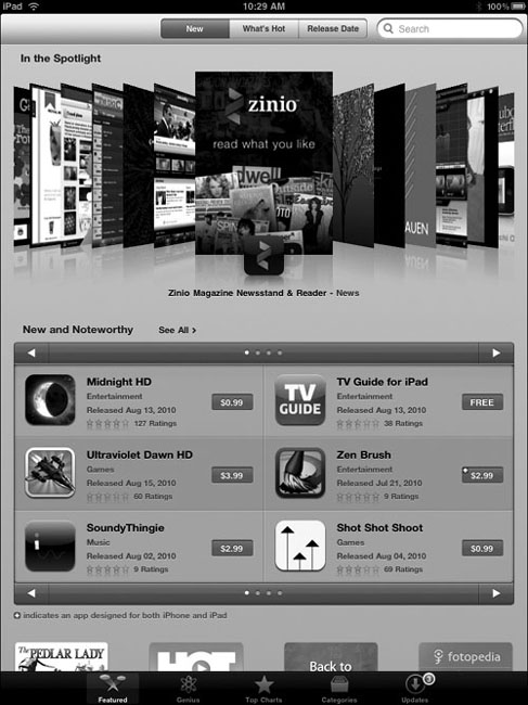
Of course, there are exceptions to some of these rules—but rarely, if ever, all of these rules. Looking at the example of the App Store, it’s clear to me that Apple’s design team can do a good job of clearly defining areas of a screen: There are three tabbed choices at the top, an In the Spotlight coverflow area beneath that, and areas below that focus on some of the newest apps that are available. The screen layout is quite clear, and it uses some emerging conventions of the device quite well—but it’s fair to say that the hierarchy isn’t particularly clear.
But when we think about it, Apple is trying to get people interested in lots of apps. All of the apps. So the lack of hierarchy is probably intentional: This is an app design that encourages browsing and searching, not navigating structured content.
So feel free to stray from the good usability conventions—when you can justify it.
Make it obvious what’s clickable
People do a lot of clicking on both websites and iOS apps, so making it obvious what is clickable—or, in this case, touchable—is of paramount importance for ease of use and efficiency. Fortunately, Apple provides us with several UI standards for designing obvious touchable spots in our apps:
• rows in table view navigations
• tabs in tab bar navigations
• rectangular buttons with rounded corners
• back buttons that point left
Additionally, more advanced app designers can leverage the nice date picker interface and other ways to interact with information and choices.
So the basic tenet of touchability is this: If something links to something else in an app, it better be obvious. I still find myself designing hyperlinks within app content and later realizing that sometimes they’re just not obvious enough as links. On the other hand, peppering content with a bunch of buttons breaks up the flow of reading, too (Figure A.2).
A.2 A screenshot from one of the apps I designed. In my opinion, there’s a button or link that should be made more obvious. Can you tell which one it is? It’s the *8, which is bold but otherwise difficult to pick out as a link.

Hmm, designing easy-to-use app content is not always simple, is it? In light of this, never hold back on iterating to keep improving a design and applying new ideas that you learn from app to app. You can update apps once they’re in the App Store: Take advantage of this!
Minimize noise
Unnecessary visual noise is less likely to infiltrate an iOS app screen than a much larger web page, but it’s not impossible. Often noise is in the details, such as the darkness of lines or shadows. If you’re designing a custom button, how wide can the border be—and how dark the shadow effect—before the button begins to make too much noise? It’s the same with a custom table view: If you’re adding a textured background image, what is elegant and subtle, and what is just loud and heavy-handed?
And once again with the iPad screen: The more real estate you have to work with, the more opportunity you have to mess it up.
In my opinion, UI design for the iPad is still very much a Wild West scenario. It’s a lot like the web in the mid-’90s: Nearly anything goes, simply because it takes a while for conventions to emerge, and tablet computing is a very new area to work in.
But don’t fall into the trap of thinking that because the conventions are still emerging, you can design whatever you want. Keep these usability recommendations in mind even more when designing for the iPad. Try to come up with good, elegant, and usable ideas that feel familiar.
Perhaps you can help develop the best practices that end up being everyone’s design conventions.