5. Focus on App Content: Text and Images
Words and images: our primary
forms of visual communication.
And our most important
content for iOS applications.
The basis for any content-based mobile application is, quite naturally, content. The forms in which we communicate primarily involve words, pictures, and often both. Fortunately, all of the understanding and experience that web designers have accumulated about structuring and formatting text and image content for the web translates very well to iOS apps designed with NimbleKit.
But before you think that working with text and images is as simple as wrapping paragraphs in <p> tags and properly sizing and formatting photos, let’s consider how HTML allows us to design content semantically—that is, with a structural hierarchy and logic. We’ll do so by considering some principles that should be familiar already, and focus on them through the unique lens of iOS devices and iOS app examples to sharpen the already-strong instincts we’ve honed by designing standards-based websites.
Structuring text
To begin exploring best practices for structuring text for iOS apps, we need a suitable sample of text that has some kind of structure. A good example of this in the public domain is the United States Bill of Rights.
There are a few different ways to go about structuring this content with HTML—let’s explore them to see how they affect the way the text is displayed.
Ordered list
One way to structure the Bill of Rights, in light of there being ten of them that need to appear in a particular order, is to make an ordered list. The semantic meaning would be conveyed clearly, and one might argue that this method is also the most convenient—in this case, NimbleKit’s web view does the numbering for us just like any other browser engine. Such a list would begin as follows:
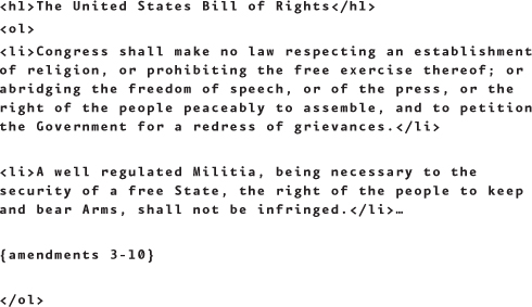
The results are rendered as shown in Figure 5.1 (on page 70).
5.1 The Bill of Rights as an ordered list.
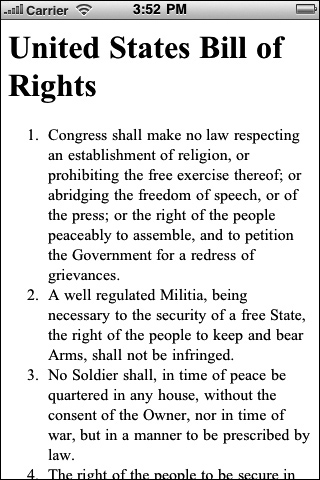
Even unstyled (that is, without any CSS giving it additional style), an unordered list with a heading above it conveys a lot of structure and meaning. And it comes with the “free styling” of the auto-numbering, so that’s kind of cool. And by styling the <li> tags, you could give this structure quite a bit more artistic flair.
One downside to this content structure is having the entire list in one screen. For an app that is only about the Bill of Rights, this might be overly simplistic; for an app that is about the entire Constitution and its Amendments, it might be entirely appropriate.
Definition list
Another way to structure this content is to place it in a definition list. I’m a fan of definition lists because I like the added built-in semantic meanings—I just think it’s particularly clever that the tags define the list with a <dl>, the term with a <dt>, and the definition or detail with a <dd>. It has a poetic clarity. So in this case, the list of amendments begins as follows:

The results are rendered as shown in Figure 5.2.
5.2 The Bill of Rights as a definition list.
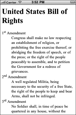
As shown in Figure 5.2, even the unstyled definition list has a bit of style to it, which I also really like. The browser engine automatically gives the definition a jaunty indent, so the list is eminently readable. And naturally, you could add to this with CSS by giving it a background, or even undoing the indent—there are countless ways to style this list. But on its own, it’s a nice serviceable starting point. And more importantly: If this app had a companion website, you could style both versions of your amendment content with the same semantic markup. I like knowing that when I start with nice web markup, my app markup can follow suit and, paired with NimbleKit, yields a nice product.
As with the ordered list version, though, the definition list still might not be your preferred way to deliver this content unless you’re designing an app about something more than the Bill of Rights. A one-screen app is not especially compelling and doesn’t give you much opportunity to leverage native iPhone user experiences.
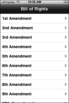
Table view
A third way to structure this content is to design a table view that goes to each amendment separately. For an app that focuses exclusively on the Bill of Rights, this is arguably the most native way to structure the content. It delivers a more genuine and interactive iOS user experience.
To code the table, use NimbleKit’s NKTableView function that we learned about in the previous chapter. Here’s the JavaScript that calls the NKTableView:

The results are rendered as shown in Figure 5.3.
5.3 The Bill of Rights as a table view.
Next is the HTML for the first amendment screen (1.html)—it’s quite brief:
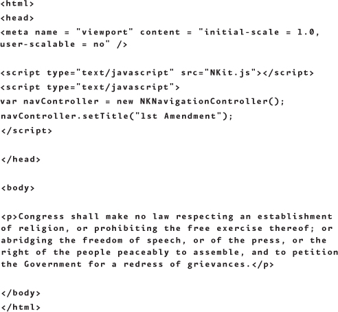
This yields the result shown in Figure 5.4.
5.4 The first amendment as a separate app screen, called from the table view.

This is not yet styled and is kind of boring, so it could use a fair amount of CSS love. But you get the idea.
So that’s another way to structure this Bill of Rights content. It results in a nicely styled table view, with great NimbleKit-powered transitions.
Integrating social content
Compared to offering free content via a web app or mobile-enabled website, designing and packaging a native iOS app for distribution in the iTunes App Store presents one notable hurdle: How can you or a client easily update content for app users without updating the entire application? Fortunately, there are a few tricks for working around this obstacle, so you don’t necessarily have to submit an updated app (and then wait for approval) whenever you have new content.
The idea in this example is to pull Twitter status updates into an app screen, just as many people do with their blogs or other websites where they want their tweets displayed in a column adjacent to their other site content. We’re basically using Twitter as a content management system. To accomplish this, people rely on JavaScript; one of the most common solutions is to use a script provided by Twitter itself, located at http://twitter.com/javascripts/blogger.js.
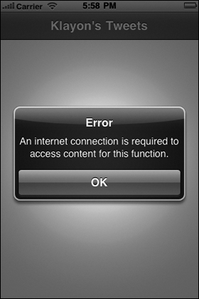
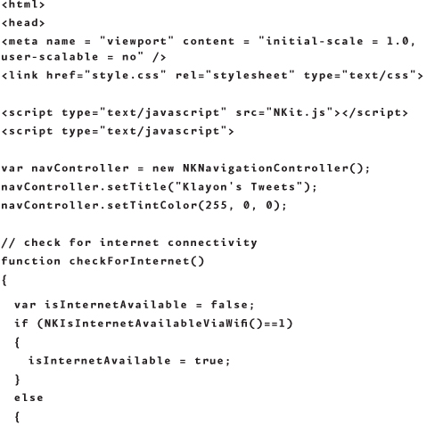
Using NimbleKit to Check for Internet Connectivity
When accessing content from the Internet, Apple wants apps to be able to check for Internet connectivity and warn users when there is no wireless or cellular connection. To do this, an alert sheet (Figure 5.5) is used to convey the message (NKAlert):
5.5 An alert sheet that tells the user there is no Internet connectivity.
and two other library items are used to check for the connectivity:
• NKIsInternetAvailableViaWifi
• NKIsInternetAvailableViaCellularNetwork
Below is a script that I recommend using in the head of all NimbleKit app HTML pages that need to pull content from the Web:

This script will help us out with our task, too. We just need to make sure that our app opens links in Mobile Safari. If we don’t do this, the links will open in the app itself. That would be rather tacky and present us with some navigational challenges because the linked page would become the new state of this view. Yet you don’t have a back button like you would in a browser. So you need to call on NKOpenURLInSafari, which tells your links to open in Mobile Safari rather than in the app itself.
The modified blogger.js JavaScript file looks like this, with the NKOpenURLInSafari addition highlighted to show you where it goes:
Keep the file name for reference purposes and name it blogger.js in your project.
Note: Making sure your .js file is in the app bundle
Sometimes when you add your own .js file to your Xcode project, the file is not automatically included in the app bundle. To fix Xcode’s oversight, simply drag the .js file to Targets > MyApp > Copy Bundle Resources in the Groups & Files pane. This copies the file to the app bundle to ensure that everything works smoothly.
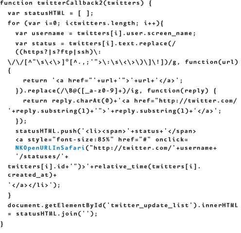
With this script in your toolbox, you can write a brief amount of HTML that will pull tweets in from a specified account. The portion that performs the Twitter magic is highlighted:


Finally, to give this unordered list some minimal style for readability, declare a few CSS rules for this view in a file called style.css:

Combining the blogger.js, main.html, and style.css files gives you a page like that shown in Figure 5.6, using my own Twitter account as an example.
5.6 Bringing a Twitter feed into a NimbleKit app.
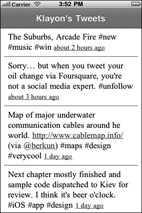
Using Twitter as a light app content management system in this way is pretty cool—it’s a convenient way to update people on the go about news or specials, just as organizations and businesses use Twitter to update people at their desktops. And while there are Twitter iOS apps that allow people to do this already, nothing says you love your clients or customers more than a very targeted and custom-designed experience. You can style this however you want, not to mention make it one of several other content screens in an app.
Working with images
We’ve talked about some ways of working with text content. Working with images in NimbleKit is also fairly simple. There are two main methods to display images: within an app’s content (inline), and as an image overlay.
Images in content
Placing images inline is just as easy as doing it in a web page:
<img src="filename.jpg" width="x" height="y"
class="classname">
And by assigning an image a CSS class, you’re empowered to style it as you wish.
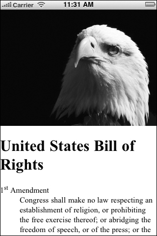
Let’s revisit the example of the Bill of Rights structured as a definition list. Wouldn’t it look better with a photo of a bald eagle above it? Sure it would!
And it just so happens that I have a nice JPG of an eagle to add, sized for the iPhone (Figure 5.7).
5.7 Photo of a bald eagle to place inline in the Bill of Rights text content.

Let’s add it to the HTML, right above the text:
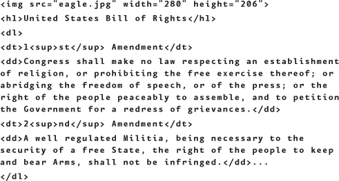
Figure 5.8 shows the results.
5.8 The Bill of Rights definition list with the eagle image added.
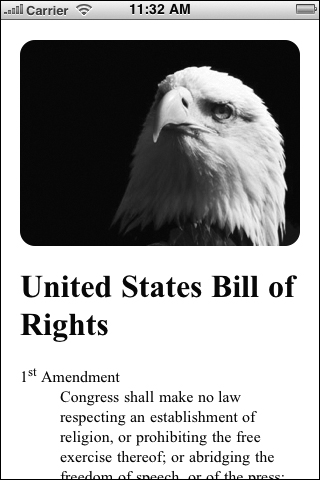
This works predictably well but could certainly use some more styling. In fact, the image runs right up to the left, top, and right edges of the screen—and that looks fine—but the text content could use a margin. As long as we’re considering that, why not add a margin around the photo? And as long as we’re doing that, why not try out some CSS3 and see whether adding rounded corners finishes it off with a bit more style?
To do this, let’s start by proportionally resizing the image a bit smaller so there’s a margin of 20 pixels around it:
<img src="eagle.jpg" width="280" height="206">
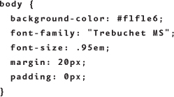
To match this, add 20 pixels of margin to the body. This can be done with CSS:
body {margin: 20px;}
Finally, let’s add some CSS3 curviness with border-radius; with NimbleKit, you don’t even need to use the WebKit version. It understands the straight CSS3 style just fine:
img {border-radius: 15px;}
Adding a margin and rounded corners creates a more finished product (Figure 5.9).
5.9 The Bill of Rights definition list with the image added, now featuring margins and rounded corners!
I hope this demonstrates some of the exciting design possibilities available to you as a web designer using NimbleKit with CSS3. (We’ll explore more CSS3 fun later in Chapter 9.)
Image overlays
Images can be more than just inline content in iOS apps. NimbleKit also supports a method of placing an image on top of a content screen called NKImageView. Here’s how it works.
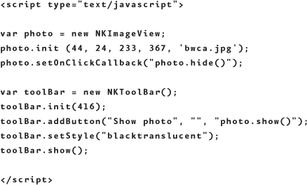
Similar to using NKTableView, NKImageView is specified with JavaScript in the head of an HTML file. First, we need to create a new variable and call on the NKImageView control.
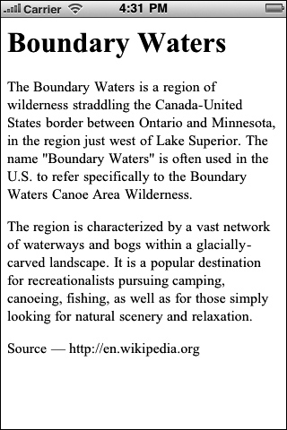
Let’s see how this would work in a hypothetical iOS app that teaches people about outdoor wilderness areas. Figure 5.10 shows a text screen about the Boundary Waters Canoe Area Wilderness in northeastern Minnesota, one of my favorite places to go on vacation.
5.10 Text about the Boundary Waters (paraphrased from Wikipedia).
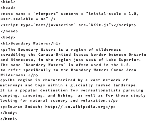
Here’s the HTML file that, when added to a new NimbleKit-based Xcode file, creates the screen shown in Figure 5.10:
This is a good start, but it’s pretty boring. We need to add some style, as well as the NKImageView control so the app’s users can see an image of the Boundary Waters. First, the NKImageView—let’s give this instance the name photo:
var photo = new NKImageView;
Next, create a toolbar at the bottom of the screen. It will contain a button for showing the photo:
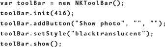
There are several things going on here:
1. The first line of code initializes the NKToolbar control and declares a variable name for it—this is called toolBar.
2. The next line positions the toolbar on the screen on the y-axis. If you start with the full height of the screen (480 pixels), subtract 20 pixels for the status bar, and then subtract 44 pixels for the height of the toolbar, the upper edge of the toolbar is placed at 416.
3. The next line adds a button labeled “Show photo.”
4. The last two lines make the toolbar translucent black and display it on screen.
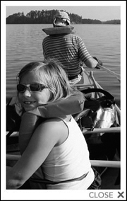
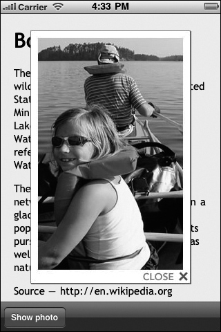
Now we need an image to add to the NKImageView. Figure 5.11 shows a photo I took during one of my trips to the Boundary Waters Canoe Area Wilderness. I’ve added a frame to make it pop a bit more on screen, and a “CLOSE X” notation in the corner so users are prompted to click on the image to make it go away.
5.11 Photo of people canoeing in the Boundary Waters.
Next, we need to initialize the control with position, size, and the name of the image. Place the corner of the JPG at coordinate 44, 20 so it’s centered in the screen:
photo.init (44, 24, 233, 367, 'bwca.jpg'),
We’re getting close; next we need to write a callback so the button we added to the toolbar will display the image. Here’s how that is coded:
Finally, one more useful detail for NKImageView is that tapping the image can also hide it (and remember, I’ve prepped the image in Photoshop to indicate this already). Add this line to the code at the end of the photo variable:
photo.setOnClickCallback("photo.hide()");
The finished code should look like this:
The main.html file should now look like this:
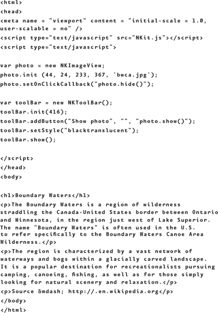
This should all work pretty well now—except that the text is not styled at all. Add a style.css file to the app bundle and style the content a little, making it a different typeface and adding background color for a bit of contrast:
After adding <link href="style.css" rel="stylesheet" type="text/css" /> to the head of the HTML file, the results will look like Figure 5.12 before the button is pressed to display the image.
5.12 The styled Boundary Waters text content.

And after the button is pressed, the screen looks like Figure 5.13.
5.13 The Boundary Waters photo overlaying the text content.
NKImageView has some potential as a great little control, especially when paired with a toolbar and button to show the image. But I’m sure you can think of additional creative ways to use this aside from the example described here!
Summary
Working with text and image content is essential for any iOS app, and this chapter scratched the surface of the many possibilities for incorporating and styling content. In this chapter you learned how to
• Structure HTML content several different ways using definition lists.
• Add social content, live from the web, to an app; in our example, we used a feed from Twitter.
• Add an image inline right into app content.
• Add an image overlay on top of app content.
This introduced you to a few techniques for exploring how you might design custom content-based apps for use offline or online. Next, we’ll look at designing specifically for people who are mobile: Chapter 6 is about geolocation on iOS devices, and looks at a few ways to design a Google Maps view into a NimbleKit-based app.