9. HTML5 and CSS3
The buzz surrounding HTML5 and CSS3 has definitely been getting louder in the past few years. But for web designers who still need their sites to work consistently and predictably across all major browsers—antique as well as modern—questions remain: What is safe to use now, and what is still premature and unevenly supported? It can be a bit frustrating—we want to start learning how it all works and gain some experience with HTML5 and CSS3, but not push the envelope too far, too fast.
Fortunately, the browser engine in Apple’s mobile operating system uses WebKit, and the same great support for most new HTML5 and CSS3 rules in mobile Safari is also available for you to leverage in native iOS apps built with the NimbleKit Objective-C framework and its web view.
Let’s take a closer look at how designing iOS apps gives you the freedom to use HTML5 and CSS3—not tomorrow but today, and with no risk at all.
Exploring additional HTML5 elements
Chapter 5 introduced you to formatting content in NimbleKit apps with well-established HTML markup such as heading and paragraph tags, unordered lists, and definition lists. But what about the new HTML5 elements that can enhance the semantic meaning of our markup? Are iOS apps a safe place to start becoming familiar with these?
Yes!
Let’s begin with some easy-to-adopt structural content elements.
Section
Adopting the section element is a fantastic way to safely wade into the new HTML5 waters, as it provides an immediate win: It helps to extricate you from having markup that has way too many div tags.
Think about sections in any printed content (this book, for instance), and you can intuitively figure out how this new element can help you with web and app content. In the case of print, sections of a book are indicated with a different typographical treatment because the paragraphs, figures, and notes in between these section indicators are related groups of information. Change topic or area of focus, and insert a new indicator to communicate that you’ve entered a new section.
Using section in your HTML is just as intuitive. In fact, I would argue that using section makes you a better designer because it forces you to become familiar with the meaning of the content you are marking up.
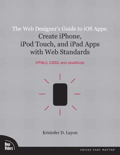
Let’s use the U.S. Constitution as an example, since we talked earlier about the U.S. Bill of Rights.1 Using HTML4, you could begin marking up Article I of the Constitution like this:
And there is certainly nothing wrong with that—it is still valid as HTML5. The only problem with the div is that by itself, it has no semantic meaning. As the W3C HTML specification notes, it is “a generic mechanism for adding structure to documents” and relies on a class or id to help it out with presentation.2 So it’s really the HTML equivalent of a brown paper wrapper. Of course, you could class the div:
<div class="article">
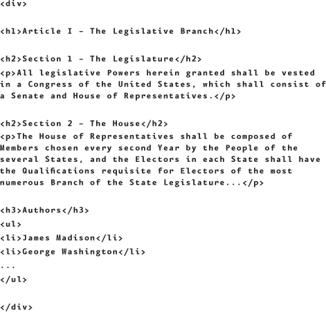
But even here, classing the div as an article is technically subjective: It does not add semantic meaning because it is serving only as a stylesheet selector. However, section does two things: It groups the content like div, and communicates that the content inside belongs together in a logical way:
And naturally, you can still class or id a section for presentational purposes.
Header and footer
Like section, header and footer can help alleviate the too-many-divs problem that HTML4 pages of content can incur while adding more semantic clarity to your markup. I’m covering them here together because they share some properties, both intuitively and nonintuitively.
Intuition would lead us to believe that content tagged with header would be high-level, introductory, and perhaps also navigational content at the top of a page; similarly, footer would be at the bottom of a page and contain reference information about the content above it: copyright, date of authorship, author, and perhaps contact information.
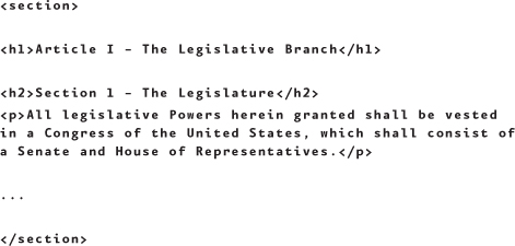
Fortunately, our intuition is correct... mostly. The only thing that might be tricky to get used to is that you’re not limited to one header or footer per page, and they are not required to be at the top and bottom of a page respectively (though one suspects that this is where most designers will use them). So to modify our Constitution markup:
See how the more HTML5 you use, the more semantic structure your content takes on? Also note that a section may contain a header or footer.
Article
Where things get slightly hazy is with the article element. It is intended to wrap areas of “self-contained content”. Well, what does that mean, exactly, and how does that differ from a section?
The metaphor I picked up from John Allsopp, author of Developing with Web Standards (New Riders, 2009), that I find extremely helpful for deciphering this apparent conundrum is this: article wraps content that could existing meaningfully and independently from the context of the whole, whereas section is literally a section of something—it only makes sense within its context.3
The comparison that Allsopp makes is
• A newspaper article typically makes complete sense on its own, so it may be wrapped with the article element.
• A traditional book chapter (that is, one that is not a short story or an article in a compilation) relies on the chapters before and after it to make sense—it’s part of a series of items. This would be wrapped in a section element.
Think of article as a more specialized section when you’re considering its use. If a suspected section of content can stand on its own, consider using article instead.
Aside
Consider the aside to be another specialized form of section and, as with article, trust that its name is laden with intentional meaning. An aside could be
• A tangential reference, such as the tips and notes in this book
• A pull quote that you want to set off semantically, and likely wish to style uniquely
One way to measure whether content fits the intentions of aside is to see whether the context in which it resides makes sense without it. If it does, the content in question is likely tangential enough to be an aside.
Nav
I saved nav for the end of the structural element discussion because it may be the least likely to be used in an iOS app setting. The reason for this is that a lot of app navigation is in the JavaScript portions of the code, so that wouldn’t be wrapped by nav tags.
On the other hand, any buttons or unordered list navigation elements in an HTML page could certainly be wrapped in nav.
Next I’ll give a quick nod to a few more HTML5 elements, two that we’ve covered already and one that will be mentioned briefly. These fall under the category of rich media.
Audio and video
The audio and video HTML5 elements were introduced in Chapters 7 and 8, and they work with Xcode and NimbleKit on iOS devices. Just remember that NimbleKit offers alternative classes in its library, NKAudioPlayer and NKVideoPlayer, which give you slightly different user experiences and options.
Canvas
The canvas element allows designers and developers to draw lines and shapes, fill shapes and areas, and animate objects. It’s a powerful, JavaScript-driven element that happens to be well supported by Xcode and NimbleKit.
Two awesome examples on the web that could get you very excited about canvas are the Visualizing the World Cup4 and Visualizing the Stanley Cup5 websites. Pay them a visit in either Safari on a Mac or mobile Safari on an iOS device. All of the visualization and typography (aside from the team logos and background images) use HTML5 and CSS3.
Very impressive!
However, the canvas element is where I need to draw the line (no pun intended) in the content I attempt to cover with any respectable depth. I didn’t want to omit canvas completely and am pretty impressed with what it can do. On the other hand, canvas doesn’t really do anything on its own—it merely opens the door for a ton of additional uses of JavaScript.
The main reason canvas isn’t demonstrated here is because it’s a fairly complicated way to do some otherwise simple things. This method works well when it scales to a large enough project, and when dynamic image generation makes the most sense. An example would be app content that’s driven by a large database, where the visualization is more efficiently done on the fly so that servers don’t need to be burdened with a bunch of prefabricated image files.
Such a scenario certainly makes canvas useful—except that this book doesn’t cover large application development. And I cannot recommend that you use canvas to draw simple shapes, either; that’s a case where the HTML5 route is actually longer and more complicated than creating bitmapped image files.
Additional HTML5 elements
The HTML5 elements covered in this book should be quite useful to you as web designers, and the most relevant to iOS app design with NimbleKit. But they are by no means all of the HTML5 elements. If you want to read up on all of them, visit the clever Periodic Table of the (HTML5) Elements, brought to you by Josh Duck6 (Figure 9.1).
9.1 The Periodic Table of the (HTML5) Elements. Brilliant!

More design options with CSS3
CSS3 allows us to quickly take a pedestrian design and elevate it to something special, and do it in a way that is extremely agile and malleable. In other words, the process of using CSS3 for presentational and visual effects enables adjusting and tweaking on-the-go as well as revisions and even substantial redesign much later. Let’s explore a few examples to see how CSS3 helps us in this way—and realize that there are many more CSS3 techniques to explore by checking out the actual specification or reading books that focus specifically on the topic.
Border-radius
The border-radius property was introduced in Chapter 5 (see Working with images and Figure 5.9):
img {border-radius: 15px;}
and in Chapter 6 (see Method two: Styling an HTML button and Figure 6.2):
ul.button li a {border-radius: 10px;}
In addition to being applied to HTML elements, it can be applied to an entire div class or id:
#box {border-radius: 10px;}
And to get a bit crazier with it, you can specify different radii for different corners:
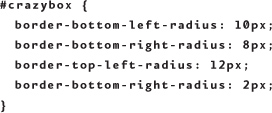
But it gets crazier still: You can supply two values, the first for the horizontal distance and the second for the vertical distance, allowing you to create something that is more elliptical:

That gives you a bit more to explore with border-radius. Have fun!
RGBA
CSS has always supported color very well. But prior to CSS3 and Red-Green-Blue-Alpha (RGBA), transparency was a hack that was accomplished by using image files that were saved with transparency. This method works OK, but it requires a lot of time-consuming image production. Worse yet, to make any changes to a design that uses a lot of images with transparency, you have to rework all of the images and resave them as PNGs.
Fortunately, RGBA is a much more agile and efficient way to achieve the same results, allowing you to tweak the design or change out images quickly without having to redo a bunch of image editing. So how does this work, and how does it result in something useful for iOS apps?
RGBA is an extension of the RGB color model that is used in many places—television and computer screens, the Photoshop Color Picker, and the NKNavigationController in NimbleKit to name a few. The first three values (R, G, and B) can be between 0 and 255 (0,0,0 is black; 255, 255, 255 is white; all other hues are made using combinations that lie in between these values). The A value can only be between 0 and 1, with 1 being completely opaque, 0 being completely transparent, and decimal values in between doing the real magic.7
Using RGBA is probably most practical when applied to a background. Here’s a background setting of 100 percent black with 50 percent opacity:
background: rgba(0,0,0,.5);
So how might one apply this effect when designing an iOS app? Let’s use a farmers’ market app as an example. Bear with me—the screen does a good job of making vegetables look sexy.
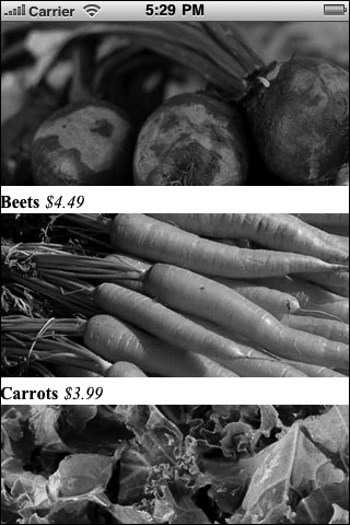
Anyway, imagine designing an app for a local farmers’ market. You might have several of these screens, each one focusing on different items: vegetables, jams and jellies, local meats, and so on. This example will be a vegetables screen with three items: beets, carrots, and kale.
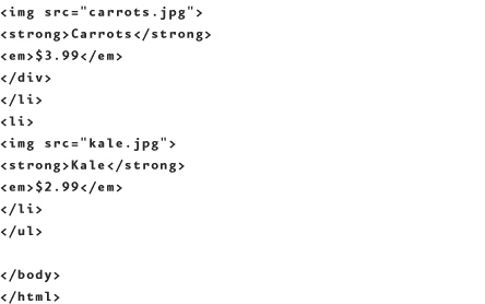
Start by making a new Xcode project for iPhone and modifying the main.html file to match the code in Figure 9.2. What you’re doing is adding an unordered list containing the three vegetables. As with the other examples, you can download this in its entirety from iosapps.tumblr.com. (This is particularly useful in this case because then you can use the same image files that I created.)

9.2 Nice photos, but this app’s UI could use a bit more work.
Now that we have some HTML underway, let’s get some CSS started on another burner. Create a styles.css file and add it to the project with the following rules:
These rules alone won’t do much for this app—yet. The point is to establish a baseline for the design. With the above HTML and CSS files in the Xcode HTML folder, testing the app in Simulator should give you the result shown in Figure 9.2.
Now the fun begins. As I was reviewing some of the books that have taught me some solid skills, I was reminded of a great RGBA example in Handcrafted CSS by Dan Cederholm. My apologies to Dan for my implementation—his designs are always so elegant, so we’ll see whether my adaptation of his method for the iOS screen can approach his level of CSS3 craft. (It may not, but at least now you know that I’ve chosen the right goal to work toward!)
With Dan setting the bar, let’s give the unordered list with the .food class some more definition by defining its li tags like so:
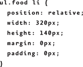
This sets up the li to also be page-width and the position: relative sets you up to create a span for wrapping the content like so:

This enables you to style the name and price content as an overlay that will be positioned right on top of the image, flush bottom. Here is the CSS for that effect:

You’re doing several things here: absolute positioning the block above the image, setting the width of the overlay to 100 percent, making its height 30 pixels, and giving the text 5 pixels of padding. And as long as you’re giving the label some style, you’re getting away from the default typeface by setting the font to American Typewriter, sizing it up to 1.5 ems, and making the text white.
This will all look very nice on top of the most important section (highlighted): the black background with 50 percent opacity.
Now create a title bar at the top of the page by adding the following to the head of main.html, and use your newfound RGBA knowledge to pay particular attention to what’s in the NKNavigationController JavaScript:
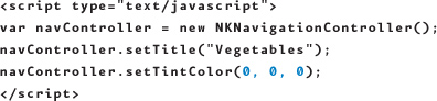
I know, I cheated and highlighted it. But see the 0, 0 ,0 ? Hopefully you remember this from Chapter 4 (see Implementing the title bar) — the RGB values that NimbleKit uses to define the background color of the title bar work the same way they do in our CSS!
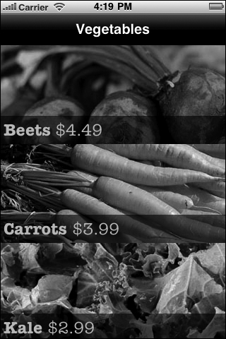
After amping up the HTML and CSS with the above code, and testing anew in Simulator, you should get the results shown in Figure 9.3.
9.3 The restyled vegetables screen, now featuring a navigation controller at the top of the page and image labels that have a nice translucent effect thanks to RGBA.
It’s great to know that if you have experience styling with some of the newer CSS3 specifications like RGBA (and border-radius, already used in Chapter 6), you can use these skills in NimbleKit-powered iOS applications.
@font-face
Another great CSS3 tool to add to your iOS toolbox is @font-face. The @font-face rule is an invigorating breath of fresh typographic air for web designers and, fortunately, what works for modern web browsers also works (in a more limited fashion) for designing iOS apps with HTML, CSS, and the NimbleKit Objective-C framework.
Technically @font-face dates to the CSS2 specification, but it didn’t really take hold until CSS3. As the W3C specification notes, @font-face allows designers to go beyond the traditional set of “web-safe” fonts, and to do so in a way that is consistent across any modern browser (or browser engine) that supports CSS3.8 This gives designers a level of independence with rendered HTML typography that we have dreamed about for years!
But before you launch into using @font-face, you should know what fonts are already resident in the iOS (Figure 9.4).
9.4 The fonts that come installed in iOS on the iPhone, iPod touch, and iPad.

Not a terribly exciting selection, is it?
It’s easy to see why an iOS app designer would be interested in using another typeface that isn’t represented in this list. So how do we go about expanding our options beyond these meager staples? The basic formula for the rule is
@font-face { <font-description> }
and the description has the same form as other CSS rules, with the familiar syntax
descriptor: value;
Now all we need is a new typeface. Hmm—where do we find fonts to install so we have more typographic freedom with our HTML content?
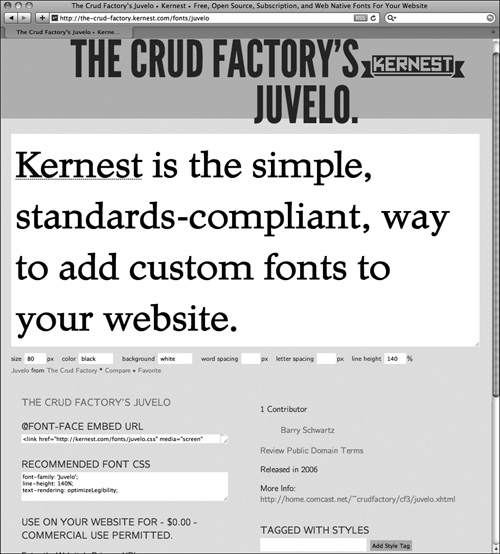
Kernest is one such place.
Kernest
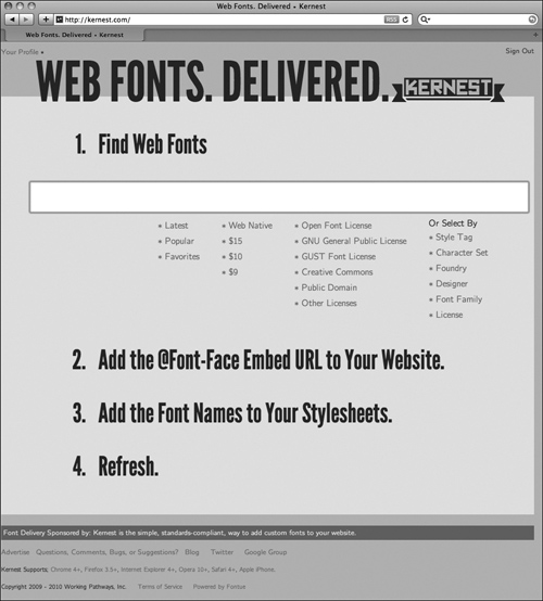
Kernest is a web font services site that delivers browser-supported font files in several formats including Scalable Vector Graphic (SVG) format, the format that’s supported by the web rendering engine in iOS. Kernest was launched in July 2009 by Garrick Van Buren and currently provides 100 fonts for online or local use (Figure 9.5)9.
9.5 Kernest, a web font service.
Here are the steps for using a font from Kernest in an iOS app:
1. Search for a new font: Kernest gives you several ways to search through its library of fonts including by style, foundry, designer, font family, or license.
2. Register for the service (this step is free) so you can sign in. Signing in is required to download new fonts.
3. Once you find the font you wish to use, download it and save it to a local drive.
4. Unzip the file archive and add the .svg and .css files that are provided to an open Xcode project.
5. Edit the .css file to reference only the .svg file, and delete the fonts/ subdirectory from the local url.
6. Add the appropriate class for your new font, as defined in the .css file, to your HTML and you are in business!
Let’s walk through an example to see how this works in practice. For this exercise, I visited Kernest and chose an attractive typeface called Juvelo.10 I found it by searching in the public domain category, because in this case I didn’t want to pay to license a font (Figure 9.6).
9.6 The Juvelo preview screen in Kernest.
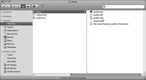
When I download the font files, they arrive in a package called juvelo.zip, which when unzipped looks like Figure 9.7.
9.7 The Juvelo font files downloaded from Kernest.
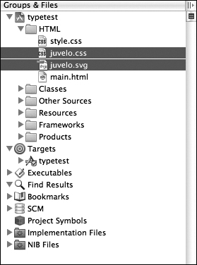
Among these files are two that are needed: juvelo.css and juvelo.svg. Add these to an Xcode project so they appear in the HTML directory under Groups & Files (Project > Add to Project) (Figure 9.8).
9.8 The Juvelo .css and .svg files added to an Xcode project.
Now we can do some coding. This is where it gets fun!
First, edit the main.html file so you have the following:
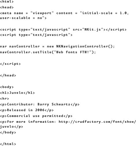
When you test it in Simulator, you’ll get this result—and it’s lying because it’s not yet typeset in Juvelo but rather Safari’s default, Times New Roman (Figure 9.9).
9.9 Our text rendered in Times New Roman—not quite for the win yet.
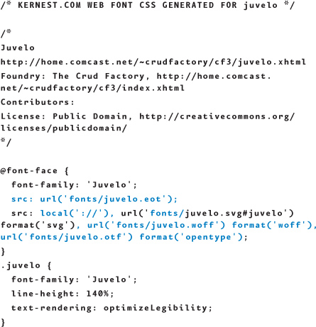
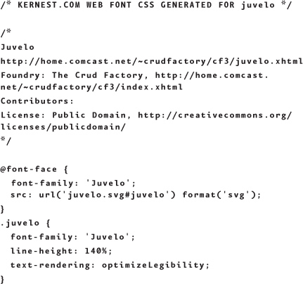
Next, let’s edit juvelo.css. The version we downloaded from Kernest looks like this—but I’ve highlighted what should be deleted from the file so it will work in Simulator and on iOS devices:
After editing, the results are:
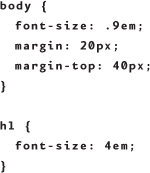
In addition to adding Juvelo to the page, I would like my <h1> to be larger, but I want to keep the non-typeface styling in a separate stylesheet. Do this by creating a style.css file, adding it to the Xcode project, and setting these rules to fine-tune the page:
The final step is to edit main.html so it links to both stylesheets, and has a body class of Juvelo so the text is rendered with that typeface. Your HTML should look like this, with these changes highlighted:
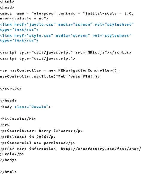
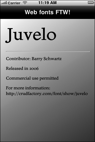
Testing the new result in Simulator should give you the following result (Figure 9.10)!
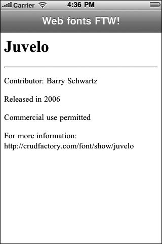
9.10 Our text being rendered in Juvelo—for the win!

Congratulations—you are now free to roam the World Wide Web for new and interesting SVG format typefaces! Doesn’t it feel great?
Gradients
There are also CSS3 effects that aren’t technically part of the W3C specification (yet—but they might be eventually). The tactic being used by some of the browser developers such as Apple and Mozilla is this: If they build on the existing CSS3 framework by adding new rules and effects, and designers adopt and implement them widely, the W3C will take notice and eventually incorporate the new rules and effects into the specification.
An example of this is CSS gradients, so let’s take a look at how they can help enhance our iOS app designs as well as save us some work.
A widely used technique to apply a gradient to a background is to design a narrow sliver of a graphic with a chosen gradient, and specify this image as a background via CSS. The graphic can be just 1 pixel wide, but by repeating it on the x-axis, we can fill the background of a div or another page element. The result is a nice gradient and the performance is pretty high because the load time for such a small graphic is negligible.
However, the work to redesign a gradient created this way is a pain. Just like the earlier example of transparency, methods that tether us to graphics require us to go through laborious updates of graphics when redesigns are called for. Plus, designing the effect the first time is kind of a pain.
Fortunately, CSS gradients are swooping in to save us both time and headache, because it’s a lot easier to specify a gradient in a stylesheet. How does it work?
Let’s continue working with the same sample Xcode project we just used to explore @font-face and add a background gradient to the page. Let’s have the gradient go from white at the top of the page to dark gray at the bottom and go from edge to edge. To do this, just add this to the style.css stylesheet:
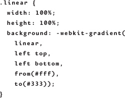
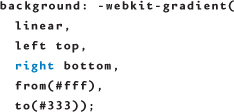
Because gradient is not formally part of the CSS3 spec yet, but is embraced by the iOS platform (both mobile Safari and the web view in Objective-C, which use the WebKit browser engine), we need to use the proprietary prefix –webkit-. Thus the CSS rule is –webkit-gradient, and our example is calling up a linear gradient so that is the next setting. Linear gradients can go from top to bottom, left to right, or even diagonally across the screen, so the next settings specify the start and end points as well as the direction. The last two settings are the start and end color; these can be hex, RGB, or named colors.
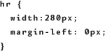
One more CSS adjustment will make this demo look great. Our current horizontal rule bleeds off the edge of the screen, but this might look a bit odd with the gradient added to the background. So let’s shorten that up a bit with this addition to the style.css file:
To put this new style into action, we just need to modify main.html by adding the .linear style to the body element:
Note that linear is appended to Juvelo—we need both classes because Juvelo is what styles the text on the page from the previous example.
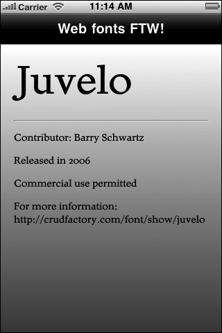
Testing this revised code in Simulator will dress up the screen substantially with the new gradient in the background (Figure 9.11).
9.11 The Juvelo text screen with its new background gradient applied evenly from top to bottom.
What if you want the gradient to be diagonal? Simple: just change the direction of change from left top to left bottom, to left top to right bottom:
The result will look like Figure 9.12.
9.12 The Juvelo text screen with its new background gradient evenly applied diagonally from top left to bottom right.
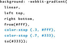
You’re not required to have a gradient start at the top and end at the bottom; you can set the start and stop points from 0 to 1 so you get larger areas of solid color and a narrower band of the gradient. To see how this works, edit your code by adding color-stop to match this example, which constrains the gradient to the middle 40 percent of the page and allots the first and last 30 percent to solid color:
And now the results look like Figure 9.13.
9.13 The Juvelo text screen with its new background gradient unevenly applied diagonally from top left to bottom right; the first and last 30 percent of the background is solid, and the gradient is applied only to the middle 40 percent of the distance.
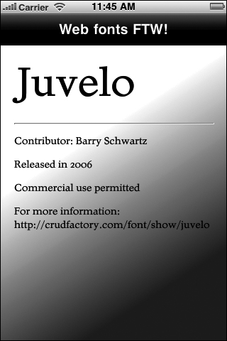
Now the result is very different, and has more of a glassy ripple effect.
As you might have guessed, this is just the beginning of using gradients—there is also a radial gradient. Experimenting with gradients is even more fun when you transition from one color to another, so give that a try, too; I couldn’t adequately convey the coolness of color gradients here in this two-color format. You’re not limited to transitioning from just one color to another, either; you could incorporate several transitions in color-stop for a rainbowlike effect.
Cool CSS3 styling tools
Writing CSS3 is not particularly difficult, but perhaps you are more of a visual designer. Or maybe CSS3 is still really new to you and you’d like to start using it more, but keep the training wheels on for a while. Regardless of your reason, there are some really cool CSS3 tools out there that can help you work much more quickly, or more safely, as you explore your options. Two of them are AppControls, a shareware application, and CSS3 Please!, a cross-browser CSS3 rule generator.
AppControls
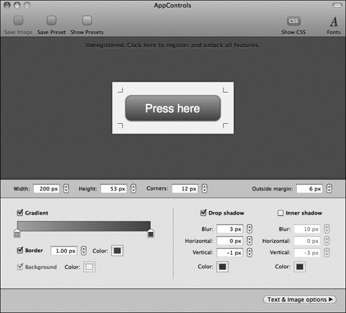
Like NimbleKit, AppControls is another iOS development tool that is featured on Apple’s website—that’s how I discovered it. In fact, it’s not technically just an iOS development tool; you could use it to style controls for websites, too.
AppControls gives you a handy window where you can quickly specify width, height, border radius, gradient, border, drop shadow, inner shadow, and text options for controls. As you make your selections, the preview changes right in front of you (Figure 9.14).
9.14 AppControls provides an easy-to-use interface for making CSS3 selections, and provides a live preview of the results in the same window.
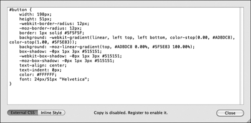
If the live preview isn’t cool enough for you, the CSS that AppControls generates for you should be. That’s right, click on Show CSS and you get all of the CSS you need to create the same look, either inline or via an external stylesheet (Figure 9.15).
9.15 AppControls also provides the CSS code, so it writes the button styles for you—and you can choose from the inline style or external stylesheet rules.
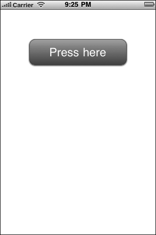
After you get the control looking the way you want to, just copy the CSS out of AppControls and put it into a stylesheet in an Xcode app. Reference the stylesheet in your HTML file, style a div with the ID that is provided, and enter the same text you used in AppControls—the result will look the same when you test it in Simulator (Figure 9.16).
9.16 AppControls also provides the CSS itself, so it writes the button styles for you—and you can choose the inline style or the external stylesheet rules.
AppControls is shareware that you can download from the folks at Blue Crowbar Software11 and at this writing the full version costs just $29.90; the free trial version does everything for you, but it doesn’t allow you to cut and paste the CSS that it generates (that is, some typing is required if you go the free route with this tool).
CSS3 Please!
CSS3 Please! is a website12 that provides results that are similar to AppControls. The up side is that the website doesn’t require you to sign up, so it’s completely free. The down side is that the interface is less elegant, and doesn’t allow you to change the content or size of the div that you’re previewing. But for quick previews of CSS3 rules in a live browser setting, you still can’t beat the price for what it can do.
The CSS3 rules that CSS3 Please! previews for you include border-radius, box-shadow, gradient, RGBA, transform (rotate), transition, text-shadow, and @font-face (Figure 9.17).
9.17 CSS3 Please! features a live preview of the CSS3 rules that you edit, but no UI is provided—you edit the code right in the same browser window!
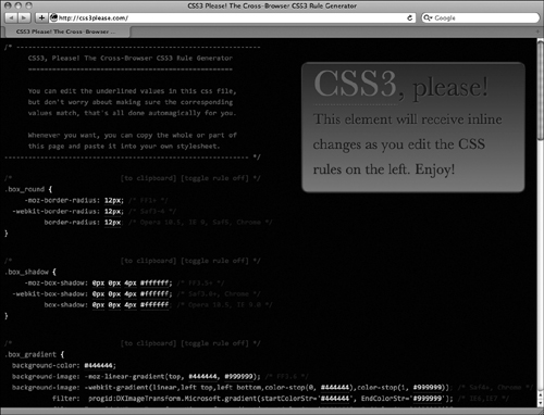
Instead of color pickers and sliders, though, you just click on the CSS that is provided right on screen and make changes that are then displayed in the adjacent live view.
It’s not quite as fancy as AppControls, but it’s fun to give it a try just to see how they built the web tool. Kudos to its creators, Paul Irish and Jonathan Neal (in association with Boaz Sender and Zoltan Hawryluk), whom you should look up—they do some pretty cool stuff when they’re not tweaking CSS3 Please!
These are just two of the many CSS3 tools and references out there. Keep searching for things that fit your app needs, personal preferences, and development budget.
Summary
HTML5 and CSS3 are still in the early stages of adoption. In fact, HTML5 is still at a point where the advantages are more behind-the-scenes and in the design phase of a project. Nonetheless, you have learned how to leverage several HTML5 and CSS3 rules for your iOS projects that are powered by NimbleKit. This gives you a leg up on the competition by providing you with applied HTML5 and CSS3 experience, which helps you not only design better iOS apps, but also better websites. Now it all comes full circle: iOS app design experience enriches your web design abilities and opportunities!
Next: NimbleKit might be cool, but are there other code frameworks for designing iOS apps without having to learn Objective-C? The answer is yes! The details follow.