1. The Big Impact of Going Small
So...why did I write this book?
Aren’t there already books
about making iPhone,
iPod touch, and iPad apps?
There are indeed several books about the subject, and they are all very informative. However, I wrote this book for a specific audience.
In short, someone a lot like me.
What I have done is write the book that I wish I’d had on my bookshelf about two years ago when I was beginning to investigate how to design iPhone applications. At the time, the only books I could find dealt with programming in Objective-C or explored how to leverage very specific functions and features of the iPhone and iPod touch.
I have nothing against Objective-C programming. I would just rather not do it myself. And while impressed by the features of Apple’s mobile devices, I am a designer: What drives my work is not technology itself, but a desire to help people and organizations communicate.
So if you are a designer who enjoys working with people more than wrestling with technology, and solving problems more than experimenting with features, you have found the right book. Because this book approaches the design of iOS applications from a human-centered, need-based approach.
Mobile magic and pocket computers
As iPhones and other smartphones have become ubiquitous, the demand for well-designed mobile content has also increased dramatically. We have all seen some astounding numbers:
• Over 85 million iOS devices sold by mid-2010
• Over 250,000 applications in the iTunes App Store
• 15 billion applications downloaded from iTunes
I have personally experienced the transformative effects of having content available nearly everywhere, whenever needed: while shopping, working out, running, even riding on a chairlift at a ski area. Unless I am at the beach or in the water, my iPhone is usually with me. I can answer questions. I can research something photographed earlier as a reference (I now use the Camera app all the time to take notes), see how far I am from somewhere, check the weather. The list is practically endless.
In fact, I believe the iPhone’s name is sort of misleading—it suggests that it’s a phone with additional uses. In fact, the device is a networked, pocket-sized computer that you can
• Bring wherever you want
• Use whenever you need it
• Customize by purchasing and installing your own applications
So we think of the iPhone as a phone (Figure 1.1) due to its eponymous app, Phone. But Phone is just one of many apps that leverage content, network connectivity, and various hardware and software features to help solve problems or access information when and where you need it.
1.1 Now this is a phone! (Whereas Phone is just one of many apps for the iPhone.)

Content—and context—are everything
So why am I focusing on this when it should be pretty obvious already? Because I am making a very important point and helping to shape how you think about designing apps.
To continue this process, consider these two dates:
January 9, 2007
and
May 25, 2010
Do you recognize either date? They are both extremely important for how we should think about iOS apps.
January 9, 2007, is the date on which Apple Computer, Inc., became Apple, Inc. And May 25, 2010, is when Apple, Inc., became the most valuable technology company in the world—three years after it dropped the word “computer” from its corporate name.
The New York Times said it best:
“The most important technology product no longer sits on your desk but rather fits in your hand.” (May 27, 2010)
Apple saw this coming in early 2007 when they changed their name, perhaps because the iPhone was on the horizon for later that summer.
But it was not the iPhone alone that made Apple the biggest tech company by the spring of 2010. The process started in 2001 when the iPod was introduced and continued in 2003 when iTunes was launched. And note that although they did not stop making full-size computers at the time, they started making some that were much smaller. And this helped integrate computer technology into our lives much more than desktop and laptop computers ever did.
With the launch of the tiny new iPod computer platform, Apple took a leap that was much larger than the one they first took from the Apple II to the Mac. In that first stage of evolution, Apple popularized the graphic user interface (GUI), the visual desktop metaphor, and the mouse input device to create a whole new world that now pervades all personal computing. Today most people interact with and work on personal computers without needing to speak their languages (that is, actually program them to do all the work).
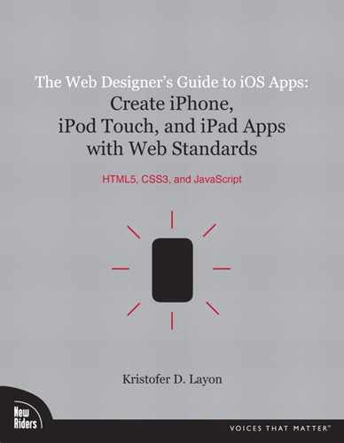
The most incredible thing about the iPod is that it’s pared down from a Mac quite drastically. Much more. Apple not only took away the mouse, they took away the desktop. They made the screen incredibly small, and made it impossible to create any content directly on the device (Figure 1.2). So Apple took a computer, removed a lot of its functionality, made it as simple and small as possible, and made it completely unproductive. And, thus, utterly unbusinesslike—the exact opposite approach to their personal computing strategy of the 1990s.
1.2 The original iPod: Shrinking and simplifying the computer even more than the Mac did.
And the result of this drastic reduction in power, size, and capability?
Sales went through the roof and have made Apple incredibly successful.
This transformation is profound, because we don’t even think of an iPod as a tiny computer. Instead we think of it as a portable, practical, and easy-to-use device for listening to music, news, information, and audio books, and seeing photos or even watching movies and TV shows.
This isn’t business content. This is life content.
Interestingly, Apple didn’t break much new technological ground with the introduction of its iOS devices. Rather, when introducing the iPhone in 2007, they simply added back a few of the key features they had taken away when they made the enormous leap from the full-size computer to the tiny iPod platform. They restored the Internet connectivity that we’re used to at our desktops and laptops, and reintroduced the ability to enter information via a (screen-based) keyboard after previously limiting users with the iPod’s click-wheel.
And oh yeah...the iPhone got the Phone application!
More importantly, iOS devices push the life content concept much further. Now the news can be breaking, the music can be live, and the information can be our kid’s soccer schedule. Or a restaurant’s address, shown on a map, with directions from our current location.
All of this means that designing for these devices needs to begin by focusing on life content, and centering on the lives of human beings and the problems that we need solved on a daily basis.
To design for these circumstances, we need to keep it real.
Mobile applications ≠ desktop applications
But we also need to keep it simple.
Thinking about mobile content needs from a life content perspective allows you to focus on the proper context of your design work, which is how and when people seek information. Next we need to focus on how people actually use mobile devices.
Many books and presentations about app development focus on leveraging specific features (learn how to make the device vibrate!). And to be sure, for a large software team working on a complex application, it might make sense to focus on specific technical features and behaviors. But this book is written from a human-centered perspective, which puts people and their content first.
When people use mobile content, their paramount concern is probably not whether someone has employed particular features of the device. But if designers neglect certain features or implement them badly, people will undoubtedly notice. Staying focused on content and on people’s needs should lead us to adopt the right behaviors and features for the right reasons. This makes much more sense to me than learning how to implement a feature first, then trying to think of a way to build an app around the behavior.
Designing an app for a mobile device is very different than designing a website that will be viewed on a computer with a full-size screen. We tend to use desktop—and even laptop—computers more often in work or educational situations. (Obviously the Internet has changed that dramatically, but bear with me a moment.) This means that the places where we tend to use computers are in offices, classrooms, or at home. Sure, a laptop can be brought many places and some of us have them with us nearly wherever we go, but most people use them in one primary location.
Compare this to using an iPhone, iPod touch, or iPad. Depending on your device and which model you have, your connectivity varies, and yet, given the pervasiveness of wireless networks, having one of these mobile computers in your pocket (more metaphorical for an iPad owner—unless you have really large pockets!) means that you are using it on the go. And this means the context is often different, and the reason for using it is probably entirely different, than using a computer. Double-checking a recipe for its list of ingredients is not a business-related task unless you are a chef or caterer: You take your iPhone or iPod touch out at the grocery store because you are human, you are hungry, and you need to solve this particular problem on the fly.
And it’s not a technical problem.
The most important thing to remember is this: Designing content for an Apple iOS device is different from designing content for a browser on a larger screen. And it’s about more than just context. On a full-size computer, the browser transforms a bit to contain our content, but we really don’t think of it that way. The browser shows us a website, and it is still on our computer—we don’t really perceive the browser itself changing.
The magic is transformational
So here’s another key difference with an iOS device: Our content delivery, particularly in a native app designed very specifically to support a particular communications need or end-use, becomes the thing we’ve designed.
If you’re not convinced, compare the ratio of the screen’s surface area to other hardware or surface details on the two devices.
The iPhone, iPod touch, and iPad are very similar in one respect: They are mostly screens. All three are about 95 percent screen from a frontal perspective, whereas a laptop is a bit less than 50 percent screen because of the keyboard and a lot of additional surface area (Figure 1.3). That’s a substantial difference. Even when an engaging website is showing on a laptop screen, it’s still visibly on the laptop, isn’t it? The keyboard, touch pad, wrist area, and frame around the screen do not disappear. They still impact the experience and keep us more distant from the content.
1.3 Even laptops are mostly keyboard, touch pad, and frame. The screen is less than 50 percent of the overall surface.

But as soon as you run an app on an iOS device, the entire device seems to transform because of its multitouch, screen-dominated design. This is more obvious in some apps than in others, but consider how the iPhone appears to become a phone when the Phone app is running. The hardware nearly disappears: Suddenly, we have a glowing phone keypad with built-in list of contacts. The same is true with Maps: It’s not really a map inside a device; the app helps the device become a map.
Understanding this transformational effect is critical to our approach in designing for these devices. We need to be extra careful about how we design a user interface (UI). We need to learn how to respect the native Apple iOS controls, and when to design custom UI elements that directly support the communications needs of the app we’re designing. And, in some cases, the UI elements extend beyond mere functionality, as branding might also be a factor.
It is also essential to understand just how important this design thinking is in this situation. Because I would argue that missing the mark in either native Apple UI controls or content- or branding-specific UI detailing is not the same as handing in a paper for a class and having it be just good instead of excellent.
Unfortunately, the illusion of the device turning into something else is far more picky than that: Missing the mark by any measurable distance doesn’t just result in a very good instead of an excellent app. It can too easily result in an extremely unconvincing, or even annoying, app.
“Well, wow, now this is starting to sound confusing,” you might be thinking. A well-designed app should be immersively designed to fit seamlessly into the user’s life no matter where they are, feature native Apple iOS user interface details wherever appropriate, and include content- or branding-specific UI details when appropriate? What’s the magic formula for that, anyway? And how do we focus on both content and user interface enough to pull this off successfully?
The answer is, of course, that there isn’t one formula. But fortunately web designers already have experience in responding to client and customer needs, and are familiar with designing using corporate style guidelines. To apply this valuable web design experience to iOS app design, you need to become familiar with native user interface standards, details, and recommendations; define your project requirements (whether for your own project or that of a client or employer); and determine the best way to design it for iOS devices.
This book will continue within this paradigm, and show you how to leverage your design experience and web skills into designing iOS apps, and introduce you to some techniques that allow you to craft these projects without writing your own Objective-C code.
Design starts with people and ends with code
“But wait,” you’re thinking, “I thought that all apps have to be written in Objective-C?”
That is true. However, this does not mean you need to write the Objective-C yourself!
In fact, what if someone else has already written it for you?
Consider JavaScript frameworks for designing content to be displayed in web browsers. Two of my favorite examples, jQuery and Yahoo! User Interface (YUI), assist web designers with employing JavaScript-powered behaviors by doing most of the heavy code lifting for us (which begs the question: How much does code weigh?). The code to achieve some very nifty behaviors has been pre-written for us into modules, and we just hook into these and use them without having to write everything from scratch. In fact, don’t forget the other important aspect of using a framework: The code has been thoroughly tested (and continues to be tested and updated on an ongoing basis) so we don’t have to debug our own code, either!
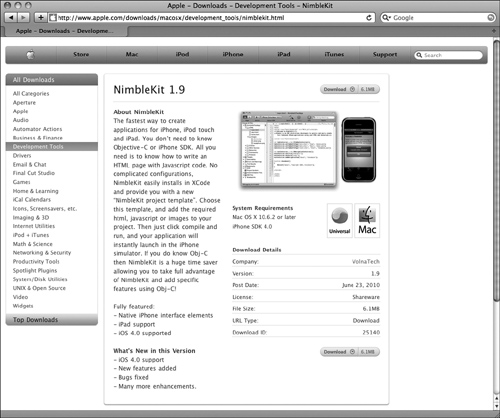
Similarly, there are iOS design frameworks that do the same thing for iPhone app design. The framework I’ve used the most is called NimbleKit (Figure 1.4). This awesome tool has a bunch of Objective-C—already prewritten for us—that performs native iOS functions and behaviors, and has been developed to be called into action with designs that use HTML, CSS, and JavaScript. When you think about it, it’s very similar to using these same languages to make a web browser display particular content and behave in a certain way. We’re simply using a different code framework in this case, and designing for a particular operating system (iOS) and distribution network (iTunes).
1.4 NimbleKit is a featured development tool on Apple’s website.
That is what the subsequent chapters are all about. Learning more about the important characteristics of iOS interfaces and behaviors, seeing how NimbleKit bridges the gap between familiar web design languages and new devices (and their native development languages). And, after learning a few examples of designing content-based iOS apps, we’ll talk about how to submit them to Apple for approval and how to distribute or sell them in iTunes.
By following Apple’s lead from 2001 to the present, we can see that content reigns supreme, and that small, simple devices with intuitive and consistent interfaces and behaviors bring our most useful content—life content—to people where and when they need it. All we need to do is focus on people and what they really need, summon our web design skills, learn some new tips and tricks, and hitch our wagon to Apple’s very successful train.
We’re just getting started!
Summary
What you’ve learned in this chapter:
• Don’t let the name “iPhone” fool you. It’s a pocket computer with a Phone app. This means it can do amazing things, and we can help shape some of these things!
• The entire iOS ecosystem is an enormous change in strategy for Apple in that it focuses on lifestyle, ubiquitous information, and content. This has created an enormous opportunity for people who design digital things.
• iOS use is immersive and more fully integrated with the rest of our lives, not just our work. How can we design apps that fit into this context?
• Native apps are programmed in Objective-C, but that doesn’t mean that designers need to learn Objective-C. They can work in teams with programmers, or use a code framework to bridge the gap. This book is primarily about the latter.