10
Case Studies in Typographic Design
The case studies presented in this chapter describe specific typographic design problems encountered in professional practice: integrating type and image on posters, establishing a visual system to unify various materials, translating content to experimental form in publication design, thinking about typography in terms of time and motion, creating dimensional and environmental typography, analyzing and visualizing data, and developing a unique visual language for everyday events. The nature of each concept is analyzed, and the rationale for the solution is discussed, with the aim of showing the complexity of applied problem solving.
CASE STUDY
Integrating type and image in poster design
A remarkable integration of type with image is found in posters designed by Jean-Benoît Lévy, who has a studio in San Francisco, California. Lévy collaborates with photographers, approaching their images as three-dimensional fields whose space is activated and extended by type. On the last day of class when Lévy was a student, teacher Armin Hofmann told him to place type in the photograph rather than on the photograph. Lévy says, “From that moment on, I knew what to do.” In his inventive designs, words and images become a unified composition.
The large star in a “Happy New Years” poster (Fig. 10-1) for the Basel studio AND (Trafic Grafic) conveys a sense of energy and motion through repetition on a diagonal axis. The background transition from orange to blue signifies earth to sky. Happy aligns with the two white stars, unifying the type and background. The sky is signified in three ways: symbolic stars; a photograph of clouds; and the lines and dots of a star chart. Subtle symbols of the world's major religions, and small type identifying each religion's deity or founder, date, and number of adherents, add another level of meaning in the bold celebratory message.
Grid structures for graphic designs are often implied, but in a poster (Fig. 10-2) for the fashion store Inflagranti, the horizontal and vertical pattern of window blinds superimposed with a double portrait of a fashion model provides a visible structure of the placement of type. The translucency and graded tones of the vertical store name echo the translucent portrait and blended tones of the blinds, further uniting word and image.
The curved forms of watch parts, their shadows, and watch-face numerals were photographed in atmospheric space for a Montres et Bijouterie Bosch watch and jewelry store poster (Fig. 10-3). Widely letterspaced type set in arcs reflects the curves in the photograph. Color is used to create harmony, with the yellow, white, and orange letters repeating the photograph's warm tones in contrast to the predominantly gray background. Lévy says the orange dots from the text signify seven planets, with the sun in the exact center.
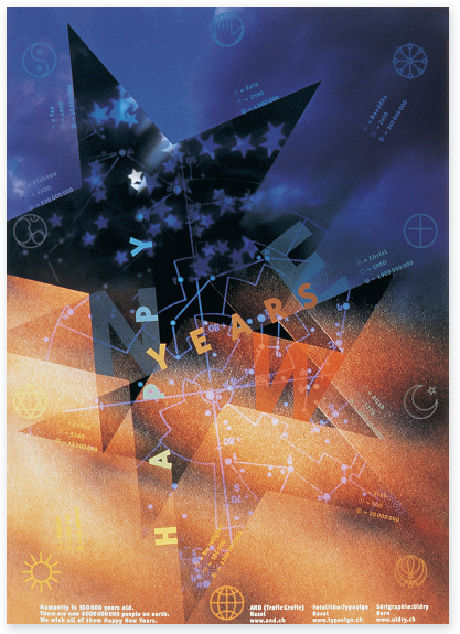
10-1 Alignment of the type along the angled edges of the stars unifies word and image. (Designer: Jean-Benoît Lévy; photographer: Tom Wedell)
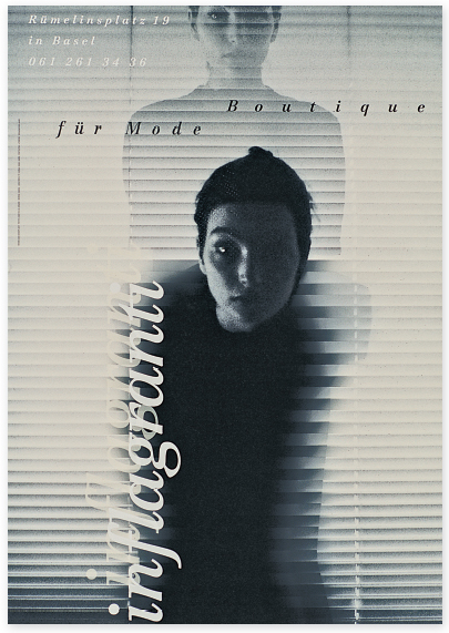
10-2 Three different type sizes and amounts of tracking creates variety, while using the same typeface brings unity to the design. (Designer: Jean-Benoît Lévy; photographer: Jean-Pascal Imsand)
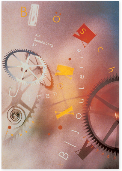
10-3 The simple geometry and spatial dispersion of the type echoes these qualities in the photograph. (Designer: Jean-Benoît Lévy; photographer: Franz Werner)
For the Savoy Intercoiffure hair salon poster (Fig. 10-4), Lévy used a photograph shot from a low viewpoint of a woman moving her head, causing her hair to fling about in a blurred shape. The photograph was carefully cropped to bleed on the right side and bottom, making a dynamic dark shape against the soft flat background. Two diagonal lines of condensed sans serif type are a sharp contrast to the blurred shape. One line links the top and bottom of the head, while the other links the top of the hair to the edge of the poster. The first word in each line is larger, and the tracking is increased for emphasis.
Markt Blatt is a free newspaper of advertisements in Bern, Switzerland. A sidelit man (Fig. 10-5) reads the paper against a warm yellow background. A trapezoid of light becomes a symbol for the process of reading, connecting the reader's eyes with the printed page. Alignment of the typography with the diagonal of the newspaper page and the horizontal and vertical edges of the poster creates a structured relationship. By making the type on the photograph yellow and the type on the background white, further integration is achieved. The bold and light type, and overlapping of the two words of the title, produce an arresting visual element.
In a poster (Fig. 10-6) for the Labyrinth bookstore in Basel, the maze or labyrinth appearing on the poster reinforces the store's name. Lévy carefully drew his complex labyrinth in pencil on a modular grid. The soft pencil tones bring warmth to the rigid geometry. This labyrinth can actually be solved by a viewer standing at the poster kiosk.
A photograph of a young man reading a book is superimposed over the labyrinth. “Reading,” Lévy says, “is like entering a labyrinth.” The organic properties of the human image provide contrast to the stark geometry of the labyrinth, softening and enriching the poster.
In a subsequent poster (Fig. 10-7) for the Labyrinth bookstore, Lévy created an image of a three-dimensional labyrinth moving back into space. This compelling image fades back into an out-of-focus, tightly cropped photograph of a reader. The letters that spell out the store's name hover in space over the labyrinth; their openness and transparency echo its edges and open channels. As in Lévy's other posters, a dynamic integration of word and image is achieved through unexpected and original compositional relationships between pictorial and typographic forms.
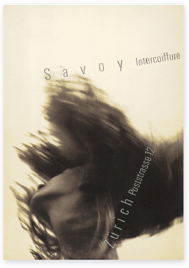
10-4 By making the x-height of the larger words the same height as the smaller words, a strong visual relationship is maintained. (Designer: Jean-Benoît Lévy; photographer: Jean-Pascal Imsand)
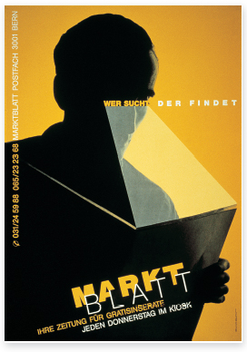
10-5 Lévy carefully retained enough of the overlapped letters to ensure their legibility. (Designer: Jean-Benoît Lévy; photographer: Alexandre Genoud)
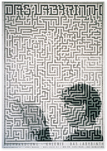
10-6 Across the top, eight rows of modules are filled in with a darker pencil tone to spell the bookstore name in geometric letterforms. The condensed all-capital sans serif type at the bottom of the poster is two modules tall; this unifies with the labyrinth. (Designer and photographer: Jean-Benoît Lévy)
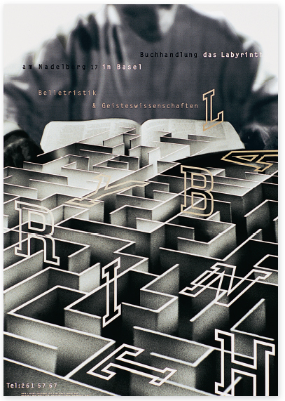
10-7 The letters of the bookstore name were executed in outline slab serif letterforms that are drawn to conform to the horizontal, vertical, and diagonal movements of the labyrinth image. (Designer and photographer: Jean-Benoît Lévy)
CASE STUDY
The U.S. National Park Service Unigrid system
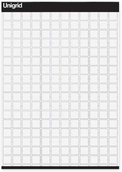
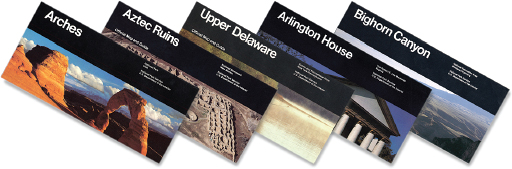
The United States National Park Service (NPS) began developing the Unigrid system in 1976 as a design system to unify the design of hundreds of site folders, while bringing harmony and economy to its publications program. Unigrid (Fig. 10-8) is based on a sheet 420 by 594 millimeters (about 16.5 by 23.5 inches), which folds into twelve panels that are 99 by 210 millimeters (about 4 by 8.25 inches). Ten basic formats (Fig. 10-9) can be derived from the Unigrid, ranging from one-panel leaflets to twelve-panel foldout broadsides. Each side of a folder is treated as a unified graphic surface that is completely unfolded by the user, just as one fully opens a map. The fold lines and the panels they create become background rather than a dominant structure, because the typical user quickly unfolds it to its full size; users rarely open a folder panel by panel. These standard formats permit great production economy because paper can be purchased in volume in two flat sizes or in web rolls. Most folders are printed in five of the available formats, further simplifying planning.
Grid modules for the folder formats measure 7 picas wide and 80 points high. Vertical spaces between modules are 1 pica wide; horizontal spaces between modules are 10 points high. Horizontal measurements are always made in picas, while vertical measurements are always made in 10-point units or modules. These spatial intervals provide a structure for organizing type, illustrations, photographs, and maps into an orderly whole.
Helvetica was selected as the type family for the Unigrid system because of “its crisp, clean details and typographic texture that make it aesthetically pleasing and easy to read.” It was also determined that Helvetica would strengthen and unify the NPS map series that accompanies the folder program. Other considerations are Helvetica's clearly defined hierarchy of sizes and weights with predictable results, large x-height with good line strength and consistent color, and outstanding printing characteristics. Text type is usually set in 8/10 or 9/10 Helvetica or Helvetica Medium in columns two or three modules wide (15 or 23 picas wide, measuring two or three modules plus spatial intervals between them).
Text type is often justified, and columns are aligned top and bottom to create horizontal movement. Sometimes the last column will run short. One line space, rather than an indentation, is used to separate paragraphs.
10-8 The Unigrid was created by Massimo Vignelli (consulting designer), Vincent Gleason (art director), and Dennis McLaughlin (graphic designer).
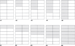
10-9 Ten basic publication formats are derived from the Unigrid structure.
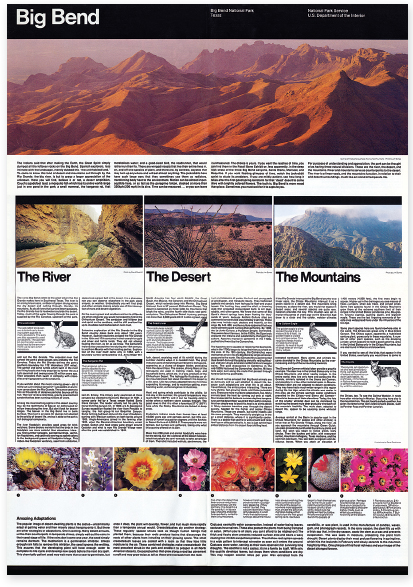
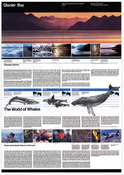
10-10 and 10-11 Copy the Unigrid in Figure 10-8 onto transparent material and place it over these folders to study the underlying structure of the designs.
Captions are set one or two modules wide (7 or 15 picas wide) in 7/7, 7/8, or 8/9 Helvetica Regular or Medium, and may be either roman or italic. This variety of weight, posture, and leading provides flexibility to create a value and texture that complements and contrasts with other typographic and pictorial elements. Captions are set ragged-right, and this helps create a strong separation between text and captions, as do contrasts between text and caption textures, weights, and line lengths.
Major display type can be set in 12-, 18-, or 24-point Helvetica Medium and is often positioned 10 points above the related text on a horizontal band of white space, frequently 40 points high, running above the text. The variety of display sizes gives the designer the flexibility needed to create appropriate scale relationships between display type, the size of the folder, image sizes, and density of text type. The margin below the text type is always a spatial interval at least 20 points high.
The cover panels of all folders have a 100-point black band that bleeds at the top and on both sides (Fig. 10-10). Titles reverse from this bar and are set in standard sizes of Helvetica Medium for park names with fewer than twelve letters. When site designation and location appear reversed from the black bar, these are set in 12/14 or 8/9 Helvetica Medium and align on the seventh grid module. Service designations are the same size and align on the tenth grid module. Cover panel type is always positioned 10 points down from the top edge of the band. This horizontal black band with its standardized title type becomes a consistent visual identification device for the National Park Service.
Horizontal movement is accentuated through the placement of the type, the horizontal margins, and internal bars that divide the space into zones of information. These bars are 25 points wide and correspond to the title bar. They may be complementary colors, contrasting colors, or black. One bar is always placed across the bottom of the folder. Display type is sometimes reversed from the bars.
10-12 The black bars and consistent typography on folder covers become a visual identification.
The Unigrid system emphasizes clarity by clearly separating the elements (Figs. 10-11 and 10-12). Type seldom overlaps images, and maps are not obscured by picture inserts or overlaps. Neutral grays and beiges, used to create backgrounds behind text areas or unify groups of images, are part of a standard palette of twenty-four colors, created from four-color process inks and a limited selection of secondary colors. This color palette creates continuity between various park publications.
Standardized formats and typographic specifications enable National Park Service designers to focus on content and design, rather than developing formats and specifications for each project. The Unigrid system is flexible, permitting unique solutions appropriate to specific messages, while leading to consistent graphic excellence and a unified visual identification.
Massimo Vignelli was the inventor and consulting designer for the Unigrid system. The program gained its vitality because the original design team remained intact over the first dozen years, and included Vincent Gleason (art director), Melissa Cronyn, Nicholas Kirilloff, Linda Meyers, Dennis McLaughlin, Phillip Musselwhite, and Mitchell Zetlin.
CASE STUDY
Book design: VAS: An Opera in Flatland
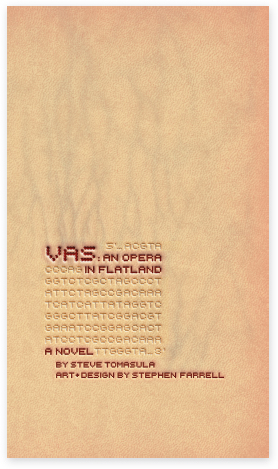
10-13 On the cover of VAS, a system of veins meandering beneath flesh introduces readers to an epic story about the human body. The book's title, bleeding blood red, emerges from a detail of DNA data.
Coauthored by Steve Tomasula and Stephen Farrell, and designed by Stephen Farrell, VAS: An Opera in Flatland, provides an uncommon, multimodal reading experience. A plethora of texts and images combine to reveal dynamic layers of subtexts and expanded narratives. “Authoring” VAS evolved more as a process of structuring and organizing masses of ideas and information than of weaving a linear tale.
Combining the processes of writing and design, the authors worked as a team for a period of six years to juggle research and source material, bits of writing, raw manuscripts, design concept sketches, and developing spreads. Based on a leapfrog method of writing, designing, and researching, the book was built from the inside out: the subject matter provided the generative mechanism—the material, the guidelines, and the constraints—for the book's organization and structure. The result fuses subject matter with literary and typographic structure into an expansive work of 370 pages.
The authors scoured material sources from popular, literary, and scientific arenas, both classic and contemporary. Raw materials included evolutionary biology and anthropology books, eugenics books, government databases, chromosome charts, genetics supply catalogs, Internet plastic surgery and egg donor sites, medical books, doll catalogs, and many other sources accumulated over several years. Some materials were used unaltered as “evidence,” some were deconstructed and reconstituted, and others were used as structural frameworks. The authors also generated many of their own images and illustrations.
The book's subject matter involves the general theme of human biology. But more specifically, the text-image novel explores the myriad ways in which the human body is represented in words and images, and how these representations shift the way we see, perceive, and relate to our bodies (Fig. 10-13).
The book's protagonist, Square, is a writer married to Circle. He considers having a vasectomy, but, having doubts about the procedure, he traverses the realms of science, medicine, bioengineering, and information technology, pondering the ways in which these domains reveal aspects of the human body through graphic and literary portrayal (Fig. 10-14).
Square focuses on one biological aspect in particular: DNA, the engine of life on earth. But the phenomenon of DNA is too small and too complex to depict in its reality. Square observes science, continuously abstracting it, analogizing it, reframing it, and repackaging it, each incarnation offering a new representation of DNA.
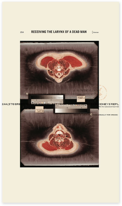
10-14 A page revealing the essence of I, a story about how we represent our biology and how these representations allow us to see our bodies, think about them, and manipulate them in various ways.
Farrell further explains, “DNA's most frequented analog is a string of letters that casts our genetic selves as a piece of writing, a grand text, a magnum opus that science has dubbed ‘the book of life.’ Through this analog, a human body is suddenly a stream of text, a living novel, a reference guide and technical manual, a printing press running off copies of itself, an agglutination of letters that, when sequenced, form flesh and blood. The genome is a raw manuscript with stories of longevity or disease, chemical balance, sexual development, the acquisition and loss of motor skills and language—a many-layered story which a body acts out and carries to conclusion.”
While reading VAS, one comes to realize that the concept of DNA and the popular analogy of DNA as a long text chain provides both the subject matter and structural framework for the book. VAS draws together this language model and the double helix model of DNA to build the book's narrative structure and its compositional and typographic structure (Fig. 10-15).
A symmetrical five-column grid of hairlines running vertically through the pages stands for the unwound DNA scaffold of the double helix (Figs. 10-16 to 10-18). Readers feel as if they are traveling a tiny stretch of genome and reading its contents. Three layers of historical, ontological, and narrative text threads assigned to the scaffolding cascade down the pages in a coiled sequence mimicking DNA. This grid provides the armature that adheres the texts and constrains them to discrete horizontal positions. This grid slips into other guises throughout the book: the lines are hair, a scalpel's path, suturing thread dipping in and out of flesh, a musical staff.
In one spread, the lines swirl into flight patterns of moths to a flame, light rays plotted in curved space, Galileo's telescope, and an abstract plot of normal vs. mentally ill children. Quotes from influential scientists, government officials, famous authors, and the like pierce the DNA strand with ideologies, each given the authority of an encyclopedic tab.
In VAS, fonts make flesh, and print technologies are analogous to body technologies where materiality of the body and materiality of the body of the text become one. Readers become fully immersed in a book printed in three colors: black, flesh, and blood.
(Farrell actually matched the red to a drop of his own blood, and the “flesh” color to Crayola's discontinued “flesh” crayon, which happens to be a very close match to 3M's official designation of “flesh” for their medical supplies.)
Three dominant typefaces were selected for the three dominant voices of the book: Clarendon, Univers, and Cholla. Many accent faces were also used, including Synchro, Fell, Winchester, and Comic Sans. The choreography of the texts and the palette of typefaces provide a sense of coherence, intelligibility, and narrative pacing to the disparate and interlocking narrative fragments.
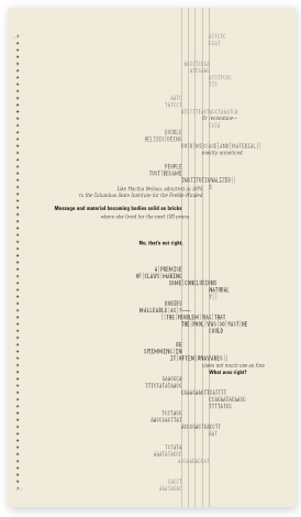
10-15 A page showing the typographical (analog) structure of the book, a “double helix” armature consisting of five vertical hairlines.
10-16 The grid lines as DNA strand provide the structure for interpenetrating text and images. The grid lines transform into a suture, visually piercing the page as if piercing skin.
10-17 A sample spread reveals an intricate typographic structure, a DNA armature where texts of multilayered content and typographical expression spin downwardly as part of a greater, all-encompassing story.
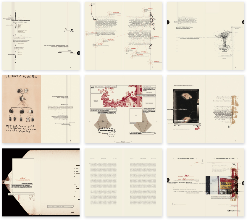
10-18 A range of spreads reveals the breadth of typographic expression and the intermingling of texts and images within the governing structure of DNA.
CASE STUDY
Typographic film titles
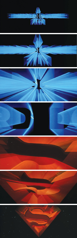
10-19 Title sequence for the film Superman. (Designer: Richard Greenberg)
Referring to a movie advertisement that used letterforms “painted by light,” typographic historian Beatrice Warde wrote, “After forty centuries of the necessarily static Alphabet, I saw what its members could do in the fourth dimension of Time, ‘flux,’ movement. You may well say that I was electrified.” Through advanced animation and computer graphics techniques, graphic designers are transforming typographic communication into kinetic sequences that might almost be called “visual music.”
Richard Greenberg has distinguished himself as a leading innovator in graphic design for film titles, movie previews, special effects, and television commercials. He considers film titles to be a “visual metaphor” for the movie that follows, setting “the tone of the movie. You have to take the people who have just arrived at the theater and separate them from their ordinary reality—walking onto the street, waiting in line; you bring them into the movie. You want to tell them how to react: that it's all right to laugh, that they are going to be scared, or that something serious is going on.”
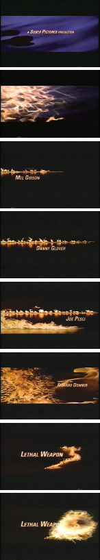
In the titles for the Warner Brothers film Superman, bright blue names and the Superman emblem streak through space like comets, stop for a moment, and then evaporate into deep space (Fig. 10-19). The speed and power of this film's fantasy superhero are evoked. This effect is accomplished by tracking rear-illuminated typography in front of an open camera lens. Each frame captures a streak of light that starts and stops slightly before the light streak recorded on the next frame. When shown at twenty-four frames per second, this series of still images is transformed into a dynamic expression of zooming energy.
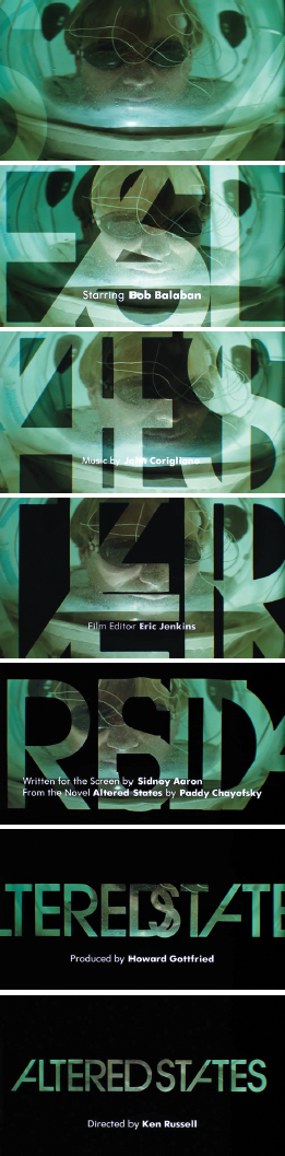
For the Warner Brothers movie Altered States, the title sequence opens with a wide-angle image of a researcher in an isolation tank (Fig. 10-20). Superimposed over this image, the two words of the title—transparent, as if they are windows cut from a black background—overlap each other as they move slowly across the screen. The film credits are superimposed in white typography in front of this lively pattern of typographic forms and counterforms. Behind the title the background slowly darkens while the camera pulls away from it, causing the letterforms to become smaller and smaller. Finally, the title Altered States appears in its entirety before the totally black screen. In the title, set in Avant Garde Demi, the repetition of this unusual configuration unifies the two words and serves to make the title a unique and memorable signification.
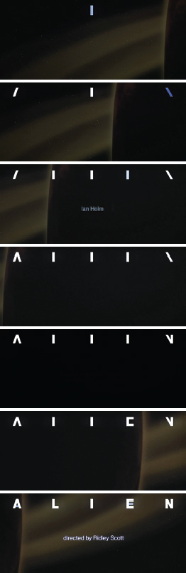
An ominous mood is created in the title sequence for the Twentieth Century-Fox production Alien (Fig. 10-21). Deep in outer space, the dark side of an immense planet (suggested by a sweeping curved edge) moves slowly onto the screen. Gradually, it passes from right to left, engulfs the screen in blackness, and then continues until it disappears from sight. As the planet passes, small white rectangles appear one by one and then undergo a metamorphosis to form a five-letter title letterspaced across the screen. An elevated sense of mystery is achieved by the harmonious juxtaposition of the passing planet and the typographical transformation. The impending arrival of aliens is evoked.
10-20 Title sequence for the film Altered States. (Designer: Richard Greenberg)
10-21 Title sequence for the film Alien. (Designer: Richard Greenberg)
10-22 Title sequence for the film True Lies. (Designer: Richard Greenberg)
10-23 Title sequence for the film Lethal Weapon 3. (Designer: Richard Greenberg)
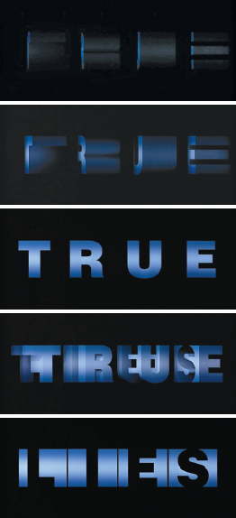
A striking three-dimensional effect is achieved in the seamless title sequences for True Lies, a film about a secret agent who learns about his wife's extramarital affair and pursues her using intelligence resources available in his profession, which is a job he kept secret from her. The title begins with four faint blue streaks that start to rotate in space (Fig. 10-22). As the lines rotate, the flat, planar letters of the word true are revealed. These letterforms continue to rotate, appearing as independent cubelike structures, with the final sequence revealing the letters of the word lies, reversed and appearing in black on the adjacent surfaces of the structures. This simple and elegant visual transformation provides a surprising tension between the two opposing words of the film's title.
Martin Riggs, the lead character in the film Lethal Weapon 3, finally meets his match in Lorna Cole, a beautiful but tough policewoman. Together with his partner, Roger Murtaugh, the three attempt to expose the illegal arms racket of a fellow police officer. The heightened suspense of the film is established with the visceral image of fire licking the surface of a calm body of water. As the flames erupt from left to right along the screen, typography presenting the names of the film's stars follows their movement (Fig. 10-23). In this film title, the synergistic relationship between type and image is fully developed as they move in time and space. This film title provides an excellent example of the integration of type into image, unlike many designs where type is merely added to, or placed upon, an image.
The time-space orientation of digital media enables the typographic designer to add motion, scale change, sequence, and metamorphosis to alphabet communication. As demonstrated by the work of Richard Greenberg, this opens new vistas of expressive communication.
CASE STUDY
Buenos Aires Underground (Subte)
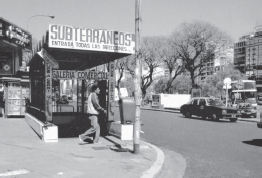
10-24 This photograph from 2004 shows a subway entrance before the Subte system was implemented. How to replace chaos with order and clarity became the question.
Buenos Aires, the capital of Argentina, is a culturally diverse city with a population of approximately twelve million people. The firm Diseño Shakespear has made a lasting impression on many facets of the city's visual culture and information infrastructure. Ronald Shakespear, founder and principal of this multidisciplinary firm, describes his design mission as “making the city legible.”
A dramatic example of this quest is the Buenos Aires subway system, a mega-wayfinding project designed by Ronald Shakespear and his sons, Lorenzo and Juan. The system inherited the name Subte (from subterráneo), city residents' colloquial term for their subway. This memorable term functions as a brand, like the Tube in London, the Métro in Paris, the Metro in Washington D.C., and the Subway in New York.
The Buenos Aires subway system originated in 1913 with the introduction of a first station and grew rapidly in later years to keep pace with a burgeoning population. Before the design transformation by Diseño Shakespear, the “system” constituted nothing more than a chaotic collection of vernacular elements (Fig. 10-24).
Between 1995 and 2007, Diseño Shakespear pursued separate stages of the subway's branding and wayfinding transformation for the existing five lines. The team relied on their established design methodology: research, analysis, synthesis, drafts, final project, implementation. Sketches and graphic notations served to visualize and synthesize ideas and concepts (Fig. 10-25).
A successful wayfinding system relies on a combination of on-site research and what Ronald Shakespear refers to as “verified intuition.” Two fundamental criteria must govern the signs in any successful system: 1) they must be easy to find and their locations predictable, and 2) they must be easy to understand. Shakespear believes that designers have an obligation “to listen to people, to decipher their codes, to discover their yearnings, and to give them an answer.”
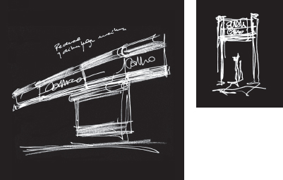
10-25 Process sketches seek to define the basic elements of the Subte system.
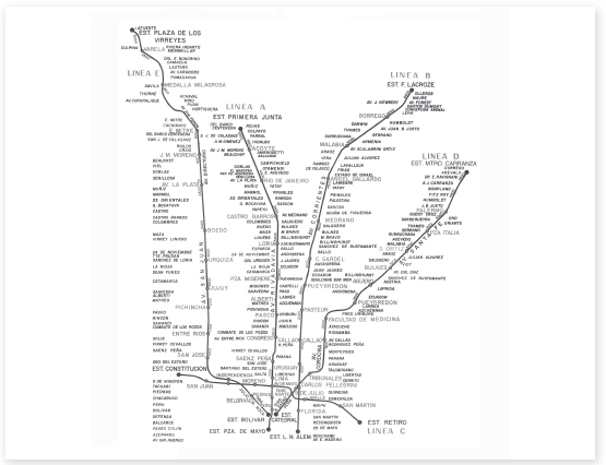
10-26 An early subway map lacks the typographic organization, hierarchy, and diagrammatic clarity required for adequate interpretation.
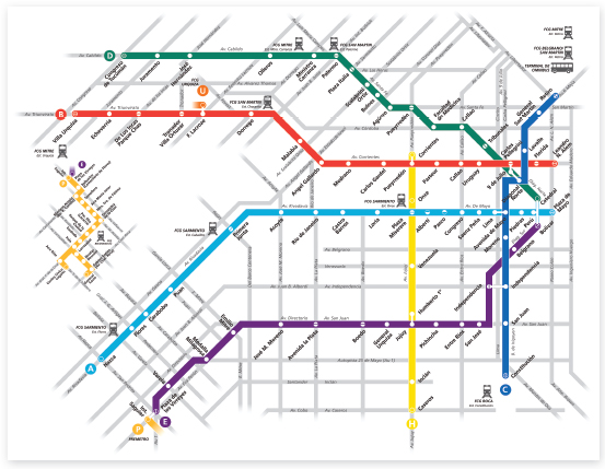
10-27 The redesigned map diagrams the cityscape into a translatable model based upon simple geometry. City streets form a secondary lattice beneath the subway lines, orienting riders to their position in the city.
10-28 This drawing reveals the dimensions of the prominent Subte station entrance signs. The proportional system shown here relates to the grid structures used in all other system components.
10-29 Contrasting colors brand subway lines, making it easy for riders to distinguish and identify each of them.
Research and evaluation of the existing system stimulated the development of a rational and functional graphic language that communicates clearly, providing travelers with the sense and assurance that they will reach their destinations without a problem. The design solution would have to be adapted to eighty-six subway stations, each with unique physical conditions.
An adaptable but consistent program governs Subte, and a well-considered hierarchy of information is delivered using a bold, clear, and concise visual syntax.
An early task was to design a new map. Prior renditions, relying on actual interpretations of topology, were visually dense and difficult to interpret (Fig. 10-26). Influenced by the map of the London Underground designed in 1933 by Henry C. Beck, and the New York Subway system map designed by Massimo Vignelli, the Subte map was reduced to a comprehensible network of linear elements and typographic labels positioned horizontally, vertically, and at 45-degree angles. The simplified, diagrammatic structure provides a legible gestalt for riders en route (Fig. 10-27).
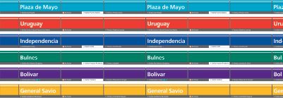
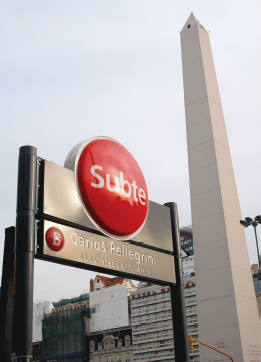
A grid system accommodates a variety of sign types, from interior station signage to exterior directional signage (Fig. 10-28). As shown in Figure 10-29, each of the six subway lines (A–F) is assigned a color from a vivid palette of primary and secondary hues. The contrast between colors brands each of the lines, making it easy for riders to pinpoint where they are and how to plan their route. The color scheme corresponds to the Subte map.
Station signage consists of forty-one signs in a typical station configuration. Station identification bands run parallel to the tracks at a consistent height of 2.2 meters from the platform floor. This creates a 220-meter “perpetual belt,” through the interiors of the stations. The station name repeats every 2.5 meters, helping riders to readily identify their stops from within the trains (Fig. 10-30).
Ronald Shakespear attests that signs are “active expressions of identity that go beyond just giving directions and solving basic circulation and communication problems.” They must integrate into the surrounding environment and contribute to a sense of place.
Observations revealed critical psychological concerns—for example, the express need for riders to leave the underground environment as soon as possible. As Shakespear puts it, “The exit sign is the most important symbol to people on the subway: How do you escape? It is unnatural to be underground in the city.” (Fig. 10-31).
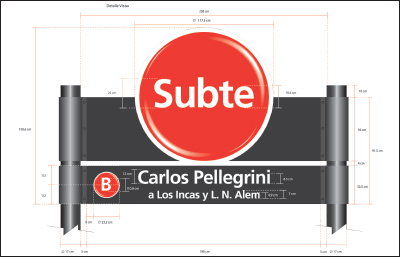
Frutiger was selected as the system typeface, not only for its superb legibility but also for its informal, friendly appearance. Set in Frutiger Bold, the name Subte provides a distinctive word picture for a memorable brand. Different weights and sizes of Frutiger are applied to the signage to establish a decipherable information hierarchy. Type was scaled to optimize readability at various viewing distances.
The final phase of the Subte transformation was the design of above-ground signage. Since a specific design program had not been employed in a hundred years, the entrance conditions, including signage, varied widely. The Shakespear team adapted visual aspects of the interior signage, but reconfigured them at an appropriate scale to help travelers identify the six different transit lines.
The circular forms identifying various lines on interior signage were integrated into illuminated sign boxes as three-dimensional orbs. Because of their three-dimensional forms and bold colors, these signs serve as prominent landmarks for Subte stations (Figs. 10-32 to 10-34). As a major urban feature, the Subte system contributes enormously to the functionality and ambience of Buenos Aires, and to the pride of its residents.
10-30 Running the entire length of each station platform, an information rail typographically repeats the station name, reassuring travelers of their arrival destination. The station name is easily viewed while riding the train.
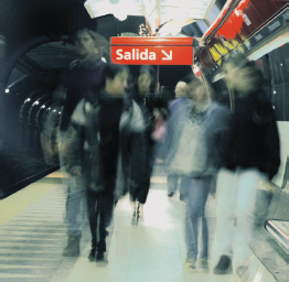
10-31 Exit signs are easily identified in the information hierarchy. Upon stepping out of trains, travelers immediately seek escape from the underground.
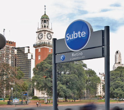
10-32 to 10-34 The prominent circular columns, viewed at a distance and from any angle, mark subway entrances and provide information about links to other lines. The Retiro station sign was one of the first to be implemented. Illuminated at night, the station signs are highly readable, encouraging twenty-four-hour travel.
Credits:
Directors: Lorenzo Shakespear, Juan Shakespear, Ronald Shakespear; team: Gonzalo Strasser, Cecilia Bonnefon, Martina Mut, Lucia Diaz, Juan Cerdá; photos: Juan Hitters, Lorenzo Shakespear, Alejandro Calderone; legal advisor: Victor Levy; construction advisor: Atlas SAIC.
CASE STUDY
Information design: Metropolitan World Atlas
Ingenious, brave, impressive, and absolutely unique—these are terms often used to describe the work of graphic designer Joost Grootens. His books on subjects of art, architecture, and urban spaces all share an analytical and intelligent approach to the subject matter.
Prior to Grootens's design of the Metropolitan World Atlas, there had been no way of directly comparing worldwide metropolises. Written by Arjen van Susteren and published by 010 Publishers, this remarkable atlas offers a unique survey of global trade networks and their impact on metropolitan spaces.
This book documents a total of 101 metropolises, analyzing them in easy-to-read ground plans. The atlas redefines cities as more than densely built-up areas. It chooses to define metropolitan areas as “regions where global relationships dominate over local ones and which are characterized spatially by a high concentration of global connections and a high concentration of people.” These areas having a global range of influence are compared via information graphics in terms of population, density, pollution, travel time, data traffic, air and water travel, and the size of central business districts, among other pertinent factors.
The unexpected combination of ground plans and statistics makes this atlas a unique reference work where for the first time metropolitan areas like Beijing, Lagos, London, Los Angeles, Rio de Janeiro, and Tokyo can be compared with one another in terms of their position in the global urban network. The atlas conveys this information with transparent clarity, enabling readers to sense instinctively that they are immersed in the language of cities.
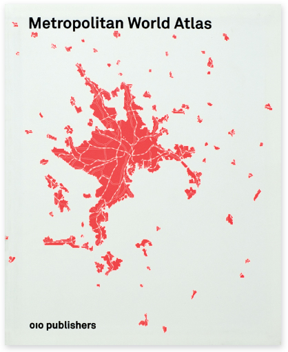
10-35 and 10-36 The cover and back cover set the stage for an approach to design used throughout the atlas: convey content elegantly by being clear, consistent, simple, and direct.
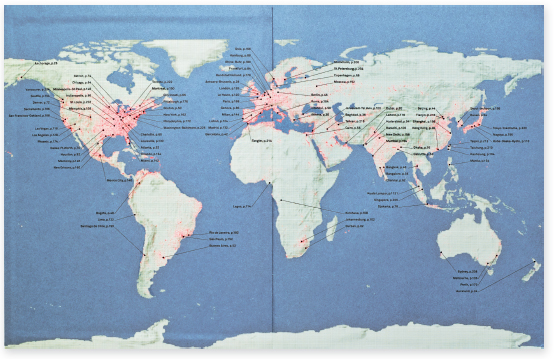
10-37 The book's endsheets show maps of the globe. The geographic locations of the 101 metropolitan areas are shown together with the page numbers of where they are located in the atlas. The color orange indicates the most populous regions.
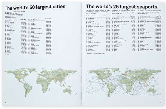
10-38 Introductory pages present lists of metropolitan areas having the most significant global impact in terms of the size of population, seaports, airports, and telecom ports. These criteria determined the final selection of 101 metropolitan areas. Grootens finds these lists to have “a poetry of their own.”
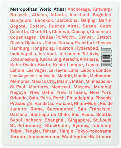
The Metropolitan World Atlas utilizes various weights of Akkurat, designed by Laurenz Brunner in 2004, as the primary type family. This highly legible, sans serif type family enables easy, unencumbered reading, and its friendly image urges readers into statistical information without trepidation. In contrast to complex content, the design of the atlas design exhibits restraint, taking on the responsible and critical task of clearly presenting the information without the use of unnecessary decorative devices. The cover invites readers to enter the content by means of a generic map printed in orange Day-Glo ink. This map corresponds to the scale of maps found throughout the atlas, becoming a part of the entire system. The orange color functions throughout the book to signify population distribution and the intensity of other statistical values. The back cover readily identifies the 101 featured metropolitan areas as a continuous list (Figs. 10-35 and 10-36).
Front and back end sheets and paste-downs provide at-a-glance maps of the globe that pinpoint locations of the major metropolitan areas. Serving as a visual index, page numbers attached to these areas indicate where they can be found in the pages of the atlas. Along with organizing the content alphabetically, this device helps readers find their way in the atlas (Fig. 10-37).
After the introduction, a section presents global (and historical) statistics, such as “The world's 10 largest cities through the ages,” and “The world's 25 largest seaports” (Fig. 10-38).
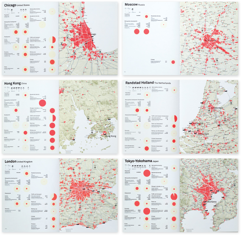
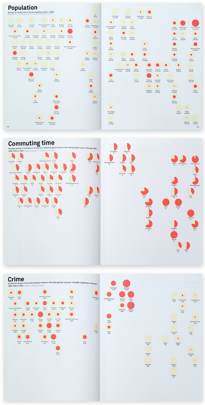
10-39 and 10-40 These sample spreads reveal the three basic ingredients used in the design of the atlas: a map, consistently framed and scaled; a system of dots to show intensity and regional variance; and a systematic use of statistical data that can be compared.
Each of the 101 metropolitan areas is shown consistently, using the same organizational structure. The designers began with a geographically projected world map and zoomed into each area to establish a 162 × 130 kilometer framework and a 1:750,000 scale.
This means that 1 centimeter on the map corresponds to 7.5 kilometers on the ground. For comparison purposes, each map has the same scale, grain, frame, and legend. Grain adjusts in density according to elevation. The legend indicates bodies of water, land area, land elevation, railways, motorways, built-up areas, airports, and seaports. A concentration of contrasting orange on these maps indicates built-up areas.
The statistical data for each metropolitan area are displayed next to each map using two methods: as diagrams, and as figures and text. The diagrammatic display shows proportions in relation to the maximum value that a given characteristic of the region can reach: a small orange dot represents a relatively low value, and a large dot a relatively high value. Maps appear on the right-hand page of the spread, while statistical information appears on the left, enabling readers to seamlessly flip through the book to compare one area to another (Fig. 10-39).
The second section of the atlas (Fig. 10-40) compares data for the metropolitan areas on a global perspective by topic. Dots representing the areas are positioned on simplified world maps. The size of dot or, in some cases, the colored pie-chart percentage of the dot refers to regional values in relationship to specific data. Readers can compare areas in terms of passenger airports, flight movements, telecom ports, population, built-up areas, average temperatures, and income per capita, among others.
The design of the Metropolitan World Atlas provides an extraordinary typographical reference work for comparing the differences and similarities of metropolitan regions from varying perspectives.
CASE STUDY
A typographic program for the 17th Street Farmers' Market
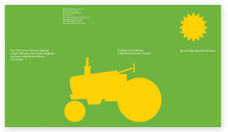
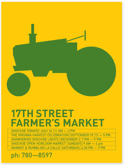
10-41 The bold, vector-based tractor silhouette, straightforward spatial composition, and vivid color are characteristics that became the defining elements of the market's graphic program.
The 17th Street Farmers' Market in the Shockoe Bottom district of Richmond, Virginia, was one of America's first public markets. It originated as an outdoor market around 1737 and was officially established in 1779. The first structure on the site was an open wooden shed, replaced two years later with a brick building and colonnade. The market expanded in the following years, and by 1854 a larger brick building—the First Market House—was built on the corner of 17th Street and Main. During the Civil War, this building served as a strategic gathering place for Confederate soldiers. Later in the war, Union troops occupied it as barracks. After the war and into the 1900s, the market prospered; but by the mid-twentieth century the Shockoe Bottom district had declined and the market could no longer be sustained. The First Market House was demolished in the 1960s. The market was again revived in the 1980s, and the current open-air pavilion was built during this time.
In recent years, the market has thrived as a vital center for community events, and as a venue for farmers, artists, flea and antique dealers, and bakers to sell their products.
The current success of the 17th Street Farmers' Market is largely attributable to a visionary period of time when the market's manager departed from the conservative thinking of the city officials and the advisory board to embrace the power of forward-thinking graphic design and typography.
Initially, John Malinoski was asked to design a poster for one of the market's events. The poster proved so successful that it soon became the pilot project for the market's identity and the inspiration for developing the graphic program (Fig. 10-41). The visual language of the program is based on compelling ideas and bold, iconographic forms rather than what might be considered the obvious market vernacular—nostalgic photographs and engravings laden with obvious period typography. The silhouetted icon of the farm tractor serves as the market's identity mark and as a central unifying element in posters, postcards, bumper stickers, and various other printed materials (Fig. 10-42).
Malinoski can be considered a second-generation modernist who pays allegiance to the universal principles of rationality, simplicity, and visual economy. He nurtures these ideals like a dedicated parent, but does so with wit, humor, and intelligence. It is possible that several visits to Holland contributed to shaping his design vision, for Dutch design has street presence and is a reflection of the processes and pragmatics of everyday living. Malinoski adheres to the idea that understatement is the most potent statement.
10-42 The sun sets on a horizon of aligned text type in this implied farm landscape.
10-43 and 10-44 The tractor icon is inventively introduced into different environments and contexts to surprise and delight viewers. Considerable effort was made to identify a typeface that visually accommodates the tractor wheel.
Malinoski's work for the market is also street savvy. The striking simplicity and boldness of the posters and other materials command the attention of people both walking and driving. Often the tractor combines with other images or typography to excite the curiosity of viewers.
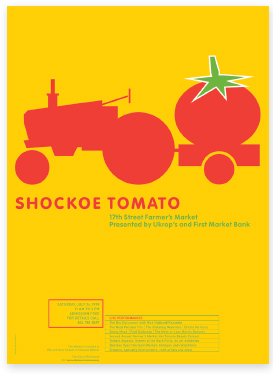
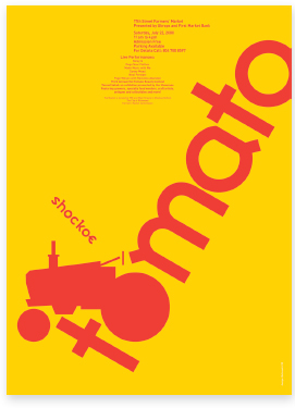
In one poster, a tractor hauls a giant tomato to create a highly exaggerated and memorable image (Fig. 10-43). In another example, the wheel of a farm tractor is substituted for the letter o in the word tomato. The large scale and oblique angle of the type, and the hot color, set the stage for a hot summer event (Fig. 10-44).
Other farm implements are sometimes used in combination with type to create thought-provoking messages. Examples include a postcard for the International Brunswick Stew Festival, where the tractor, a passenger jet, and a bowl are objectively displayed as a series of international symbols (Fig. 10-45); and a brochure featuring a wheelbarrow loaded with type (Fig. 10-46).
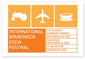
10-45 Reminiscent of travel baggage stickers and tickets, the postcard communicates the international scope of the event. The warm colors suggest autumn.
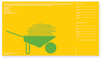
10-46 The contrast between a sturdy wheelbarrow and delicate type creates a convincing image. The wheelbarrow is filled with items found at the market.
10-47 and 10-48 Incongruent combinations of type and image challenge the expectations of viewers.
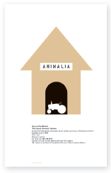
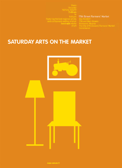
Sometimes type and image combine in surprising ways to tell a story or convey an abbreviated narrative. For a market event focused on pets, a tractor is placed in a doghouse (Fig. 10-47), and in an announcement for Saturday Arts on the Market, a living room setting with a framed image of the tractor suggests that art was purchased at the market (Fig. 10-48).
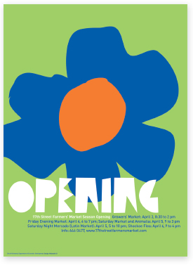
When departing from farm-related images, as in a poster announcing the market's opening season, the consistent use of robust icons preserves visual unity (Fig. 10-49).
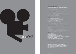
The universal feel of the graphic system is supported by the use of DIN as the text typeface. Designed by H. Berthold AG in 1936, DIN is the face used for road signage in many parts of Europe. When large amounts of text occur in materials, it is set into flush-left, ragged-right blocks, as seen in a flyer for a film festival. (Fig. 10-50). The inherent simplicity of the graphic program belies the careful attention paid to every conceivable typographic detail.
10-49 The word opening refers to the market's new season and the emergence of a spring flower. The typeface selected for the word is both organic and geometric, effectively corresponding to the flower.
10-50 The bold, vector-based tractor silhouette, straightforward spatial composition, and vivid color are characteristics that became the defining elements of the market's graphic program.