11
Typographic Design Education
The rapid advance of technology and the expanding role of visual and media-based communication in contemporary society have created new challenges for typographic education. Faced with a complex communications environment, and the changes that are occurring and are anticipated, how can a designer nurture sensitivity to typographic form and communication? An appreciation of our typographic heritage, an ability to meet the standards of contemporary design practice, and an innovative spirit in facing the future are required.
The following assignments, ranging from basic theoretical exercises to complex applied projects, were selected to provide an overview of contemporary typographic design education. An effective curriculum is composed of perceptual and conceptual development, technical training, and processes for solving multifaceted design problems. These projects were selected with emphasis upon building the perceptual and conceptual abilities that provide a foundation for effective and innovative typographic design practice.
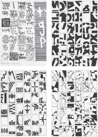
Letter/digit configurations
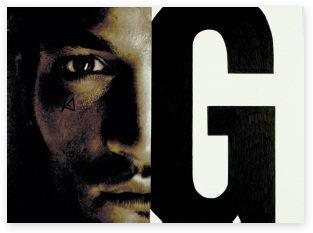
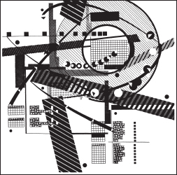
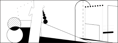
Visual configurations were invented by combining letters from the English alphabet and single-digit numbers (Figs. 11-1 to 11-4). Scale, proportion, weight, and shape relationships between two different signs were explored.
Objectives of this exercise include introducing letterform drawing and drafting skills, using typographic joinery to unify the two distinct forms into a visual gestalt, and understanding the variety of spatial relationships that can exist among characters.


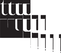
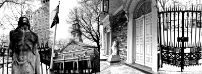
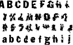
Urban letterform studies
Letterforms in an old section of a European town were studied and documented through drawing, rubbings, and found material. A black-and-white letter composition was developed, depicting graphic qualities found in the assigned area.
On a formal level, compositional issues such as dynamic asymmetrical composition and form-counterform relationships are explored. On an interpretive level, the ambience of a historical area is translated into a typographic configuration (Fig. 11-5).

Flowering typography
Selected letters of the alphabet were combined with images of flowers that have been reduced into visually simplified forms. Each letter is coupled with a flower whose name begins with the chosen letter. In the examples shown, A is for alyssum (Fig. 11-6), K is for Kirengeshoma (Fig. 11-7), J is for jalap root (Fig. 11-8), and H is for hollyhock (Fig. 11-9).
A primary objective of this project is to achieve a harmonious synthesis between type and image, and in the process create a new visual configuration. It is essential that both the letterform and the flower be recognizable in this hybrid form. This project is also concerned with exploring the dynamic relationship between positive and negative space.


Fig. 11-6 to 11-9 Designer: Li Zhang
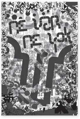
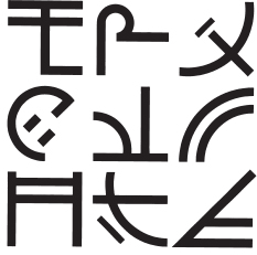
Inventing sign systems
A set of nine signs were invented (Figs. 11-10 and 11-11). Each was required to be a distinctive mark, with unique optical characteristics, yet harmonious with all the other signs and clearly recognizable as part of the set.
The focus of this project is to make students aware of the properties that bring unity to any typographic system. These include stroke weight and direction, stress, form repetition, and intersection.
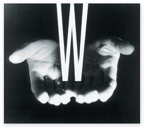
Comparative relationships: type and image
In this two-part project, students considered visual relationships between type and image. After selecting photographs, students chose typefaces and letterforms that related to the image through visual characteristics such as shape, weight, decorative embellishments, and other design attributes. Part one involved hand drawing the letterform in a side-by-side comparison of form (Figs. 11-12 and 11-13).
In part two, the relationship was explored further by integrating the letterform into the image (Figs. 11-14 and 11-15). Attention to typeface selection, scale, repetition, color, and balance allowed the merger of type and image into a single entity.
This project helps students who are innately image-oriented understand how design characteristics of typefaces are distinctive. Selection of an appropriate font can enhance the communicative message, and type and image can be composed into a unified composition.
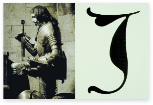
11-12 Designer: Brandon Luhring
11-13 Designer: Brandon Luhring
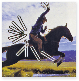
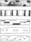
Sequential typographic forms in space
By cropping, shifting, rotating, and scaling a large sampling of single letterforms within square modules, students discover the dynamic relationships between form and counterform and the resulting effect upon visual space. Students then proceed with a study of typographic kinetics by organizing selected modules into a linear sequence of ten modules (Figs. 11-16 to 11-19). Similar to musical scores, diagram sketches enable students to articulate and test sequences with respect to rhythmic patterns, shape and value transitions, and the flow of typographic elements (Fig. 11-20).


11-16 to 11-20 Designers: Virginia Commonwealth University sophomores
Typography and image transformations
A letter has been altered in a series of steps until it is transformed into a simple object, an abstract shape, or another letterform (Figs. 11-21 to 11-23). An understanding of typographic sequencing, permutation, and kinetic properties is developed. Students gain an awareness of form and counterform relationships, and of the unity that can be created in complex configurations.


11-21 to 11-23 Designers: University of Cincinnati sophomores
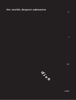
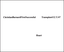
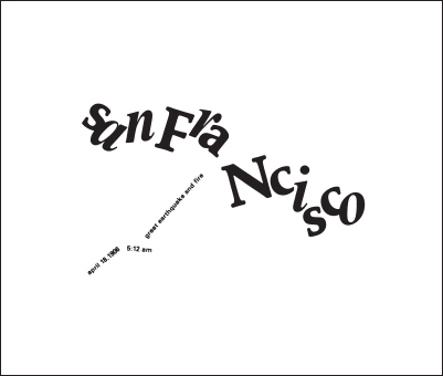
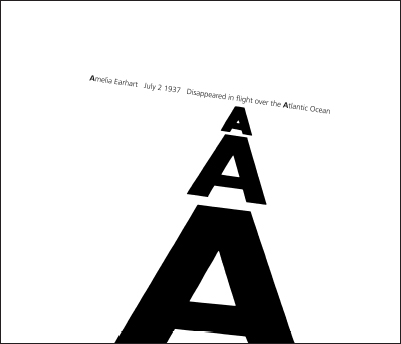
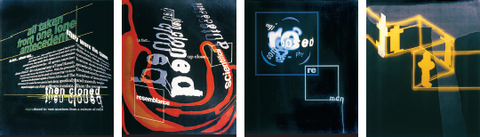
Unity of form and communication
Students select a historical event as a subject, and develop a typographic message using the visual properties of type and space to amplify its content (Figs. 11-24 to 11-27). This project develops an understanding of the inventive potential of typographic form. As a message carrier, typography can intensify and expand content and meaning.
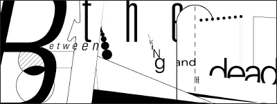
Syntactic explorations using onomatopoeic terms
An onomatopoeic term (a word that sounds like the thing or action denoted) was selected and used in syntactic explorations. The first level involved drawings exploring syntactic variations using a grid to create visual relationships. These studies evolved into complex type compositions expressing the term.
Level two saw an additional word added as a simple linear element. Unexpected yet meaningful relationships were sought. Visual relationships were created through alignment, balance, juxtaposition, and direction.
In level three, a photograph was added, completing the composition and forming a meaningful message. Unexpected, ironic, or complex associations were encouraged. A spectator or fan at a sporting event (Fig. 11-28) adds a new dimension to the ver sound of a fan. Rabbit ears cause schhh (Fig. 11-29) to denote the static of poor television reception. The meaning of the word croak (Fig. 11-30) is changed by the gun. The ding-dong (Fig. 11-31) comes from the bell in a boxing match after a prizefighter is added to the design.
This project addresses a complex set of issues. Type style, size, and placement can express the meaning of words. Effective visual organization is achieved with the help of a grid. Words and pictures strengthen and even alter each other's meaning.
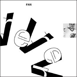
11-28 Ver, fan, and spectator. (Designer: Elisa Robels)
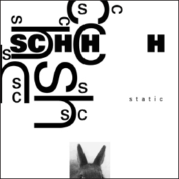
11-29 Schhh, static, and rabbit ears. (Designer: Kelly Olsen)
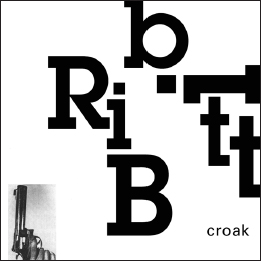
11-30 Ribbitt, croak, and gun. (Designer: Cheri Olsen)
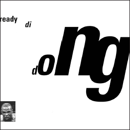
11-31 Ding dong, ready, and boxer. (Designer: Paris Jones)
Visual structure motion studies
Following an introduction to basic principles of narrative and animation, students created a series of ten-to-fifteen-second motion studies to communicate a specific visual principle or structure using abstract type and basic forms. The goal of the sequence was to combine the more static visual language of traditional graphic design (composition, color, shape, depth, tension, and contrast) with the dynamic visual language of cinema and film (pacing, rhythm, and sequence). Elements included in the motion studies are letterforms, abstract shapes and forms, and sound.
Students selected a principle from the following list: rhythm and repetition, progression, symmetry and asymmetry, contrast, randomness and order, figure and ground, spatial layering and overlapping, grid. They then began to research, sketch, and plan their sequences as storyboards. Four rough-draft animations were assigned and then refined into final animations over three weeks (Figs. 11-32 and 11-33). Play, discovery, and exploration were encouraged.
Work was evaluated in the context of how the motion sequences communicated the chosen principle and how they functioned as visual narratives over time. Discussion and critique addressed the potential of typography as a vehicle for both denotative and connotative messaging through kinetic behavior and orchestration with sound.
11-32 Rhythm. (Designer: Xiaozhou Li)
11-33 Randomness. (Designer: Napasawan Sirisukont)
Type chronology booklet
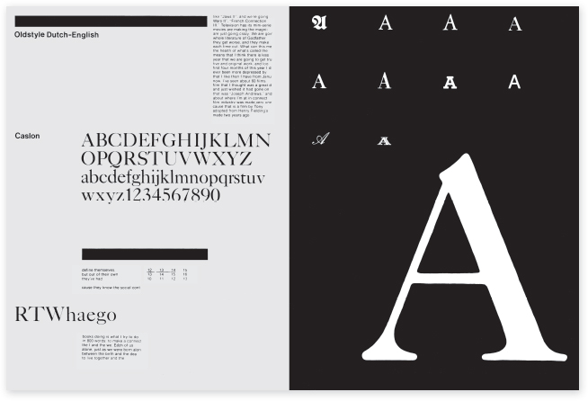
A comparative study of ten typefaces was made by each student. The information was organized chronologically in a booklet with four pages devoted to each typeface. In Figure 11-34, the opening spread juxtaposes descriptive text and a complete font opposite a large letterform. The following spread contains a historical application of the type opposite a contemporary application created by the student.
This problem involves developing research skills, an understanding of typographic history, and an ability to work with different typefaces. Large amounts of complex data are organized, a consistent format is developed, and diversity is created within this format.
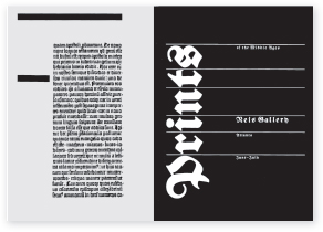
Typographic hierarchy
In this sophomore-level project that develops an in-depth understanding of informational hierarchy and composition, students built on their knowledge of letterspacing, wordspacing, linespacing, rags, and alignment. Students were asked to research and choose content for an event series related to contemporary dance, music, or architecture.
Over the course of nine weeks, students worked within a 7 × 7–inch format to explore the possibilities for visual communication with typographic hierarchy. In the first exercise, students used only Univers 45 Light at 10 point, experimenting with leading, alignment, and negative space. Compositions built in complexity as specific parameters were introduced, explored, and analyzed each week: alignment, weight, slant, scale, extreme scale, texture, and image/series (Figs. 11-35 to 11-40). All compositions started with thumbnail sketches, which were evaluated before students were then asked to design five compositions for each parameter. The project culminated in a presentation book that included the most successful composition for each parameter and that demonstrated the range of a student's exploration and understanding.
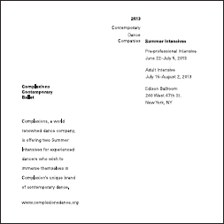


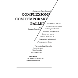
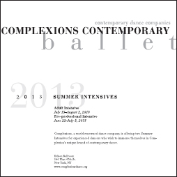
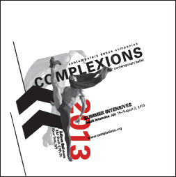
11-35 to 11-40 Designer: Anna Rising
Calendar deconstruction
Calendar pages were designed using typographic elements to organize the space and direct eye movement on the page (Fig. 11-41). Emphasis was placed on experimentation, creating unity and movement on each page, and developing a visual elaboration over twelve pages. A grid structure was established and used to achieve diversity and order within a sequence of twelve designs. Students identified a personally meaningful categorization of time which formed the modules used to inhabit the grid. Typeface usage was limited to a single family. Graphic elements were limited to typography, rules, and single color.
This assignment enables students to explore interrelationships between graphic elements and the surrounding space, grid construction and usage, and sequence.
This project is a re-investigation of the original by Josef Godlewski that is included in earlier editions of Typographic Design: Form and Communication.

Experimental compositions with found typography
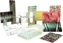
Using all of the typography found on a product label, a grid-based composition was produced exploring size relationships, spatial interval, and weight (Fig. 11-42). A second composition was generated with more dynamic movement and scale change (Fig. 11-43). Visual notations were made of each, analyzing eye movement, massing, and structure (Figs. 11-44 and 11-45). Tone, texture, and shape were substituted for the typographic elements.
This project is designed to encourage an understanding of the abstract properties inherent in existing typographic forms. An exploratory attitude toward space and visual organization is developed.
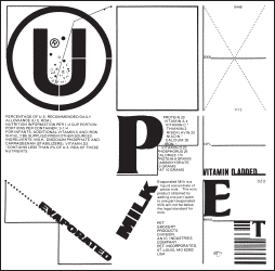
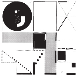
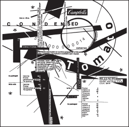
11-42 to 11-45 Designer: Ryoji Ohashi
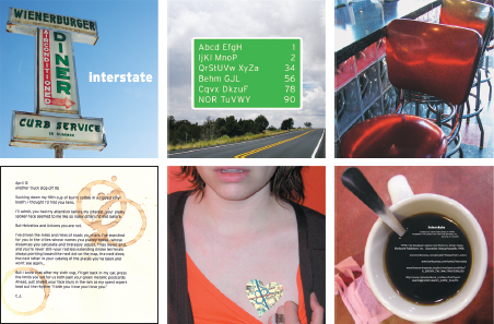
Directional poster: from your house to the university
Typographic posters reveal the directional path between students' homes and the university. Message content, hierarchy, and sequencing of letters, words, and lines of type were explored to enhance the development of a typographic landscape. Bumpy, smooth, straight, jagged, curvy, up, down, slow, traffic jams, smooth sailing, bumper to bumper, confusing, farmland, city, over water, and through tunnels are examples of concepts explored through typographic space to amplify and expand content, context, and meaning (Figs. 11-46 to 11-49).
11-46 Designer: Todd Duchynski
11-47 Designer: Monique Maiorana
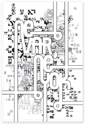
Visual organization and grid structures
Students developed linear grid structures and then created a series of plates, organizing found typographic materials into spatial compositions based upon the underlying structure (Fig. 11-50).
This project introduces the grid structure as a formal design element. The grid module is the basic compositional unit, bringing order to the arrangement. Students consider contrast, structure, positive and negative space, balance, texture and tone, and rhythm as design properties.
11-50 Designers: Craig McLawhorn and Matt Monk
New York Times grid analysis
A grid was established by each student after analysis and documentation of columns and baselines from pages of the New York Times (Fig 11-51). The grid was then reconstructed digitally, and carefully selected modules within it were filled with three primary colors. Students then built upon this initial composition by mixing and adding more colors, creating many variations (Fig. 11-52). A single colored grid was then reproduced with paint on paper (Figs. 11-53 and 11-54).
Exploring projected and reflected light as it inhabits and translates a grid of each students' own construct demonstrates a process for architectural page analysis and offers the opportunity to create experimental form from a relatively humble and simple source.
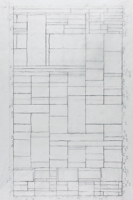
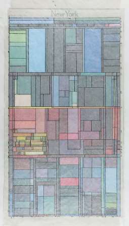
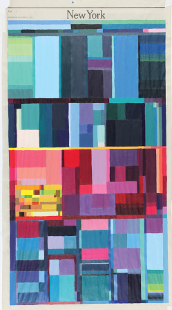
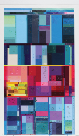
11-51 to 11-54 Designer: Sarah Boley
Environmental grids
To explore a relationship between type and image, students began by choosing and photographing a physical environment they find compelling for its spatial complexity, diversity, and uniqueness (Fig. 11-55). Students then chose text that complemented the space through metaphor, counterpoint, irony, or humor.
Images of the physical site were abstracted in a series of line and shape studies (Fig. 11-56). The text was analyzed through experimental compositions to understand tone, structure, and meaning (Figs. 11-57).
Students then combined image, line, shape, and text into a single visual statement, using underlying structures in the image to guide placement of typography (Figs. 11-58 and 11-59). The studies were expanded into a larger format to refine the integration of type and image.
This assignment helps students combine image and type, create structure to organize fluid and nontraditional grid systems, and build a stronger understanding of hierarchy, order of reading, legibility, and contrast.

11-55 to 11-59 Designer: Laurie Duggins
Banknote design
Cultural diversity was the underlying context for this project. Students were asked to design a series of banknotes in three sequential denominations, both front and back sides (Figs. 11-60 and 11-61). They began by researching the country of their origin and engaging in word lists, mind maps, visual notations, and image gathering. The goal of the project was to design a currency system revealing pertinent historical, social, and environmental aspects of the home country, providing the system with functionality and aesthetic beauty.
Ultimately, the new banknote designs attempted to surpass the quality and communicative effectiveness of those currently in use.
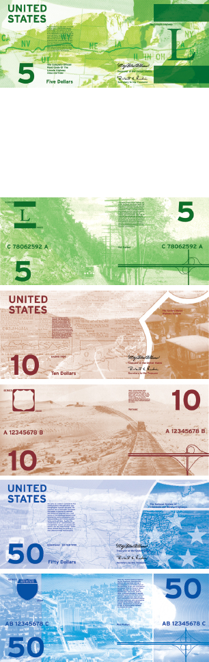
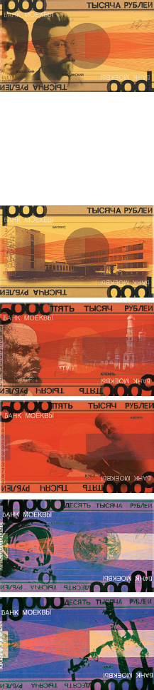
11-61 Designer: Christian Pearson
Observing systems in our surroundings
Students were first challenged to identify distinctive modular grid structures found within the environment, or to create them using physical materials. Once a grid structure was selected, the system was playfully explored in an effort to generate a “dot-matrix” Latin or Arabic alphabet. In other words, typographical characters were constructed from modules distilled from the larger grid structure. The constructed letterforms were analyzed for visual attributes that could be shared among characters to provide a unique font.
The design of the alphabet was informed by studying a well-designed existing typeface and the underlying visual qualities that coalesce a set of diverse characters into a unified font.
These emerging fonts were recorded as sets of photographs, which enabled the students to compare characters, evaluate legibility, and make changes as appropriate to improve the unity among characters.
Each alphabet design evolved from the unique structures and limitations inherent in the initial grids. This project was realized as a collection of individual letterforms recorded on photographic cards and integrated into a poster presenting the results (Fig. 11-62).
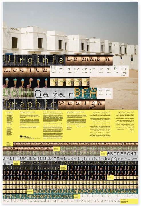
11-62 Designers: Aisha Bushawareb, Aldana Al-Malki, Fatema Al-Doh, Fatma, Al-Remaihi, Fatma Al-Jassim, Kholoud Al Sada, Mariam Gasan, Maryam Al-Homaid, Reem AlHajri, Rihab Mohamed, Rouda Al Thani, Sarah Husni, Abeer Al-Kubaisi, Angela Guy, Asma Al-Thani, Esra Abduljawad, Fatima Zainal, Hadeer Omar, Najla Al-Kuwari, Riam Ghani, Sahwa Elnakhli, Sara Qubrosi
Typographic cubes
A visual presentation combining typography, images, and symbols was created as an extension of a self-assessment study by advanced design students (Figs. 11-63 to 11-65). The students made a formal analysis of their past experiences and future goals. This part of the project stressed research and information gathering. The collected materials were evaluated for their communicative effectiveness in a complex design.
Transforming diverse information into a three-dimensional cube poses a complex design problem. Each side of the cube functions as part of a totality; the six contiguous sides are graphically and communicatively integrated.
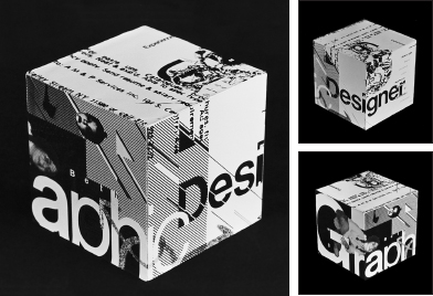
11-63 Designer: Beth April Smolev

11-64 Designer: Katherine St. James
Blending Latin and non-Latin typographic forms
Objectives of this project included a rigorous process of form generation. After selecting an existing Latin letterform from a provided list, students were asked to identify a non-Latin letterform having similar but also contrasting formal characteristics. Students were then instructed to create a unique symbol, a blend of the visual characteristics of the two typographic forms. A large quantity of experimental processes were explored using different materials. First explored two-dimensionally, the final outcome was realized three-dimensionally. Foam prototypes led to the construction of highly crafted wooden typographic object signs (Figs. 11-66 to 11-68).
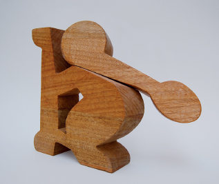
11-66 Designer: Fatima Bukhshaisha
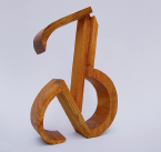

11-68 Designer: Joanne Bermejo
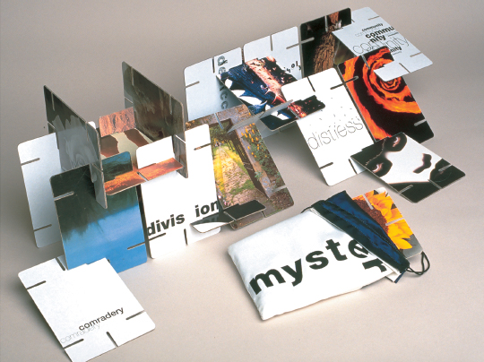
Type and image in the third dimension
In 1952, Charles and Ray Eames created the House of Cards, a set of interlocking playing cards for children and adults. This project is an adaptation of that now-famous design system.
Students chose a subject and designed a set of twenty cards that communicate, on opposite sides of each card, the subject as a conceptual duality (as related to semiotics, color theory, symbolism, etc.). The interlocking feature of the cards allowed students to explore type and image in dimensional form and space.
Three excellent examples of this project include Fourteen Generations, the Holing family lineage traced to the voyage of the Mayflower (Fig. 11-69); Catalog of Building Materials (Fig. 11-70); and Cards of Mystery, where type and image were manipulated to express different emotions and sensations (Fig. 11-71).

11-69 Designer: Allison Holing
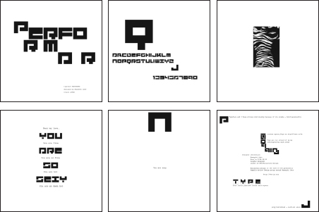
Typezine: my favorite typeface
After considering many possibilities, students were asked to select their favorite typeface—one with which they would choose to have a “love affair.” On the basis of the selected typefaces, six pages were designed by each student to be combined into a single collection (Figs. 11-72 and 11-73). The content consisted of the following: a title, type specimens, an image having a metaphorical relationship to the typeface, a love letter to the typeface, an experimental interpretation of the typeface, and a page revealing the research process.
This project exposes students to the enormous range of available typefaces, creating an awareness of the history, form, and function of different typefaces.
Typeface design: mind/machine
This project was launched by Max Kisman as part of a visiting lecture series. Because of the short length of his visit, the project was completed under the tutelage of Rob Carter and Henk Groenendijk. Students were asked to design a typeface based on the concept mind/machine. Kisman's premise that “an alphabet can be anything and anything can be an alphabet,” encouraged students to pursue open-ended and unique designs. Typefaces derived from a variety of methods and tools were realized using font design software (Figs. 11-74 and 11-77). Other components of the project include a short movie about each typeface (Figs. 11-75 and 11-78) and a folder containing specimens and a poster (Figs. 11-76 and 11-79). The two examples shown are the typefaces Alphemotibots and Franklin Zombie.
11-74 to 11-76 Designer: Erin Hall
11-77 to 11-79 Designer: Ginny Winston
Experimental typographic system
Italo Calvino's 1972 novel Invisible Cities is used as a basis for typographic experimentation and expression. In conversations between Marco Polo and Kublai Khan, fifty-five cities are described as physical spaces and as impressions of residents and memories of visitors. With poetic prose, Calvino presents an alternative to how we usually think about cities, using metaphors based on human nature, linguistics, and semiotics. These metaphors provide a springboard for typographic play and manipulation, thereby teaching students how to achieve more expressive communication.
Students selected one of the cities from the book. Experimentation began with identifying descriptive words and aphorisms for the chosen city. Students explored how type can clarify a message, function symbolically, or emphasize meaning in a conceptual way. Work continued with physical alteration of letterforms, integration of texture or other images, and composition studies in an effort to create an authentic, impressionable representation of the city's geography, activities, and citizens. These investigations culminated in a book about the city (Fig. 11-80). Other system elements included a two-sided poster with a calendar of events (Fig. 11-81), voter registration cards (Fig. 11-82), and various digital materials.
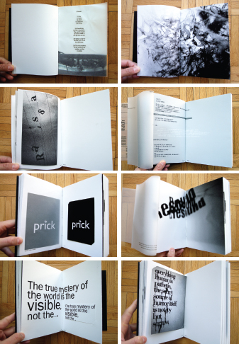
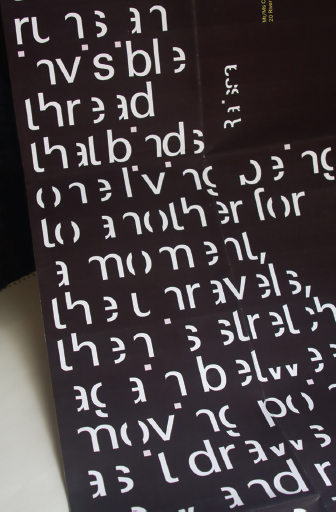
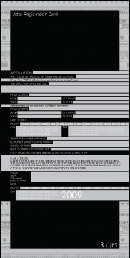
11-80 to 11-82 Designer: Chiu-Ping Chiu
Expressive typography: form amplifies message
Design students explored the potential of software techniques to intensify typographic messages. Content derived from scientific newsletters was used to create typographic identifiers that clearly summarized factual information contained in the article. By employing a source of subject matter that is usually designed routinely, the temptation to appropriate a solution was minimized.
Special attention was given to the role of visual hierarchy and typographic contrast while developing drafting skills useful in professional practice. The ease with which the computer generated variations facilitated visual refinements (Fig. 11-83).
11-83 Designers: University of Cincinnati juniors
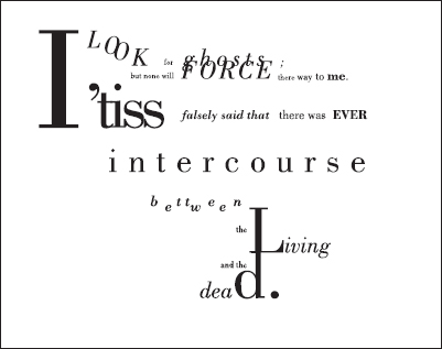
Type as metaphor
Students investigated a subject, and then, working with one to three primary texts, they developed four panels that approach typography as metaphor. The first panel was composed of paragraphs, sentences, and phrases; the second panel, individual words; the third panel, syllables; and the last panel, individual letters. Through research, critical thinking, mind mapping, and experimentation, students gave form to metaphoric implications through compositional arrangement, juxtaposition, and typographic manipulation. Design students were pushed beyond utilitarian, overliteral, or preordained approaches to typography (Fig. 11-84 and 11-85).
This project is a variation of the Type as Metaphor project by Mike Schmidt (University of Memphis), which was inspired by Andrew Blauvelt.
11-84 Designer: Kerry De Bruce
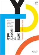
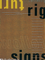
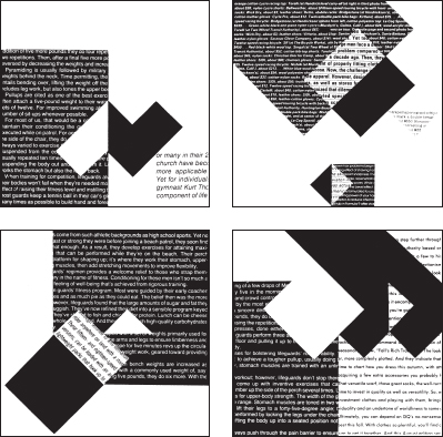
Form and counterform, scale and proportion: “Ne var, ne yok?”
“Ne var, ne yok?” is an old-fashioned Turkish greeting that translates roughly to “What is, what isn't?” These conglomerate posters represent the culmination of a series of five typographic experiments, each investigating critical aspects of form and counterform (Fig. 11-86). Literally, what is, and what isn't? The formal challenge was to incorporate each and every one of hundreds of hand-drawn sketches they created, organize and perhaps resolve a few of them, and project this essential question (Figs. 11-87 and 11-88). Inspired by the introduction to Ara Güler's seminal book, Memories of Istanbul.