Chapter 2
Styling the Page with CSS
IN THIS CHAPTER
 Understanding cascading style sheets
Learning the three methods you can use to add a style sheet
Applying styles to web page elements
Working with fonts and colors
Taking advantage of classes and other style sheet timesavers
HTML elements enable Web-page designers to mark up a document’s structure, but beyond trust and hope, you don’t have any control over your text’s appearance. CSS changes that. CSS puts the designer in the driver’s seat.
— HÅKON WIUM LIE, THE “FATHER” OF CSS
One of the things that makes web coding with HTML so addictive is that you can slap up a page using a few basic tags and when you look at the result in the browser, it usually works pretty good. A work of art it’s not, but it won’t make your eyes sore. That basic functionality and appearance are baked in courtesy of the default formatting that all web browsers apply to various HTML elements. For example, <strong> text appears in a bold font, there's a bit of vertical space between <p> elements, and <h1> text shows up quite a bit larger than regular text.
The browsers' default formatting means that even a basic page looks reasonable, but I’m betting you’re reading this book because you want to shoot for something more than reasonable. In this chapter, you discover that the secret to creating great-looking pages is to override the default browser formatting with your own. You explore custom styling and dig into specific styles for essentials such as fonts, alignment, and colors.
Figuring Out Cascading Style Sheets
If you want to control the look of your web pages, then the royal road to that goal is a web coding technology called cascading style sheets, or CSS. As I mention in Book 2, Chapter 1, your design goal should always be to separate structure and formatting when you build any web project. HTML’s job is to take care of the structure part, but to handle the formatting of the page you must turn to CSS. Before getting to the specifics, I answer three simple questions: What’s a style? What’s a sheet? What’s a cascade?
Styles: Bundles of formatting options
If you’ve ever used a fancy-schmancy word processor such as Microsoft Word, Google Docs, or Apple Pages, you’ve probably stumbled over a style or two in your travels. In a nutshell, a style is a combination of two or more formatting options rolled into one nice, neat package. For example, you might have a “Title” style that combines four formatting options: bold, centered, 24-point type size, and a Verdana typeface. You can then “apply” this style to any text and the program dutifully formats the text with all four options. If you change your mind later and decide your titles should use an 18-point font, all you have to do is redefine the Title style. The program then automatically trudges through the entire document and updates each bit of text that uses the Title style.
In a web page, a style performs a similar function. That is, it enables you to define a series of formatting options for a given page element, such as a tag like <div> or <h1>. Like word processor styles, web page styles offer two main advantages:
- They save time because you create the definition of the style's formatting once, and the browser applies that formatting each time you use the corresponding page element.
- They make your pages easier to modify because all you need to do is edit the style definition and all the places where the style is used within the page get updated automatically.
For example, Figure 2-1 shows some <h1> text as it appears with the web browser’s default formatting. Figure 2-2 shows the same <h1> text, but now I've souped up the text with several styles, including a border, a font size of 72 pixels, the Verdana typeface, and page centering.

FIGURE 2-1: An <h1> heading that appears with the web browser’s default formatting.

FIGURE 2-2: The same text from Figure 2-1, except now with added styles.
Sheets: Collections of styles
So far so good, but what the heck is a sheet? The term style sheet harkens back to the days of yore when old-timey publishing firms would keep track of their preferences for things like typefaces, type sizes, margins, and so on. All these so-called “house styles” were stored in a manual known as a style sheet. On the web, a style sheet is similar: It’s a collection styles that you can apply to a web page.
Cascading: How styles propagate
The “cascading” part of the name cascading style sheets is a bit technical, but it refers to a mechanism that’s built into CSS for propagating styles between elements. For example, suppose you want all your page text to be blue instead of the default black. Does that mean you have to create a “display as blue” CSS instruction for every single text-related tag on your page? No, thank goodness! Instead, you apply it just once, to, say, the <body> tag, and CSS makes sure that every text tag in the <body> tag gets displayed as blue. This is called cascading a style.
Getting the Hang of CSS Rules and Declarations
Before I show you how to actually use CSS in your web pages, let's take a second to get a grip on just what a style looks like.
The simplest case is where a single formatting option is applied to an element. Here’s the general syntax for this:
element {
property: value;
}
Here, element is a reference to the web page doodad to which you want the style applied. This reference is often a tag name (such as h1 or div), but CSS has a powerful toolbox of ways you can reference things, which I discuss later in this chapter.
The property part is the name of the CSS property you want to apply. CSS offers a large collection of properties, each of which is a short, alphabetic keyword, such as font-family for the typeface, color for the text color, and border-width for the thickness of a border. The property name is followed by a colon (:), a space for readability, the value you want to assign to the property, and then a semi-colon (;). This is known in the trade as a CSS declaration (although the description property-value pair is quite common, as well).
 Always enter the
 property name using lowercase letters. If the value includes any characters other than letters or a hyphen, then you need to surround the value with quotation marks.
Notice, too, that the declaration is surrounded by braces ({ and }). All the previous code — from the element name down to the closing brace (}) is called a style rule.
For example, the following rule applies a 72-pixel (indicated by the px unit) font size to the <h1> tag:
h1 {
font-size: 72px;
}
Your style rules aren't restricted to just a single declaration: You’re free to add as many as you need. The following example shows the rule I used to style the h1 element as shown earlier in Figure 2-2:
h1 {
border-width: 1px;
border-style: solid;
border-color: black;
font-size: 72px;
font-family: Verdana;
text-align: center;
}
Note that the declaration block — that is, the part of the rule within the braces ({ and }) — is most easily read if you indent the declarations with a tab or with either two or four spaces. The order of the declarations isn't crucial; some developers use alphabetical order, whereas others group related properties together.
Besides applying multiple styles to a single element, it’s also possible to apply a single style to multiple elements. You set up the style in the usual way, but instead of a single element at the beginning of the rule, you list all the elements that you want to style, separated by commas. In the following example, a yellow background color is applied to the <header>, <aside>, and <footer> tags:
header,
aside,
footer {
background-color: yellow;
}
Adding Styles to a Page
With HTML tags, you just plop the tag where you want it to appear on the page, but styles aren't quite so straightforward. In fact, there are three main ways to get your web page styled: inline styles, internal style sheets, and external style sheets.
Inserting inline styles
An inline style is a style rule that you insert directly into whatever tag you want to format. Here’s the general syntax to use:
<element style="property1: value1; property2: value2; …">
That is, you add the style attribute to your tag, and then set it equal to one or more declarations, separated by semicolons.
For example, to apply 72-pixel type to an <h1> heading, you'd add an inline style that uses the font-size CSS property:
<h1 style="font-size: 72px;">
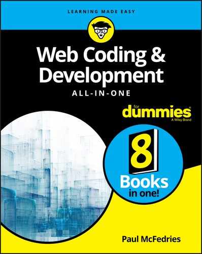
Note that an inline style gets applied only to the tag within which it appears. Consider the following code:
<h1 style="font-size: 72px;">The Big Kahuna</h1>
<h1>Kahunas: Always Big?</h1>
<h1>Wait, What the Heck Is a Kahuna?</h1>
As you can see in Figure 2-3, the larger type size only gets applied to the first <h1> tag, whereas the other two h1 elements appear in the browser's default size.
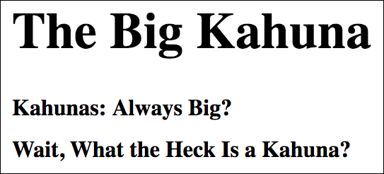
FIGURE 2-3: Only the top <h1> tag has the inline style, so only its text is styled at 72 pixels.
Embedding an internal style sheet
Inline styles are a useful tool, but because they get shoehorned inside tags, they tend to be difficult to maintain because they end up scattered all over the page’s HTML code. You’re also more likely to want a particular style rule applied to multiple page elements.
For easier maintenance of your styles, and to take advantage of the many ways that CSS offers to apply a single style rule to multiple page elements, you need to turn to style sheets, which can be either internal (as I discuss here) or external (as I discuss in the next section).
An internal style sheet is a style sheet that resides within the same file as the page’s HTML code. Specifically, the style sheet is embedded between the <style> and </style> tags in the page's head section, like so:
<!DOCTYPE html>
<html lang="en">
<head>
<style>
Your style rules go here
</style>
</head>
<body>
…
Here’s the general syntax to use:
<style>
elementA {
propertyA1: valueA1;
propertyA2: valueA2;
…
}
elementB {
propertyB1: valueB1;
propertyB2: valueB2;
…
}
…
</style>
As you can see, an internal style sheet consists of one or more style rules embedded within a <style> tag, which is why an internal style sheet is also sometimes called an embedded style sheet.
In the following code, I apply border styles to the h1 and h2 elements: solid and dotted, respectively. Figure 2-4 shows the result.
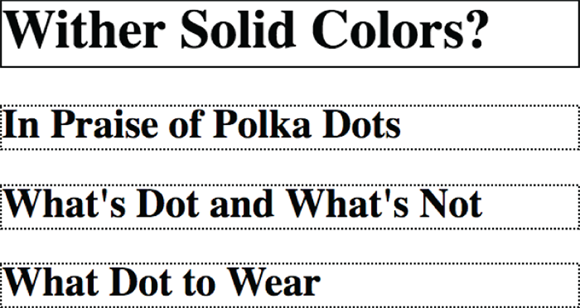
FIGURE 2-4: An internal style sheet that applies different border styles to the h1 (top) and h2 elements.
CSS:
<style>
h1 {
border-width: 2px;
border-style: solid;
border-color: black;
}
h2 {
border-width: 2px;
border-style: dotted;
border-color: black;
}
</style>
HTML:
<h1>Wither Solid Colors?</h1>
<h2>In Praise of Polka Dots</h2>
<h2>What's Dot and What's Not</h2>
<h2>What Dot to Wear</h2>
Note, in particular, that my single style rule for the h2 element gets applied to all the <h2> tags in the web page. That's the power of an internal style sheet: You only need a single rule to apply one or more styles to every instance of a particular element.
The internal style sheet method is best when you want to apply a particular set of style rules to just a single web page. If you have rules that you want applied to multiple pages, then you need to go the external style sheet route.
Linking to an external style sheet
Style sheets get insanely powerful when you use an external style sheet, which is a separate file that contains your style rules. To use these rules within any web page, you add a special <link> tag inside the page head. This tag specifies the name of the external style sheet file, and the browser then uses that file to grab the style rules.
Here are the steps you need to follow to set up an external style sheet:
- Use your favorite text editor to create a shiny new text file.
-
Add your style rules to this file.
Note that you don’t need the
<style>tag or any other HTML tags. -
Save the file.
It's traditional to save external style sheet files using a
.cssextension (for example,styles.css), which helps you remember down the road that this is a style sheet file. You can either save the file in the same folder as your HTML file, or you can create a subfolder (named, say,cssorstyles). -
For every page in which you want to use the styles, add a
<link>tag inside the page's head section.Here’s the general format to use (where
filename.cssis the name of your external style sheet file):<link rel="stylesheet" href="filename.css">If you created a subfolder for your CSS files, be sure to add the subfolder to the
hrefvalue (for example,href="styles/filename.css").
For example, suppose you create a style sheet file named styles.css, and that file includes the following style rules:
h1 {
color: red;
}
p {
font-size: 16px;
}
You then refer to that file by using the <link> tag, as shown here:
<!DOCTYPE html>
<html lang="en">
<head>
<link rel="stylesheet" href="styles.css">
</head>
<body>
<h1>This Heading Will Appear Red</h1>
<p>This text will be displayed in a 16-pixel font</p>
</body>
</html>
Why is this so powerful? You can add the same <link> tag to any number of web pages and they'll all use the same style rules. This makes it a breeze to create a consistent look and feel for your site. And if you decide that your <h1> text should be green instead, all you have to do is edit the style sheet file (styles.css). Automatically, every single one of your pages that link to this file will be updated with the new style!
Styling Page Text
You'll spend the bulk of your CSS development time applying styles to your web page text. CSS offers a huge number of text properties, but those I show in Table 2-1 are the most common. I discuss each of these properties in more detail in the sections that follow.
TABLE 2-1 Some Common CSS Text Properties
|
Property |
Example |
Description |
|
|
|
Sets the size of the text |
|
|
|
Sets the typeface of the text |
|
|
|
Sets whether the text uses a bold font |
|
|
|
Sets whether the text uses an italic font |
|
|
|
Applies (or removes) underline or strikethrough styles |
|
|
|
Aligns paragraph text horizontally |
|
|
|
Sets the size of the indent for the first line of a paragraph |
Setting the type size
When it comes to the size of your page text, the CSS tool to pull out of the box is font-size:
font-size: value;
Here, value is the size you want to apply to your element, which means a number followed by the unit you want to use. I discuss the units you can use in the next section, but for now we can stick with one of the most common units: pixels. The pixels unit is represented by the letters px, and a single pixel is equivalent to 1/96 of an inch. All browsers set a default size for regular text, and that default is usually 16px. However, if you prefer that, say, all your paragraph (<p>) text get displayed at the 20px size, then you'd include the following rule in your style sheet:
p {
font-size: 20px;
}
Getting comfy with CSS measurement units
CSS offers a few measurement units that you need to know. You use these not only for setting type sizes, but also for setting the sizes of padding, borders, margins, shadows, and many other CSS properties. Table 2-2 lists the most common CSS measurement units.
TABLE 2-2 Some CSS Measurement Units
|
Unit |
Name |
Type |
Equals |
|
|
pixel |
Absolute |
1/96 of an inch |
|
|
point |
Absolute |
1/72 of an inch |
|
|
em |
Relative |
The element's default, inherited, or defined font size |
|
|
root em |
Relative |
The font size of the root element of the web page |
|
|
viewport width |
Relative |
1/100 of the current width of the browser's content area |
|
|
viewport height |
Relative |
1/100 of the current height of the browser’s content area |
Here are some notes about these units that I hope will decrease that furrow in your brow:
- An absolute measurement unit is one that has a fixed size: either 1/96 of an inch in the case of a pixel, or 1/72 of an inch in the case of a point.
- A relative unit is one that doesn’t have a fixed size. Instead, the size depends on whatever size is supplied to the element. For example, suppose the browser’s default text size is
16px, which is equivalent then to1em. If your page consists of a single<article>tag and you set thearticleelement'sfont-sizeproperty to1.5em, then the browser will display text within the<article>tag at24px(since 16 times 1.5 equals 24). If, however, the browser user has configured her default text size to20px, then she'll see yourarticletext displayed at30px(20 times 1.5 equals 30). - The
emunit can sometimes be a head-scratcher because it takes its value from whatever element it's contained within. For example, if your page has an<article>tag and you set thearticleelement'sfont-sizeproperty to1.5em, then the browser will display text within the<article>tag at24px(assuming a16pxdefault size). However, if within the<article>tag you have a<section>tag and you set thesectionelement'sfont-sizeproperty to1.25em, then the browser will display text within the<section>tag at30px(since 24 times 1.25 equals 30). - If you want more consistency in your text sizes, use
reminstead ofem, sinceremis always based on the default font size defined by either the web browser or the user. For example, if your page uses a16pxdefault size and it has an<article>tag with thefont-sizeproperty set to1.5rem, then the browser will display text within the<article>tag at24px. If within the<article>tag you have a<section>tag and you set thesectionelement'sfont-sizeproperty to1.25rem, then the browser will display text within the<section>tag at20px(since 16 times 1.25 equals 20).
Applying a font family
You can make a huge difference in the overall look and appeal of your web pages by paying attention to the typefaces you apply to your headings and body text. A typeface is a particular design applied to all letters, numbers, symbols, and other characters. CSS types prefer the term font family, hence the property you use to set text in a specific typeface is named font-family:
font-family: value;
Here, value is the name of the typeface, which needs to be surrounded by quotation marks if the name contains spaces, numbers, or punctuation marks other than a hyphen (-). Feel free to list multiple typefaces, as long as you separate each with a comma. When you list two or more font families, the browser reads the list from left to right, and uses the first font that's available either on the user’s system or in the browser itself.
When it comes to specifying font families, you have three choices:
- Use a generic font. This is a font that’s implemented by the browser itself and set by using one of the following five keywords:
serif(offers small cross strokes at the ends of each character),sans-serif(doesn't use the cross strokes),cursive(looks like handwriting),fantasy(a decorative font), ormonospace(gives equal space to each character). Figure 2-5 shows each of these generic fonts in action. - Use a system font. This is a typeface that's installed on the user’s computer. How can you possibly know that? You don’t. Instead, you have two choices. One possibility is to use a system font that’s installed universally. Examples include Georgia and Times New Roman (serifs), Verdana and Tahoma (sans serifs), and Courier New (monospace). The other way to go is to list several system fonts, knowing that the browser will use the first one that’s implemented on the user’s PC. Here’s a sans-serif example:
font-family: "Gill Sans", Calibri, Verdana, sans-serif; - Use a Google font. Google Fonts offers access to hundreds of free and well-crafted fonts that you can use on your site. Go to
https://fonts.google.com, find a font you like, then click the plus sign (+) beside it. Click “1 Family Selected” and then use the Customize tab to add styles such as bold and italic. In the Embed tab, copy the<link>tag and then paste it in your HTML file, somewhere in the<head>section (before your<style>tag, if you're using an internal style sheet, or before your CSS<link>tag, if you’re using an external style sheet). Go back to the Embed tab, copy thefont-familyrule, and then paste that rule into your CSS.
FIGURE 2-5: Generic fonts are implemented by all web browsers and come in five flavors: serif, sans-serif, cursive, fantasy, and monospace.
Making text bold
In Book 2, Chapter 1, I talk about how the <strong> and <b> tags have semantic definitions (important text and keywords, respectively), but you'll often come across situations where you want text to appear bold, but that text isn’t important or a keyword. In that case, you can style the text the CSS way with the font-weight property:
font-weight: value;
Here, value is either the word bold, or one of the numbers 100, 200, 300, 400, 500, 600, 700 (this is the same as using bold), 800, and 900, where the higher numbers give bolder text and the lower numbers give lighter text; 400 is regular text, which you can also specify using the word normal. Note, however, that depending on the typeface you're using, not all of these values will give you bolder or lighter text.
Styling text with italics
In Book 2, Chapter 1, I mention that the <em> and <i> tags have semantic significance (emphasis and alternative text, respectively), but you might have text that should get rendered in italics, but not with emphasis or as alternative text. No problem: Get CSS on the job by adding the font-style property to your rule:
font-style: italic;
Styling links
When you add a link to the page, the web browser displays the link text in a different color (usually blue) and underlined. This might not fit at all with the rest of your page design, so go ahead and adjust the link styling as needed.
You can apply any text style to a link, including changing the font size, the typeface, adding bold or italics, and changing the color (which I discuss later in this chapter).
One common question web coders ask is “Links: underline or not?” Not everyone is a fan of underlined text, and if you fall into that camp, then you can use the following rule to remove the underline from your links:
a {
text-decoration: none;
}
 Creating a custom style for links is standard operating procedure for web developers, but a bit of caution is in order because a mistake made by many new web designers it to style links too much like regular text (particularly when they've removed underlining from their links). Your site visitors should be able to recognize a link from ten paces, so be sure to make your links stick out from the regular text in some way.
Aligning paragraph text
By default, your web page paragraphs line up nice and neat along the left margin of the page. Nothing wrong with that, but what if you want things to align along the right margin, instead? Or perhaps you want to center something on the page. Wouldn’t that be nice? You can do all that and more by pulling out the text-align property:
text-align: left|right|center|justify;
In case you’re wondering, the justify value tells the web browser to align the element's text on both the left and right margin.
Indenting a paragraph’s first line
You can signal the reader that a new paragraph is being launched by indenting the first line a bit from the left margin. This is easier done than said with CSS by applying the text-indent property:
text-indent: value;
Here, value is a number followed by any of the CSS measurement units I mention earlier in this chapter. For example, a common indent value is 1em, which here I've applied to the p element:
p {
text-indent: 1em;
}
Working with Colors
When rendering the page using their default styles, browsers don’t do much with colors, other than showing link text a default and familiar blue. But CSS offers some powerful color tools, so there’s no reason not to show the world your true colors.
Specifying a color
I begin by showing you the three main ways that CSS provides for specifying the color you want:
- Use a color keyword. CSS defines a bit more than 140 color keywords. Some of these are straightforward, such as
red,yellow, andpurple, while others are, well, a bit whimsical (and hunger-inducing):lemonchiffon,papayawhip, andpeachpuff. The Web Coding Playground (wcpg.io/dummies/2-2-14) lists them all, as shown in Figure 2-6. - Use the
rgb()function.rgb()is a built-in CSS function that takes three values: one for red, one for green, and one for blue (separated by commas). Each of these can be a value between 0 and 255, and these combinations can produce any of the 16 million or so colors on the spectrum. For example, the following function produces a nice red:rgb(255, 99, 71) - Use an RGB code. An RGB code is a six-digit value that takes the form
#rrggbb, whererris a two-digit value that specifies the red component of the color,ggis a two-digit value that specifies the green component, andbbis a two-digit value that specifies the blue component. Alas, these two-digit values are hexadecimal — base 16 — numbers, which run from 0 to 9 and then a to f. As two-digit values, the decimal values 0 through 255 are represented as 00 through ff in hexadecimal. For example, the following RGB code produces the same red as in the previous example:#ff6347

FIGURE 2-6: Go to the Web Coding Playground to see a full list of the CSS color keywords.
Coloring text
To apply a CSS color to some text, you use the color property:
color: value;
Here, value can be a color keyword, an rgb() function, or an RGB code. The following three rules produce the same color text:
color: tomato;
color: rgb(255, 99, 71);
color: #ff6347;
Coloring the background
For some extra page pizazz, try adding a color to the background of either the entire page or a particular element. You do this in CSS by using the background-color property:
background-color: value;
Here, value can be a color keyword, an rgb() function, or an RGB code. The following example displays the page with white text on a black background:
body {
color: rgb(255,255,255);
background-color: rgb(0,0,0);
}
When you're messing around with text and background colors, make sure you leave enough contrast between the text and background to ensure that your page visitors can still read the text without shaking their fists at you. But I should also warn you that too much contrast isn’t conducive to easy reading, either. For example, using pure white for text and pure black for a background (as I did in the preceding code, tsk, tsk) isn’t great because there’s too much contrast. Darkening the text a shade and lightening the background a notch makes all the difference:
body {
color: rgb(222,222,222);
background-color: rgb(32,32,32);
}
Getting to Know the Web Page Family
One of the prerequisites for becoming a web developer is understanding both the structure of a typical web page and the odd (at least at first) lingo associated with that structure. As an example, I’m going to refer to the semantic HTML elements that I demonstrate in Book 2, Chapter 1 (in Figure 1-16, in particular). Figure 2-7 shows that semantic structure as a tree diagram:
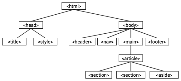
FIGURE 2-7: The structure of a semantic HTML web page.
As you can see, the tree has the <html> tag at the top. The second level consists of the <head> tag and the <body> tag, and the <head> tag leads to a third level that consists of the <title> and <style> tags. For the <body> tag, the third level contains four tags: <header>, <nav>, <main>, and <footer>. The <main> tag leads to the <article> tag, which contains two <section> tags and an <aside> tag.
Okay, I can see the “So what?” thought bubble over your head, so I'll get to the heart of the matter. With this structure in mind, you can now identify and define four useful members of the web page family tree:
- Parent: An element that contains one or more other elements in the level below it. For example, in Figure 2-7, the
<html>tag is the parent of the<head>and<body>tags, whereas the<head>tag is the parent of the<title>and<style>tags. - Child: An element that is contained within another element that sits one level above it in the tree. (Which is another way of saying that the element has a parent.) In Figure 2-7, the
<header>,<nav>,<main>, and<footer>tags are children of the<body>tag, whereas the two<section>tags and the<aside>tag are children of the<article>tag. - Ancestor: An element that contains one or more levels of elements. In Figure 2-7, the
<body>tag is an ancestor of the<aside>tag, whereas the<html>tag is an ancestor of everything in the page. - Descendant: An element that is contained within another element that sits one or more levels above it in the tree. In Figure 2-7, the
<section>tags are descendants of the<main>tag, whereas the<article>tag is a descendant of the<body>tag.
This no doubt seems far removed from web development, but these ideas play a crucial role not only in CSS, but also JavaScript (see Book 3) and jQuery (see Book 4).
Using CSS Selectors
When you add a CSS rule to an internal or external style sheet, you assemble your declarations into a declaration block (that is, you surround them with the { and } thingies) and then assign that block to an element of the page. For example, the following rule throws a few styles at the page's <h1> tags:
h1 {
font-size: 72px;
font-family: Verdana;
text-align: center;
}
But the element you assign to the declaration block doesn’t have to be an HTML tag name. In fact, CSS has a huge number of ways to define what parts of the page you want to style. These methods for defining what to style are called selectors (because you use them to “select” those parts of the page you want styled). When you use a tag name, you’re specifying a type selector. However, there are many more — a few dozen, in fact — but lucky for you, only four should cover most of your web development needs:
- The class selector
- The id selector
- The descendant selector
- The child selector
The class selector
If you master just one CSS selector, make it the class selector, because you’ll use it time and again in your web projects. A class selector is one that targets its styles at a particular web page class. So, what’s a class? I’m glad you asked. A class is an attribute assigned to one or more page tags that enables you to create a kind of grouping for those tags. Here’s the syntax for adding a class to an element:
<element class="class-name">
Replace element with the tag and replace class-name with the name you want to assign. The name must begin with a letter and the rest can be any combination of letters, numbers, hyphens (-), and underscores (_). Here's an example:
<div class="caption">
With your classes assigned to your tags as needed, you’re ready to start selecting those classes using CSS. You do that by preceding the class name with a dot (.) in your style rule:
.class-name {
property1: value1;
property2: value2;
…
}
For example, here’s a rule for the caption class:
.caption {
font-size: .75rem;
font-style: italic;
}
The advantage here is that you can assign the caption class to any tag on the page, and CSS will apply the same style rule to each of those elements.
The id selector
In Book 2, Chapter 1, I talk about creating an anchor by adding a unique id attribute to a tag, which enabled you to create a link that targeted the anchor:
<element id="id-name">
Here's an example:
<h2 id="subtitle">
You can also use the id attribute as a CSS selector, which enables you to target a particular element with extreme precision. You set this up by preceding the id value with a hashtag symbol (#) in your CSS rule:
#id-name {
property1: value1;
property2: value2;
…
}
For example, here's a rule for the subtitle id:
#subtitle {
font-size: 2rem;
font-style: italic;
color: blue;
}
This isn’t as useful as the class selector because it can only target a single element, which is why web developers use id selectors only rarely.
The descendant selector
Rather than targeting specific tags, classes, or ids, you might need to target every instance of a particular element that is contained within another element. Those contained elements are called descendants, and CSS offers the descendant selector for applying styles to them. To set up a descendant selector, you include in your rule the ancestor and the descendant type you want to style, separated by a space:
ancestor descendant {
property1: value1;
property2: value2;
…
}
For example, here’s a rule that applies a few styles to every <a> tag that's contained with an <aside> tag:
aside a {
color: red;
font-style: italic;
text-decoration: none;
}
The child selector
The descendant selector that I discuss in the previous section is one of the most powerful in the CSS kingdom because it targets all the descendants of a particular type that reside within an ancestor, no matter how many levels down the page hierarchy those descendants live. However, it’s often more suitable and more manageable to target only those descendants that reside one level down: in short, the children of some parent element.
To aim some styles at the child elements of a parent, you use the CSS child selector, where you separate the parent and child elements with a greater-than sign (>):
parent > child {
property1: value1;
property2: value2;
…
}
For example, here's a rule that targets the links that are the immediate children of an <aside> tag:
aside > a {
color: green;
font-style: bold;
text-decoration: none;
}
Revisiting the Cascade
 I close this first CSS chapter with a quick look at three important concepts that you need to drill into your brain if you want to write good CSS and troubleshoot the inevitable CSS problems that will crop up in your web development career:
- Inheritance: If a parent element is styled with a property, in many cases its child and descendant elements will also be styled with the same property. This is known in the CSS game as inheritance: Parents “pass along” some of their properties to their children and descendants. Notice, however, that I said “some” properties are inherited. Lots of properties — such as the padding, borders, and margins I cover in Book 2, Chapter 3 — don’t get inherited, so you need to watch out for inheritance (or its lack) as you code your pages.
-
Weight: The different ways that you can specify styles for a page have a built-in hierarchy of importance, or weight in CSS-speak. Here’s that style source hierarchy in ascending order of weight:
- Browser styles — The list of default styles that the web browser applies to certain HTML tags. This is known officially as the user agent style sheet.
- User-specified styles — The styles that the web browser user has configured, such as a new default type size. This is known to CSS pros as a user style sheet.
- External style sheets.
- Internal style sheets.
- Inline styles.
What this means is that if a web browser comes across the same style property in two or more style sources, it uses the property value from the source that has the greater weight. For example, if you set
font-size: 1.5remin an external style sheet and then setfont-size: 2remwith an inline style, the inline style “wins” because it has a greater weight than the external style sheet. -
Specificity: What happens when two or more style rules from the same source target the same element? You can't go by weight since they all reside in the same style source, so you have to turn to a concept called specificity, instead. This is a score given to each style rule, where the browser implements the rule that garners the highest specificity value. Here’s how the browser determines the specificity for a rule:
- Add one point for each element (such as
divorspan) in the rule’s selector. - Add 10 points for each class in the selector.
- Add 100 points for each ID in the selector.
- If the selector is part of an inline style, add 1,000 points.
In practice, you can use specificity to figure out why a particular element has styles that don’t seem right. Quite often, the problem turns out to be that the browser is applying some other style rule that has a higher specificity.
- Add one point for each element (such as